Whether you’re just curious or serious about using Arrtx 120A Anime Colors Acrylic Markers for your projects, in this article, I share 6 tips on how to paint with them.
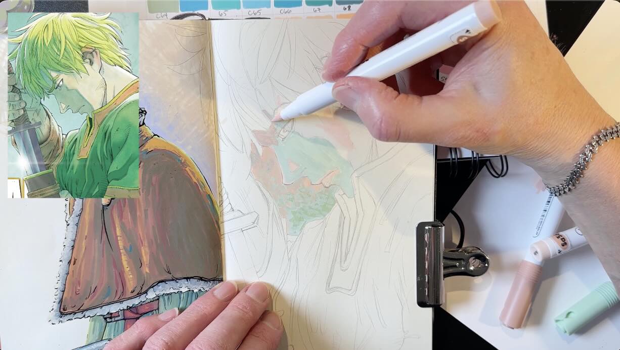
To demo the markers, I’ll be drawing studies by master Makoto Yukimura of his Vinland Saga manga illustrations in colour and pen and ink.
You’ll find links to the art supplies used to create the illustrations at the end of this article in the resources section.
//DISCLOSURE: I earn a small commission when you use my affiliate links to make a purchase. Visit the Terms page to learn more.
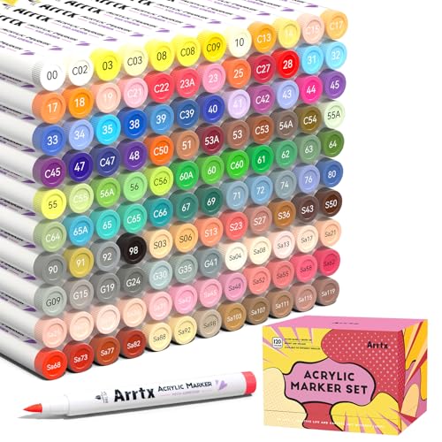
Arrtx 120A Anime Colors Acrylic Markers
This is actually my third set of Arrtx acrylic markers.
I’d been experimenting with their 90B set:

To participate in their 10th anniversary campaign, I was also gifted with a set of the 36-Colors liquid paint set:

So, when they approached me for another collab, I said “yess”. All the yes, to their 120-anime marker set:
Arrtx is a good fit with my values
Arrtx is a China-based company with its head office in Hong Kong.
They started in 2015 with the idea of conceiving original designs in collaboration with artists around the world.
They make high-quality, reasonably priced products to inspire creativity.
To me, any art supply that gets you excited about doing more art is something to celebrate.
I’ve not only enjoyed testing new supplies, but the whole experience of working with the Arrtx team has been dreamy.
The communication has been super respectful so far, which isn’t always the case when bigger Brands approach small creators like myself.
I feel like they genuinely care about artists and listen to feedback with interest. You can see this by what they share on social media. They’re not pushing pens. They’re encouraging everyone to play and make things.
That’s why I was thrilled to test this anime-specific marker set and will continue to collaborate with them, whatever they send me is a – hell yeah!
Whether you’re a beginner or an experienced painter, there are 6 key things you’ll want to know about using this marker set for your projects.
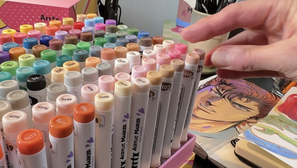
Because when you first open the box, it’s like candy. The impulse is to dive in. But trust me, with 120 colours, there’s merit to a more planned approach.
Sure, it’s exciting to experiment, but also great to see results for your efforts, which means a worthwhile first step is to get organized.
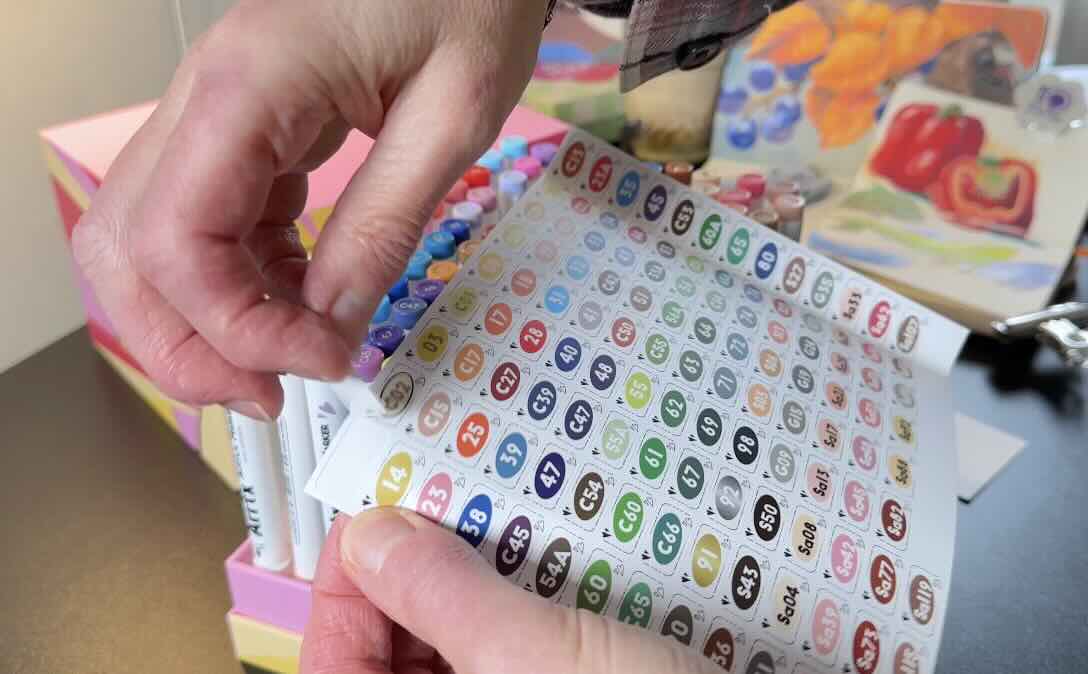
Tip 1 – Label the colours
The first step to getting organized is to use the provided sticky labels.
For a dynamic painterly effect with vibrant hues, not mud, it helps to understand basic colour theory.
But even if you know very little about colour mixing, you can trust that the Arrtx system makes it easy to harmonize your colour choices.
That means the colour science is already done for you. So, the numbers are how the colours are coded, and it matters.
That’s what the stickers are for.
The pens are standing vertically in the holder and numbered at the top, but when in use, your markers are lying flat on the table.
Therefore, the stickers not only save time, but they also become a necessity.
📝 FYI – I wrapped my stickers around the pens, but later discovered that it’s best to position them along the length so they don’t peel off with wear over time.
The numbering sequence may seem odd at first, but the more markers you get, the more it all makes sense.
Each marker set comes in a palette of colours best suited for specific subjects (example: pastels, skin tones, anime, landscapes). If you’re lucky enough to own every set, the numbers fit together all in order, like a giant puzzle.
Which is a brilliant concept.
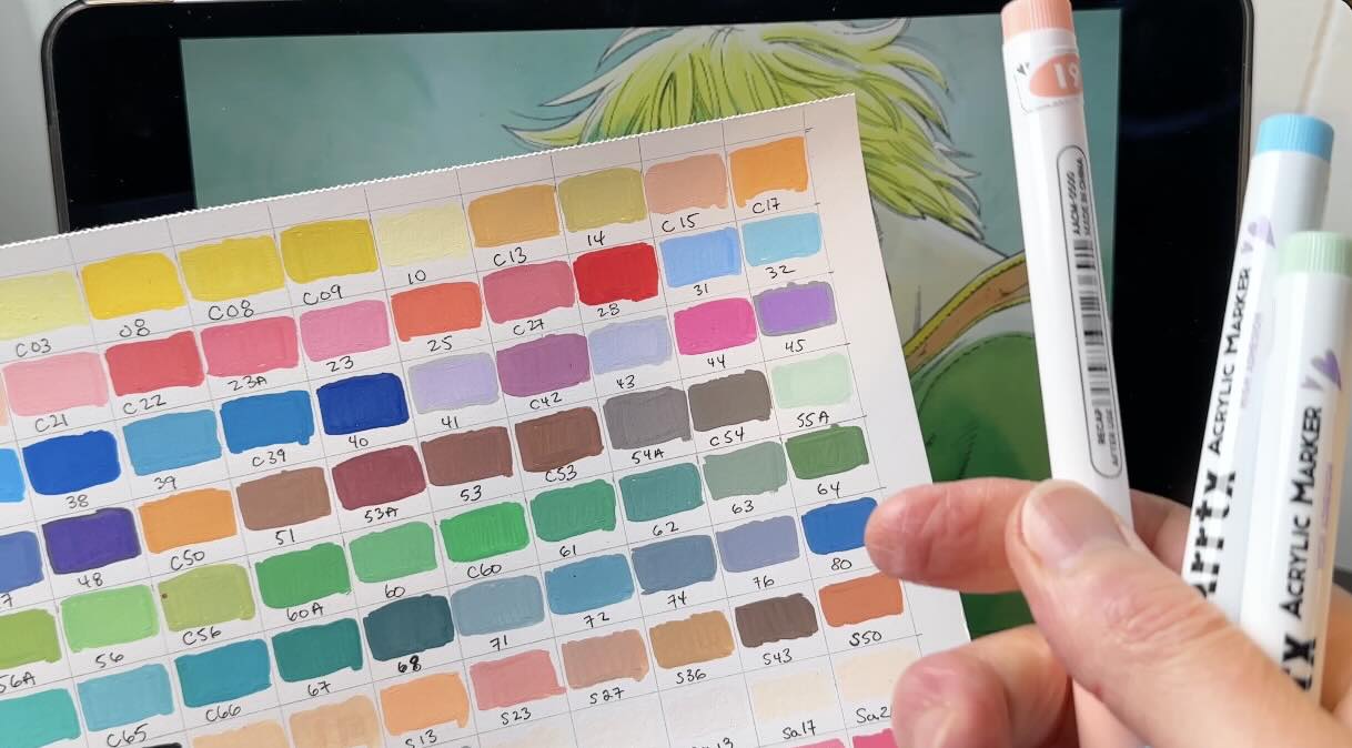
Tip 2 – Make a colour chart
The stickers are super helpful, and the next important step is to make a colour chart.
You need a colour chart to:
- place the pens back in the holder in the same order
- have a quick reference of what the colours look like all altogether
- more accurately match the colours to your subjects
You see, the colour on the pen cap and the colour on the printed sticky label don’t match and, most importantly, not exactly how the colour comes out on paper, wet or dry.
The chart you’ll make becomes your best guide to match expected outcomes.
DYI or download the free 120-color chart from Arrtx here:
Tip 3 – Make a colour wheel
Once your chart is complete, make a colour wheel.
A colour wheel isn’t a must, but it helps for creating rich mid-tones, realistic shadows and luminous highlights. It’s a quick guide to your complementary colours.
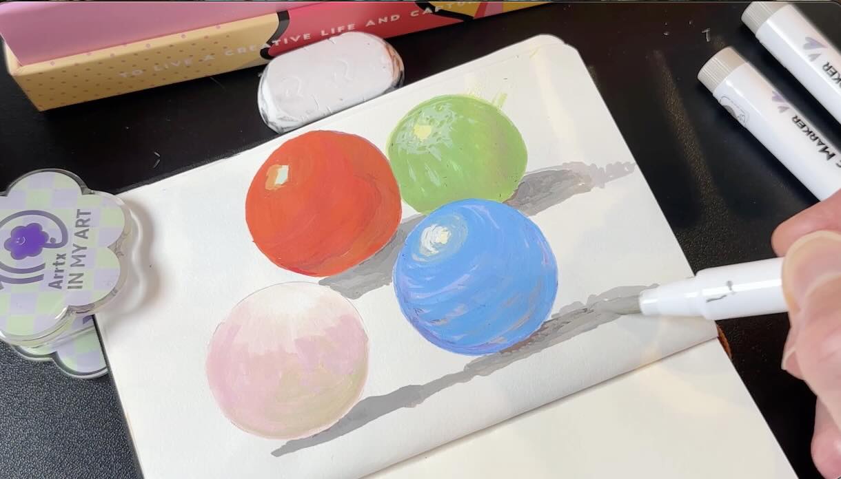
For example, the sphere below is blue. Blue is my local colour, the colour of the subject.
The most common method is to paint the core shadow in a darker shade of the local colour, in this case, dark blue. Dark blue becomes an underlayer that you paint over with the local colour, and the gradation looks nice. Nothing wrong with that.
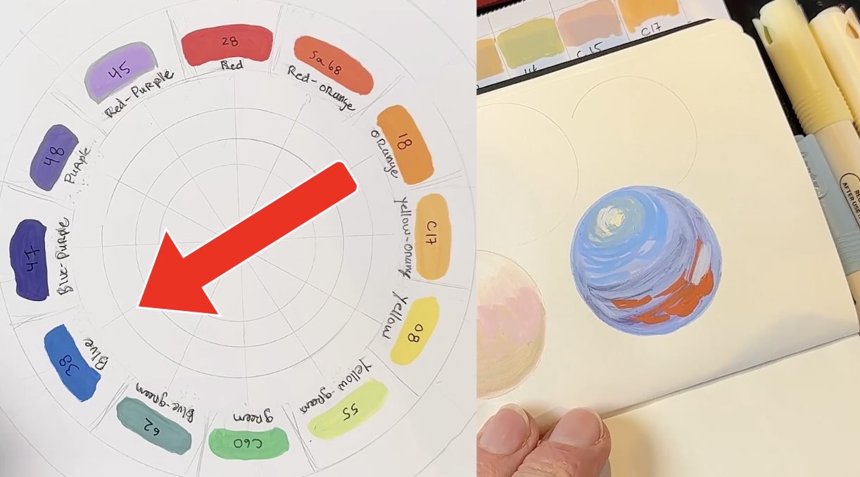
My favourite method is to instead of dark blue, paint that underlayer orange. Orange is the complement of blue; sitting opposite on the colour wheel.
Let’s do that again.
On the red sphere, I’m using the common method; building the core shadow using analogous colours, the colours sitting next to each other on the wheel, for the different tones.
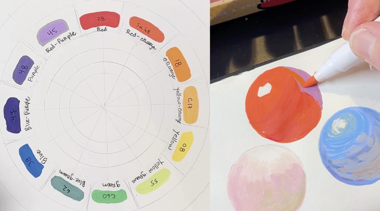
So, a little bit lighter than red is red-orange, going into yellows for the lighter areas on the sphere. Then a little bit darker than red is red-purple, going into blues for the darker areas.
For the green sphere (pictured higher up) I used purple as the core shadow underlayer.
Either method works, depending on the effect you want. I use both.
The key thing is that the Arrtx markers are numbered in the analogous format. They’re standing side-by-side by tonal value in the holder, like side-by-side on the colour wheel, which is good to know.
📝 FYI – Colour theory:
- Primary: Red, Blue, Yellow
- Secondary: Orange, Green, Purple
- Tertiary: red-orange, red-purple, yellow-orange, yellow-green, blue-green, blue-purple.
Transition colours
- Green (green with more blue is cold, green with more yellow is warm)
- Purple (purple with more red is warm, purple with more blue is cold)
Colour schemes
- Monochromatic – one colour
- Analagous – next to each other on the colour wheel
- Complementary – across from each other on the colour wheel
Let’s put these colour theory mixes into practice with some Vinland Saga drawings.
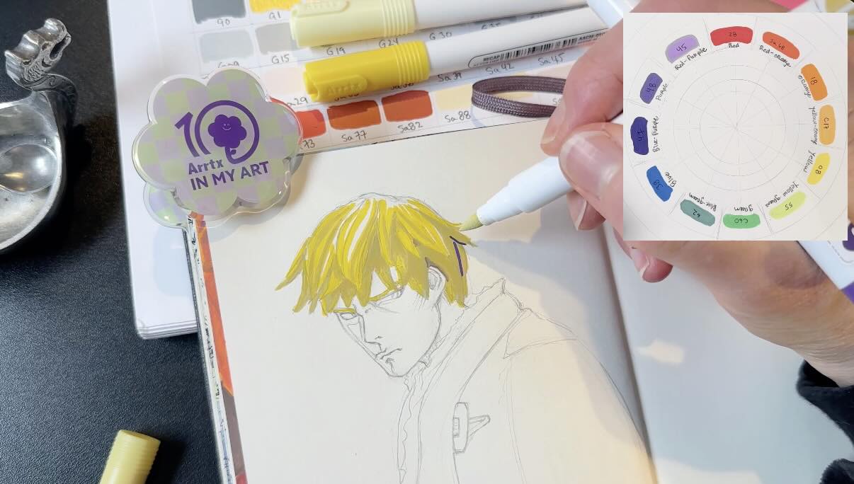
Tip 4 – Colour scheming
Now that you know how to find, match, and harmonize your colours, the next step to staying organized is selecting your colour schemes.
Hot tip number 4 is to pick colour schemes section by section for each colour arrangement in your illustration project.
A colour scheme is a set of colours that has a range of tones. You’ll have:
- 1 local colour
- 1-3 colours to make highlights
- 1-3 colours to make shadows
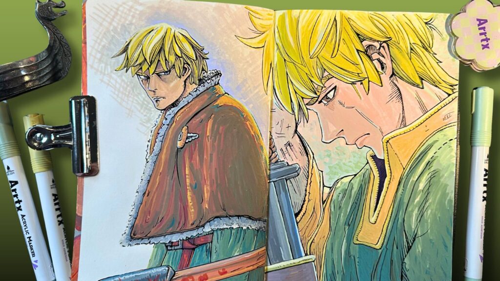
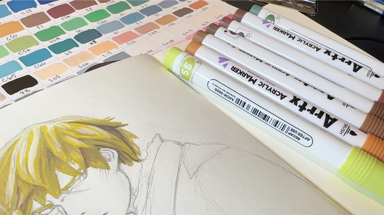
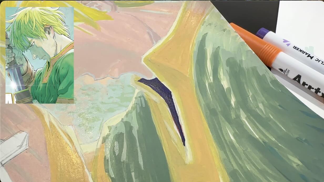
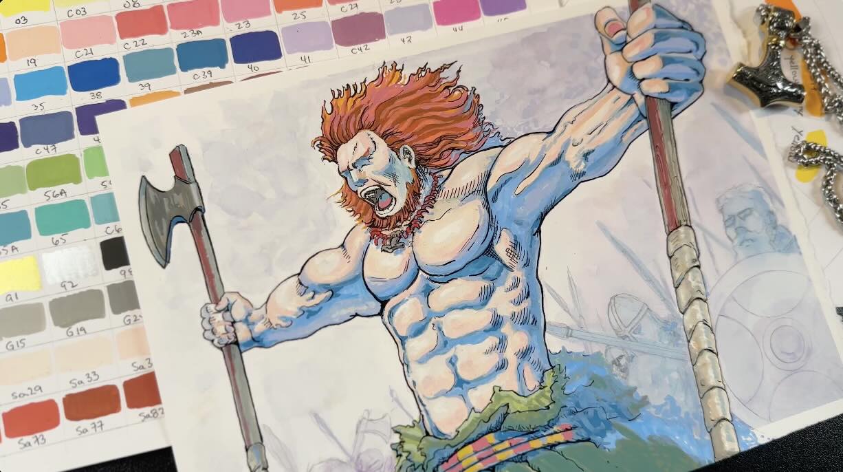
So, pictured above, I’m using yellow as my local colour for Thorfinn’s hair. Then a shade darker of that yellow for the mid-tones.
For the cast shadows, I use two shades of purple for the underlayer. The darker the shadow, the deeper the purple underlayer and the darker the yellow overlayer.
Finishing with two shades of brighter yellows for the highlights.
As you can see, the colour application is opaque, similar to gouache, which allows for layering light over dark.
If you want to layer a light colour over a dark one effectively, the paint must be dry. If you want to blend or fade the colours together, the paint must be wet.
Tip 5 – Wet on wet
It’s best to work fast so you can blend the colours while they’re wet.
The markers are super quick-drying. Great for layering, but if you want a soft, gradual edge, then you’ll want to blend while the ink is wet.
I’ve seen other artists use a wet paint brush, but I prefer just using the markers to blend.
Once I’m done painting one section of the illustration – like the hair, I move on to another section of the drawing, like the cape, and pick a new colour scheme.
I stay organized by placing the finished scheme back in the holder. Then place the new scheme on my table.
Otherwise, if you just keep pulling random colours in piles, it will be challenging to keep track of the colours, which can lead to layering with weird values. You risk creating mud.
Yes, even though it’s easy to fix mistakes and keep layering colours, I find that without a plan, it can get tricky to match my subject. It just depends on what you’re trying to achieve.
Again, because it’s an opaque medium, it’s up to you whether to start with the highlights or the shadows.
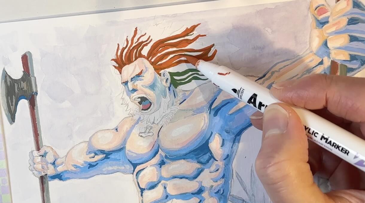
📝 FYI – About the brush pens:
The brush on the Arrtx markers is nice. It’s a sponge tip, with non-toxic, odourless water-based ink.
It’s labelled as an ink, but think of it as liquid acrylic. It works just like acrylic or gouache, as mentioned.
I also mentioned that you can blend with water and a separate brush, though you’ll want to experiment to find the right consistency (and use a wet or mixed-medium paper).
You don’t have to pump or shake. Just use them just like a regular brush pen.
I hold the pen vertically to use the tip for details and thinner lines. And the belly of the brush for even coverage when blocking larger areas of colour.
Tip 6 – Mix-medium friendly
The Arrtx acrylic markers are mixed-medium friendly.
It’s said that they’re compatible with just about everything from fine arts to crafts. And apparently, they perform on practically any surface, even glass, rocks, fabric, or wood.
I’ve combined them with fine liners, brush pens, coloured pencils, and watercolour with pleasing results.
The only caveat I found is some “pilling” on the paper. Pilling, sort of like when a wool sweater gets those small balls of fabric.
It’s caused by either too much friction or over-saturation of the fibres. To minimize this, use appropriate quality paper for your higher-end projects. Also, limit layering to three passes max when using larger blocks of colour.
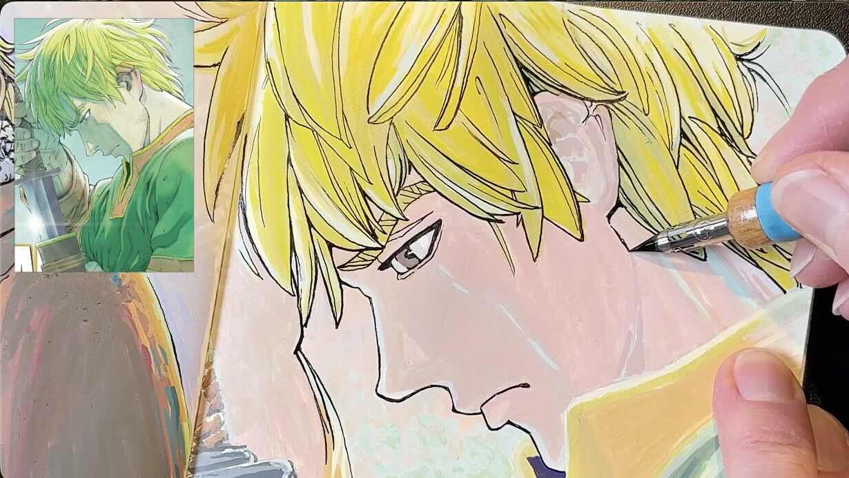
Typically, I like my pencil underdrawing sketch to be as light as possible so that it doesn’t show through or damage the paper.
But with this ultra-opaque medium, I want the sketch to show through at each stage of the process.
I therefore do the linework in black ink last; otherwise, it would get completely masked with the marker application.
I’ve watched other Arrtx creators use a red or blue pencil to sketch. I opted for an HB lead.
For the Vinland illustrations, I used traditional manga-specific dip pens, a G-nib and a Soft Maru 77. Both made by Tachikawa.

And paired that with Speedball Art Super Black India ink.

The first two studies of Thorfinn, were done in my trusty Moleskine sketchbook. It’s a smooth, hot press paper that performs well with a wide range of dry and wet mediums.

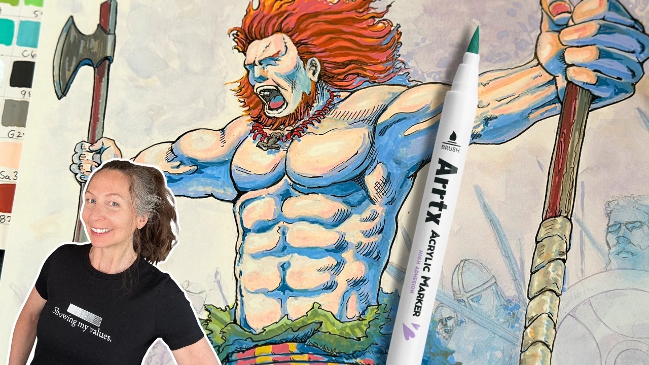
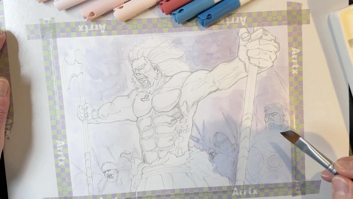
The final study of the battle scene is on a sheet of Strathmore 184 lb mixed-media paper because I wanted to frame it.

It turned out so awesome (see below), now hanging in my art studio!
📝 FYI – About the 120-set
Those are the main tips that I recommend for using the Arrtx acrylic markers.
A couple of last notable things I appreciated about the 120-set were the wide range of skin tones and greys.
I was impressed by how many skin tones were available, making it easier to match subjects regardless of the style (anime, realistic, abstract).
And the wide range of warm and cool greys was a bonus, not only for muting colours but also for drawing metallic subjects like swords and armour or organic ones like rocks, wood or cloth.
I hope you enjoyed these tips on using the Arrtx acrylic markers for your illustration projects and be sure to check out the resources below.
Resources
📚 Vinland Saga Manga Set Volumes 1-11

✍🏻 All the supplies:
- Arrtx 120-anime-marker-set
- Staedtler Lead Holder
- Staedtler Mars Rotary Lead Sharpener
- Faber-Castell Kneaded Eraser
- Tachikawa G-nibs
- Tachikawa Soft Maru 77 5pc
- Moleskine Arts Sketchbook
- Speedball Super Black India Ink
- Strathmore 400 Mixed-Media Paper
- Winsor & Newton Cotman Watercolour Set
- Princeton Aqua Elite, Series Synthetic Kolinsky Watercolor Paint Brush, 4 Piece Set