
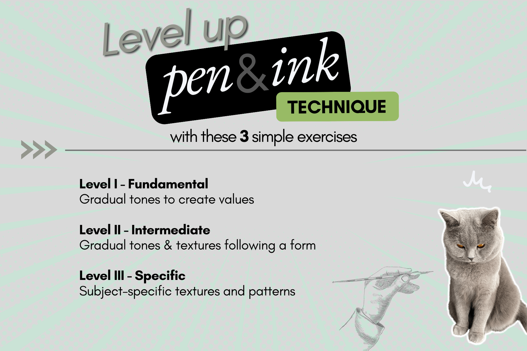
3 exercises for pen and ink technique
No undo. Are you nervous?
Drawing traditionally with pen and ink… There’s no back button so what about mistakes?
In this article, we’ll look at three key exercises to level up essential fundamentals for more confident inking.
Disclosure: Some of the links on this page are affiliate links. I earn a small commission when you use those links at no cost to you. You can read more about the Affiliate Disclosure on the Terms page.
I’ve taken my share of pen and ink tutorials in the past where in an attempt to ease my apprehension instructors insisted that “happy accidents” were part of the process, an easy fix.
Have you ever tried to save a project by adding more marks or covering your mistakes with a whiteout?
Others might not spot the corrections you made on your artwork but you see them. You know. And that can be disappointing, especially if you spent a lot of time on your piece.
Knowing what to practice
To get the most from your practice sessions, it’s important to know what the exercises do. Then, you’ll have a better understanding of what will most help develop your inking confidence.
Through a higher comprehension of the art fundamentals and how you can apply these principles to inking mediums, you will gain more power over your learning.
Not only will you build the skills to execute on your ideas, you will also:
- acquire the knowledge to critique your own work in a productive way;
- be able to gauge your progress against commonly established standards; and
- know which terminology to use to customize your searches when looking for learning resources specific to your needs.
Pen and ink fundamentals
Fundamentals are the basic principles of art.
Tool handling and mark-making techniques become extra important for pen and ink because the artwork is made of lines.
Marks and lines are used to create an image that visually communicates a story, a message, a scene, an emotion, or a moment in time.
Have you ever heard the expression “this piece reads well” from an instructor or a pro inker? It means that the line work is effective in creating the illusion of:
- Depth
- Form
- Shape
- Texture
- Space
- Dimension
And bonus points if the artwork also tells a story and provokes an emotional response.
A solid concept with careful composition of the elements is the first step.
It is through the use of light and dark tones, grading the tones and shadows by use of contrast and effective shading techniques that the effects are accomplished with marks.
Wondering what dip pens are best for your inking approach? Read my dip pen guide.
The top 10 art fundamentals for pen and ink are:
- Lines, strokes, and brushwork
- Shape (contour, outline)
- Value (tone, contrast, lighting, shading, edging…)
- Form (volume)
- Textures (organic, material, elements…)
- Perspective (depth, position)
- Composition
- Proportions (dimension, space)
- Anatomy (human, animal, structural…)
- Visual storytelling
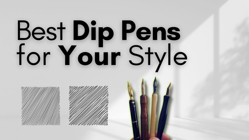
If you are already grounded in a knowledge of drawing, then it’s just a matter of handling pen and ink tools such as:
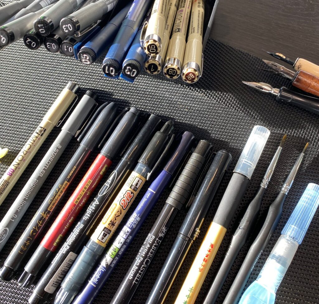
- technical pens
- dip pens
- fountain pens
- brushes
- brush pens
- fine point ruling pens
- markers
- ballpoint pens
- etc.
Wondering what to ink with? Visit my Tools page to browse recommended supplies.
Being able to consistently draw straight and curved lines is a great starting point.
Let’s put this into practice.
Exercise 01 – Shading and tone
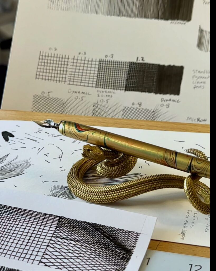
The first exercise is a values chart. You’ve likely seen or done one of these value-scale charts before.
Values charts are useful because they are a straightforward representation of tone in their full spectrum from white to black.
For most line drawings, tone – also known as shading is achieved by making marks. Once you’ve created a values chart that you are happy with, you can use it:
- as a reference to gauge your range of “greys” when you are creating a piece
- as a record of your progress – you can compare previous charts against today’s and so forth
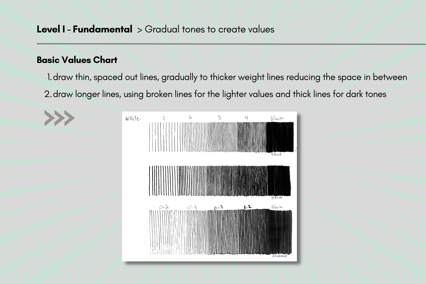
You can create a scale of 0 to 5 from white to black.
I start with thin spaced-out lines, aiming for even spacing between each mark. Then I reduce the spacing between the lines while gradually thickening the weight of the lines. Bringing the lines closer together until we have 100% solid black.
You can increase the weight of the line by:
- using a thicker-weight pen
- adding pressure on the pen
The objective of the exercise is to aim for a smooth gradation. This is what creates tonal value.
Repeat the same process with slightly longer lines, incorporating some broken lines for the lighter tones. Using longer lines serves to test hand control.
Switch tools. Try various sizes of dip pens, brushes, or markers.
You can see that my strokes are far from perfect. I’m simply aiming for improvement each time.
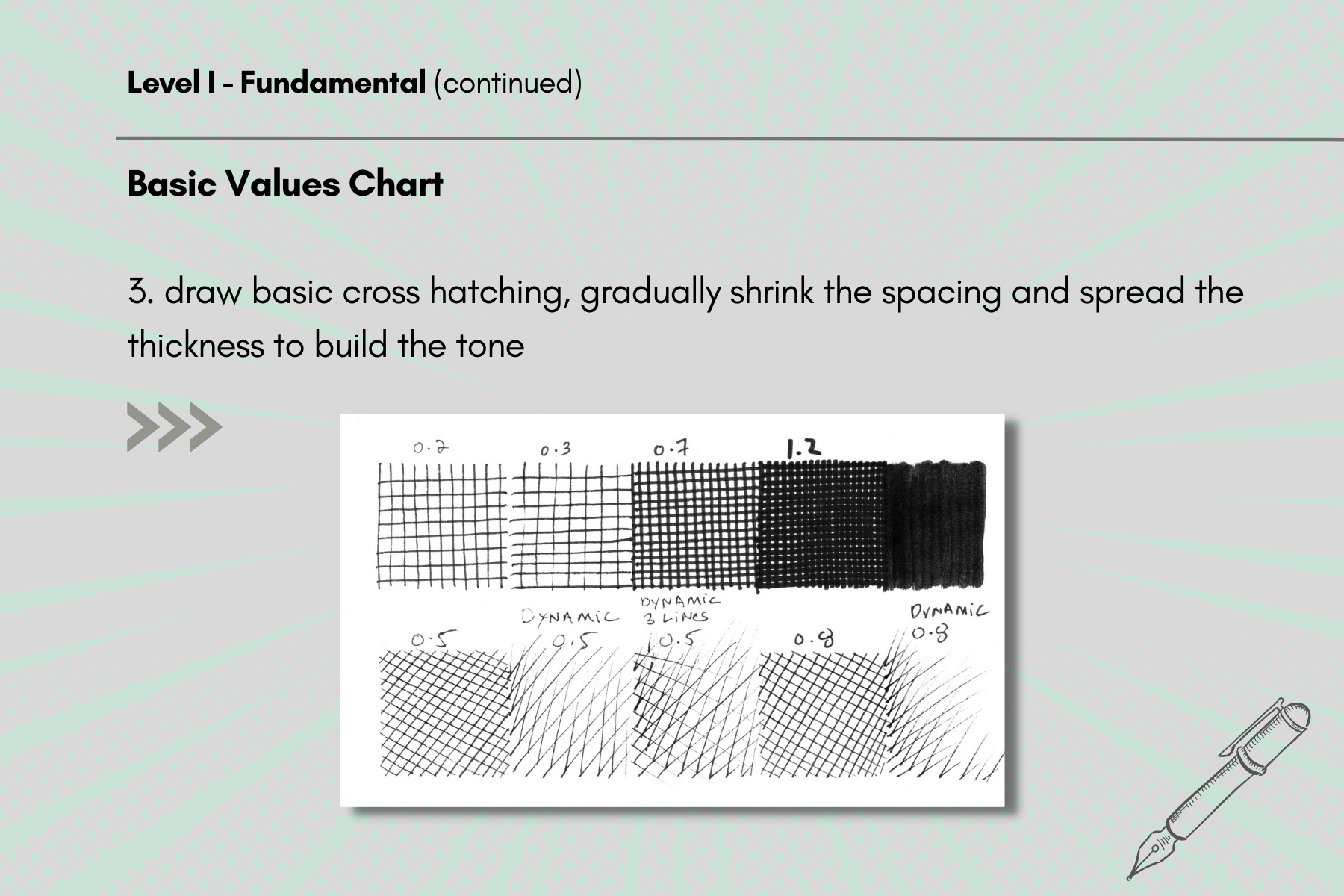
Next, is ‘up and down’ cross-hatching. It looks like little squares.
Again, shrinking the spacing and spreading the thickness to build tone.
I like to practice making strokes freehand, however, there’s nothing wrong with using a ruler as a guideline if you prefer.
Keep in mind that the sooner you can draw straight lines freehand, the quicker to mastery.
To change the direction of the lines, some artists will modify the direction of their strokes by changing the trajectory of their hand movements. I prefer to rotate the paper rather than my movement. This way I can create marks in the angle I’m most comfortable in, which is to pull the pen towards me.
In some instances, like for faster, more dynamic lines, I’ll push the strokes with speed, away from the body.

Exercise 02 – Building form and volume
For this practice, the same principles of mark-making apply except now our strokes follow a form.
The objective of this exercise is to create the illusion of volume using different mark-making techniques on shapes:
- squares
- cylinders
- circles
- ovals
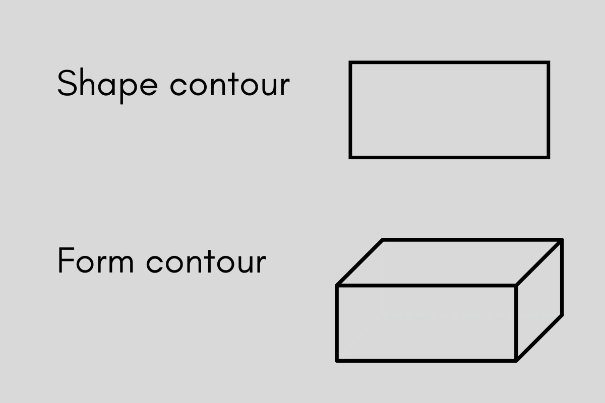
A shape is flat.
A form is a shape with volume. The contour is the outline that defines it.
The most common mark-making techniques are:
- hatching
- cross-hatching
- curved cross-hatching
- cross contour hatching
- stippling
- scribbling
- irregular lines
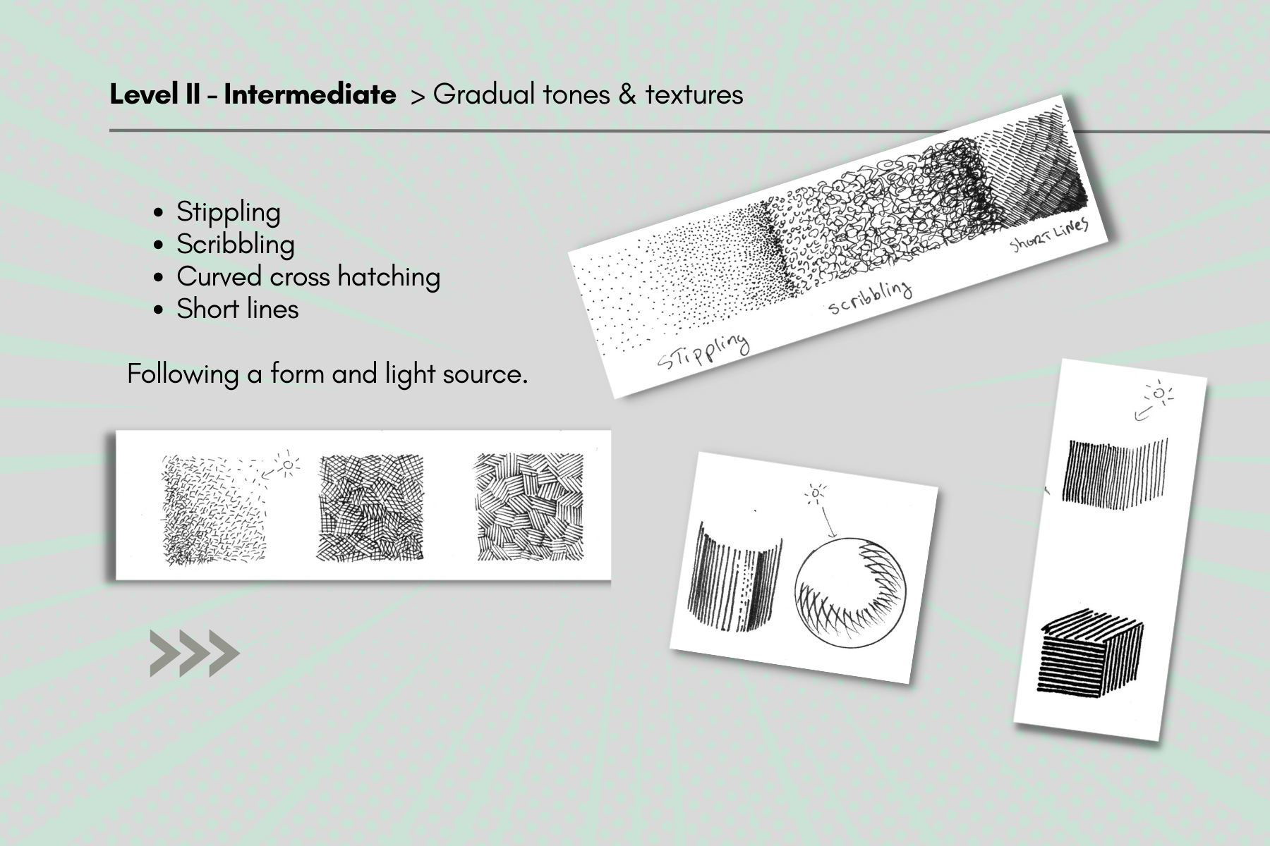
Again, practice fading these marks from light to dark or black to white depending on the direction of the light source.
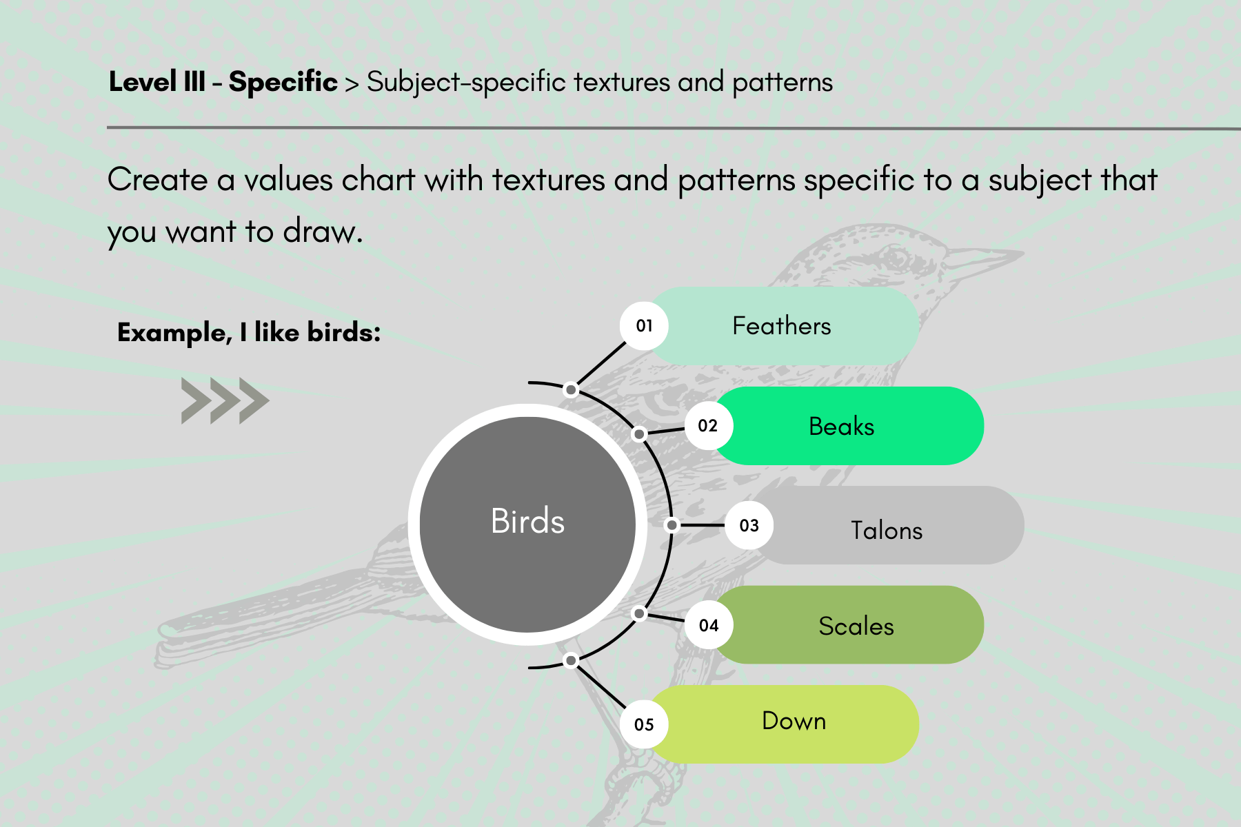
Exercise 03 – Creating textures
Now we’re ready to advance to level three: creating tone and volume on shapes with textures.
To personalize this practice, start by making a list or table.
In one column write down subjects that you currently enjoy or would like to draw.
In the second column, describe the textures that apply to each of those subjects.
| Subjects | Textures and patterns |
| Humans/characters | hair, skin, skeletons, muscles, clothing, armour |
| Landscapes | grass, rocks, flowers, trees, lakes, waves |
| Atmospheric/weather | flames, clouds, wind, sunrays, rain, snow |
| Animal | fur, scales, horns, claws, feathers |
| Urban | wood paneling, bricks, glass windows, drapery |
I’m most inspired when drawing birds, characters, and nature. For this exercise, if we take a bird as the subject then the main texture categories would be:
- feathers
- scales for the talons
- shiny smooth for the beak and claws
And from that list, I customize my textures’ chart to be as specific as possible for my project.
🎨 Visit the Gallery Page to see examples of how I apply these principles in my artworks.
How often should you practice?
I do a complete values chart at least once monthly.
By consistently practicing the above three basic exercises, I have progressively built confidence in my strokes.
Gone is my fear of the “no undo” commitment to laying ink to paper.
Also, before beginning a new project, I will first warm up for 15-20 minutes by doing line work and textures on shapes before inking my final drawing.
By incorporating these three exercises into your art routine, you will quickly level up essential fundamentals and gain confidence in your inking technique.
Best of luck with your practice. I wish you all the best with your projects.
Resources
Visit the FAQ page for additional resources and answers to the most commonly asked questions.
My top pick for pen and ink reference books:
- Rendering in pen and ink by Arthur L. Guptill
- Pen and ink technique by Frank Lohan
- Pen and ink drawing, a simple guide by Alphonso Dunn
- The Treasury of American Pen & Ink Illustration
- Understanding Bridgman Drawings with Jeff Watts
Purchasing for a friend? Read my pen and ink gift guide.

These exercises are fantastic. Thank you for putting this all together and sharing your insight.
Thank you Alli!