This pen and ink style is for artists interested in dramatizing the effects of opposing forces between light and shadow.
The technique is a blend of silhouetted shadow shapes in negative spaces. Also known as the “Pictorial style”.
You’ll find the list of books, tools and supplies that I used for these Hugo Pratt studies in the references section at the end of this article.
/DISCLOSURE: I earn a small commission when you use my affiliate links to make a purchase. Learn more about my affiliate partnerships on the Terms page.
Observations About the Pictorial Style
You’re likely familiar with the illustration works of:
To name a few.
Today, we’re studying the works of master Hugo Pratt, and my observations about how he achieves a pictorial style
Observation I
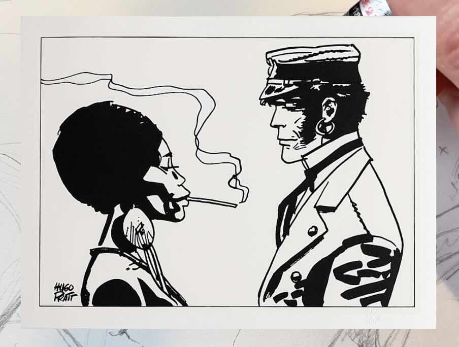
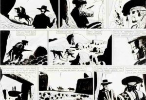
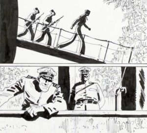
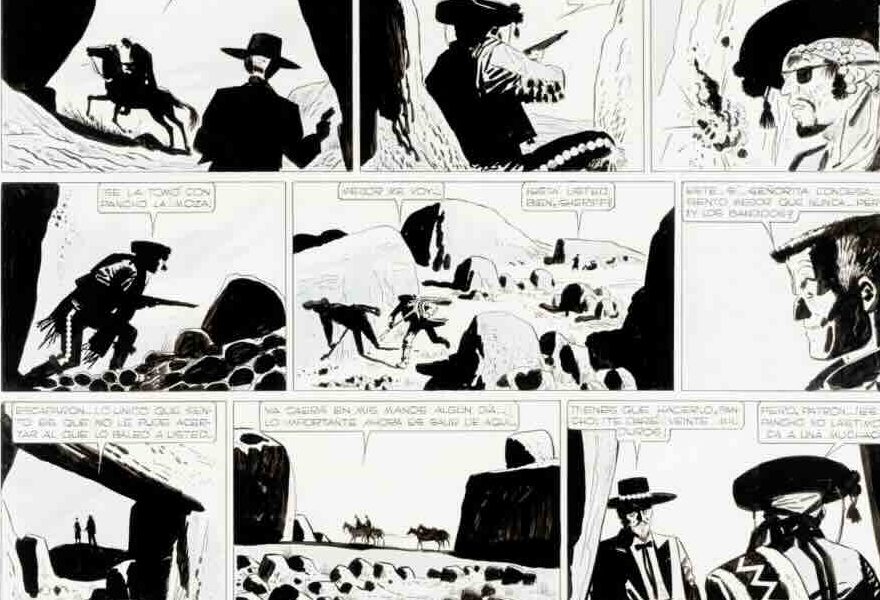
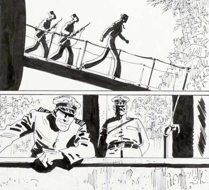
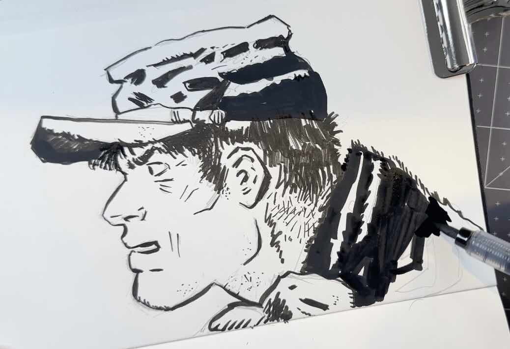
You’ll notice that most of the shading is solid black. There’s minimal hatching, sometimes no rendering at all. Just simple lines and large areas of black. Giving us extreme contrast.
You’d think that large areas of solid black would make the drawings look flat, but master Pratt shapes the blacks just enough to create depth.
He uses shadow shapes.
Below is a gradation of tone, rendered with a classic pen and ink crosshatch technique. I’ll come back to the smiley faces in a second.
Also below; a value scale using master Pratt’s shadow shape technique.
Smiley Face A appears whiter than Smiley Face B. That’s because A is framed by dark tones, whereas B floats in open space.
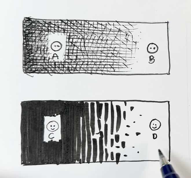
Similarly, Smiley Face C appears more white than Smiley Face D.
But here’s the big difference: Compare box C to A.
The contrast is extreme.
This is what dramatizes the effects of opposing forces between light and shadow.
Tip 1 – The less rendering you use, the more visual drama you get.
The caveat of this style is that it’s taxing to look at over time.
More effort is required to read the drawing, because the subjects are partly obscured. You need to complete the image in your head.
The result is that you’re either more engaged in what you’re looking at or tune out because it takes too much effort to read the drawing.
It takes longer to figure out the shapes or what’s going on when the contrast is overly extreme, and the effect is overused.
Observation II
Pushing this extreme of contrast in every single panel of a comic book would get tiring for the viewer.
That’s probably why Pratt adds hatching strokes to some of the panels to keep us in the sweet zone of attention. Plus, it makes the spreads flow better visually.
When he does add rendering, he keeps the drawings clean simply by varying the stroke weights. Thin or thick as part of the overall shadow shape design.
The common rule of thumb for using stroke weights is:
- Bold in the front
- Thin in the back
This hierarchy of line weights tells the viewer what is near and what is far, creating a sense of depth.
This line weight protocol has even more impact when combined with shadow shapes. It works.
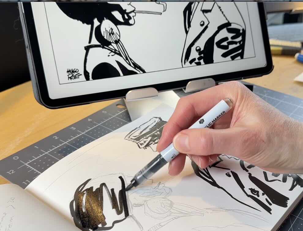
While doing these studies, one thing that mattered more than I expected was the choice of tools and materials.
Tip 2 – Test tools and materials.
For tools, obviously, fine liners and dip pens are not suited for bold strokes nor for filling in large solids.
Even my bristle brush pens were too flimsy to create accurate shadow shape strokes.
So, if you’re struggling, as I was (at first), to match the style, test different tools until you get a match.
A soft sponge tip calligraphy pen for the thinner strokes worked great. Paired with a large sponge tip marker for everything else.
I used my favourite Tombow fudenosuke brush pen with a soft tip, because you can vary the line weights in a single stroke.

And an Arrtx acrylic brush tip marker because it gives great even coverage for large areas of black. Plus, this saves your “good pens” from running out of ink too quickly.

I also tried a number 2 synthetic sable watercolour brush by Winsor & Newton. Which worked out perfectly for the ink wash portions (see drawing further above). This paintbrush is stiffer than a bristle tip brush pen, giving better control.

The there’s the paper.
Do use a hot-press smooth-finish paper, even just for studies like these.
You’ll get better results, plus this saves your inking tools from wearing out too quickly from the rough surfaces of most sketching papers.

Observation III
For really convincing shadow shapes, the next critical thing is understanding lighting and the direction of light.
Master Pratt pushes the contrast to the limit.
He shows the minimum information that describes the shapes.
In this example, the character is in a black room, the small flame he’s holding to light the lamp is the only source of light.

The shadow shapes here do several things.
The shadow shapes complete the facial feature. Pratt left the back of the hat and the ear white as clues. If those sections were all black, the drawing would look flat and weird.
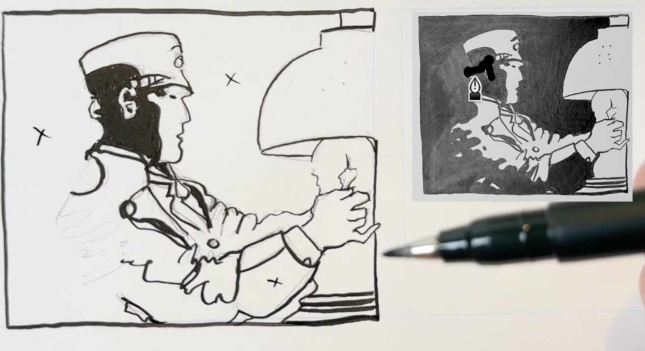
On the back of the jacket, the shadow shapes indicate folds in the fabric, giving the arm volume
✍🏻 BTW: the little “x’s” in the drawing indicate where the solid blacks will go.
The overall combination of shadow shapes and line weights tells us that the light is flickering from a flame.
In the second example, we have a back light.

Same idea here. Pratt reversed the nose to white from the nearly all-black face. There’s just enough white to describe the character’s features and clothing detail.
Master Pratt pushes the contrast to the extreme edge of being legible.
Tip 3 – Understand the role of lighting.
To better understand this concept of extreme contrast, try this exercise.
For a moment, ignore how you normally depict light and shadow.
Meaning: Don’t think of white as the light or black as a shadow.
Instead, just focus on blocking in shapes using opposite negative space.
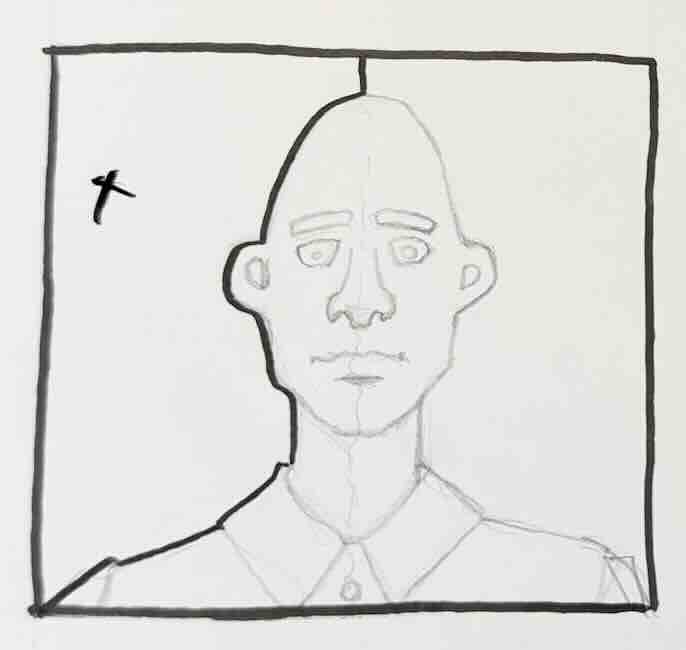
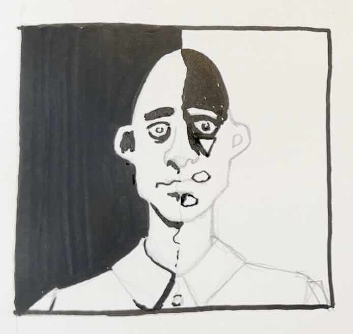
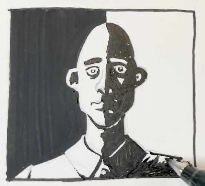
Symmetrical reverse. The features of this generic fellow’s features are mirrored, right down the middle.
Only define what’s necessary to describe the subject.
Another thing that Pratt does exceptionally well is describing his subjects.
Observation IV
You need to know your subjects well to do this style effectively.
Even this simple drawing of the character carrying a large sack over his shoulder.
This would be difficult to draw from imagination in the pictorial style without being extremely familiar with the character’s delineating features and details of his costume.
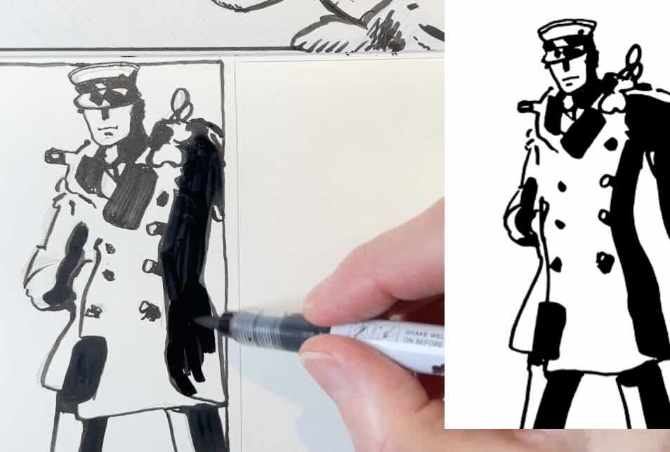
Either Pratt used references to determine what should be a simple line and what becomes a shadow shape.
Most likely, he’s drawn this character 10,000 times, so he just knows what’s what.
But for us, trying to learn the technique, the solution is to practice with a live subject. Let’s do another exercise, except this time, taking into account the direction of light.
Grab any object, play with the lighting until there’s a good balance of contrast.
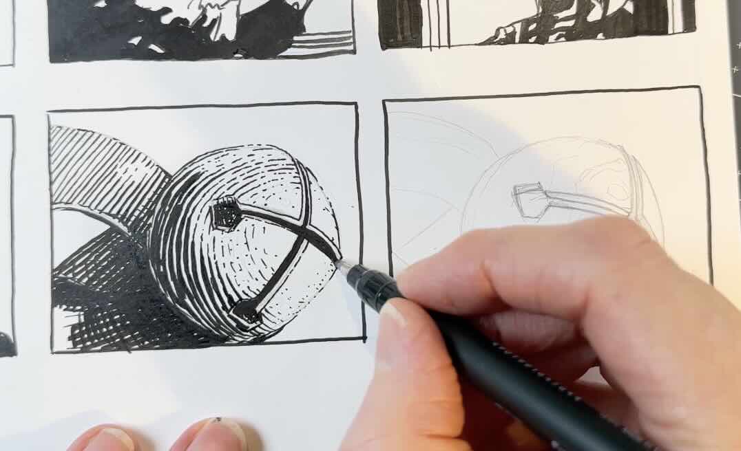
First, render your object as you normally would with hatch marks to get a sense for where to place the highlights and shaded areas.
For the Pratt style, similarly to the previous exercise (with the generic fellow), set a boundary on the picture plane to establish the solid black.

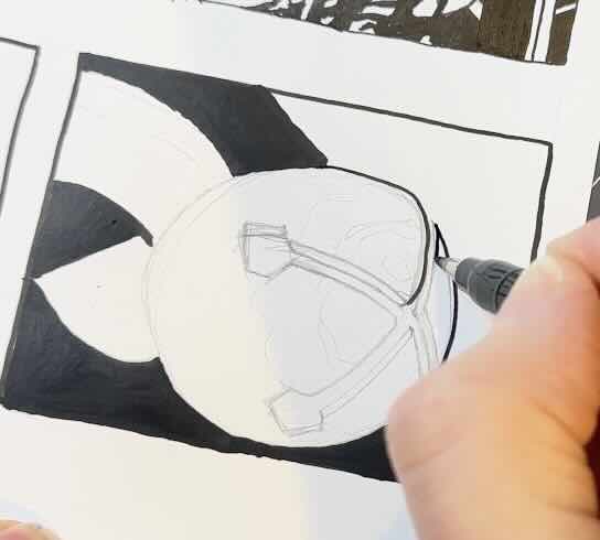
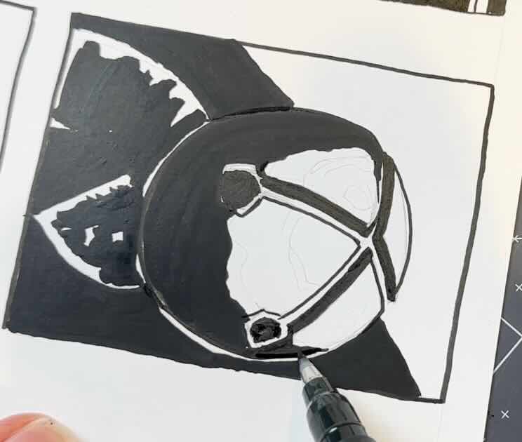
From there, it’s easier to gauge what’s a line and what’s a shadow shape.
The parts of the subject that are on the white side are rendered with line weight.
The parts of the subject on the black side become the shadow shapes.
Leave some white to define the edges, but only on your first pass of black.
Then chip away at those edges using more black.
Gradually, push the limit of the edges, making them disappear. Keep only what’s necessary to visually describe the object, in that dramatic pictorial style.
If you overdo it and accidentally swallow the outlines with black, then you can correct with white gouache or a white gel pen to steal back some of the edges.

Try different ways to shape the shadows to see what looks best if you’re not happy with your first try.

Conclusion
Those were my four tips on how to study and apply the pictorial style of master Hugo Pratt.
Thank you to my YouTube subscribers for suggesting this master for a feature.
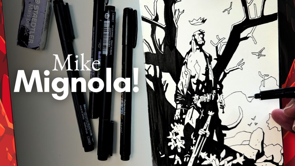
📝 If you enjoyed this article, you’ll enjoy the Mignola master study.
Resources
✒️ My tools
📚 Books ↓↓
- Mike Mignola’s Hellboy In Hell Book 2 Artist’s Edition
- Alberto Breccia’ Mort Cinder
- Will Eisner the Best of the Spirit
- Frank Miller Sin City
- Hugo Pratt – Corto Maltese

🧰 Supplies used ↓↓