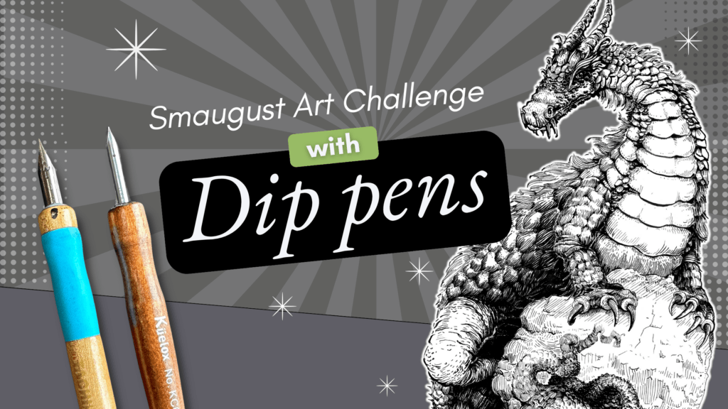
In this article, I demonstrate how to ink reflective, shiny metal objects.
You’ll learn how to apply this technique in three different hatching styles to several different subjects, including medieval armour.
//DISCLOSURE: I earn a small commission when you use my affiliate links to make a purchase. To learn more about my affiliate partnerships, read the Terms Page.
Rendering Metal Objects and Armour
Of course, it would be super fun to start rendering the armour right away.
But if you’ve never rendered armour before, then a better place to start is with simpler objects.
Before jumping into the exercises, do some research. Gather photos of shiny metal objects as a reference. Better yet, look for ordinary, everyday metallic-looking objects around your house to draw directly from observation.

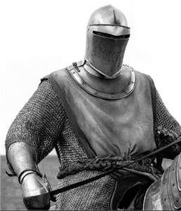
Also, look for an armour reference with good lighting for practice. You can download mine for free below.
Also, flag the works of masters you admire for inspiration on rendering style and technique. Also, look for a reference for your final project.
Why are we using coat hooks and coffee pots to render armour?
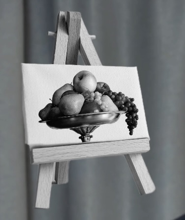
There’s a reason why teachers made us draw fruit bowls in beginner art class.
It’s because we’re not emotionally attached to drawing subjects that we didn’t pick ourselves, especially boring household items.
It’s more straightforward as a skill-building exercise without the stress of wanting to do a good job on the drawing.
It makes sense, not starting with your goal project; it’s confidence-building when you work toward your final illustration progressively.
However, as you can see in these examples, even everyday objects can be pretty cool once you factor in techniques and stylization.

Decide on a rendering approach for your final project, whether it be your natural style or mimicking a favourite master.
You can decide on the style by trying out a few beforehand in the exercises.
Linear Styles
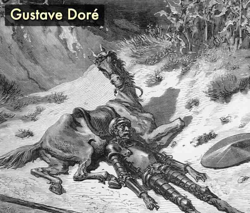
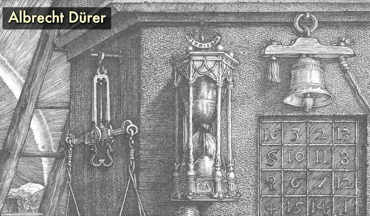
I prefer linear strokes that follow the form. My approach to inking metal would be more like masters:
- Kentaro Miura
- Albrecht Dürer
- Gustave Doré
- Bernie Wrightson
But maybe you naturally lean towards a scribbly hatch?
Scribbly Styles
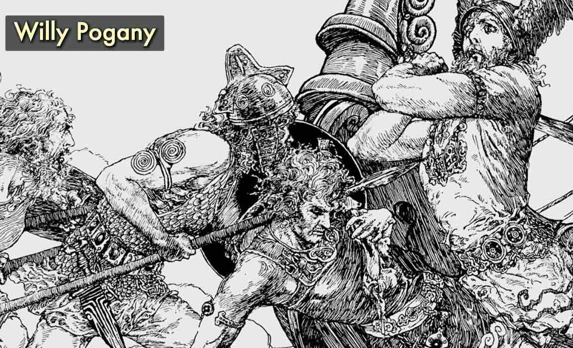
Masters with a scribbly style:
- Willy Pogany
- Sergio Toppi
- James Montgomery flag
- Waiter Jardin
Or perhaps a classic comic book style?
Comic Book Styles
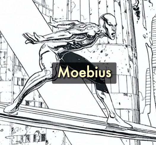
Masters with a comic book style:
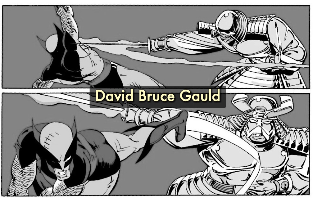
- Moebius
- DBG (David Bruce Gauld) silver Samurai
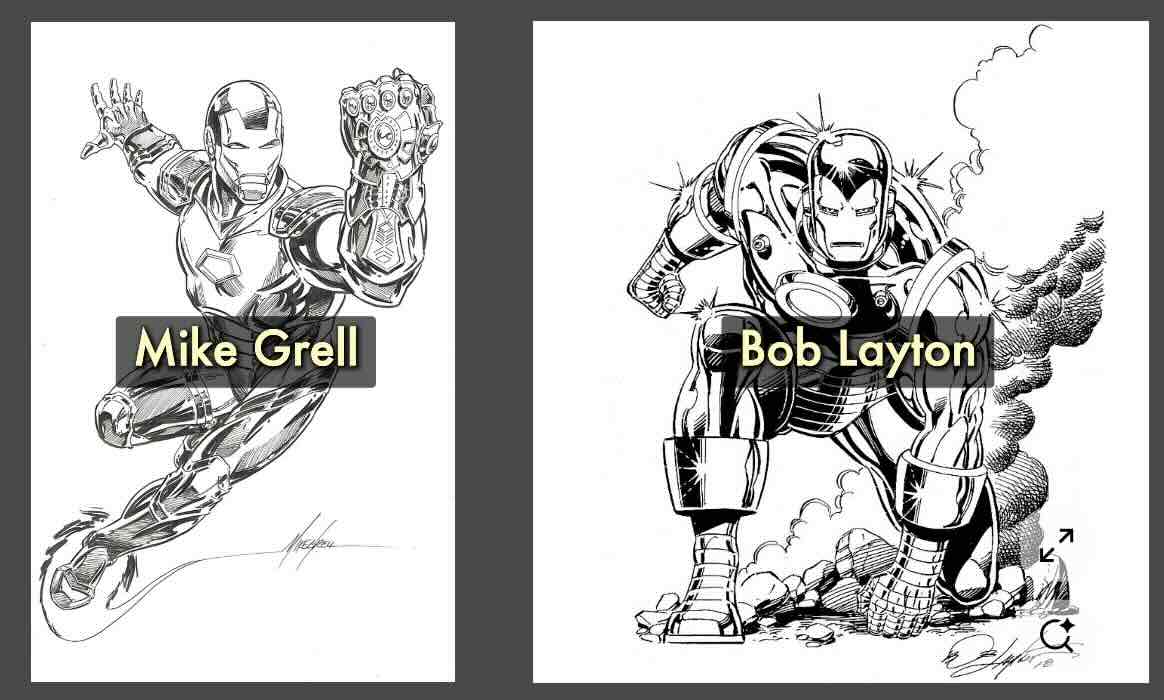
- Mike Grell
- Bob Layton
Regardless of your rendering approach to inking, the first step is the distribution of values.
Metal is reflective. Tonal values land on metals differently than on a non-reflective object.


Below is a typical greyscale used for paint and similar mediums as a reference for the value levels.

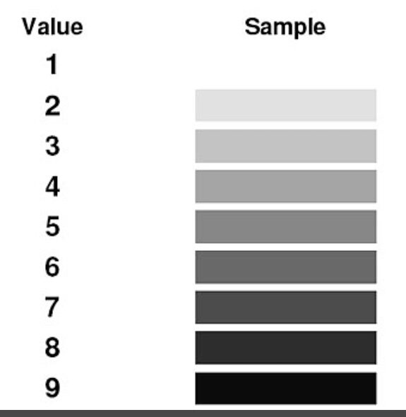
From this, you’d create a value scale in pen and ink using the same rendering style as for your final illustration project.
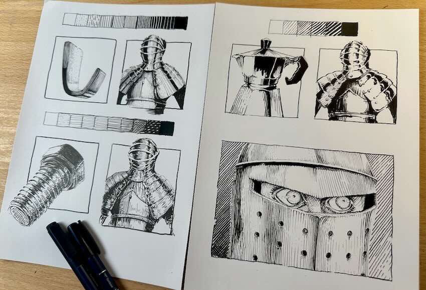
In this case, we’ll do three value scales to help us decide on a preference.

Rendering Exercises
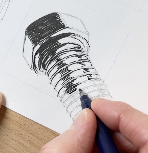
For the first value scale, we’ll practice with parallel lines.
In pencil, draw the metal hook from the photo reference or draw a similar object from your research results.
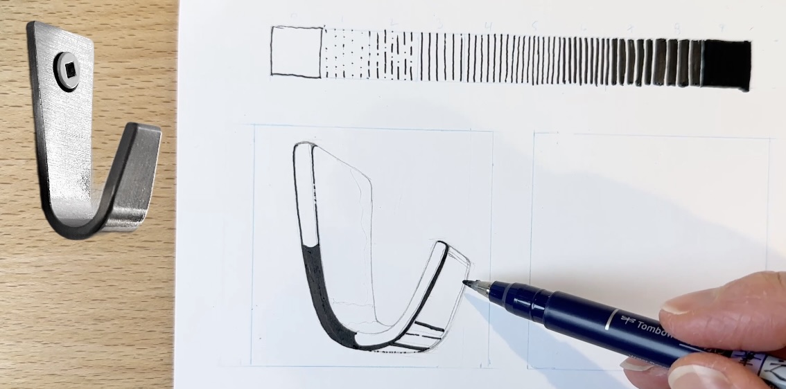
Look for the most extreme contrasts in value:
- Black
- White
- 50% grey
Still in pencil, I map out on the hook where the black will go and where to leave white spaces.
Then I ink the 100% black first, then fill in the 50% grey with parallel strokes, leaving open spaces for the white areas.
Refer to the value scale to gauge the 50% – it’s basically the middle value on the chart.
Next, you can start filling in the other values, still using gradations of parallel strokes.
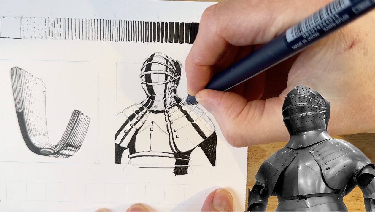
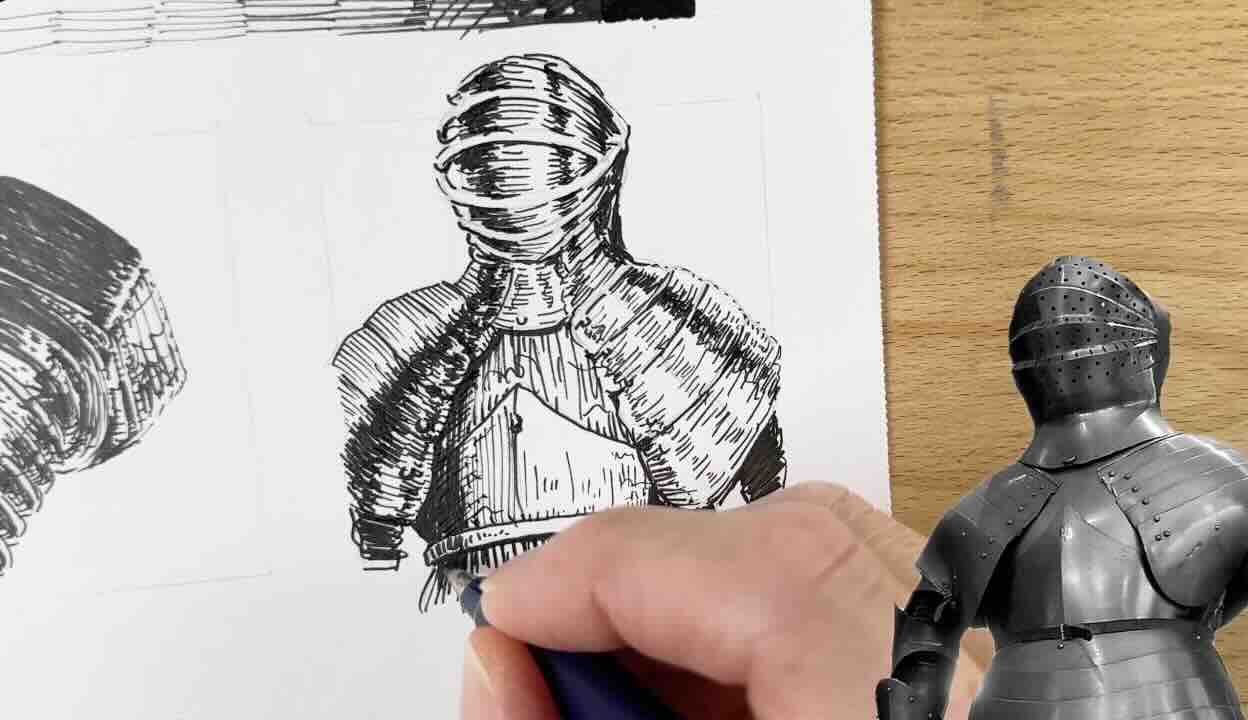
Then practice on actual armour. Follow the same steps:
- Sketch the armour from photo reference
- Plot where the high contrast values will go
- Fill in 100% solid black
- Render the 50% grey
- Leave open spaces for 100% white
- Finish with the other grey values.
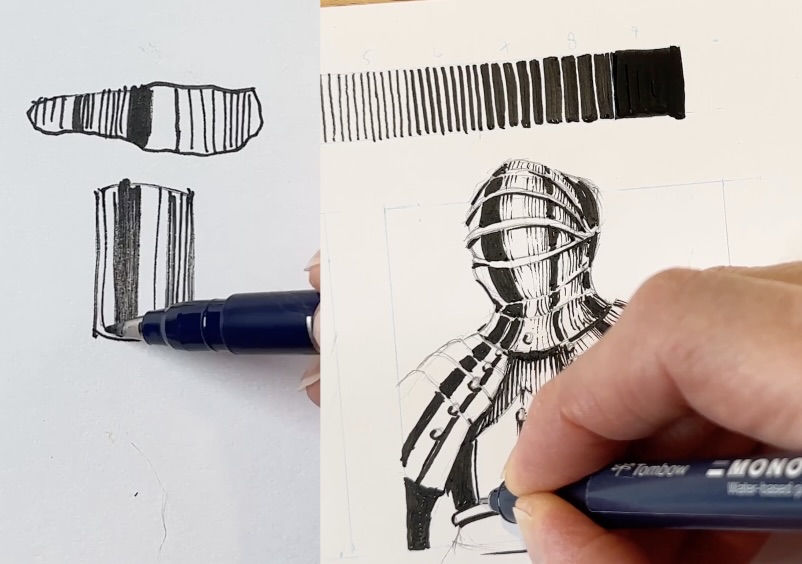
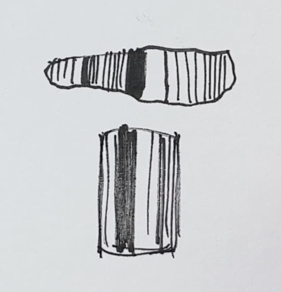
The hook was flat. The armour has a curve to it like a cylindrical shape.
As you can see from the flat and cylindrical shapes, there’s a gradation as the strokes wrap around the form.
Be mindful not to over-render. Aim to preserve the high-contrast.

Next style is loose and scribbly.
I did a thumbnail sketch of the screw first to distribute the values. Then did a cleaner version, careful to map out the high contrast areas as we did before.
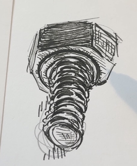
I’m using lively, scribbly strokes to fill in the black, then the greys.
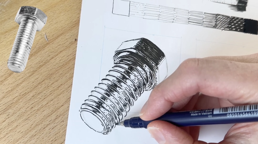
And continue to glance over at the value scale, the photo reference, and some of the masters of that style to render my drawing.
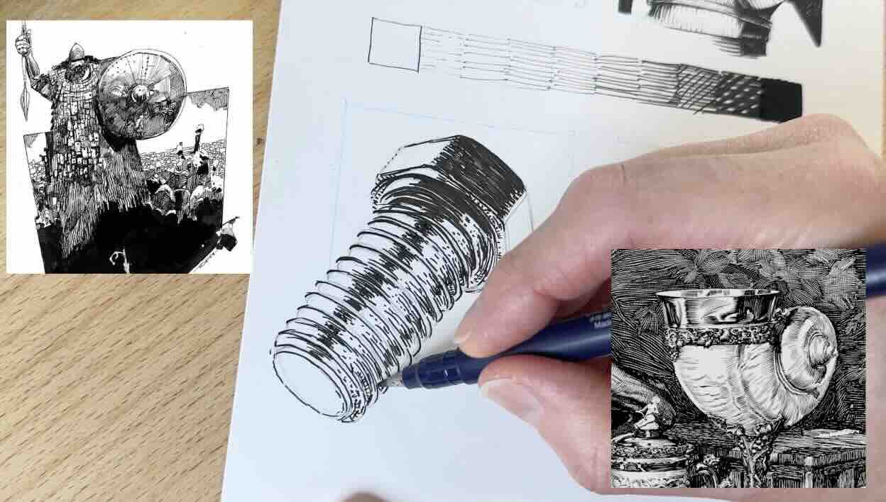
This way, all that research at the beginning is paying off.
Then repeat the same steps, using the scribbly rendering style on the armour subject.
- Black
- Half-grey
- White space
- All the greys
Remember that the armour is not flat; use a gradation of greys to describe its roundness.
For the comic book style, I once more did a rough thumbnail sketch. This time of the coffee pot to get a feel for how to map the high contrast areas.
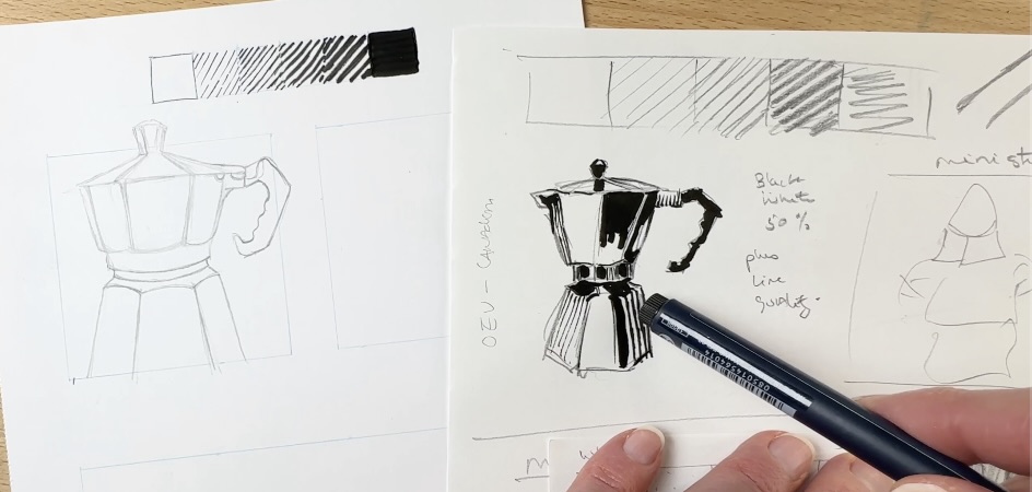
Then, using a big marker filled in the black on the clean version of my coffee pot drawing.
For rendering style, I referred to the silver samurai by DBG (David Bruce Gauld) for a change. Otherwise, I’d be leaning towards Moebius, as I do love my Moebius studies.
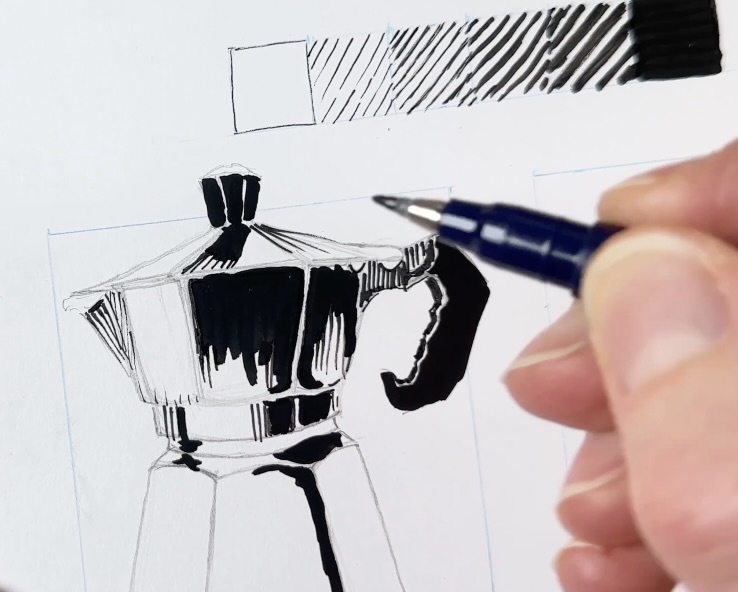
The contrast is even more exaggerated compared to the previous styles.
This one has minimal grey rendering. You’ll note that there’s more emphasis on line quality to communicate the values. The lines taper from thick to thin.
This effect is even more stark and streamlined on the curves of the armour.
Did you have a preferred style?
Now you can use the value scales and your mini-studies as guides for your final project.
Final Project
Finally, let the fun begin! You can render your metallic subject of choice worry-free because you did all this prior practice.
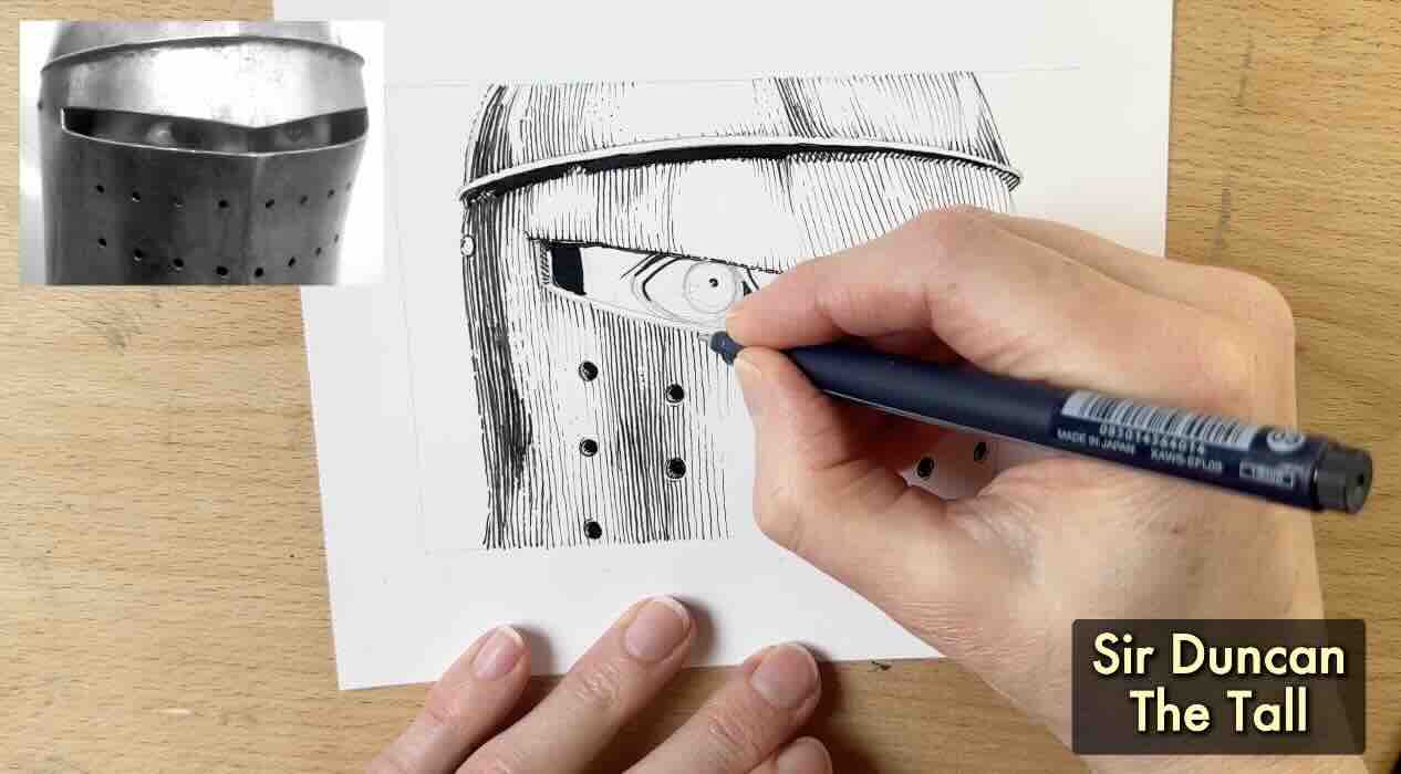
I opted for armour again, using a screenshot of Sir Duncan The Tall from the show Knights of the Seven Kingdoms. His helmet is probably made of beat-up iron and not particularly shiny. But it’s the perfect texture for my preferred rendering style.
Conclusion
So, there you have it. Practice on ordinary objects first, and also on an object similar to your final project.
Do a value scale in your preferred rendering style, or test out a few if you’re unsure.
Distribute the values aiming for high contrast. The greys are there to help create the illusion of form.
I hope this quick lesson on how to render metal with pen and ink was helpful for you. If it was, do share this article with your inking friends.
Resources
✒️ My tools

🧰 Supplies to Render Metal Objects ↓↓