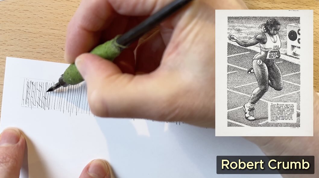
Robert Crumb is a master of the cross-hatch technique in pen and ink.
Join me for this master study as I decipher his approach to layering values. I’ll demonstrate how this cross-hatching method can be applied in a drawing project.
//DISCLOSURE: I earn a small commission when you use my affiliate links to make a purchase. Read more about my associate partnerships on the Terms Page.
Deciphering The Crumb Hatch
When I sat down to study the works of master Robert Crumb, what stood out from my perspective as an inker was his cross-hatching.
After a few rough sketches, I realized the best way to decipher his technique was to start with the fundamentals.

When you look closely, you’ll see that his first layer is an even ‘blanket’ of parallel strokes.
📝 Never done a Master Study? Read this post for the steps.
As a whole, the marks are spaced evenly apart. They may seem random but they’re really not. His marks are just exceptionally lively.
Crumb’s hatches are not set in a calculated placement like the marks of master Franklin Booth.
Crumb’s marks are scribbly like Charles Dana Gibson – and that’s a characteristic of someone who draws from observation, and draws a lot. You need to be fast when drawing live subjects.
In the illustration samples that I observed, Crumb builds the grey values of that baseline ‘blanket’ layer by layer. Bringing the strokes gradually closer together, and bolder. But not always, sometimes he keeps it all evenly spaced.
It’s important to distinguish which method he uses on the first layer because that determines how the values are constructed from start to finish.
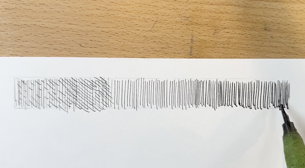
He starts the cross-hatch on that base blanket layer in the second pass.
Short dashes, long dashes, then full strokes, gradually to match the layer underneath. The marks have a dynamic rhythm.
The result looks spontaneous, not stiff or academic.
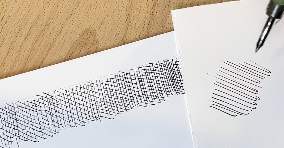
I’m aiming to mimic the little hook his marks have at the end, those springy speed hooks.
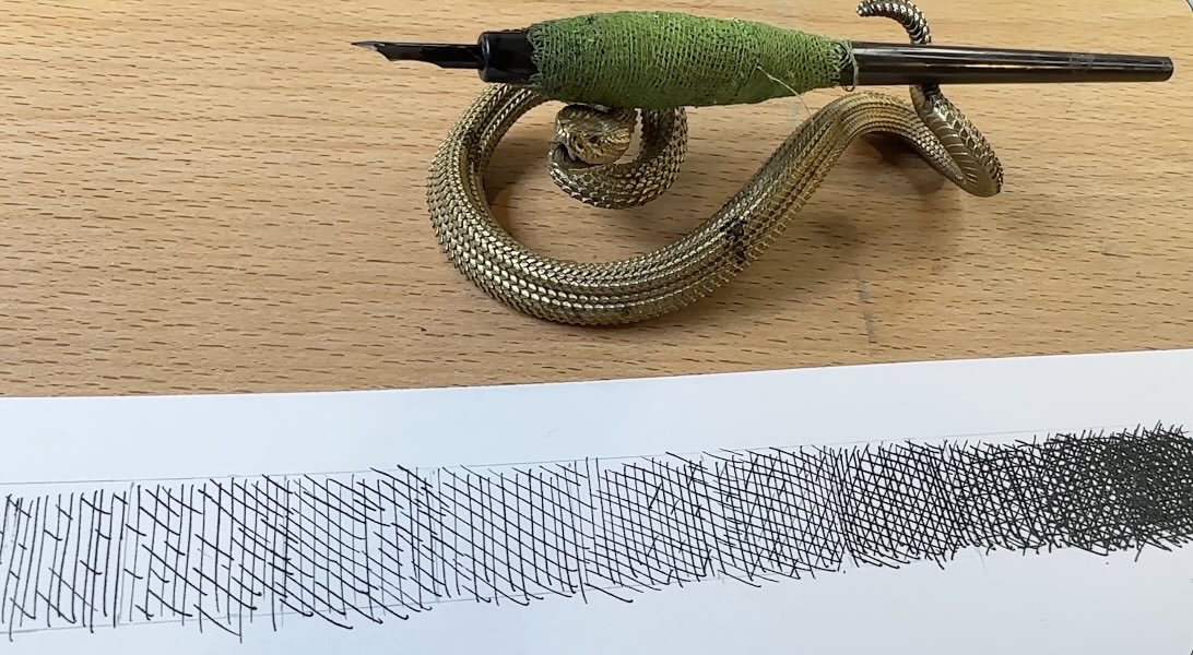
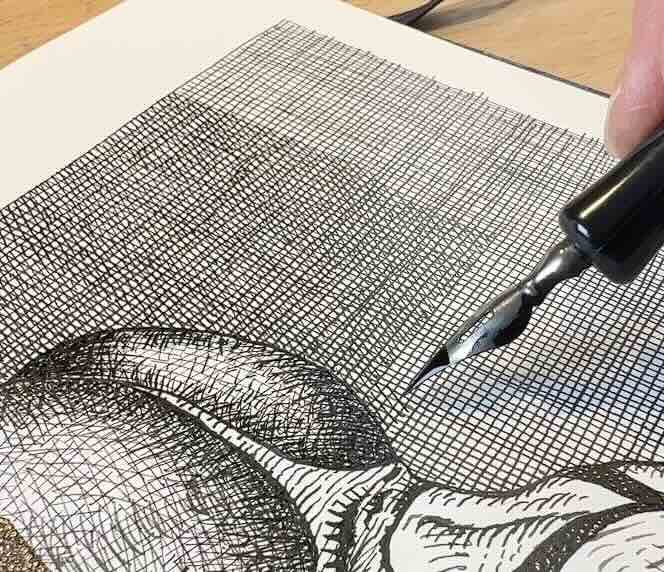
His inking instrument of choice was a Rapidograph technical pen.
The closest inking tool I have to a Rapidograph is a Crow quill, though it is said that he used dip pens as well.
You might be thinking that a fine liner pen would be more accurate in simulating the marks of a Rapidograph.
Perhaps yes, in terms of the weight (line width) consistency, but it’s not a match for marks made with liquid ink.

That’s why I think a dip pen with India ink is more similar.
On the third layer, I cross the darker value levels with diagonal strokes. Then I repeat the crossing of marks a couple more times. Changing the plane direction as I do, weaving the strokes to a nearly black value.
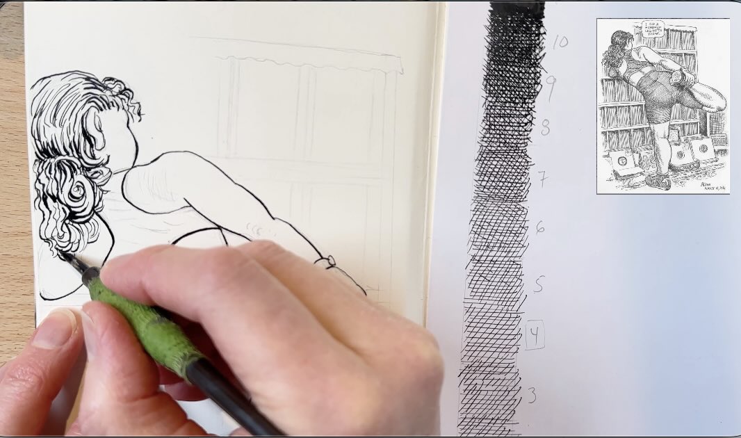
Now that we’ve deciphered that master Robert Crumb uses a base ‘blanket’ of strokes to build his cross-hatch layer by layer, we can use the value scale we made to help us study further.

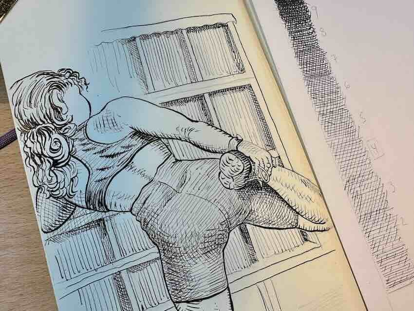
Preliminary Study of R. Crumb’s Cross-hatch – The Powerlifter
I chose this drawing of the athlete stretching because it has typical elements of what R. Crumb is known for.
He loves to draw strong-looking ladies in intricate poses.
If you’re familiar with Crumb’s underground comics, you know that some of his subjects are not “everyone’s cup of tea”. I’ll leave it at that.
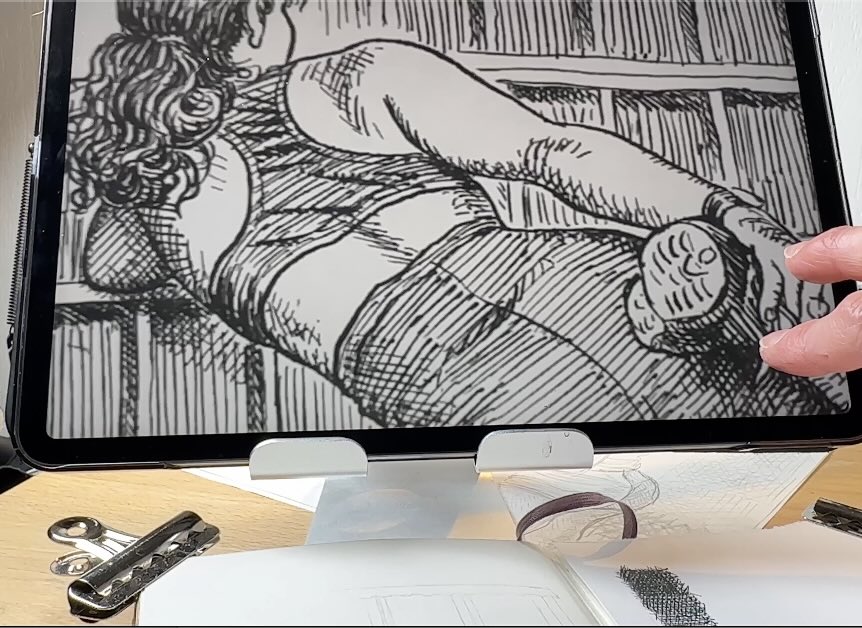
Also, this drawing showcases the cross-hatch in a clear, less intimidating way than some of his other pieces (for example, the second study further down has epic, nerve-racking textures).
So, this is a good place to start a Master Study.
Note how, in the background where the bookshelves are, there’s a single layer of vertical strokes with a few cross-hatch patterns for the cast shadow areas.
He changes the stroke direction to a horizontal plane for the base blanket layer on his main subject, the athlete.
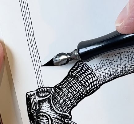
There are no open edges. He uses a solid outline, so the outline is where I begin the ink application.
That’s also when I noticed that he used line quality to describe volume. Thicker outlines for the elements of the drawing that are closest to the viewer. And thinner outlines as things get further in the distance.
The line quality accentuates the sense of depth.
While inking, it’s easy to get distracted by the shading.
To stay on task, it’s best to focus on capturing the line quality first. Which is challenging enough because we also want to keep the strokes looking confident and lively, as he did.
After establishing the main outlines, I venture into the first layer of shading.
I begin with rendering her hair. In that section, Crumb is using traditional linear strokes, which makes it an easier starting point for that initial layer of ink.
As you progress with the rendering, keep an eye on the play of thick and thin strokes. Thick for shadows, thin for areas of highlights.
📝 Do you know how to analyze the work of a master artist? Check out my master study guide for the steps.
Once the sections of regular hatching are complete, we can start laying down the ‘blanket layer’ of values using horizontal strokes.
As shown earlier, while doing the values scale, we created the lighter values using short and long dashes. Before, we were rendering a flat section, but now we’re inking a three-dimensional subject with curves. Therefore, the strokes follow the form of the subject.
I see that Crumb adds lines between lines to build the value for the shadow areas. And there are cross-directional strokes to indicate a bunching in the fabric in her top. That’s also where we see a bit of cross-hatching to emphasize that she’s twisted in her pose.
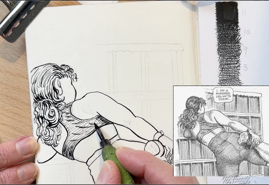
Doing the layers one section at a time makes it easier to follow the same values that he used.
I’m repeating the steps from when we did the values scale, using the same sequence to build the values on the subject. Except here, as mentioned, we also use directional strokes to contour her forms.
Then, adding the last, darkest layer, such as the cast shadow under the foot that she’s holding.
I’m doing the rendering on her skin last because that’s the part that makes me the most nervous. Crumb’s gestural strokes are deadly accurate, where mine are tentative.
✍🏻 Looking to improve your gestural drawings? I highly recommend “Gesture / An Introduction to the Art of Figure Drawing” by Brent Eviston, master artist & instructor on Skillshare.
It was a good idea to do this preliminary study as training. It was a great warm-up to loosen up the hand and the nerves before tackling this main piece next.
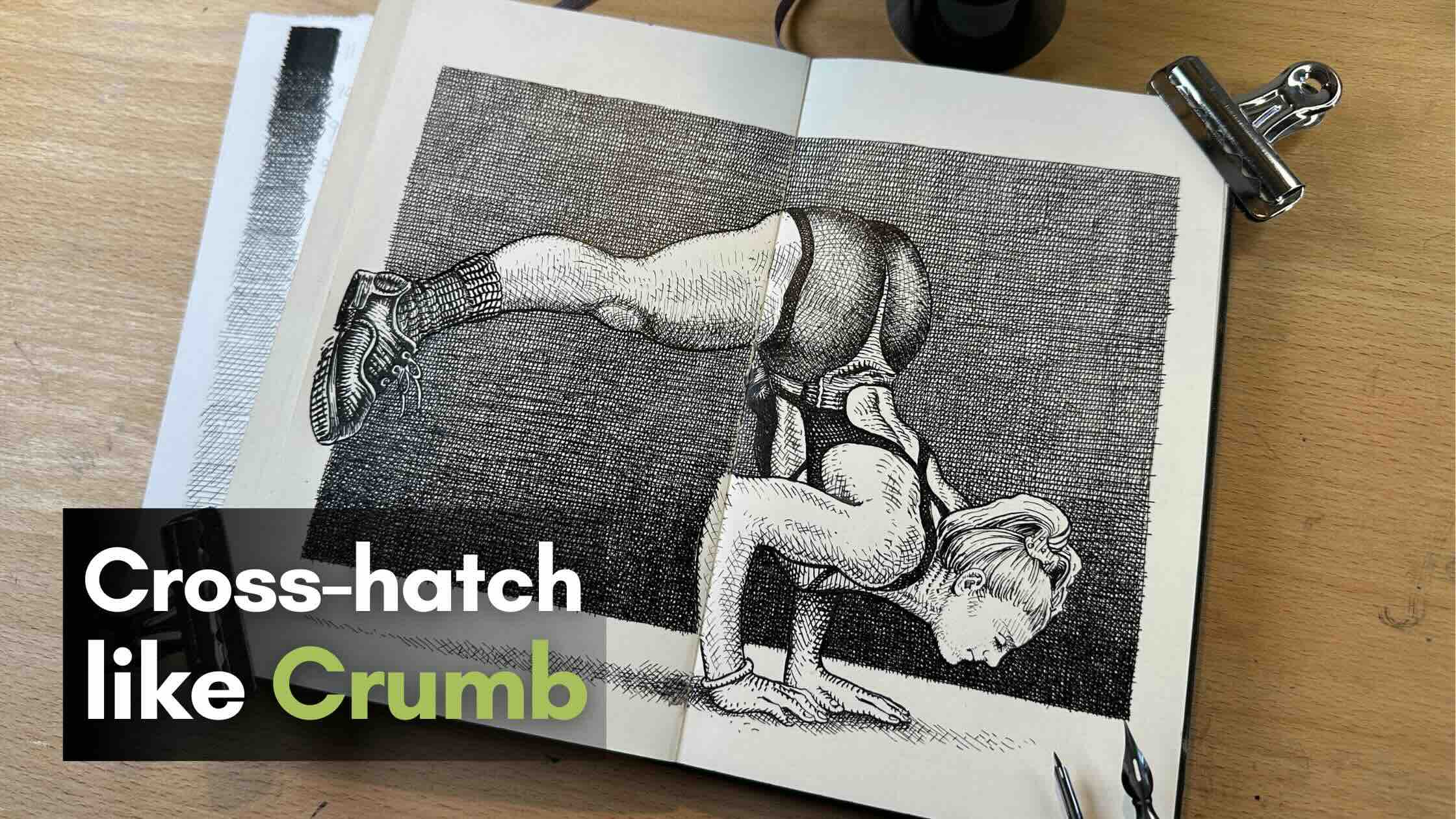
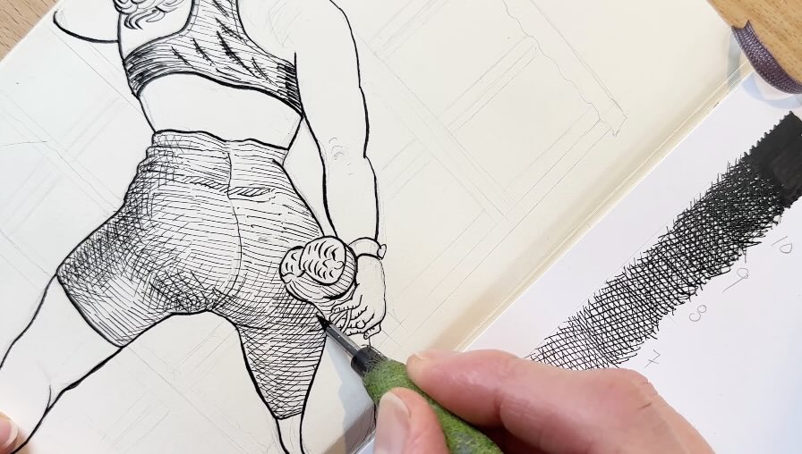
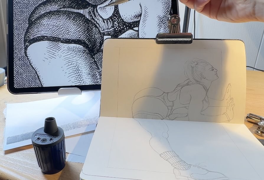
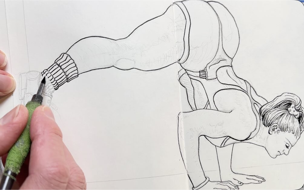
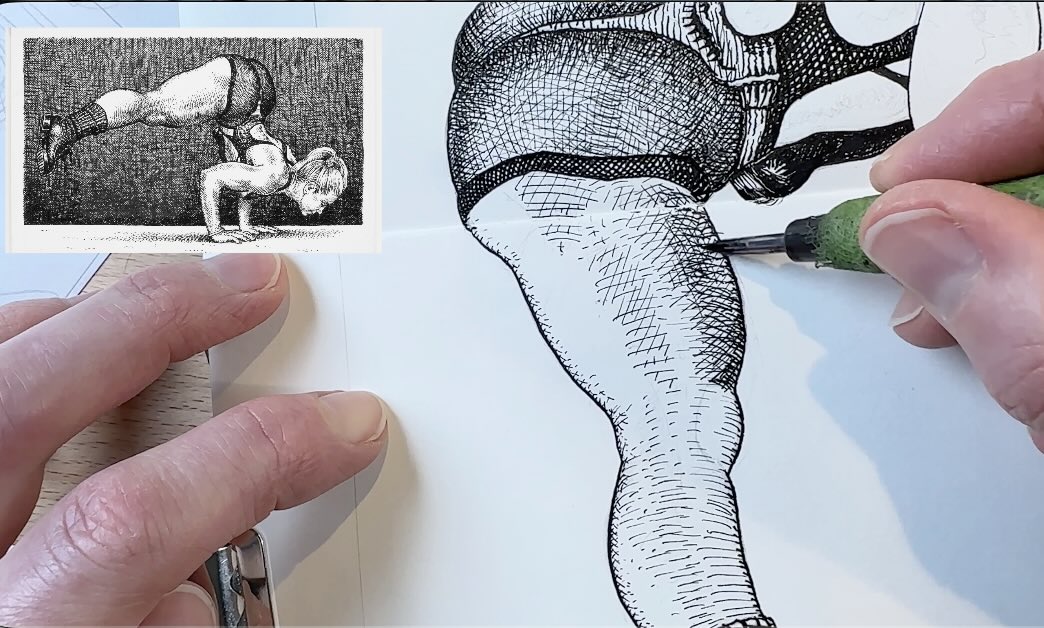
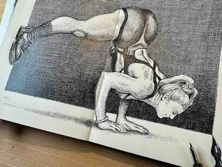
Main Study of R. Crumb’s Cross-Hatch – The Acrobat
As you can see, not only is this acrobat pose complex to draw, but I also want to respect Robert Crumb’s distinct stylization of anatomy.
I found his style challenging to replicate. At least it was for me at my current level of drawing experience.
I’m following the same sequence of steps as the values scale and the previous study. Starting with the solid outline, being mindful of line quality.
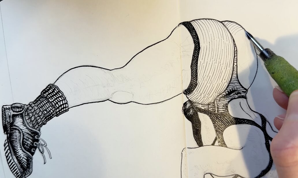
Then on to the “standard hatching” technique, he uses to render hair. Which also carries over to the subject’s sock and the shoe. So again, for this first section, it’s just traditional, classic linear hatching.
The iconic ‘Crumb hatch’ truly begins when we arrive at her costume.
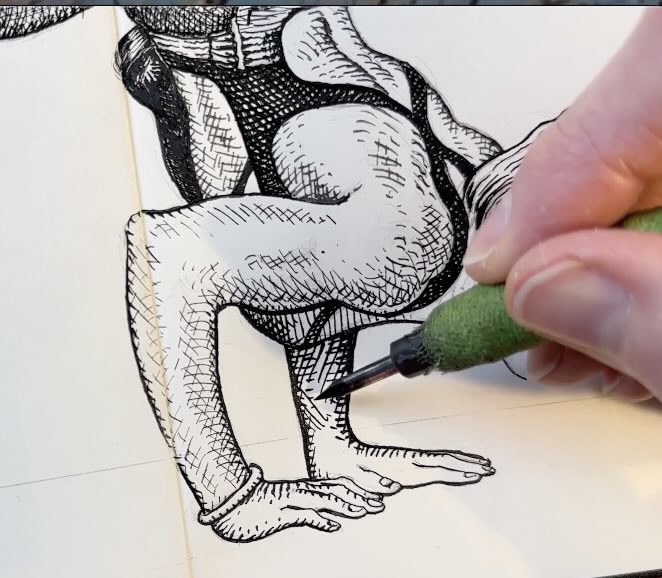
Since I can see the tone of her costume will be rendered nearly black, it’s safe to lay down the base layer with a thicker stroke.
Then mirror that same line weight in the second pass. Followed by a third pass in the concave areas of her bodysuit, then matching that same tone on the band across her shorts.
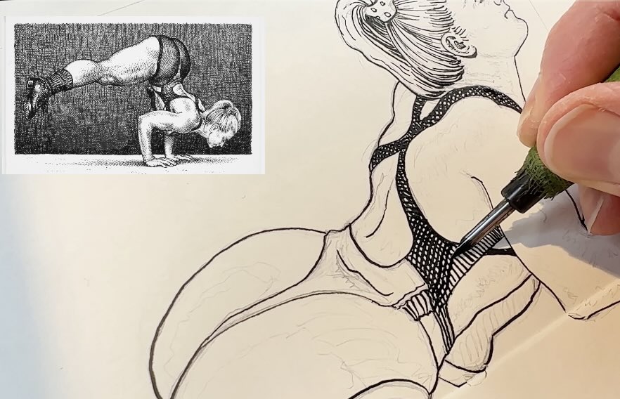
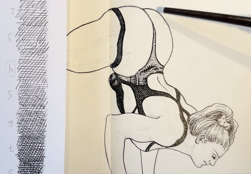
I keep referring to the values scale, especially for the buttocks section of her costume. The fabric stretches in a see-through, sheer effect over her form.
The base layer is again a series of dashes to lines. The hatch changes direction as it wraps around her physique.
In the second pass, the cross-hatch builds in tonal density, creating volume. The third and fourth passes further increase the density of the values, giving additional emphasis on the effects of gravity, from her upside-down pose.
There’s a subtle cross-hatch on the very edge of her leg, then Crumb lays marks to define the muscular anatomy.
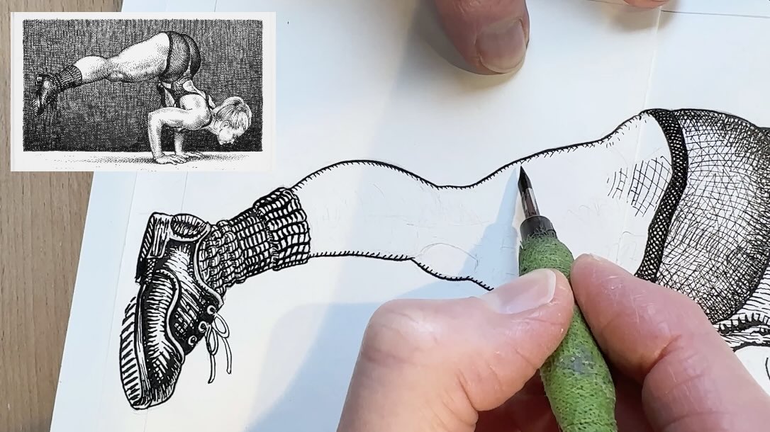
Again, using the second and third pass of values to accentuate that she’s balancing, controlling the gravitational pull with her strength.
If the shading appears overly dark or if you’re wondering why he’s not using a lot of reflected light on the outer contours, that’s because the background he composed is nearly black. And the lighting in a dark room would probably bounce black, not white.
It’s subtle, yet the brain automatically registers that it’s a dark room.
Crumb uses shading to communicate that this is a performance. He tells us not just with the pose, the costume or the impressive physique, he also provides clues from the environment.
Even though there are no other distinctive objects to describe the location, the shading visually tells the story. His cross-hatching becomes a prop in some way.
Once the illustration of the subject is rendered completely, I make the outlines bolder in anticipation of adding the dark background.
An Epic Background
For the background, I switch to a bigger nib because the final product is quite dark. So, thicker strokes for the base layer.
Laying down the first blanket layer, all in the same tone, meaning the lines are spaced evenly apart.
Then I match the line weight and spacing, crossing the first layer on the second pass.
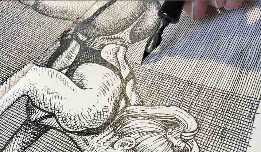
Crumb builds the third layer in an asymmetrical pattern, one small section at a time.
A lot of concentration is required to keep track of the pattern without accidentally double-overlapping strokes. Unwanted overlaps would create blotchy dark patches. We’re aiming for a smooth and gradual weave.
To achieve this epic weave effect, be prepared for the background to be as time-consuming as the rendering of the subject.
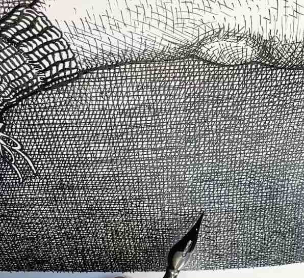
That’s because even though the strokes aren’t perfect rigid lines, they’re still very carefully composed to build the values in just the right way.
Remember, I mentioned that the background has an incredibly important role in this illustration. Done wrong, and it could either be overpowering or ineffective in creating the illusion.
Conclusion
I hope that you enjoyed this study analysis of master Robert Crumb’s cross-hatching technique and are inspired to incorporate this method into your own projects.
First, lay a blanket value, then build a gradual weave layer by layer for a beautiful patterned tone.

If you’re curious to learn more about Crumb’s process or his works, I’ve linked videos and books in the resource section below.
Resources
🎥 About R. Crumb on YouTube:
📚 Crumb Books ↓↓

🧰 My supplies for the studies ↓↓
- Adjustable Tablet Stand
- Adjustable Tabletop Easel
- Faber-Castell Kneaded Eraser
- Speedball Dip Pen Set
- Speedball Super Black India Ink
- Staedtler Mars Technico Lead Holder
- Moleskine Art Sketchbook
✒️ All tools
I’m conflicted. I love his drawing style, and the art is often funny, but I also find a lot of his work creepy and distasteful. Thank you for the analysis and demo of his style. And thanks for all the links. I’m now working up the courage to watch the documentary about him (Prime video).