Economy of lines. This technique is fascinating because there’s more to it than just using fewer strokes.
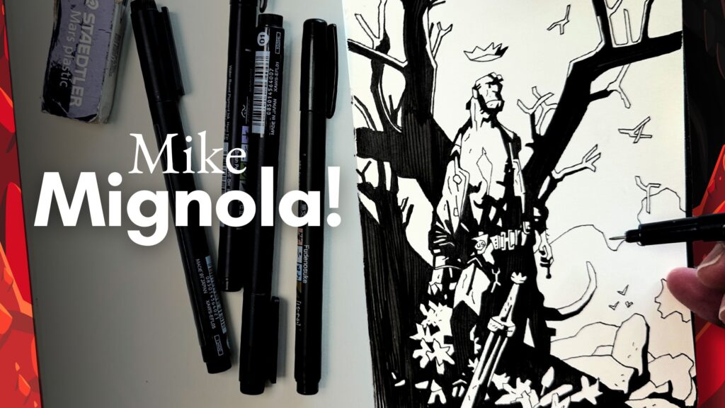
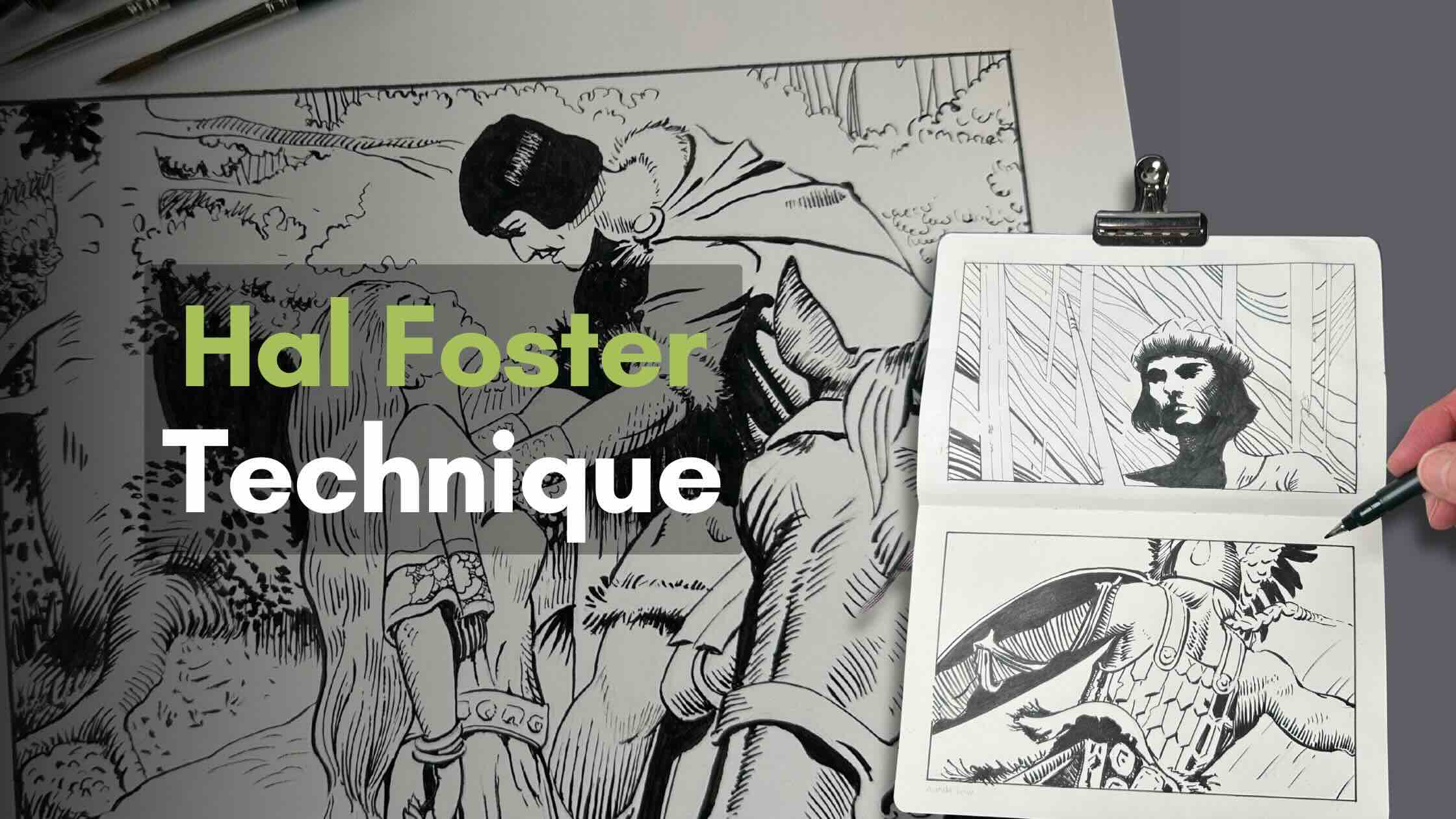
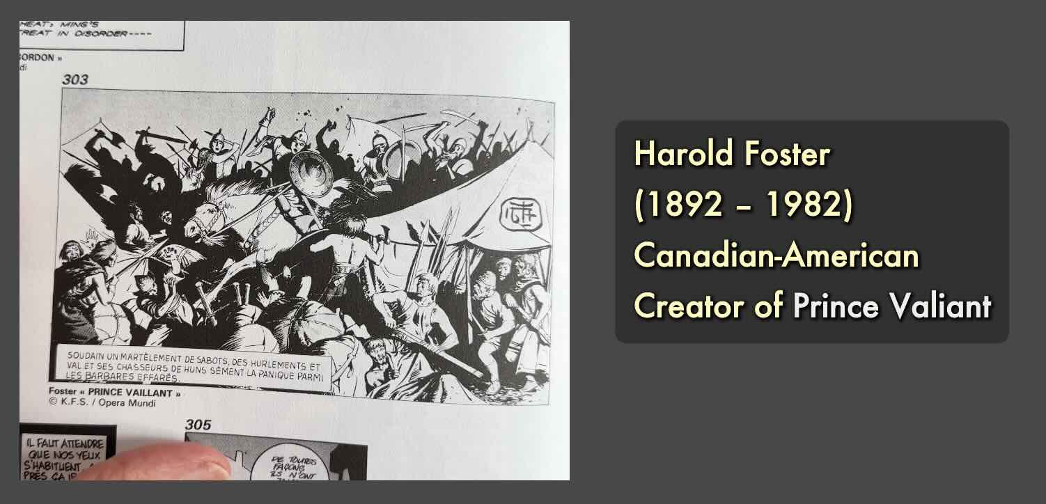
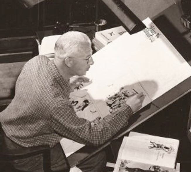
In this article, we’ll review the pen and ink techniques used by master artist Hal Foster in his comic book series Prince Valiant.
//DISCLOSURE: Some of the links in this article are from affiliate partnerships. I earn a small commission when you use my affiliate links to make a purchase. Read the Terms page for info.
You’ll find links in the resources section to where you can download Hal Foster comic book images for free (for your own studies), as well as the books and supplies I used.
Economy of Lines
What I observed is that Master Hal Foster strips away what’s unnecessary.
The marks that do stay on the page must serve multiple functions. Line economy is similar to a minimalist philosophy.
He achieves this effect because of what he knows …
- He knows when to connect a line and when to leave an edge open.
- When using shadow shapes, he knows how to best combine those with thin or thick strokes.
- And thirdly, he knows how to leverage perspective distortion.
I’ll walk you through where I encountered those techniques.
I did two sketchbook studies using markers, and one on illustration board using brushes.
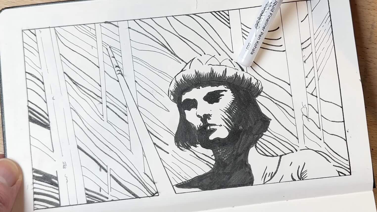
Sketchbook Study I
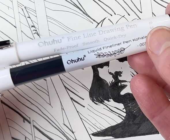
I did the first study in my Moleskine Art sketchbook using two types of fine liner pens and brush pens from Ohuhu.
As a side note, these Ohuhu pens were not my favourite on the first try. They smudge, and the design of the pen is uncomfortable to draw with in your hand. I can’t recommend these if you’re looking for professional-level results with your ink drawings.

Let’s get into what I observed about the first illustration I studied.
Starting with a shadow shape that describes:
- The eyebrow
- Ridge of the nose
- Eye and cheek
And overall expression of the character, he looks tense or focused.
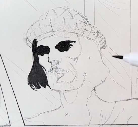
Combined with a thin line for the nose, notice the open edge at the top ridge of the nose. Then more shadow shapes to complete the nostrils.
Foster used perspective distortion on the shape of the nostrils.
Perspective distortion is when you warp the subject’s proportions to create the illusion of depth. It’s like foreshortening, but more subtle.
When would you use this?
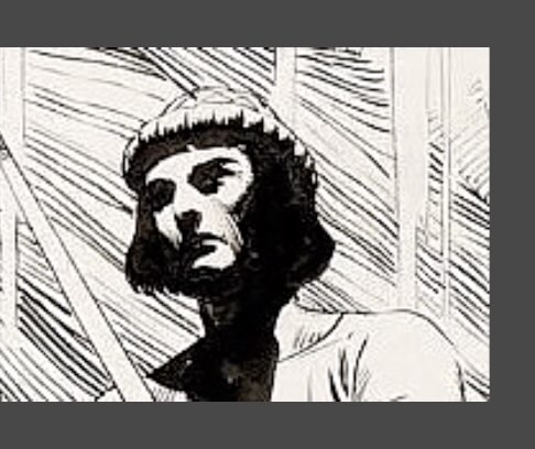
It’s an important effect in this drawing because we can’t see the vanishing points within this close-up of the image on the picture plane.
What’s brilliant about using perspective distortion is that no matter how you look at this drawing, your brain gets a sense of depth from just a few clues in the drawing.
Look at the image that’s uncropped. Now you see how Foster reinforced the illusion of perspective with the parallel lines (the rocky arch above the character) that converge off the panel toward a vanishing point.
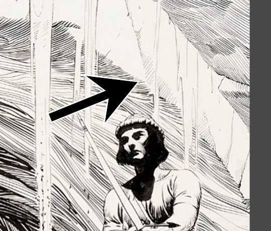
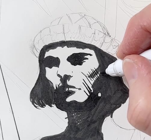
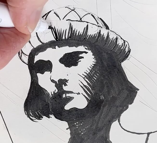
Foster leaves a few judicious white spots under the character’s chin to describe the throat, Adam’s apple and jaw line. Then a few shadow strokes to shape the cheekbone.
The hat is where decisions are made about where is best to connect the edges or to leave them open. By edges, I mean the outer outline or the contour lines.
The edges that are left open will be completed by either the background or by the juxtaposition of butting strokes.
Essentially, open edges are completed by the viewer’s mind. The contour lines are implicit.
Also, back to shadow shapes for a second, the character’s bangs are solid black, and so is the hat. But they’re visually separated by the stroke angle, which falls into the category of perspective distortion.
In a sense, this is an example of an implied edge as well. The only difference is that it’s black-on-black instead of white-on-white.
You can see on the final drawing how the background closed the loop on the open edges that were left white.
There are more examples of these techniques in the following two studies.
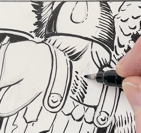
Sketchbook Study II
I did the second study in my Moleskine sketchbook, but this time using my trusty Tombow Fudenosuke pens.

The first thing I observed is the open edge where the hair tucks under the armour straps. Then, Foster uses bold and thin strokes on the straps to indicate their thickness and the cast shadow.
I’m noticing a perspective distortion right away. The warrior’s arm closest to us on the right of the picture plane is larger than the arm holding the shield, making the shield arm appear further.
Also, for the rendering of the neck muscles. Here, using both angle and stroke weight variety to communicate perspective distortion once again.
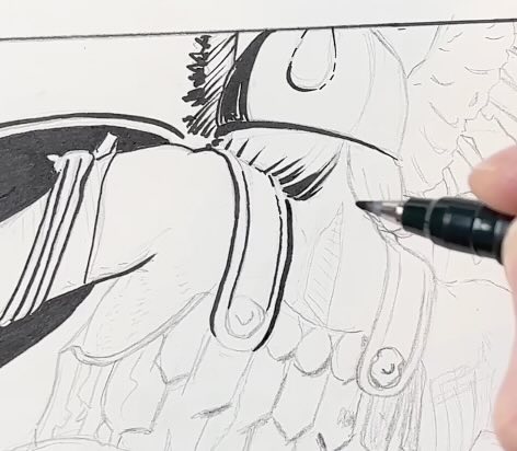
The section below the armpit where the armour connects on the warrior’s flank is a perfect example of where Foster strips away what’s unnecessary. It emphasizes that those marks serve multiple functions.
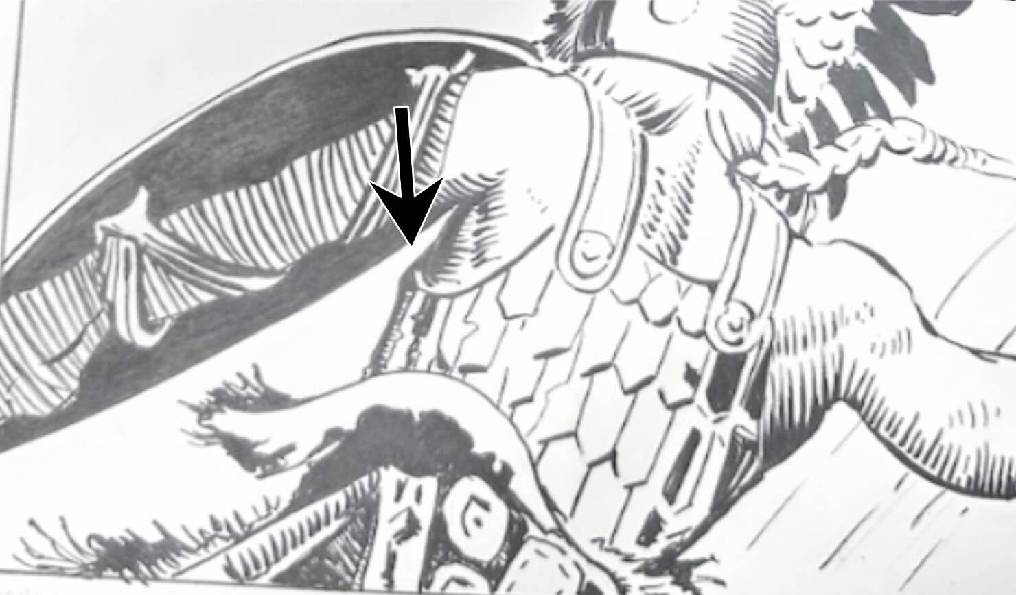
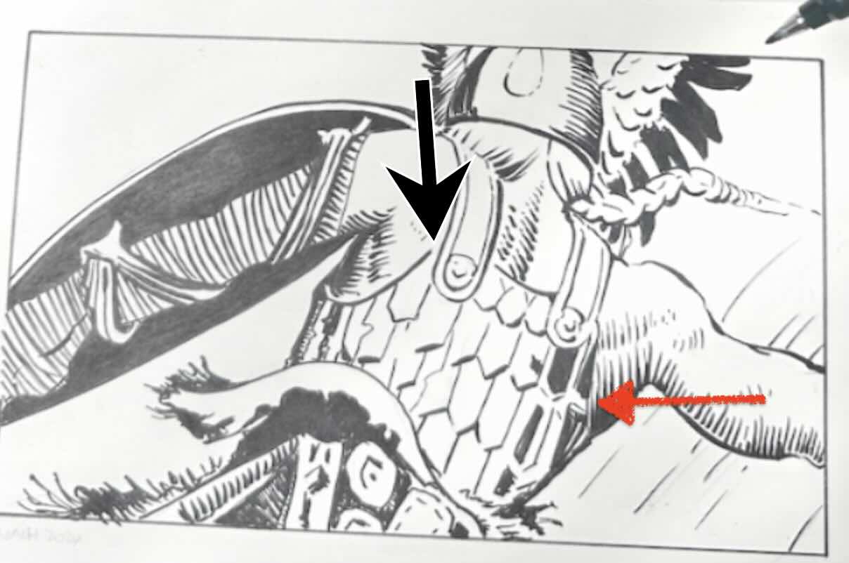
Note how the top of the armour doesn’t connect to the strap – why?
By leaving that edge open, it looks like an area of strong highlight, which also makes it appear closer to the viewer. It makes the character’s shoulder blade appear to pop towards us.
Foster also omitted the outline for the top of the seam on the armour, but we know it’s there because he completes it in reverse in this shadow shape.
Then we see a hint of it on the other side of the armour, as a sliver of white, which completes the illusion.
That’s economy of line!
These two studies were of cropped images from larger drawings. In the third study, I level up from ‘sketch’ quality to a more polished illustration.
Illustration Board – Study III
In this section, I describe the materials I used for the final study and why.
Master Foster drew on full-size illustration boards (23-inch by 34-inch). So, it makes sense that he could ink nearly every stroke using brushes.
I say this because, even though there are tiny brushes that make thin lines, brushes require more hand control because they have a soft tip.
Brushes are extremely flexible, compared to the rigid tip of a standard pen or a dip pen’s nib. Dip pens are elastic, but not nearly as “floppy” as a paintbrush.
If you’ve been following my work for a while, you know that I favour using rigid pens and dip pens.
My preference is to work in smaller formats.
Rarely do I illustrate projects larger than 9 x 12 inches. Smaller formats, in a detailed style using a wide range of values is indeed best suited to pen work.
However, since there have been many requests from my YouTube audience to see more brushwork demonstrations, I aimed to complete 93% of the final piece using brushes.
I used a number one and a number two synthetic sable brushes from Winsor & Newton.
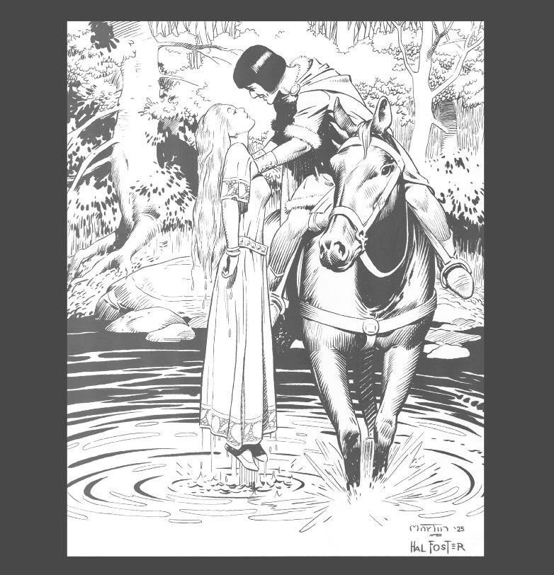
Brushes were possible because I cropped Hal Foster’s illustration to a zoomed-in, enlarged section, for an easier replication of his strokes. On a piece of Bainbridge hot press illustration board that I cut down to approx. 8 x 10 inches.
The Ink Application Sequence
In this section, I describe the sequence of steps for the ink application and provide additional examples of the techniques previously mentioned.
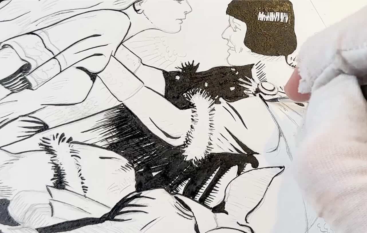
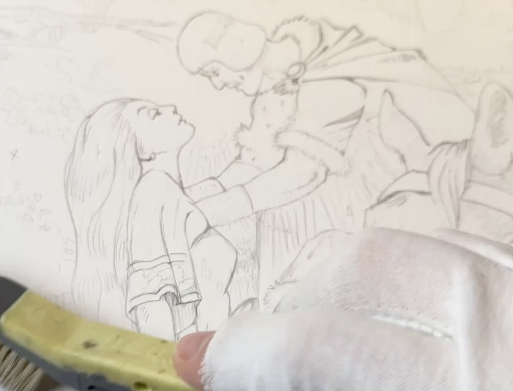
I did the pencils freehand from scratch using an H led and a kneaded eraser.
It took several tries to get the pose just right, where the Lady’s armpits are in the correct position for the Prince to grab hold of.
It took over two hours to finish the pencils.
I wanted a very clean drawing so that it would match the original as closely as possible. This was a wise decision because it removed any guesswork as to which sections of the drawing would be:
- Shadow shapes
- Cast shadows
- Open edges
- Connected strokes
When I’m inking my own work, I prefer to start with the lighter values first, building tone from light to dark.
For the Foster style, it made more sense to fill in all the solid black first, since we noted in the previous studies that he used shadow shapes to create the illusion of form and depth, not values.
I did a first pass with the bigger brush first, careful to leave gaps for open edges.
I used Speedball Super Black India Ink, which works as well with brushes as with dip pens for drawing.

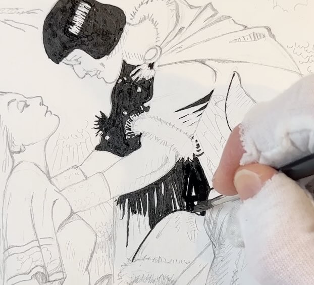
The horse in the very forefront of the picture plane had the most details and boldest strokes.
Once all of the solid blacks and heavier-weight strokes were completed, I switched to the number one, smaller brush.
I used the smaller brush for the remainder of the strokes, all the marks except for the characters’ hands, faces, and finer details of their costumes. For which I later used a dip pen.
The finer brushwork required a lot of concentration to replicate the lines that go thin to thick to thin in a single stroke.
The other challenging sections were the strokes that double as a cast shadow or shadow shape, such as the fur trim on the Prince’s costume.
Also, making sure to connect the lines when they’re supposed to, like on the cape’s hood – only leaving open edges where intended.
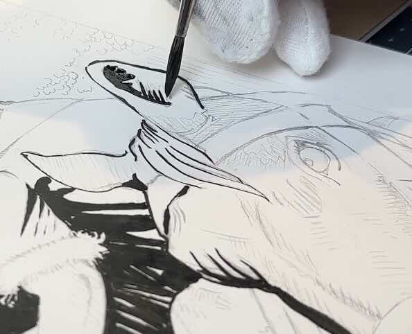
Another thing to pay attention to was stroke direction. Some strokes indicate perspective distortion, doubling as a contour of the form, like around the horse’s muzzle.
Once the rendering of the foreground and middle ground elements was complete, I went ahead with the background section, still using the small brush.
The background section was where Foster’s draftsmanship seemed exceptional to me.
With a few abstract, uncluttered marks, he builds an entire environment that perfectly frames the main point of interest, which is the Prince picking up a damsel by the armpits.
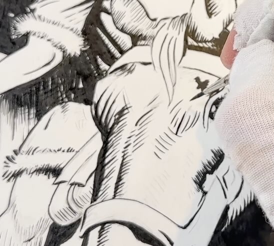
The contact point where the Prince’s hands are draped under the fabric of the Lady’s tunic is another great spot where Foster uses all of the techniques mentioned.
See if you can spot them all:
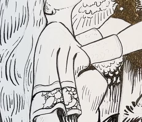
- There are open gaps on the insides of the Prince’s arms. The lines then connect on the outside of his arms.
- The shadow shape below his hand is a cast shadow that also completes the form of her breast.
- Then the line where his hand is tucked under her armpit has an open edge where it lines up with her sleeve.
- The few strokes that frame that area are angled around the forms to make that section look more 3-D.
At last, switched to a Tachikawa soft Maru number 77 to finalize the last details of the characters’ faces, hands and costume ornaments.
In the end, I was quite pleased to have achieved my goal of inking this piece primarily with brushes. A first for me.

Thank you to those who suggested Hal Foster for a study. I hope you enjoyed the Prince Valiant drawings as much as I did. If so, feel free to share this article.
Let me know in the comments what other pen and ink topics you’re interested in, and be sure to watch the companion YouTube video as well.
Resources
Hal Foster Comic Art – References
- ✨ My Gallery
- ✒️ Tools
- 🎓 Courses
- 📚 Master Studies Guide
- 🎥 YouTube
- 🖼️ Art Shop
📚 Books ↓↓
🧰 Supplies ↓↓