Improve your pen and ink backgrounds
In this article, we’ll review three things that remarkably improved how I do pen and ink backgrounds and how you can too by using these tips.
- What is a pen and ink background?
- Problems caused by bad backgrounds
- 1 – Fix your backgrounds with a mindset shift
- 2 – Fix your backgrounds by pre-arranging the values
- 3- Fix your backgrounds by fading the textures
- Is your plan complete?
- Pencil Underdrawing
- Ink Application
- In summary
- Resources for this project
Disclosure: Some of the links on this page are affiliate links. I earn a reward or small commission when you use those links at no cost to you. Read more about the Affiliate Disclosure on the Terms page.
What is a pen and ink background?
A background is the environment, area, or elements behind the main subject in a composition on the picture plane.
‘Pen and ink’ is a technique used to render the artwork. Ink is the medium. Different tools, also called instruments, such as pens and brushes are used to apply the ink to a surface.
Problems caused by bad backgrounds
Bad backgrounds can create problems. These include:
- Weird proportions
- Making the subject look flat
- Distracting attention from the subject
- Can be visually chaotic to the viewer
If you’re like me, you spend the bulk of your creative time on the main subject of your artwork. This leaves the background treatment as more of an afterthought.
When I started with pen and ink, I drew birds and they were all staring into white space.
By doing Master Studies, and growing confidence in my technique, I started adding backgrounds to my bird illustrations. I did plan my projects, but planning efforts were focused on the main subject.
I sketched in the background at the end of the project, rushed and without organization.
The results were inconsistent.
Several backgrounds seemed tentative or incomplete (see Raven Man).
A few turned out good (Fool Me Once) and others had problems (Tug War).
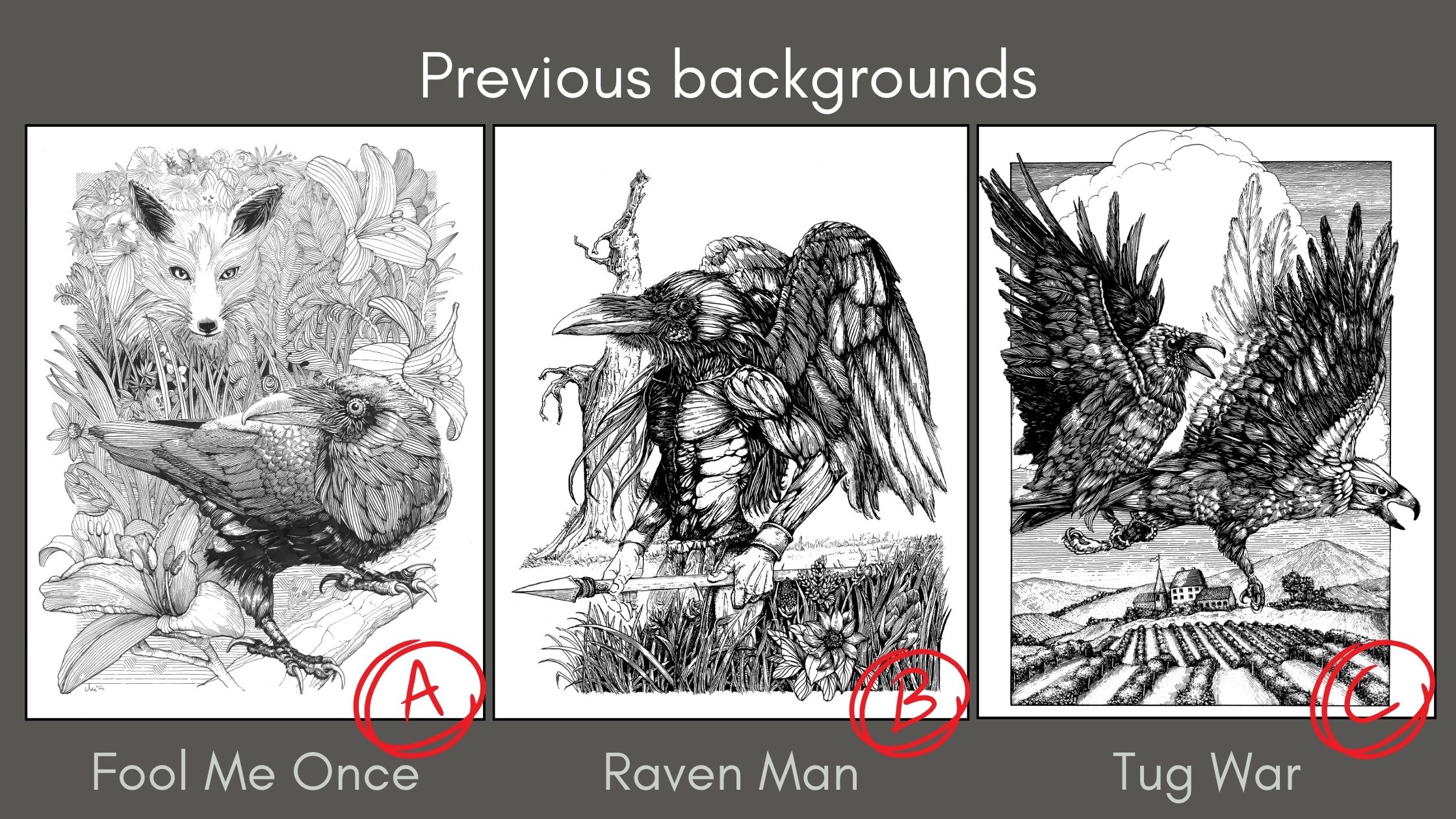
Bad backgrounds analysis
In the Raven Man drawing, the white space is effective in framing the subject. The problems are:
- The forefront values compete with the subject
- The background values fail to communicate atmospheric perspective
In the Tug War drawing, the problems are:
- Abrupt edges
- Insufficient gradations of greys (no fades)
- Overemphasized contrasts
- Lost focal point
The solution to bad backgrounds is to plan holistically.
1 – Fix your backgrounds with a mindset shift
The first thing that will make your backgrounds remarkable is a mindset shift.
I had to change my assumptions about backgrounds. They’re an essential part of the composition, not an “add-on”.
The planning phase starts with mentally preparing for the amount of time it takes to design and execute a remarkable background.
All the bad backgrounds stem from one issue: impatience to finish the artwork.
2 – Fix your backgrounds by pre-arranging the values
The second thing is the opposite of visual chaos.
It’s what the masters do so well. They call this method a values arrangement.
Arthur L. Guptill explains how we can use a values arrangement method for planning backgrounds. On page 243 of his book, he presents four options (shown later in this post).
These guidelines help determine how to arrange the values for emphasis of the subject.
You can use Guptill’s guidelines when you’re starting a new project, right from the ideation concept phase. It’s also helpful for fixing existing artwork.
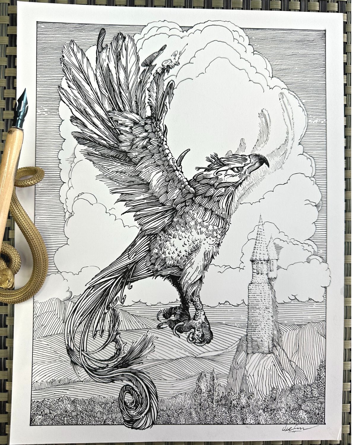
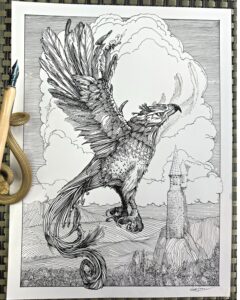
To demonstrate how to apply the values arrangement planning method, I’ll be adding a background – the correct way – to a subject already created.
How to arrange values to emphasize your subject
We’re starting with a phoenix floating in white space.
If you’ve done the Phoenix tutorial on YouTube with me, then you’ll also have that drawing in your possession, ready for your addition of a background.
If you’ve not done the Phoenix tutorial, you can download the FREE PDF template to use for this demonstration.
🎬 Watch the Phoenix Tutorial on YouTube.
Values Arrangement Option 01
In the first combination of contrasting tones, the thumbnail shows a white spot against a black background. It shows up so plainly that the eye goes directly to it.
To demonstrate how this arrangement looks in an illustration, Guptill drew a white house in strong sunlight, against a background of dark trees, and it’s framed by gray tones.
The third thumbnail is a test with our Phoenix of this values arrangement treatment.
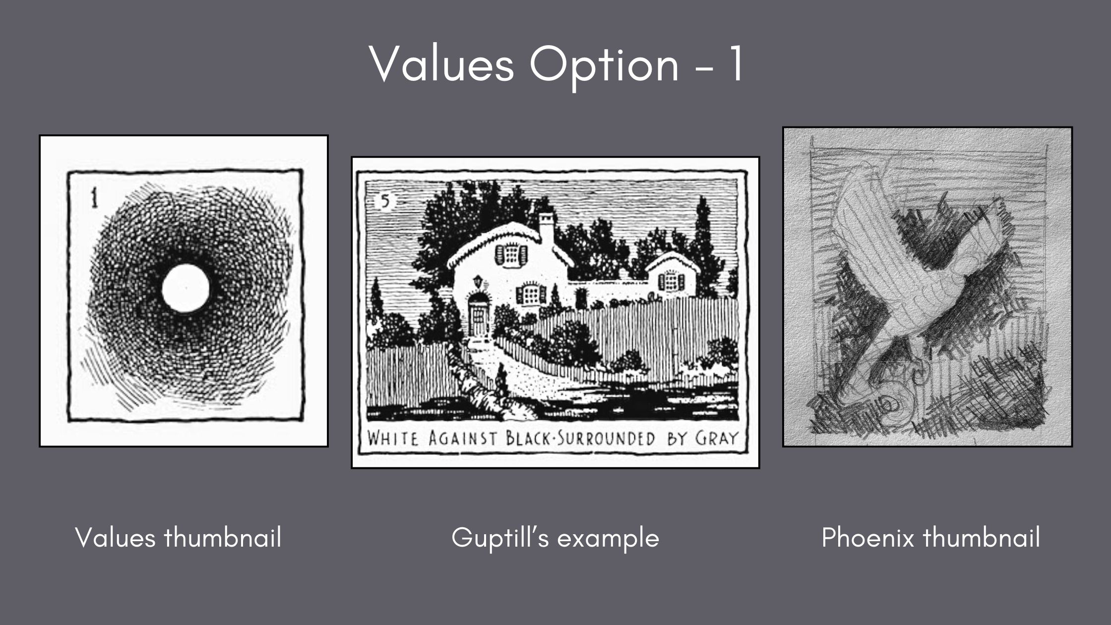
Direct your attention to the arrangement of values and not on the details of the renderings.
Remember, this exercise serves to train our brains to observe what we see and translate into a visual language for our viewers.
Values Arrangement Option 02
The next thumbnail is the reverse of the previous treatment. For the example, Guptill rendered a dark building silhouetted against a white sky, surrounded by grey.
And illustrated by Yuko Shimizu, is a great example of this silhouetted subject against white, surrounded by grey. It’s so amazing that it still reads well at this mini-size.
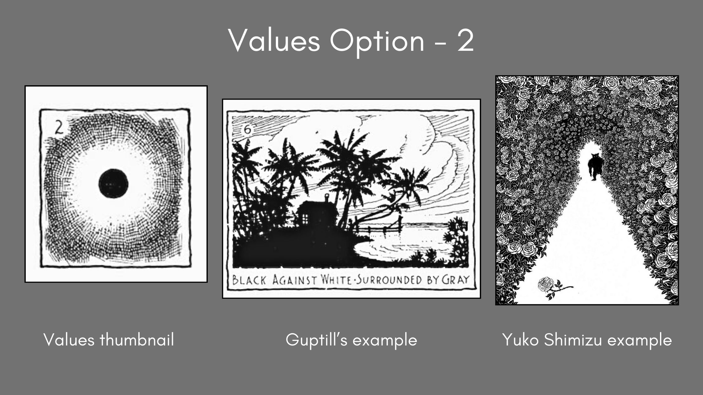
Our phoenix is not all-light or all-dark but rendered somewhere in the middle in the mid-tone range. Therefore, the silhouette arrangement is not a good match and is immediately eliminated from the options.
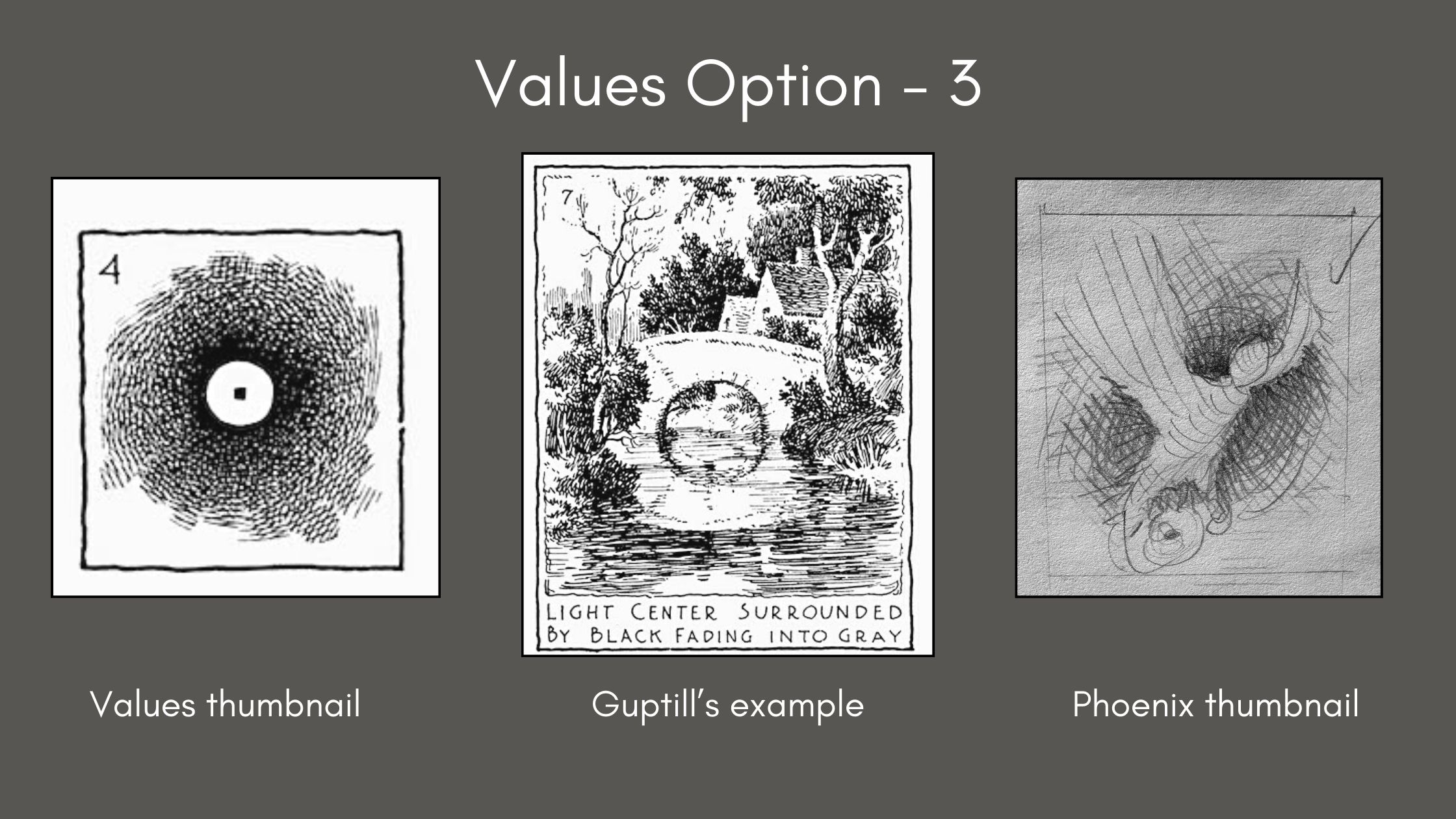
Values Arrangement Option 03
Next, we’re pulled to a strong center of interest by lighter tones against darks fading to grey. This arrangement has the potential to work for our phoenix.
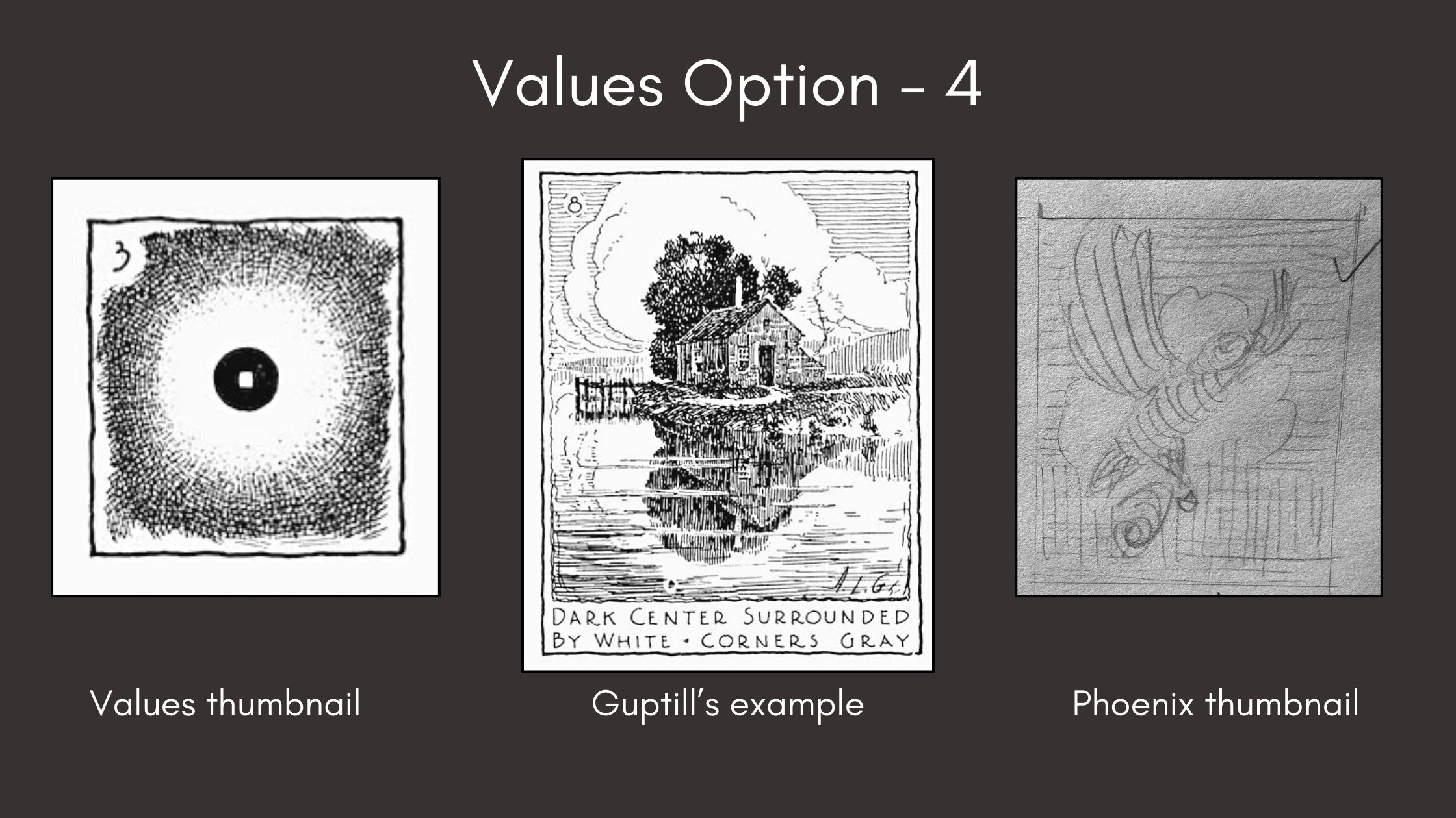
Values Arrangement Option 04
Then, we reverse the contrast from the previous example. Gutpill drew an image with a dark center surrounded by white, framed by grey.
This option is the best choice.
Test your theories before committing to ink
What is going in the background?
We’ve established the degree to which elements on the picture plane should be light or dark, and where these values will sit in relation to the main subject. But what are the elements of the background?
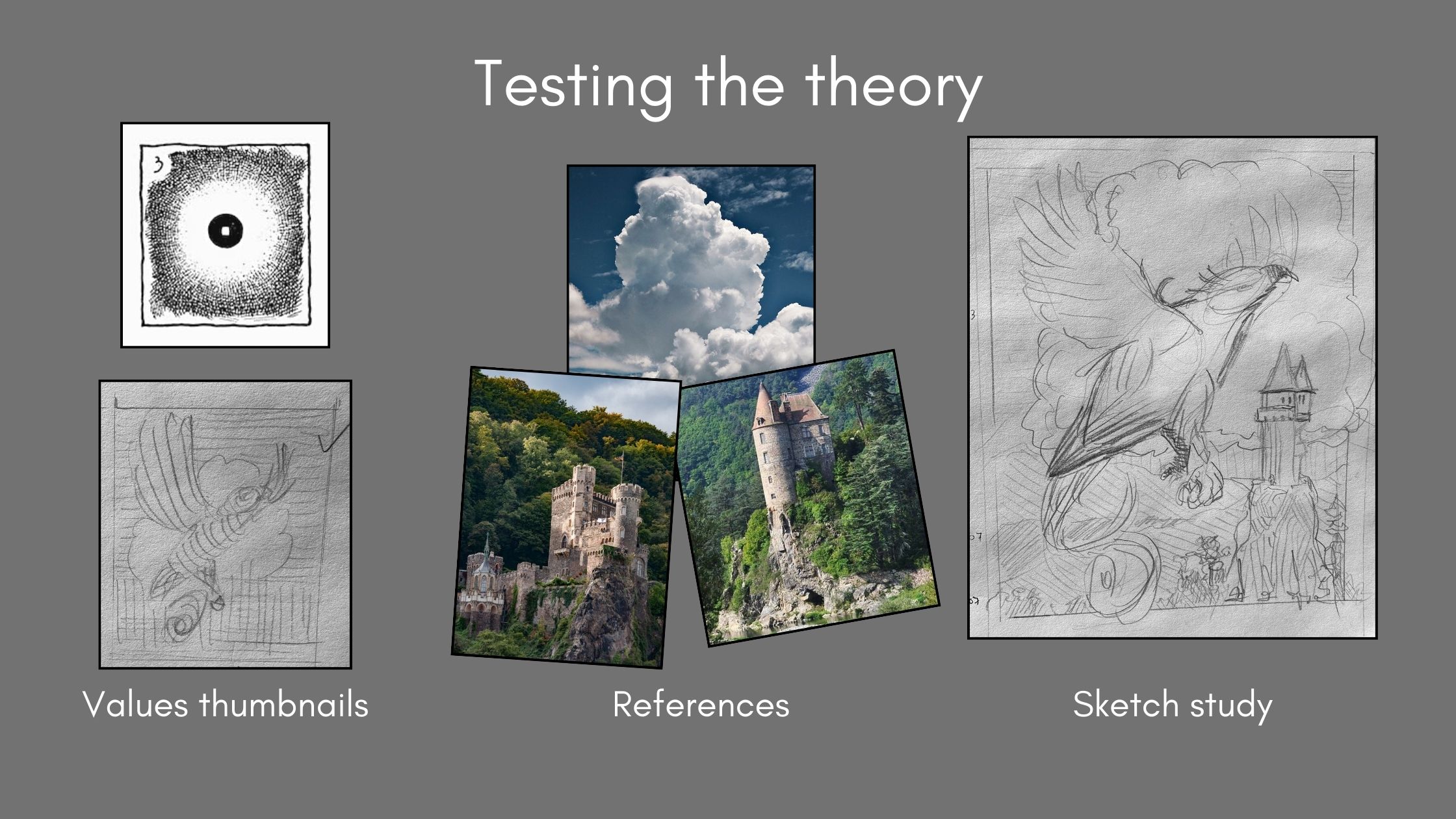
Because it’s a bird in flight, it’s fitting to have clouds for the white surrounding the subject, then a sky fading to the grey corners.
For the bottom half, I found some castles on PixaBay. I’ll use the leafy tree tops from those photo images as a reference for the landscape in the foreground as well.
Based on these references, I drew another draft in my sketchpad to confirm that the background (and foreground) elements I envisioned actually work with the dimensions of our existing artwork – so that we don’t end up with weird proportions.
If you’re wondering, why bother with a sketch – why not save time by drawing the elements directly on the phoenix artwork?
It’s because I’m using Bristol paper for inking with a dip pen.

You want to avoid having excess graphite residue from the pencil on the paper surface, dents from pressing the lead, or bald spots from the constant erasing. These can interfere with the accuracy of your ink application. And that can be frustrating.
To be clear, I recommend doing these steps even if you are starting from a brand-new idea.
You could also combine the concept exploration phase (what subject to draw) with the values arrangement thumbnail tests. Then sketch studies to determine proportions, line directions, plane changes, textures, etc.
For a new project, I would approach the project in these stages:
- Research references (what to draw)
- Thumbnails (concept, values arrangement)
- Subject study (composition, textures, line angles)
- Pencil underdrawing (clean drawing of the subject and background/foreground)
- Ink application (final artwork)
3- Fix your backgrounds by fading the textures
The third thing for remarkable backgrounds is textures.
I’m not talking about having a variety of patterns or using different textures – that is important.
What will elevate a background to a higher level is applying the arrangement of the values planning to textures as well.
Meaning, using gradations for the textures, and fading your patterns from dark to light or white to black.

Do a values chart as part of your planning
If you’ve never done one, I recommend doing a values chart.
You don’t need to create a new chart for every project if you’ve done one recently. I already had a chart of line values from my previous project that I could build on for the Phoenix project.
What was missing from my line chart was the texture patterns for our desired background.
The line work chart is helpful as a reference guide for the sky and hills. I also charted the fading of textures for the:
- tree-tops, clusters of leaves
- rocks below the castle tower
- stonework on the castle
- castle roof
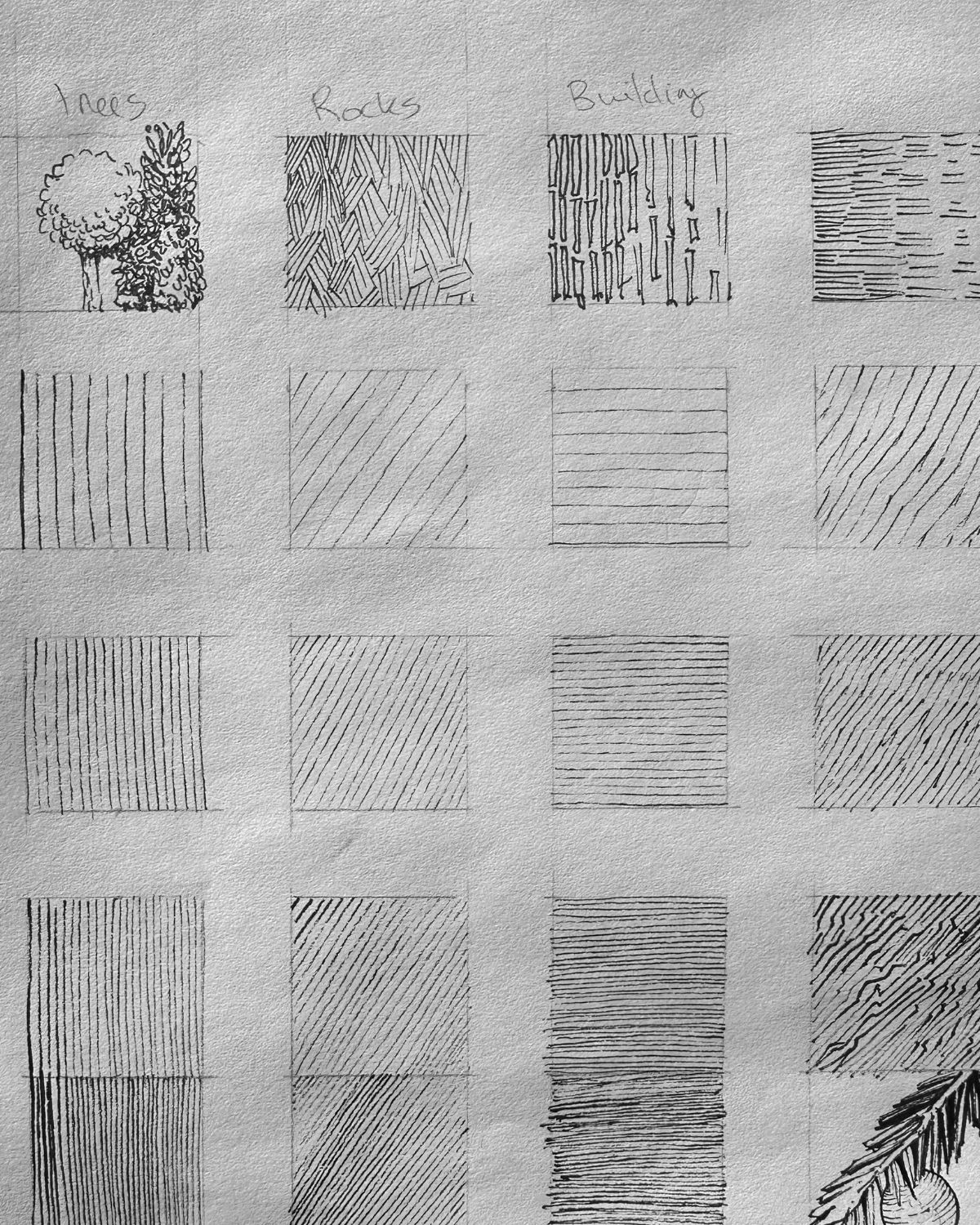
To learn more about how to do values charts, read 3 exercises for pen and ink technique.
Is your plan complete?
Success! Your planning phase is now complete. You’ve done:
- Research
- Thumbnails
- Sketch studies
You are now equipped to make the best decisions for your pen and ink drawing project as a whole. Now we can tackle:
- Pencil underdrawing
- Ink application
Pencil Underdrawing
I’ve gone ahead and drawn the new elements in graphite pencil.
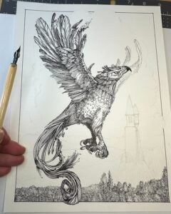
I’m using a Staedtler Mars Technico Lead Holder with an H lead on the Strathmore 300 Bristol Smooth paper. The H lead is not too hard, not too soft. It creates a faint line without needing to use pressure on the inking surface.


I’ve mapped boundary outlines for textures and plane changes.
You want to keep the marks to the minimum you’re comfortable with for your ink application. I include just enough information, such as:
- line directions
- angle changes
- texture boundaries
- values boundaries
The thumbnails, sketches, values charts, and photo references serve as our guides for the best inking.
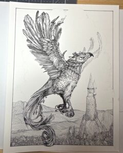
Ink Application
If you have several nibs to choose from, do a test first to compare mark size against the line weights of your subject. We want thinner lines/lighter marks for the background in relation to the subject.
The nib I’m using is equivalent to a 02-03 fine liner size.
I used a 05 pigment liner to draw the border. Otherwise, I’m using:
- Brause steno 361 nib (blue pumpkin)
- Speedball Universal classic pen holder
- Speedball super black India ink
- Strathmore 300 Bristol Smooth 9×12

To learn more about dip pen selection for your projects, read my beginner’s guide to dip pens
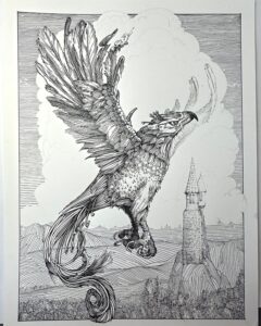
Inking tips
If you’re newer to pen and ink, on my website’s Tools page, you’ll find the supplies you want for each stage of your projects, including a list of resources such as the Arthur Guptill book. There are more links in the resources section of this post.
For best results:
- Work front to back of the picture plane (overlap elements for perspective)
- Work from light to dark (easier to add ink than to subtract)
- Right-handed? Ink from left to right (avoid smudging)
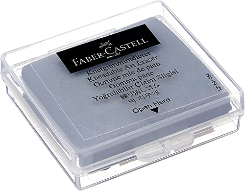
- Use a kneaded eraser to remove graphite after each section is complete, and
- Periodically squint, taking a step back (to monitor the values arrangement)
In summary
Incorporating a planning method significantly improved my illustrations, and yours will too by following the tips that we covered in this post.
By being mentally prepared for the time it takes to plan, and using values arrangements to find the best contrasting methods for your subjects – you’ll have the most remarkable backgrounds.
There’s a lot more to learn about backgrounds by studying the masters – if that sounds interesting to you – check out my Master Studies category.
Let me know in the comments how you enjoyed this article, share it with your pen and ink friends, and I wish you the best with your projects.
Resources for this project
🎬 Draw a Phoenix bird with dip pen and ink (YouTube)
🎬 Master Study Playlist (YouTube)
🎬 Best way to use thumbnails by Ian Roberts (YouTube)
Rendering in pen and ink by Arthur L. Guptill (Paperback)
Get the tools you want for your projects (page)
Frequently asked (FAQ) and more information on tools, materials, and supplies