Intro to Wrightson Rendering
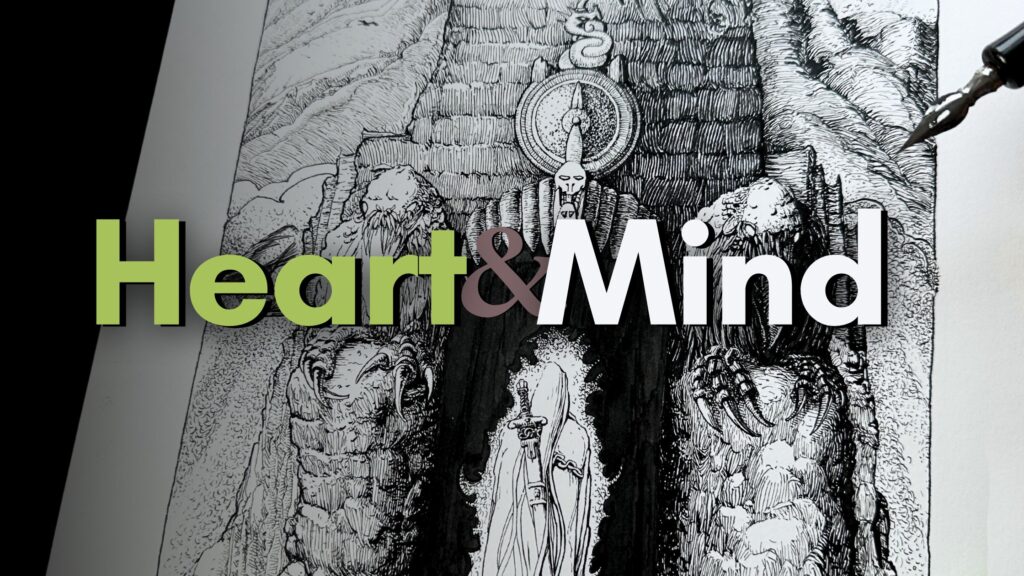
Bernie Wrightson (October 27, 1948 – March 18, 2017) was an American comic and illustration artist, known for:
- The Swamp Thing
- Frankenstein
- Cycle of the Werewolf
And many more Masterpieces featuring his trademark intricate pen and brushwork.
Let’s learn more about Bernie Wrightson’s signature rendering techniques.
DISCLOSURE: Some of the links below are affiliate links. I earn a small reward or commission when you use those links on qualifying purchases at no cost to you. Read more about the Affiliate Disclosure on the Terms Page.
There are 3 essential techniques that I consider fundamental to understanding the genius of Wrightson:
- Atmospheric Perspective
- Shadow Shapes – or Silhouettes
- Line Direction
Atmospheric Perspective
Atmospheric perspective is the illusion of distance and depth in a composition.
With pen and ink, the elements that are furthest away from the viewer on the picture plane will be lighter in weight and rendered with fewer discernable details.
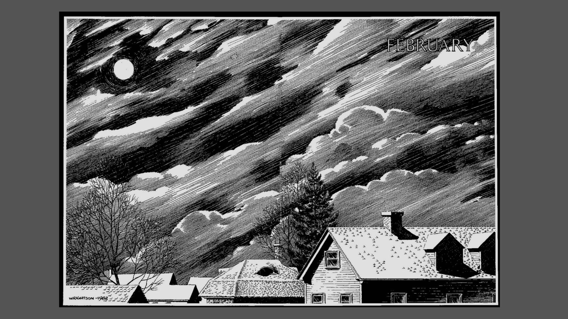
In the first two images below, the elements in the background are lighter in tone with fewer details, fading to white.
In the third image, the background fades into shadow, achieving atmospheric perspective in reverse.
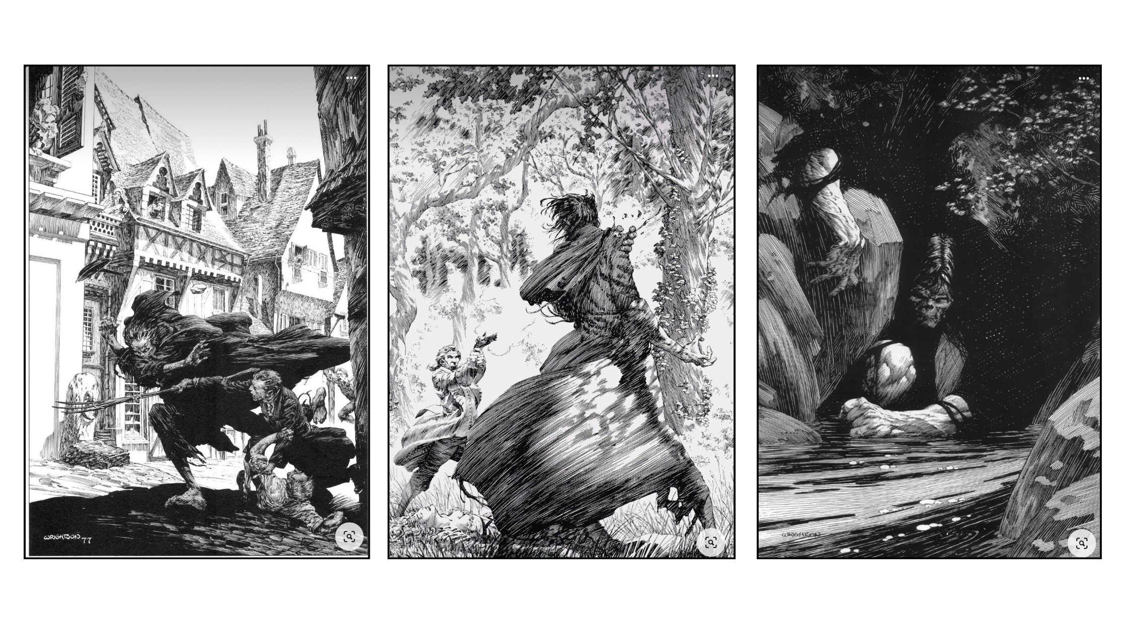
TIP: It helps to render elements for atmospheric perspective by using less pressure on the nib or a smaller tip-size pen.
Shadow Shapes – Silhouettes
Silhouette is an element drawn in a single value, either solid black or all-white. A shadow shape is a similar principle, rendered in the same tonal value, in the same grey.
The silhouette technique can communicate information at a glance. When well executed, it explains a composition to the viewer without distracting from the main subject.
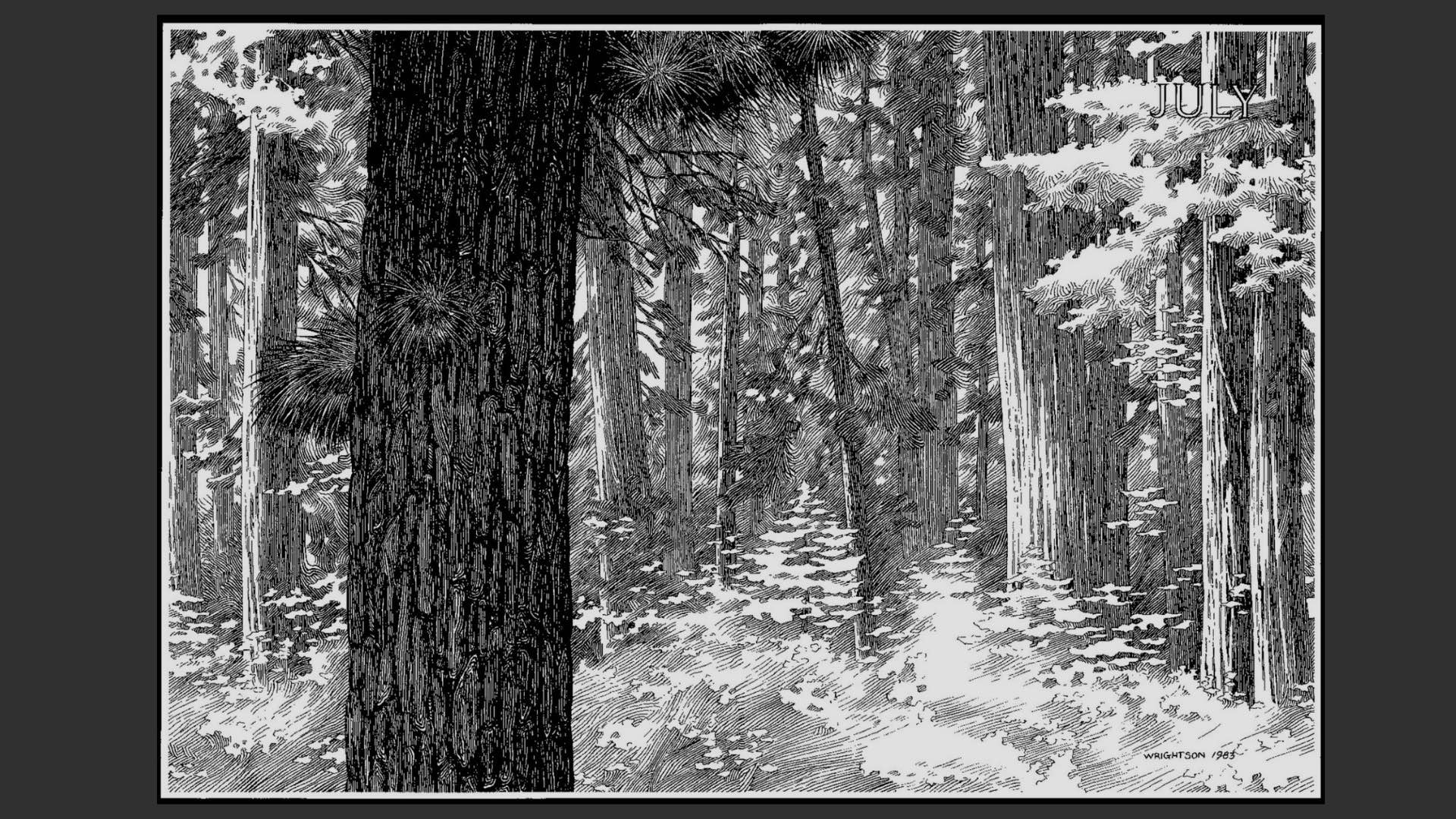
The small trees and shrubs on the middle plane of the illustration below are silhouetted in reverse from the background.
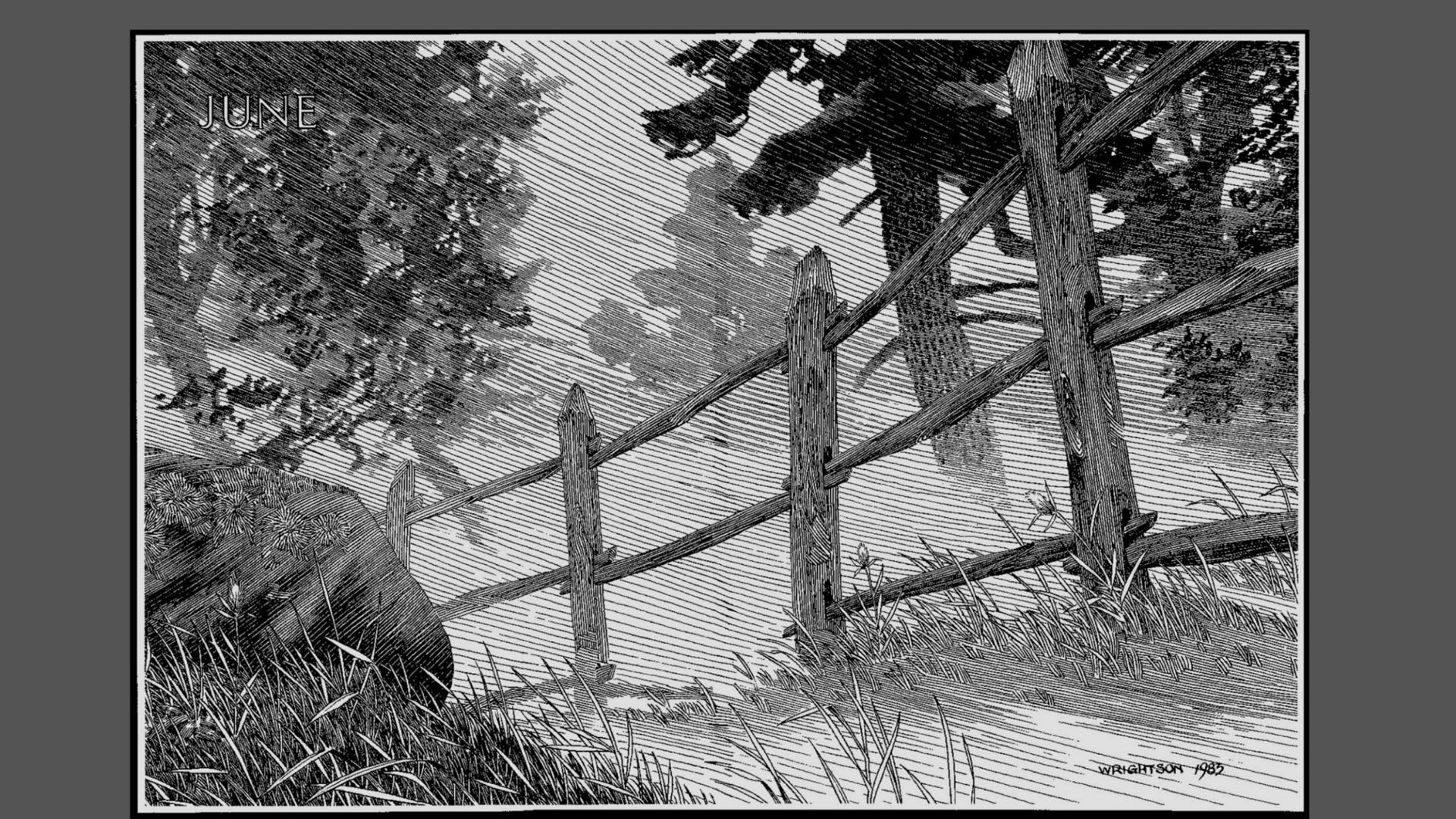
In the following illustration, the trees in the backdrop are shadow shapes.
Wrightson uses these effects in various ways to keep the viewer’s attention on the storytelling.
Line Direction
Line direction is the most fascinating wizardly of the Wrightson style.
He uses a continuous stroke effect, in the gradation of tones transitioning the shading of each element seamlessly in the composition.
2 Mini-Studies
A fun way to practice is to do mini-studies, where we “zone in” to an area of an illustration, and focus on one or two rendering techniques per study.
The two Wrightson illustrations I chose for my studies are less complex than his Frankenstein illustrations.
These are scenes from when he illustrated Steven King’s Cycle of the Werewolf (1983). If you’re wondering, I bought the Kindle version and the images are good quality.
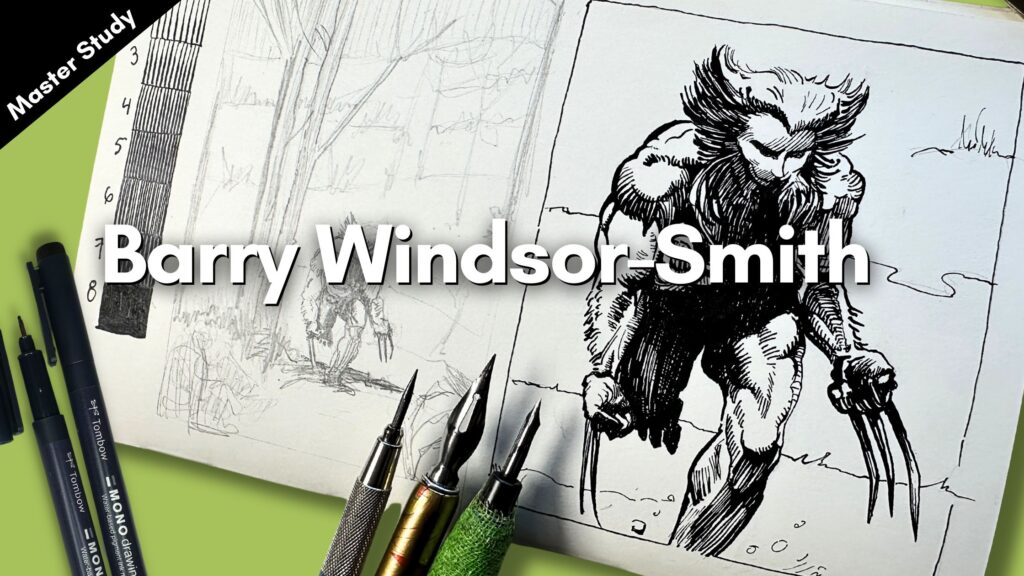
You’ll find more links in the resources section below for the supplies I used in this article and the YouTube video demo (below).
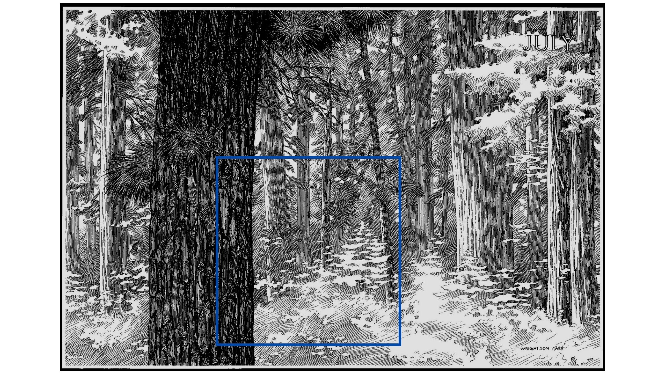
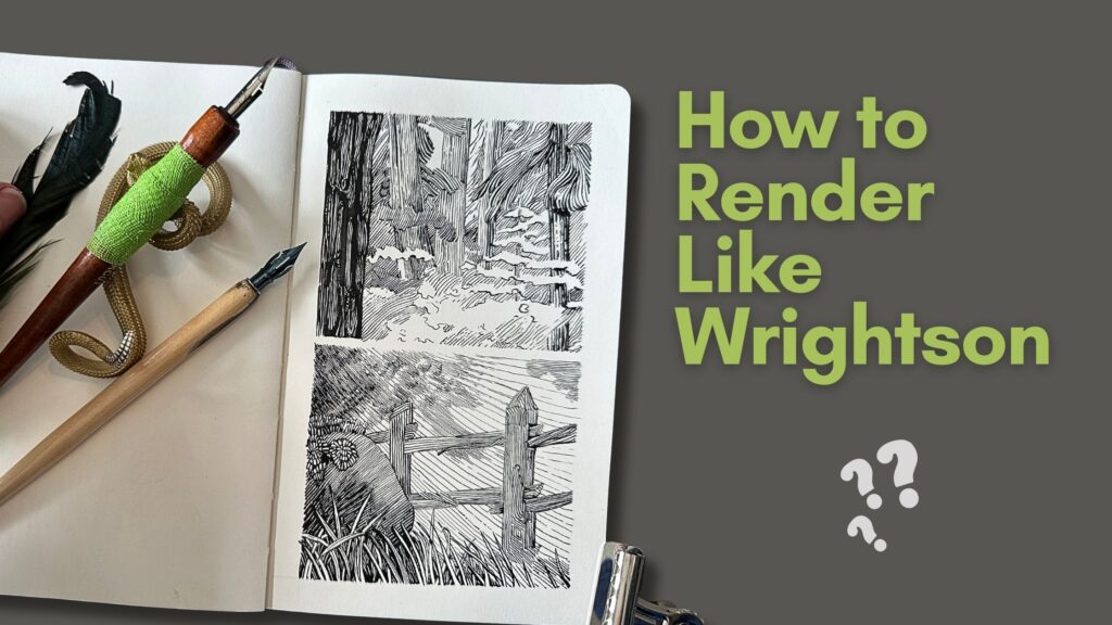
Landscape Study I – Atmospheric Perspective
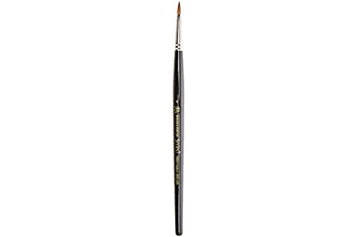
I used a no1 Kolinsky Sable brush for the dark tree texture in the foreground. If you’re interested in inking with brushes, I recommend watercolour brushes of good quality.
Typically, a No1 and a No2 are good for line work, and a bigger square, flat brush for filling in solids.
For the first landscape, I used Tachikawa’s G-Nib.
G-Nibs are super stiff but Tachikawa produces a wider range of line-quality nibs for thin to thick effects. It’s rated as medium softness but keeps its signature springy rigidity.
I find that G-nibs are better suited to a scribbling style than for the precision work of Wrightson, so I switched pens for the next study.
See my Complete Guide to Dip Pens to learn more about how to find the right nib for your drawing approach and aspirations.
Anyway, since it’s just a sketch – for this study, I focussed on atmospheric perspective using light pressure on the nib for elements that are less defined.
The background and foreground both have a misty look to convey the eerie mood of a horror story.
I’m using background shading and overlapping elements to frame the forefront elements. The shading then acts as the contouring lines where the lines are broken or there are none.
Wrightson will often minimize his contour lines in the areas of strong highlight for a more engaging effect.
My pencil sketch was minimal for this landscape, so I did get a little lost with the abstract nature of my zoned-in section.
Despite this, the atmospheric effect is there, therefore my practice session was still on track for meeting goals.
Landscape Study II – Shadow Shapes and Line Direction
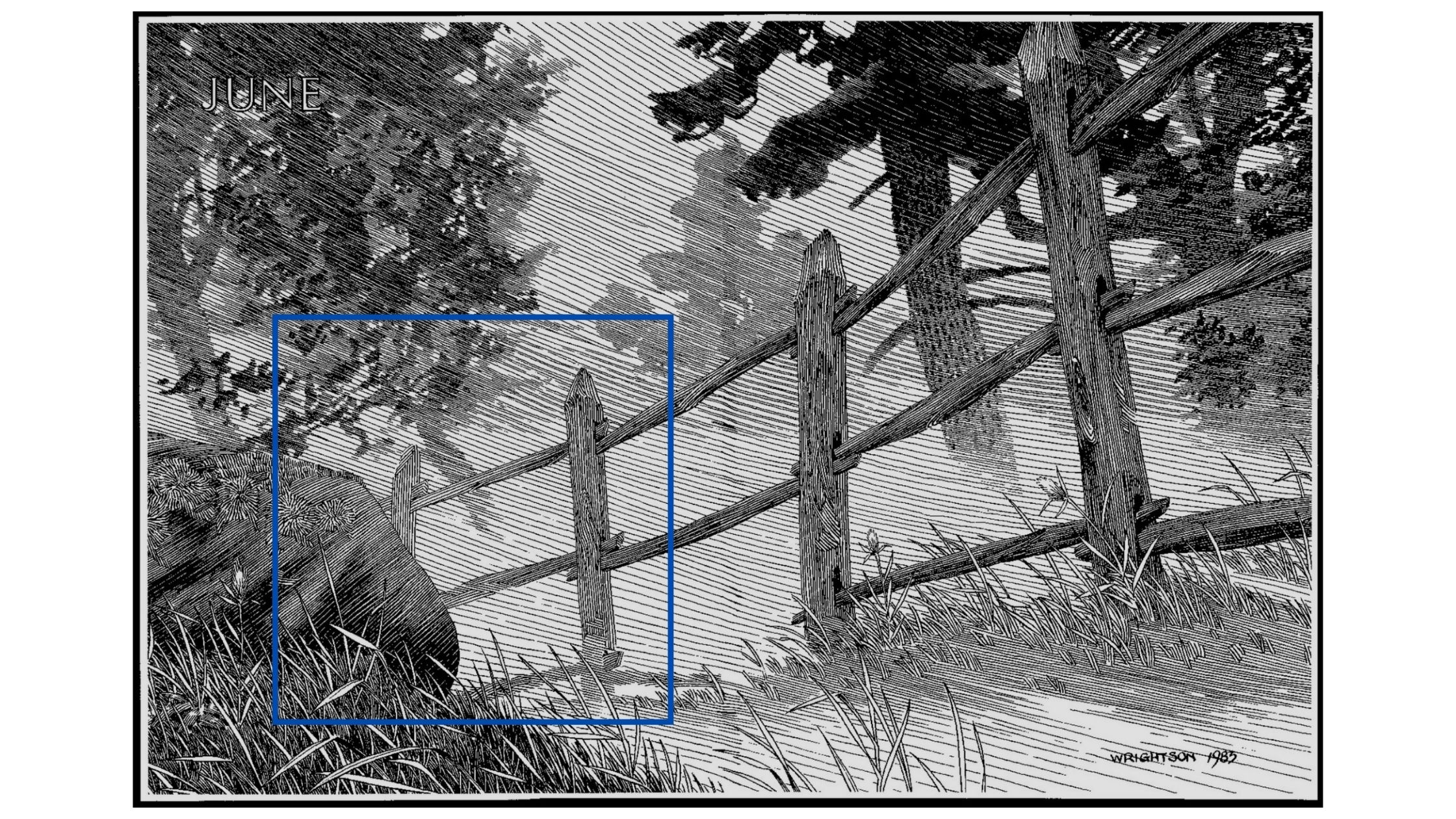
For the second study, I chose another landscape from the same book.
The focus of my second study was on shadow shapes. I used that technique to render the elements positioned further in the picture plane.
For this piece, Wrightson calls attention to his wizard’s ‘line direction technique’ to transition tones from light to dark in the composition.
I had never tried this technique before this study and was excited to give it a go.
I switched to a Brause Steno 361 Blue Pumpkin pen.
This Blue Pumpkin nib is rated as a soft medium. It has high flexibility and medium elasticity. It gives a soft but springy mark-making experience.
I began the ink application with the blades of grass in the foreground. The grass has contour lines, so this illustration was easier to understand than the previous one.
The trick for accentuating the overlapping effect of the foreground elements is to add weight as a drop shadow under the blades standing in the forefront of the picture plane.
To reinforce the illusion of depth, the layer of blades that grows behind is thinner. There is also a thickening of shadows from the boulder, creating more depth.
As I rendered the fence, I noted that the light came through in that section. And therefore the wood pattern emerged from the blades. To emphasize that effect, the marks are spaced further apart for the areas of stronger highlight.
For the tonal gradation happening in the background, I layered the lines gradually. As long as the strokes were slanted at the same angle, the shadow shapes would still be effective even if my rendering did not match the Master’s.
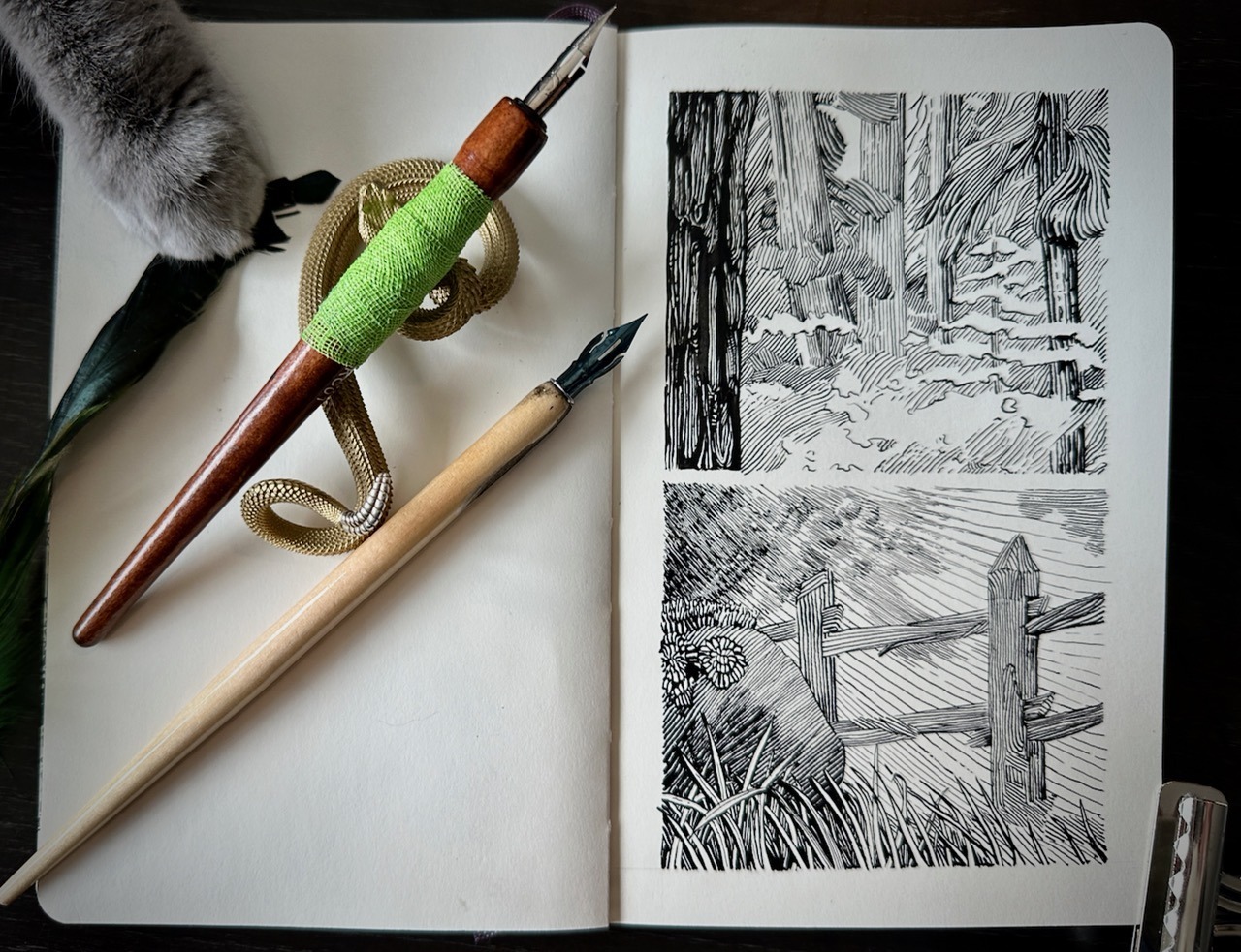
I was happy to have tried my first Wrightson study and look forward to rendering a full illustration in the future.
I hope that you will also give it a try, let me know in the comments if you do!
Resources
B. Wrightson’s Cycle of the Werewolf Authored by Steven King (Kindle)
B. Wrightson’s Frankenstein (Paperback)
Speedball Super Black India Ink 2oz
Large Adjustable Tabletop Easel
Swing Arm 5x Magnifying Desk Lamp
Overhead Phone Mount 10″ Selfie Ring Light
My Studio Equipment and Art Supplies
Follow on Instagram for demos and final artwork




Hey there would you mind sharing which blog platform you’re working with?
I’m looking to start my own blog in the near future but I’m having a hard time selecting between BlogEngine/Wordpress/B2evolution and Drupal.
The reason I ask is because your design seems different then most blogs and I’m looking for something completely unique.
P.S Sorry for getting off-topic but I had to ask!
I use wordpress.org with the Astra Pro theme.
Great study & great blog! Thank you so much for the insights. It helps tremendously to understand the techniques.