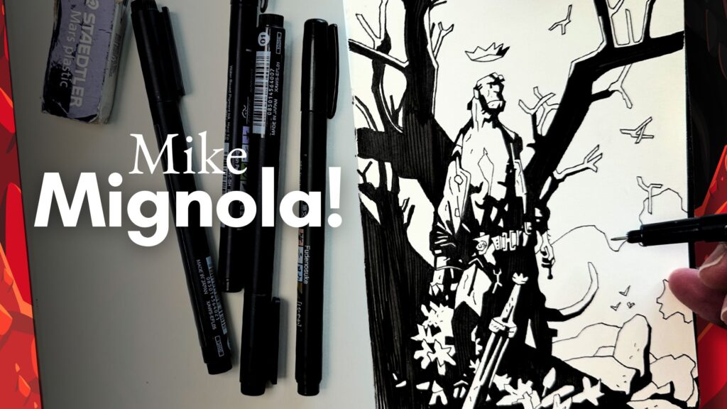
Learn more about what Mike Mignola is known for, how to practice his style, and how to apply his techniques to your subjects with pen and ink.
// DISCLOSURE: This post contains affiliate links. View the Terms for more information.
Benefits of Studying Mike Mignola’s Drawing Style
The key benefit of studying a unique master like Mike Mignola is that it can provide direction for convincingly styling your drawings.
Mignola has managed to make extremely stylized cartoons feel realistic and legendary.
At first glance, his techniques seem easy.
At least that’s what I thought a couple of years ago when I first tried to study his works.
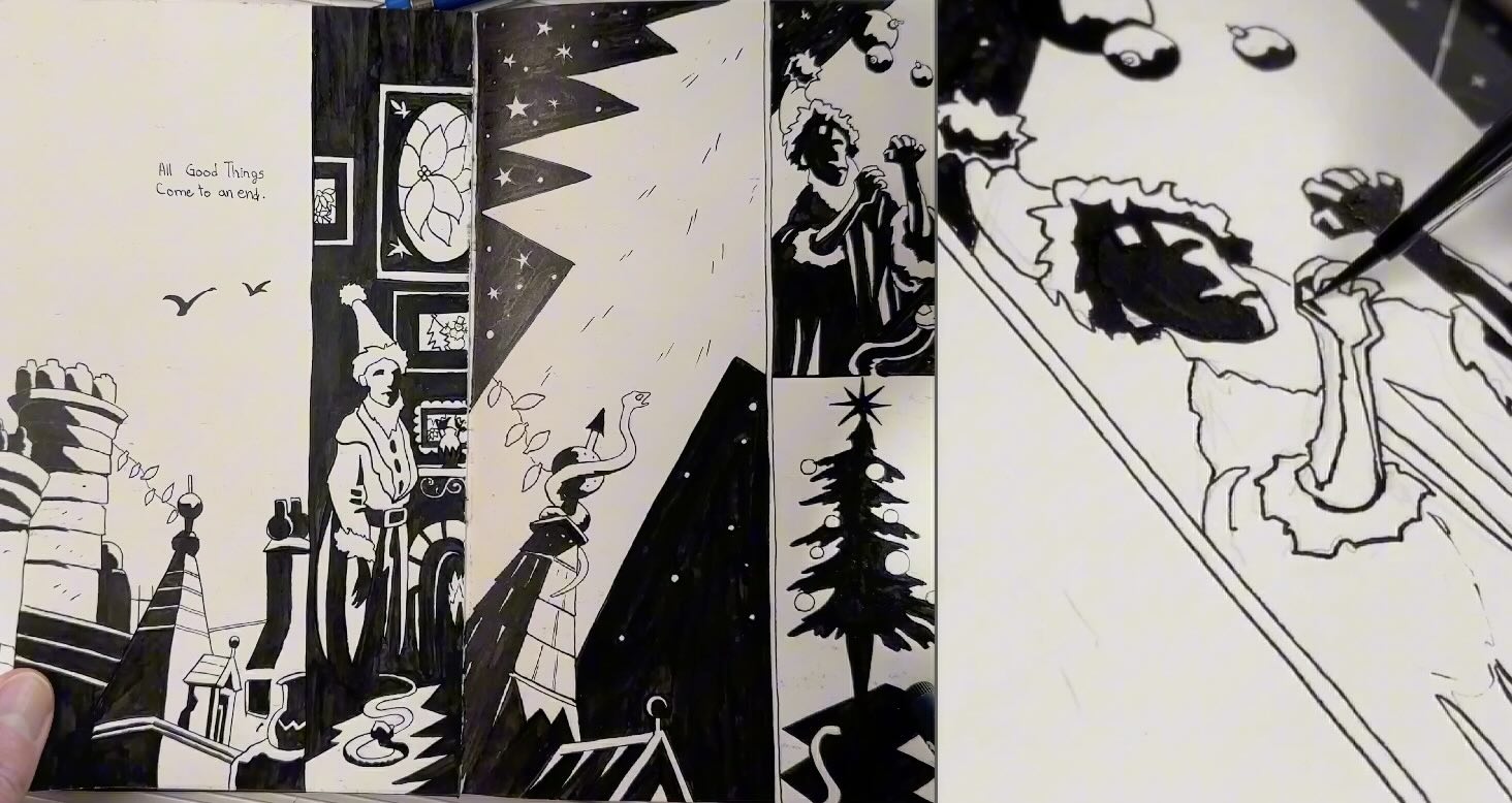
I couldn’t figure it out. I traced and then copied his work without truly understanding the logic of his designs.
Disappointed with myself, I parked these studies until my skills progressed a bit more.
If you are a beginner artist or new to pen and ink, my recommendation is to try this style.
If you have an affinity for it, his style clicks for you right away, great. If it’s frustrating, don’t give up. It will make more sense when you revisit it later.
You see, although his drawings look simple to recreate, on a scale from beginner to expert, Mignola is ranked above that. He has reached the genius level.
What Mignola is Known For
Mike Mignola is an award-winning comic writer and artist, best known as the creator of Hellboy.
His style is easily recognizable by the blocky shape shadows.
Mignola pushes contrasts to maximum levels, leaving no tone with very minimal rendering.
How to Study Mignola’s Drawing Style
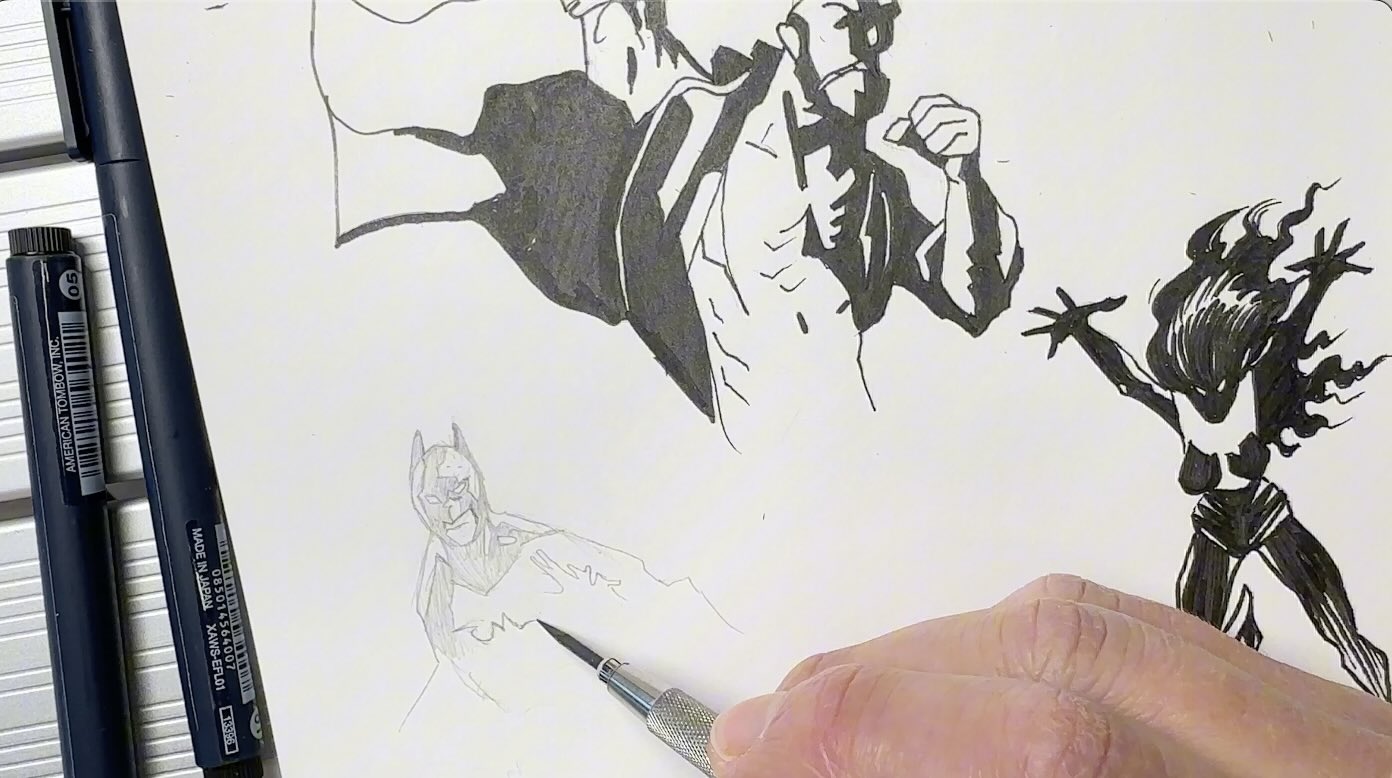
When practicing Mignola’s drawing style, there are several techniques to pay attention to.
In addition to the blocky shape shadows, you’ll observe:
- paper-doll hands of his characters;
- angular shapes, and;
- minimalistic rendering using;
- gapped-tooth hatching,
- dashes,
- dents, and
- strands.
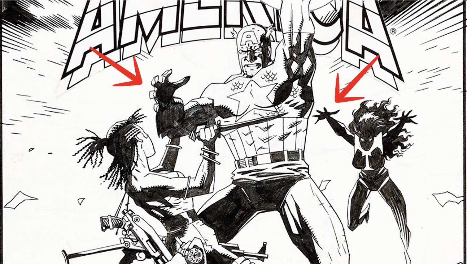
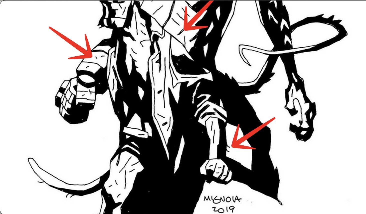
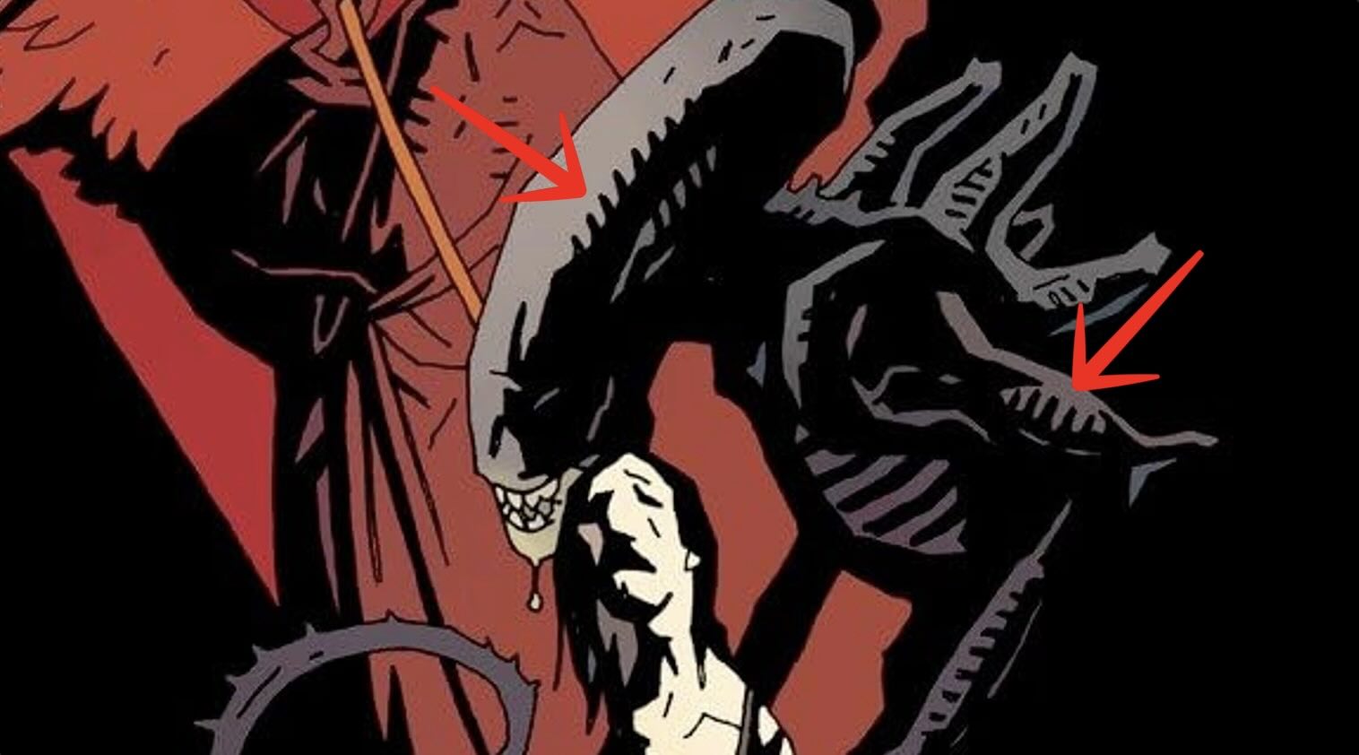
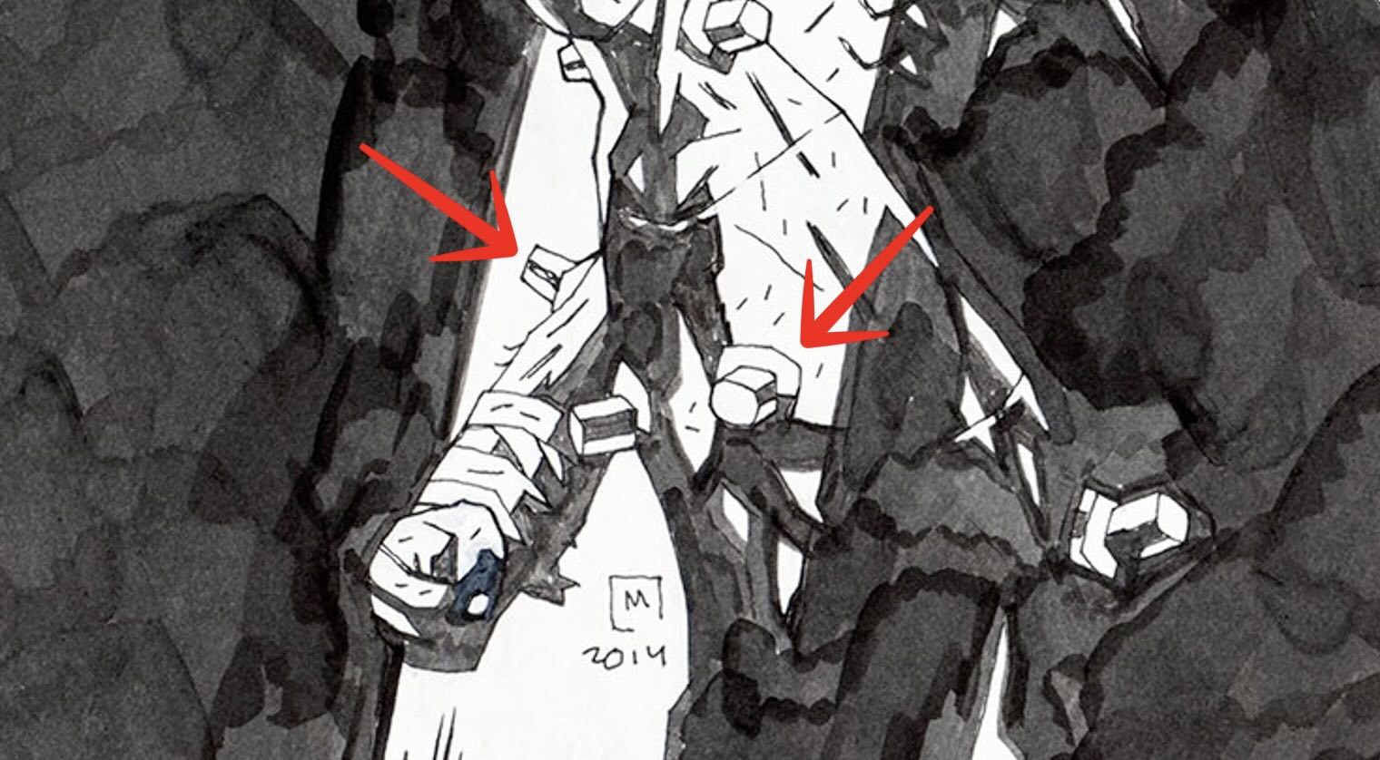
It’s in the execution of those details that Mignola is set apart.
It’s been said that he disregards using correct anatomy or perspective. I disagree.
You’ll see in the examples through this article, how proportions and angles are scaled correctly on the picture plane. He does follow the rules of anatomy and perspective.
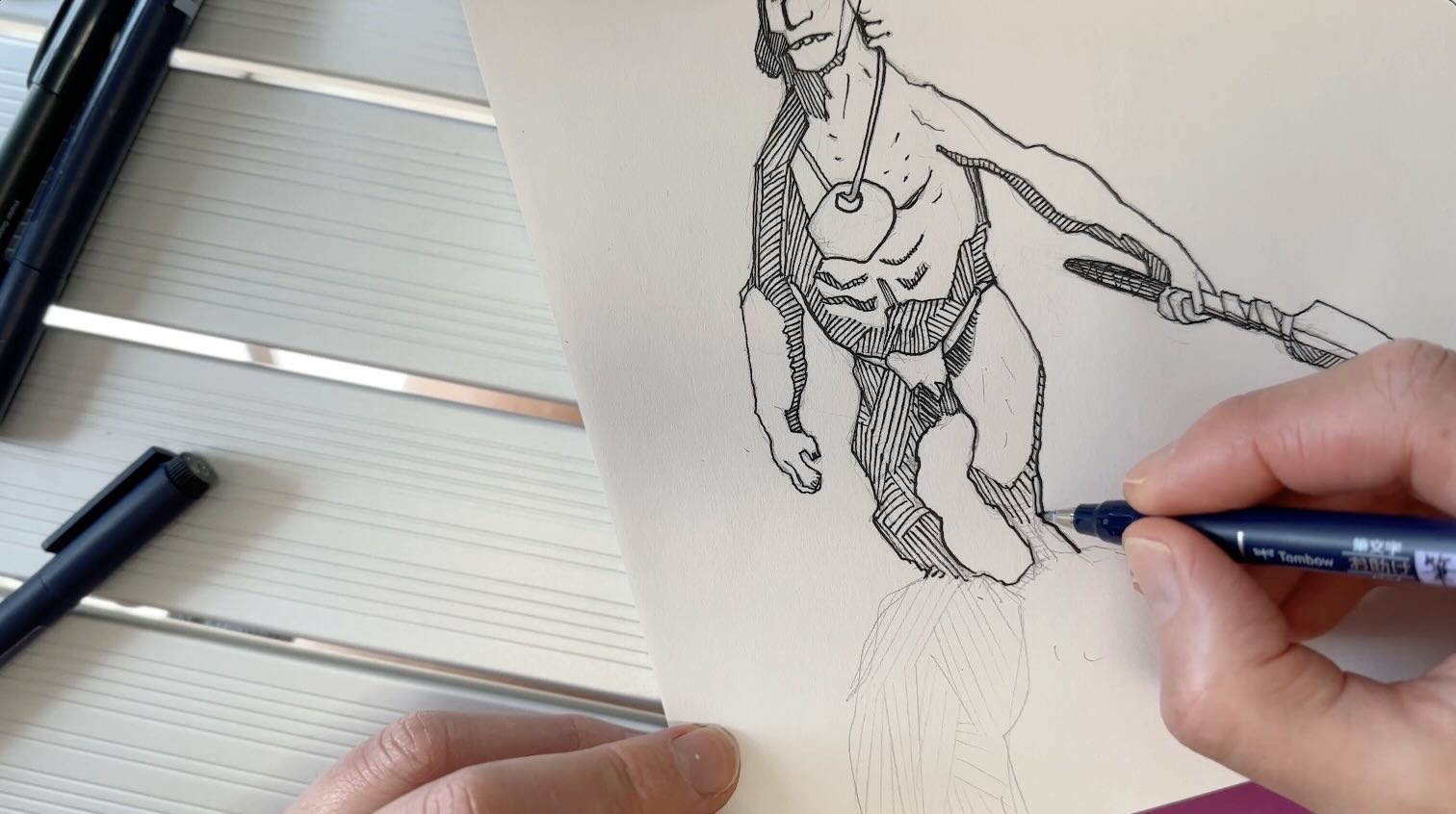
Note in the example below, how the perspective for the weapon is visually accurate. Also, the anatomy of the hands are convincingly realistic.
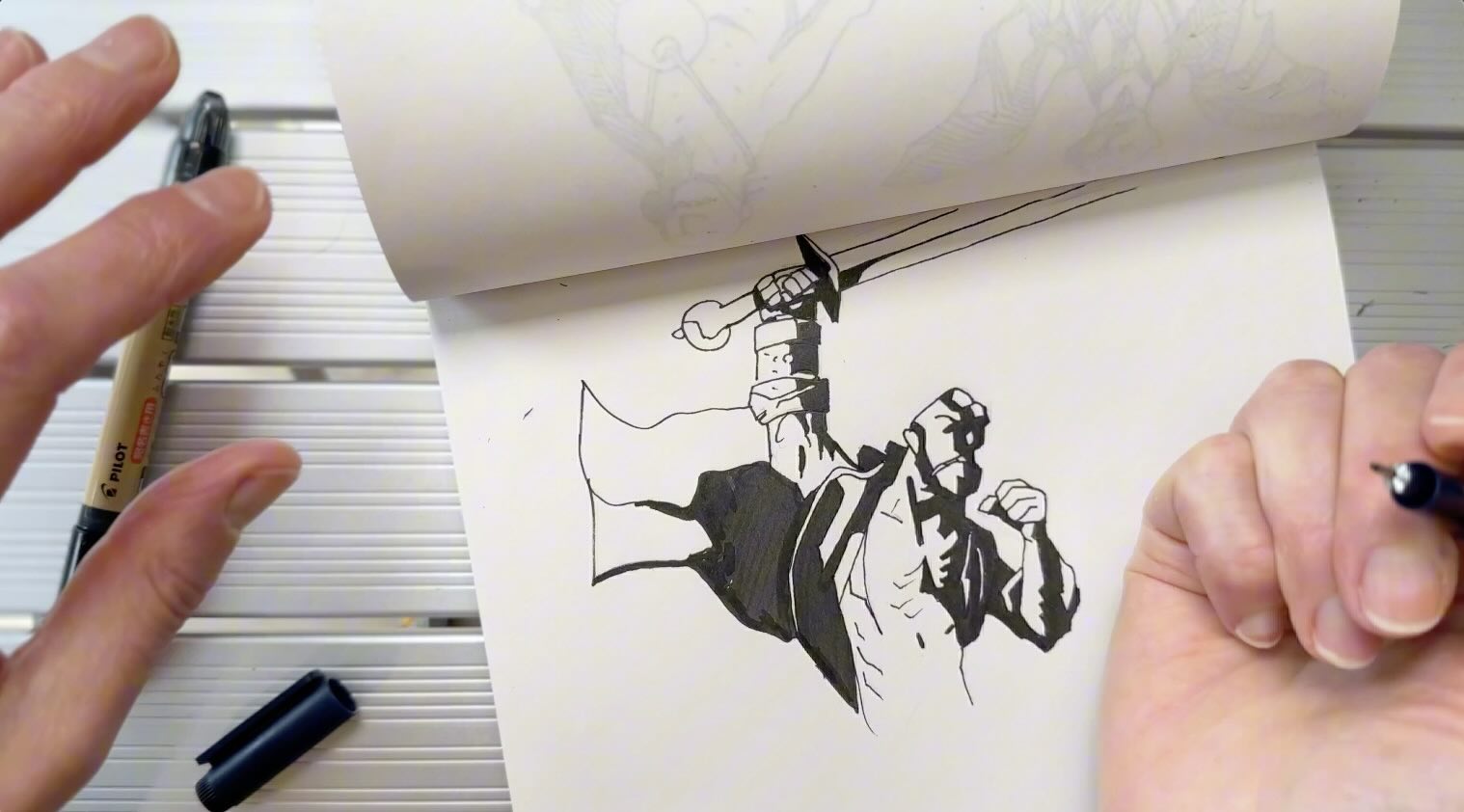
Yes, the proportions of the character are exaggerated for style, yet everything is scaled relatively. The body parts which are closest to the viewer are proportioned in relation to the body parts further in the picture plane.
In the example, below, look at the way the loincloth hangs off the character’s pelvis and where the legs come out. How the drapery is shaped by using downward strokes describes to the viewer that the character’s ribs and belly are heavy.
There is a loose freeform feel to his drawings, but it’s deceptively calculated.
The details are tightly polished. The result is a deliberate combination of loose, precise strokes.
And you’ll realize this for yourself, through repetition.
These are not techniques I would have picked up on observation alone. It was only after my 4th study that I started to notice those little things.
This is why I recommend doing at least a dozen sketch studies of his illustrations or more before forming an opinion.
How to Practice Mignola’s Drawing Style
To practice Mignola’s drawing style, using his finished illustrations as a reference isn’t all that helpful. Instead, search through his sketches.
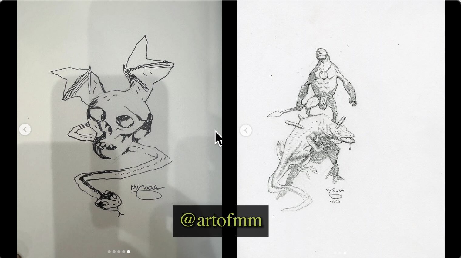
In Mignola’s Quarantaine Sketchbook, we see his construction lines and the stroke direction he used.
Even though those hatched pencil sections will be filled in with solid black at the inking stage, he stylized the strokes anyway.
The way he pencils his underdrawings ensures all the major decisions are made prior to doing the inks.
The level of professionalism seen in his sketches is carried all the way through. That’s why he’s ranked high above the expert scale.
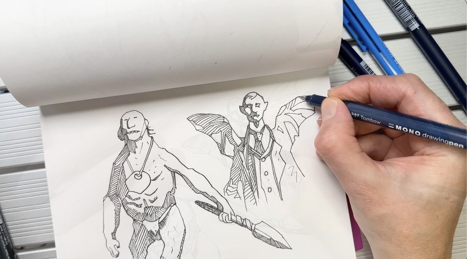
I’d love to get my hands on a physical copy of the Quarantaine Sketchbook in the future, meanwhile, I found sample pages on Amazon, on his Instagram and there are several flip-through videos of it on YouTube. You’ll find more links to the resources mentioned at the end of this article.
In some of my practice sessions, instead of filling in the solid shadow blocks with black, I used hatching strokes. I tried to mimic his pencil strokes from the sketches.
This helped me get a clearer sense of the angles he used.
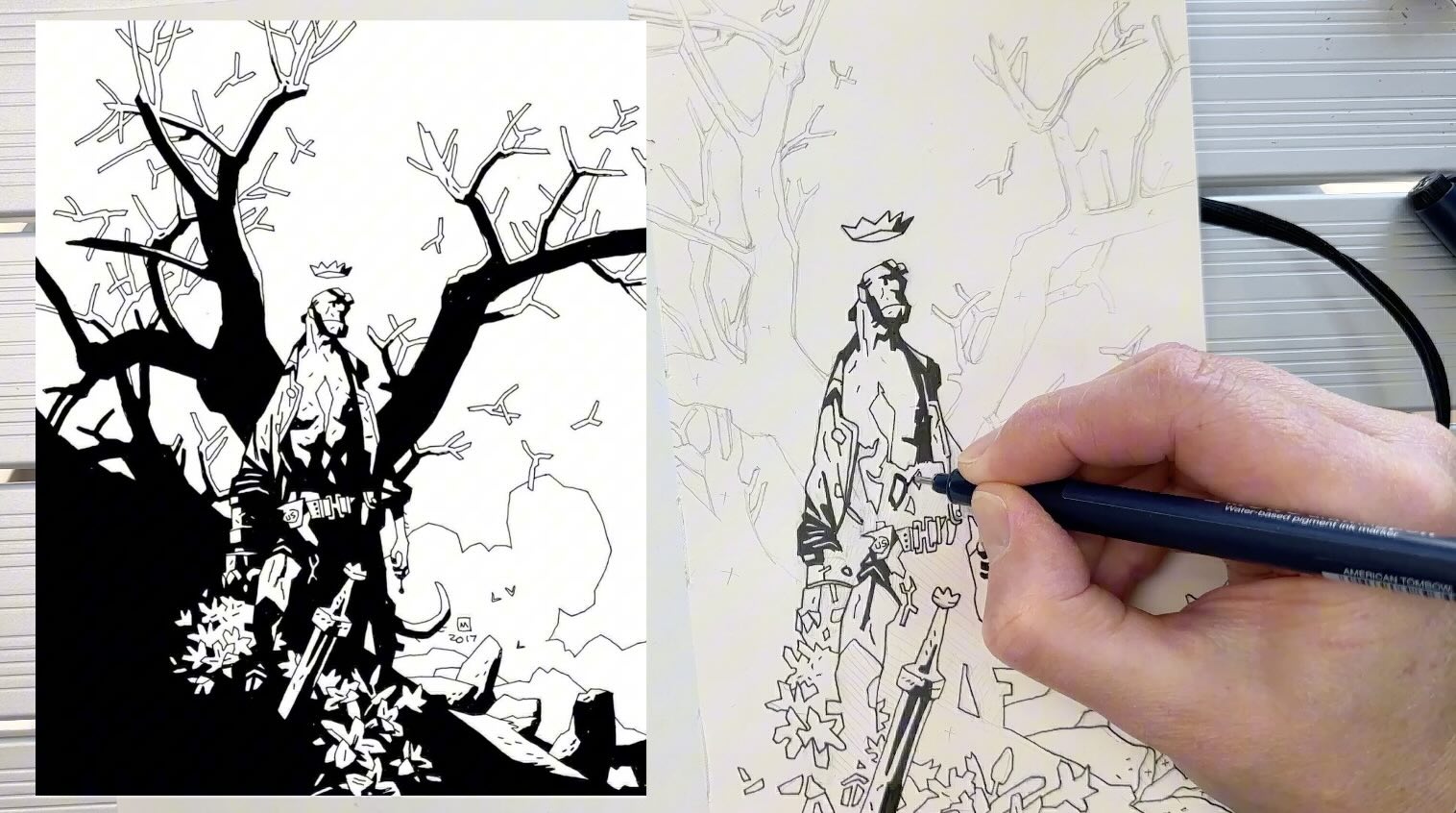
In my final study of Hellboy below, to not accidentally ink sections that are intended to be left white, I indicated where the solids would go – either with pencil hatches or small ‘x’s.
Mignola adds a contour line to everything, and so I did the same.
Then, I used a thicker-tip pen to fill in the solids.
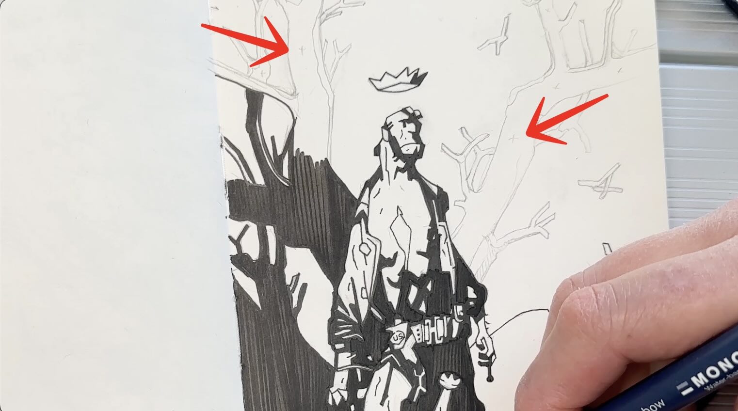
After two weeks of studying and practicing Mike Mignola’s drawing style, it was time to apply what I learned to my own subjects.
How to Apply Mignola’s Style to Your Subjects
You can apply Mignola’s style to a subject of your choice. I recommend starting with a single element rather than a complete scene. Ease into it.
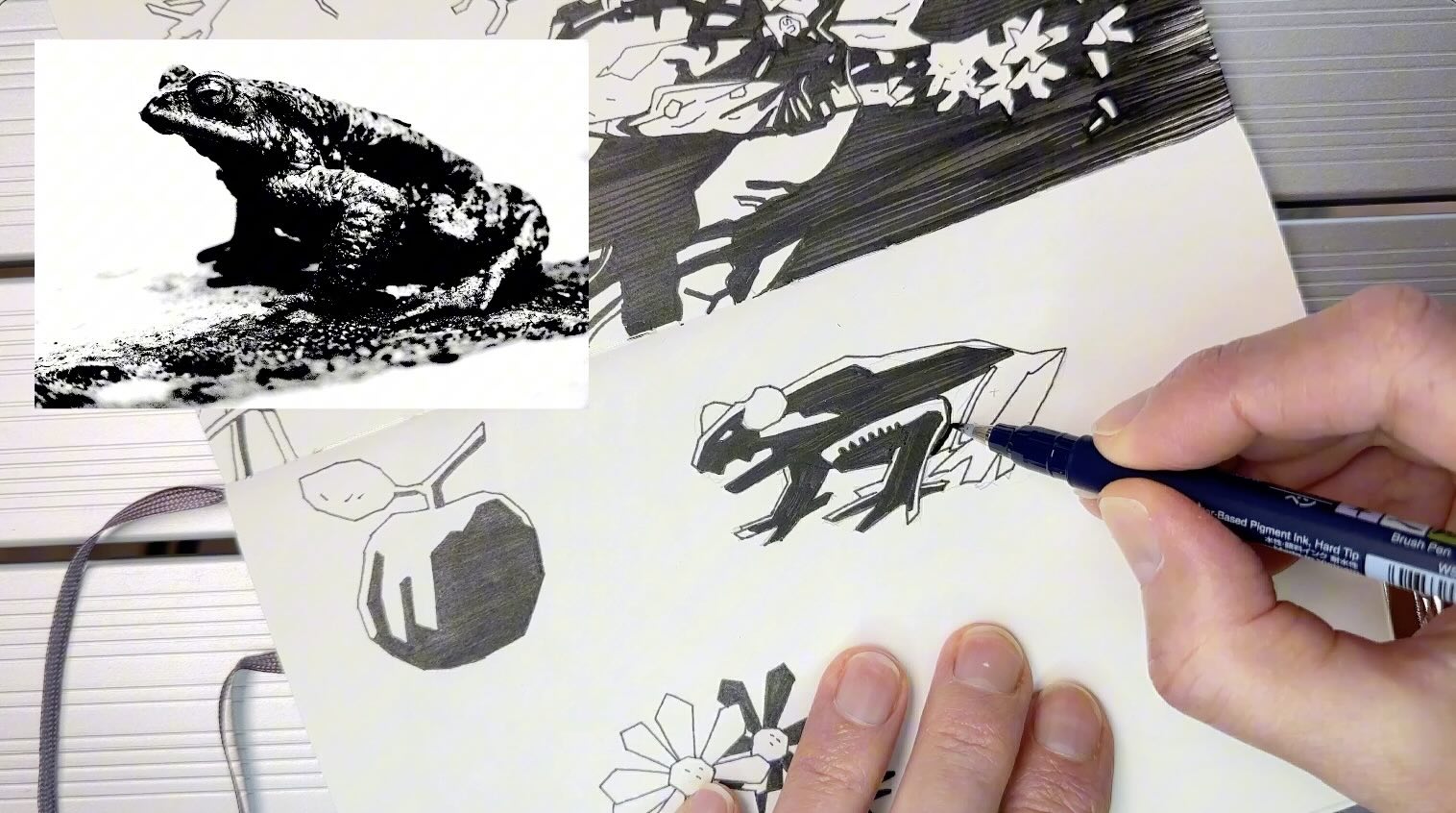
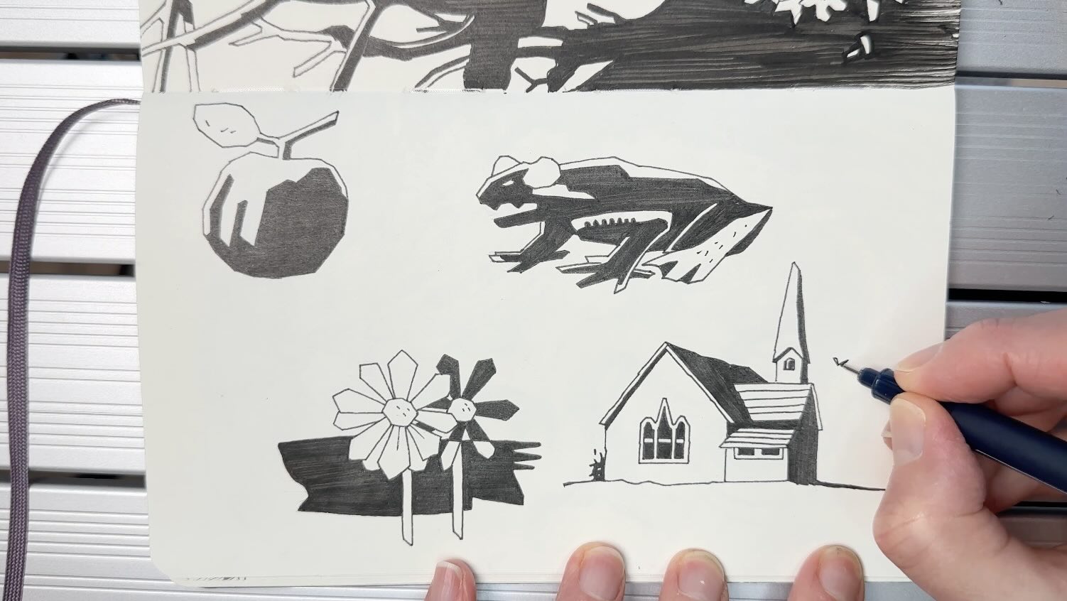
To demonstrate how to incorporate Mignola-isms into your creations, I gathered 4 copyright-free references; an apple, daisy, toad, and church building.
It’s helpful to convert the images to greyscale and maximize their contrast levels. You can do this in any basic photo image program.
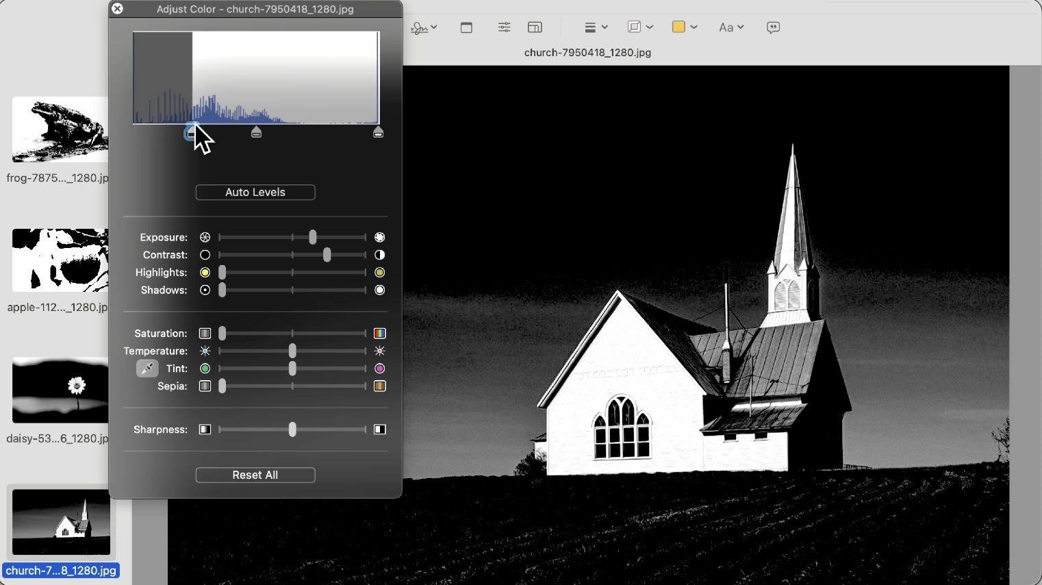
Subject 1 – Angular Shape and Line Weight
I rough sketched the apple as I normally would.
Then to Mignolize it, I chopped away the roundness into blocky angles.
For the contour line, I used a 03 fine liner pen. Mignola doesn’t taper his strokes from thick to thin, he uses a single line weight throughout the illustration, so you only need one tip size for the contour lines.
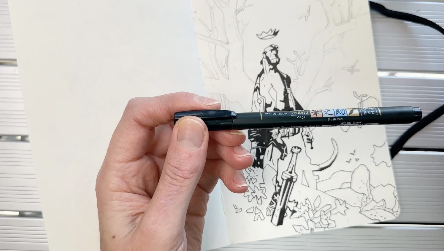
I used my Tombow Fudenosuke Brush Pen to fill in the solids. Mignola primarily uses brushes with ink (Higgins Black Magic India Ink) and often markers.
Then finished off with a few dash hatches on the leaf to indicate the form, in the Mignola style.
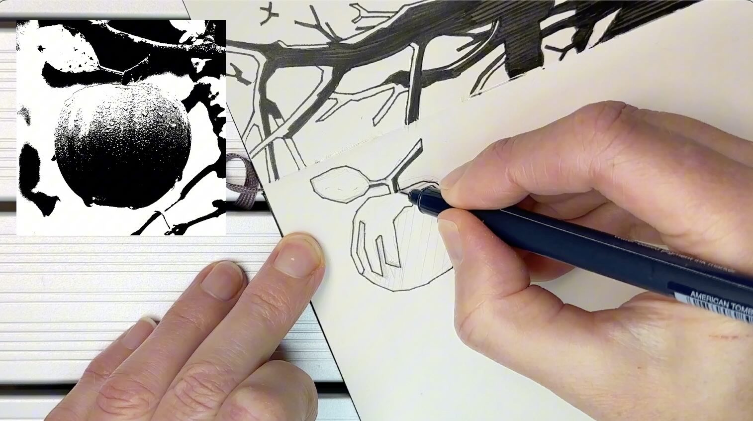
Subject 2 – Reversed from Background
I added a second daisy and a background to try the reversed overlap effect Mignola uses in compositions.
Even though the flower looks cartoony using the Mignola angular shapes, you’ll note that the contour lines are joined cleanly.
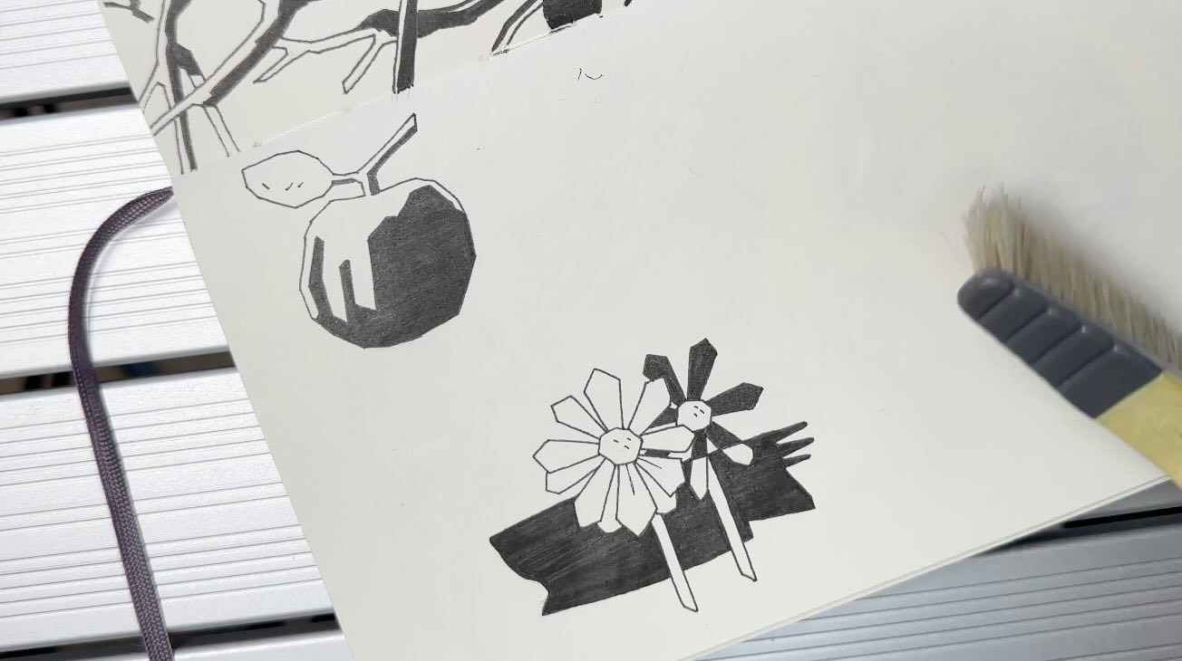
Below is an example of a stroke that is not cleanly executed, the lines either cross over another or are incomplete.
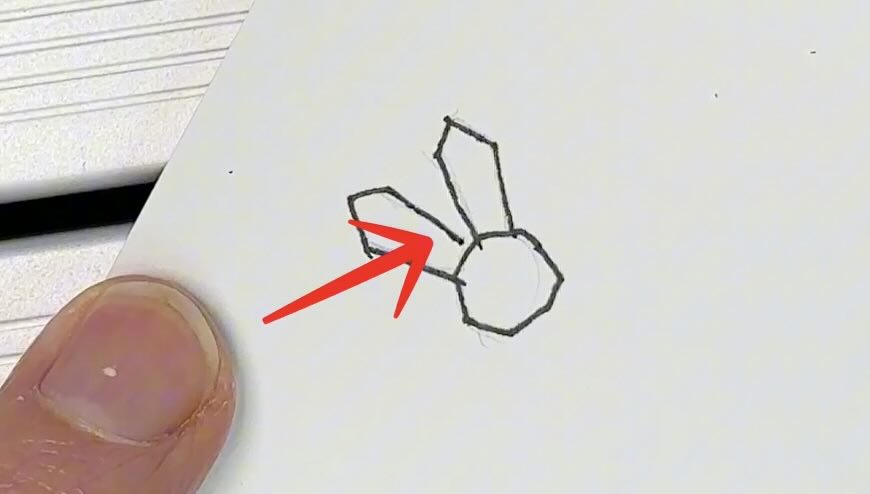
Mignola keeps his strokes neat, never rushed or scribbly.
Some artists will use whiteout gouache to make corrections, but Mignola does it right the first time.
That’s another reason why Mignola’s work is legendary!
In general, it’s a good habit to aim for clean lines (avoid whiteout), especially if you intend to sell your original artwork to collectors.
Subject 3 – Paper Doll Hands and Gapped-Tooth Hatches
This toad creature is perfect for doing the blocky shape shadows, paper-doll hands and the gapped-tooth hatches.
As mentioned, Mignola doesn’t use gradations or tone so I aimed to space the gapped tooth hatches evenly as he does.
Subject 4 – Blocky Buildings
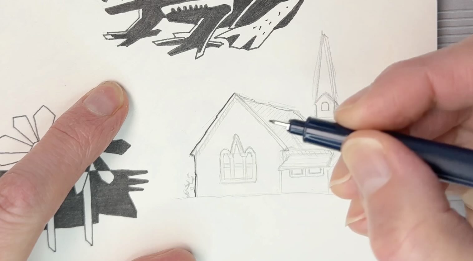
Even buildings will have that blocky look. All the lines are sloped to a slight degree, they’re not straight.
I hope that you enjoyed learning more about what Mike Mignola is known for and that you’ll use these tips to practice his style and apply his techniques to your own subjects.
Looking for a step-by-step guideline on how to do Master Studies? Check out the Ultimate Master Study Checklist in my shop.
Resources
- How to Do Master Studies: Read Blog | Watch on YouTube
- Mike Mignola’s Instagram
- My Instagram
- Mike Mignola, The Quarantine Sketchbook
- Staedtler Technical Pencil
- Staedtler Rotary Sharpener
- Staedtler Plastic Eraser
- Tombow Fineliners
- Tombow Fudenosuke Brush Pen
- Speedball Art Flexi Sketch Pad 8×8
- Moleskine Sketchbook




I enjoyed this exploration of mignola’s style. I found your lesson easy to follow and useful.
That’s great! Thanks Chris, I wish you the best with your art projects.