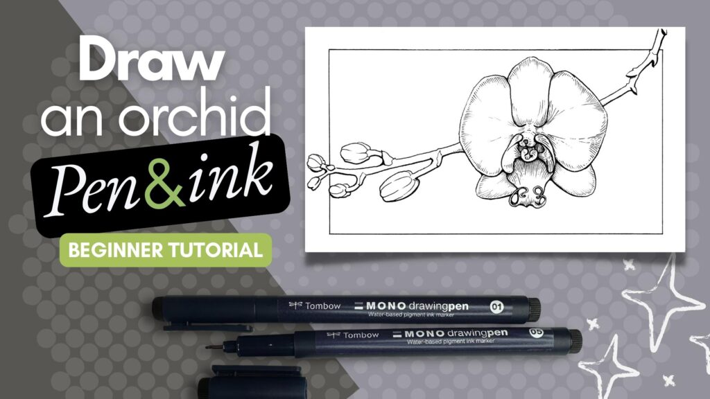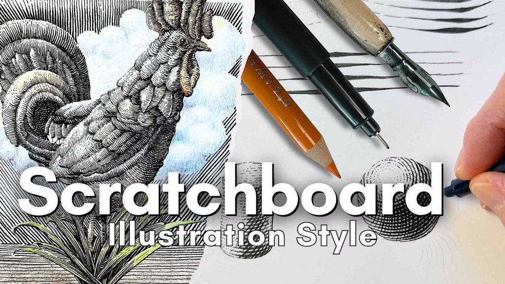
In this article, we explore the mark-making illustration style inspired by scratchboard and engraving techniques with pen and ink.
//DISCLOSURE: I earn a small commission when you use my affiliate links to make a purchase. Visit the Terms page to learn more.
Engraving Illustration Style
Scratchboard, etching, and engraving use different methods, but the illustrations all have a certain look about them.
Engraving uses instruments to carve onto wood or a steel plate; the ink is then transferred into the grooves and onto paper in the printmaking process.
Scratchboard uses instruments to carve into pre-inked clay boards to reveal the layer underneath.
Both methods have you working in reverse, where you remove the medium in order to see the image.
However, what we’ll be practicing today is the illustration style that resembles the effects of engraving and scratchboard. We add the medium to create the image.
In this beginner-friendly step-by-step pen and ink tutorial, we will:
- Practice the marks that create the illusion
- Apply the technique to basic shapes
- Bring it all together in a final project

Tools and Supplies
Sketching and Inking Supplies
For drawing, a pencil and eraser. I’m using an H lead. A plastic, and also a kneaded eraser.
A ruler, and if you have geometric templates, great.
For inking, a set of fine liner pens.

- Staedtler Lead Holder
- Staedtler Carbon Lead, 2mm, H
- Staedtler Rotary Lead Sharpener
- Faber-Castell Kneaded Eraser
- Staedtler Mars Plastic Eraser

If you’re keen to use dip pens, I’ll demo with those as well. Any of the pointed nibs will work, preferably mid-sized bowl nibs (like the ones pictured below), and your drawing ink of choice.
🎓 Interested in trying dip pens for your projects? I have a full course on that. Visit the Courses Page to learn more.
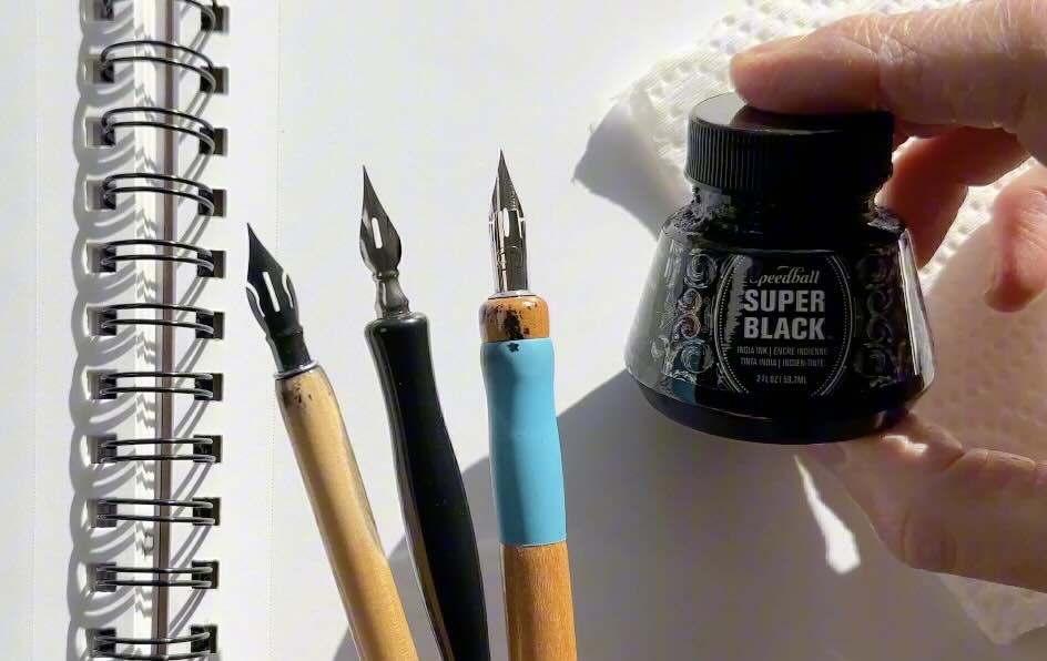
I’m using a carbon-pigment mix waterproof India ink.
- Tombow Fineliners Set
- Speedball Super Black India Ink
- Purple Pumpkin Nib
- Tachikawa Nib
- Speedball Dip Pen Set

Paper
Preferably a paper surface that works for both graphite drawing and inking, not too toothy. We’ll be applying ink to all of our sketch exercises.
To demonstrate the final project, I’ll be switching to my Moleskine sketchbook. It’s a cold-press paper that handles mixed media.
I’ll be using pencils for colouring the line work.
- Canson Pen and Ink Sketchbook
- Moleskine Arts Sketchbooks
- Faber-Castell Coloured Pencils
- Primacolour Pencil Sharpener

Otherwise, of course, use the materials you have on hand.
Understanding Lighting and Shading
‘Lighting and shading’ is the most important fundamental to understand when it comes to executing this style.
The key to producing the effects of this style relies on line quality.
Line quality is the variation of line weight (thin to thick).
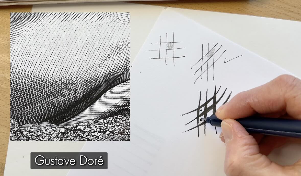
In some illustrations, particularly in an engraving, we get the impression of a continuous line that thins and swells as it snakes its way along and across the forms in the composition.
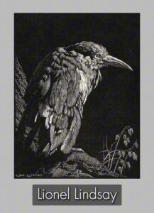
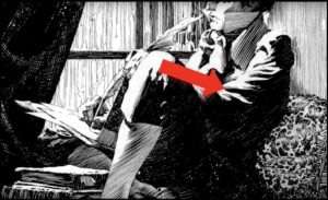
For this Gustave Doré engraving you can follow the line as it contours the folds, it swells to solid black in the shadows and thins out in the highlights.
So, what determines the thickness of the line is the source of light. For this, we need to understand the principles of lighting and shading as it pertains to form.
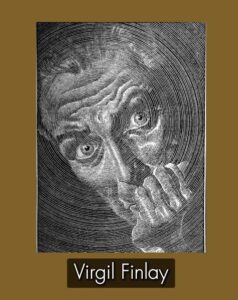
In this Bernie Wrightson illustration (below-right), again looking at the drapery of this shirt, whatever is concave, such as the bulges in the fabric, is closest to the light source.

In pen and ink, a ‘highlight’ is often interpreted by using sparse rendering or none, leaving the white of the paper blank.
Following that logic, the areas that are convex or simply further from the light source, are then darker. Meaning, lots of rendering or solid black in those areas.
In simplified terms, using this technique of mark-making, the strokes are like bumpy waves that thin and swell depending on their exposure to the light, as they contour the form.
All the values in between are there to describe how close or how far that wave is to the light source.
Then there are cast shadows, but for now, let’s see how these principles translate to our desired mark-making technique.
Mark-Making Technique
Let’s have a look at the mark-making techniques.
We said the thickness of the line is dependent on the amount of light coming through.
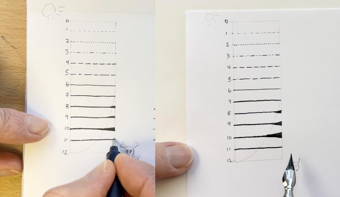
Since the marks are affected by the values, it makes sense to start with a values scale.
But rather than a traditional scale with value-squares, for this exercise, we’ll assign one value to each stroke, and call them “value weights”.
In pencil, sketch a vertical rectangle, 3 inches tall and 1 inch across. (~2.5 x 7cm). Add tick marks as guides along the side of your rectangle, ¼ inch apart (1/2 cm). Join the notches with horizontal guidelines.
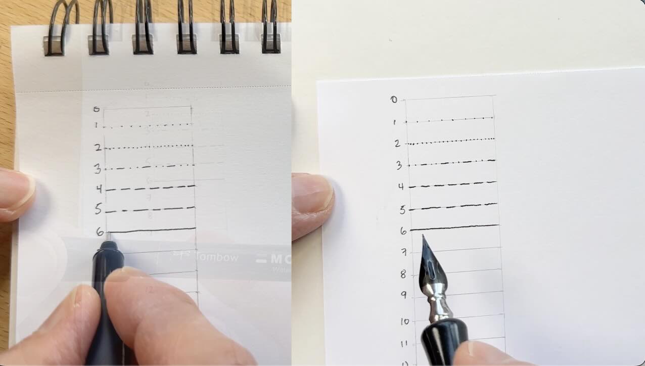
- 0 – the top line is blank for the “zero weight”. Go ahead and number these down to 12.
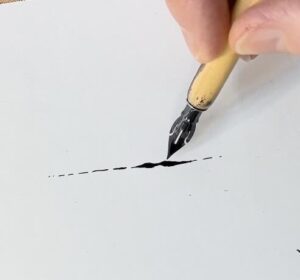
- 1 – the number 1 weight are light dots spaced wide apart. If you’re using a ine liner, use an 01, with a dip pen, ink lightly without applying pressure on the nib.
- 2 – the second weight is a lightly dotted line, spaced evenly apart.
- 3 – Next, every second dot turns into a short dash.
- 4 – Now dashes only.
- 5 – Next weight, short and long dashes.
- 6 – Now we have a solid line
So far, the lines have equal width, so the same line quality in terms of weight.
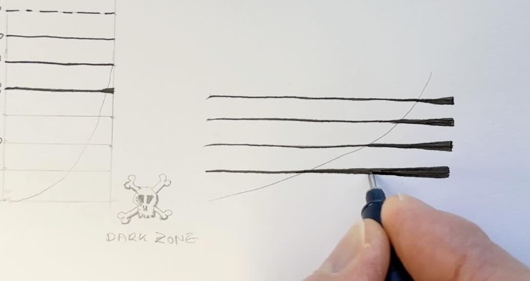
- 7 – For value-weight number 7, go one size up or use pressure on the nib, or double it for a thicker line than 6.
- 8 – Now it gets interesting, we’ll say it’s sunny on the left side, the right side is in shadow. In pencil draw a vertical curved line, start it at the end of 7, diagonally across to the start of 12.
At the start of the dark zone, thicken either side of your main line. Closeup, looks something like this (pictured above):
- You have your main line, the start zone here, add one line on this side, build it up gradually in the shape of a wedge. Repeat on the other side, so it looks like a long skinny triangle.
- One you get the principle, aim for a smoother transition.
- 9 – Go up a tip size for no9. And continue to build the weight of it.
- Repeat the process of incrementally increasing the thickness of the line, as you progress to 10, 11, and 12 of your weight-value scale.
In pencil draw 5 wavy lines. With the light on the top left-hand corner, we’ll start with the base value-weight, the bump in the light, that’s our value-weight 1 to 4 and the base line is 6.
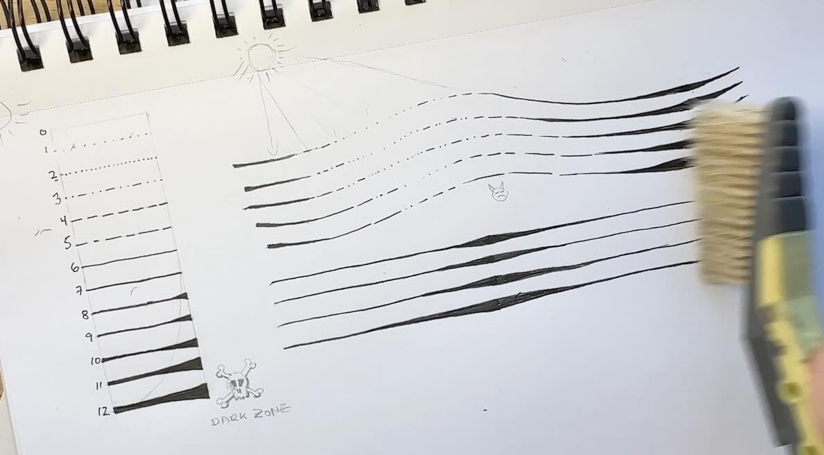
As we get closer to the dark zone, the line weight values match.
For more practice with the thickening wedge lines, especially with a dip pen, I highly recommend the exercises from Arthur Guptill’s book.
Mapping the Subject
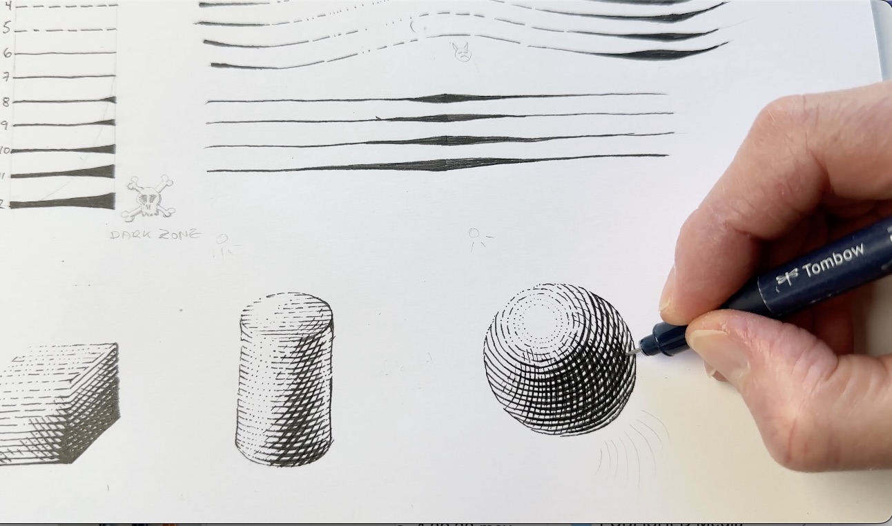
Let’s practice mapping a subject. We’ll render a square box, cylinder, and a sphere.
Square Box
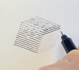
We begin with a basic square. Measure out a 3/4 inch square (1.9cm).
Then turn your square into a 3-dimensional box – no need for perfection, just convincing enough.
Now add horizontal guidelines to each panel, equal strokes apart.
(pictured below)
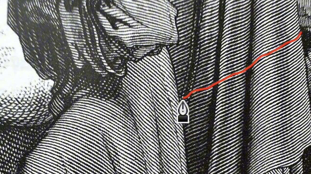
What makes this technique different is that the rendering is primarily a cross-contour line going across the forms and around the form. You see here, the linework isn’t up and down, it contours around.
At the inking stage, we’ll add another line in between the guides, so the rendering is even tighter.

With the source of light at the top left-hand corner, start rendering the top panel as the lightest. We’ve already practiced this, so go ahead and shade it with our line weight values 1 to 5, I’m using a 01 tip.
The front panel fades from 3 to 6. The back panel starts at 6 then to 7. This is our first pass – Remember that the thicker ‘weight values’ we build on top of number 7.
Now go ahead and wedge your lines from top to bottom, and dark to light, starting with the front panel.
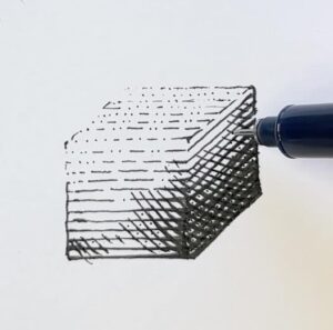
Now add the contour line, leaving some gaps where there’s more light.
Another characteristic of this style is that there’s sometimes cross-hatching but it has a particular shape. It looks more like a knit.
Avoid the square-hatch look. We’re aiming for more of a diamond pattern. The sweet spot is between 30-45 degrees (pictured below).
And it looks even better if you put a slight curve to your crossing strokes.
And with the wedge treatment, where the lines cross is where the dark zone happens.
Some artists place a dot in the center like master Doré (pictured below).
Let’s apply a cross-hatch texture to our box, keeping in mind the source of light.
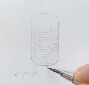
Cylinder
With the cylinder, we’ll use the same principle, map the lines across the form, which is now curved.
We also place vertical guidelines to indicate the highlight, and core shadow – our dark zone. Since this object is more rounded, there will also be a ‘reflected light’ close to the edges.
Same process as for the box, starting with my smallest tip for the baseline weights, remember to use the lighter weight-values on the highlighted part of the cylinder
Erase the pencil lines and touch up the outline. Optional to add a cross-hatching.
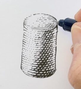
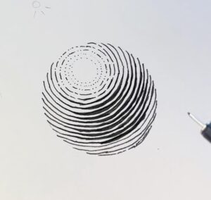
Sphere
I’m using a plastic circle template to draw the sphere. Add a smaller circle to indicate the highlight.
The cross-contour guideline unwinds from the highlight circle, then progressively unravels. This takes a bit of patience.
Go ahead, starting with the highlighted area with your 01 pen, then switch to the 03 for the remainder of the base weight on the first pass.
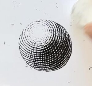
For the next pass, we start to build the weight of the core shadow, then transition the mid-tones, and keep adjusting the values to make the sphere appear round.
I think it looks good as is after the second pass, but let’s layer in a bit of cross-hatch in the darkest area. My hatch came out a bit too square, so I’ll keep the wedges a bit more subtle.
And finish by erasing the graphite.
Final Project
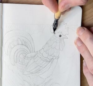
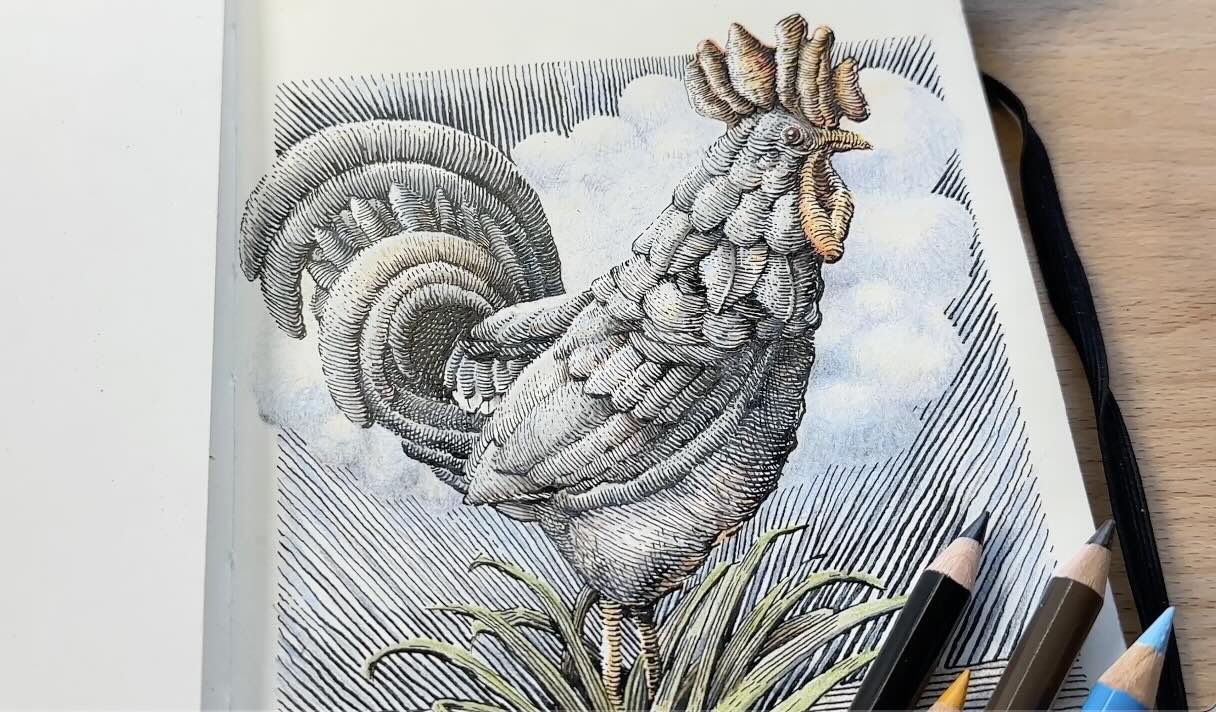
I’ve now switched to my Moleskine sketchbook to demonstrate the technique with a final project.
I’m referring to a royalty-free image of a rooster for proportions, but simplifying the design.
Once the basic shapes are laid down, we can refine the details. The rooster’s feet are not visible in the reference, so I’m using blades of grass (in place of feet) to balance the composition.
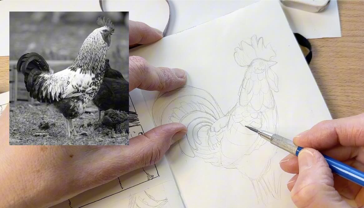
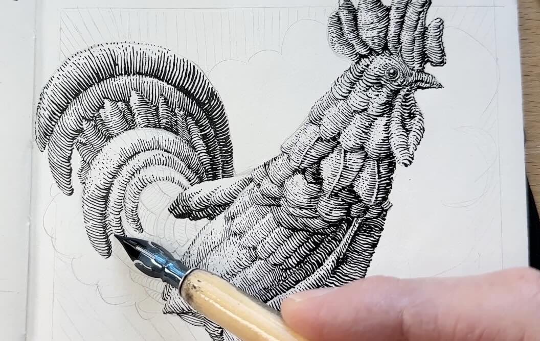
Next, map the rooster design with contour guidelines. To save time, I’ve spaced the lines further apart in some areas but intend to add lines in between at the inking stage.
For the ink application, I’m using a Purple Pumpkin dip pen.
The Purple Pumpkin produces a broad range of line weights. Using this pen, the thin-to-thick line quality practiced in earlier exercises can be accomplished nearly in a single stroke.
This means that instead of doing 3 passes with the ink, you do one or two.
Because of this, it might look like all the values in the illustration are correct on the first pass. But the mid-tones and contrast will need refinement in a second pass.
You might wonder if it’s better to use a dip pen than fine liners to emulate the scratchboard/engraving technique, but it’s a toss-up.
Using a dip pen requires more control, therefore, it presents a risk of messing up the values with accidental excess pressure. And there’s a danger of smudging wet ink.
It’s more possible to correct mistakes with a fine liner than with a dip pen piece.
With a dip pen, there’s extra time spent re-dipping in ink and keeping the nib clean while in use to ensure proper ink flow.
It probably takes the same amount of time using a dip pen as it does fine liner pens for this technique.
The main benefit of inking with a dip pen (and liquid ink) is how dark and clean it looks.
Plus, once dry, you have plenty of options for colour mediums:
- Watercolours
- Gouache
- Markers
- Coloured pencils
- Coloured inks
- Pastels
- Acrylic Paint
📋 Resources
📗 Books ↓↓↓
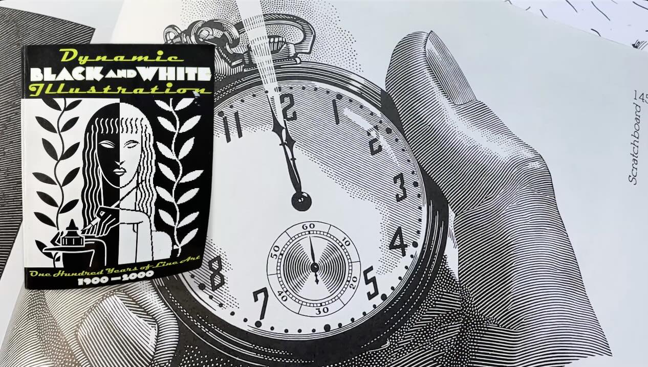
Dynamic Black and White, Leslie Cabarga
Rendering in Pen and Ink, Arthur L. Guptill
The Doré Illustrations for Dante’s Divine Comedy
Perrault’s Fairy Tales with Illustrations by Gustave Doré
Bernie Wrightson’s Frankenstein
🎓 My Courses ↓↓↓

✒️Tools ↓↓↓
- Staedtler Lead Holder
- Staedtler Carbon Lead, 2mm, H
- Staedtler Rotary Lead Sharpener
- Faber-Castell Kneaded Eraser
- Tombow Fineliners Set
- Speedball Super Black India Ink
- Purple Pumpkin Nib
- Tachikawa Nib
- Speedball Dip Pen Set
- Faber-Castell Coloured Pencils
- Primacolour Pencil Sharpener
- Canson Pen and Ink Sketchbook
- Moleskine Arts Sketchbooks
- Adjustable Tabletop Easel