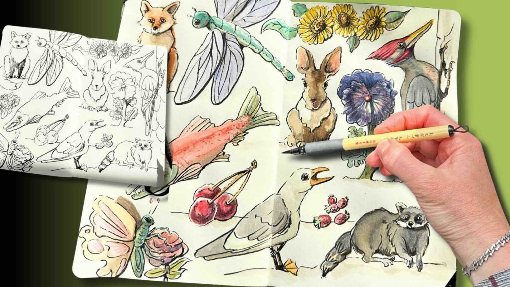
In this relaxed atmosphere step-by-step lesson, we’ll practice inking using a brush pen, then colour various subjects with watercolours.
At the end of this article, you’ll have a pleasing composition in a sketchbook of furry animals, fish, bugs, and berries rendered in a whimsical style.
//DISCLOSURE: I earn a small commission when you use my affiliate links to make a purchase. Visit the Terms page to learn more.
Cozy Sketchbook Doodling
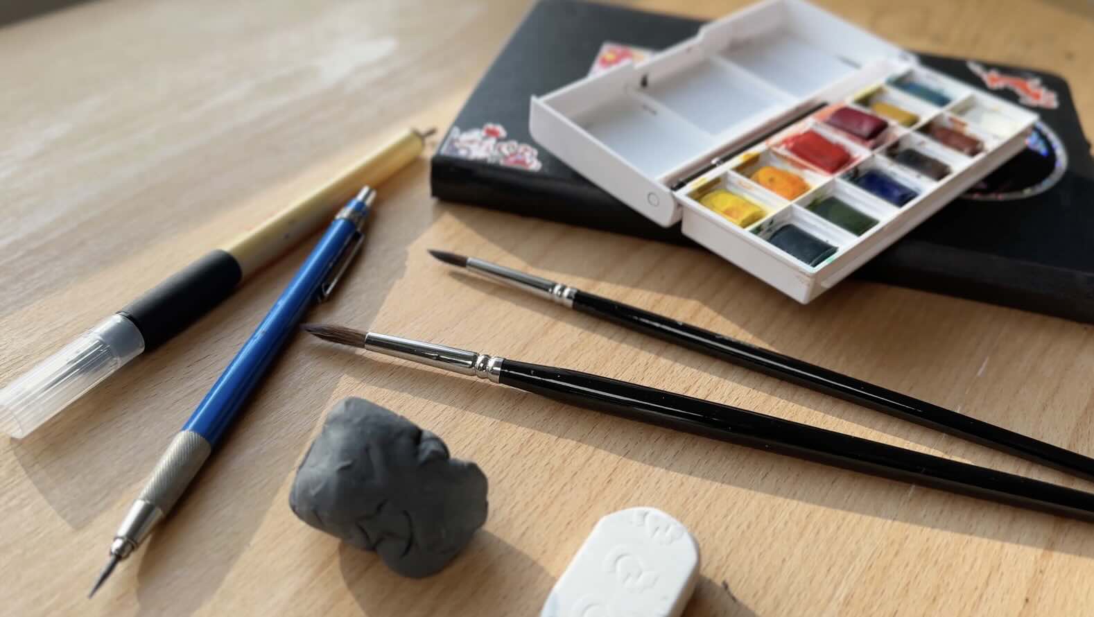
Tools and materials:
- Pencil and eraser – preferably a kneaded eraser
- Brush pen – make sure it’s waterproof or water resistant when dry
- Sketchbook – ideally a smooth, cold-pressed paper for mixed media
- I’ll also be using watercolour pigments and brushes.
Of course, use the materials you have on hand.
You’ll learn more about the tools and materials I’m using as we draw along. The full list of supplies is listed in the Resources section at the bottom of this article.
Sketching Subjects in Pencil
In this section, we’ll follow the same formula for each subject.
- In pencil, start with a rough sketch to define the main shapes.
- Lighten the ‘finding lines’ with a kneaded eraser.
- Refine the drawing until you’re happy with it.
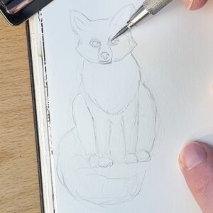
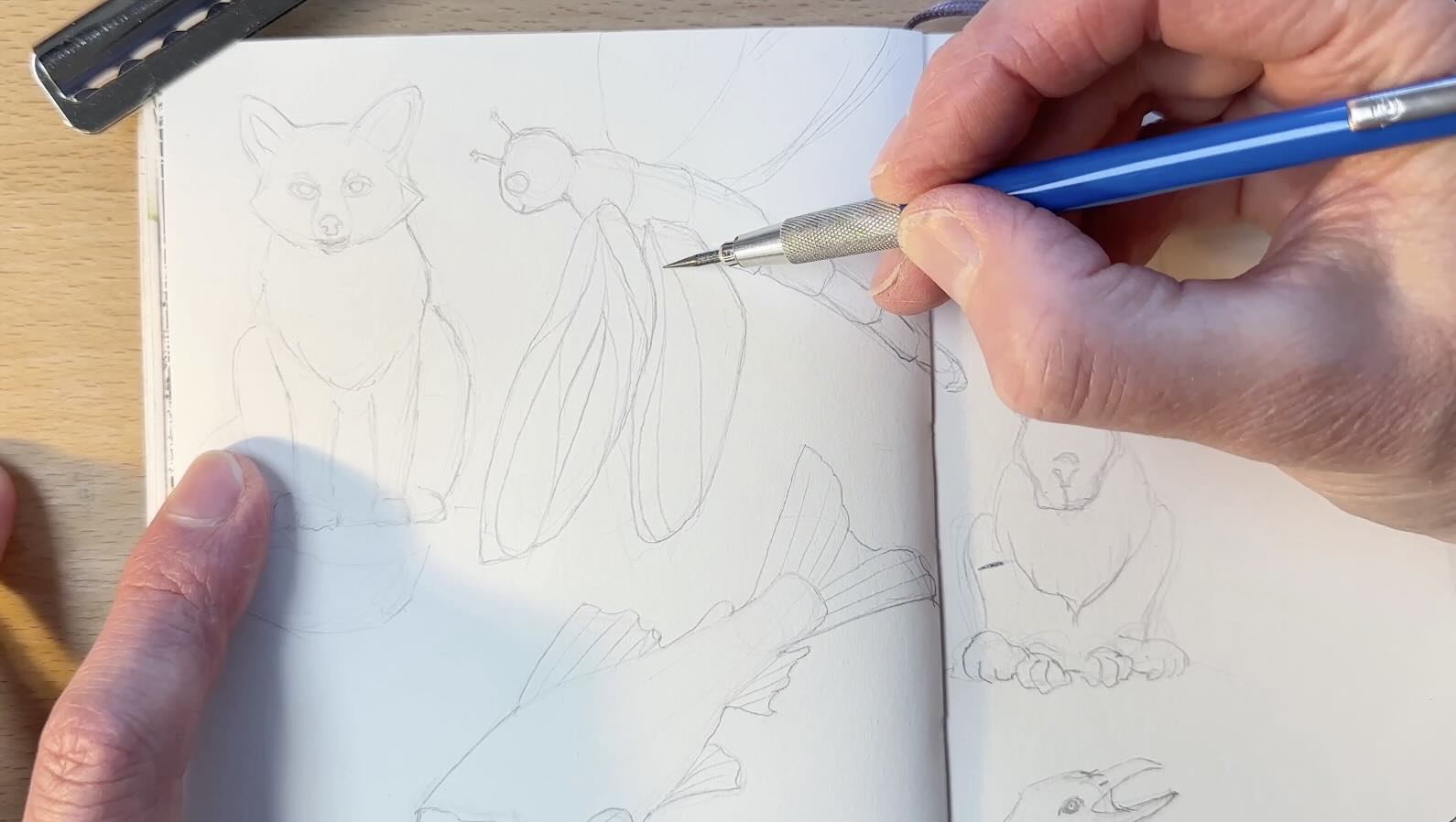
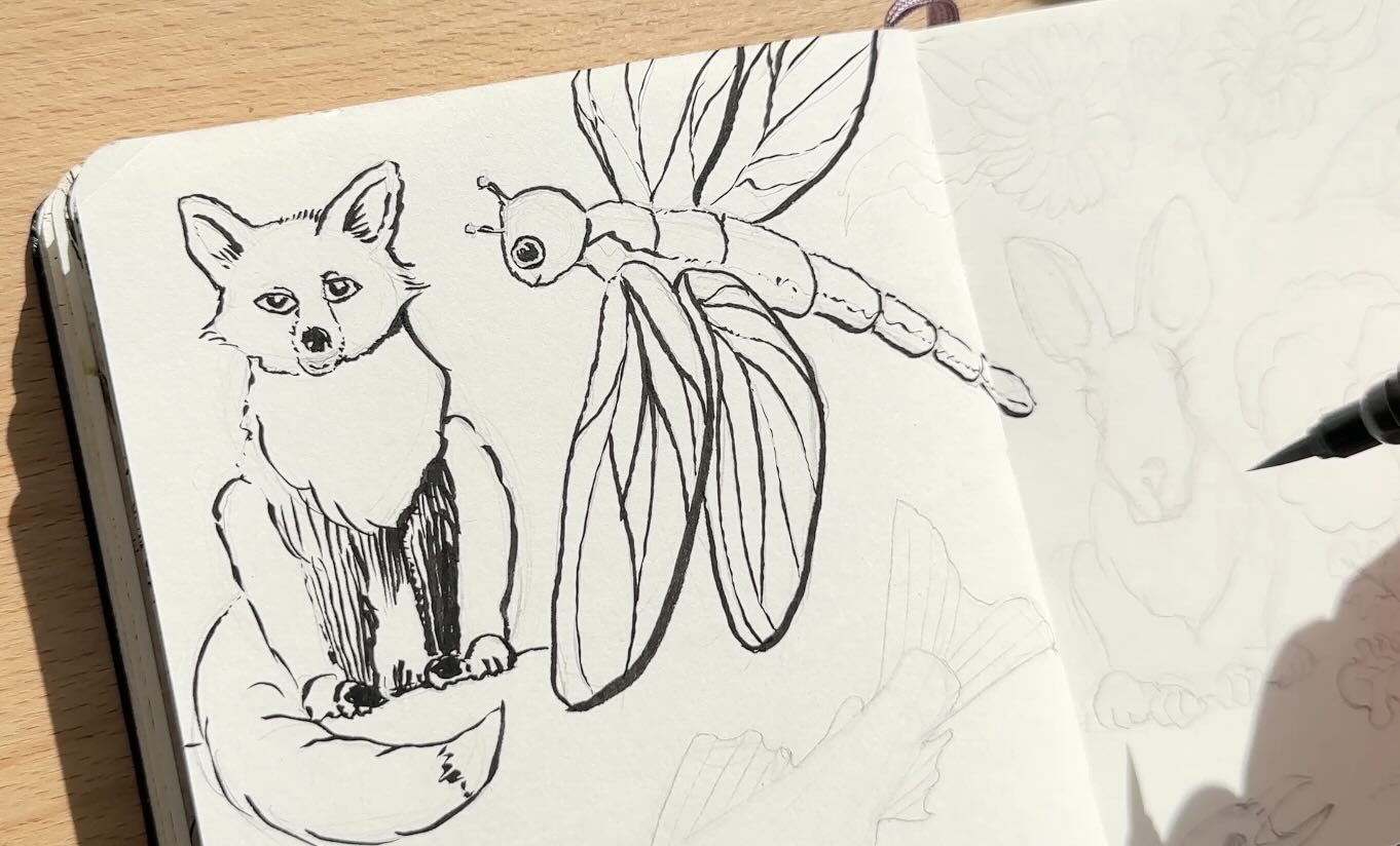
Fox
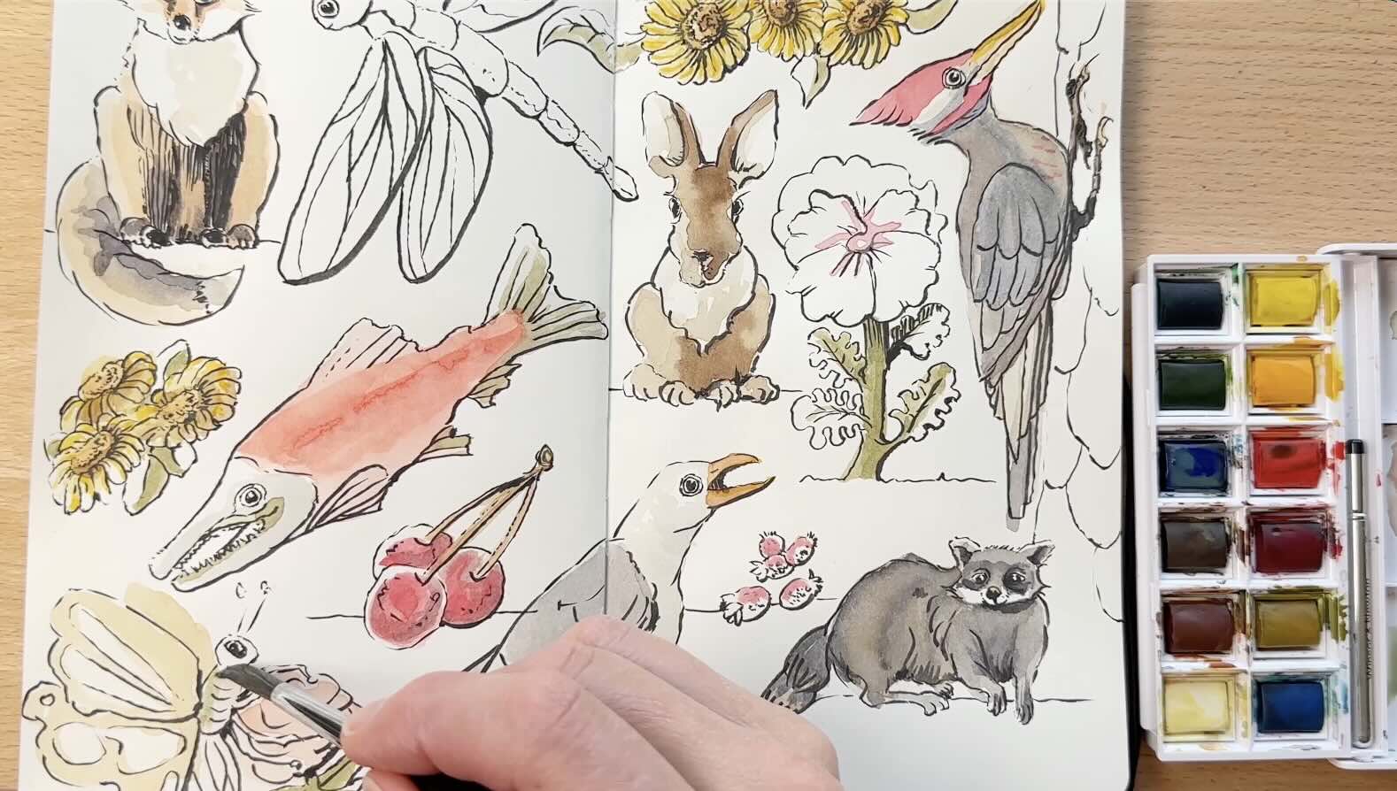
Top, left-hand corner, in my Moleskine Arts sketchbook, I’ve gone ahead, with our first subject, a cute fox.
Starting with a circle for the face and a triangular shape for the body.
Then add the Fox’s:
- ears
- face
- long skinny snout
- almond-shaped eyes

He’s in a sitting position:
- front legs
- back legs
- fluffy tail
Don’t worry about proportions. Aim for representational rather than realistic. It’s intended as a whimsical style.
Once you have the rough shape of your fox, lift off some of the ‘finding lines’ with your kneaded eraser. Press down on the drawing with the eraser until the lines are very light.
With your pencil, go over the lines you like. Continue to refine the sketch until you’re happy with your fox.

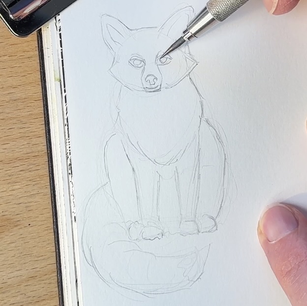
I’m using a technical pencil because I like the balance of it in my hand. I prefer an H lead for sketching for these types of projects because it’s less prone to dent the paper or leave graphite residue on the paper.
Residue graphite on the paper surface can sometimes interfere with the ink or any other medium you’re using. Like today’s watercolours.

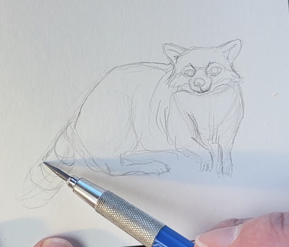
Racoon
Travelling to the bottom-right-hand corner of your sketchbook, sketch a circle for the head, another oval shape to indicate where the bum goes, then connect those two shapes.
Our creature is in a sideways crouching position. Adding ears, a face, front legs …. it’s a rough guide of… what is it?
Hello raccoon!
Pick up the rough marks with the kneaded eraser first, so that you can better refine the sketch.
Refine the drawing by giving your raccoon that distinguishing fluffy masked face.

Give your raccoon:
- long-fingered paws
- a hunched body
- a striped tail
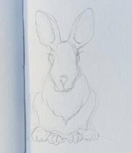
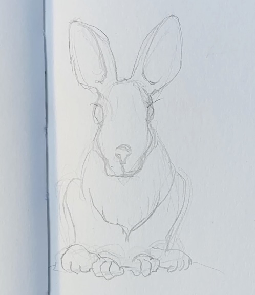
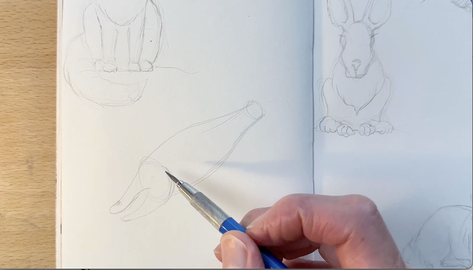
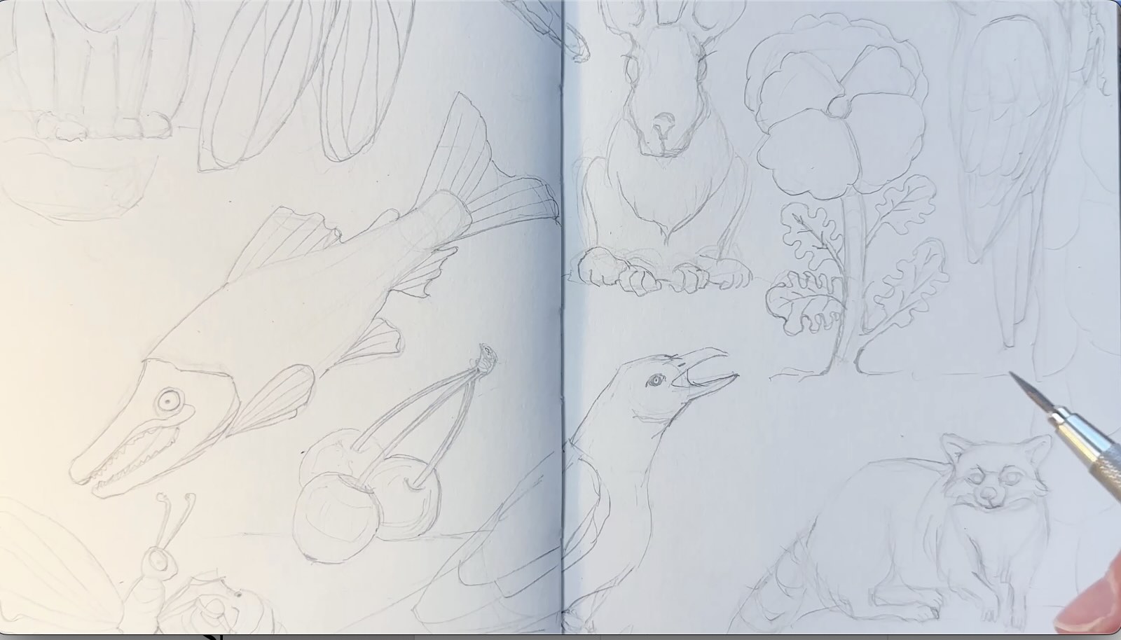
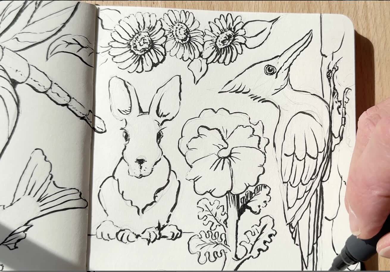
Hare
Start with an egg shape to establish the face.
Cute nose, bulging eyes, big ears.
The body is in a sitting position, the same formula as we did with the fox.
Refine the shape until you’re happy with the way your creature looks.
To ensure the composition is pleasing, we’ll arrange the bigger animals on the page first.
Continue to fill the gaps on the picture plane with the remaining creatures:
- Fish
- Bugs
- Flowers
- Berries
Essentially going big-to-small. Spreading them out evenly on your two-page spread (or across the page, depending on the format of your page/sketchbook).
Sketching the subjects in this sequence makes it easier to balance them in a pleasing layout.
💡 TIP: Don’t let your subjects float in space. Add a few lines under each to indicate the ground.
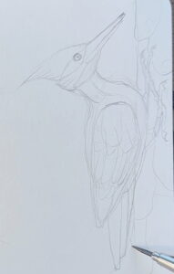
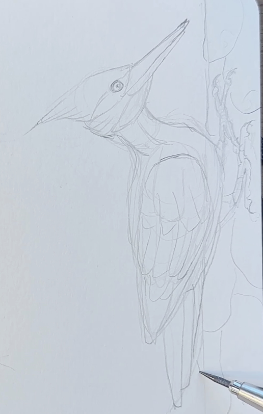
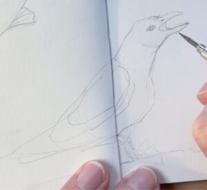
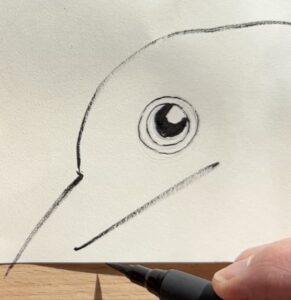
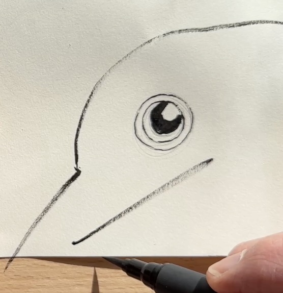
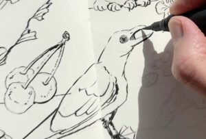
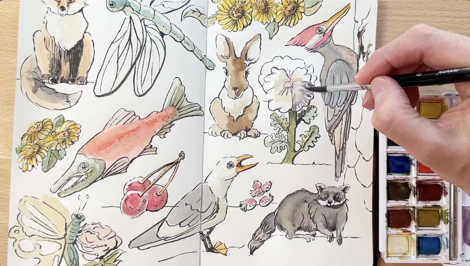
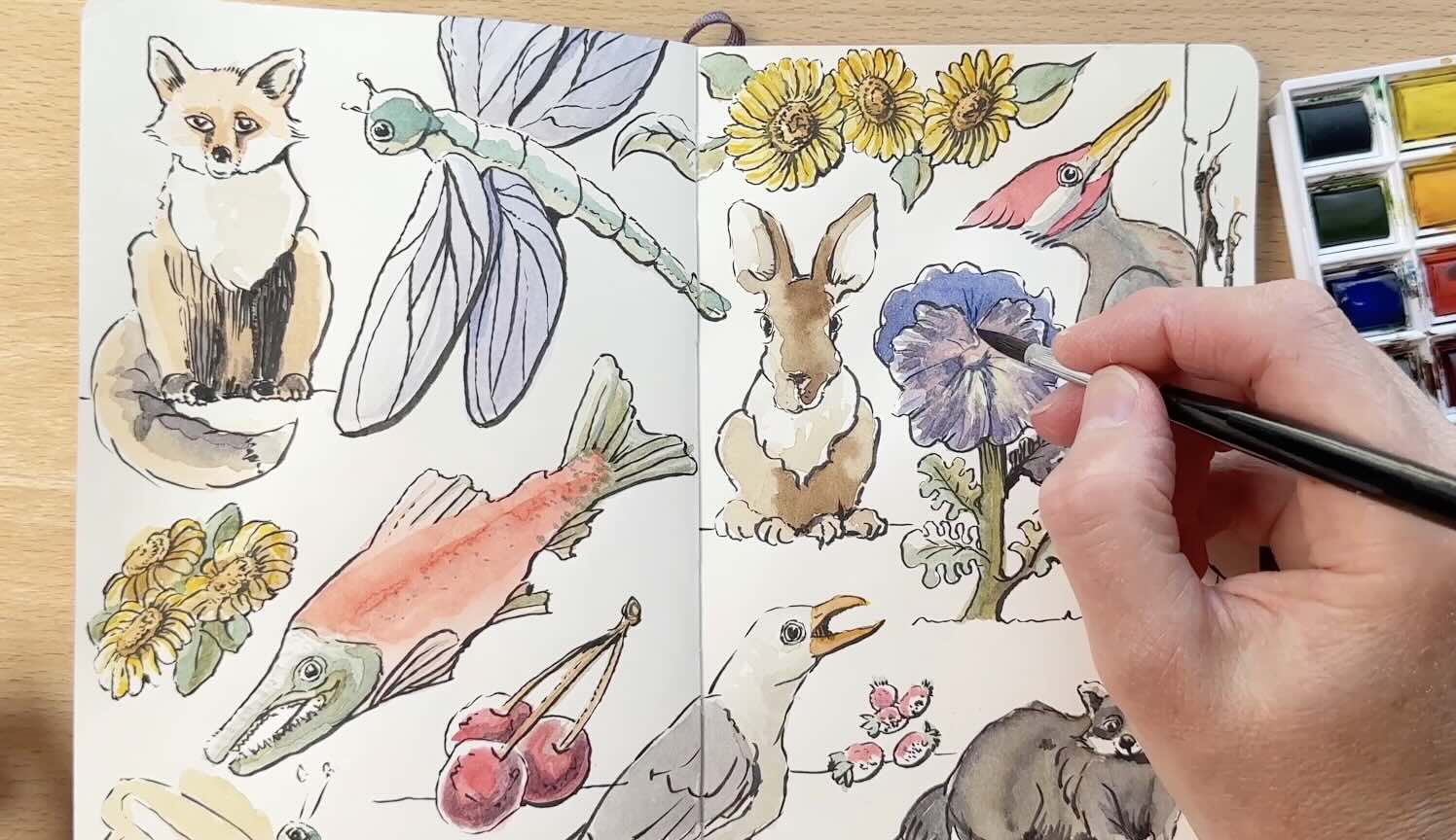
Wood Pecker
Take advantage of the paper’s edge to draw a wood pecker on a tree. The tree is actually just a line parallel to the edge of the paper, but perfect for a woodpecker in action.
Draw a loose circle for the head, and another smaller circle inside for the eye. Then, under the eye, start a line to build the long, slender beak.
Build a neck and body from there, a tail, and add cross contour lines to give form to the wing. Add feathers to the wing and extend the tail from there.
I’m sketching these subjects from imagination; if you are as well, however they turn out is fine.
Finish this drawing with an indication of bark on the tree.
Sockeye Salmon
Join two ovals for a fish body, add a big open mouth, a round eye, and a tail.
We’re aiming for the general look of a sockeye salmon.
Refining the details on your second pass. Same process for all the subjects.
I haven’t spent much time looking at sockeye salmon up close, but I imagine they have sharp teeth.
Seagull
It makes sense to have a seagull next to our salmon.
Same steps as for the woodpecker, except with an open beak and webbed feet.
Again, we refine the shape and details on the second pass.
Now that there is less space on our page, we can move on to drawing bugs, flowers and berries to fill the gaps.

A big dragonfly in the sky
I’m estimating the size and direction of the dragonfly’s body with small marks.
It’s going to be flying out of the book. A small circle for the head, add the body, and massive wings.
The cross-contour lines on the body are there to visualize volume. This will help guide our marks at the inking stage.
We’ll give its wings some detailing.
It should probably have legs, but it looks fine without for now.
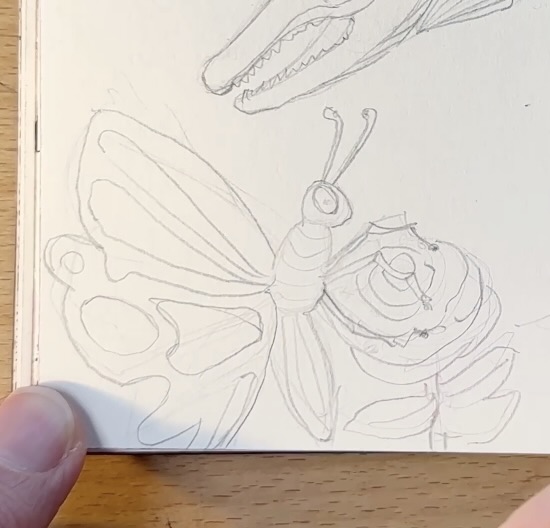
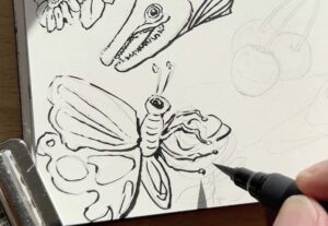
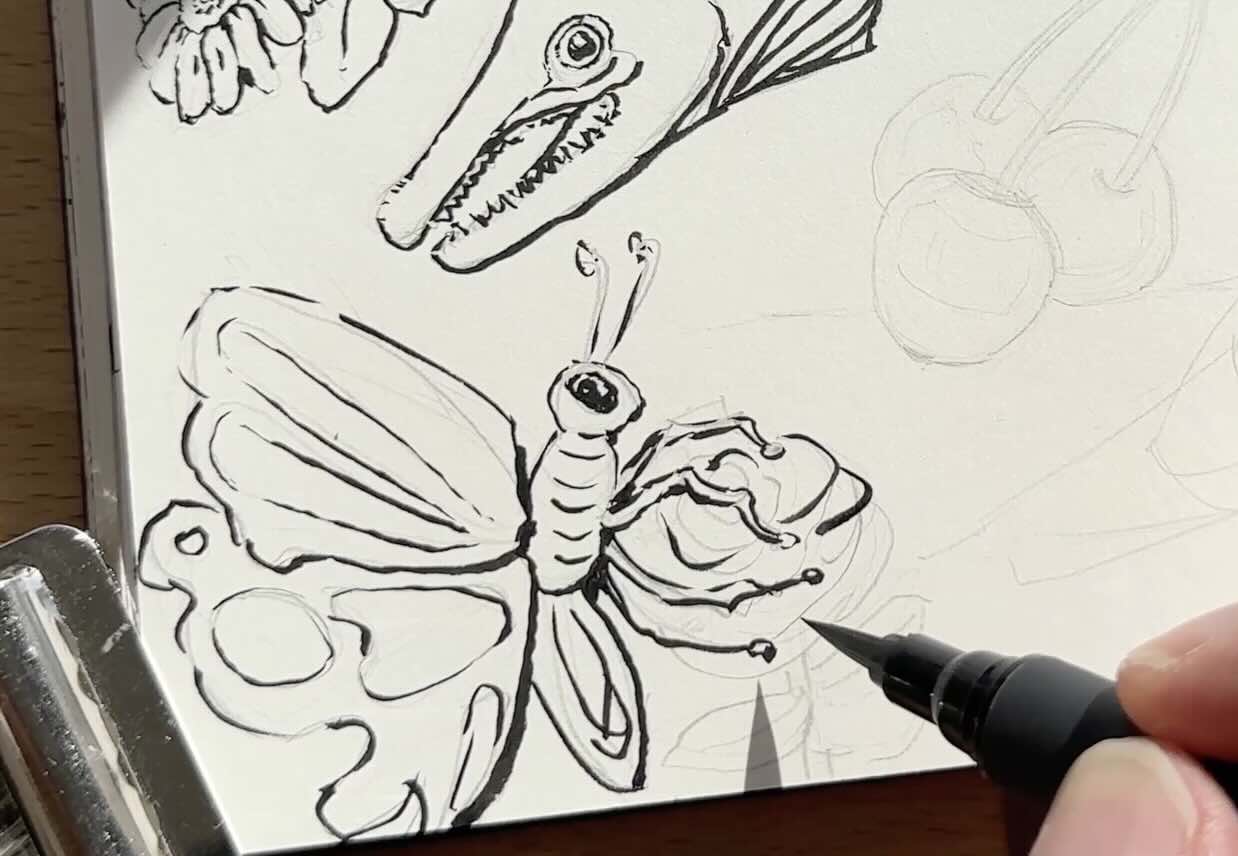
Butterfly
We’ll add legs to this next bug.
The bottom of the page is perfect for a butterfly on a flower. The stem of the flower is coming from the bottom edge of the sketchbook. Like we did for the woodpecker.
Start with the flower, then draw the butterfly on top.
Give the butterfly big bulging eyes and shapely legs that are grabbing the flower.
Then improvise a design on the wings. Note that the wings overlap the body.

Pansy
We’re running out of space, but there’s a good spot for a lone, giant pansy with several leaves.
For the flower, overlap the petals stemming from the center.
The leaves have a fun, irregular shape. Stagger the veins on the leaves.
Again, I’m paying attention to overlaps as I add leaves to the flower stem. Overlaps help create a sense of depth.
Cherries
Draw three circles for cherries, still attached to their stems. Join the stems at the top.
Pay attention to how you’re using the space, and make adjustments as needed to visually balance as you add subjects.
You can put an indication of a reflection on the cherries.
We’ll get more into how to do the shading and lighting of the subjects once we get to the ink application.
Wild Strawberries
Go ahead and sketch some wild strawberries.
The strawberries closest to the foreground are a little bigger than the others that are behind. Keep working with the space you’ve got.
The subjects are not in proportion to each other. That’s intentional with this whimsical style.
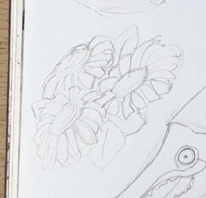
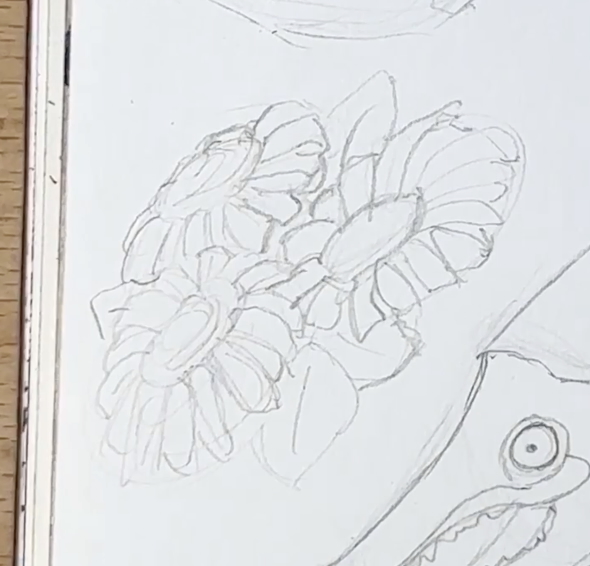
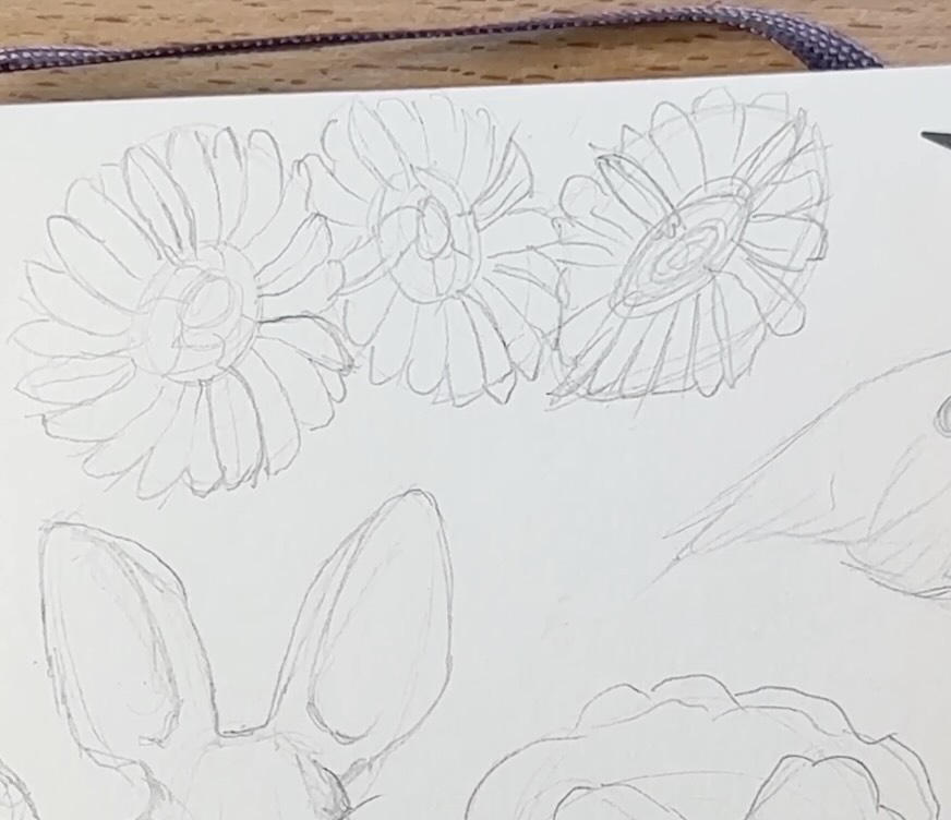
Daisies
Draw a cluster of daisies to fill the remaining gaps on the page.
Same steps. Rough circles and ovals, then refine.
To construct the flowers, start with four petals spread evenly around the center, then overlap more petals from there.
For the overlapping petals, start with lines, then join the ends of the lines in an arc.
Finish your clusters of daisies by adding leaves to make them more symmetrical within the available space.
The last open spot in your sketchbook goes to a second cluster of daisies.
Go ahead and repeat the same steps. Play with the angle of the guiding ovals so your second set of daisies is a bit different than the previous bunch.
Now that all our guiding sketches are in place, assess the overall balance of the composition.
Make small adjustments to achieve balance on the page.
Extend a leaf here, a tail there, longer wings, and continue to tweak until it looks good.
Now we can proceed to the ink application.
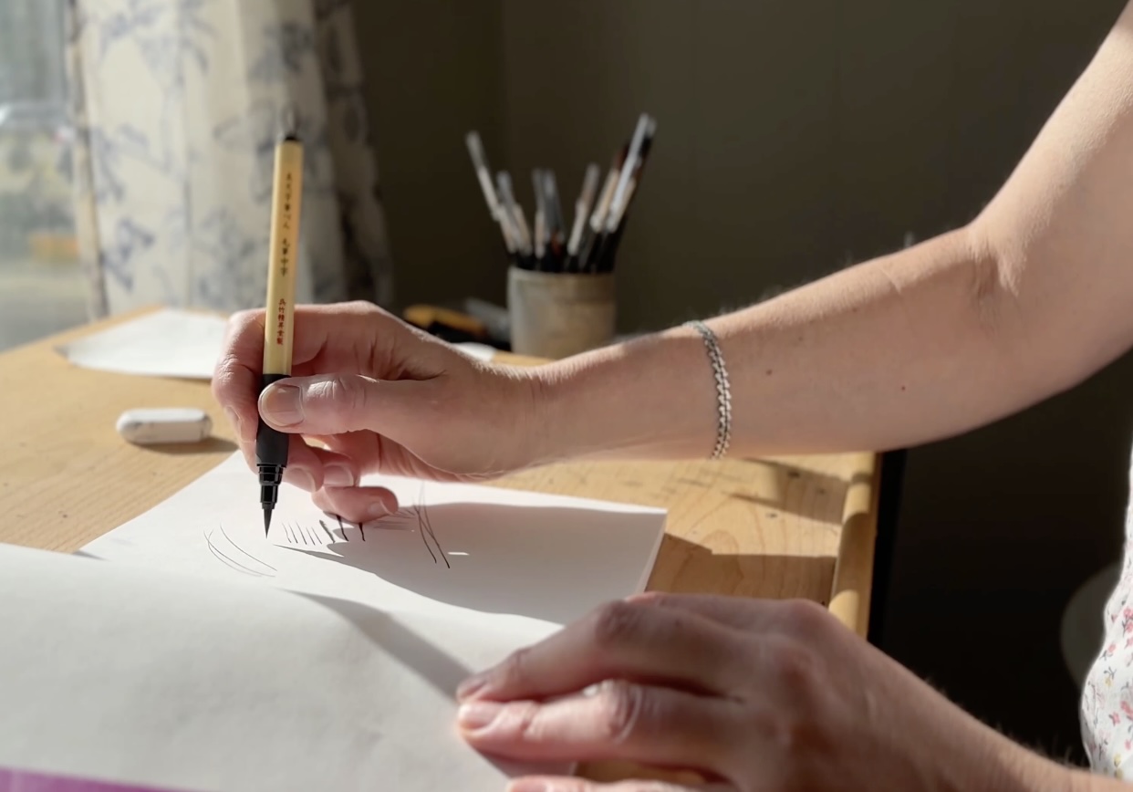
Inking the Subjects with a Brush Pen
I’ll be using the Bimoji Fude Medium Brush Pen to ink the drawings.
This brush pen has a bristle tip and is water resistant when dry.
The tip of a bristle brush is finer than a sponge tip (marker brush pen). It’s more sensitive to pressure, giving a broader range of thin-to-thick strokes. They also last longer than a sponge tip and are closer in feel to a paintbrush.
I prefer a watercolour paintbrush over a brush pen for inking my drawings, but brush pens have the convenience of an ink reservoir and are easier to use than a conventional brush.
If you’re more of a pen artist than a painter, inking with a brush pen will feel wonky.

Wonky is normal, though.
Brush tools have their own set of behaviours and produce different effects than inking with pen tools.
You’ll see master artists holding their brushes more upright and closer to the tip than a pen tool.
I’m more comfortable pulling strokes towards me than with pushing motions using a brush pen. Except I like the flicking effect you can get from pushing the strokes.
💡 TIP: You can rotate the sketchbook to suit the mark-making angle you’re more comfortable with.
But do experiment to find your most natural holding position.
With practice, you can achieve straight, uniform, even marks, like for shading with hatch marks.
But that’s not where a brush pen excels. It’s designed for free-flowing, curvy, organic strokes.
The advice I was given is to let the brush do its thing. The brush will do what it does, so let’s focus on what we can control.
We’re srtiving for a cohesive style, and there are three things that we can do for that:

First, the eyes.
A subtle trick to help unify the composition is to render all the eyes similarly. We’ll leave a highlight on all the pupils.
Second, the direction of light.
With a brush pen, line weights will vary naturally.
But if we establish that the sun shines from the top left-hand corner, then, as much as possible, pay attention to how much pressure you’re using based on the direction of light.
More pressure = bolder lines.
Try to leave some gaps in the contour lines on the highlight side, and use slightly more pressure on the brush for the shadow side.
Just aim, generally to respect the source of light.
Third, will be our colour choices.
We’ll discuss how to do that at the colour stage.

The Ink Application
I’ve gone ahead and inked the fox starting with the eyes (as we practiced with the shiny pupil), then the face and so on.
It’s a good habit to stick to one direction of travel on the picture plane (in your sketchbook) when you’re working with wet mediums, to avoid smudging.
Just go for it with the brush pen. As long as you’re mindful of the direction of light for the shading, all will be well.
This fox has black front legs, so I put a hatch texture there to indicate darker values.
“Punch up” the contrast on the shadow side of the fox. You add contrast by thickening the line slightly, making it bold by going over that area, but only a little.
Ink the dragonfly on the same principles. Start with the eye and face, using delicate strokes on the sunny side and applying more pressure with the brush on the shadow side.
Use loose, swooping lines for the big shapes, then thinner, more delicate strokes for the detailing. Then finish with a touch of contrast on the shadow side of your subjects.
Let the pen do its thing, without fighting to control it.
Continue to travel left to right on the picture plane, unless you’re left-handed, then you’d reverse the direction of travel.
You can add a texture to the centre of the daisies. The texture is denser on the shadow side of the flowers.
While that daisy design is still top of mind, swoop down to the other set of daisies we pencilled earlier and ink those next.
Ink the sockeye salmon next, starting with the eye, then the contour outline of the body.
Add details to the fins, tail, and teeth. Finishing with bold touches on the shadow side, like on the previous subjects so far.
The eyes on the hare are at a straight angle, but you can still achieve the same effect with a highlight in the pupil.
The steps are the same as for the previous subjects, finishing with bold touches.
For the pansy, add a few hatch marks for texture on the petals. Then more hatch marks for the cast shadows below the flower on the stem, and over the leaf that’s halfway tucked behind.
For the cherries, again, I’m emphasizing the shadow side with bolder lines. I’ve gone ahead with squiggles to indicate the reflective texture we had drawn in at the pencil stage.
Ensure the eye is nice and big on the seagull to match the other subjects.

Add some hatch marks for the darker values under the seagull and in its open beak.
Do a similar texture on the wild strawberries to match the textures from the centre of the daisies. The texture is denser on the shadow side of the berries (and daisies).
And lastly, the fluffy raccoon. Use the same curvy, broken lines as you did for the other furry subjects.
Congrats, you’re done with the ink application!
Erase the remaining pencil lines, and then we can start the colour application.
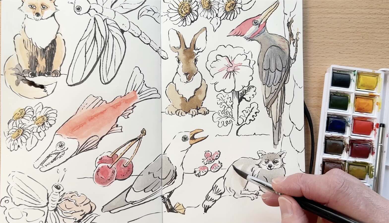
Colour Application
I’m using a couple of round, watercolour brushes and the basic travel palette from Winsor and Newton. The brushes are no4 and no6.
If you’re wondering whether you could have used the same brushes for the ink application AND watercolour. The short answer is yes.
The long answer is I prefer to dedicate a set of brushes to each medium. Mostly because ink never seems to completely leave the bristles and therefore accidentally seeps into your colours.
Remember that the supplies and other helpful resources are linked in the Resources section at the bottom of this article.

I’m not fussed about the names of the pigments at this point, so in this post, I’ll not be making distinctions whether, for example, I mixed a yellow ochre versus the lemon yellow.
I’m just getting into colour mediums. A few of you recommended James Gurney’s “Color and Light” which I’m enjoying so far. He is a true master of colour!
From what I gather, with watercolours, it’s critical to start light and build the intensity in layers.
Same fundamentals as with pen and ink, where tonal values are built gradually. It’s essential not to have too much contrast right at the onset.
📖 For more tips on the fundamentals of pen and ink, read “How to Improve Pen and Ink Technique”.
I mentioned earlier that the third thing we have control over in the composition is colour unity.
To achieve this effect, I’m using various tints of the same colours on multiple subjects.
You can either water down the colour or mix the hue with a white or dark pigment. I don’t have black in this palette, so I’m using the brown and blue to make a Payne’s grey.
Our raccoon has stripes. So far, we’ve been working dry on dry for the first pass of colour. But for the raccoon, try wet on wet to blend the stripping more evenly.
Watercolour is fairly forgiving to revisit, even when it’s dry. Much different than working with ink.
While you’ve got greys and browns on the palette, work your way to the other subjects to tie in the colour scheme.
Then onto yellows.
Be mindful to leave gaps in the white of the paper to indicate areas of highlights. We’ll be filling those areas later with a boost of brighter colours (if not leaving white).
Note: On the butterfly, I added a back wing in colour that wasn’t drawn in before. You can add a thin outline in ink if you prefer.
Moving on to greens, we’ll do several tones of greens on the leafy parts. Continuing with the same green on the other subjects for that visual consistency. And continuing to play with hues of green to dot a texture on the salmon’s belly and tail.
Start a new colour for the pansy, a deep, brownish purple. Work that colour into the other subjects. That shade of purple works especially well for shadow areas. Use it as a mid-tone and to deepen the shadow layer for some of the elements where that looks good.
Then unto another new colour. A blue to use for the dragonfly wings, and to layer more of the mid-tones.

Now that the base layer, mid-tones and some of the shadows are in, we can address the highlights with brighter colours. But first, take a moment to assess the overall effect.
Fill some of the highlight gaps with brighter colours. Greens on the leaves and the dragonfly, then light yellow on the daisies and the top of the birds’ beaks.
It’s time to punch up the contrasts and refine the details. Starting with a deeper red on the woodpecker, then carrying that red through to the other subjects (cherries, strawberries, and the bottom flower beneath the butterfly).
Next, mix a bit of that red with yellows to brighten the fox with orange.
Using that orange as the base, mix it to give all the subjects golden brown eyes.
Mix that orange into a deep brownish grey, then layer that colour on the shadow side of our subjects to deepen or blend the darker tones.
Dilute that brownish-grey and use it as a background to tie everything in, with a few brush strokes beneath each subject.
And here we have a pleasing layout in a sketchbook with various subjects in ink and watercolour.
Recap
To briefly recap, the main steps were:
A rough sketch to establish the big shapes.
Using the kneaded eraser to lighten the graphite pencil, then refining the drawing
We started with the bigger subjects first on the corners and middle of the spread, then filled gaps with smaller subjects like berries.
Once we were happy with the balance of our composition, we moved on to the ink application.
The key tips for inking were the direction of light, but also to let the brush do its thing.
In the last stage of our project, we continued to unify our composition with the distribution of colour, ensuring a pleasing visual balance.
This rendering formula can be applied to any subject.

Resources
📗 Books ↓↓
✒️Tools ↓↓↓