3 Tips so you know you’re doing it right from the beginning
In this article, we’ll look at how to plan so you know from the beginning that you’re doing it right and can ink textures fearlessly.
With these three tips you’ll be able to:
- Better self-assess for progress with your pen and ink drawings, and;
- Gain confidence that you’re working on the right things from the beginning.
Be sure to read until the end for extra ideas to keep your textures fun and fearless.
Disclosure: Some of the links on this page are affiliate links. I earn a reward or small commission when you use those links at no cost to you. Read more about the Affiliate Disclosure on the Terms page.
What are textures and why they’re important
Texture refers to a pattern or design that gives the illusion of some kind of surface.
They’re important with pen and ink, especially working in black and white because proper textures have the power to explain a subject to a viewer in a more convincing way.
Why plan textures for a finished drawing?
Why bother planning textures? You may be wondering … Isn’t this overcomplicating the process?
It depends.
It’s not something you need to do for every pen and ink project. It’s beneficial, especially to beginners, if you’re concerned that your:
- technique lacks variety – you keep using the same patterns
- subjects look dull – elements appear flat without volume
- composition lacks a focal point – confusing to the viewer
The above problems could be due to various factors. However, you’re nearly guaranteed that planning textures will give you answers to what, specifically, needs more practice.
Tip 1 – How to self-assess for progress
It’s sometimes hard to know how to self-assess for progress.
By using this planning process, you’ll be able to see if the textures in your artwork have improved before and after.
I have proof.
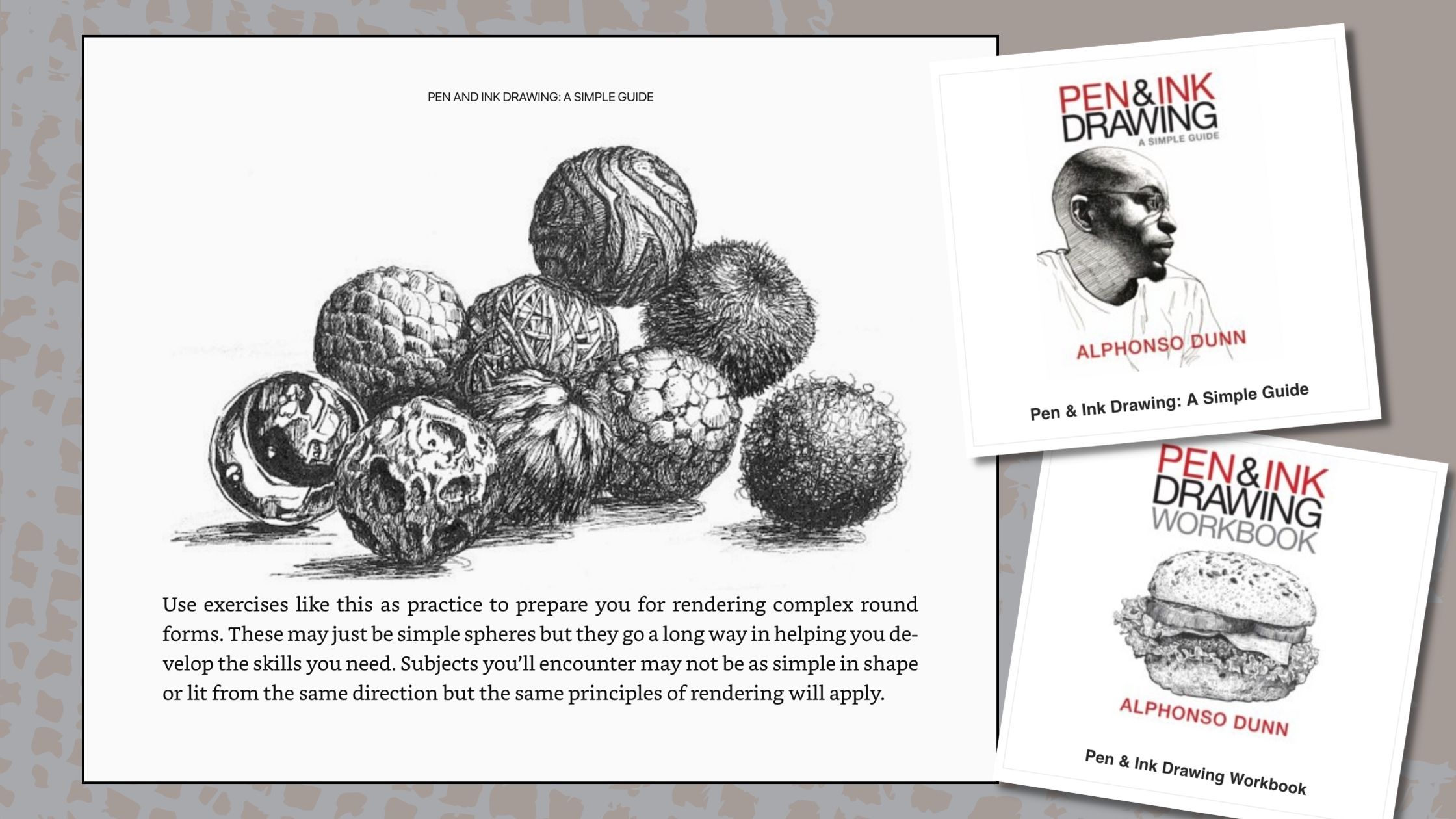
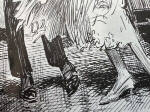
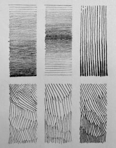
Below is Alphonso Dunn’s famed “balls” exercise for how to shade textured forms.
Below is my version of his exercise that I did near the end of 2020 when I first started drawing with pen and ink. And next to it is the same exercise repeated in January 2024.
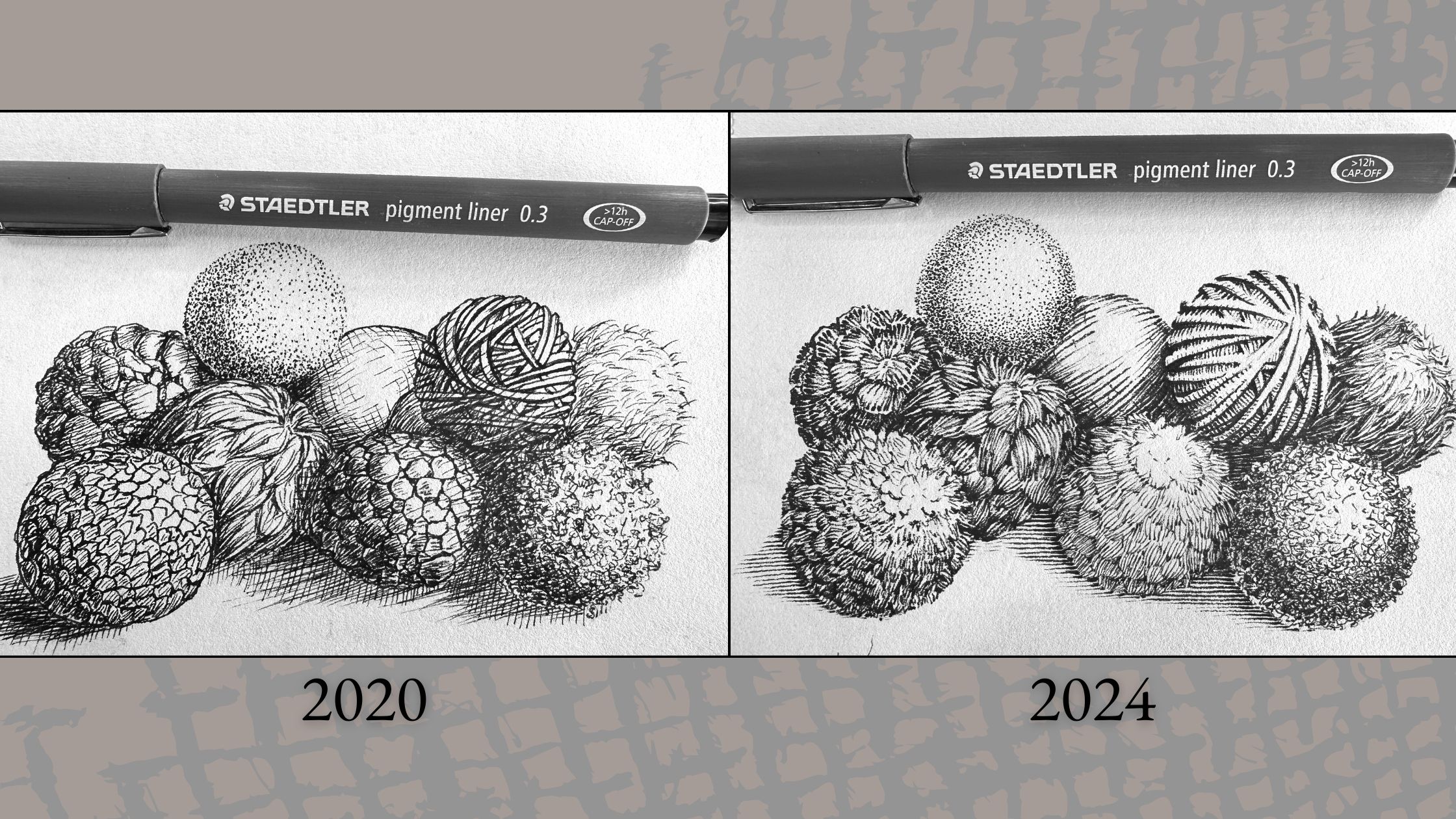
You’ll find that it’s more straightforward to assess your progress by comparing exercises to one another than finished pieces of artwork.
Exercises are less subjective than art because they can be judged under the same criteria.
With the balls exercise, I used the exact same:
- Subject
- Dimensions
- Materials
- Timeframe (approx. under 1 hour)
I can therefore with my self-critique, compare apples to apples.
Did I achieve a convincing illusion of surface with my textures?
I think so, but what jumps out is an improvement in the technique I used to transition tones from light to dark values.
In the 2020 doodle, I darkened the values by hatching lines overtop of the textures.
In the 2024 version, I darkened the tone by increasing the density of the marks.
There’s nothing wrong with adding marks on top of other marks to increase the tone. In fact, this is a rendering style used by many famous artists.
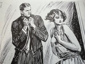
Below you see how Charles Dana Gibson overlaps his lines.
Observe how his strokes are organized in a value range, which effectively functions to explain the forms. The effect is lively, not messy.
The key takeaway here is that you’ll be happier with how your artwork turns out if you:
- set a standard or a goal to reach; and,
- plan your practice toward reaching those standards.
I’m aiming to develop a similar technique to Bernie Wrightson and Franklin Booth, whose styles of shading textures are influenced by engraving methods and nothing like Gibson’s.
So, if you’re aiming for a particular look with your ink application, then set that as your standard and you can plan for it.
Tip 2 – Plan how to reach your standards
Let’s talk about planning for “how” to reach your standards.
You’ll be more confident with your ink application if you make a few key decisions before starting your artwork, such as mark-making techniques.
The most common types of mark-making techniques are:
- hatching along the form
- cross contour hatching
- curved cross-hatching
- cross-hatching
- stippling
- scribbling
- irregular lines
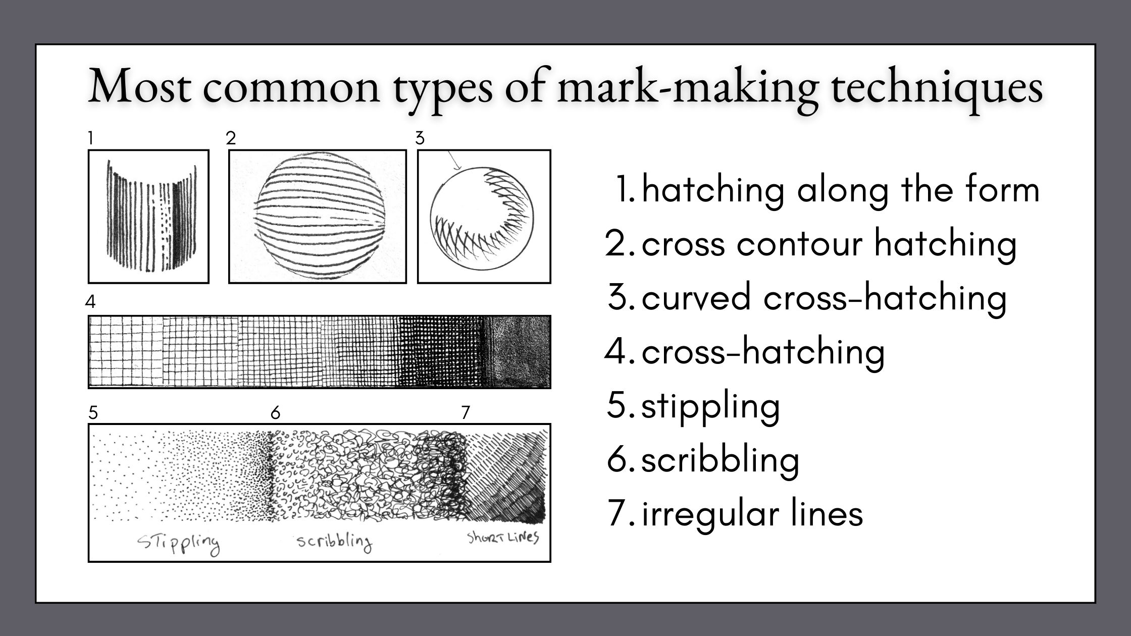
You can create textures using any of the above or whatever other strokes you prefer.
Depending on the style you’re aiming for, you’ll want to pre-select the mark-making techniques you’ll be using to render your textures.
A good rule of thumb is to limit the rendering to two to three techniques.
Some teachers insist on not mix-matching multiple techniques as this can cause a jumbled effect. For instance, they’ll advise against mixing stippling with lines.
You can be the judge of what will work for the art that you want to make.
The objective is to plan ahead to avoid regretful decisions and stay in range of your standards during the ink application.
Plan your textures by subject and composition
Before getting too excited about techniques, we first need to select a subject.
I’ll be using these thumbnail compositions to talk about the process.
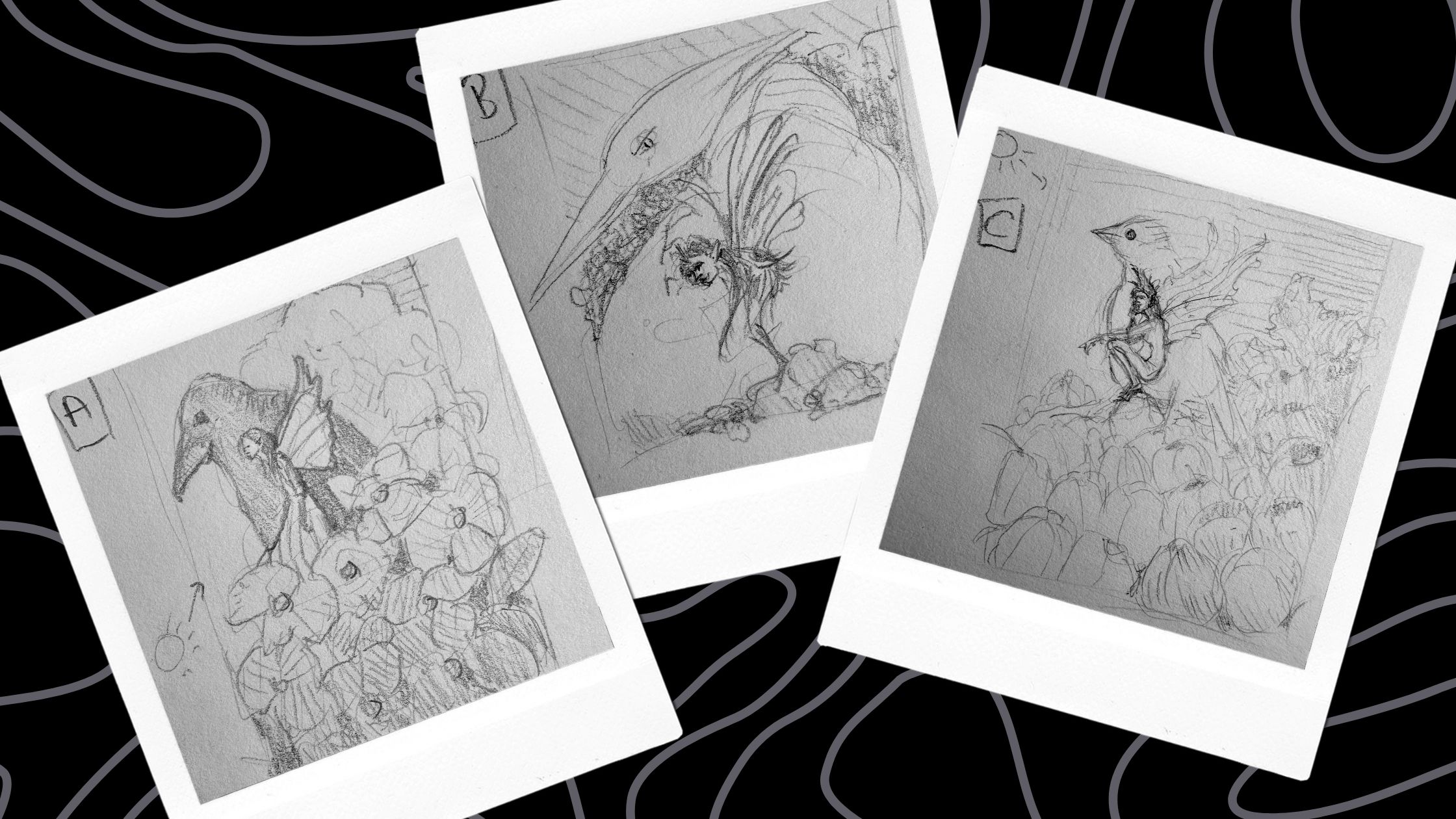
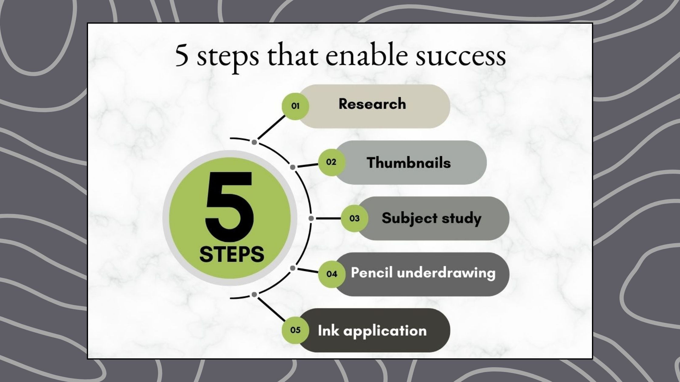
I use a five-stage process to create finished artwork.
I’ve already done:
- research
- gathered references
- created concept thumbnails (A, B, C)
We’ll therefore sort out our textures at stage three of the chart below as part of the subject studies.
Tip 3 – Test the possibilities by creating samples
To test possible textures, below is a table to help sort them into categories so that we can sketch samples.
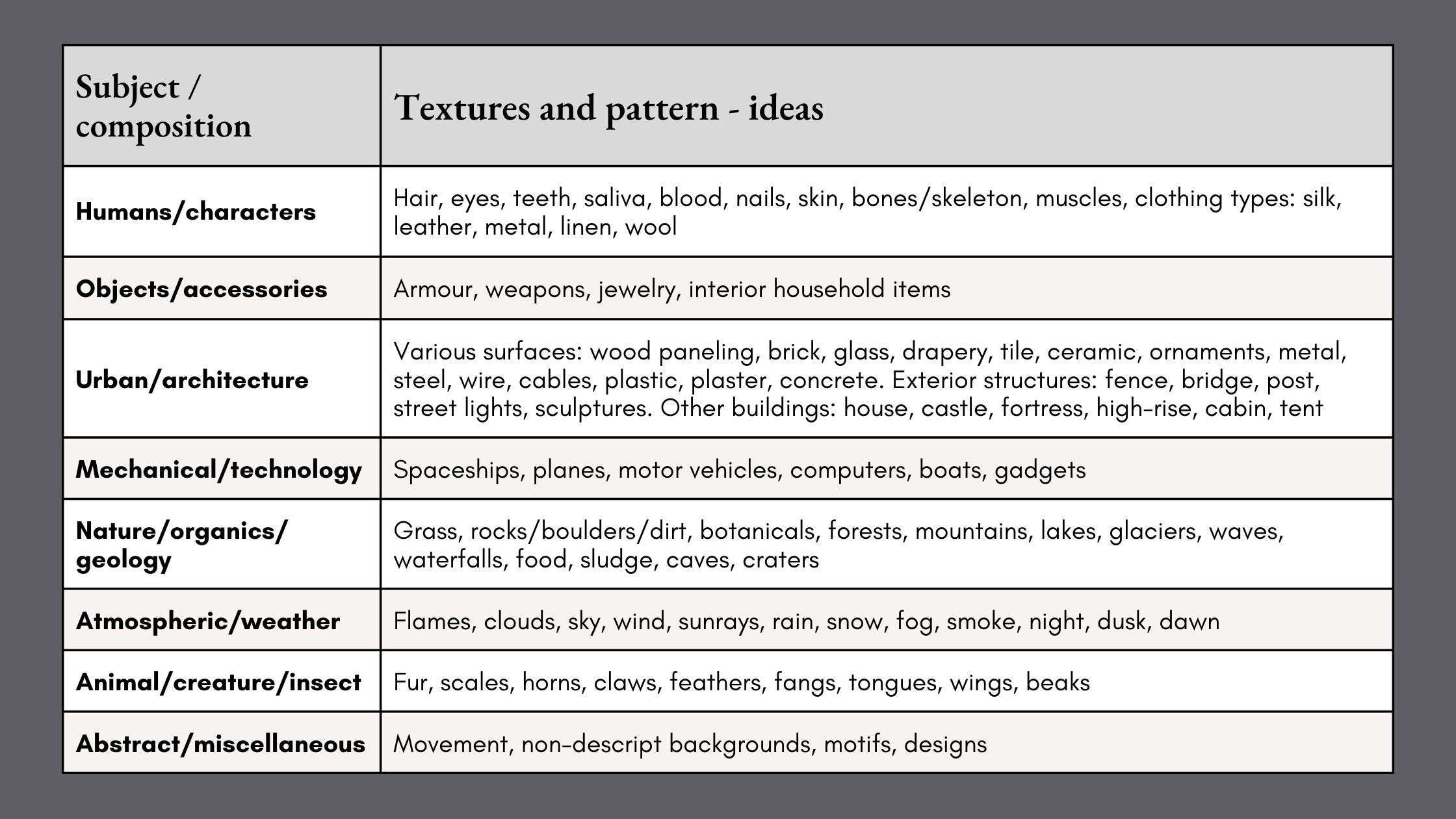
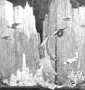
Looking at my three thumbnails, let’s identify all the potential textures we could create. I prefer Concepts A and C, so we’ll only work with those two.
For the faery character, we have:
- Hair, skin, some anatomy features and clothing
For nature, we have:
- Botanical varieties of tulips and lilies, leaves, blades of grass
For atmospheric effects, I see:
- A sky, clouds, maybe sunrays
There’s also a bird and maybe a non-descript background pattern to consider.
The objective of this step is to evaluate the possibilities, and then narrow those options down to a few accent textures.
To gain further insight we’ll do a values study to shade the main textures.

Exercise – Shading textures
Next is an exercise to shade textures on a gradation scale.
First, decide which mark-making techniques you want to use. Think of your standards and the style you’re aiming for.
For my rendering style, I’ll be using:
- hatching – lines parallel to the forms
- cross contour hatching – lines going across the form
And for accent textures, I’ll be testing:
- irregular short lines – dashes and dots
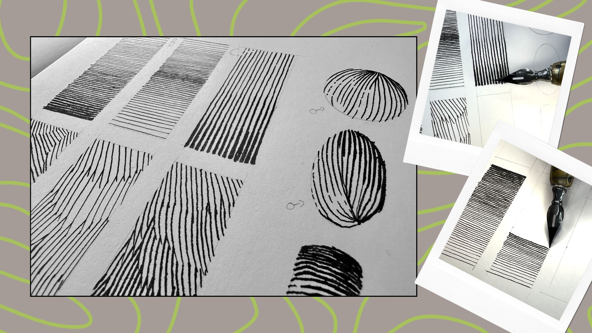
I shaded the textures with the source of light coming from different directions.
The prominent elements of my composition are flowers, the bird, the faery, and maybe a sky.
To shade the hatching textures, I created a gradation scale from light to dark.
I darken the tone by gradually increasing its density. You achieve density by:
- bringing the strokes closer together, reducing the space between the marks, and;
- using thicker lines.
I’m using dip pens with India ink on Bristol paper for these studies because those are the exact tools and materials I’ll be using for my finished artwork.
You’ll find the list of the tools and materials in the resources section at the end of this article.
If you plan to ink your final project with fine liner pens of various sizes, then use those to conduct your values tests.
You can do a variety of these gradation charts based on the types of textures you’ll be using.
Exercise – Shading textures on a form
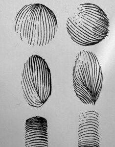
Realistic subjects are usually 3-dimensional. Therefore, the second part of this exercise is to shade textures on a form. Similar principle to Alphonso’s “balls” exercise.
The source of light comes from the bottom left-hand side in thumbnail A, and the top left-hand side in thumbnail C, so I shaded both light directions on various shapes.
If you’re keen and want to add a third part to this exercise, you can also grade your textures for portions of your subject.
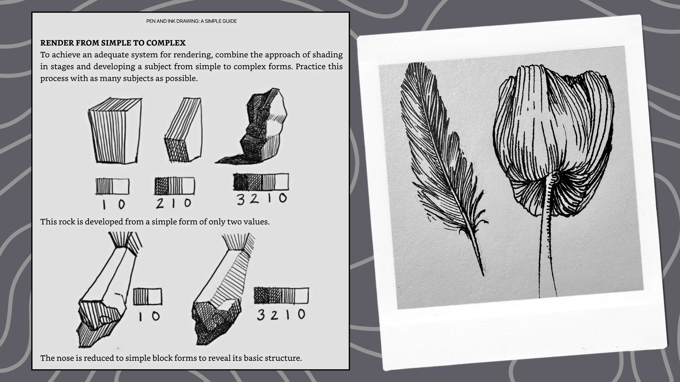
Using another Alphonso example, below he shows how to shade simple to complex forms, demonstrating further by shading part of his subject.
And I rendered a feather and a tulip as subject studies.
Before I explain how to play the Fearless Textures Game, let’s review the key steps:
- After you’ve done your research and have a subject;
- Do thumbnail concepts and identify the key elements that have textures;
- Based on the rendering style you’re aiming for – pick stroke techniques for those textures, and then;
- Do two or three values studies to shade those textures, first on a flat chart then on a form, then as a subject sample.
🎓 BTW: for more tips on doing Values Charts read ‘How to improve pen and ink technique’.
The three tips were:
- Tip 1 – Self-assess for progress by comparing “apples to apples”
- We established that it’s more straightforward to compare exercises judged under the same criteria than to subjectively self-critique artwork.
- Tip 2 – Plan how to reach your standards
- Set standards for your self-critique, so you can better target your practice, and plan for it.
- Tip 3 – Test the possibilities by creating samples
It’s basically a guarantee that your pen and ink projects will turn out the way you want with this level of preparation.
What if you don’t have a project on the go or are low on ideas for a subject?
Below is a fun way to keep practicing, fearlessly.
Fearless textures
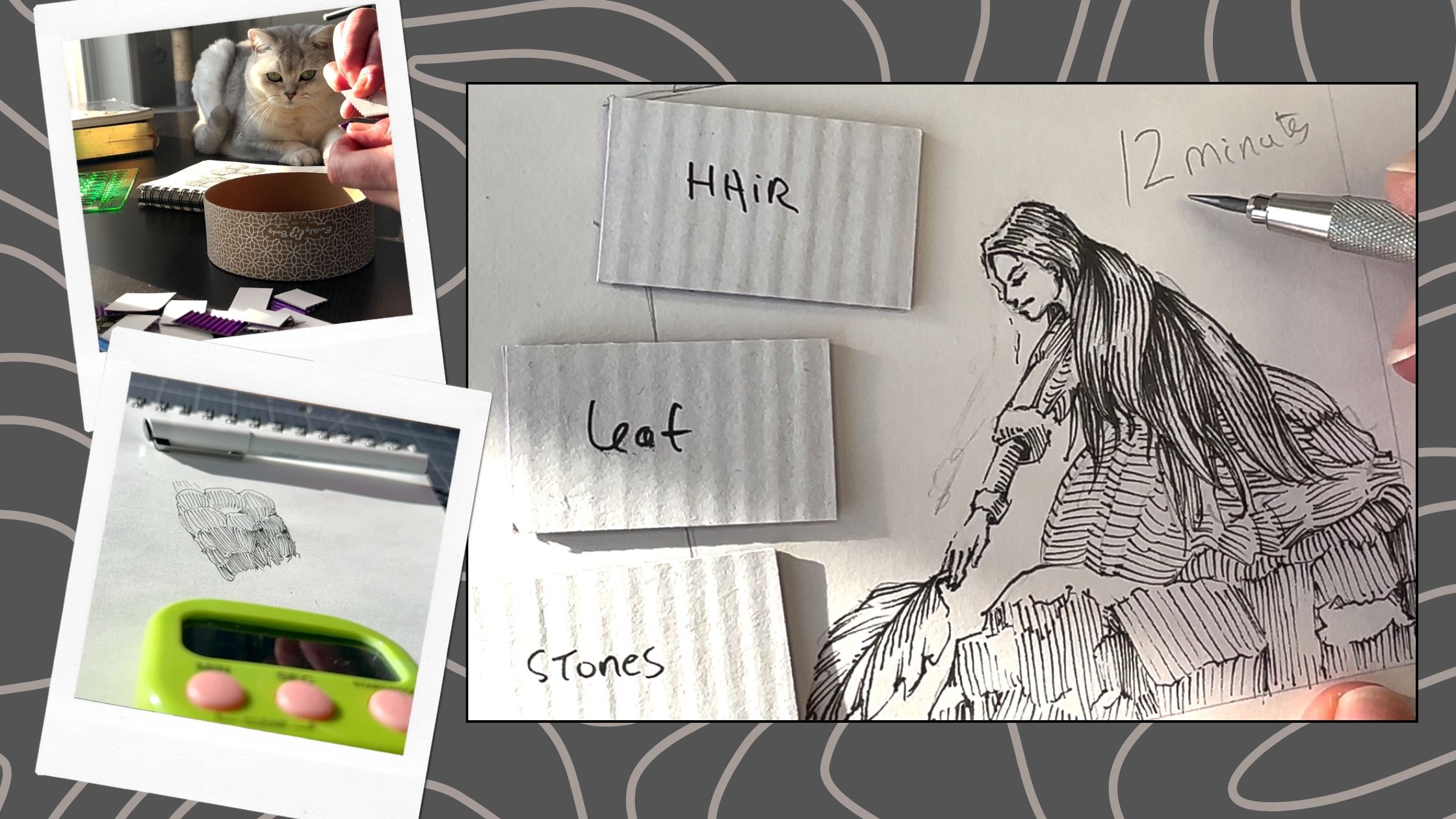
This fearless textures game is easy to make.
From the Textures Table, write down one texture per card or on a piece of paper. Put them in a container.
- Pick a random texture from the container;
- set a timer for three to five minutes, and;
- shade your texture from light to dark.
The timer adds pressure.
This forces you to just go for it, not overthink or over-render.
The clock trains you to be a fearless inker.
You can also use this game as drawing prompts. I randomly picked three textures. Then set my timer for 12 minutes.
And from those three texture prompts, emerged a subject. This doodle can now serve as a part of a study for a future project.
You can set the timer for whatever amount of time you want, though aim to reduce the time for each practice session.
I hope that you enjoyed this overview of how to plan textures for your pen and ink projects. If you did, please share this post and I’m also always happy to read your comments.
Resources
Alphonso Dunn’s | How to create realistic textures (video)
Alphonso’s books (paperback bundle)
Rendering in pen and ink by Arthur L. Guptill (Kindle)
🎨TOOLS and SUPPLIES from this article
Staedtler Mars Technico pencil with 2mm (H lead)
Staedtler Mars Technico lead sharpener
Staedtler Pigment Liner Set of 6 Pens
Speedball Super Black India ink
Speedball Universal gold pen holder