He is renowned for breathtaking anime, but it was his Nausicaä manga that made me a fan.
// DISCLOSURE: Some of the links in this article are affiliates. I earn a small commission when you use my affiliate links to make a purchase. Read the Terms for more information.
Master’s Style
From a pen and ink learning perspective, 3 things stand out about master Hayao Miyazaki’s style:
- Character Design
- Stroke Finesse
- Energetic Textures
Character Design
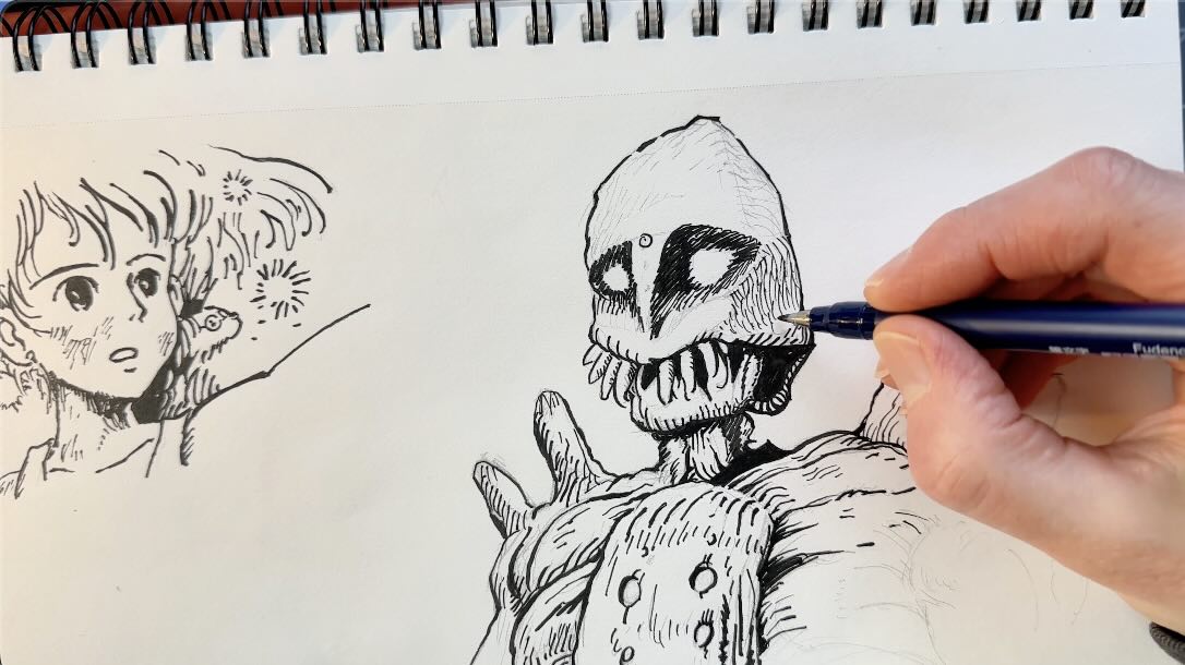
Some may argue that master Miyazaki follows the standard manga formula to design his characters, like large glistening eyes and cartoonish expressions.
Yet they have an identifiable style.
The main characters typically have elongated faces and short noses, with their eyes set far apart.
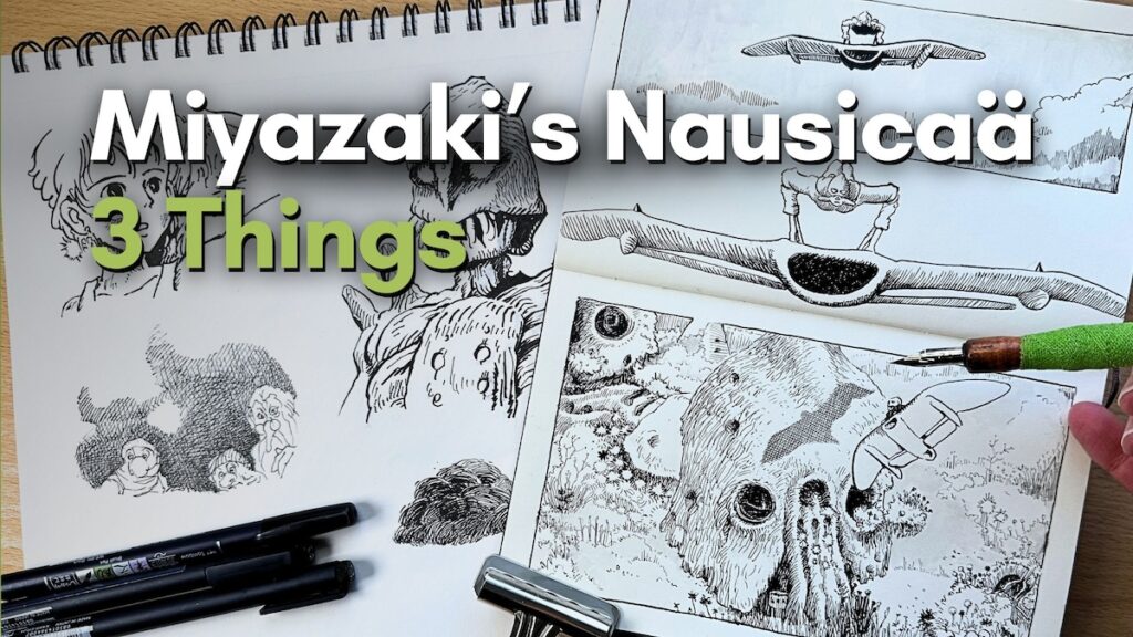
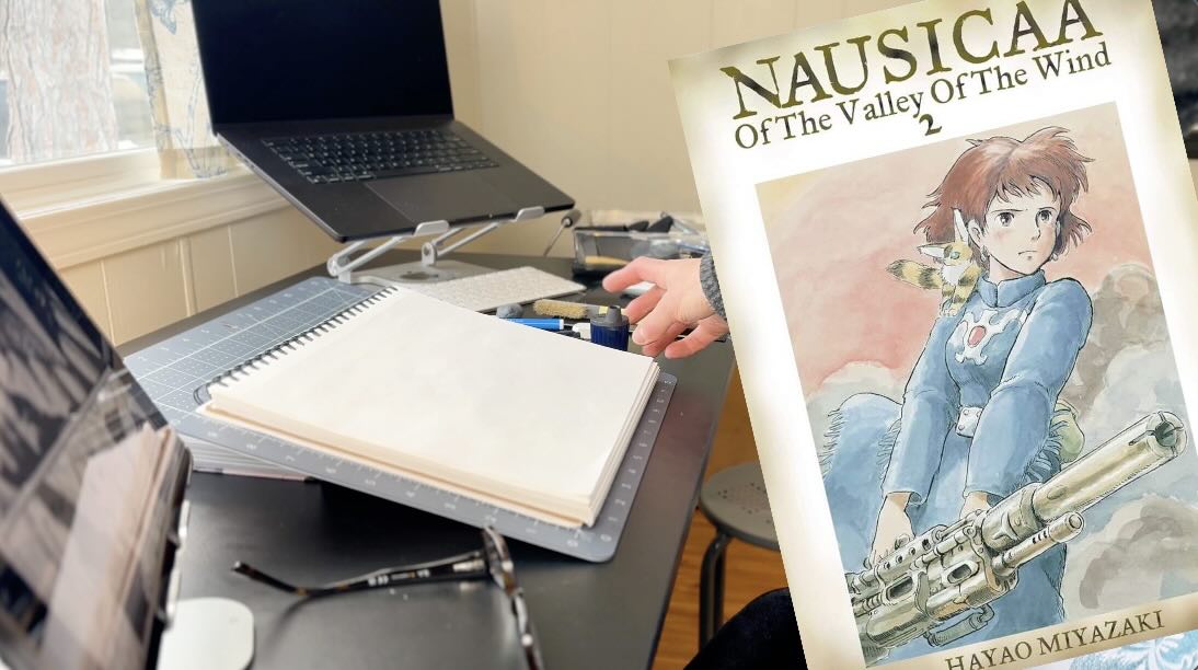
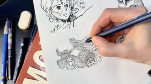
I did a few studies of characters from Nausicaä.
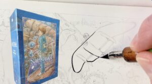
📗 Check out the 7-issue Nausicaä Box Set on Amazon
Although they’re not identical copies of the master’s works, the facial proportions are unmistakable to anyone familiar with his stories.
📖 Read more about Studio Ghibli Films.
It’s said that the setting and visual style of this manga was influenced by Mœbius.
They had a mutual admiration.
There’s even a book where they illustrate each other’s characters.
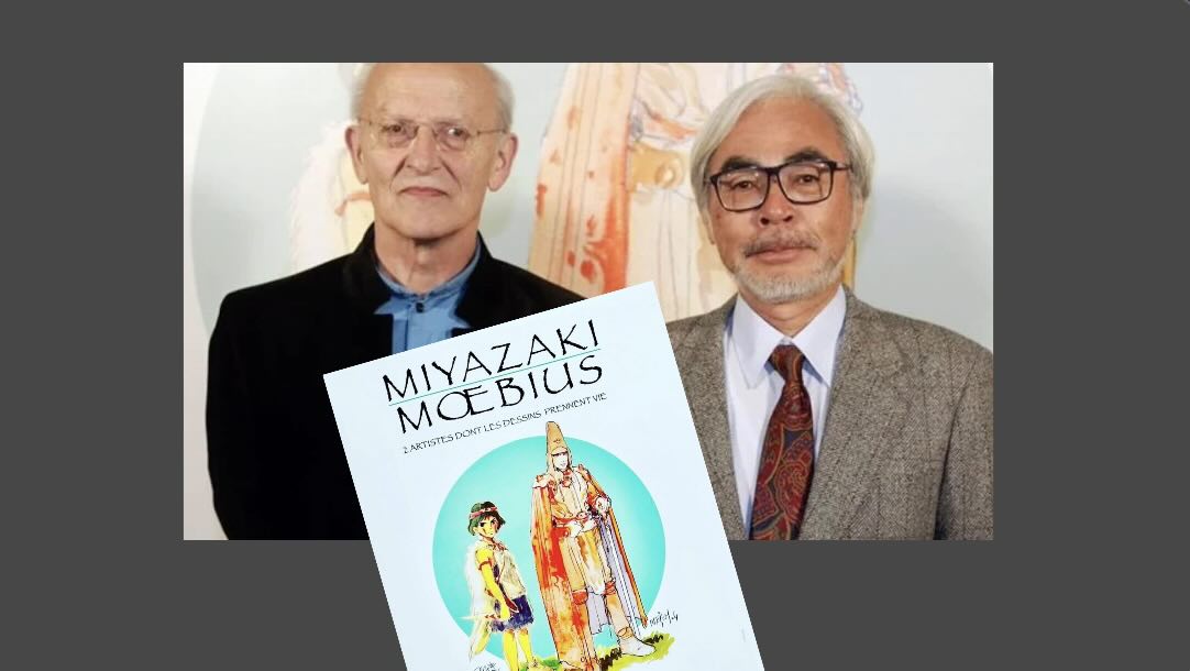
📔 View the free Miyazaki & Moebius Book
“Characters are pictured very simply in Mœbius ‘ drawings, yet they have a sort of atmosphere around them. And the characters themselves exhale all kinds of things, notably solitude and a great nobleness.”
– Hayao Miyazaki
The same could be said of his characters.
Hayao Miyazaki and Mœbius were equally obsessed with the aesthetics of technique.
Want more Mœbius? Check out my study!
📖 Read Post | 🎥 Watch on YouTube.
Stroke Finesse
Miyazaki’s strokes show remarkable finesse.
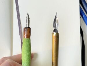
Traditionally, mangaka’s would ink with a Gnib or Saji – similar to the large speedball nib pictured below.
Some manga issues were inked but for the majority, Miyazaki illustrated Nausicaä in pencil.
The printing process made it look inked in sepia tones.
Because he used pencils, the marks don’t have that thin-to-thick quality you’d see from a dip pen or a brush stroke.
Yet his marks have a refinement and the exquisite finesse from years of practice.
Since there’s little weight variety in the strokes, he builds tone with a sort of staggered pattern.
📖 Read Kumi Kaoru’s analysis of Miyazaki’s illustration process.
Energetic Textures
Miyazaki’s textures are vibrant with energy.
Even the denser scribbly marks are intentionally aesthetic.
Like this background’s cross-hatch (pictured further above), there’s an appealing curve to the marks.
For the smoky-cloud pattern (below), the hatching angle is varied ever so slightly.
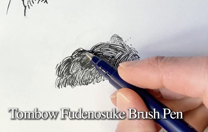
The lines either butt together or seldomly cross.
This results in an organized gradation of energetic textures.
You’ll also note shorter hatches in between the longer ones to build tone, like on this glider and the wisps of clouds in the sky, below.
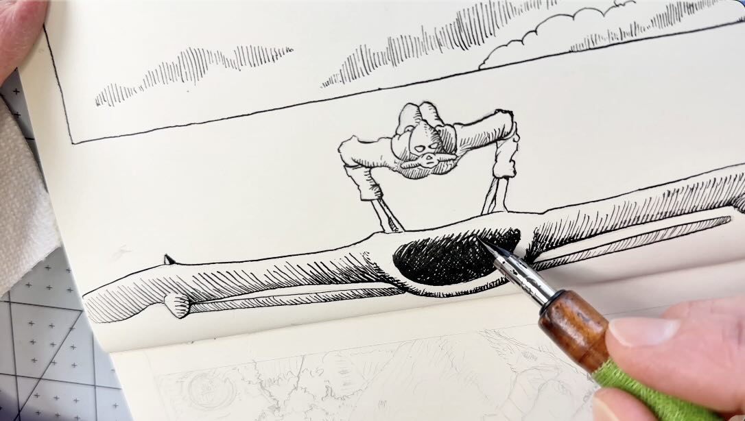
Not one hatch mark is exactly repeated.

They go long, short, medium, curved, and straight. The spacing in between remains the same to keep the tone uniform.
The effect makes everything look more alive and fantastical.
🎓 Learn about stroke variety in my dip pen class with: SkillShare | Udemy
Study Miyazaki’s Style
Check out Miyazaki’s manga and see what stands out for you about his style.
Do a few mini-studies.
Practice the textures using different tools. He was also known for using a ballpoint pen, so that could be a fun exercise as well.
I enjoyed studying his work.

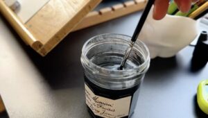
I tried to get that sepia look by doing a subtle ink wash with a watercolour brush.
I used the ink water only, to keep the tone light.
Speedball’s Super Black Ink is waterproof and great for light ink washes.
The Moleskine Art Sketchbook paper is of formidable quality. There’s hardly any buckling or show-through.


✒️ For more tips or info on what tools I use, remember you can always check the FAQ or Tools pages.
I hope you enjoyed this brief overview of the 3 things that stand out about the style of Hayao Miyazaki.
I wish you the best with your pen and ink projects.
For more practice, check out “2 Pen and Ink Exercise Ideas”:
📖 Read | 🎥 Watch
Resources
Staedtler Rotary Lead Sharpener