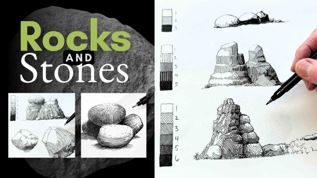
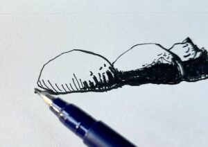
In this lesson, we’ll render stones and rocks using techniques based on various styles of the pen and ink masters.
We’ll practice ten different hatch styles to render smooth stones and five exercises to texture rocks.
The stone and rock photo references are downloadable for free. Look for the big download buttons in those sections of the article.
Before starting the exercises, you’ll find a description of the tools and supplies suggested for the lesson.
The complete materials list (with links) is in the final ‘Resource’ section, which also includes reference book titles of the masters mentioned in this article.
- Tools and Supplies for the Exercises
- 10 Ways to Render Smooth Stones with Pen and Ink
- 1 – Single Smooth Stone, Sparse Rendering
- 2 – Single Smooth Stone, Freestyle Technique
- 3 – Single Smooth Stone, Vertical Stagger
- 4 – Single Smooth Stone, Engraving Effect
- 5 – Single Smooth Stone, Curved Horizontal Lines
- 6 – Single Smooth Stone, Horizontal Abstract Scribble
- 7 – Single Smooth Stone, Horizontal Variation
- 8 – Single Smooth Stone, Short Dashes
- 9 – Single Smooth Stone, Cross-Hatching
- 10 – Group of Smooth Stones, Freestyle Technique
- 5 Ways to Render Rocks Textures
- Resources
// DISCLOSURE: Some of the links in this article are affiliates. I earn a small commission when you use my affiliate links to make a purchase. Read the Terms for more information.
Tools and Supplies for the Exercises
Below is a description of the tools and supplies used for the exercises, including alternate options.
For the complete list with links for purchase, scroll to the ‘Resources’ section at the bottom of this article.
Inking Tools
For inking, in this lesson, I’m using Tombow Fudenosuke Brush Pens.
These calligraphy-drawing brush pen markers come in both soft and hard tips.
Both tips have surprising flexibility and bounce.
This combination of flex-bounce allows for varying the line weight from thin-to-thick in one stroke.
This saves you from having to switch pens to different tip sizes to modify your line widths.
The soft tip pen has a juicy feel. The hard-tip pen feels more precise.

Best Brush Pen Markers for Sketching
I’ve tested several brands with similar types of tips. Below in order of preference:
- Tombow Fudenosuke Set
- PILOT Fude Brush Pen, Hard
- ZEBRA Double-Sided Brush Pen
- Kuretake Double-Sided Brush Pen
- Faber-Castell Pitt Artist Brush Pen
Other reputable brands, including Staedtler, Sakura Micron, and Copic, all make marker-type drawing pens.
However, I found the tips on their marker pens overly rigid and unsuitable for creating variable line widths in a single stroke.
These markers are great for filling in solids and hatching thicker strokes but are not comparable to calligraphy brush pen markers.
Note that brush pen MARKERS are different from brush pens.
Brush pens have hair-like tips to simulate the stroke quality of a traditional hair-bristle brush.
A bristle brush demands expert control to produce even parallel lines. Not an ideal tool for the exercises in this article.
Alternatively, you can use any set of fine liner pens to vary your line weights. At the very least sizes 01 and 05.
Or if you’re skilled with a dip pen, that is a fine option for these exercises, as long as you have the right paper for drawing with liquid ink.

Best Paper for Inking Exercises
For the smooth stone exercises, I used a manga-specific inking paper made by Deleter.
For the jagged rock exercises, I opted for a high-quality sketching paper made by Strathmore.
Any good-quality paper labelled ‘mixed dry media’ or specific to ‘pen and ink’ will work for inking with fine liners or any of the brush pen markers listed above.
The Delete paper is suitable for drawing with liquid ink using a dip pen.
The Strathmore 400 sketching paper will not work with liquid ink. It will swell, buckle, and tear.
When in doubt, my go-to all-purpose wet-dry paper that never disappoints is the unbeatable Moleskine Art Sketchbook.

Best Pencils and Erasers for Underdrawings
Pencil
You’ll want to use a hard lead pencil like 2H or H.
To ink a sketch, I typically use a carbon graphite lead.
Avoid soft graphite leads (B and up) and charcoal pencils.
These substances are difficult to erase and leave residue on the paper surface. This residue interferes with the ink application.
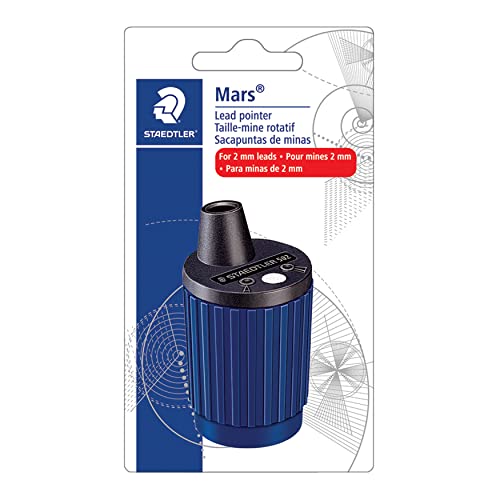
I’m happy with my Staedtler Mars Technico lead holder.
It holds a 2mm thick lead that is easy to switch out to various hardnesses.
This holder is perfectly balanced for light sketching, which is what you want for the underdrawing of an ink piece.
I keep the lead pointy using the Staedtler Mars Technico Rotary Lead Sharpener. Alternately, the push button on the Mars Technico lead holder doubles as a sharpener.
If you prefer a traditional pencil, I recommend:
Eraser
Any artist-quality eraser will do.
Cheap erasers mark and damage the paper surface, so you’ll want to avoid those.
For these exercises, I used my Staedtler Mars Plastic Eraser.
That plastic eraser is adequate to use for exercises on sketching paper.
Whenever I’m using a higher quality paper with liquid ink, I’ll switch to my Faber-Castell Kneaded Eraser.
For a complete list of ALL the tools I use in my studio, check out the FAQ page.
🎥 To see some of these tools in action, watch “My top 9 pen and ink drawing supplies” on YouTube.

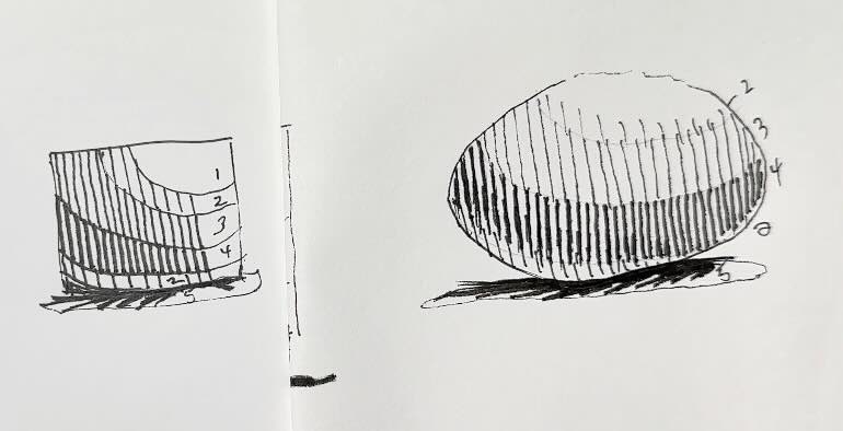
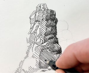
10 Ways to Render Smooth Stones with Pen and Ink
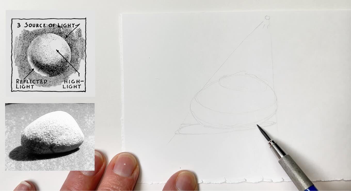
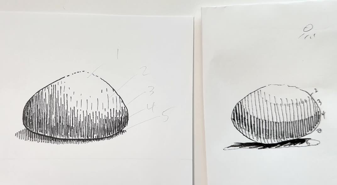
The following section will review the fundamentals of lighting and shading for rendering a hard smooth stone surface.
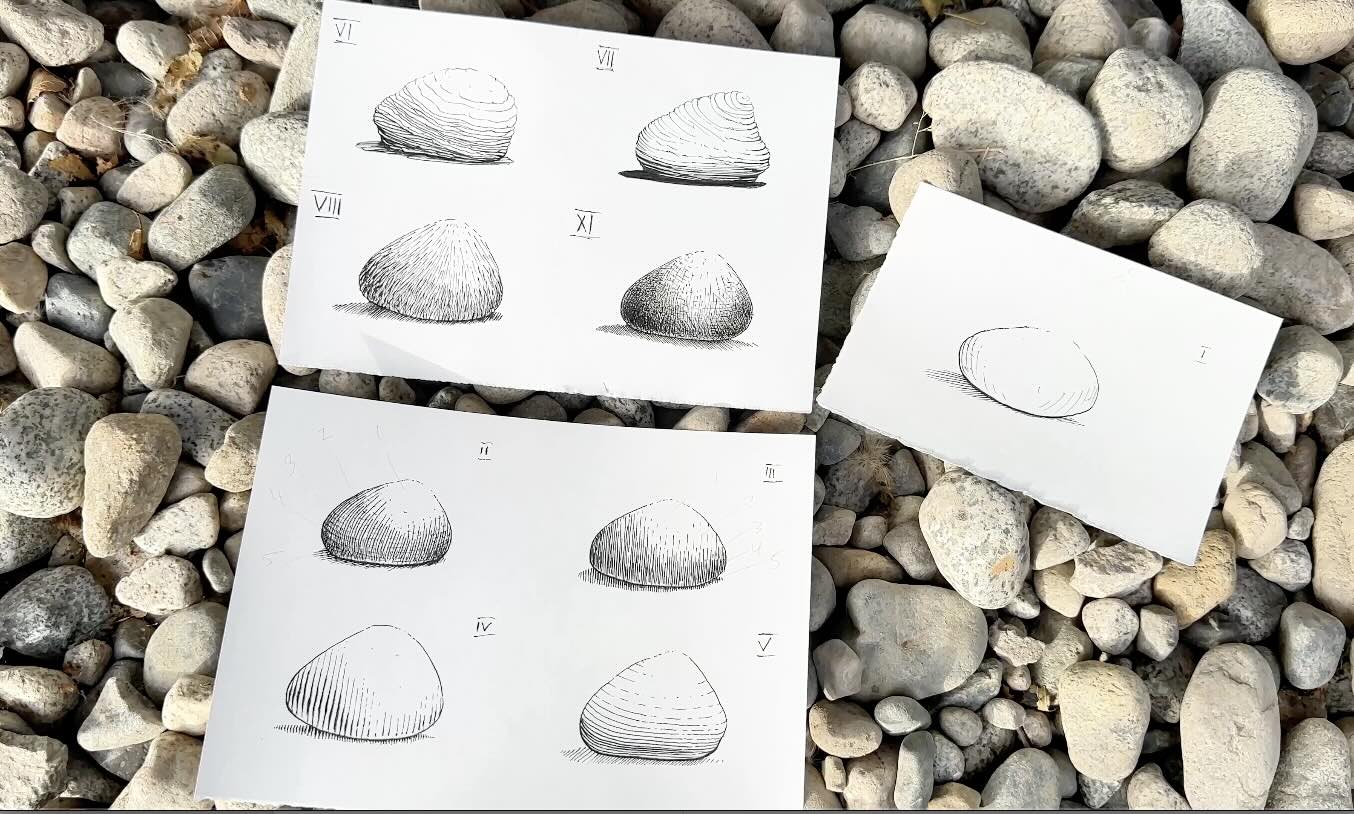
These are the oval-type stones, you often see lying on a beach or grassy fields.
We’ll reference this stone I picked up from the beach.
The shape is simple to draw, so let’s focus on the tricky part: its surface.
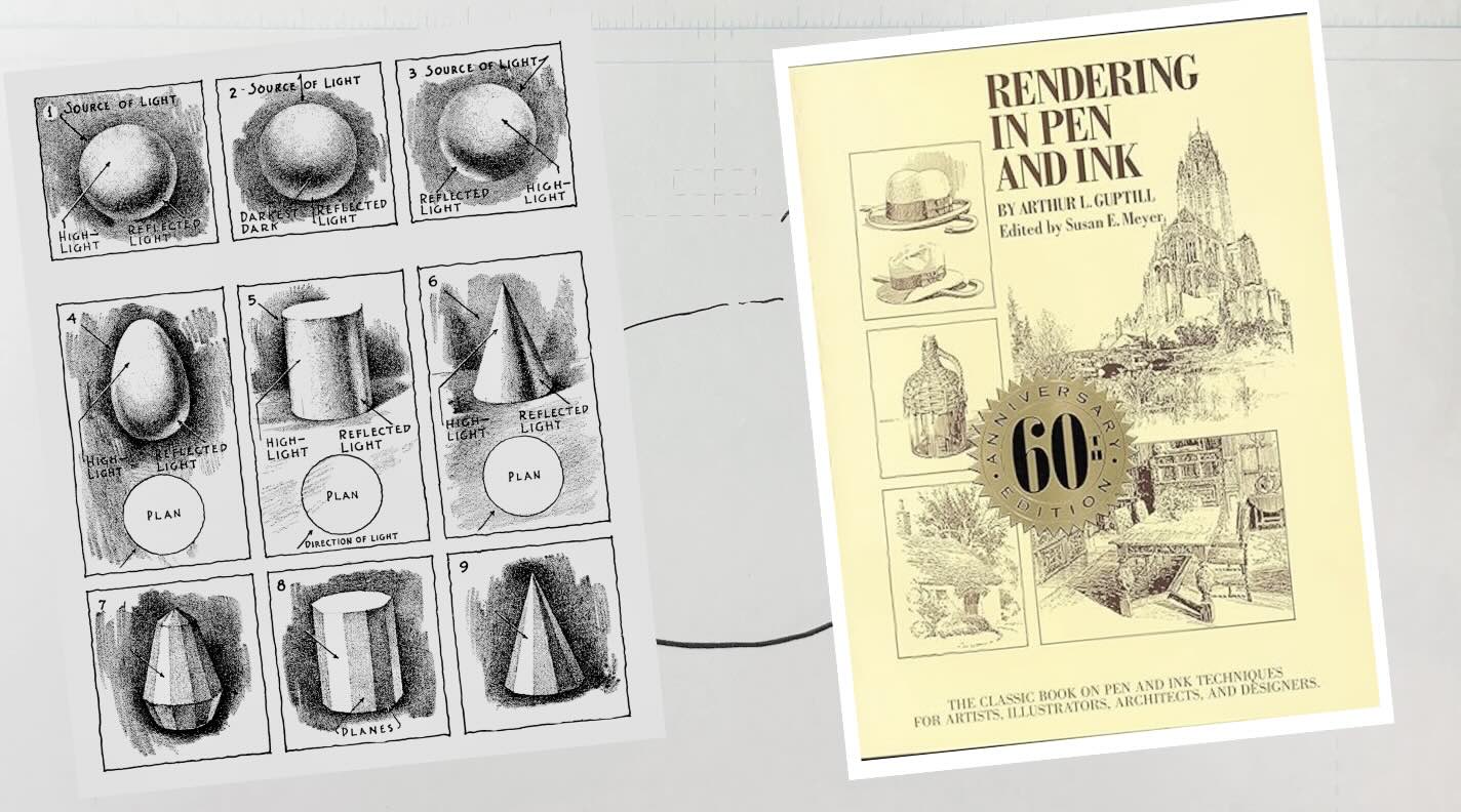
For this, we’ll consult Arthur Guptill’s guidelines on lighting and shading.
What’s important to note is the shape doesn’t go from light to dark directly, there’s a reflective area near the edge of the stone.
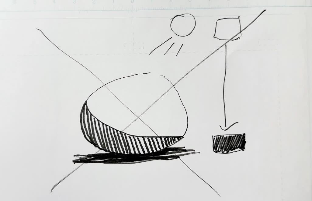
Think of the light source as a little tent or tepee to visualize the concept.
This tent-light creates bands of values across the surface of the stone. You can number the values on the stone as a guideline.
It even shows you where to put the cast shadow.
With this information, we’ll first look at the simplest method of rendering the cast shadow.
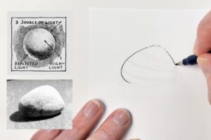
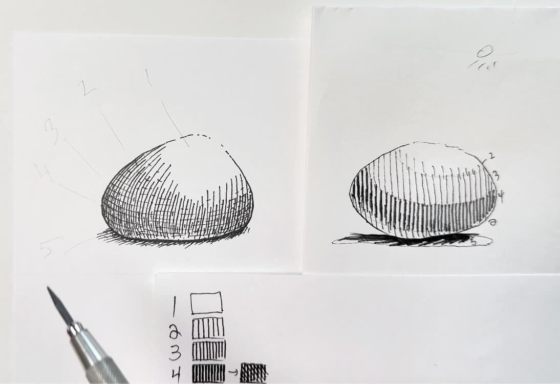
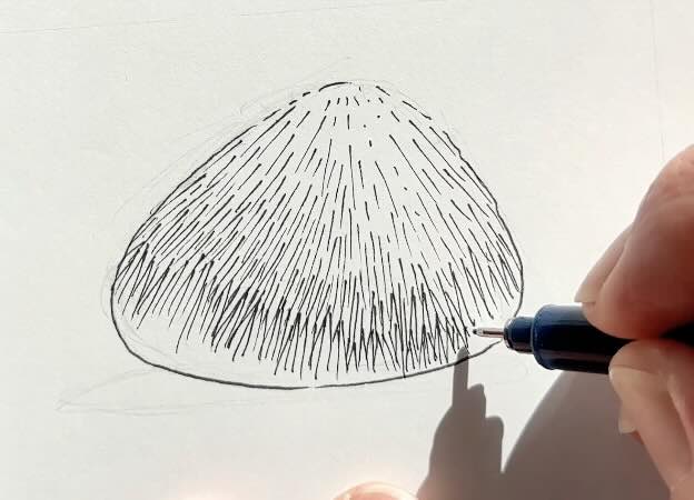
1 – Single Smooth Stone, Sparse Rendering
The simplest way to shade this stone is to use line quality.
When you render a subject by varying stroke weights, marks that appear thin-to-thick or thick-to-thin are described as line quality.
You’ll break the outline on the areas of the stone that get direct light.
The part of the stone in shadow has a thicker outline.
The stronger the light source, the fewer details the eye sees.
📖 To learn more about how the eye perceives light and shadow in a scene, read the Nausicaä Manga Study.
For rendering, we’ll lightly hatch the darkest value on the stone, plus the stone’s cast shadow.
Then add a few marks to indicate a texture on the stone’s surface.
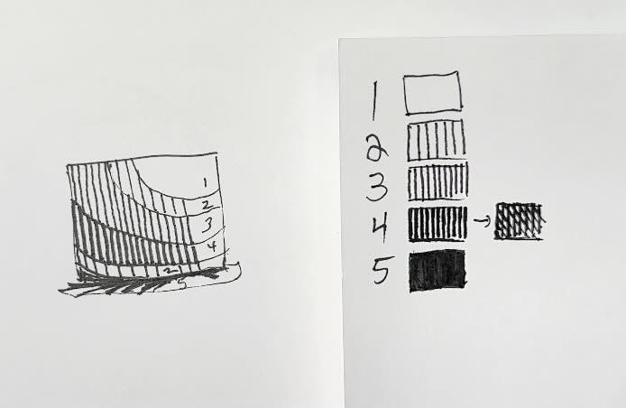
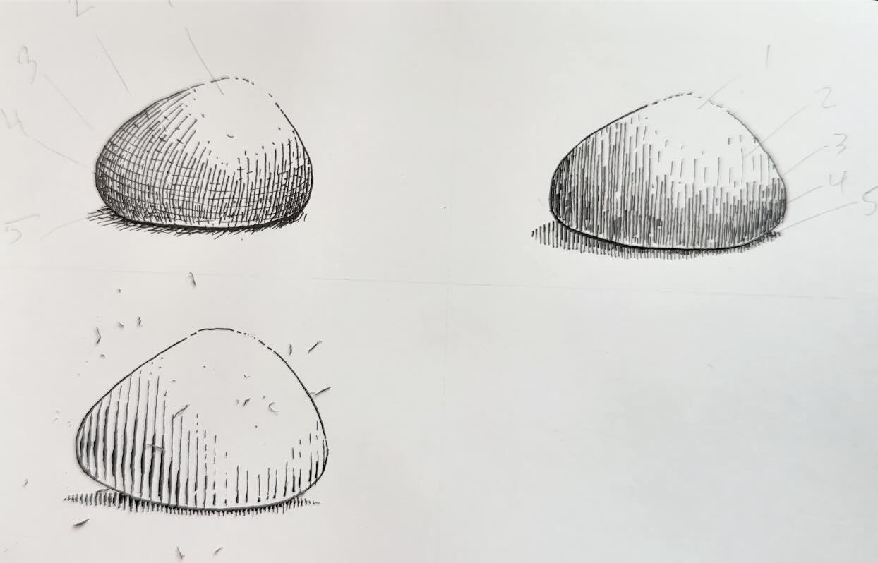
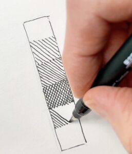
Working with a Values Scale
It’s a good idea to start a pen and ink project by planning how your desired rendering technique will look in different tonal values.
A value scale includes:
- Solid white
- Shades of greys
- Solid black
The previous stone was rendered as though it was under a bright light.
But what if our scene had varied lighting?
We’d see more details and more tone variety on the stone’s surface.
Like in this 5-tone value scale (above) that goes from white to solid black, the marks get closer together, the denser the shadow gets.
The hatching pattern can vary, but the principles of lighting and shading stay the same.
If we applied those exact values from the chart to our stone, the values could be correct but the rendering in this example looks abrupt and unconvincing.
Let’s fix that.
We’ve got the right values, now let’s work on rendering techniques.
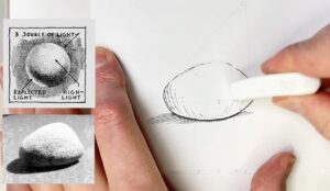
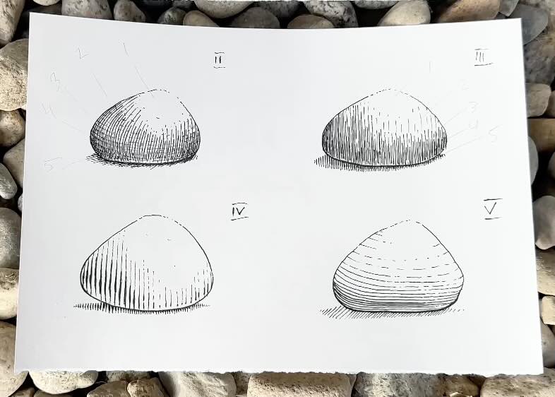
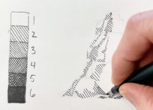
2 – Single Smooth Stone, Freestyle Technique
Outline the stone’s contour thin-to-thick, with broken edges as before.
Use curved hatches that follow the form of the stone.
Space your strokes to match the no2 value from the chart. Your lines should be long enough to cover more of the stone, than in the previous exercise. (see below)
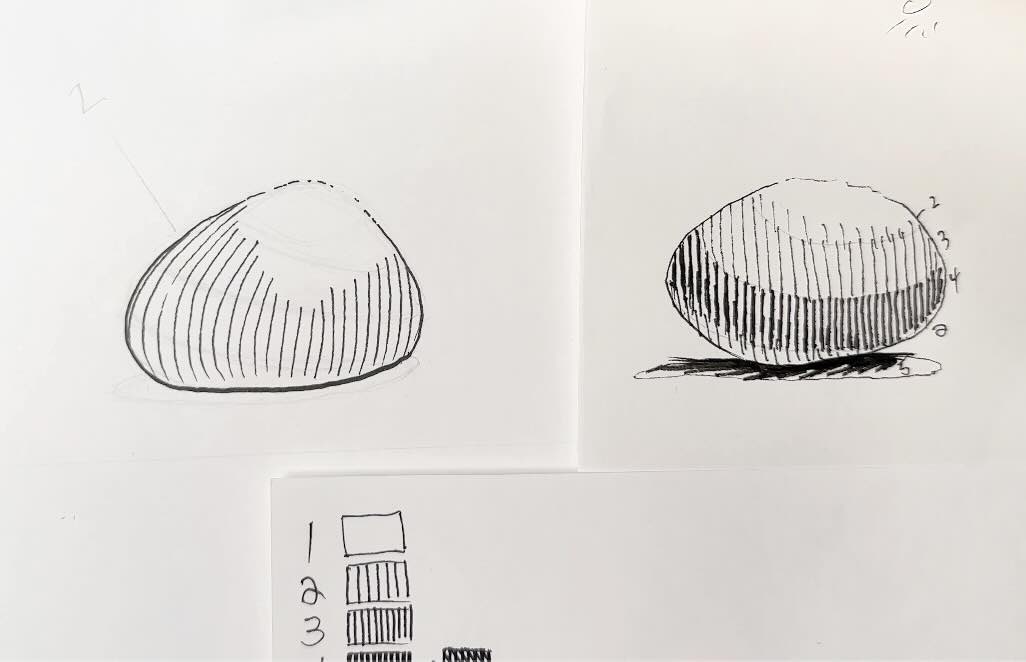
To achieve the no.3 value, add shorter hatches in between the longer ones, along the rock band. Refer to the rock-band values image as a guideline.
We apply the no.4 value with cross-hatches to shade the darker band that goes across.
We finish off with the no.5 value, layering in a subtle crosshatch.
Continue to refine the transition of tones. Remember the rim light reflection, especially closest to the bottom of the stone.
Add the cast shadow. And done.
We used the same value chart, but this natural rendering technique makes our stone look more realistic.
3 – Single Smooth Stone, Vertical Stagger
Start your stone with the same technique outline as before. You will begin each stone exercise in the same manner going forward.
For this stagger style, render using vertical parallel lines. Space them to match the no.2, then no.3 values.
Vary the line height in a staggered effect following the bands that form across the stone’s surface.
Some hatches are long, some short. Continue to layer strokes in between to deepen the tone as we did in the previous exercise.
Add a cast shadow below the stone, you will conclude each stone exercise with a cast shadow.
4 – Single Smooth Stone, Engraving Effect
Start with a no.2 value using vertical lines.
Instead of adding lines in between, increase the weight of the lines where the value is darker.
You increase the line weight by adding more pressure on the tip of your brush pen marker. Or if using fine liners, go over that portion of the lines in bold to match darker values.
The thickening of the strokes in the transition areas from light to dark gives the marks an engraving effect.
5 – Single Smooth Stone, Curved Horizontal Lines
Let’s see what our stone looks like with curved horizontal lines.
Referring to the values chart, transition the tonal value by spreading the spacing between the lines, tight to broad. Dark to light.
Now that we’ve applied the principles of shading and lighting to the most common rendering techniques, let’s experiment with more freeform textures in the following exercises.
6 – Single Smooth Stone, Horizontal Abstract Scribble
Use horizontal squiggly lines to contour the form. Bring the lines closer together in the areas with less light.
7 – Single Smooth Stone, Horizontal Variation
Try a similar contouring pattern but with the light source closer to the centre of the stone (pictured above, VII).
8 – Single Smooth Stone, Short Dashes
Now with short dashes, that follow the form and transition into a pattern. Same principle we used before, adding strokes in between to darken the tone.
9 – Single Smooth Stone, Cross-Hatching
How about a dense cross-hatching pattern?
The possibilities are limitless; we could easily do a dozen more.
Your ink drawings will turn out well, when mindful of the values and how the light interacts with the surface of an object.
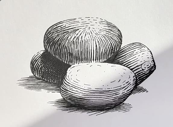
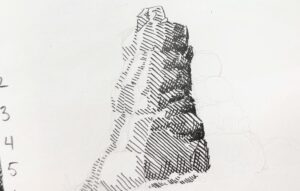
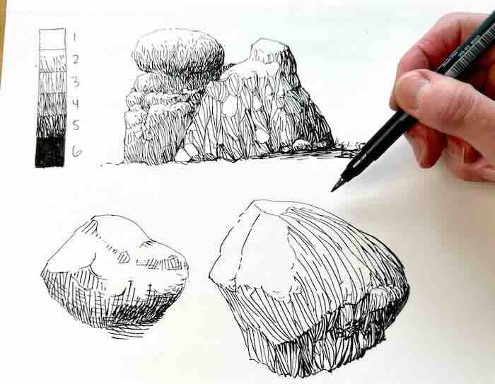
10 – Group of Smooth Stones, Freestyle Technique
I’ve gone ahead and drawn a sample pile of stones from my reference.
As you can see, the shading gets more complex.
The stacked stones block the light and cast shadows on the stones beneath.
Looking back at our values chart:
- White – means direct light
- 2 – less light
- 3 – is in the shade
- 4 – is a cast shadow
- Black – Absence of light (nooks and crannies) – total darkness
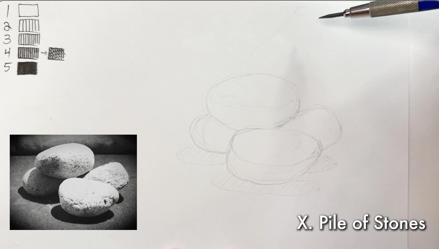
In pencil, sketch the values in, including the shaded areas and where stones block the light.
Render the pile of stones in your preferred inking style from the previous exercises or a combination of the styles.
We looked at how light affects single smooth stones and groups of stones. And how to plan the values while applying various styles.
In the next section, we’ll explore more styles of textures to render rocks and groups of rocks.

5 Ways to Render Rocks Textures
In the following section, we’ll render rock textures using techniques based on various styles of the pen and ink masters.
Rock Exercise 1 – Silhouette Style
In pencil, sketch a simple box.
Create a scale using only 3 Values.
Render your box with the light source coming from the top left-hand corner using the three values.
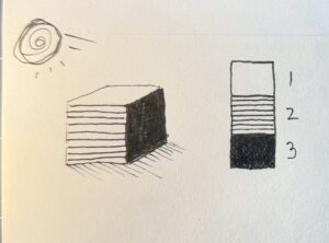
This 3-value technique works well for master styles such as:

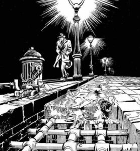
This style intends to simplify shapes, creating forms through extreme contrasts.
The objects are rendered as silhouettes, often with only one gray tone if any.
These masters also use line weight to enhance the illusion of depth, just as we practiced in the stone exercises.
From imagination, sketch and render a few rocks using this method. Remember to include the rim light and cast shadows.
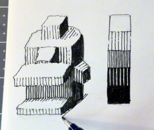
Rock Exercise 2 – Line Style
Now sketch a complex box shape (see example below).
Render a scale using five values.
Create the gradation by increasing or decreasing the space between the strokes.
I started the values scale with a solid black, fading to white, reducing the line weight as the strokes spread from dark to light.
Render your complex box starting with the three primary values, same as we did in the previous exercise with the simple box.
Because the overhanging features cast shadows below, those areas have a deeper shading. Similarly to the piles of stone from the previous section (exercise 10).
That’s why we need the extra mid-tones, from three to five values.
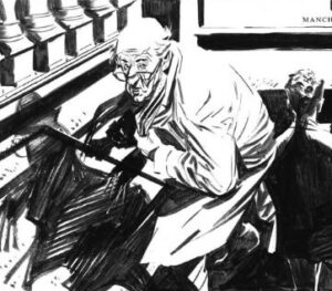
The intention of this style, using only parallel lines, works well if you’re influenced by the techniques of masters:
- Franklin Booth and Bernie Wrightson, neat and calculated, or;
- fast and scribbly, like James Montgomery Flagg.
Note that line direction is less important. We’re interested in building a gradation using parallel lines.
The strokes can be vertical, horizontal, or perpendicular, as long as they don’t cross over another.
The lines interlock, sometimes have no edges, and seldom overlap.
Since this style is more abstract, you can get away with shapes that are less realistic as long as the values make sense.
From imagination, sketch and render a couple of tall rocks using this method. Remember to include the shadows cast from overhanging features.
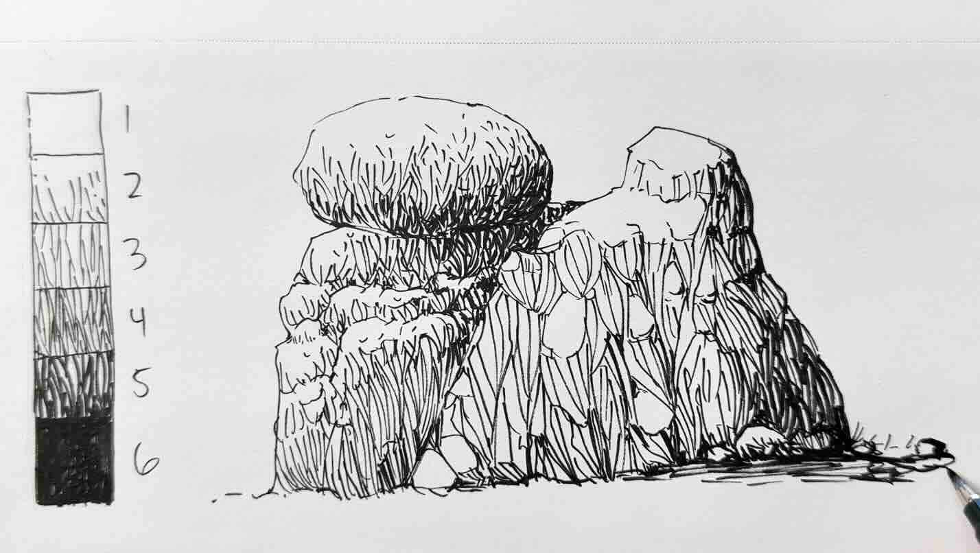
Rock Exercise 3 – Cross-Hatching
With exercise three, let’s start with the value scale.
To build tone, intensify the shading by crossing strokes over another, starting at value no.4.
We’ll also squeeze in a sixth value, aiming for a realistic style. Now value no.6 is solid black.
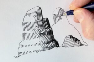
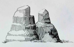
Based on the concept of a complex box, sketch a large rock.
Start rendering the lightest value next to the whites, then the mid-tones, finishing with cross hatches for the darks.
Here, I did the outline last. It’s a technique I learned from doing master studies, for a lively, fluid illustration. Try it out.
You can build on your rock shape. Adding next to it. Smaller stones, or tall boulders to test a broader range of cast shadows.
If this were a landscape, the further rocks would appear less detailed, simplified, similarly to the rendering technique from the silhouette-style rock exercise.
This works well if you favour the style of masters like:
Rock Exercise 4 – Freestyle Technique
If none of those styles are a good fit for how you like to render or for an illustration you’re working on.
Some masters mix it up with a freestyle technique using all of the styles in combination. Such as:
You would still refer to a values scale. The guiding principles remain the same.
Create your desired pattern using irregular strokes for the values scale
Any texture will work, whatever suits the piece you’re working on.
From imagination, sketch and render a pile of tall rocks using your freestyle texture.
So far, we’ve rendered rocks from imagination without a reference.
This is doable because we’re following the principles of lighting and shading for pen and ink.
Rock Exercise 5 – Rendering from Reference
Let’s say you are drawing from a reference for a particular project.
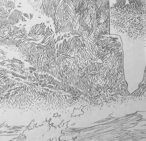
We’ll use this rock from my backyard to demonstrate.
The steps remain the same:
- Establish the source of light
- Simplify the shapes of your subject
- Choose a rendering style
- Create a values scale
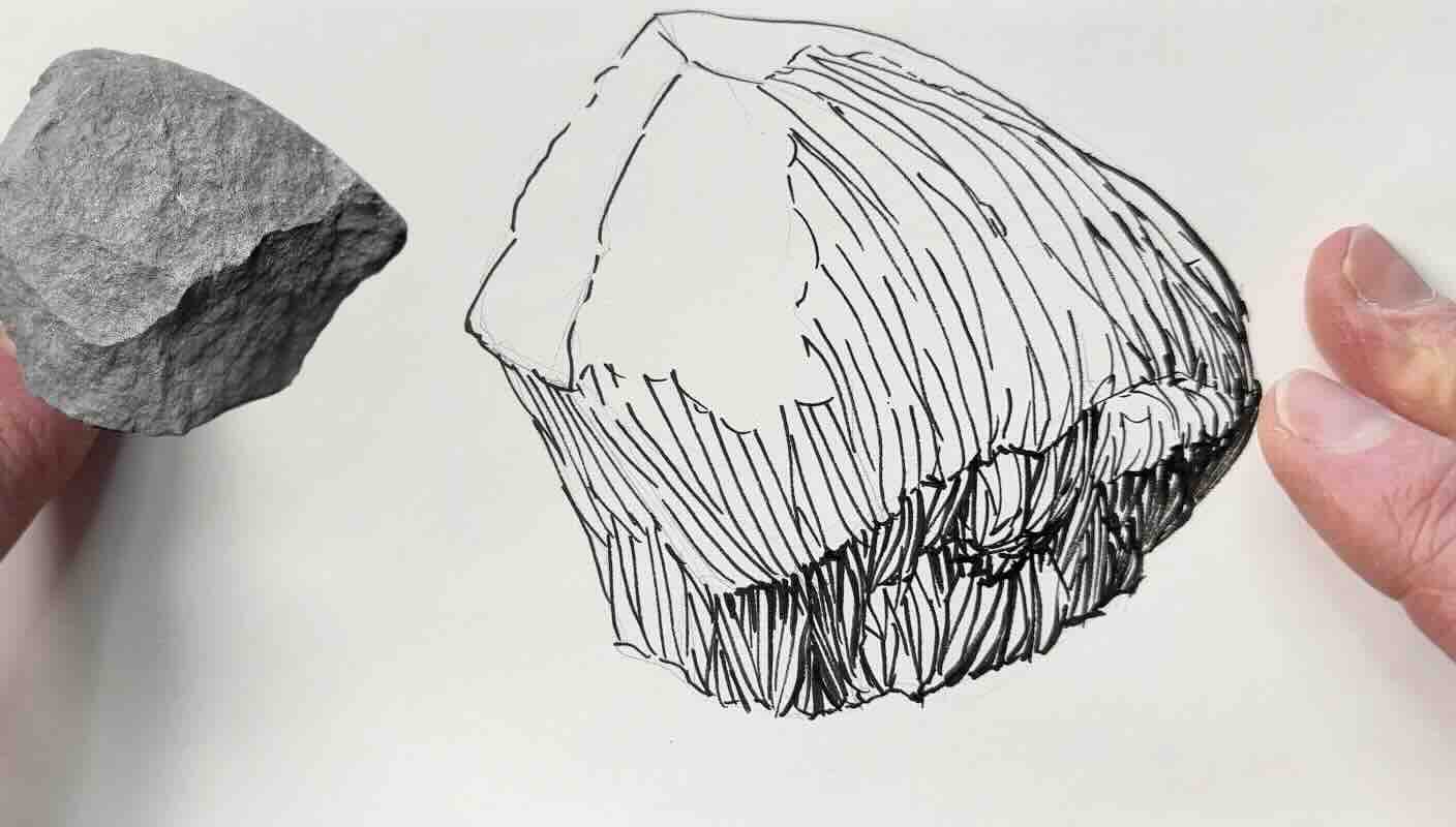
Once you’ve sketched the basic shapes, render the lightest values, then build the mid-tones as you include more details.
The shape of this rock is quite irregular.
Even though I used a live reference, a copy of reality is not always the most convincing in an illustration.
In this case, my preference is to use the reference only to inform where to place the values.
The reference inspired its form, but I modified the shape to look more like a standard rock. Now, this is a rock shape you would expect to see in a landscape (pictured above on the left of the ‘realistic’ rock).
Unless the rock itself is the main subject, rocks and stones typically fulfill a supporting role in a composition without distracting the viewer from the focal point.
I hope that you enjoyed this lesson:
- practicing ten different hatch styles to render smooth stones based on the principles of lighting and shading for pen and ink, and;
- five exercises to texture rocks using techniques based on various styles of masters.


Resources
📗 Books ↓↓↓
- Arthur L. Guptill Book
- Frank Miller Sin City
- Alberto Breccia Mort Cinder
- Will Eisner The Spirit
- Treasury of American Illustration
- Franklin Booth Silent Symphony
- Bernie Wrightson Frankenstein
- Barry-Winsor Smith Wolverine
- Albrecht Dürer Woodcuts
- Enki Bilal Cruise of Lost Souls
- Hugo Pratt Corto Maltese
- Grzegorz Rosiński Thorgal
- Kamome Shirahama Witch Hat Atelier

✒️Tools ↓↓↓


Thank you for the great overview, the thought-provoking ideas, and the exercises. A fantastic, very helpful post. I’m glad I found your blog.