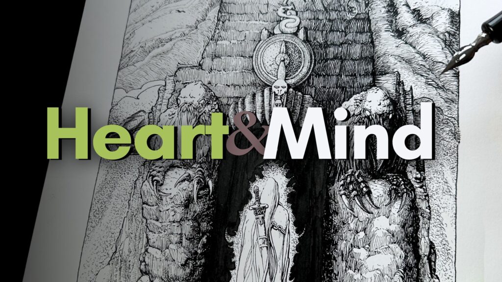
More Interesting Pen and Ink
These three things from Master Sergio Toppi will make your pen and ink renderings instantly more interesting.
//DISCLOSURE: I earn a small commission when you use my affiliate links to purchase something. Learn more about the affiliate partner disclosure by reading the Terms page.
It’s Like Having a Mentor
Do you struggle to come up with original ideas?
Or you have many ideas, but when you start to render your sketches, you get lost and maybe give up?
That used to be me, but I found help along my pen and ink journey.
Studying the works of masters, to me, is like having a mentor. This has transformed how I render my sketches.
Regardless of your level, you’ll pick up a few if not many ideas and methods to render your sketches as a result of studying the masters.
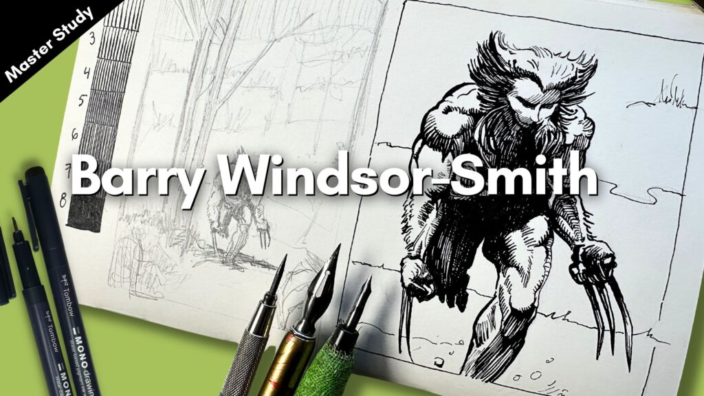
Specifically, in this article, we’ll practice the three things from Master Sergio Toppi and apply the learnings to a final piece.

3 Things About Master Toppi’s Illustrations
When you’re looking at a masterwork, the first step of a study is to identify what jumps out, and then seek to understand why it’s done that way.
Browsing through Toppi’s ink pieces, I’m immediately struck by 3 things:
- His textures serve as a design element; he uses different effects, yet the textures remain a focal point.
- The design of his textures performs in harmony. The textures don’t compete with one another because of his effective use of contrast.
- To achieve this well-balanced contrast, he uses division of space; and silhouetting.

By judicious assembling those three things:
- textures
- contrast, and;
- space …
he achieves that eye-catching composition.
If you’re keen to learn more about the steps for how to do a master study, read ‘the 4 best exercises for master studies’.
Texture Design
Texture refers to a pattern that visually explains how a surface might feel.
In a realistic style of illustration, an artist would typically aim to render a subject’s texture to closely resemble what it looks like in real life.
Sergio Toppi adds an element of design to his textures.
Looking at the image below, it’s unmistakably a seal.

But how about now?

With the image partly covered, what other information do we have that would help explain the subject?
The source of light comes from the top right-hand corner. We can see the subject has a pear shape and form but otherwise, it’s unclear what it is.
This lady has awesome hair, right?

Again, when I cover part of the image, the texture alone doesn’t reveal the entire story.
What the texture design achieves is building the viewer’s interest.

From an art fundamentals point of view – all the key things are there:
- Light and shadow
- Line quality (line weight)
- Shape and form
- Dimension, and so on.
To learn more about how to apply the art fundamentals to improve your pen and ink projects, check out this master study PDF checklist.
Let’s look at one more image.

The claws in the image above hint this could be a creature.
Otherwise, your imagination can fill in the rest.
At this point, you’re probably wondering why bother studying textures that don’t explain to the viewer how a surface might feel?!
Because! Look how delightful the image below becomes once fully unveiled.

Supplies – FYI
I’m using a variety of inking tools for the exercises and final piece, such as:
- Prismacolor Non-Photo Blue Pencil
- Staedtler Technical Pencil
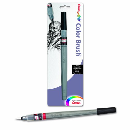
- Pentel Arts Brush Pen (M)
- Tombow Water-based Fineliners
- Deleter Comic Book Paper
- Speedball Art Flexi Sketch Pad 8×8
- Speedball Super Black India Ink
- Speedball Signature Series Set
- Speedball Crowquill Set
- Beginner Paint Brush Set

Not to worry. The tools are less of a factor in this study.
You’ll benefit from the exercises using the supplies you have on hand to sketch and ink your pieces.
Texture Design Exercise
Let’s practice by rendering small sections of Master Toppi’s texture work.
Referencing the bear and the hair-lady pieces, I used the blue pencil to sketch a 3 x 3-inch texture-sample portion of each artwork.

The Bear’s Texture
At first, I couldn’t figure out the hatching logic of the bear texture – but then I did.
It’s not exactly a pattern but it goes something like:
- A couple of thick to thin strokes going in one direction
- Then a couple more strokes, running parallel to the first set of strokes except thin to thick
- Plus a few more in the same direction, but much bolder or otherwise leaving a gap
- Then, change the direction or angle from the previous set of strokes
For an added challenge, it’s good to do a gradation scale.

You’ll have observed that Toppi’s light and dark tones appear to be loose and intuitive.
Toppi’s values have a spontaneous characteristic, if compared to Bernie Wrightson or Gustave Doré whose arrangements of values are precisely calculated.

The Hair-Lady’s Texture
For the lady’s hair texture, I’m using a brush pen to simulate the effect.

Toppi’s strokes are an intertwined mix of very thick with thin strokes.
And, similarly to the texture pattern on the bear, he uses stroke angles to grade the tones.
A standard values scale that fades in tonal values is only somewhat informative to help us make shading decisions for Toppi’s style.
How Toppi Structures Composition
Toppi structures his compositions through the use of:
- Contrast,
- division of space, and;
- silhouetting.
The difference between the lightest value and the darkest value is known as the contrast.
Space refers to the illusion of depth, dimension, and proportion created within the picture plane.
A silhouetting technique is when the shape of a subject, an element or part of its outline is represented as a solid, either all-black or reversed to white.
Toppi’s use of silhouetting is cleverly coordinated, as it provides structural balance in the picture plane.
Typically, artists will aim to structure a composition through the use of well-established guidelines such as the rule of thirds or the golden ratio.
Toppi uses the rule of thirds as a baseline.
Then, more directly leads the viewer to a point of interest through the use of contrast which divides the space with appealing symmetry, giving a sense of stability in the structure overall.
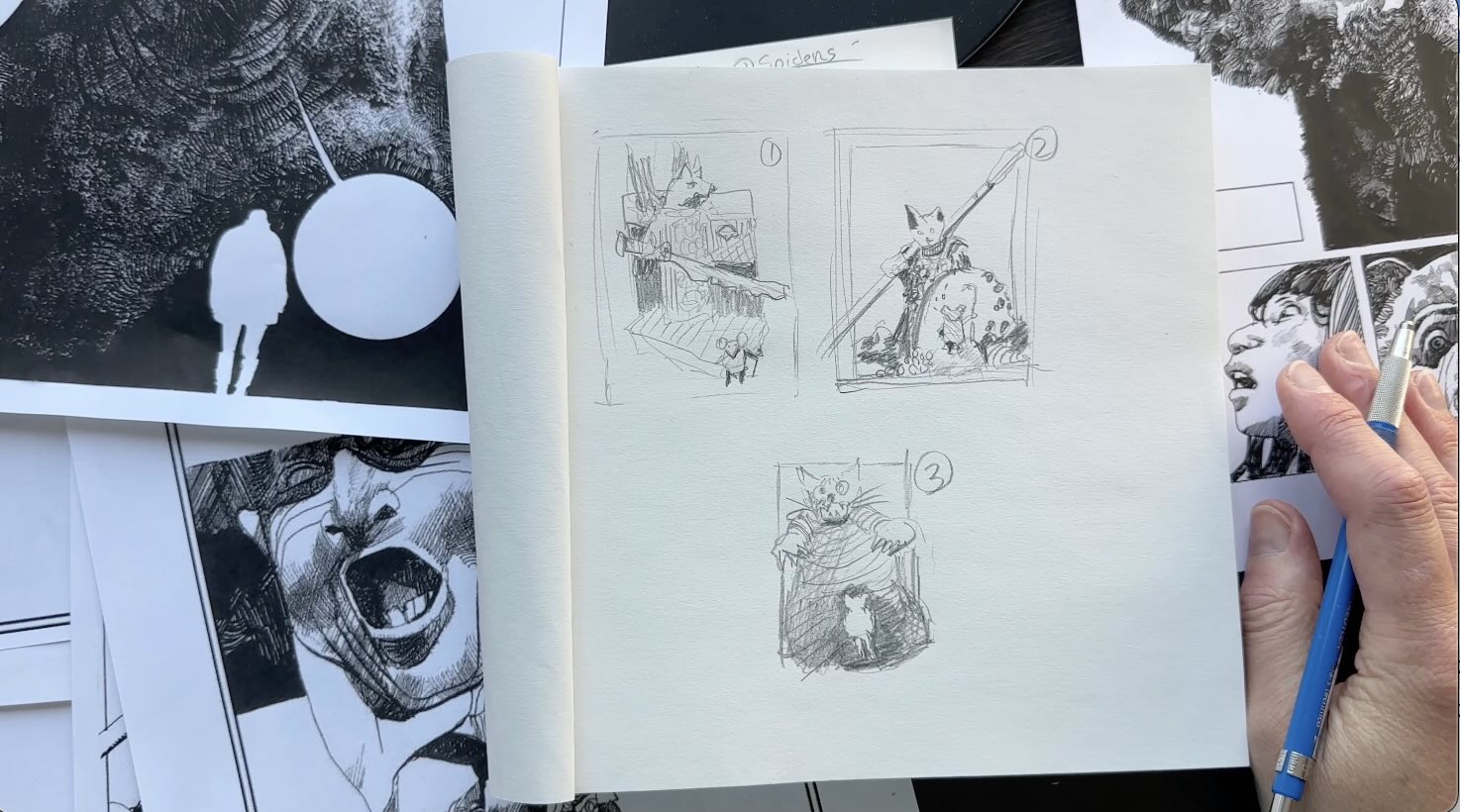
Composition Exercise
For the composition exercise, I’m sketching 3 thumbnails with an HB pencil, using Toppi’s framework to structure different options.
At this stage, I’m just arranging elements on the page, so the details aren’t yet important.
The objective of these thumbnail sketches is to figure out what parts of the composition will be contrasted in black or silhouetted, which parts will be textured, and how the space is to be divided on the picture plane following Toppi’s methods.
In this case, I’m copying his layouts for practice, then just swapping his subjects for my characters.
In the next step, we’ll combine our textures exercise with the thumbnail ideas to create a final piece.

Final Artwork
For the final piece, I pencilled the underdrawing on a Bristol vellum paper.
The composition is based on my first thumbnail for the concept, plus elements from each sketch to get the maximum practice from using Toppi’s methods.
While drawing, I applied the Master’s tricks that give the illusion of symmetry.

In this layout (above), you’ll observe the elements are framed with equal spacing from the edges of the picture plane.
You’ll also note the sword is on a parallel plane to the edge of the vignette frame.
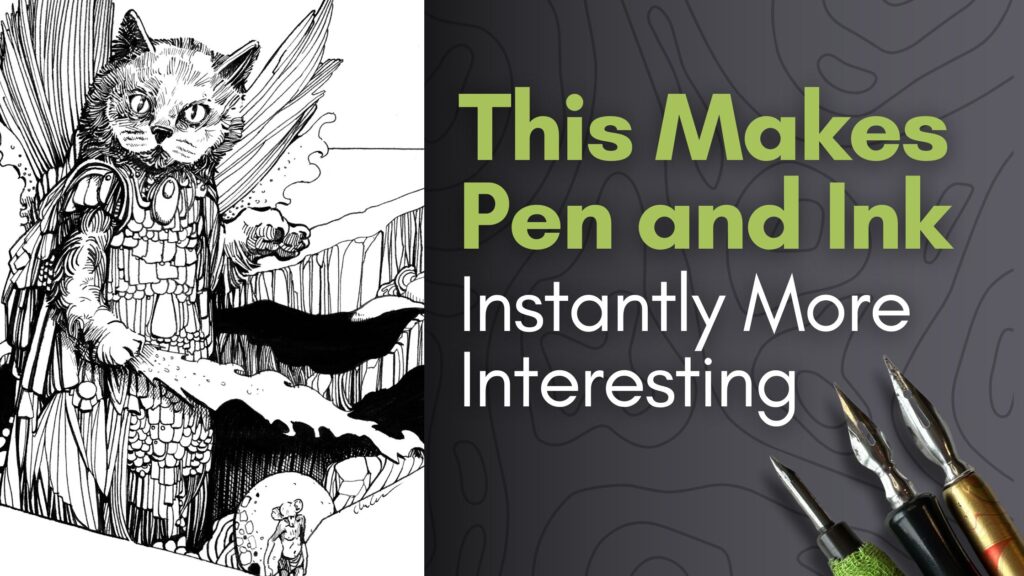
My British Short Hair cat kindly posed as a reference for the main character. I swapped the sword from Toppi’s layout for a shooting flame coming out of the cat’s paw.
For the ink application, on the cat’s face, I used a Hunt 102 crow quill made by Speedball. That 102 nib is precise for smaller details, yet flexible enough to produce thicker lines in a single stroke.

For the cat’s fur, I aimed to create a similar pattern to what I practiced for the texture of the bear.
Master Toppi likely inked with a brush and perhaps a variety of instruments. Maybe he inked with a pen tool first then did a second pass for the darker areas using a brush.

After I finished rendering the cat’s furry arm, I went ahead and did the line work for the gown and fire beam, then the remainder using a Hunt 512 nib.
For the areas of darker values, such as cast shadows, I switched to a large nib, a Hunt 513EF.
I saved the brushwork for the end. I used a watercolour no.4 micro-brush to fill in the solids.

If this were a piece with a complex values arrangement, for example in the style of Franklin Booth, I would ink light to dark.
However, the emphasis of Toppi’s style is more on contrast and texture design than on tonal values and therefore the inking sequence has less impact on the result.

You’ll note that Toppi uses sparse cross-hatching. I went ahead with a crow quill to cross-hatch a subtle cast shadow under the cat’s arm and flame on the robe.
I didn’t end up using the hair texture from earlier practice as a reference in the piece. However, that exercise was valuable. It helped with loosening my strokes. Which comes through in the final piece with a playful energy.

That concludes our study of Master Sergio Toppi’s style.
Observing and practicing his pieces felt like spending time with a mentor.
He indirectly teaches us how to design textures and gives us ideas on ways to structure compositions in instantly more interesting ways.
If you enjoyed this article, share it with other pen and ink enthusiasts by email or on social media as it helps support the Blog for more content like this.
Resources
Instagram Account Dedicated to the Art of Sergio Toppi
Longstride Illustration on Instagram