Booth Master Study
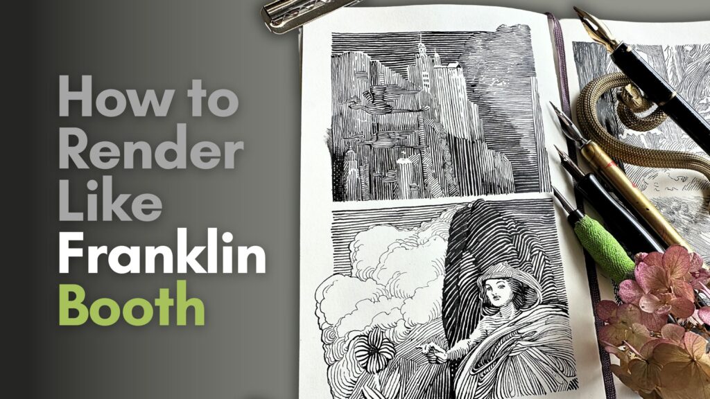
In this article, you’ll find ideas for how to render using two techniques from pen and ink master Franklin Booth.
//DISCLOSURE: I earn a small commission when you purchase using one of my affiliate links. Read more about the Affiliate Disclosure on the Terms Page.
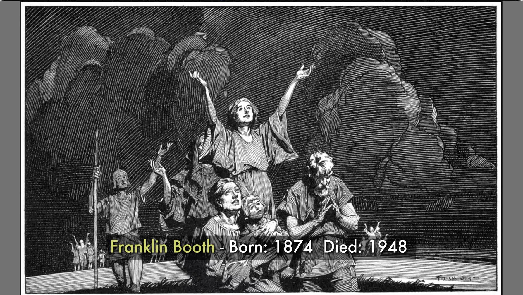
The illustrations of Franklin Booth are known for their intricate range of values, and continuous interlocking lines.
Control of Values
Franklin Booth demonstrated prowess in his control of tonal values.
Value is how light or dark something is.
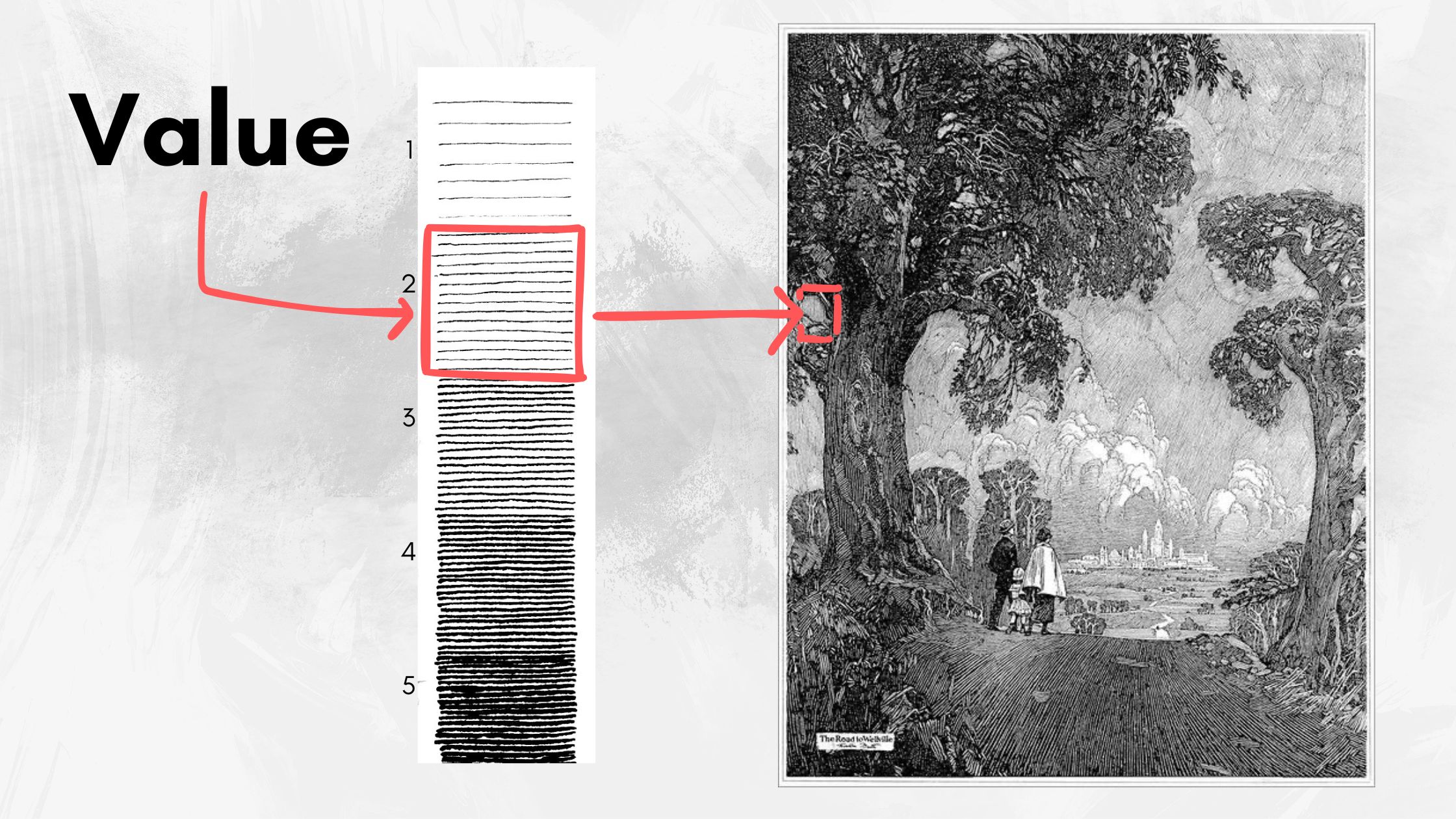
In pen and ink, value is communicated using strokes or textures that fade from light to dark, based on a scale typically ranging from 1-5 or zero to solid black.
Tone is the degree to which a value is light or dark.
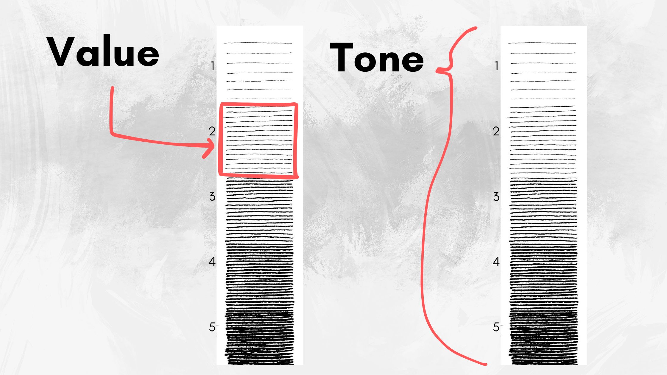
Tone is where Booth excels. He adjusts the degree of tones at a micro-level. It’s as fine-tuning the dial of a light dimmer switch.
From Zero to Infinite
How Franklin Booth renders tonal values gives the impression that his scales are infinite.
Something notable in Booth’s value scales is that he rarely fills his gradations to solid black.
You’ll see the “zero” values, which are the ‘white of the paper’, but not the reverse.
Instead of solid black, he meticulously builds the tones, painstakingly knitting each texture in an orchestrated arrangement to describe each element in the picture plane.
His placement and spacing of lines produce multi-faceted shadows and luminescent highlights.
Franklin Booth’s Influences
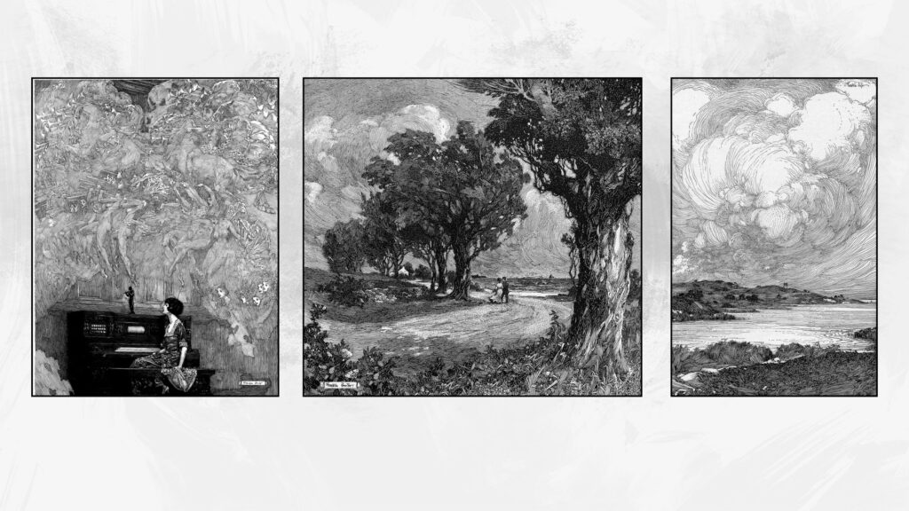
It’s well-documented that he developed this hatching style by recreating engravings with pen and ink.
You’ll recognize some of Booth’s influences most notably Gustave Doré and Albrecht Dürer.
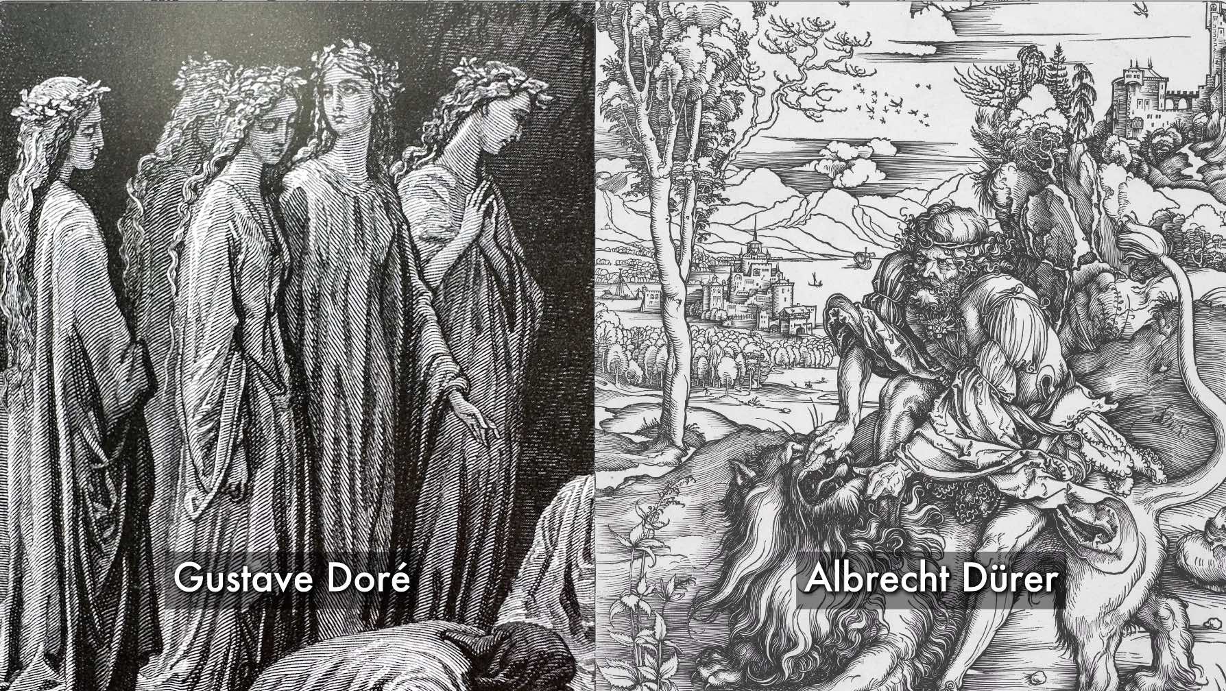
To me, what sets Booth apart, where he shines is through his drawing skills.
He was an accomplished draftsman excelling in depicting a broad range of subjects.
His figures, structures, and landscapes are coordinated in spellbinding compositions.
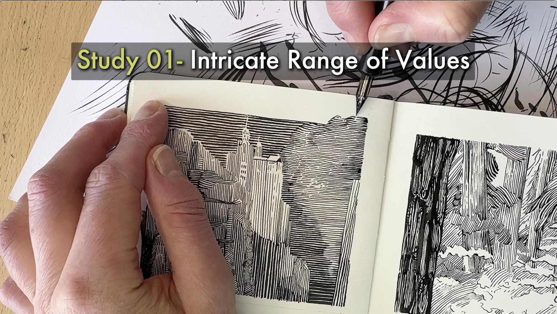
Practice Study I – Tonal Values
I rendered a mini-study for practice using a section of the 1923 illustration below.
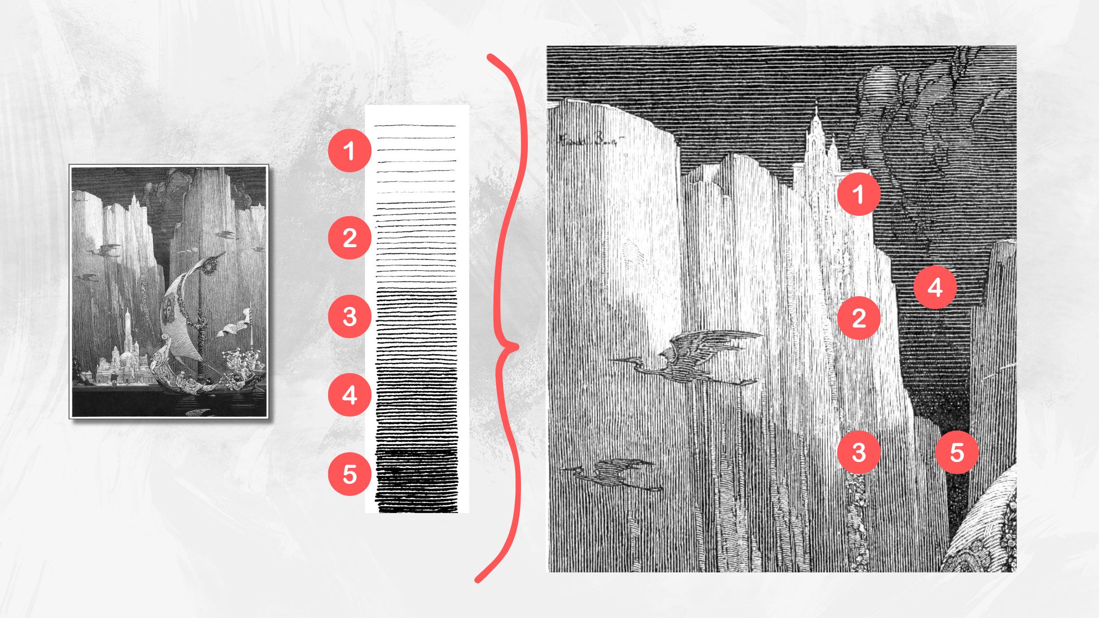
I chose that particular illustration because it seemed less complex. Less complex in terms of having a limited range of values comparatively.
Values using parallel lines are what give this piece a sense of scale, depth and dimension.
While inking, I realized that replicating the illustration’s tones hinged on being precise with my allocation of values.
Inking Sequence
If you’re wondering where to start an inking sequence, I first tried rendering my sketch from top to bottom.
I reserved empty spaces for the hatch lines that track at a different angle from the main vertical lines.
For example, I left gaps in areas for the creatures and castles because they’re rendered in a non-vertical pattern.
That sequence of inking was ineffective though. Consequently, my values became disorganized.
A strategy that worked better was to ink front to back starting with the gaps, those patches of non-vertical patterns.
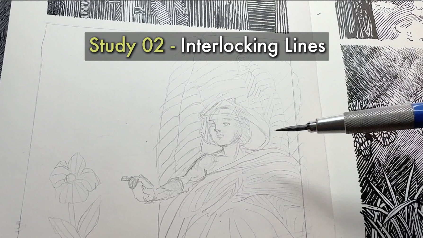
Practice Study II – Interlocking lines
For the second study, my focus was on his interlocking line system.
Franklin Booth’s linework is essentially a continuous flowing puzzle.
As it relates to the art fundamentals, lines and stroke techniques serve as the starting point of design in pen and ink.
Lines create shapes, explain form, divide space, and so on.
Check out my Master Study Worksheets to learn more about the inking fundamentals.
Plane Changes
Let’s talk about plane changes.
A plane change happens when the lines switch angles, including:
- Vertical
- Horizontal
- Diagonal
- Curved
Plane changes are commonly used to convey the dimensionality of a shape.
However, Booth changes the plane direction in unique and delightful ways. Sometimes going “against the grain” as seen in the example below.
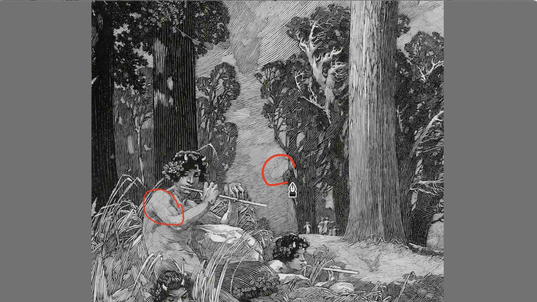
Going against the grain is effective for Booth because of two important factors.
Factor 1– Interlocking System
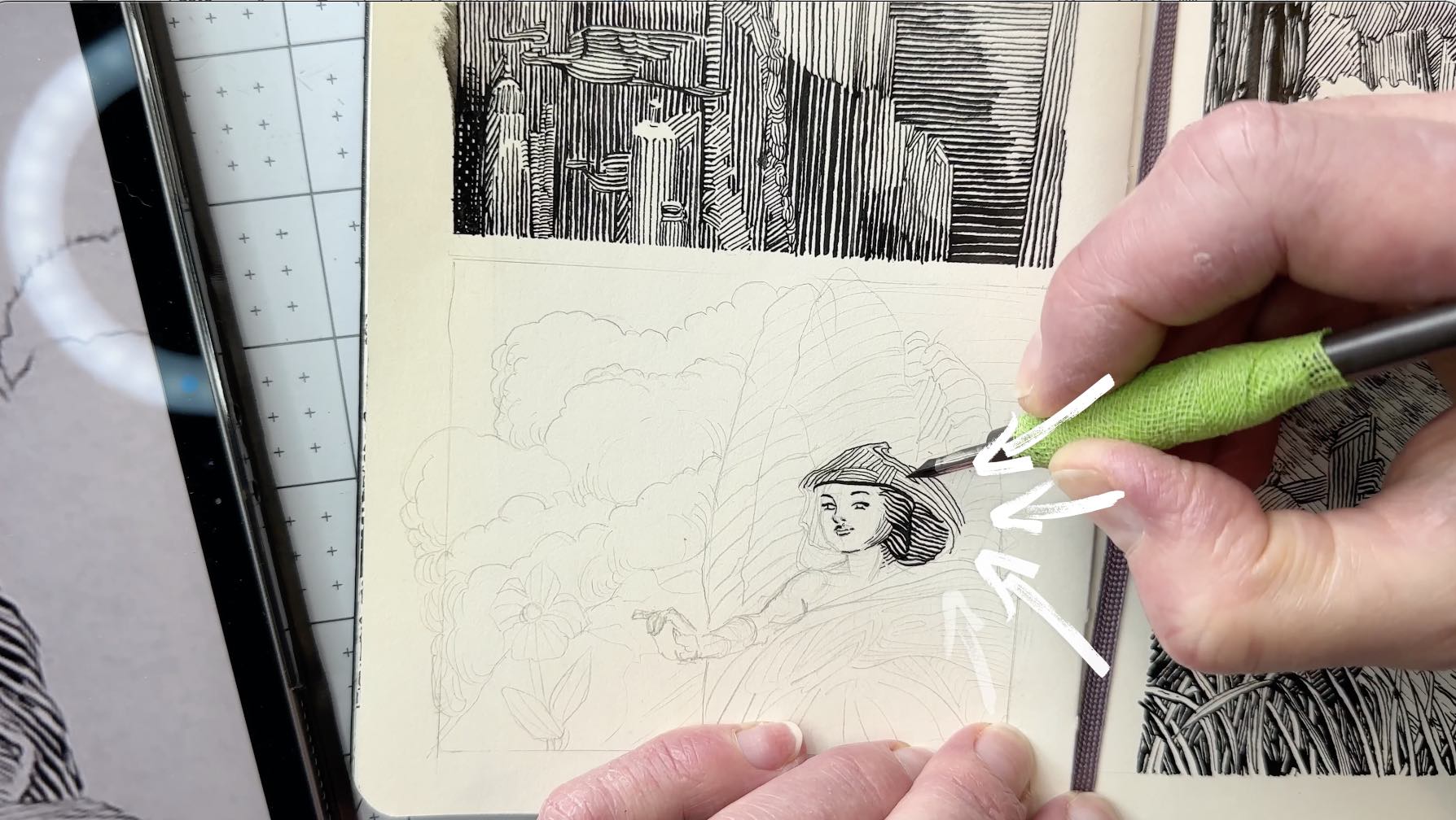
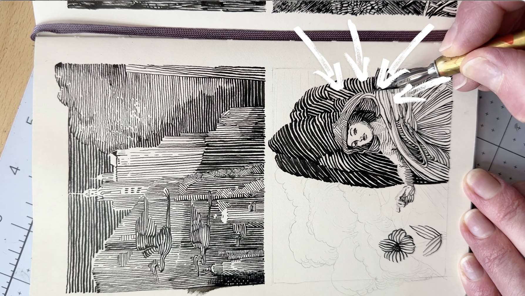
When there is a change of angle, each line is connected with a purpose.
You’ll rarely find an orphaned endpoint. Not only is each line attached, but it’s executed in a way that’s not abrupt.
For example, in the images below, I left some lines unconnected (orphaned) on the first pass, and then connected them to the lines of the background layer, as Booth does.
Factor 2 – Continuous Flow
Booth micro-adjusts the tone as a continuous path regardless of the angle.
To demonstrate and better understand his logic, I traced the micro-adjustment in the image below of a boulder.
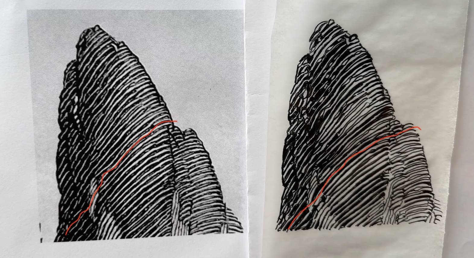
Follow how the line travels, you’ll see how the white of the paper expands and contracts, it’s the darkness that chokes its path.
This makes sense seeing as his technique is trained based on engravings. Booth sort of reverse-engineered the strokes.
I then redrew sections of that piece in my Moleskine Sketchbook.
For the inking sequence, I started with the main subject going front to back of the picture plane.
I used various-sized dip pens to get a broader range of line quality (width of the marks).
For ink, I use Speedball Super Black India Ink, ideal for sketching with dip pens.
Those Enchanted by Booth
Booth’s combination of the intricate range of values and continuous interlocking lines gives his technique an enchanting quality.
Imagine how epic a comic book would have been illustrated by Franklin Booth.
Luckily, Booth influenced countless other artists including Bernie Wrightson and Frank Cho who gave us terrific comic books.
I hope the tips in this article gave you new ideas for how to study the masters.
Resources
✨ Images of Franklin Booth (Download for free)
✨Franklin Booth: Silent Symphony (Book)
✨Treasury of American Pen & Ink Illustration (Book)
✨My Studio Equipment and Art Supplies (and FAQ)
✨Follow on Instagram + Threads

You can take my dip pen class for free on Skillshare with a 30-day trial (and have access to all their courses). Or own it forever, when you purchase my course from Udemy.




Greetings! I just finished reading this blog post and felt compelled to leave a comment. Your analysis on this subject was spot-on and gave me a lot to think about. I appreciate the time and effort you put into creating such valuable content. Looking forward to more posts from you!
Bonjour Chloé. Je suis vos vidéos avec beaucoup d’intérêt. Celle sur Franklin Booth en particulier qui est une de mes illustrateurs préférés. Et bien sûr ” j’étudie” ses oeuvres pour essayer de comprendre sa démarche. Un point qui m’a permis de mieux la comprendre est la découverte de la pratique du scratchboard ou clay panel et du travail par zone des illustrateurs américains qui permet d’avoir des lignes blanches fines sur un fond noir. Depuis peu je m’essaie au tracés à l’encre acrylique blanche sur formes à l’encre de chine noire. Pas trop simple mais prometteur. Avec mon admiration pour vos talents. Georges
merci et bonne chance dans vos projets !