Learn what makes Marc Silvestri’s illustrations distinctly recognizable, how to practice his style, and how to apply his techniques to your own subjects in pen and ink.
// DISCLOSURE: I earn a small commission when you use my affiliate links to make a purchase. Please read the Terms for more information.
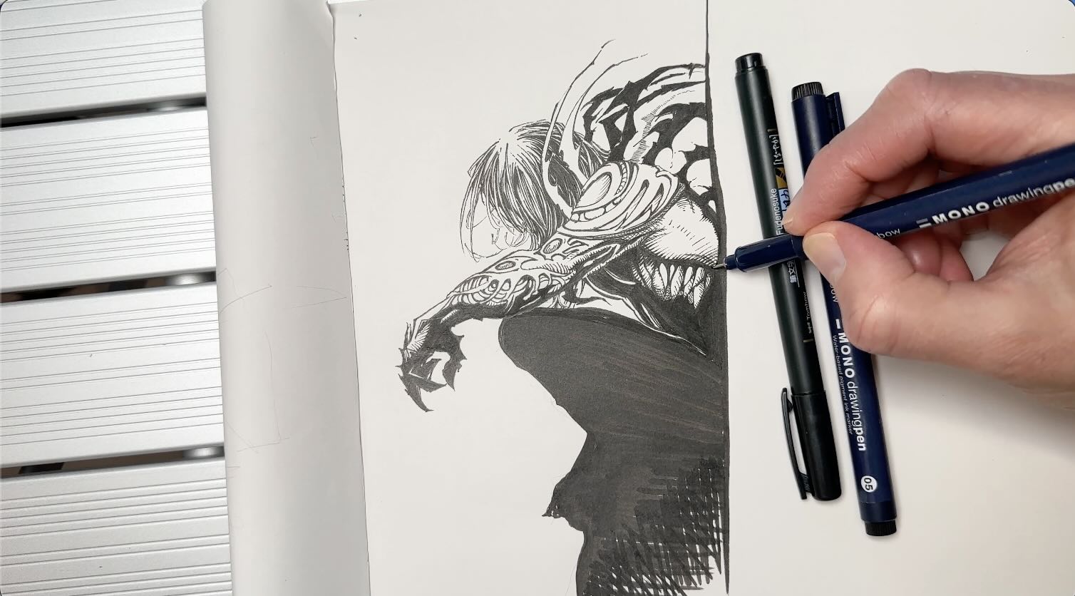
The Art of Marc Silvestri
Marc Silvestri is known as a great storyteller with an identifiable style.
He’s a comic book artist, primarily a penciller. This means the final artwork we see is often created in collaboration with a team.
Different inkers may give Silvestri’s drawings a different finish, but his marks are always recognizable.
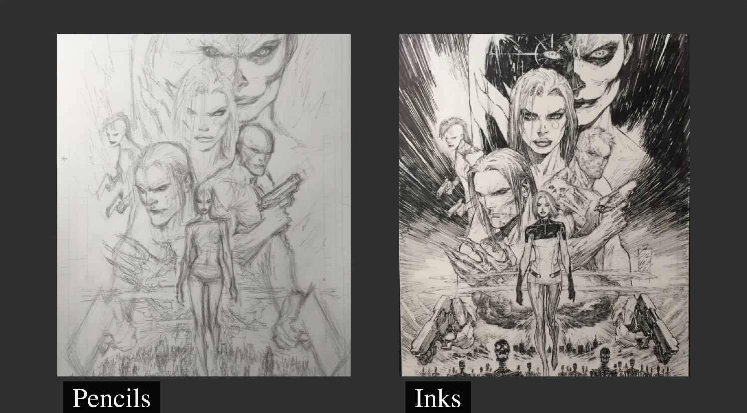
Marc Silvestri’s Pencilling Approach
Marc Silvestri draws with energy using an organic, impressionistic approach to pencilling his illustrations.
An impressionistic approach means that Silvestri’s lines are spontaneous. It’s scribbly, yet confident and never sloppy.
It’s like he ignites invisible paths on the page.
Copying a Silvestri drawing is nearly impossible. One can only try to mimic the stroke direction he uses and work towards his level of freedom.
He finds the lines, the rest of us are still searching for.
Marc Silvestri’s Inking Style
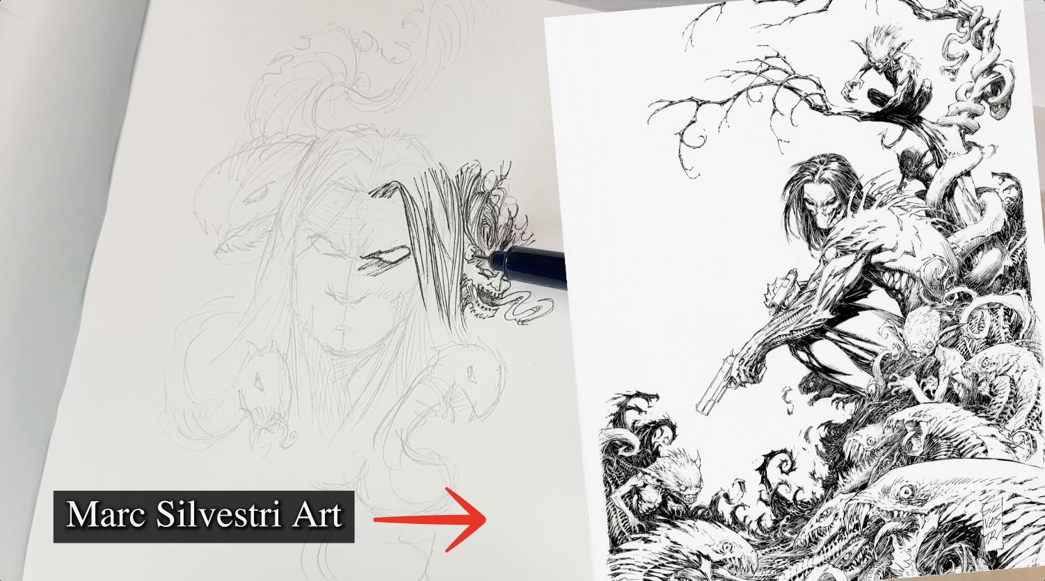
I watched footage of Silvestri drawing and inking his own work.
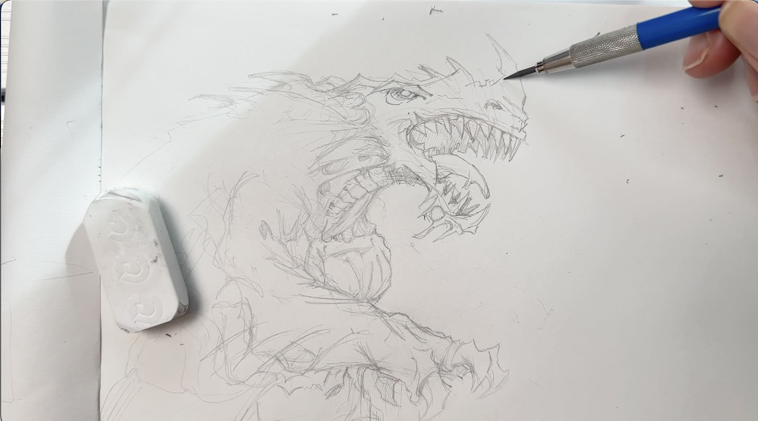
For pencils (the pencil underdrawing), he starts loose and fast. He sketches numerous “finding lines” to construct the drawing, going from big to small on the page.
Silvestri’s viewpoint is that, in comics, accuracy is not as important as aesthetics.
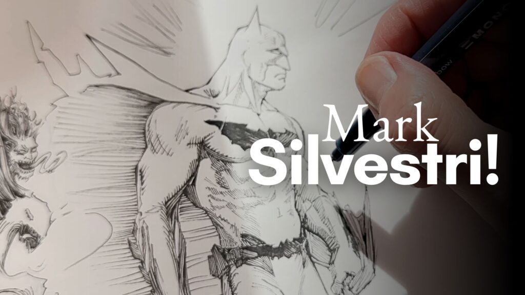
For example, the drapery of Batman’s cape here is not necessarily realistic – but it’s a very persuasive cape. It gives the illusion of being made of a menacing material.
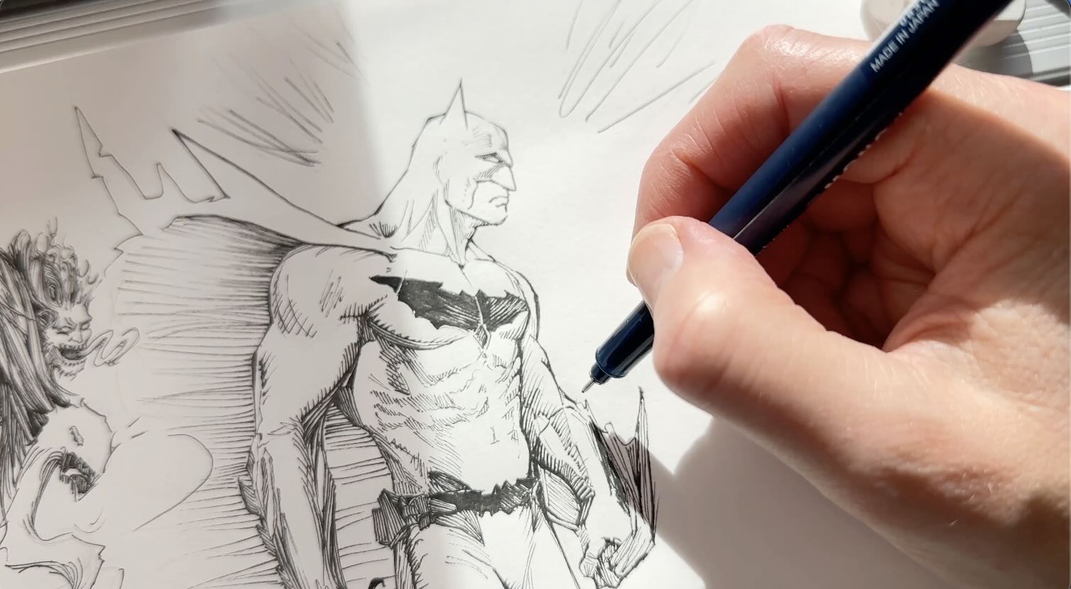
I think Silvestri’s point is that if the artistry of the strokes tells a convincing story, then the exactness of what’s illustrated comes secondary.
He can get away with that because his illustrations are so effective.
Observe the pleasing angles of the character’s anatomy and how that cape emerges from his collarbone.
Look at the energy lines. The strokes seem to radiate from Batman’s core.
Silvestri’s linework is like an electric network of grit emitting from the solar plexus.
And that right there, the solar plexus thing, is the secret of his compositions.
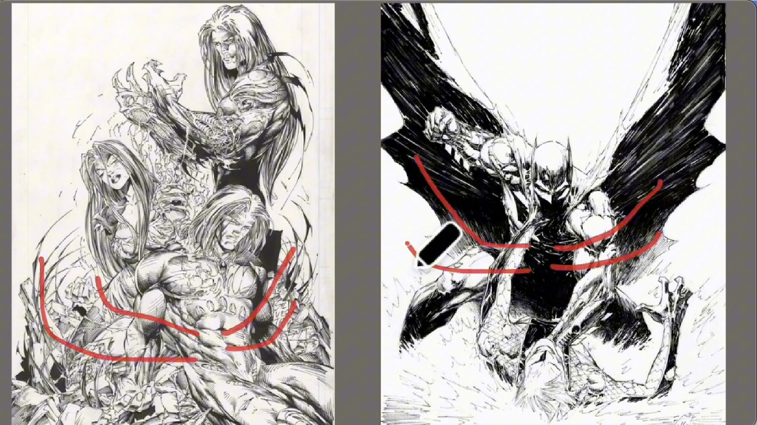
Composition Structures
His pinup compositions typically have a “v” or an “s” shape structure.
Silvestri achieves a well-balanced structure by using squiggle shapes as background elements, and with the “solar plexus strokes” I mentioned earlier.
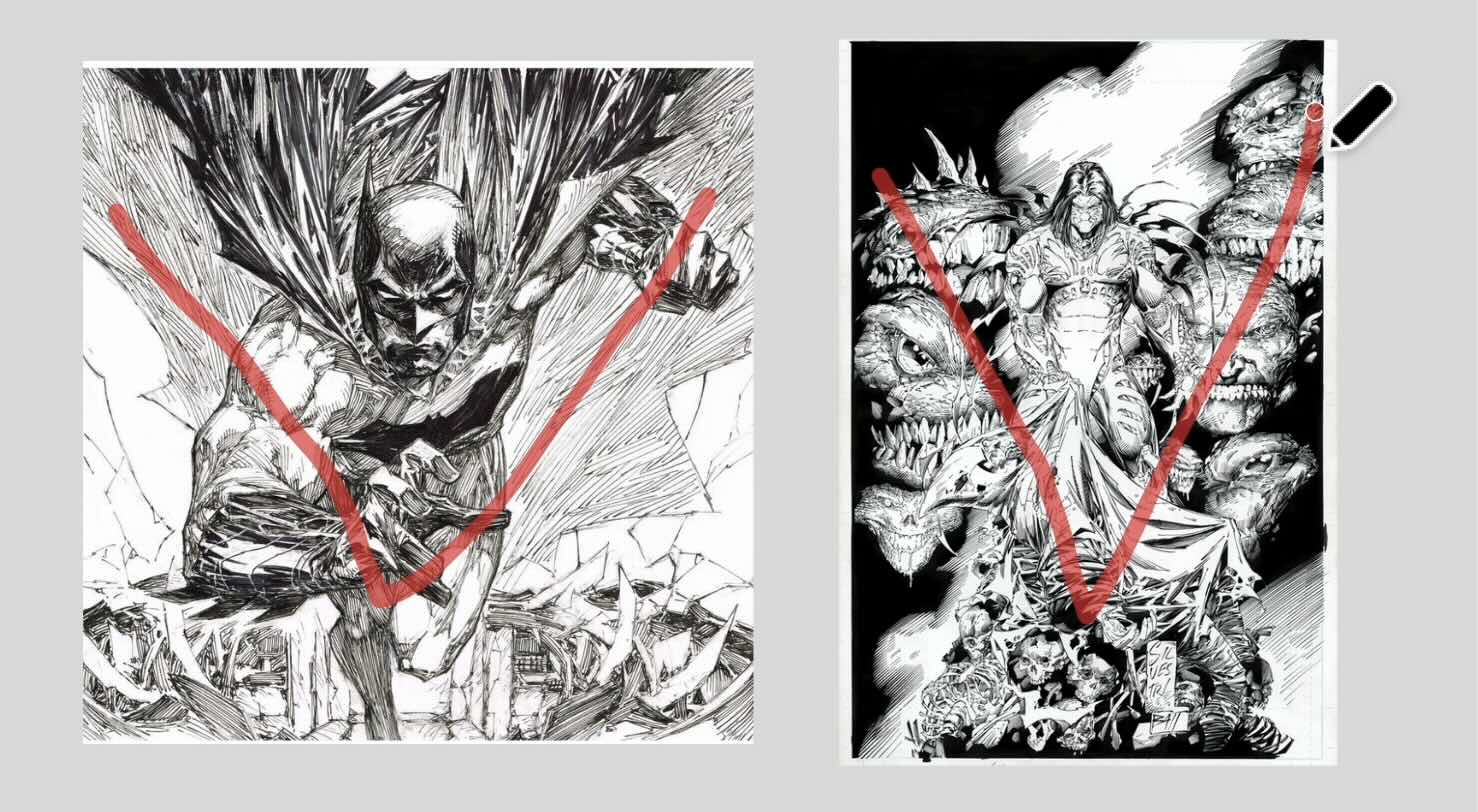
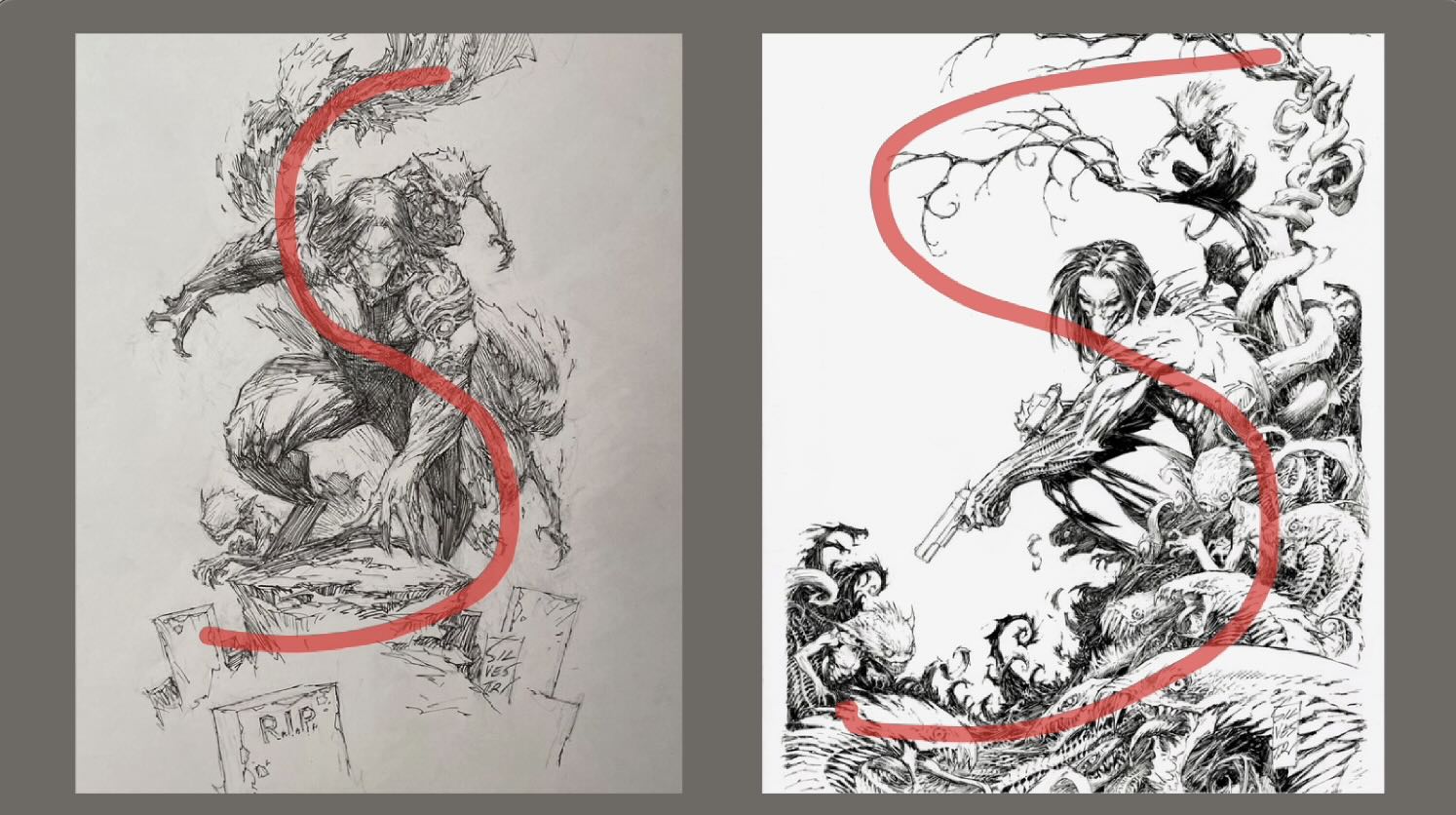
Earlier, I said that the final artwork we see is often created in collaboration with a team.
I did a sketchbook study of a piece inked by Joe Weems.
And another inked by Matt Banning, known as “BATT”.
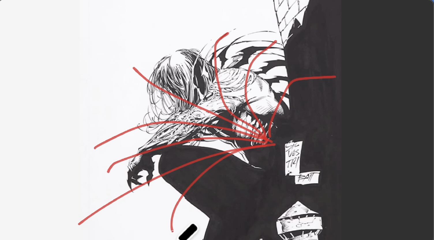
Silvestri uses Copic Fine Liners and Brush Pens to ink his work. (I used my Tombow fineliner pens).
Even though WEEMS and BATT use different tools and techniques, you’ll recognize the key Silvestri-isms, which are:
- The organic, spontaneous feel of the drawing;
- The vibrant energy of the line work – which seems to emit from the solar plexus of the main character, and;
- S or V composition.
How to Draw Like Mark Silvestri
Silvestri’s drawing approach is to find the lines by following the energy of a piece.
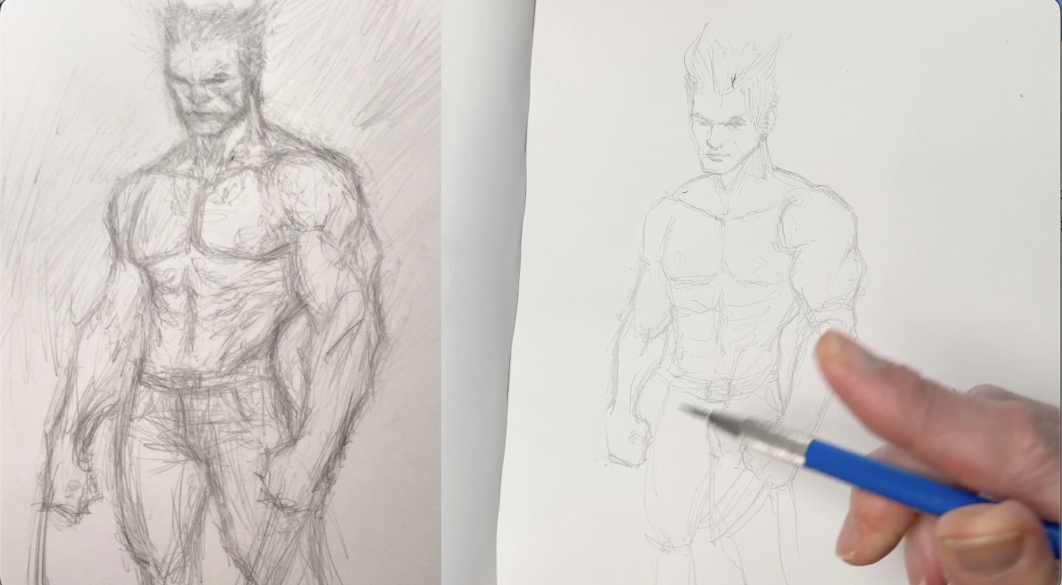
An exercise that helps develop this skill is called: “draw in one take.”
Using one of Silvestri’s sketches as a reference, your pencil doesn’t leave the page.
Start with a very loose, light doodle from big to small shapes.
Then refine it. Bold the lines that you want to keep and erase the remainder.
Let’s try the exercise using a photo reference.
You’ll see how quickly you can find the forms just by following the contour lines of the subject with your eyes, and keeping your pencil on the page.
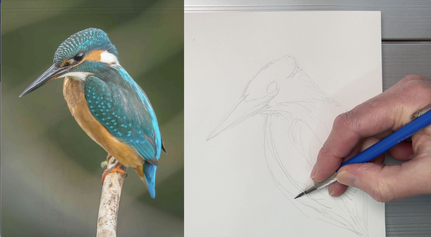
I normally don’t draw this way.
I prefer the Loomis or Bridgeman methods to construct my subjects. But this turned out surprisingly well and the “draw in one take” is a worthwhile exercise to practice.
How to Apply Marc Silvestri’s Style
To apply the Silvestri style to any subject, I’ve redrawn the same bird, again using the “draw in one take” method.
I went with the “s” structure Silvestri frequently uses to organize his compositions.
I settled on a monster theme from his “The Darkness” Comic.
With a supernatural vibe to the illustration, using those squiggly shapes that Silvestri likes as background elements is not out of context.
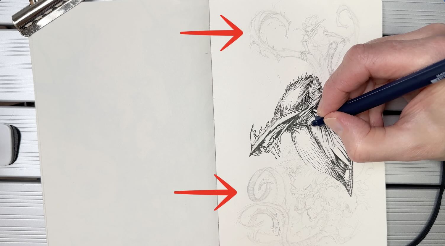
Silvestri’s use of squiggly shapes combined with energetic lines brings visual balance. So I did the same as he did in my composition.
I also remembered to angle the stroke direction as though they were emerging from the main character’s solar plexus.
The finished piece is playful. You can lose track of time noodling about in an illustration like this.
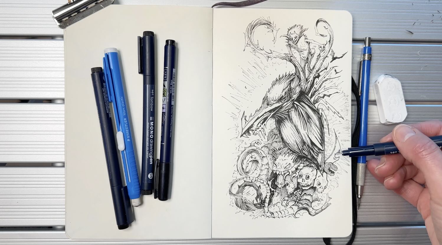
A note of caution …
With a doodly style of inking, it’s easy (dangerous) to over-render a piece.
If I were to do this study again, I would start with a thumbnail sketch to pre-arrange the values.
An effective arrangement of values uses the gradation of tones to lead the viewer through the composition, and more directly to the focal point.
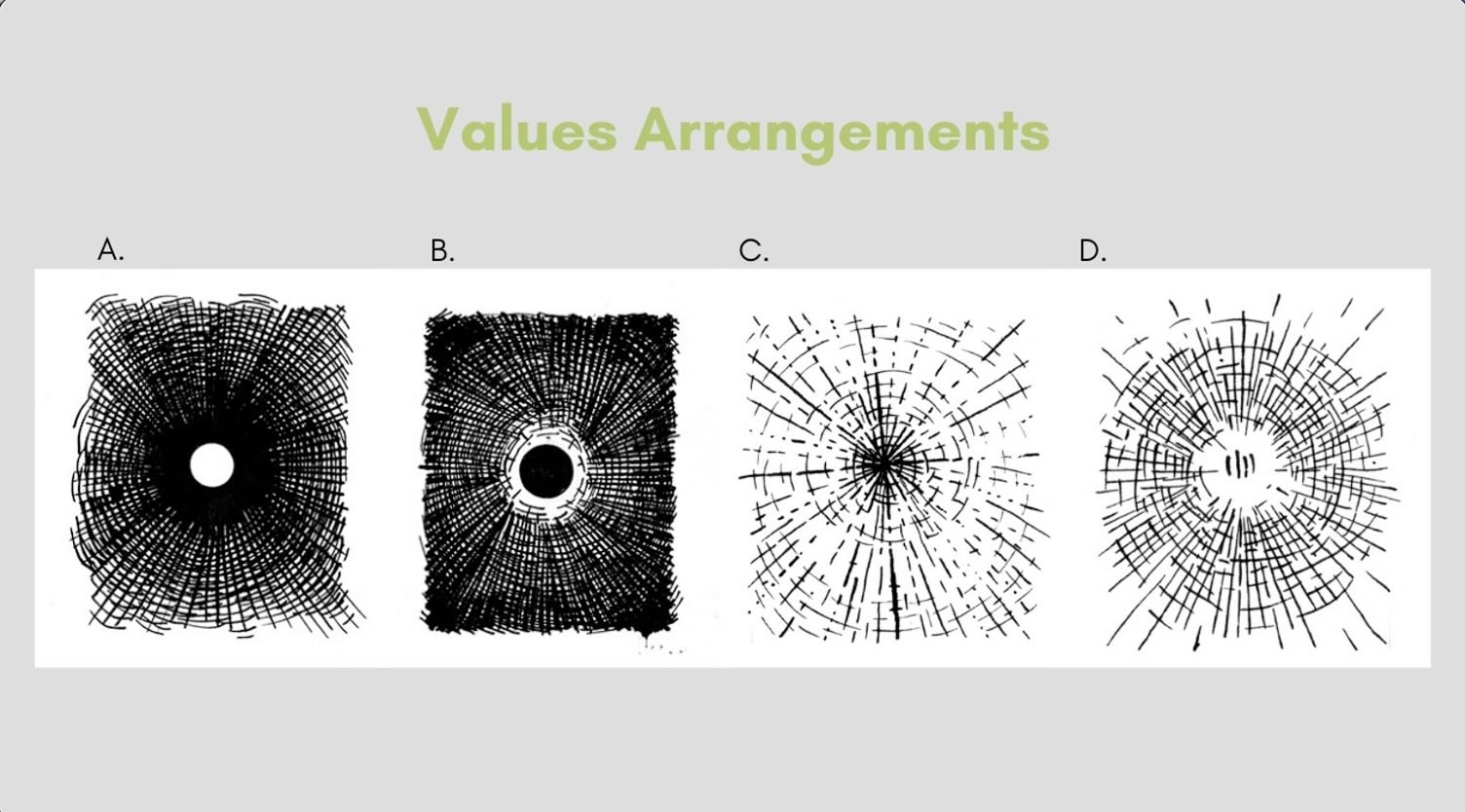
To learn more about effective value arrangements for your compositions, read the “How to do Backgrounds” article.
I hope you’ll keep an eye out for Marc Silvestris’ illustrations.
With these tips, you can practice his style and apply his techniques to your subjects in pen and ink.
