The trick with grass is to draw the blades in the first row first. Then add the next layer of blades that are tucked behind.
To stay on track, and not get lost in the intertwining of grasses, immediately thicken the shadow side of the overlapping blades, and add the cast shadow – this will keep you sorted as you layer in your grassy landscape.

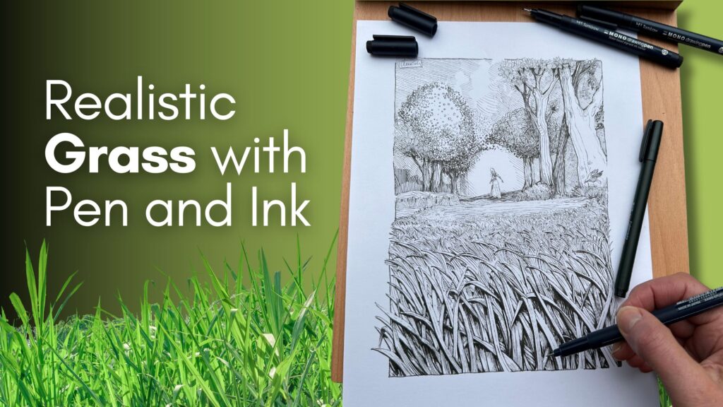
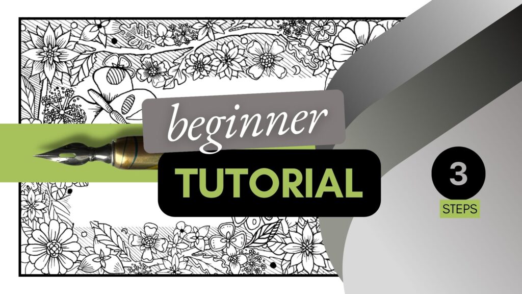
5-step Process
In this article, we’ll render grass in a nature scene with pen and ink using a 5-step process.
We’ll also quickly examine how top ink masters illustrate grassy landscapes with style.
The Ink Masters discussed include Franklin Booth, Bernie Wrightson, Kentaro Miura, Sergio Toppi, Aaron Horkey, and Philip Harris.
// DISCLOSURE: I earn a small commission when you use my affiliate links to purchase something. Learn more about the disclosure of affiliate partners by reading the Terms page.

1 – Research
Why do research?
“It’s important to draw a lot but understanding your subject is more important”
– Kim Jung Gi
We all know what grass looks like, but drawing from memory, it can end up like this:

Some people have great “memory banks” of images and can recreate anything. But it takes years of practice to draw realistic subjects from memory.
Grass is rarely the main subject in a piece, it’s usually a supporting element. However, if drawn unconvincingly, the result can distract the viewer. Bad grass can ruin your artwork.
Using references provides a better chance to render grasslands with confidence.

When you’re inspired by a landscape, download or snap a few photos.
Sketch different species of grass while you’re in nature to better understand the subject.
Once you’ve gathered references, you’re ready for the thumbnail stage.
2 – Thumbnails
In the thumbnail stage, you’ll decide on a composition.
If, like me, you’ve gathered several references to compose a scene, you’ll want to assemble the elements in proportion, in a pleasing arrangement.

Remember to establish the direction of light at this stage.
If you have multiple references, the sun likely shines from a different angle in each image. You’ll want your composition to have highlights and shadows based on the direction of light you have chosen. When in doubt, just draw a small sun on the top left or right-hand side of your thumbnail as a reminder.
In these examples, I’ve tested three different directions of sunlight.

You’ll also note that I’ve drawn the front row of blades at eye level. The other elements in the nature scene fade toward a vanishing point on the horizon line.
Once you are satisfied with your thumbnail sketches, select a favourite.
You’ll work off of this thumbnail as a template guide for the following three stages.
3 – Subject Study
Based on your chosen thumbnail, you’ll explore rendering techniques by doing a subject of study.
The subject study stage is not only a practice session before the final artwork, it’s where you make key decisions about how to ink your piece.
If you look closely, grass grows in leaves and clusters.

As it grows tall or older, it falls and folds. The wilder the grass, the more crisscrossing.
Practice different hatching techniques on close-up leaves and far-away clusters in your sketchbook before moving to the next stage.

4 – Pencil Underdrawing
Recreate your best thumbnail sketch in pencil as an undrawing on your good inking paper.
Which lead hardness or type of pencil you use is personal. I use a semi-hard lead (2H) as it leaves less graphite residue on the paper, which helps reduce smudging.
My preference for pencilling the underdrawing is to use a mechanical pencil.
It is more precise because of the:
- grip
- distribution of weight
- balance of the tool
- consistent lead diameter.

The downside of using a robust technical pencil like a Steadtler holder is that it’s more challenging to control how much pressure to apply without denting the paper.
Pencil Hardness Chart from Faber Castell
I typically use a smooth finish Bristol paper when inking with a dip pen and liquid India ink.
Since I plan to ink this piece with fine liner pens, I chose a vellum finish Bristol paper. A vellum finish gives you the option to use mixed medium and add colour to your ink piece.
In the front row of eye-level grass, I immediately add shadows to keep track of the overlapping blades.
After sketching the font blades, I pencil in the background as a contour drawing using the tiny figure as the vanishing point on the horizon.

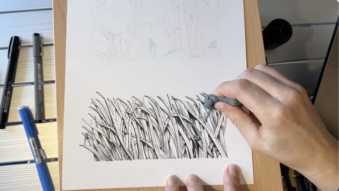
I’ve switched from plastic to a kneaded eraser. It works well to lift off graphite with minimal smearing. Once you’ve removed excess graphite from your Bristol paper, you’re ready for the ink application.
5 – The Ink Application
For the ink application, I’m using a set of Tombow fine liners and calligraphy pens.
These pens are similar to the popular Sakura Microns except Tombow’s tips are more pliant. They’re softer. This gives me the ability to vary the pressure for line quality.
Line quality = variety of line weight thin-to-thick in a single stroke.

Again, the trick with grass is to ink the blades in the first row first. We’ll pencil in the next layer of blades tucked behind after the inking of the first row is complete.

To stay on track, and not get lost in the intertwining of grasses, immediately thicken the outline on the shadow-side of overlapping blades. Then add the cast shadows – this will keep you sorted as you layer in your grassy landscape.
You’ll note that I’m leaving gaps in the outline on the highlight side.
This technique is called missing edges. Leaving these gaps gives the option to close those edges when we render the background.

To learn more about missing edges, watch this Frank Frazetta Master Study on YouTube.
I inked the outlines with a size 03 pen, 05 for the shadow parts, and 01 for hatching fine details on the blades.
If you’re wondering how to hatch the blades – it helps to convert your grass references to greyscale.
Trust your thumbnail and subject studies, to guide you. You’ve already made the key decisions. The final ink application is more of a refined version of your previous creations.

Keep your artwork tidy for the next row of grasses using a kneaded eraser. If you don’t have one, erase the pencil marks gently with your eraser of choice.
Draw the tips of the second layer of grasses. These blades are slightly skinnier and higher up the picture plane than the first row.
You’ll connect the bottoms of those new blades at the inking stage.
As you’re inking, remember to add the cast shadow immediately to mark which stroke belongs to a blade’s edge and which is a separation from the background.
The cast shadow on the second layer is longer than for the first row.
To create an illusion of depth the remainder of our grass becomes a line texture.
Bring the strokes closer together gradually as you draw grass lines (texture) towards the horizon line.
The grass blades become significantly shorter, with gradually fewer details, lighter values, and thinner strokes.
Instead of darkening the shadows, we widen the highlights.

Once the piece is rendered fully, revisit the arrangement of values to add contrast or mid-tones where needed.
I switched to my thickest pen size to emphasize shadows and gaps in the forefront.
I’m using a hard Tombow Fudenosuke Brush Pen for the solid blacks and bolder outlines.
This pen is sold in the calligraphy section, individually or as a set, soft and hard. They last longer than competing brands in that category and I like using them a lot.

I’ve added mid-tones to the blades buried behind.
This is where you could use cross-hatching if that’s the technique you prefer for blending mid-tones.
My hatching style is largely influenced by Franklin Booth and Bernie Wrightson, mentioned later in this article. You’ll see this reflected by the use of parallel spacing to create the effect of gradations without crossing any strokes.

Let’s take a quick peek at how the ink masters illustrate grass for inspiration on style.
How Masters Render Grass
Franklin Booth, Tiger Hunt:

Bernie Wrightson, Frankenstein:

Kentaro Miura, Berserk Guts:

Sergio Toppi from his sketch series:

Aaron Horkey, To Harrow a Naïf:

Philip Harris, Princetown Quarry Building Ruins:

Although their hatching styles differ, each Ink Master used the principles of shading and lighting from the art fundamentals to render their pieces.
They each:
- rendered more details and used bolder lines for the blades closest to the viewer
- framed the grassy areas with contrast, either with solid black or solid white
- augmented the cast shadows on the top overlapping blades
- reduced the size, weight, and details of the grassy blades fading into the horizon
- created a grassy texture to represent blades spaced furthest from the viewer
These principles create a believable illusion of perspective and depth.
For exercise ideas to practice the principles mentioned in this article, check out Arthur L. Gutpill’s Rendering in Pen and Ink book.
I hope you enjoyed these observations of the Ink Masters rendering grass and my 5-step approach for creating an ink piece from start to finish.
Got questions? Find answers to frequently asked questions on the FAQ page, and the resources from this article below.

Resources
Strathmore Bristol Vellum Paper
Portable Adjustable Aluminum Table (for outdoor sketching)
Rendering in Pen and Ink by Arthur L. Guptill
Félicitation à l’artiste, tout est si compréhensible et extraordinairement merveilleux.
Merci!