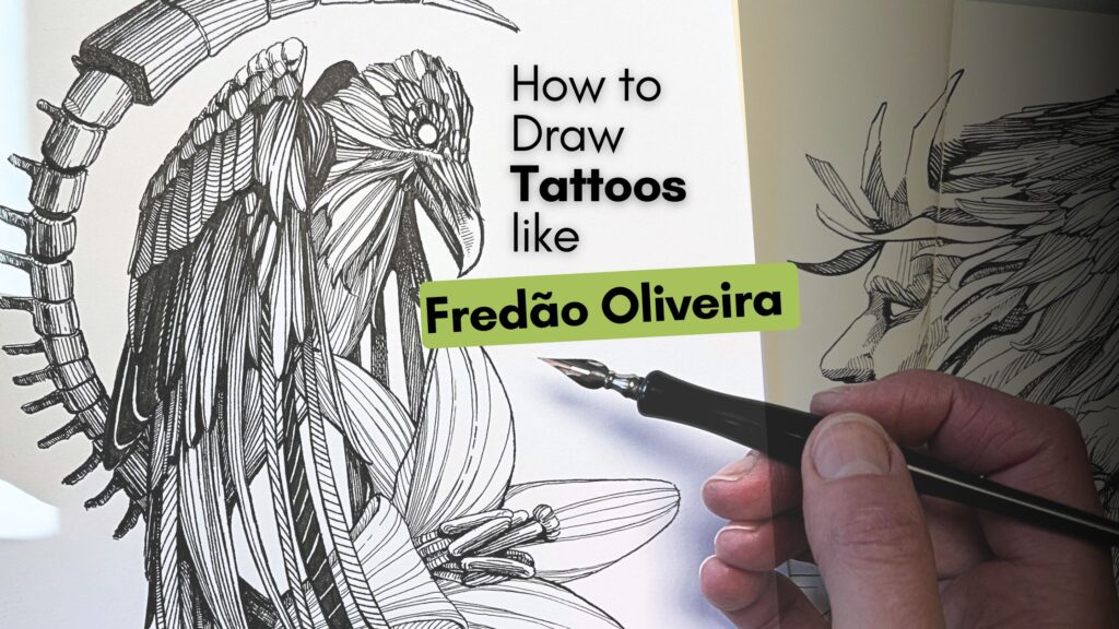
The Art of Fredão Oliveira
Fredão Oliveira is a Master tattoo artist from Brazil.
He’s known for his line style, which looks on skin like it was rendered on paper.
In this article, you’ll learn about his work and how to apply three of his techniques to an original creation of our own.
DISCLOSURE: I earn a small commission when you use my affiliate links to purchase something. Learn more about the disclosure of affiliate partners by reading the Terms page.

About Fredão Oliveira’s Art Style
Spend time on Master Fredão Oliveira’s website and Instagram account to see what stands out about his art style.
I rendered one of his pieces with fine liner pens in my Moleskine sketchbook to get a feel for his line work.

The three things that stood out for me about Master Fredão Oliveira’s technique are that he:
- shades using line gradations;
- creates the illusion of form with stroke density, and;
- uses contrast as a stylistic element.
Now we’ll look at specific technique examples by practicing samples of his work.

Line Technique Practice Exercises
Technique 1 – Shading with Line Gradations
In the first exercise, I rendered the wavy muffin shape at the bottom of the cat design (pictured above).
The strokes that shade the muffin are of equal line weight. I’m using a size 05 Tombow fine liner pen throughout this sample.
I’m shading from light to dark by gradually reducing the space between the lines.
As the strokes come closer together, the tone increases in value. The value becomes darker, progressively blending to solid black.
You likely know this shading technique because it is a straightforward value scale.
What stands out is how striking the line gradation scale looks when applied to a shape design.

Technique 2 – Create Form with Stroke Density
The second exercise is a variation on the previous gradation scale.
We’ll apply the technique to a single feather as practice, then shade a wing.

He uses sparse, far-apart lines in the areas of highlight just like in the prior example.
Except now for the areas of shadow where he brings strokes closer together and increases the number of those strokes to build tonal density.
In the wing sample, the strokes tighten together and become denser in quantity to build tone in the areas of shadow.

The final touch is to bold the shape outlines. The heavier contours create contrast as a stylistic element.
Tombow’s Fudenosuke Brush Pen is ideal for inking bold outlines.
Alternately, a thicker fine liner like a size 08, a marker, or another type of brush pen would work.
I favour the Fudenosuke because the tip’s flexibility-elasticity ratio is a delight to control. Also, if you’re interested in inking with dip pens, training with a Fudenosuke makes that transition smoother.

I’ll talk more about Master Fredão Oliveira’s use of contrast later in this article.
Tattoo Line Art Design
Now that we’ve looked at his techniques, we’re ready to experiment with a composition for our original piece.
Master Fredão Oliveira combines several subjects in his pieces. Skulls, nature, beasts, and weather elements are his subjects of choice – like the wavy ocean feline muffin we did earlier.
I went ahead and gathered references to combine three subjects. I’ll try a raven, a lily, and maybe a Xenomorph?!

My first three attempts failed, but the 4th thumbnail composition had potential.
Tattoo Pencil Underdrawing
I redrew the fourth thumbnail composition with graphite as a pencil underdrawing on my Bristol inking paper.
The Master draws on his tablet or with fine liners. Since I’m opting for India ink, it’s best to ink on a high-quality Bristol paper.

For dip pen inking, I would typically use a smooth finish, but ran out of supplies during my travels.
The vellum finish tends to bleed a little bit, however, this finish does work well when inking larger areas of solid black.

Inking Your Tattoo Artwork
For the ink application, I used a small mapping nib for the fine details of the eye and head of our main subject.
I switched to a No. 1 watercolour brush for solid black areas.
And alternated with a bigger nib for all other bold lines.
Specifically, I used the following inking supplies:
- Strathmore Bristol Vellum Paper
- Speedball Super Black India Ink
- Speedball Hunt 512 Bowl Nib
- Tachikawa t-40 Dip Pen Holder
- Tachikawa no 99 Nib
- W&N Cotman Watercolor No1 Brush

You’ll see how the shading techniques practiced earlier are applied in this final piece:
- Using sparse strokes in the areas of highlight
- Achieving gradations of light to dark by reducing the space between the lines
- And increasing the number of strokes to build tonal density.

These inking techniques are universal and not unique to this artist.
However, how Master Fredão Oliveira combines these art fundamentals makes his work stand out.
You’ll note the raven’s feathers on top have lighter values with a bold outline. The feathers underneath gradually fade to black through stroke density. That’s a standard shading technique.
The style element is that each feather is rendered in a different pattern.
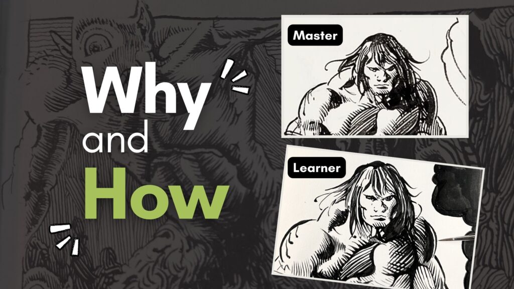
Here’s a crow I illustrated with dip pens and ink in 2022. This was before I started studying the Ink Masters.

For comparison, in today’s raven piece, the various patterns, stroke density and bold outlines – all combined create the illusion of volume.
In my 2022 crow piece, the patterns are uniform without variety. I’m using highlights effectively but the gradations into shadow are abrupt. Especially in the bird’s underbelly area where that section looks nearly flat.

You can follow my artwork progression on Instagram.
With more experience and studying the ink masters, I find it’s best to ink a complex piece in sections rather than outlining the entire subject.
That way, based on the direction of light, you can better control the value scales.
Applying the ink in sections also helps for keeping track of overlapping elements. The trick is to immediately add the cast shadows to the layers on top closest to the light.

When your piece is complete, revisit the mid-tones or add contrast with bold outlines as a final stylistic touch.
📖 For tips on how to shade overlapping elements, read “Realistic Grass with Pen and Ink”.
I hope that you enjoyed this study of Master tattoo artist Fredão Oliveira where we applied:
- shading using line gradations;
- building form with stroke density, and;
- using bold outlines for contrast as a stylistic element.
Let me know in the comments if you design a tattoo piece in this Master’s art style. I’ll be curious to hear how these technique tips helped with your project.


I am extremely impressed with your writing skills and also with the layout on your blog.
Is this a paid theme or did you customize it yourself?
Either way keep up the nice quality writing, it’s rare to see a nice blog like this one today.
Thanks! I’m using Astra Pro, it’s a paid theme that I customize myself.