It’s stylized, so unique, and utterly confusing. It paralyzed me.
So, I procrastinated on doing a master study of Jojo’s Bizarre Adventure…
There’s just something bizarre about this art style.
I worried I wasn’t going to like it.
But I couldn’t have been more wrong.
JoJo’s Bizarre Adventure
//DISCLOSURE: I earn a small commission when you use my affiliate links to make a purchase. Visit the Terms page to learn more.
Mangaka Hirohiko Araki
Since the start of my YouTube channel (January 2023), one of the most requested masters to feature has been the creator of the manga series Jojo’s Bizarre Adventure, Hirohiko Araki.
My perspective about the art immediately shifted once I learned more about the creator himself.
It turns out there’s a lot that I admire about master Hirohiko Araki.
From what I learned, he:
- struggled from rejection in his early days, yet persevered because he believed in his dream
- takes an analytical approach to creativity; uses a workflow, and is crazy methodical in his processes
- has wild influences – from fine arts to fashion design – he’s dedicated to self-study and has a relentless discipline to improve.
The more I learned about him, the more my appreciation for his creations increased.
Steps of a Master Study
Usually, I begin a master study with an analysis.
Followed by exercises to deepen my understanding of what I observed from the analysis phase.

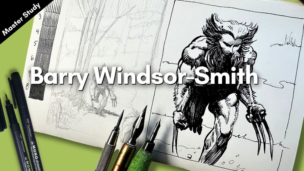
📖 If you’re curious about that, read my Wolverine Illustration Analysis for the step-by-step process using a Barry Windsor-Smith master study.
In this post, we’re fast-forwarding to the study exercises, because I’m introducing something new to my pen and ink projects.
Something else that’s been in high demand.
Master Study Warmup Exercise
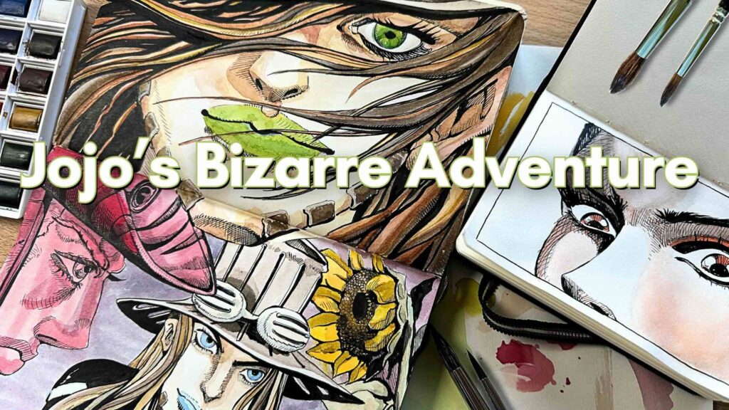
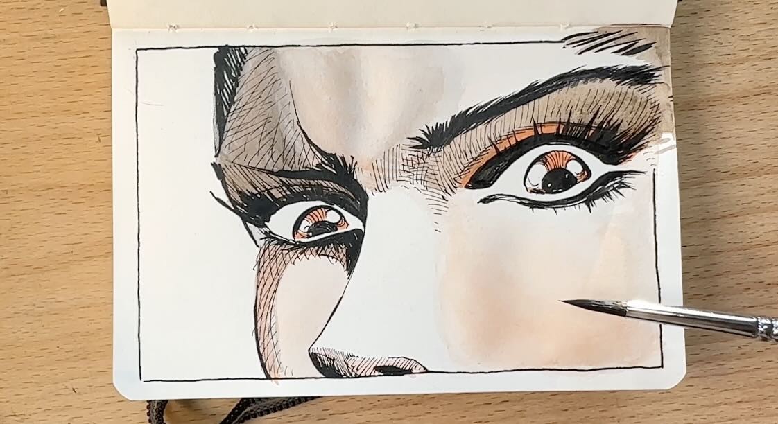
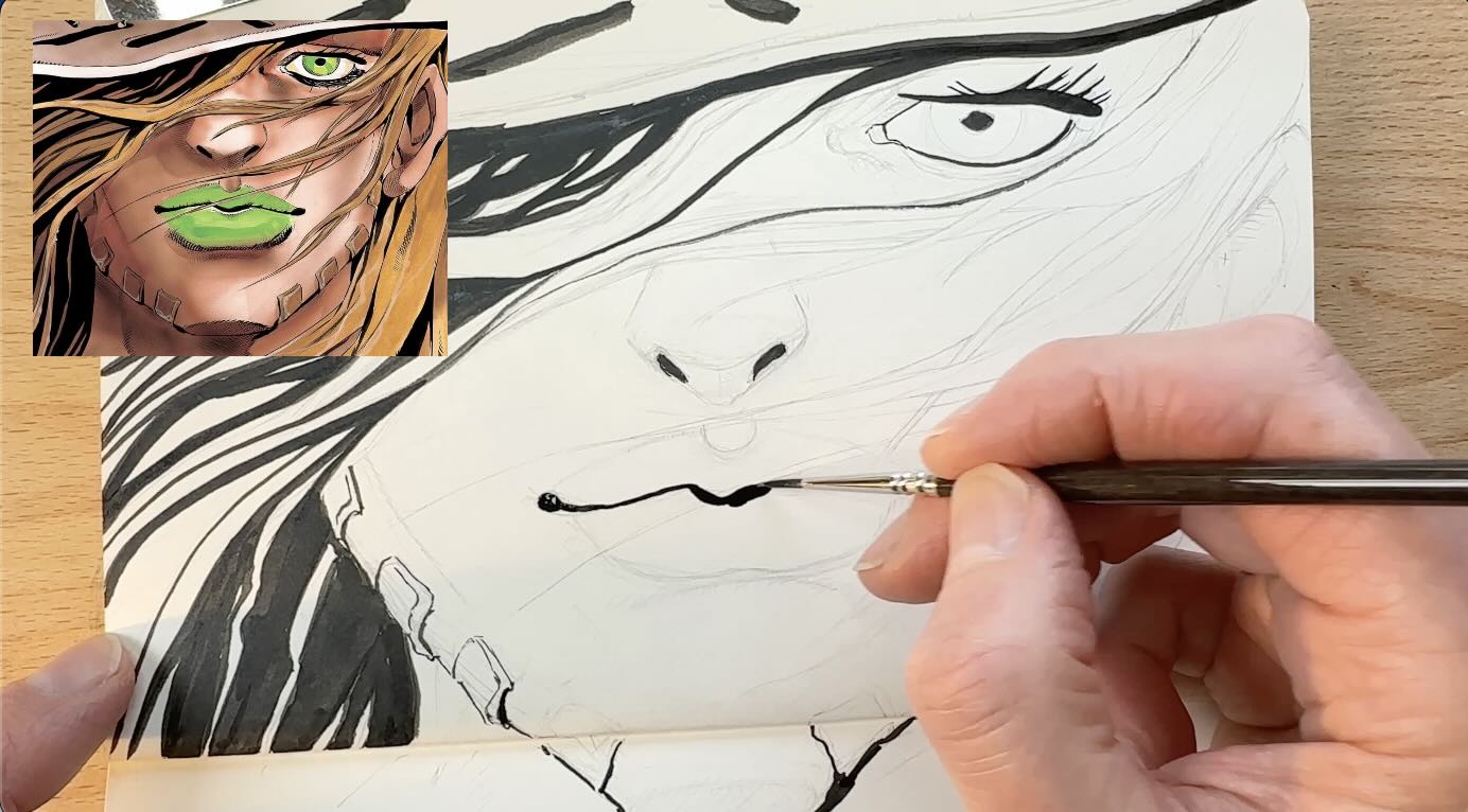
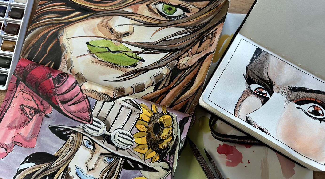
For the first master study exercise, as a warmup, I rendered a close-up image in my pocket sketchbook (5.5 x 3.5 inches).
I chose this image as my first study because of the eyes.
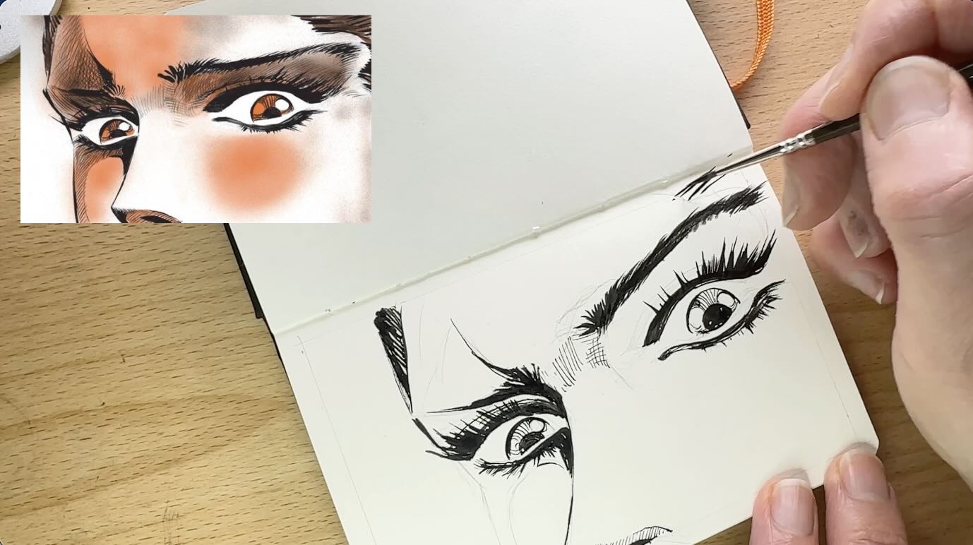
Even though manga and anime eyes tend to follow a standard formula, each mangaka puts a unique twist on how they render their characters’ eyes.
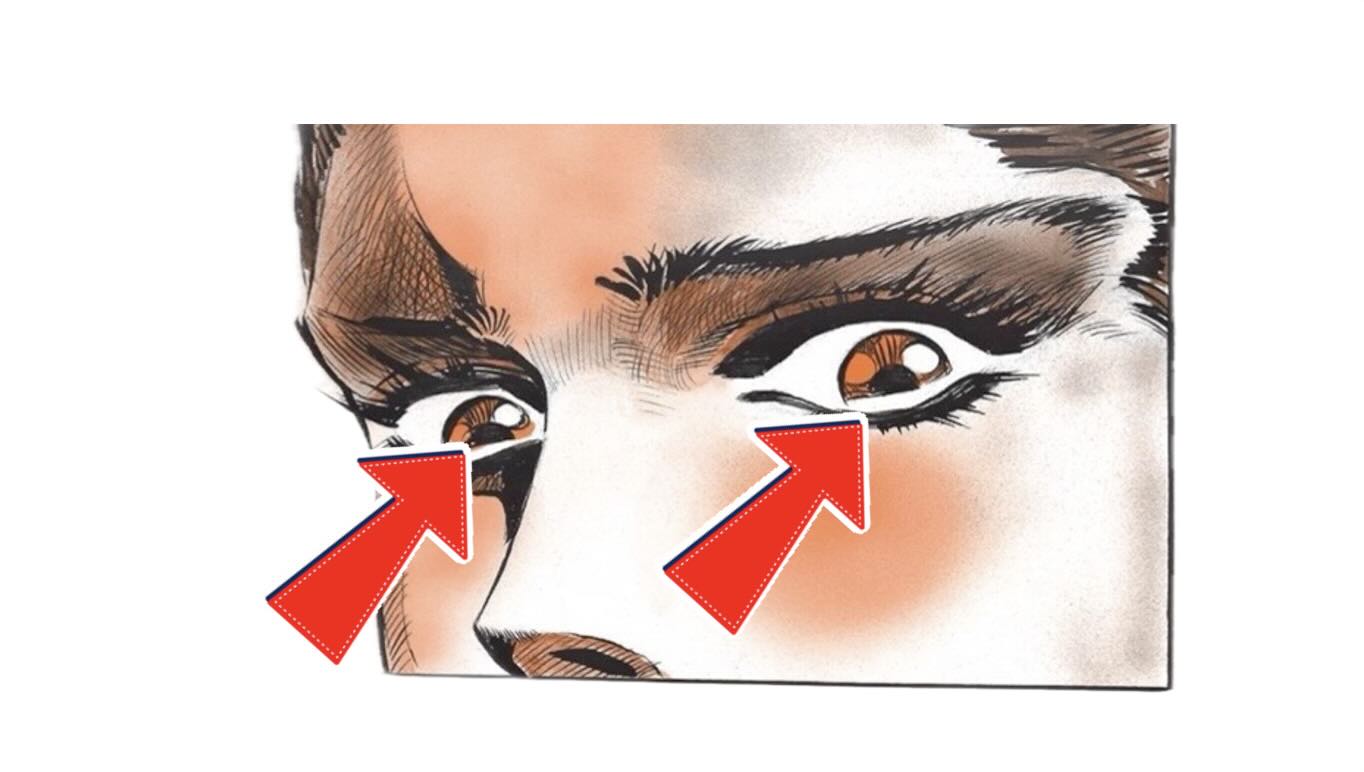
This lady is tearing, so the master conveys this with my favourite technique: implied edges.
Implied edges or lines are when there is a break in part of the marks, negative space, or reversed tones juxtaposed to create the illusion of a continuation of the line, shape, or form.
See at the bottom of each pupil, the edging between the shapes and values is left white. The tears are part of the negative space created by the eyeball.
It’s a subtle technique with a “wow” factor.
The second reason I picked this image is because of the limited colour scheme, easier for me to ease into the world of ‘Line and Wash‘ …
Something New – Line and Wash
Did I just say “colour”?
Yup. I’m starting with “Line and Wash” (watercolours).
Requests for colour with line work have been piling up. Jojo’s is the perfect opportunity to introduce a colour category to this Blog.
🎥 Check out the mixed-media playlist on YouTube. [Coming Soon]
Let me know in the comments your thoughts on mixing colour media with black ink.
In the future, for pen and ink with colour media, I’m also considering:
- Gouache
- Coloured pencils
- Markers
- Coloured inks

Line Wash Materials
I ordered a basic Winsor & Newton watercolour set just to test it out.
I already had an assortment of round watercolour brushes for inking. These range in size from 5/0 to 12. I could probably use a large Sumi brush for backgrounds and skies.
I’m primarily an inker. So, the paper types I have on hand are best suited for dip pen and brushwork using Carbon-Piment Based India ink. So for projects, I typically use Bristol, which is a smooth hot press paper.
For projects with mixed media, like pigment-based inks and watercolours, I’ll be using my Bristol vellum paper.
The vellum finish is a cold-press paper with a texture that accommodates dip pen drawing and a bit of wet mediums. Not too wet or it will buckle and tear.
This vellum paper is not suitable for starting wet on wet, which means I’ll need to:
- work fast for the colours with soft blending edges
- let the paper dry for the colours with hard edges
This holds true, to a certain degree, for the paper I’ll be using for the master studies. Except that the cold-press paper in my fancier sketchbooks holds up amazingly for almost anything.
These are:
- Moleskine Art Sketchbook series of various sizes and colours
- Speedball Journal Artist Canvas series of various sizes and colours
Master Study Minis
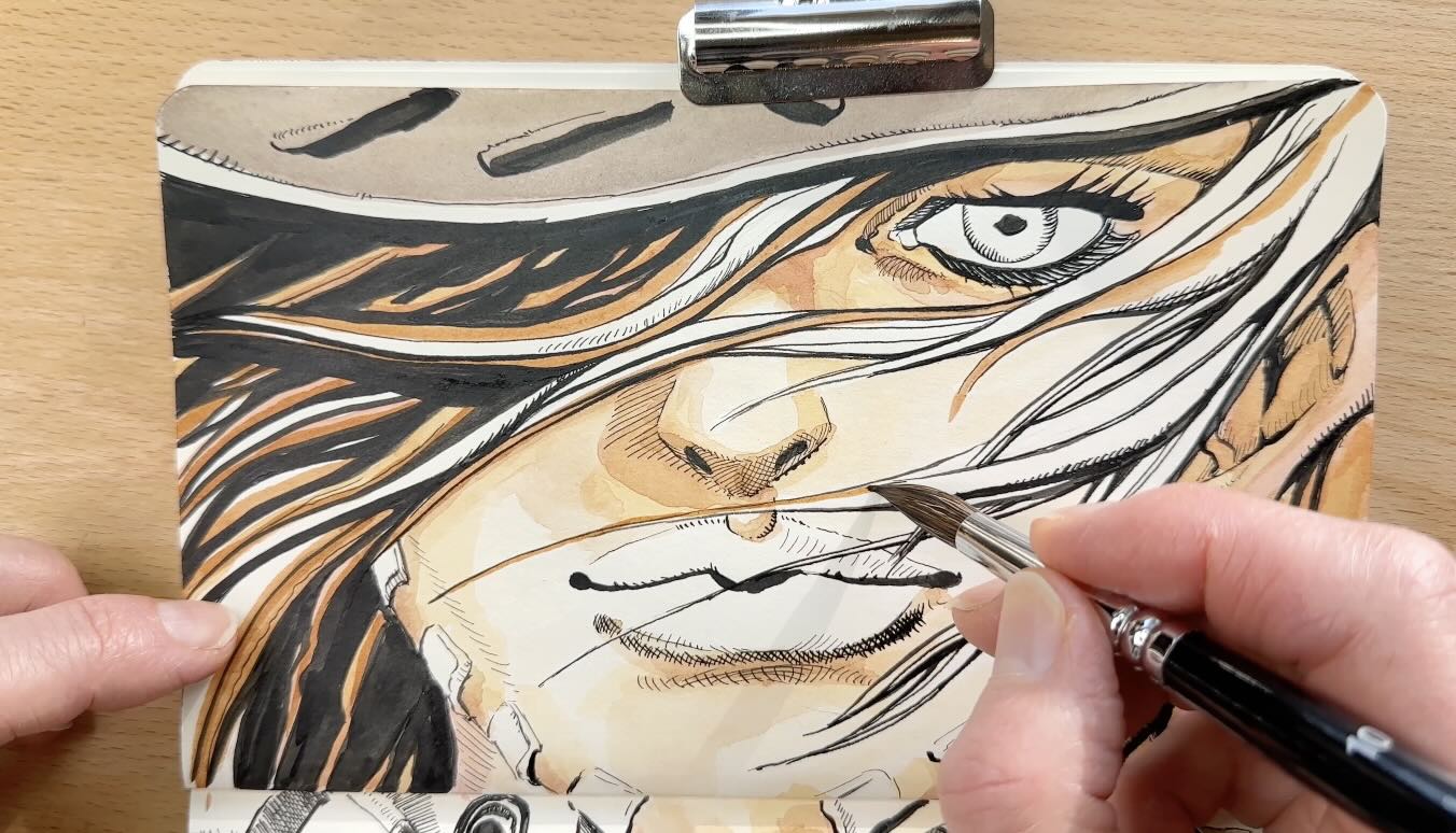
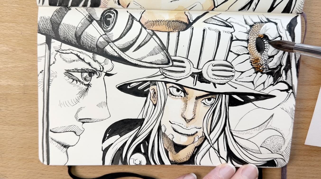
After completing the first mini-study of the close-up, tearful eyes as a warm-up, I decided to tackle something more ambitious.
I cropped mini-sections from two different illustrations.
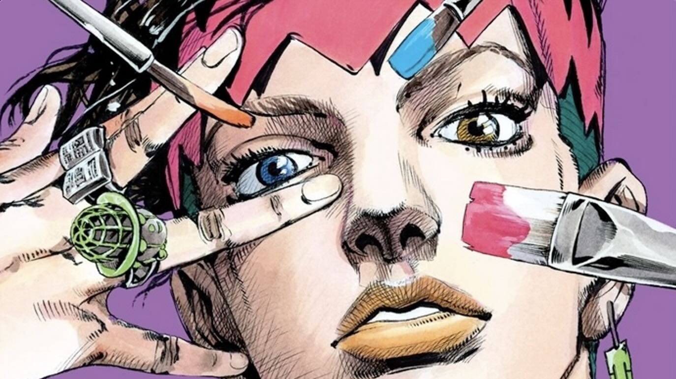
Both illustrations are from JoJo’s Bizarre Adventure: Steel Ball Run. I used the covers of Volumes 1 and 2 as my references for two more studies.
The only thing was …It’s obvious that master Hirohiko Araki inked these covers with a brush.
Brushwork is my nemesis … which is another reason why I was dragging my feet on doing these Jojo’s studies.
Initially, I intended to render everything with my dip pens. But soon realized there was no way around it.
His marks are loose and chic, so the inks had to be brushed.
I ended up using my dip pens only for the hatched areas and the finishing touches.
Master Study Observations
While sketching the underdrawings of my two mini studies, the first thing I noticed was how angular the master’s strokes are.
His drawing style is particularly angular in these cover illustrations, where he shapes the anatomy and strands of hair.
The strands of hair look fluid yet interrupted, as though they’re made of ripped paper ribbons.
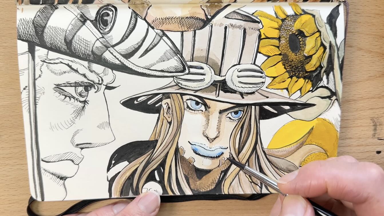
Master Study Ink Application
For the ink application, I started with a No. 1 Kolinski Sable brush. The ink is a carbon-pigment mix, waterproof India ink made by Speedball.
✒️ The list of mentioned books, tools, and materials is in the Resources section at the end of this article. Visit the Tools page for more of what I use.
The brush handling was more manageable than anticipated, perhaps because of this master’s style. I found copying his strokes more enjoyable than expected.
Usually, my preference when working with values is to render from light to dark.
Mostly because it’s easier to build tone than to lighten it. Actually, it’s impossible to go lighter with permanent ink unless you use white gouache to remove marks. And that doesn’t look great.
For these, I went dark to light because there’s not much line work. Most of the values come from the watercolours.
I filled in the larger areas of solids first. In the reference, you can see that the solid black areas are from the cast shadows.
In the reference, the cast shadow is from the brim of the hat and the thicker strands of hair. I also brushed the bold marks for the facial details;
- Eyelashes
- Eyebrows
- Nostrils
- Ears
- Mouths
- Face Contours
I finished up with a Tachikawa dip pen for the thinner hatch marks.
Inking is often like a puzzle that becomes clear once all the pieces are in.
The last step of the puzzle would be filling in the values. The values that would come from applying colour. But I wouldn’t get to experience this stage for another 24 hours.
Master Study Colour Application
With the ink dry, the next day it was time to try my new watercolour set.
Since this was my first time using watercolours, I did a test on another piece.
But before that, I watched a few YouTube videos to learn the basics. Some of my favourite channels so far are:
For a successful colour test, it was important to use the same materials.
I chose a past Alfredo Alcala study done in my dedicated master studies Moleskine Sketchbook (pictured earlier in this article).
It was brushed with waterproof, permanent India Ink, so exactly the same materials as my Jojo’s sample.
Lessons Learned from Master Hirohiko Araki
The top 3 things I observed from my studies of master Hirohiko Araki are his:
- Art style
- Characters and narrative
- Creative influences
The Art Style
The style is unusual. But don’t let the weirdness distract you from the artistry.
I honestly had not experienced inking anything like this before and was surprisingly delighted in the end.
I loved the clean, bold lines with airy negative space, which frame each scene fittingly.
The art is instantly recognizable and super consistent. The characters, setting, and themes in the manga are seamlessly cohesive. It all works together brilliantly for the narrative.
The Characters and Narrative
The characters are androgynous, angular, and seemingly rendered like Baroque sculptures. Which makes total sense given his influences (more about this later).
Observe the unnatural chiselling on the characters. Without even reading the story, my imagination is 100% intrigued to know these characters.
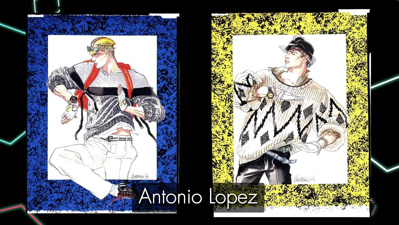
The Creative Influences
As a whole, what makes master Hirohiko Araki’s art style and techniques even more compelling are his influences. These include:
- Frank Frazetta, comic book artist
- Enki Bilal, comic book artist
- Paul Gauguin, fine art painter
- Gian Lorenzo Bernini, fine art sculptor
- Antonio Lopez, fashion illustrator
Like I said, wildly diverse influences. That’s when it all clicked for me.
Final Lesson from My Jojo’s Studies
My first impression looking at Jojo’s was confusion. I didn’t understand the art.
My perception of the art completely shifted after I learned more about the creator and practiced copying his work, doing the studies.
Now that I know more about the artist and his work, I feel that I’ve gained so much in a short time and am super motivated to work even harder on my art.
As well, for my first stab at ‘line and wash’, I’m pleased with how my coloured studies turned out.
I’m keen to explore mixed media and hope you’ll be following along as I share the learnings.
Resources
📗 Books ↓↓↓
Hirohiko Araki’s Craft of Creating Manga
Hirohiko Araki’s Art Book 2024
JoJo’s Bizarre Adventure: Steel Ball Run, Vol. 1
JoJo’s Bizarre Adventure: Steel Ball Run, Vol. 2
🎓 My Courses ↓↓↓
On Skillshare (Subscription) – Chloe Gendron
On Udemy (Pay-per-course) – Chloe Gendron
or visit the Course Page for more info
✒️Tools ↓↓↓
j’aimerais bien en savoir plus