In this article, we look at what Harry Clarke is known for, what stands out about his illustrations, and how to apply his style to your pen and ink projects.
The Style of Harry Clarke
Harry Clarke is known for his stained-glass art. It was the family business.
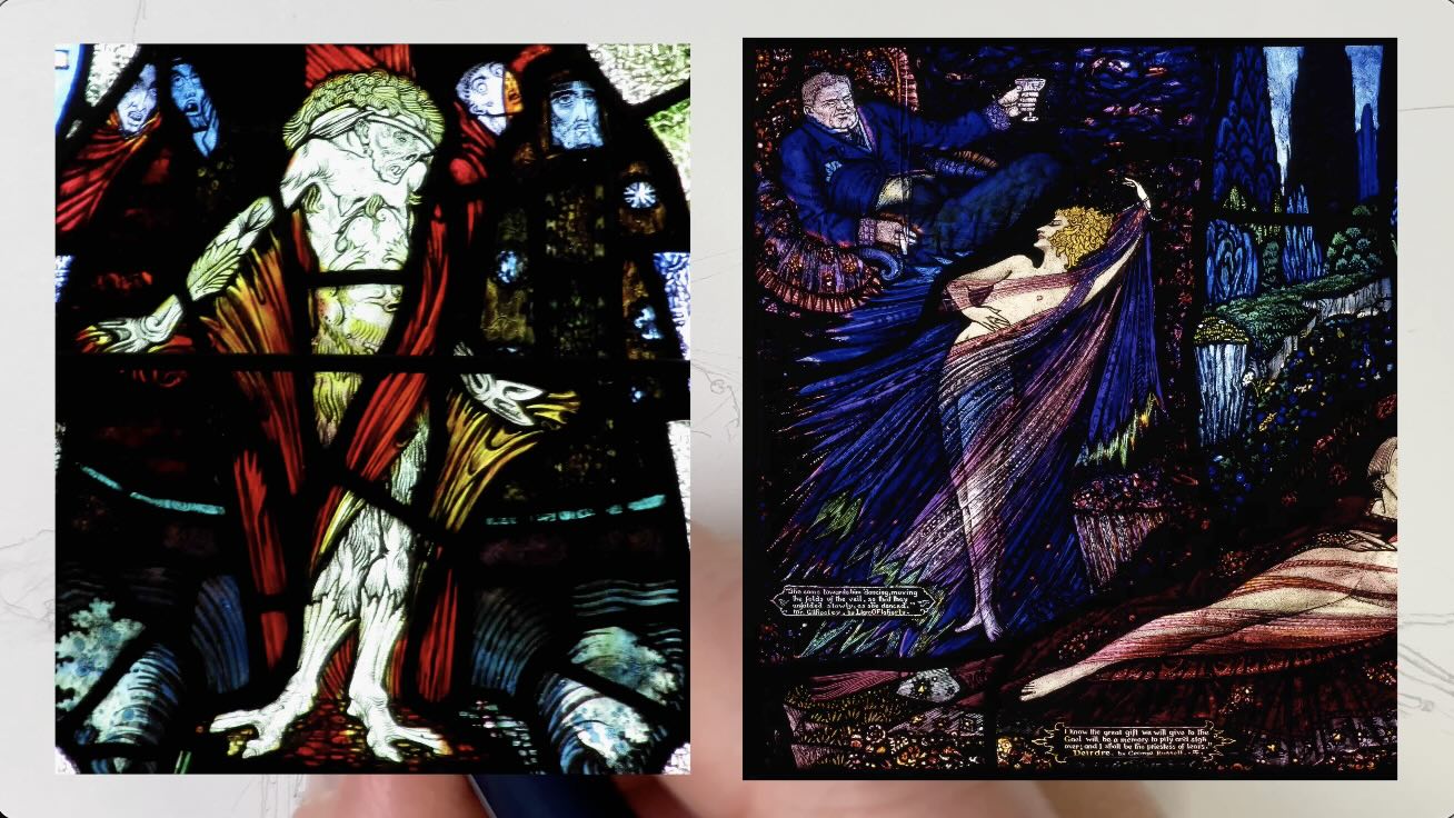
But Clarke aspired to be a book illustrator and his creative approach produced interesting results…
// DISCLOSURE: I earn a small commission when you use my affiliate links to make a purchase. Please read the Terms for more information.
Clarke’s peculiar style was well suited for narratives with a quirky mix of supernatural, macabre, spicy, nightmarish and sometimes enchanting.
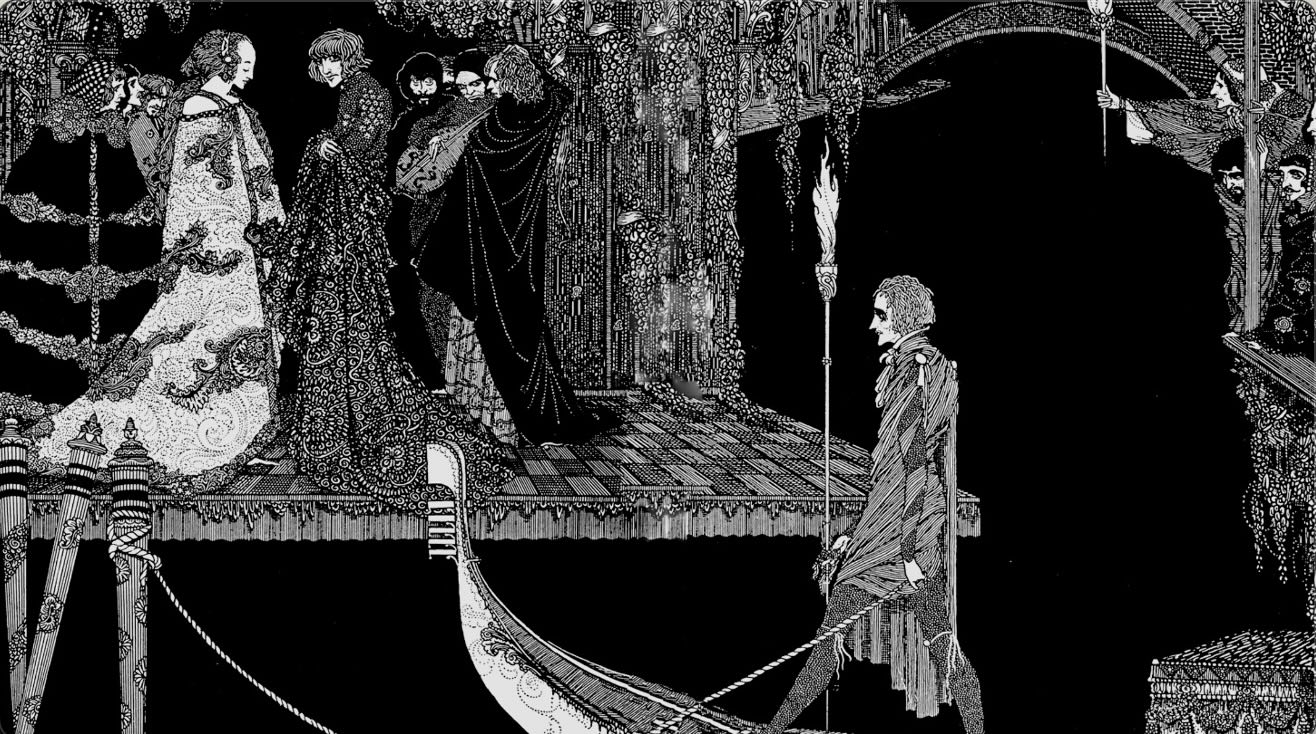
I found a wide range of his works online.
Most Harry Clarke images are now Public Domain (copyright free), and you’ll find links to these, along with a list of the art supplies I used in the resources section at the end of this article.
What Stands Out
Harry Clarke used a delightful range of ornate textures and imaginative compositions.
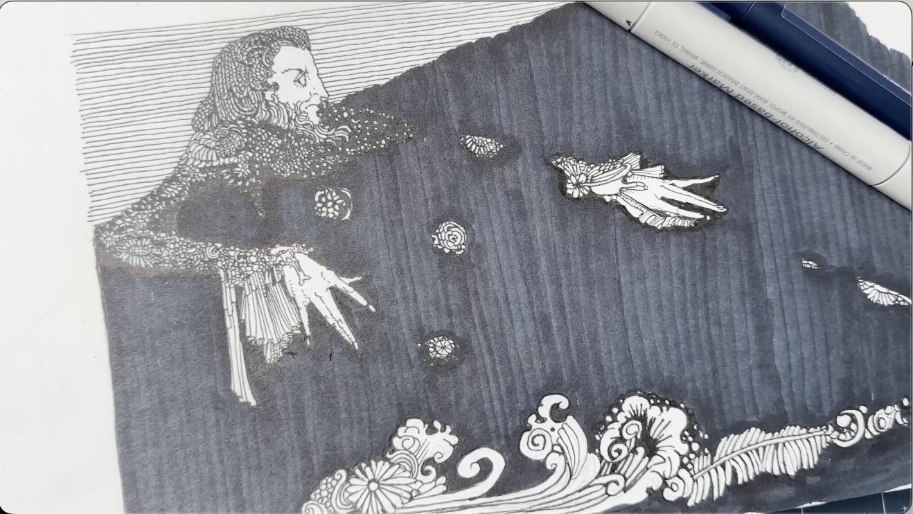
Harry Clarke’s Approach to Illustration
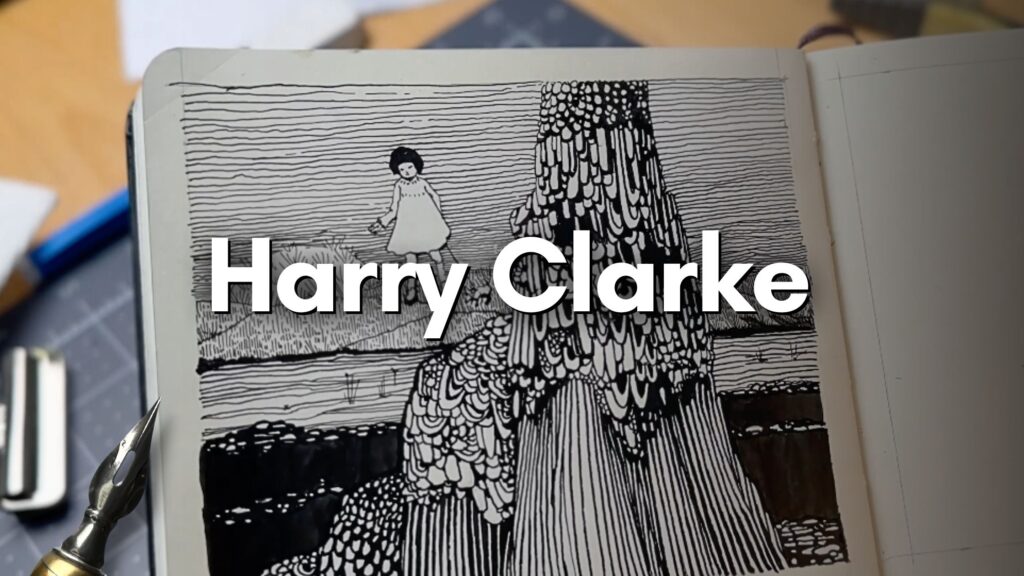
I did a preliminary sketch using markers of one of his pieces to get a feel for his approach to illustration (pictured above).
I chose an image from Edgar Allan Poe’s Tales of Mystery and Imagination (1902) that offered a good representative sample highlighting key elements of his style.
📖 Check out Harry Clarke’s illustrated books on Amazon.
Perhaps because of his stained-glass background, the resulting techniques lean on:
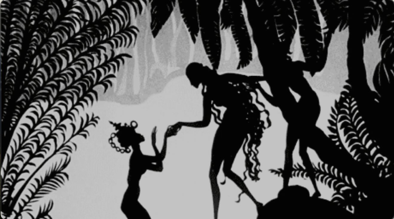
- Silhouetting with a lot of black on black
- Two-dimensional subjects, resembling bony shadow puppets
- Rich, goth patterns
After my marker study in my regular Strathmore paper sketchbook, I switched to dip pens and India ink in my Moleskine sketchbook.
The high-quality Moleskine paper is ideal for mix-media and safe for dip pens and watercolour brushes.
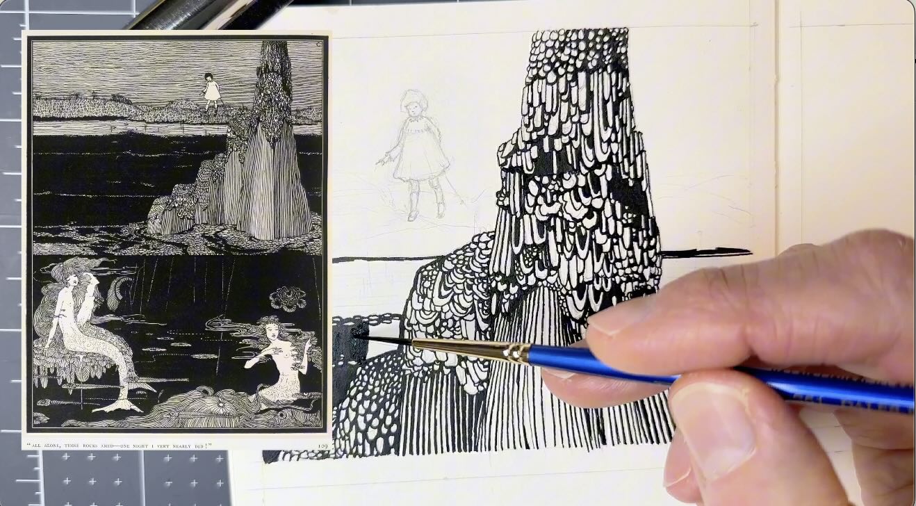
Using Speedball Super Black India ink, my next study was of Clarke’s mermaid illustration from “Very Nearly” by Queenie Scott-Hopper.
Harry Clarke’s Patterns
Looking at the mermaid illustration (scroll to image further below), the rich goth patterns seemed intimidating to draw.
For the boulders that look covered in seaweed and shells, I noticed that Clarke follows the form of the subject with his stroke direction to create those patterns.
He builds the patterns in layers gradually.
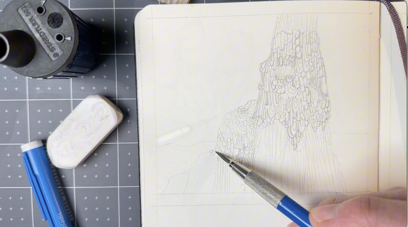
What gives the illustration rich complexity is that Clarke varies the shapes to create the patterns:
- Long-short;
- small-large; and,
- some shapes are slightly off-angle.
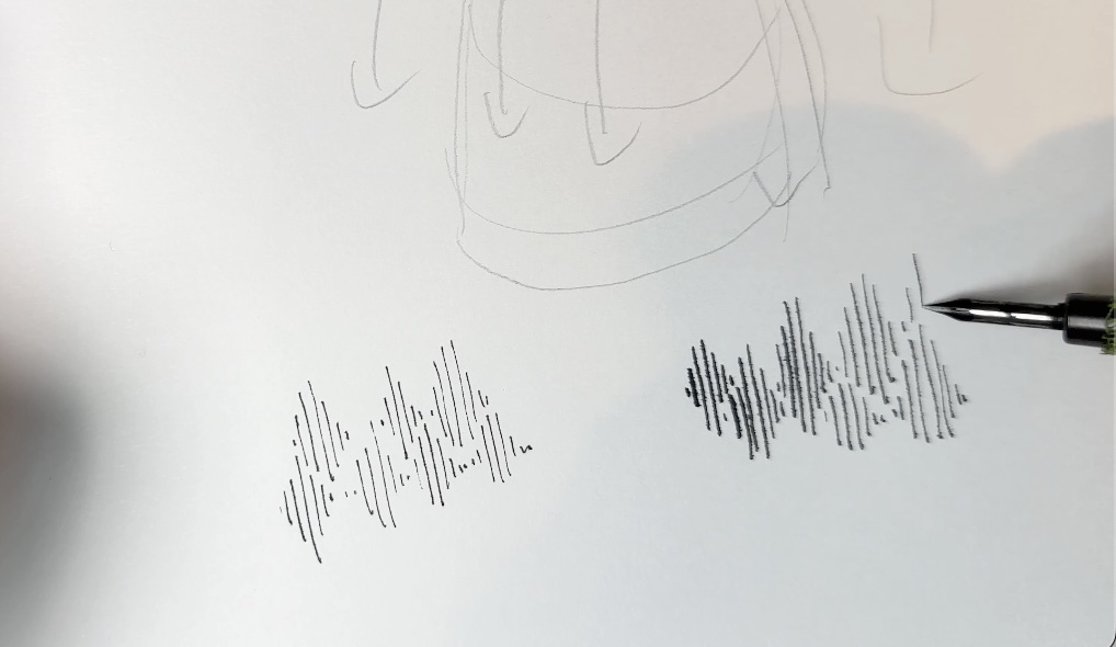
Additionally, Clarke varies the stroke weights.
The Two-dimensional Quality of Clarke’s Illustrations
Some of his line weights contribute to a sense of atmospheric perspective, except that Clarke breaks that rule – here and there.
He prioritizes pattern variety with line weights because his style faithfully has a two-dimensional quality.
Again, likely because of his stained-glass background, I noted that Clarke uses rather thick contour lines throughout the illustration.
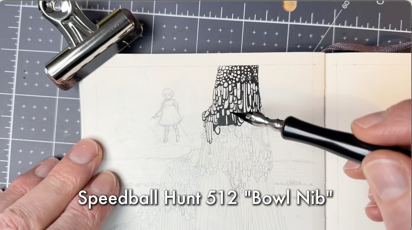
I began this study using a crow quill, a small flexible nib. Then, I switched to a bigger nib to better simulate the weight size of his strokes.
How Clarke Does Lighting and Shading
As part of my observations during the study, I aimed to find the source of light to establish highlights and shadows.
However, the direction of light is less critical with Clarke’s style comparable to a more realistic style like Gustave Doré (🎥 watch Doré study) or Franklin Booth (🎥 watch Booth study).
There are clues the light might be coming from the top left side.
However, from my observations of his works, I concluded that Clarke places greater emphasis on pattern variety, which, in turn, acts as tonal values.
To learn more about tonal values, which is part of the art fundamentals for drawing in pen and ink, check out the article ‘How to Master Studies for Pen and Ink Drawing’.
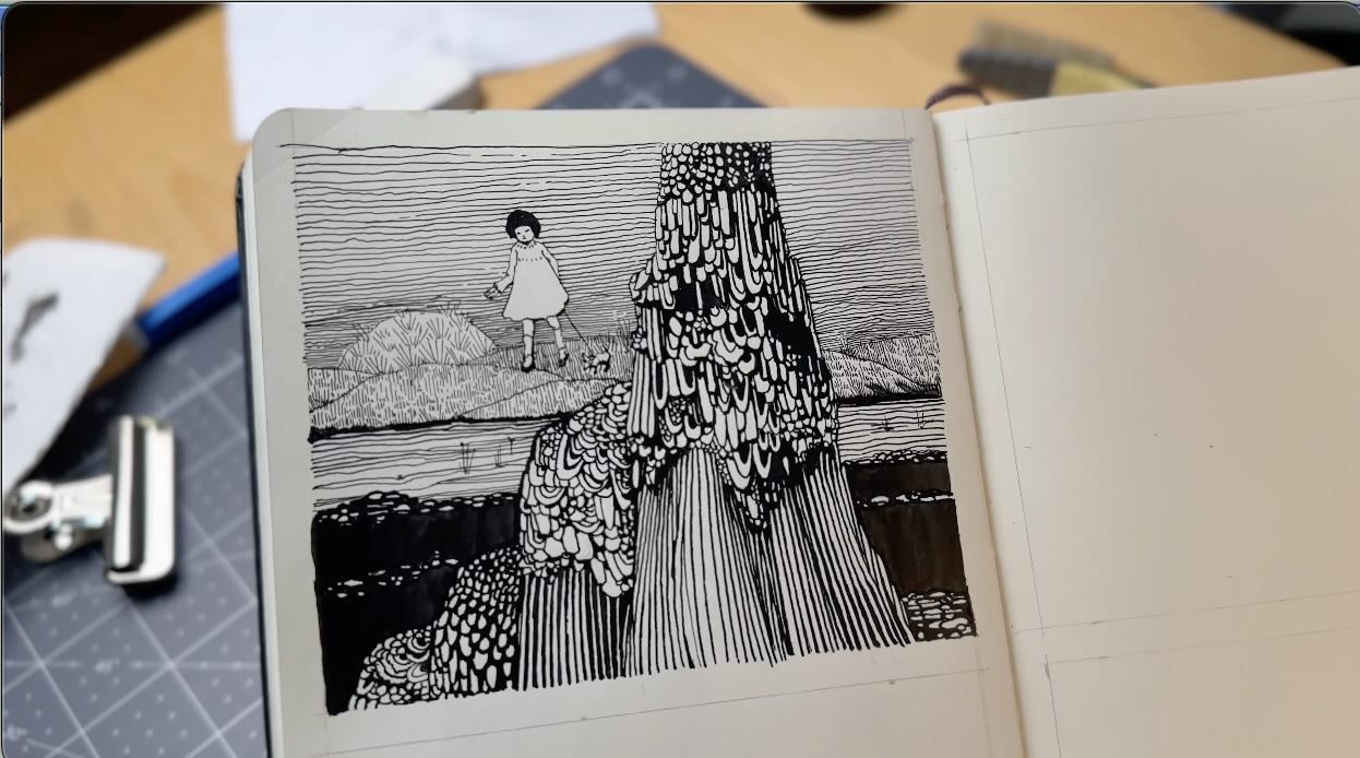
I used a no. 1 brush (and no. 2) for the solid blacks, then back to my crow quill to ink the little girl and the grassy knolls positioned further from the viewer in the picture plane.
Similarly to the seashell boulders, the grassy knolls follow a pattern around the form.
Clarke hatched the grass using an interlocking formation and variations of it.
How to Apply Clarke’s Style
To apply Clarke’s style to my own piece, I decided to draw something festive because December will include celebrations for:
- Christmas
- My 55th birthday
- New Year’s Eve
- And settling into my new home!
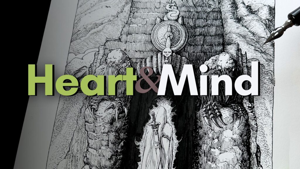
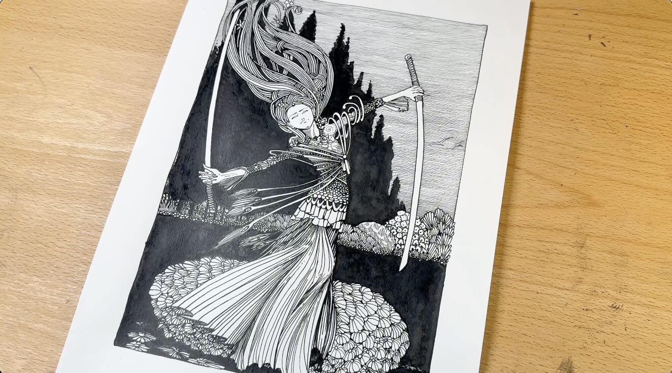
I went with a two-sword dance to ward off evil spirits and bring calm in the new year. This felt like a fitting concept for Harry Clarke’s illustration style.
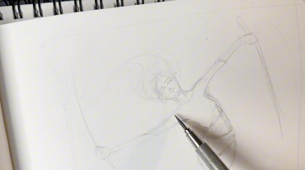
I started with a sketch to figure out the anatomy and composition. Then introduced the Clarke stylization.
Applying what I learned from the previous studies:
- Long bony two-dimensional
- Black on black
- Rich variety of goth patterns
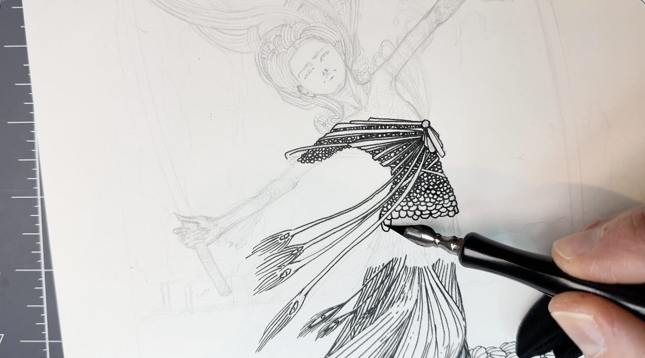
After re-drawing a clean version of the sketch on my Strathmore Bristol Smooth inking paper, I went ahead with the ink application.
If you enjoy Harry Clarke’s style of illustration, you may also like this article on a master study with Sergio Toppi.
Resources
Public Domain Review Blog on Harry Clarke
More Copyright Free images of Harry Clarke Illustrations
Tools and Supplies ↓↓↓
// DISCLOSURE: I earn a small commission when you use my affiliate links to make a purchase.

