In this lesson, you’ll learn practical exercises that you can directly apply to your pen and ink drawing projects.
You’ll find the list of referenced books, tools used and supplies in the resources section at the bottom of this post. If you enjoyed the lesson, I appreciate you sharing it.
//DISCLOSURE: I earn a small commission when you use my affiliate links to make a purchase. Read more about my affiliate partnerships on the Terms page.
Practical Training for Better Pen and Ink Techniques
There are two paths to improving your pen and ink drawing techniques:
- Through skill, and
- Knowledge.
Through knowledge, you learn the fundamentals: shape, form, shading, and so on.
📝 Learn more about the fundamentals of pen and ink in this post.
Learning about the fundamentals can be challenging, especially when just starting on your pen-and-ink journey, because it requires acquiring that knowledge from somewhere or someone.
With skill, that’s just practice. The more control you have over your instrument, the quicker you’ll see results.
But what should you practice?
Being able to draw a straight line is key.
Hah, but drawing a straight line can take years to master.
Something else that has just as much impact as a straight line and way easier to master is to start and finish a line exactly where you want it to.
Before we get into the exercises, gather your materials. For this section, I’m using:
- Stainless steel ruler (12”)
- One sheet of Canson smooth pen and ink paper (7×10”)
- Faber-Castell kneaded eraser
- Non-repro blue pencil
- A set of fine liner pens 01, 03, 05, 08

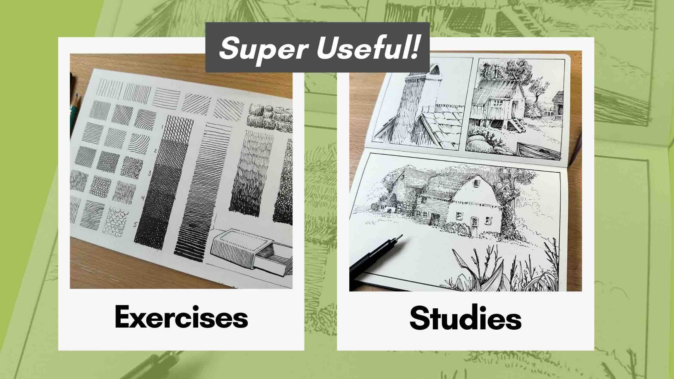
Texture Chart
To practice the start-stop motion control exercises, you’ll begin with a warm-up.
But first, you’ll want to set up your exercise chart template.
How to Set Up Your Chart Template
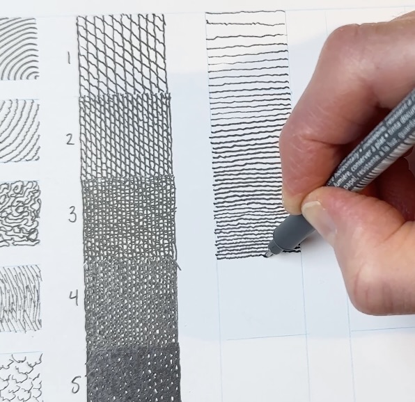
Below is what my finished chart looks like.
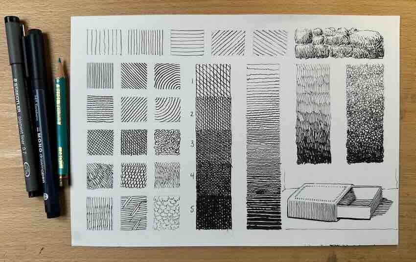
Using a ruler, draw columns and rows of squares as guidelines on your inking paper. I used a non-photo blue pencil, but a regular lead pencil or any other colour is fine.
For the top row, there are seven squares, three-quarter inches tall and one inch wide. The last two squares at the end of the first row are combined into a rectangle for the stone wall study.
Then, 3 columns, 5 rows, of approx. ¾ inch squares. Next to this are 4 columns, slightly larger. The first two are for 5-level value scales, and the last two are for split exercises.
You can organize your chart however you like to make the best of the spacing, depending on the textures and values you wish to practice.
I typically will choose textures for practice based on the subject I plan to sketch for my studies or projects, but we’ll talk more about this as we progress here.
The Exercises
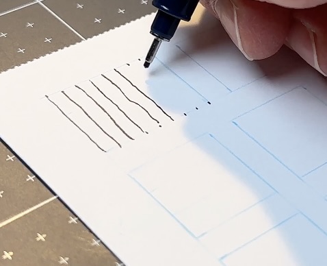
Use a ruler and a fine liner pen (any size 01 or 02 or 03) to mark dots on the top and bottom of the first square, 1/8th of an inch apart. Warm up your hand by joining those dots with vertical strokes.
Then move on to just using the guideline, no dots, in the second box over. Start and stop your stroke in the same spot to achieve even-length lines. Also, reduce the spacing between those strokes.
Change the direction of your strokes from vertical to horizontal using wider, even spacing.
Then diagonally, once in each direction.
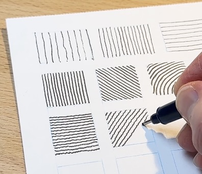
I often cheat and turn (swivel) the paper to the angle best suited for my comfort level. This gives me the most control, but doesn’t serve my training in the long run.
We want to increase our hand’s range of precision, so keep the paper where it is. These gymnastics will reward you with clean lines in the end (eventually, with practice).
Try a curved hatch as well, in both directions.
Go for a squiggly line. Now we’re getting into a variety of textures.
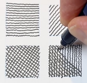
Most of us can render a decent parallel hatch. But as soon as the strokes overlap is where the shading can get sloppy and make a drawing hard to read.
A chart exercise like this gives you instant feedback; it’s clear how you’re doing within these little squares. There’s no hiding botched hatch marks within a composition.
As mentioned earlier, to make the most of your training, practice hatching textures that you would actually use in an illustration project.
For example, practice textures that you would use to build environments like:
- trees
- rocks
- stones
- sky, or
- whatever you plan on drawing next.
If not a nature subject, then practice a variety of surfaces such as:
- cloth
- hair
- fur
- scales
- metal
- water
- glass, and so on.
What’s even more useful is doing a value scale with your textures.
This way, your chart becomes a quick guide as a reference for shading your subjects with highlights, mid-tones, and shadows.
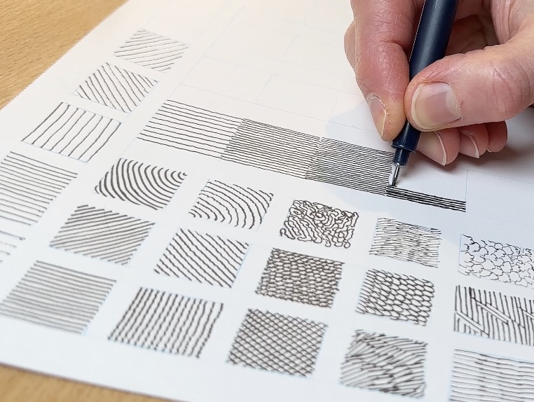
In my example, I used a 5-level scale with squiggly strokes from light to dark. Then turned it into a cross-hatch for extra practice.
Note that a full values scale includes white and solid black; however, there’s little need to practice that.
For the darker tones, I switched to my thickest tip pen and increased the number of times I crossed the lines. Up to four passes for the nearly black values levels 4 and 5.
Also, do a fade. So instead of distinct boxed levels, blend the tones gradually from light to dark.
Next to that, do two more shorter fades using more complex textures. I used stone and leafy-tree textures for my gradation practice.
We’ll do a couple of quick studies as part of the chart since I saved some space for that next.
Texture Studies
If you don’t have a project lined up, meaning you don’t have a plan or ideas for a specific drawing, then I suggest doing studies.
Just copy from a pen and ink guidebook. All of the exercises shown here are from master Arthur L. Guptill’s pen and ink guidebook.
So, for my first mini-study, I’m copying the shading he used in this stonework sketch. It’s the stonework fade texture I just practiced in my chart.
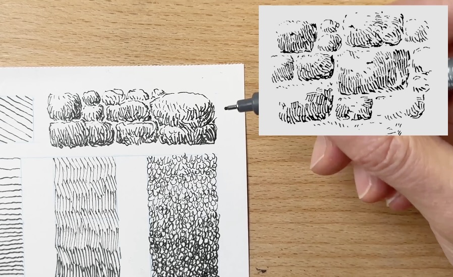
Doing tiny sample studies is an easy way to test your gradations on a real subject, not just in little squares.
Next, I used the squiggly line gradation for a matchbox study. Since I’m out of space on the chart paper, it’s time to progress to bigger studies.
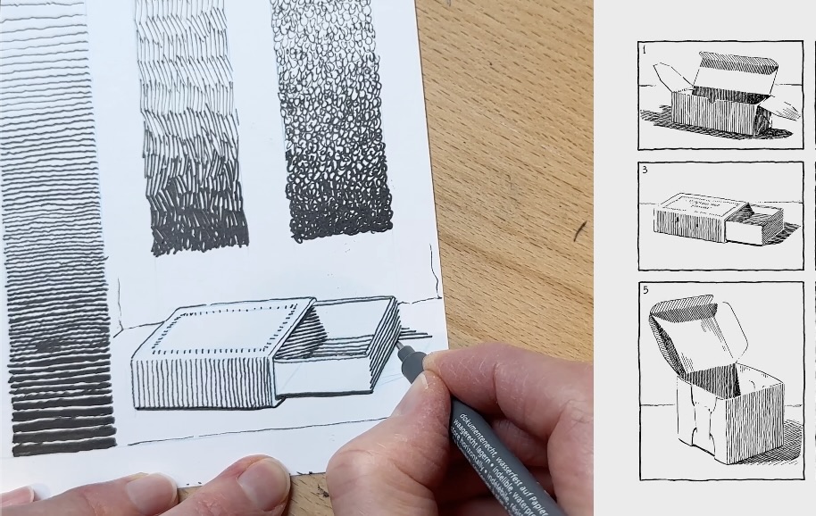
Bigger Studies
Master Guptill’s guidebook has tons of study examples, just like the stonewall and matchbox, for you to practice a variety of hatching techniques, from simple to complex.
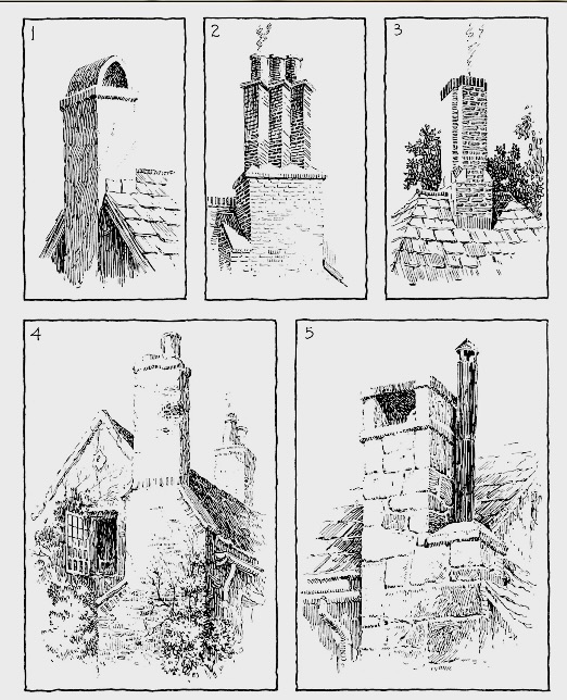
Like these chimneys (pictured left, below). I had purposely practiced the specific textures in my chart for the Guptill studies. Remember those curved strokes? Now I can use them on my chimney study (pictured right, below).
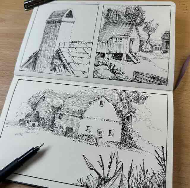
For these bigger studies, I switched from the Canson practice paper to my better-quality Moleskine sketchbook.
As noted earlier, if you don’t have a drawing in mind, then flip through a guidebook, flag 2-3 subjects to copy. Then you’ll know which hatching texture techniques to practice ahead in your chart.
Now we can confirm that being able to draw a straight line is nice, but as you can see from these studies, the straightness of a stroke is not the most important thing.
Being able to start and stop your strokes where you want them to has a bigger impact visually.
I barely even used contour lines in these sketches, meaning there are few hard edges. I created the illusion of contours by rendering with various hatch-mark textures in a gradation of values from light to dark.
To summarize, the shading shapes did most of the work. No straight lines required.

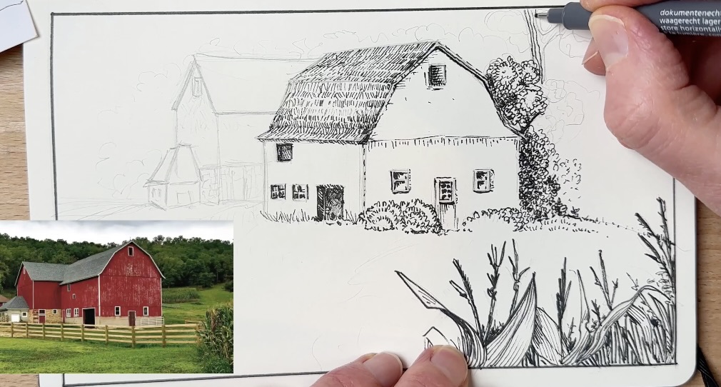
Mini Project
The final phase is to apply the exercises directly to your own design.
Pick a subject similar to the studies you just completed, so you can reuse the same chart as a guide.
I found a barn photo reference to match the architectural textures.
I used a parallel hatch on the corn in the foreground, and pretty much every hatching technique from my chart, including the tree leaves and the stone wall textures.
This is how you can use a structured approach for better pen and ink. Specific training that you can directly apply to your own pen and ink projects.
I hope this skill-building session gave you fresh ideas for what to practice.
You also saw how copying sketches from a guidebook not only gave us skills but also knowledge as well. By studying the works of a master, we were able to learn more about the art fundamentals, shape, form, shading and so on.
If you found this article helpful, I appreciate you leaving a comment and sharing it. Good luck with your practice.

Resources
📚 Books ↓↓
Rendering in Pen and Ink by Arthur L. Guptill
Frank J. Lohan Pen and Ink Techniques
🧰 Tools and Supplies ↓↓
- 12” Corked Stainless Steel Ruler
- Adjustable Tablet Stand
- Adjustable Tabletop Easel
- Canson Pen and Ink Sketchpad
- Caran d’Ache Non-Photo Blue Pencil (2)
- Faber-Castell Kneaded Eraser
- Staedtler Fineliner Set
- Staedtler Mars Technico Lead Holder

✒️ My tools