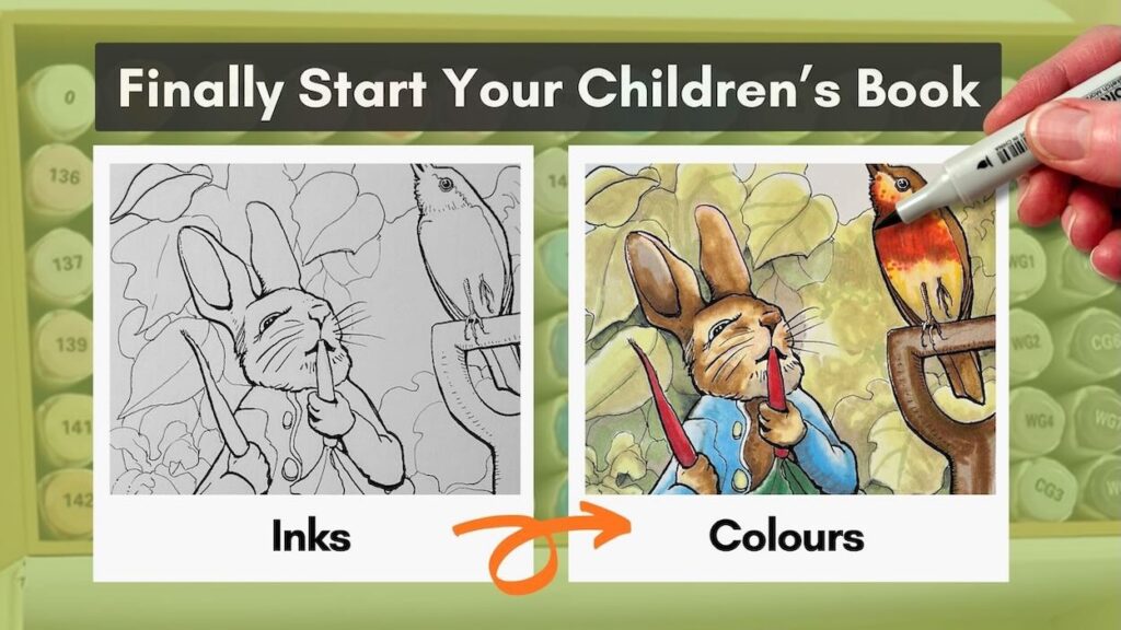
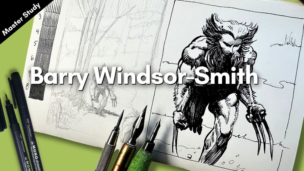
If you love to draw, then at some point, you’ve likely thought of illustrating a children’s book.
In this article, you’ll get fresh ideas on:
- how to get started;
- what tools and supplies to use, and;
- what to practice to end up with great results.
We’ll study the works of five of my favourite children’s book illustrators from the list of top sellers of all time.
- Children’s Book Illustration Essentials
- Practice Techniques with Ink and Arrtx Alcohol Markers
- Le Petit Prince by Antoine de Saint-Exupéry (1900-1944)
- The Cat in the Hat by Dr. Seuss (1904-1991)
- Winnie the Pooh by E.H. Shepard (1879-1976)
- The Tale of Peter Rabbit by Beatrix Potter (1886-1943)
- Where the Wild Things Are by Maurice Sendak (1928-2012)
- Final Thoughts
- Resources
// Disclosure: Some of the links in this article are collaboration partner and affiliate partner links. I receive a small commission when you make a purchase using some of these links. Read the Terms page to learn more about my affiliate partnerships.
Children’s Book Illustration Essentials
What can really get you going with a big project like this is doing master studies of legendary children’s books.
Studying the masters achieves three things:
- It makes you try out different techniques, materials, and in what order.
- Helps you practice the right things to make progress with your own project.
- It gives you a more concrete idea of what’s possible.
Essentially, you’ll learn a lot quicker what you need and what to do.
For whom to study, you can refer to the list of influential books, the top sellers of all time.
From which I picked five of my childhood favourites, starting with: The Little Prince.
Practice Techniques with Ink and Arrtx Alcohol Markers
For materials, all the storybooks featured in this article are from the same era, using traditional pen and ink with watercolour.
Your objective, though, is to test the materials that you want to use for your own storybook.
I’ll be testing different drawing and inking tools.
For colour, I’m opting for alcohol markers, and you’ll see the advantages of using markers over watercolour as I explain.
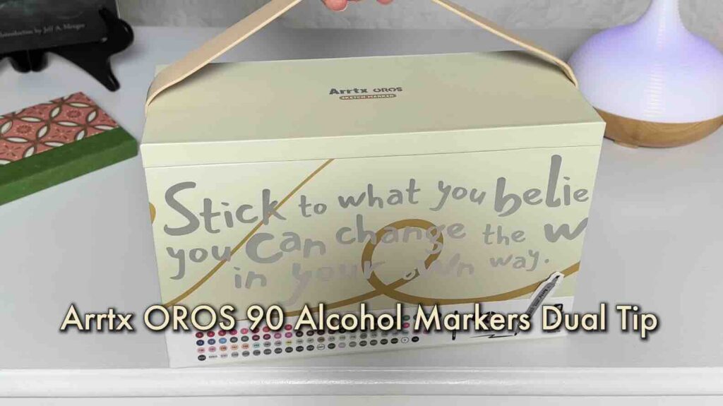
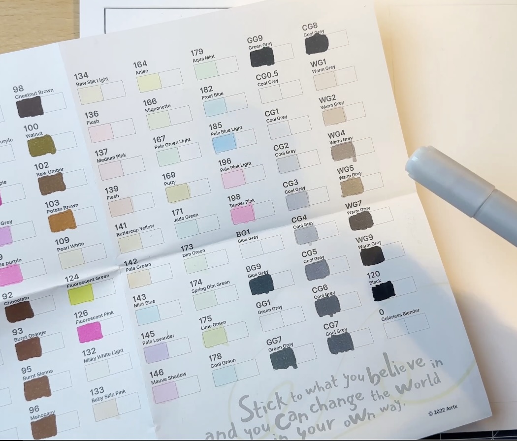
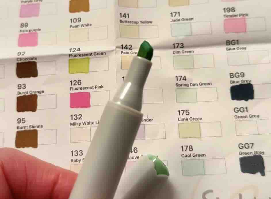
The markers I’m using are the Arrtx OROS 90 Alcohol Markers | Paint Markers with Dual Tip. Get yours here:
✨Big Sale (15%-20%off) on the markers in the Amazon stores in January 2026, get yours here:
You’ll find all of the supplies used in the studies listed in the Resources section at the bottom of this article.
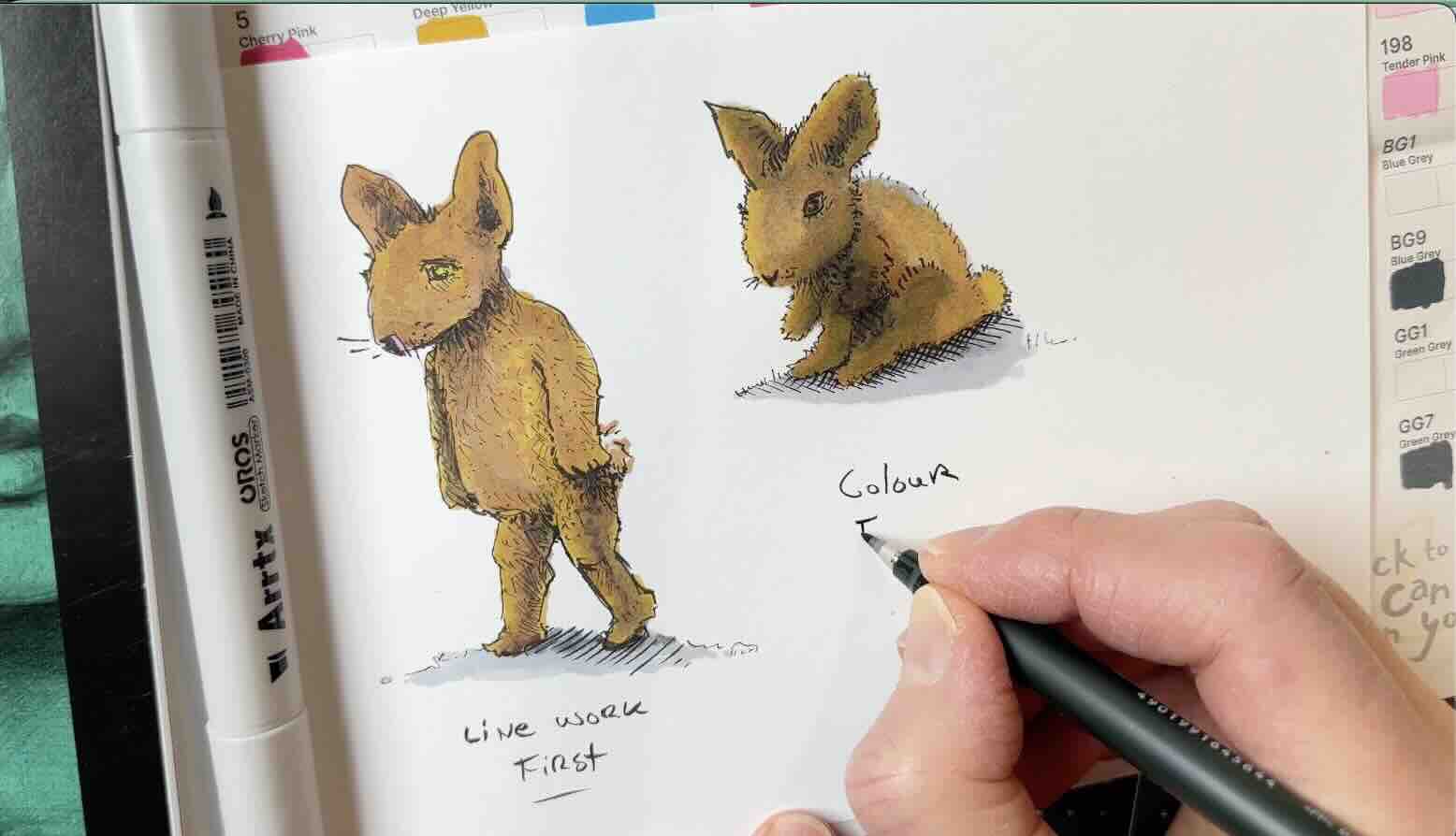
I noticed a lot of industry professionals use blue pencil for their underdrawing, which is the initial sketch.
Therefore, the blue pencil is our first test with The Little Prince.

Le Petit Prince by Antoine de Saint-Exupéry (1900-1944)
The second part of this test is for your workflow. A workflow is the order of the stages.
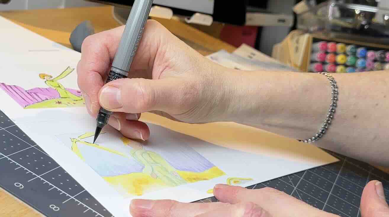
For this first study, after the underdrawing is complete, I’ll apply the colours in markers first, then the inks on top.
For the colour application, I’m starting with the background, layering each colour back to front.
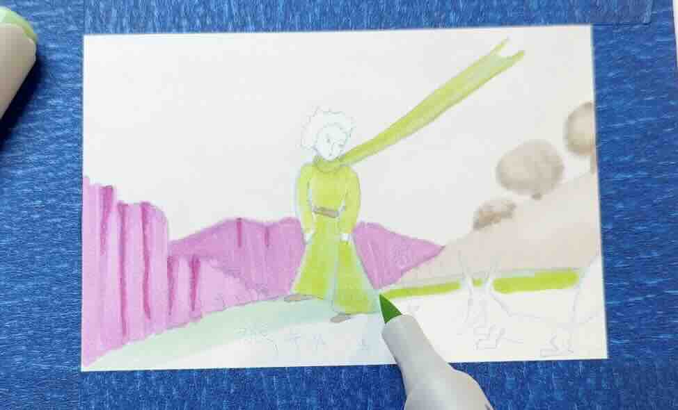
Note that I’m using directional strokes with my marker, the same way I would with any other medium.
I learned to use directional strokes from doing hundreds of master studies. Masters use directional strokes, which is a hand-motion that follows or contours the form.
Using directional strokes is the simplest way to visually describe volume. Meaning your drawing won’t look flat if you do it this way.
This hand-motion technique is especially important when layering a semi-transparent medium such as alcohol markers.
Aim to match the colours used by the master in his illustration; this helps develop observation skills.
Take time to analyze his colour choices. Is there a deeper meaning attached to those particular colour schemes?
The Little Prince sold over 140 million copies worldwide. It was translated into 600 languages and became the second most translated work ever published, trailing only the Bible.
So maybe the colour scheme is not random?

The goal is to make your practice count for great results. That means paying attention to what you notice, why it matters, and taking notes along the way.
For the ink application, I’m using a brush pen to mimic the organic feel of the master’s lines. It’s said that he inked using a quill, but it looks like brush work to me; he likely had an extremely soft nib. A soft nib means a broader range of line quality; thin-to-thick in a single stroke.
📖 Curious about using a dip pen? Read this article to learn which nib is best for your drawing style.
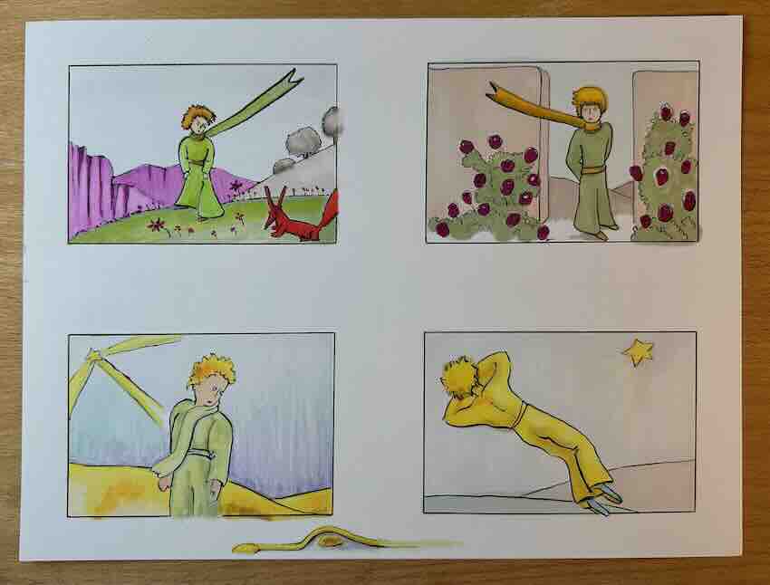
As I begin my second study of The Little Prince, what jumps out is how the character looks so different from the previous drawing.
Compare these four scenes and note the differences in the costume design and hairstyle.
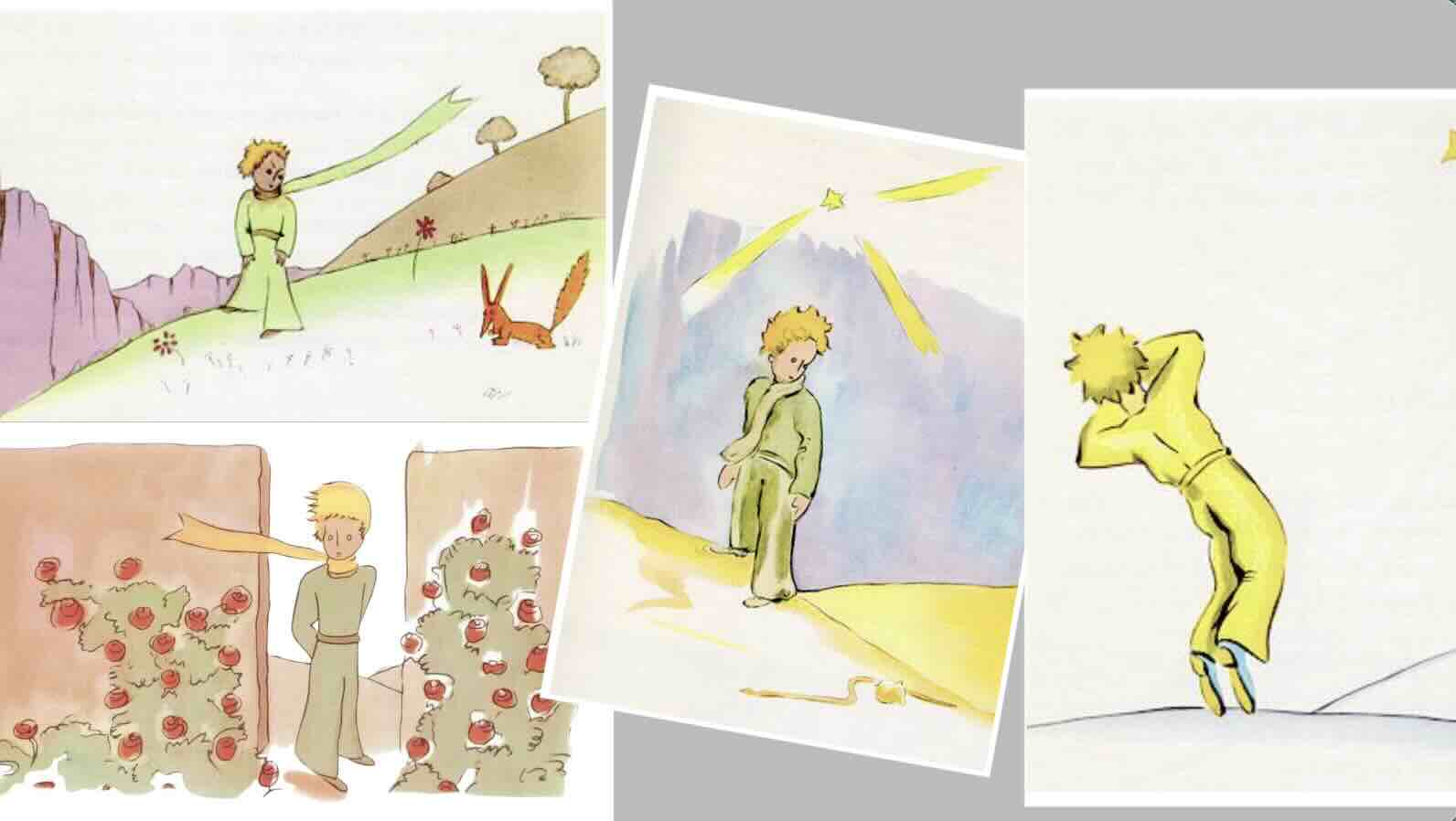
To me, that’s actually encouraging because if you’re worried about drawing your original characters the same every time, you can see here it’s not a big deal if you don’t.
Your skills can evolve over time, even within the same story.
Also, note the different green tone of the costume from image to image.
That inconsistent colour could be a deliberate storytelling technique, but I think it’s because he used watercolour.
It is challenging with watercolours to mix the pigments with water so that they consistently match exactly from illustration to illustration.
This is a major factor as to why I view markers as a more reliable, beginner-friendly colouring solution. Especially for longer-term projects like a book or series.
And unlike watercolours, markers are quick drying, so there’s no waiting for your drawing to dry before you can apply the ink on top.

This matters because India Ink tends to re-activate when wet, so it’s important to apply your inks to a dry surface. Using markers instead of watercolour saves you lots of time.
Plus, Arrtx alcohol markers won’t fade, so a solid choice all around.
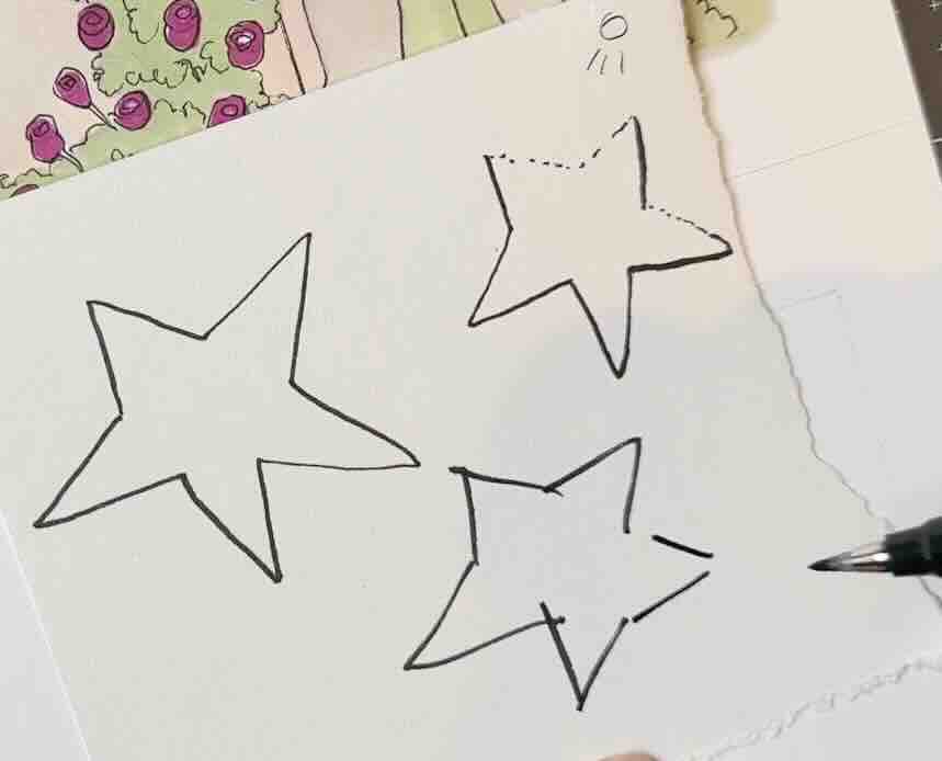
There is one technique I noticed that was done deliberately. It really jumped out while doing these studies. It’s how the master captured the hearts of children by mimicking how a child would draw.
For example, an adult beginner would draw a star that’s slightly misshapen, but with all the lines connecting perfectly.
An intermediate adult would include line quality, using broken edges for the highlights and bolder lines for the shadow areas.
A child, however, would cross lines and leave open gaps where lines should join. Then colour outside the lines. And some of the master’s illustrations were a little like that.
Antoine de Saint-Exupéry studied architecture but had no formal art training. He kept a journal and was a prolific doodler. He drew from observation, imagination and wrote stories inspired by real-life events.
What I find so uplifting about this book is that it invites you to create from where you stand. Whatever level you’re at, just draw and be free.
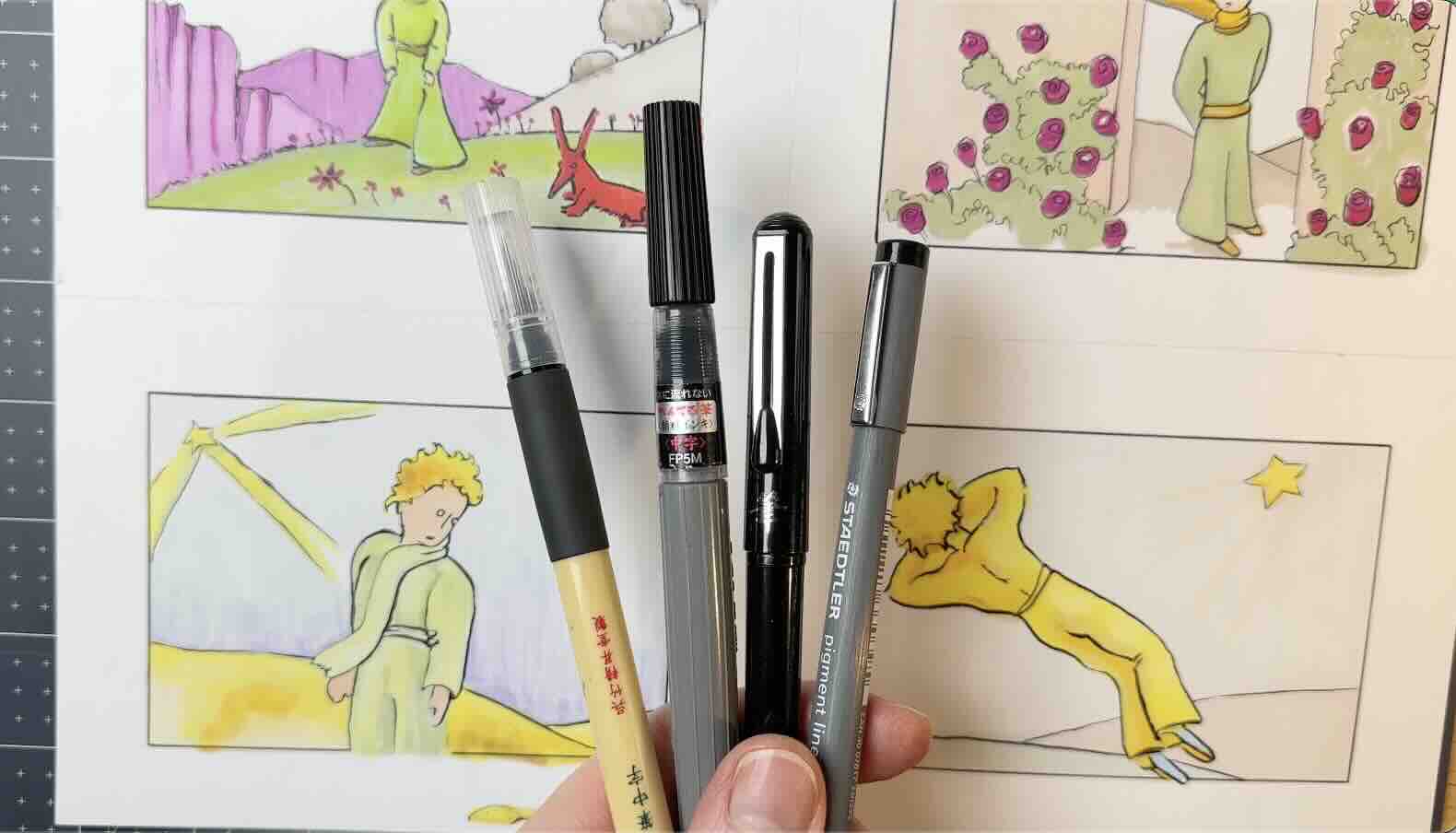
For all four studies, I used a blue pencil, the Arrtx colour markers, and inked using three different types of brush pens and one with fine liners.
The next famous doodler with no art training who ended up selling over 600 million copies of this book: The Cat in the Hat by Dr. Seuss.
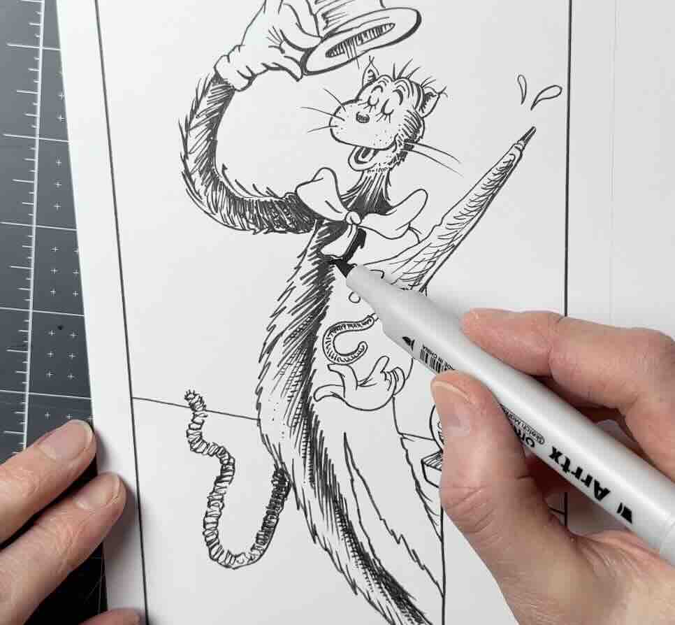
The Cat in the Hat by Dr. Seuss (1904-1991)
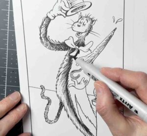
For the Dr. Seuss Cat in The Hat studies, I’ve switched from the non-repro blue to a graphite pencil for the underdrawing stage.
For my workflow, I’m now opting for inks first, then colours on top.
Again, it’s said that a dip pen was used, but it also looks like brushwork to me.
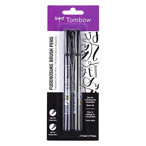
Regardless, for these two studies, I used a set of Tombow Fudenosuke felt-tip brushpens, one hard and one soft. With this tool, I can recreate the line quality, thin-to-thick, in a single stroke.
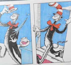
As in the previous studies, the drawing style would foremost appeal to children. Paired with a storyline that deepens in meaning as you age. It’s the book that grows with you.
The shading and textures are rendered in loose scribbly motions, yet they’re precisely executed to show volume. This, combined with line quality, achieves depth of field.
I’m using the black Arrtx marker to fill in the solid blacks, then I filled in the other colours on top of the inks.
He typically used just black, white, and one or two primary colours.
I did a cross-hatching pattern in blue marker for the background. If you prefer a super smooth, solid colour instead of a texture, there are three simple ways to do it.
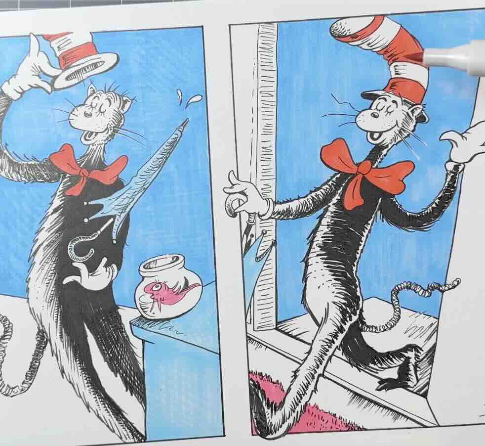
First is using directional strokes to apply the colour, as shown in The Little Prince studies.
Second is your paper choice.
It’s normal with alcohol markers to have some show-through, which means the marker ink seeps through the paper fibre.
If you’re using a sketchbook for your studies, just place another sheet behind the one that you’re drawing on to protect the next sheet of drawing paper underneath in the pad. Or you can use separate sheets.
Either way, for the best outcomes, use a smooth finish paper surface. For studies, I just use an economical student-grade paper.
For beautiful results, like for your children’s book project, I recommend a thicker, professional-grade paper. Then you’ll see minimal streaks in your large solids of colour.
The third method to achieve super smooth colour transitions is to layer the application. I’ll show you in this next study with Winnie the Pooh.
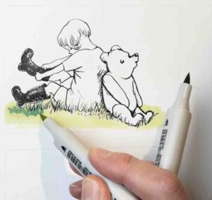
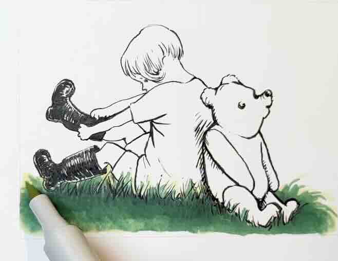
Winnie the Pooh by E.H. Shepard (1879-1976)
Just like the other masters, E.H. Sheppard kept a journal and doodled from observation and imagination. Unlike the others, he completed formal art training and worked as a commercial illustrator.
What strikes me about his Winnie the Pooh drawings is the accuracy of the gestures. It shows that he classically developed his fundamental art skills.
His lines are economical and expressive. It’s a scribbly style with purpose in every stroke.
For the first study, I opted for a classic paintbrush with liquid India ink and applied the colour over the inks.

For a painterly effect and to blend with the smoothest transitions, it’s best to build your colours in layers.
To do the layering, you’ll want a mid-tone, a highlight, and a shadow-tone.
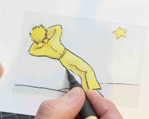
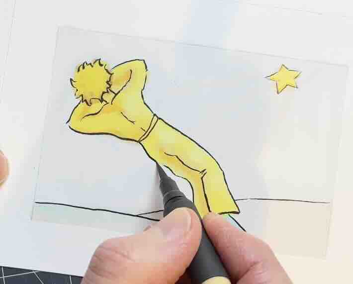
For example, in the image below, I used three greens, starting with the lightest colour – the highlight green.


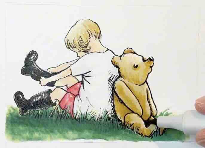
Then I layered in the mid-green and used the highlight green to blend it in. Next, I added the shadow green on top and blended it in using the middle green.
🖍️✨Tip – Be sure to give the caps a little twist each time you put your markers away. For the long-lasting life of your markers, store them in a cool and well-ventilated place away from direct light.
To stay organized, I pick the colour trio (or sometimes a few more) for each section that I’m colouring, then put them back in their stand holder. Note that the top cover of the OROS 90 box doubles as a stand.
That’s all you need for seamless, vibrant colours.
With watercolour, it takes a lot of time and expertise to get comparable effects.
Comparatively, these markers make painting super accessible at any level.
For the second study, I tried inking with a ballpoint pen as it suits the loose style. It’s amazing how a few scribbles can transform into a full landscape environment.
I took mental notes about this composition and what about it makes it memorable.
The Arrtx OROS 90 set has lots of grey tones. So instead of colour, I opted for a monochrome effect.
The ink in my ballpoint pen reactivated with the alcohol makers. It looks intentional, though; it’s what we would call “a happy accident”.
I don’t recommend using a ballpoint pen for final art anyway, but for studies, it’s a lot of fun. If you were considering a ballpoint pen more seriously, I suggest that you apply your colours first, then the ink on top to avoid unwanted surprises.
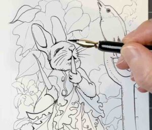
Next, let’s jump into The Tale of Peter Rabbit using a dip pen and India ink.
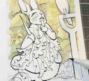
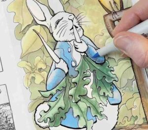
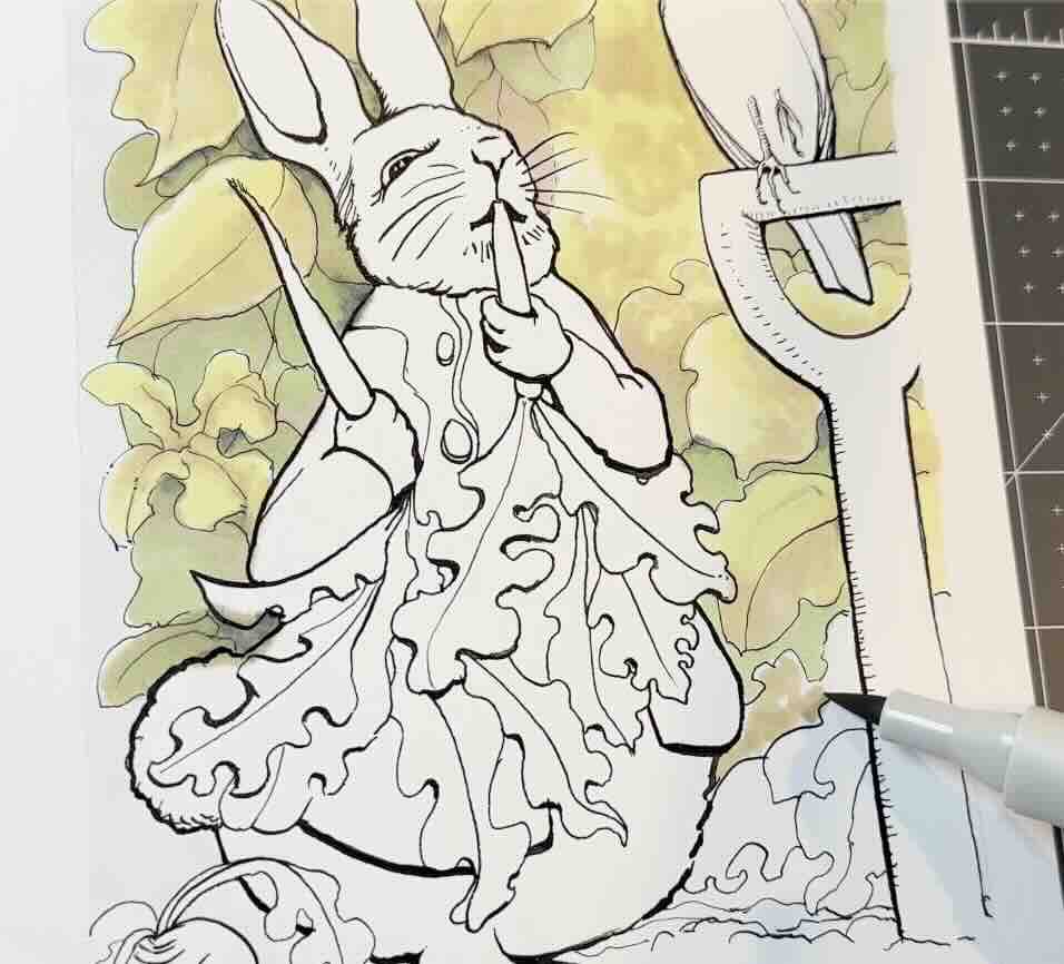
The Tale of Peter Rabbit by Beatrix Potter (1886-1943)
Beatrix Potter initially self-published The Tale of Peter Rabbit, and then she went on to write over sixty books!
Like the other masters, she was also an avid doodler, always with her sketchbook. She could be seen at the mere age of 14 out in the garden, gathering source material.
If you’re looking for storybook ideas, apparently drawing kids and animals is the way to go.
Also, look through your sketchbooks; there are untold stories in there, I’m sure.


As artists, we’re typically focused on skills and technique and often hesitant about sharing imperfect drawings. I’ve learned from doing these studies that the key to a successful children’s book is relatability and the emotion that evokes in the reader. Not technique or flawless drawings.
For inking tools, I used two sizes of dip pens with India ink. I used a large nib (Speedball Hunt 513EF) to get a bolder outline around the main elements in the foreground, and to pronounce some of the shadow lines.

I applied the same layering technique for the colour. This time, I included greys as part of the layering sequence to deepen the shadow tones.
That’s a solution when you’re looking for an additional transition colours: use a cool or warm greys as the base or over top.
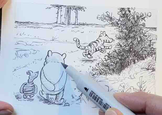
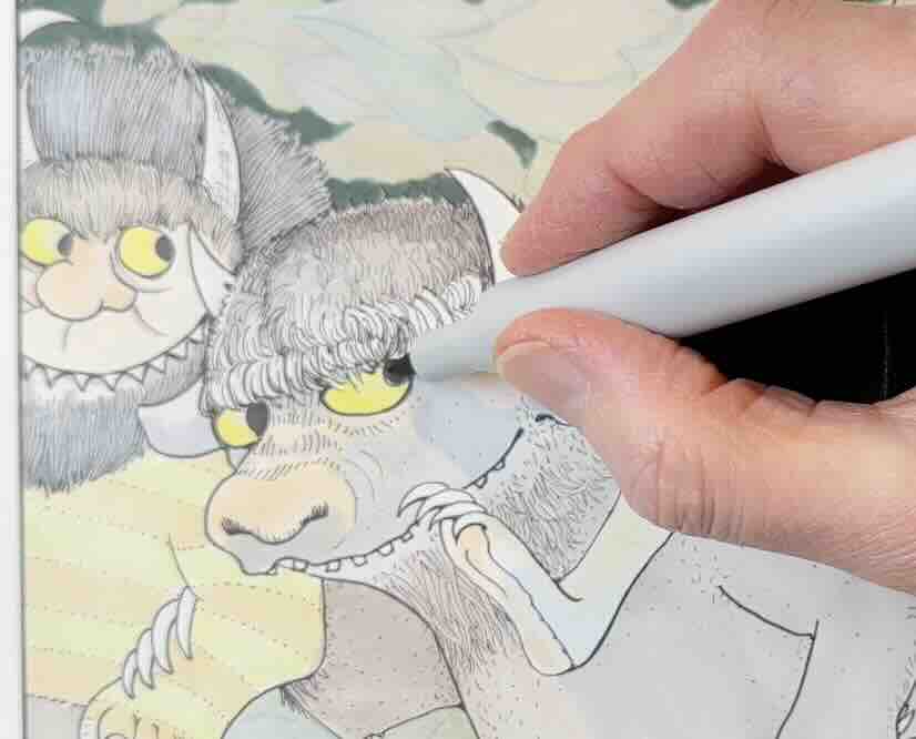
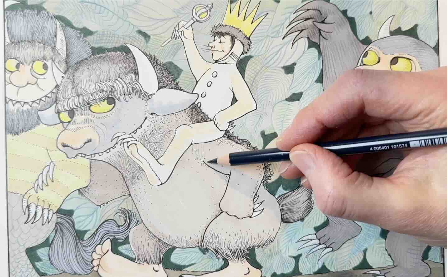
Where the Wild Things Are by Maurice Sendak (1928-2012)
Maurice Sendak’s illustrations from Where the Wild Things Are are complex, with lots of detail and rendering, so I switched to a professional-grade Bristol smooth paper for the final study.
I opted for a full set of fineliners. Having various tip sizes was helpful because he uses different line weights throughout the illustration.
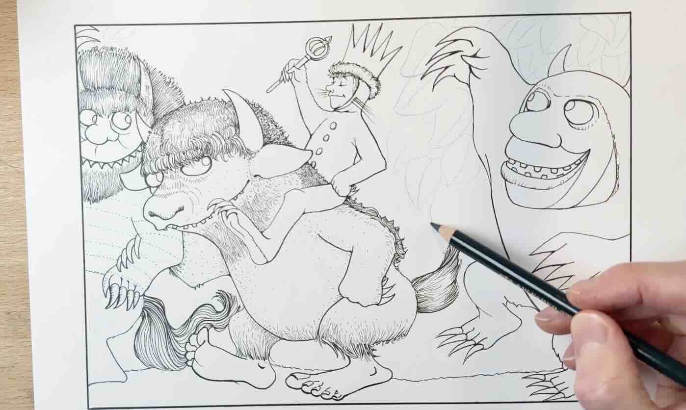
Most of the rendering, the hatch marks, is done in a medium other than ink. I read that he used pen and ink, graphite, watercolour and poster paint. I assume the hatch marks are rendered in graphite overtop.
Therefore, I kept my hatching in ink minimal before jumping into the colour application.
After the main foreground elements were rendered in ink, I drew in the background detail using a coloured pencil.
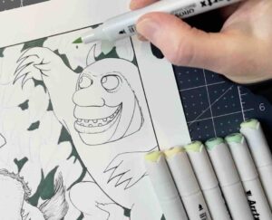


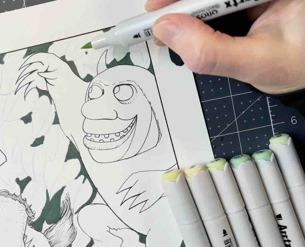
Then I used the chisel tip of the alcohol markers to cover the bigger solids of colour.
The chisel tip is handy for covering larger surface areas. Otherwise, I mostly use the brush tip because it’s really precise. Plus, my drawings are small in size and tight.
Speaking of tight, that was my key observation of this master’s work. His drawings are so fine and precise.
Master Sendak was largely self-taught. He illustrated over one hundred books during his sixty-year career, selling over 50 million copies of this series.
Final Thoughts
I hope that you enjoyed these five master studies and that you’re encouraged to get started, test supplies, and have fresh ideas on what to practice next.
The goal is to make your practice count for great results. That means paying attention to what you’re learning, taking notes along the way, and building momentum for your book project.
The majority of modern commercial storybooks are produced with digital tools, but how you create your book really comes down to time, budget and preference.
So, it is helpful to test different combinations to see what gets you excited to get your project off the ground and out there, and become the next inspiring best seller of children’s books!
Resources
📚Books
- Little Prince 75th Anniversary Edition
- Winnie the Pooh Classic Edition
- The Tale of Peter Rabbit Set
- The Cat in the Hat
- Where the Wild Things Are

🖋️ Other Tools and Supplies
- Adjustable Tablet Stand
- Adjustable Tabletop Easel
- Cricut Cutting Mat
- Faber-Castell Kneaded Eraser
- Kuretake Bimoji Fude Brushpen
- Pentel Arts Color Brushpen
- Pentel Arts Pocket Brushpen
- Prismacolor Non-Photo Blue Pencil
- Speedball Dip Pen (w/cleaner and ink)
- Speedball Super Black India Ink
- Staedtler Mars Technico Lead Holder
- Steadtler Fineliner Set
- Strathmore 300 Bristol Smooth
- Tombow Fudenosuke Set

Such an interesting exploration of styles and art tools. I love the work of Beatrix Potter and E.H. Shepard. The nuanced linework is so delicate yet expresses so much. Thanks for doing these studies!