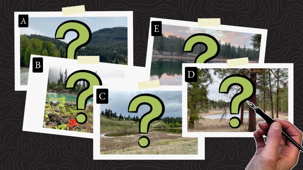
Do you know how to choose the best landscape photo references for your illustrations?
In this article, we’ll use a guideline that’ll help your compositions stand out when drawing realistic landscapes with pen and ink from a photo reference.
//DISCLOSURE: I earn a small commission when you use my affiliate links to make a purchase. Visit the Terms page to read more.

References for Pen and Ink Drawing
I shot the above five landscape photos near my home in British Columbia (Canada).
Out of these five images, pick the top two that seem like the best compositions to draw with pen and ink.
Remember your choices until the end.
Now we’ll evaluate the photo references based on three sets of criteria:
- Structure
- Focal point
- Inspiration / fun factor
Structure
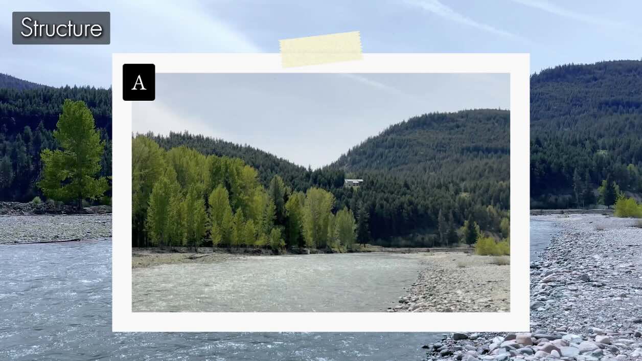
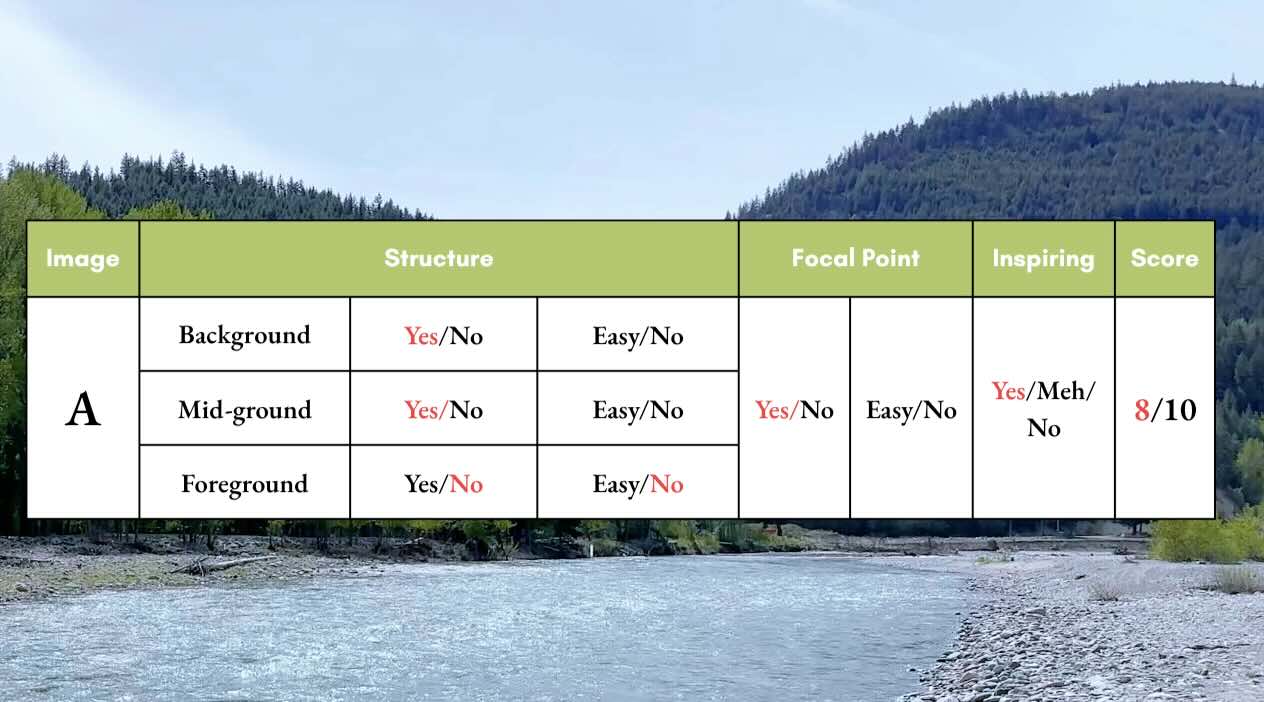
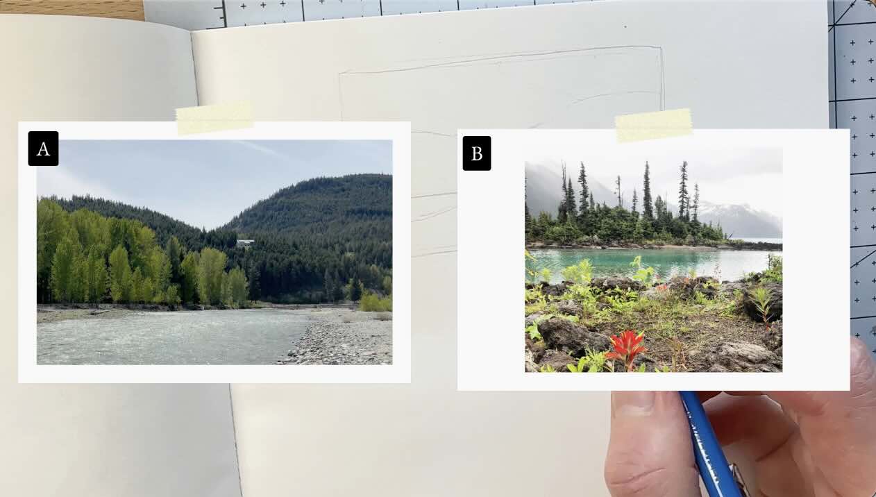
Landscape Picture A
The first criterion in our rating guide has to do with how the composition is naturally structured.
Look for a distinct:
- Background
- Middle ground
- Foreground
It’s best to have a background, middle ground, and foreground in a landscape because these create overlapping elements. Elements are objects or parts that make up the whole.
Overlaps in a composition make it easier to establish a sense of depth using pen and ink.
In picture A, the horizon line divides the space into background and foreground; the house then becomes a middle ground.
Visually, the foreground might cause issues.
The vantage point is the cause.
A vantage point is the angle at which the photo was taken. In a drawing, it’s also the position of the viewer, which is an important consideration for visual storytelling.
Therefore, the foreground could cause problems at the inking stage because it’s too far in the composition for us, the artist, to create clear overlaps.
You see, the stones and river are nearly the same tonal value. That means the foreground elements are the same intensity of grey.
There’s a risk this illustration might not turn out well. It might come out looking flat or overly busy.
Is it an easy fix?
We could place a branch or larger boulders on the edge of the picture plane in the foreground to create an overlap and contrast.
But the vantage point could make that overlap placement seem odd, look “off”.
So, I say “no” it’s not an easy fix to add a foreground.
Focal Point
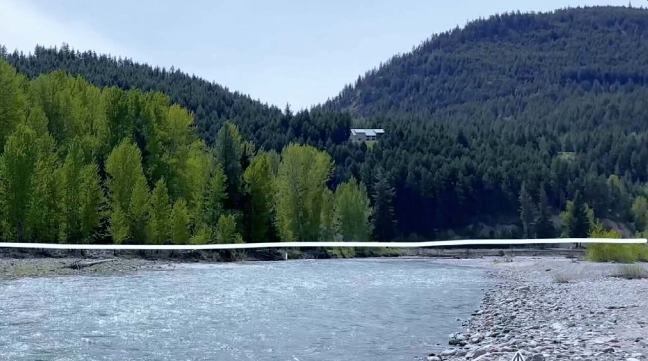
Landscape Picture A
The second criterion in our rating guide has to do with visual storytelling.
You’ll need to determine whether the image naturally leads the viewer to a point of interest.
If there isn’t an obvious, single focal point, how believably can we create one using pen and ink techniques?
So, in picture A, where does your eye land first?
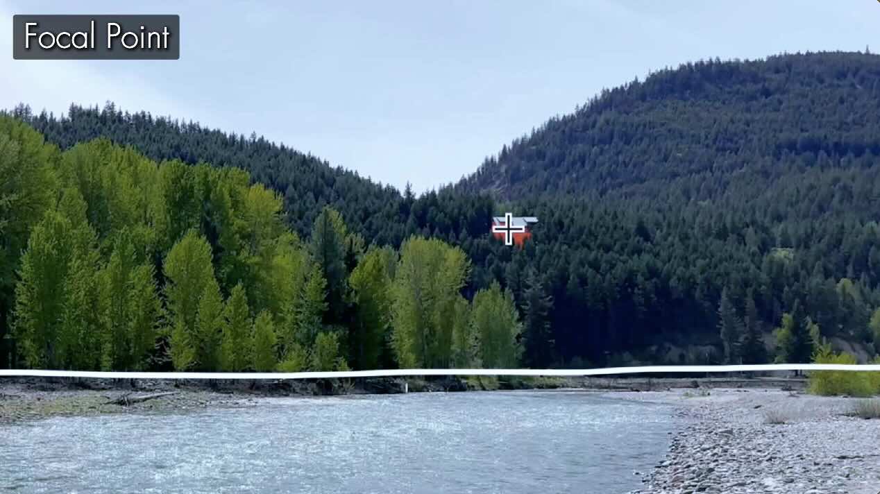
The house on the hill immediately draws my attention.
The house incites immediate interest because it’s framed by contrasting values, light against dark.
As well, the angles in the landscape naturally lead the eye to the house. Note the edges of the river, the hills, and even the stringy cirrus clouds in the sky – all converge towards the house.
So, “yes”. There is a natural focal point in this photo.
Inspiring?
Landscape Picture A
The third criterion in our rating guide is more of an overall feeling.
Is this reference too simple, or too complex for your ability?
How excited are you to render this image?
I like this composition a lot, because there’s opportunity for texture variety with the different types of elements, and the lighting provides a clear delineation of shadows, which makes this reference easier to draw convincingly.
So, I say “yes” this reference does inspire me to draw.
In our Rubric, we assign 2 points for a “yes”, 1 point for “easy” or “meh”, and zero for “no”
Picture A therefore scores: 8 out of 10 in total.
Structure
Landscape Picture B
In this composition, even though the overlapping flowers are blurry in the photo, this is a good foreground.
This photo was shot low from the ground, looking up, which makes an attractive composition.
The vantage point provides perspective that balances the foreground, middle ground and background in a pleasing way.
So, picture B gets a full score for structure.
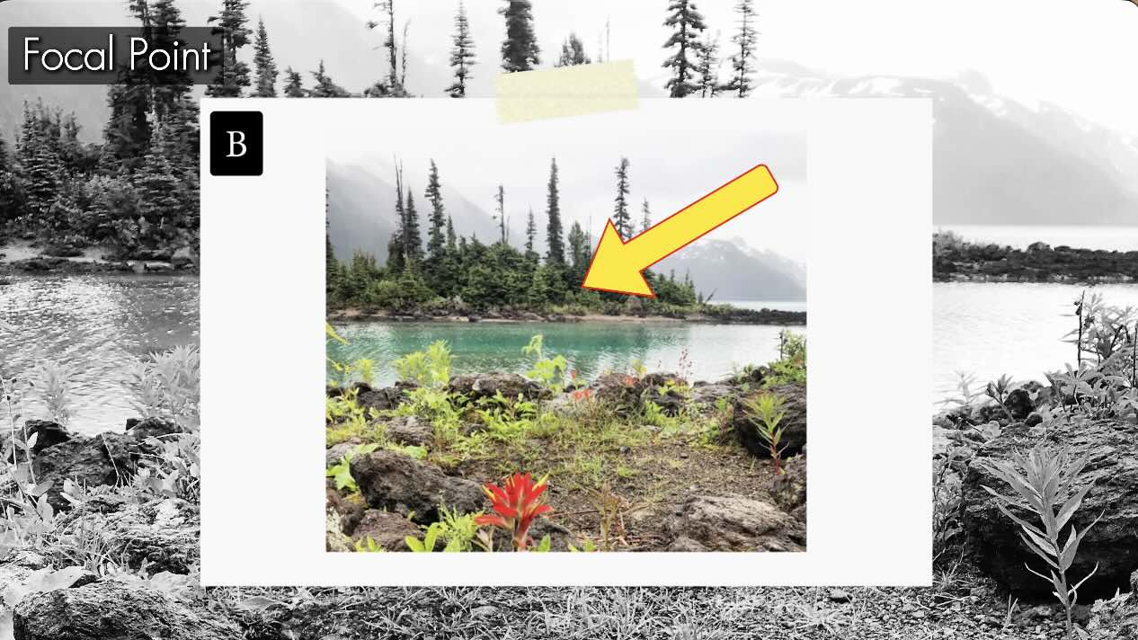
Focal Point
Landscape Picture B
When you first look at picture B, where does your eye go first?
My tendency is to look at the island first.
However, my attention immediately shifts to the foreground flowers.
Sort of back and forth, skipping from the Island to the flowers and back.
This is distracting, which means we have competing areas of interest.
Would you want the viewer to focus on the flowers first or the island?
You, the artist, can control this by emphasizing one or the other with the use of values and your rendering technique.
We’ll talk more about techniques later in this article, but for now, we’ll give it one point, since the focal point is an easy fix.

Inspiring?
Landscape Picture B
I also give picture B a full score on the fun factor because of the broad potential for texture variety:
- Rocks
- Plants
- Trees
- Water
- Mountains
And even fog!
If executed well, the island image would make a memorable subject.
I give picture B a 9/10 final score.
Structure
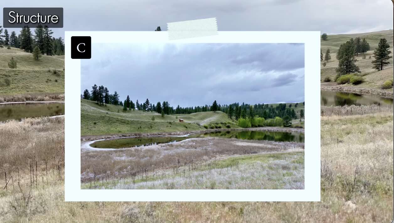
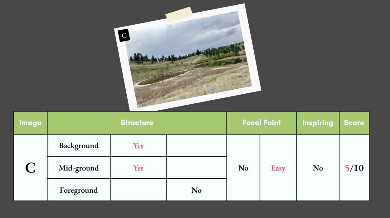
Landscape Picture C
In picture C, similarly to picture A, the foreground is further from the viewer.
The grassy plane in the foreground is too spread out to render an overlap in a pleasing way.
Unless you plan your values really well, the risk with this foreground is that it turns into visual noise. Too busy with the same tones.
The viewer is standing at eye level.
Again, you can test the vantage point by overlaying an object in the foreground. Doing this helps confirm whether it’s an easy fix to add a foreground. I say not.
The background is also a bit underwhelming.
You could render a more imposing background, such as placing stronger emphasis on the cloud texture at the rendering stage.
Focal Point
Landscape Picture C
For the focal point of picture C, I first look at the tiny cabin.
But the higher contrast in values around the left side of the lake pulls the eye to that side of the picture.
There is potential for at least two or more areas of interest.
However, the focal point in picture C would be simple enough to control with a clever arrangement of values.
So, one point.
Inspiring?
Landscape Picture C
I’m somewhat inspired.
I like the plant variety and the pretty reflections in the lake.
But compared to the other presented options, this reference would not be my first choice for a pen and ink illustration.
Final score for picture C is 5/10.
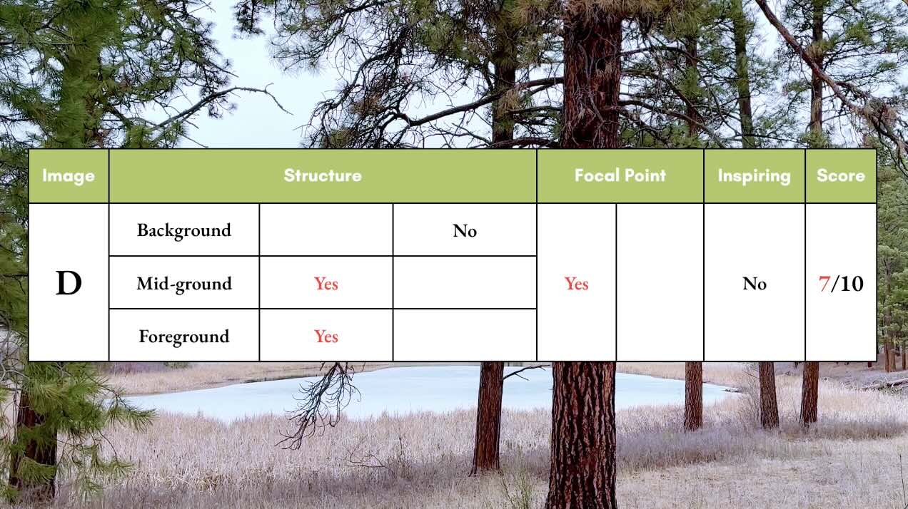
Structure
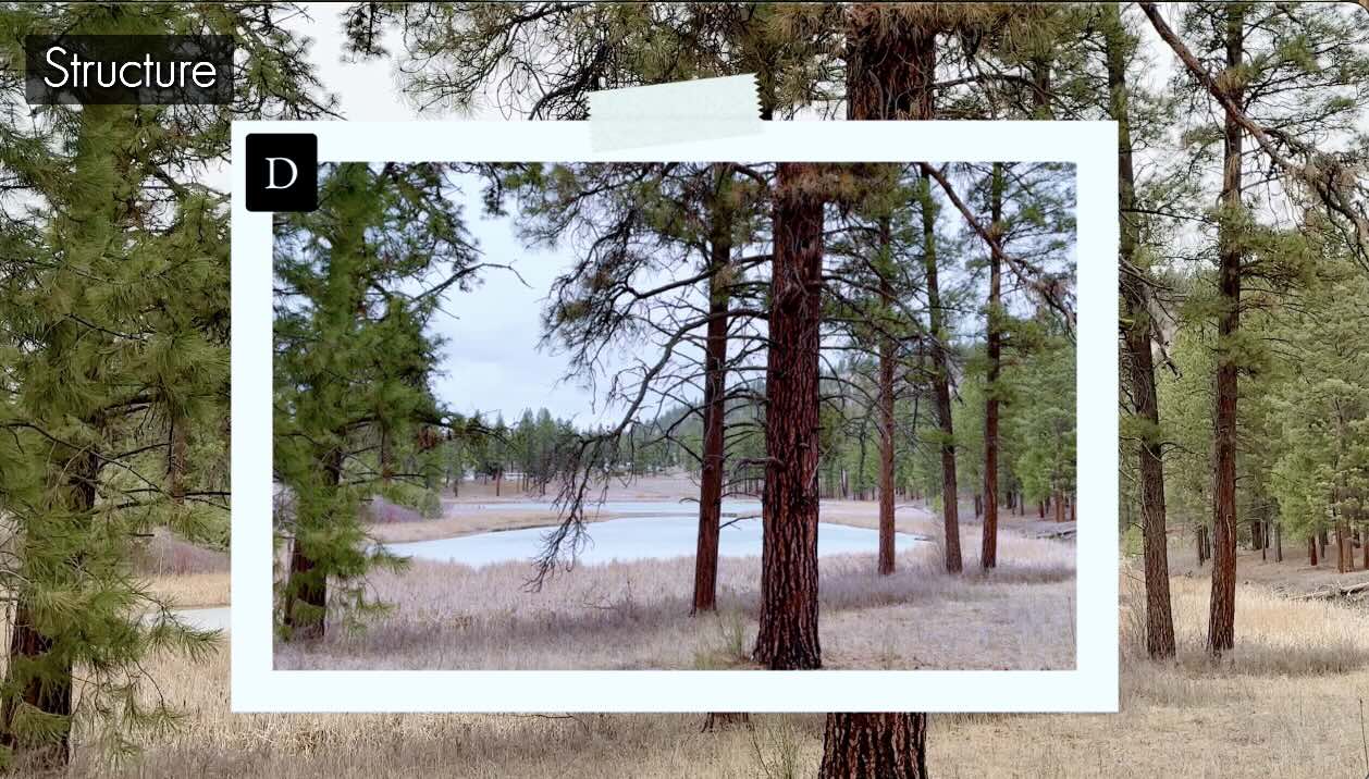
Landscape Picture D
Picture D has a prominent overlapping foreground with the beautiful cedar, and a frozen lake for the middle ground.
The background is weak because there’s insufficient distance front-to-back in the picture plane.
Adding a mountain range and clouds in the background would help this structure.
Not full points, but close.
Focal Point
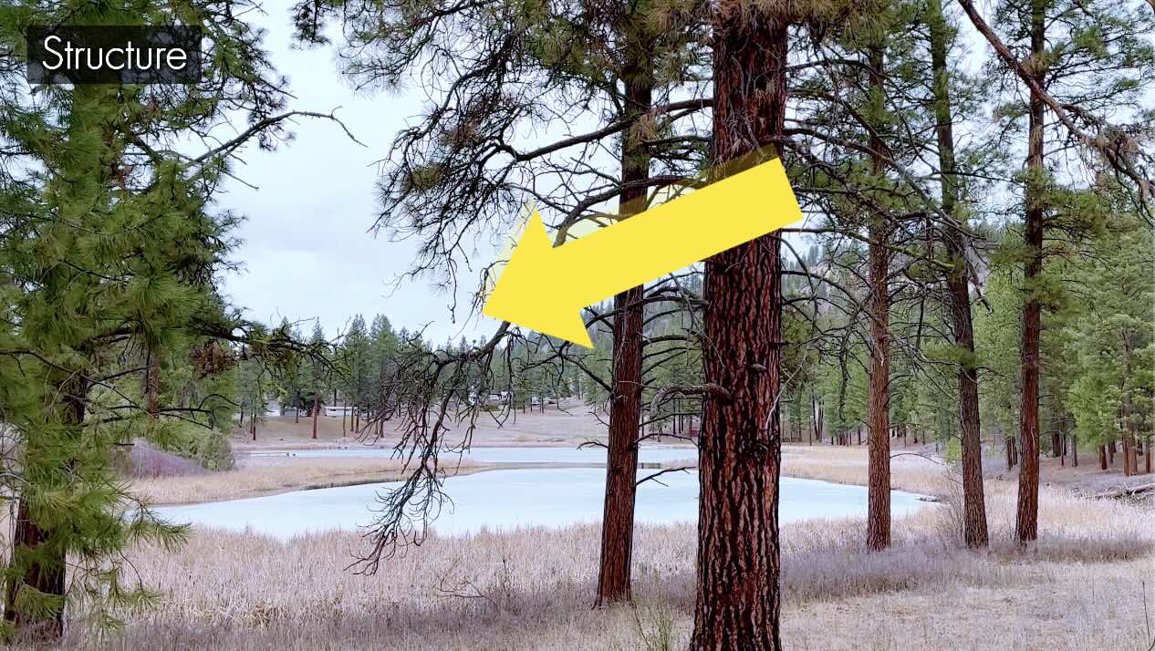
Landscape Picture D
For the focal point, the big cedar in the foreground.
Even if you let your eye wander through the scene, you naturally come back to the tree.
So, picture D has a strong focal point. The best one so far.
Inspiring?
Landscape Picture D
Does this photo reference strike inspiration?
At first glance, I liked this photo a lot.
The bark texture looks fun to render, and the scene is pretty.
But when you convert to greyscale … imagine how repetitive the rendering would be for 80% of this image.
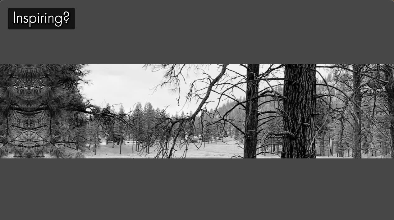
It’s a lot of the same thing. Not much variety for textures, plus the patience required to draw all those tiny branches should not be underestimated.
Even the lighting is flat, which affects the values.
This image could potentially become more tedious than fun to render, so no.
Final score 7/10 for picture D.
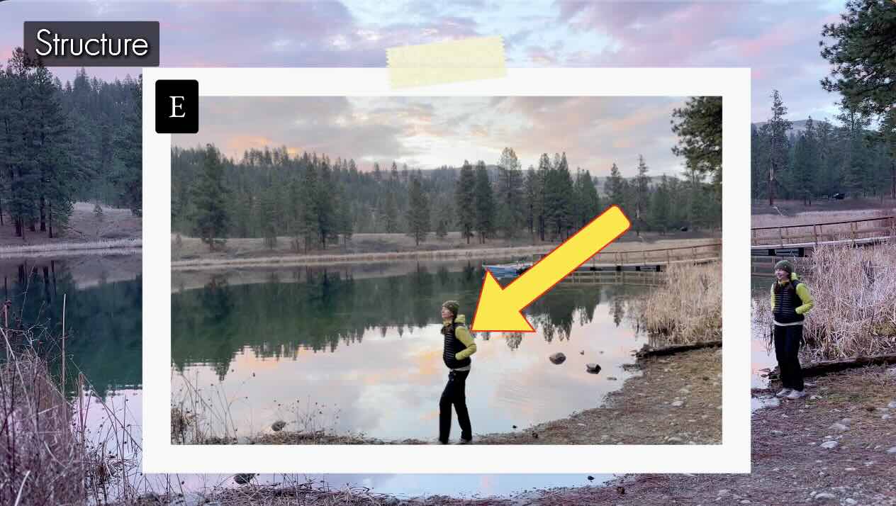
Structure
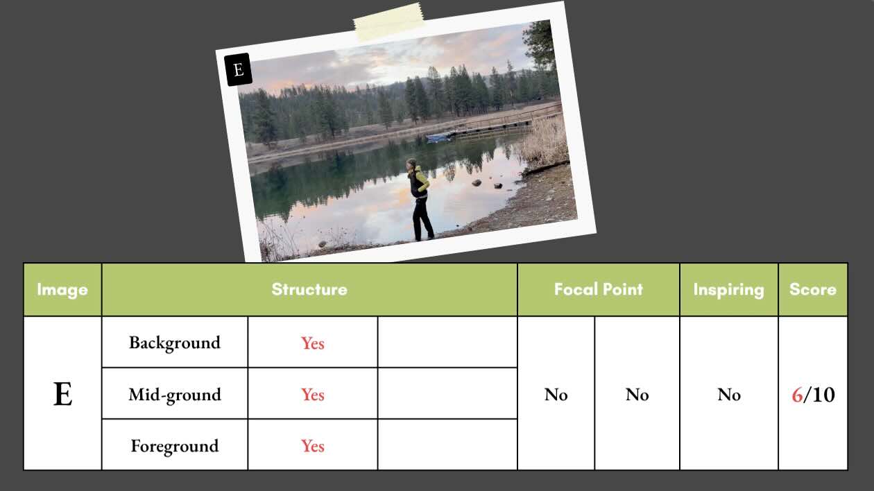
Landscape Picture E
Same lake, different vantage point and lighting. Giving us a more apparent background with the hillside and a potential cloud texture in the sky.
The middle ground even has a boat, and a distinct reflection in the water.
A character and plants overlap the scene in the foreground. Full score for structure.
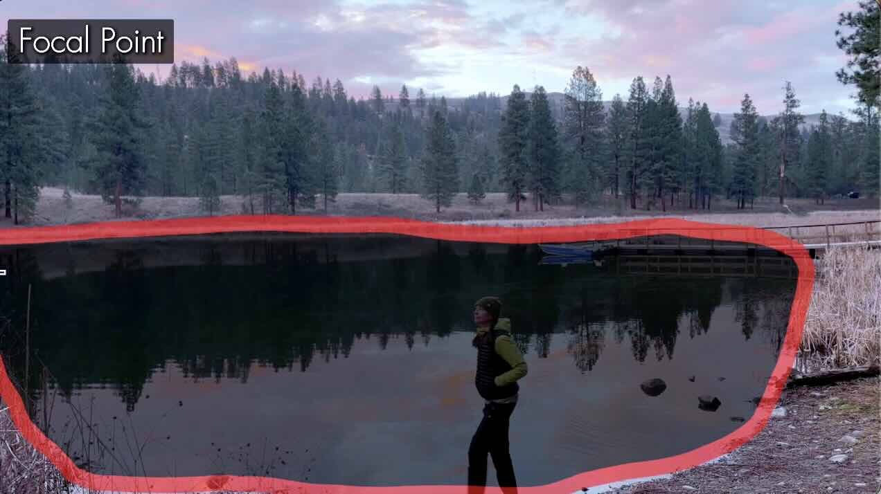
Focal Point
Landscape Picture E
When you place a figure or a face in your illustrations, you’re guaranteed that this will be the first point of interest.
We’re instinctively compelled to look at the character first, then expand out toward the horizon. Our eye then catches on the boat on the way up, then we’re drawn further to the highlighted area in the sky.
But then, look at the lake.
Note how much space the lake takes up in this composition as a whole.
Could the lake be the focal point in this composition?
If the lake is not your desired focal point, it could otherwise be a huge distraction.
Imagine rendering this lake with black lines, no colour, just hatch marks.
Look how the contrast of the lake’s reflection sharply divides the space.
There is a risk that the lake would overpower the entire composition.
Picture E therefore has competing focal points, and it’s not an easy fix, so zero points.
Inspiring?
Landscape Picture E
Is picture E inspiring?
Yes. It’s visually pleasing.
But my preference is to balance delight versus frustration.
Count how many things in this image might cause you problems at the inking stage.
I see at least four problem areas.
The character. Humans are hard to draw convincingly. Anatomy is an advanced art fundamental.
The deck and the boat are technical compared to the organic elements of a typical landscape.
Then there’s the reflections in the lake we talked about.
Depending on your drawing level and inking experience, this project is full of traps presenting the highest likelihood of problems.
6/10 – the lowest score.
Does that surprise you?
Recall your initial vote for the best landscape photo reference to draw in pen and ink.
Did your two favourites score the same as my evaluation?
We’ll verify these results by taking the top two contenders to the next stage, thumbnails.
Thumbnails
Second Place Landscape Reference
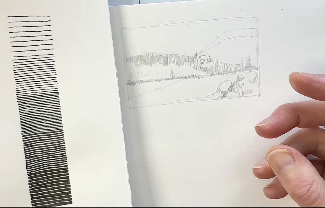
The next stage is to sketch a couple of thumbnails to determine the values arrangement.
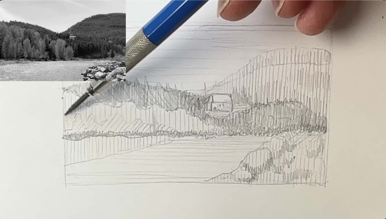
Starting with picture A, our second-place contender with a score of 8/10.
We said it needed a foreground, so let’s put one in.
In our thumbnail sketch, we’ll map out the key elements in pencil. Essentially, capture the contour edges of the bigger shapes in the picture plane.
We also said the focal point would be the house.
To be successful with our rendering, we’ll need to plan the values so they lead the viewer to the focal point. We had determined that the natural point of interest was the house.
Values are affected by the light source. So, we will determine the direction of the light source first.
When I zoom into the photo, the deepest shadows appear to be mostly on the right-hand side of the picture plane. Most noticeably on the house, trees, and foreground stones.
We’ll go ahead and sketch in some of these darker tones to our thumbnail.
Refer to a values scale if you have one already made. Referring to a graded scale will make it easier to distribute the values from the photo to your thumbnail.
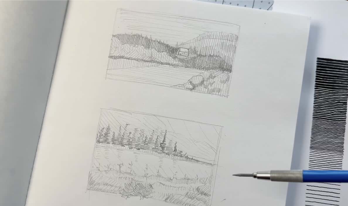
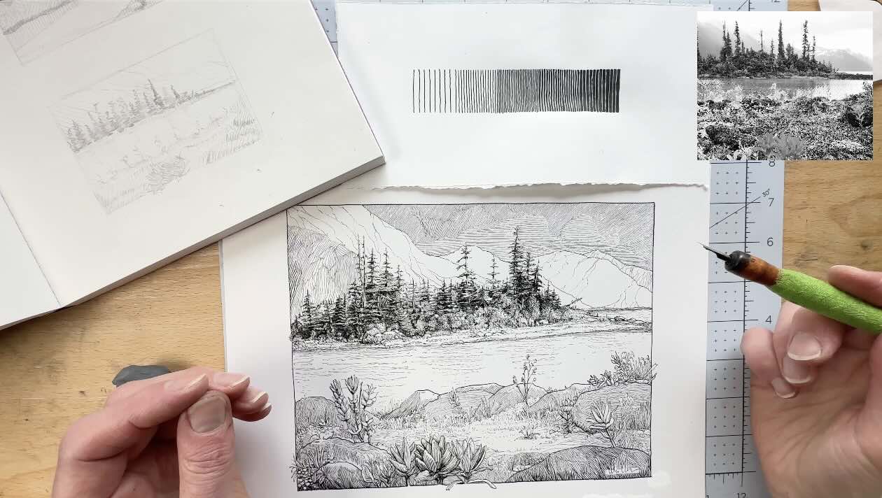
First Place Landscape Reference
The goal is to control those values to frame the focal point.
Repeat the process with Picture B, the winner from our evaluation exercise, with a score of 9/10.
We can tell that the source of light comes from the right-hand side, because the darkest values in the image are all more prominent on the left side of the rocks and trees.
Go ahead and outline the key elements, then fill in the values to match the photo.
As you recall, the focal point was either going to be the island or the flower.
Doing the thumbnail clarified that the island is the more natural point of interest with a minor tweak of the values.
Doing this thumbnail exercise also confirms our initial observations that picture B makes the best composition for a pen and ink drawing.
If you’re wondering whether you need to do several more thumbnails to explore other value arrangements, it depends on your objectives.
If you’re exploring concepts or different approaches to render your illustration, then absolutely, fill the page with thumbnails.
But for this exercise, our goal was to triage photo references to find the best subject for a pen and ink drawing. We’ve achieved this goal.
Some may argue that an artist should be able to draw anything regardless of references.
In theory, all five of these pictures are fine subjects. Except that one has more guarantees to turn out the way you want.
Ink Application
First Place Final Art
Looking at the final illustration, just like in the thumbnails, I kept the foreground values in light greys, using two tones, to lead the eye to the island first.
The island is dark, rendered with contrasting values, and framed in lighter tones.
You can see how going through the rubric rating guide to select a subject helped with thinking through potential problems.
Having a set of criteria helps weigh the fun factor against the reality of rendering a colour photo with black ink.
Without this “slowing down” analytical process, we may otherwise have overlooked potential problems when selecting photo references to draw from a first glance.
I hope that you enjoyed this article, if you did, also check out the YouTube video.
All the best with your inking projects.
Resources
🎓 My Courses ↓↓↓
✒️Tools ↓↓↓