In this article, we’ll study how legendary illustrator Norman Rockwell distributed values as a visual storytelling technique in his compositions.
To explore this concept, we will render one of Rockwell’s famous festive holiday-themed paintings in pen and ink.
For these exercises, I’ll share how I distributed the values based on observation. You’ll also have the option to use a free online values tool created by Stan Prokopenko.
//Disclosure: I earn a small commission when you use the links in this article to make a purchase on Amazon. To learn more about affiliate partnerships, read the Terms page.
Distribution of Values
Distribution of values. That’s probably not the first thing that comes to mind when looking at the legendary works of Norman Rockwell.
But for a pen and ink artist, studying how Rockwell uses values in his compositions is hugely beneficial.
Distribution of values is a technique Rockwell used for visual storytelling.
Values Arrangement Vs. Values Distribution
How you arrange the values in a composition has an impact on how effectively you’ll emphasize the focal point and lead the viewer through the composition.
How you distribute the values in a composition contributes to leading the viewer through the composition, plus affects the mood and visual storytelling of a piece.
But what’s the difference?
Value is how light or dark something is. Shading refers to the shadows in a piece. Lighting refers to the highlights.
The difference between the lightest value and the darkest value is known as the contrast.

Everything in between is a grey tone, a level-value of grey.
The level depends on how many values you use in a scale. With pen and ink, a values scale can show as few as three values (white, grey and black). And as many as ten or twelve.
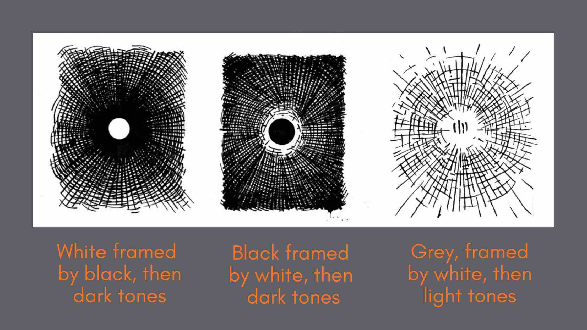
Where you position grey tones and contrast in a composition is the values arrangement.
For example, in the image below, the eye is drawn to the centre of each value’s arrangement. Each centre point is framed by the use of contrast. The first two are high-contrast, the third is low-contrast.
The values distribution has more to do with which tones or value levels you use in a composition, and how intense those are.
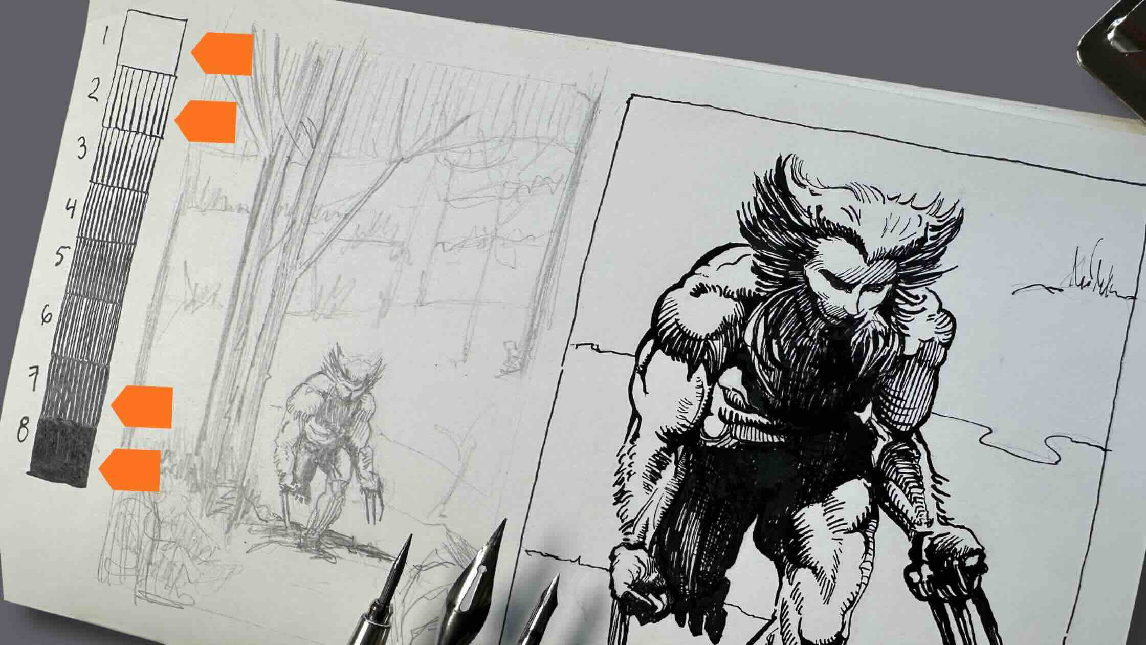
For example, in the study below of master Barry Windsor Smith’s Wolverine, he used groups of light tones and dark tones with very few mid-tone values.
Learn more about how different masters use values in their compositions in my course:

Let’s see how master Rockwell distributes values by doing a few studies.
How Norman Rockwell Uses Values
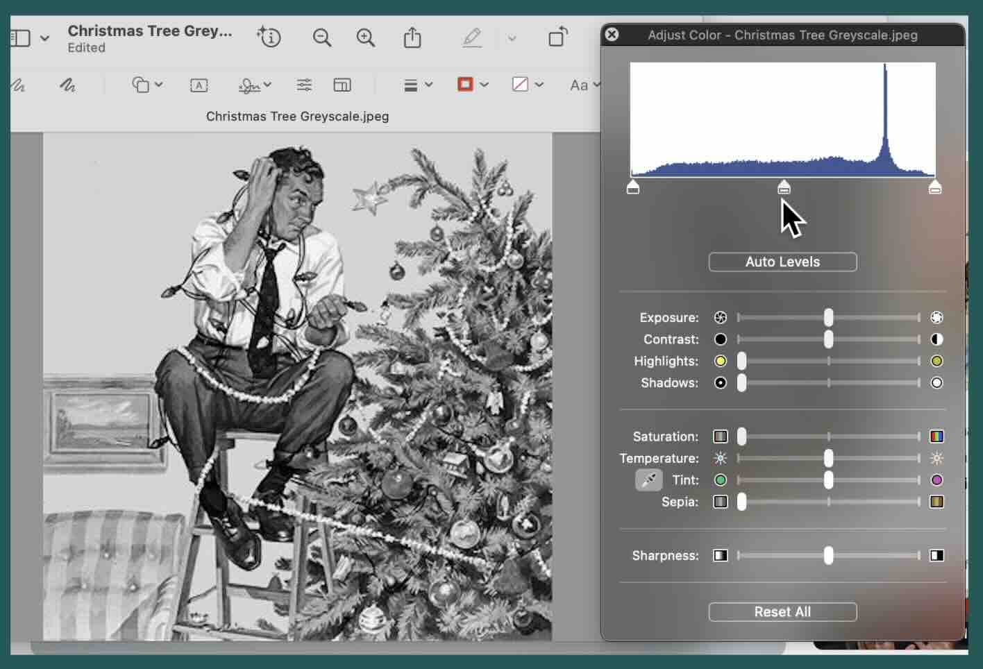
After converting the image to greyscale, I did a quick thumbnail of Rockwell’s famous Christmas Tree painting.
It’s a good idea to start with a rough thumbnail as it gives you an immediate feel for the values in a composition.
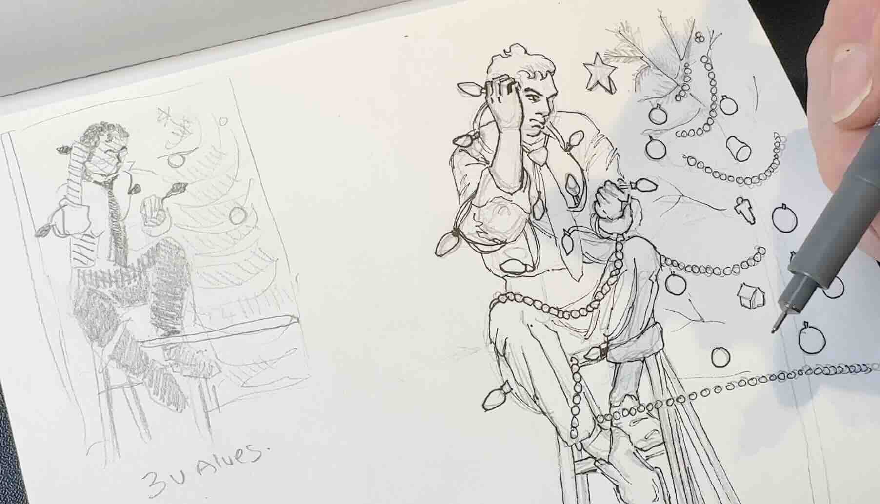
Next, I did a clean drawing of it, then inked the main outlines with a fine liner pen.
To save time and for consistency, I traced that same image in another sketchbook two more times to give me three identical drawings for the values studies.

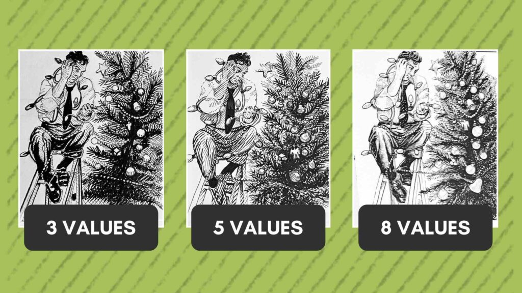
Three-Values Study
Limiting the range to three values forces you to identify the areas in the illustration that have the highest contrast.
With pen and ink, contrast plays a big role in a composition. As we saw in the prior examples, contrast guides the viewer’s eye like a path, and it frames the focal point.
You can see in my small thumbnail how the black tie framed by the white shirt draws you in.
The white shirt is framed by grey, which leads you to the man’s face and what he’s holding.
The pants, hair, and lightbulbs are in black and frame the information about the story. We see that the man is confused, and it has something to do with the light bulbs. That’s when we notice the tree.
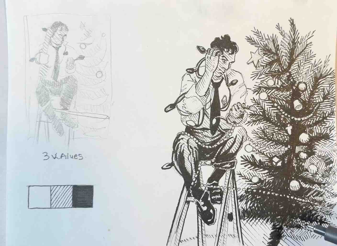
In the drawing, I’m also using only three values: white, grey, and black.
But in this study, I’ve distributed the values differently, putting a bit more emphasis on the tree than I did in the thumbnail.
In the thumbnail, the tree was mostly grey. In the drawing, the tree has three values distributed more evenly.
Now the story is less about the lightbulbs and more about the act of decorating the tree.
As mentioned, working with only three values forces your focus to the areas of highest contrast in a composition.
Looking at Rockwell’s painting, it might be challenging to “see” the values if you’ve never done it before.

A Tool to See the Values
It’s helpful, like in these exercises, to limit the value range on your scale; that way, you can more easily group the values into families of tones:
- Light values (white, nearly white)
- Mid-tone values (greys)
- Dark values (black, nearly black)
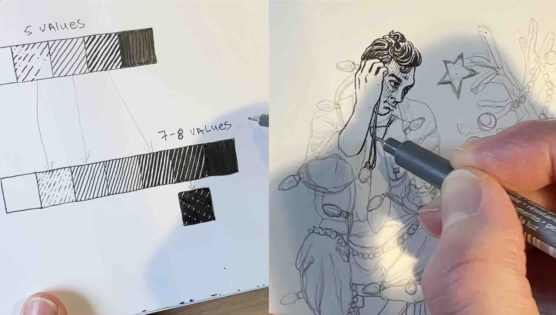
Proko developed a helpful tool that can assist with seeing values and how they’re arranged and distributed in a composition.

Upload your image, then specify in the gradient bar how many values you’d like to see by using the slider. Click on “distribute”. Then you can download the images for your studies.
For example, to assist the exercises in this article, you would create an image for each value range:
- Three values
- Five values
- Eight values
If you want to use the tool to find out how many values the original artwork has, then you’ll need to compare it visually. Use the slider until the image in the tool matches the image from the master you are studying.
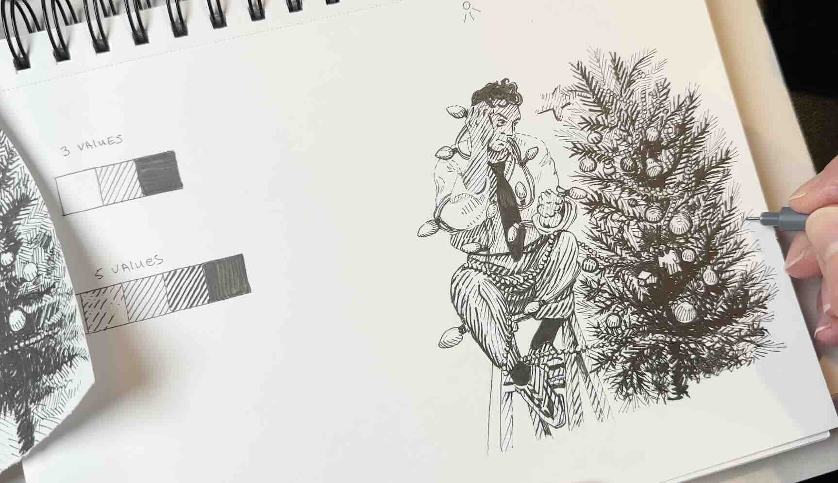
Five-Values Study
Let’s expand to five values.
Adding two more shades of grey means smoother transitions and a less abrupt contrast.
In theory, the darkest and lightest tones should technically be in the same spots as in the previous study, just less intense.
Looking at Rockwell’s illustration, the light source seems to be top middle, casting a shadow under the man’s raised hand and chin.
Since the man’s shirt is white, the lightest value (level 1), then following that logic, his skin gets a level 2, and some of the cast shadows on his shirt are also level 2-3.
Despite having an additional two greys, it feels like I don’t have enough values to transition the mid-tones with adequate subtlety.
One way to make it look like there are more values is to vary the direction of the hatch marks.
Having five values did provide midtones for a less stark contrast compared to the first exercise with only three values.
Eight-Values Study
When going from five to eight values, instead of gradually spreading the values equally on my scale, I redistributed them to match what I observed from doing the previous studies.
When doing the five-value study, I felt like Rockwell’s painting used a broader range of darker values than light values.
So, he had white, nearly white, no light greys, several shades of dark greys, nearly black, then black.

It could be partly because the original painting uses complementary colours that, when converted to greyscale, hold the same tonal value.
It could also be how my eye interprets the value levels.
That’s why we do studies – to check our assumptions.
After doing the eight-values study using a dark distribution of values, you could do another using a lighter distribution of values for comparison.
Redistributing the values to have a broader range of the lighter greys would look more like my initial thumbnail. And we already saw that with fewer darks in the composition, the area of focus shifted from the tree to the man’s struggles with his decorating.

What We Learned from the Studies
Doing a rough thumbnail gave us information about the composition, general arrangement and distribution of the values.
The three-value study helped us identify the areas in the composition that have the highest contrast. This study put more emphasis on the man and his lightbulbs.
The five-values study gave us a couple of mid-tones so that we could smooth out the transition areas and unify the composition a bit more. This study put more emphasis on the act of decorating the tree.
The eight-values study gave us the option to distribute those mid-tones on the scale. And as we saw where we place the intensity of the contrast affects the mood of the composition. This study put more emphasis on the story surrounding the man in the act of decorating the tree.
Had we done an eight-value study using a distribution of the lighter-level values, perhaps the mood of the composition would have shifted our interpretation of the story.
The distribution of values was one of the techniques Norman Rockwell used for visual storytelling, and I hope you found these studies helpful for your pen and ink projects.
Happy Holidays, thanks for being here.

Feel free to share, pin, or repost articles you find helpful.
Resources
How to use values by Proko YouTube video
📗 Books ↓↓
More books on the Tools Page
🧰 Tools ↓↓↓