In this tutorial, you’ll learn key principles for how to render mountains in pen and ink. You’ll be able to apply this method to simple sketches and elaborate illustration projects.
Pen and ink shading and lighting techniques
//Disclosure: I earn a small commission when you use the links in this article to make a purchase on Amazon. To learn more about affiliate partnerships, read the Terms page.
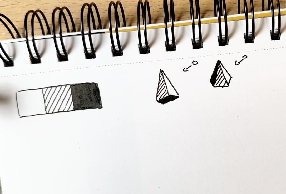
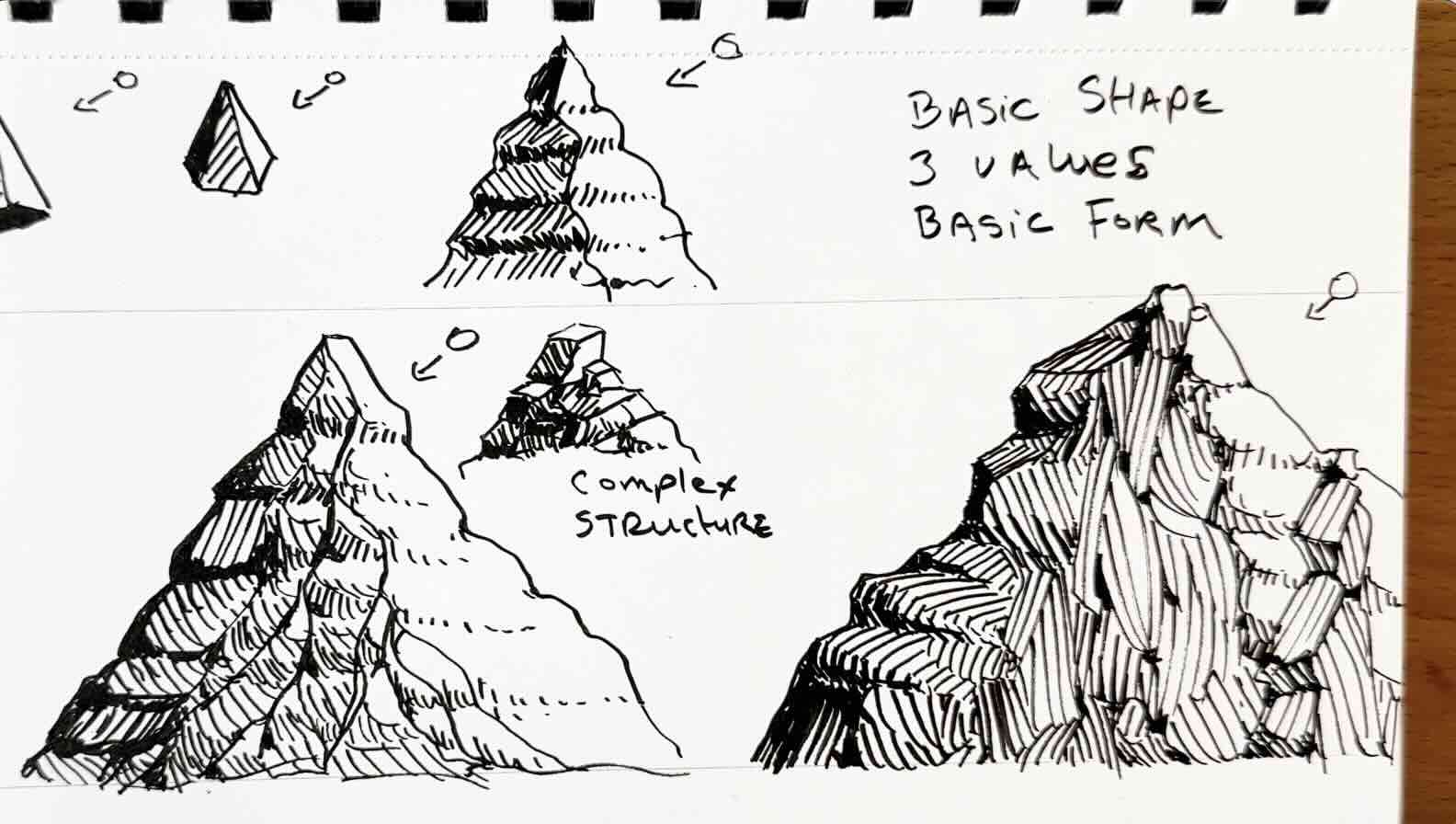
Basic Shape, 3 Values
For the first sketching exercise, we’ll start with three values: white, grey, and solid black.
To render a basic shape, the side closest to the sun is white. The side furthest from the sun is grey. The bottom is absent of light, therefore solid black.
If this shape were a mountain, the side furthest from the light would be darkest.
A mountain near the peak, at least up in the high alpine, is usually rocky, and the shape is irregular. Because the shape is irregular, the light isn’t uniform. It’s more like a staircase.
The side of the mountain furthest from the light will be grey and black. The planes of the mountain facing the light are mostly white with some gray.
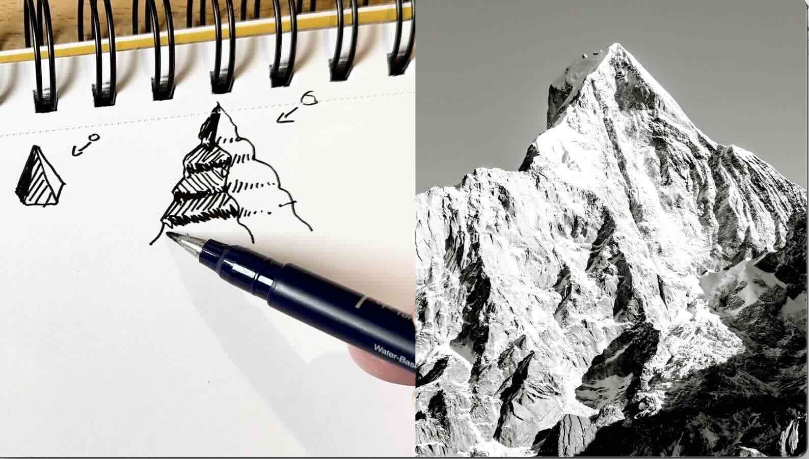
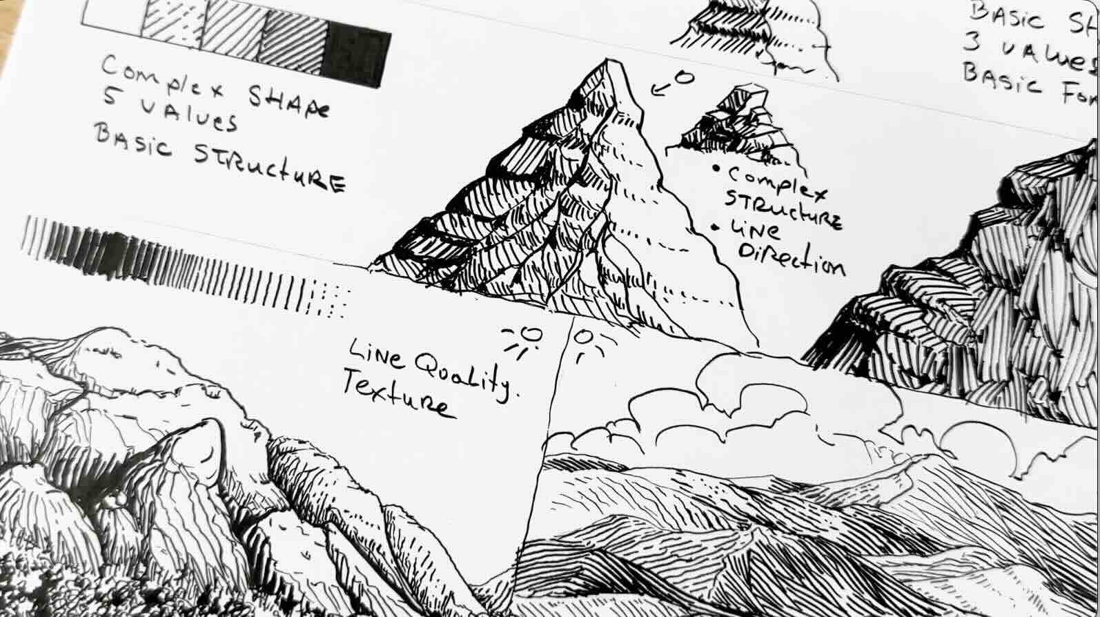
Using that same principle, let’s expand our values scale from three to five. This will give our mountain shape more structure and depth.
Complex Shape, 5 Values
For this exercise, our value scale expands. The grey tone we had in the previous exercise becomes value number three. White is value number one, and solid black is value number five.
We go lighter by breaking the lines and spacing them further apart. And darker by making the lines thicker and placing them closer together.
Our mountain peak, like in the previous exercise, has a jagged outline. We’ll also give it one prominent ridge. The ridge spurs downward into smaller ridges and gullies.
The shape is more complex, but the shading principles remain the same.
We know the side furthest from the sun has the darkest values. And that the areas absent of light are solid black.

We’ll make the steeper parts of the rocky ridge solid black.
As we move closer to the light, the steeper parts are dark grey. Adding bits of solid back to those parts gives the illusion that it’s got three or four sides to it, like a block. Similar to the stairs in the previous exercise.
Then, closer to the light, the shaded areas are rendered in a lighter tone.
Now that all the areas that would be in shadow are shaded, let’s add the mid-tones.
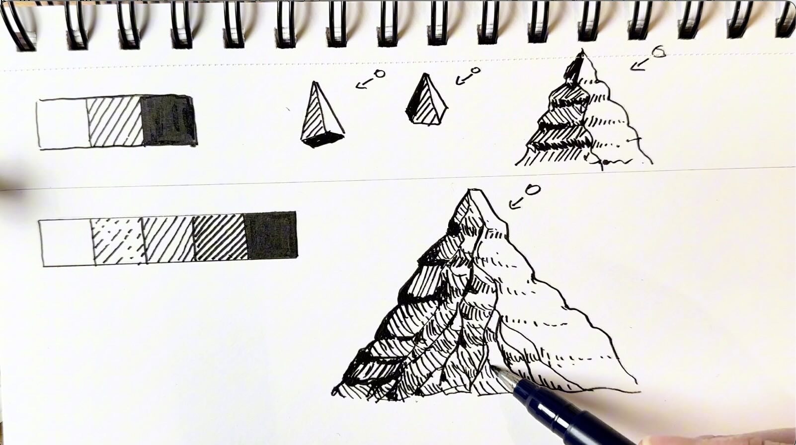
It’s more convincing if the entire back side of the mountain is shaded in a gradation, from dark to lighter tones. If you throw in a few irregular marks and vary the direction of the strokes, it gives an indication of texture as well.
We started with basic shapes, and with only three values, gave those shapes volume and form.
Then we gave that shape more complexity, shading it with five values, to establish a basic structure.
Let’s zoom in on that structure for a moment. Like, literally. Let’s look at it up close. The only time we’d see the details of a mountain summit is in a zoomed-in photo, or if you’re physically climbing it.
Typically, when drawing, say a landscape illustration, the mountains sit further in the distance in the composition.
Even for a massive mountain, we wouldn’t draw every single detail. We would create the illusion of details with rendering effects.
Even when the shape is complex, it helps to break it down into simple blocks. As long as the values make sense, then the drawing will be convincing.
Again, following the same logic, distributing the values based on the source of light, but this time exaggerating the irregular lines and varying the direction of the strokes to suggest details without actually drawing details at all.
Line Quality and Texture
Another thing that mimics details and texture is line quality.
Line quality is the thickness of the marks or strokes.
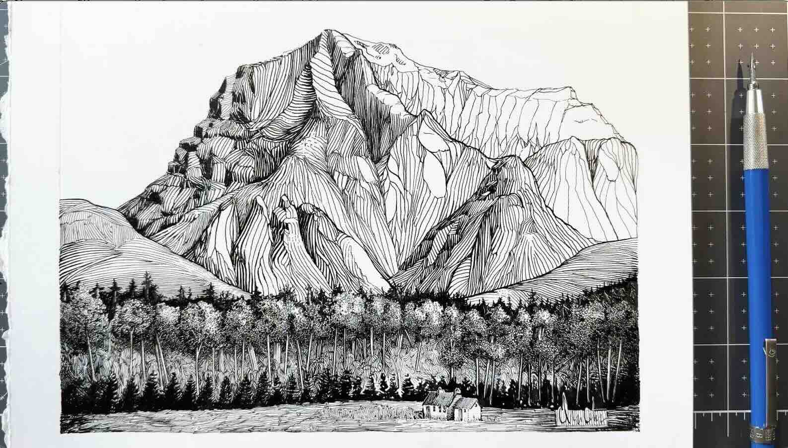
It’s really helpful, especially if your composition has a big mountain with lots of overlapping parts, like in this photo reference of the Squamish Chief, in British Columbia, Canada. Where I used to live.
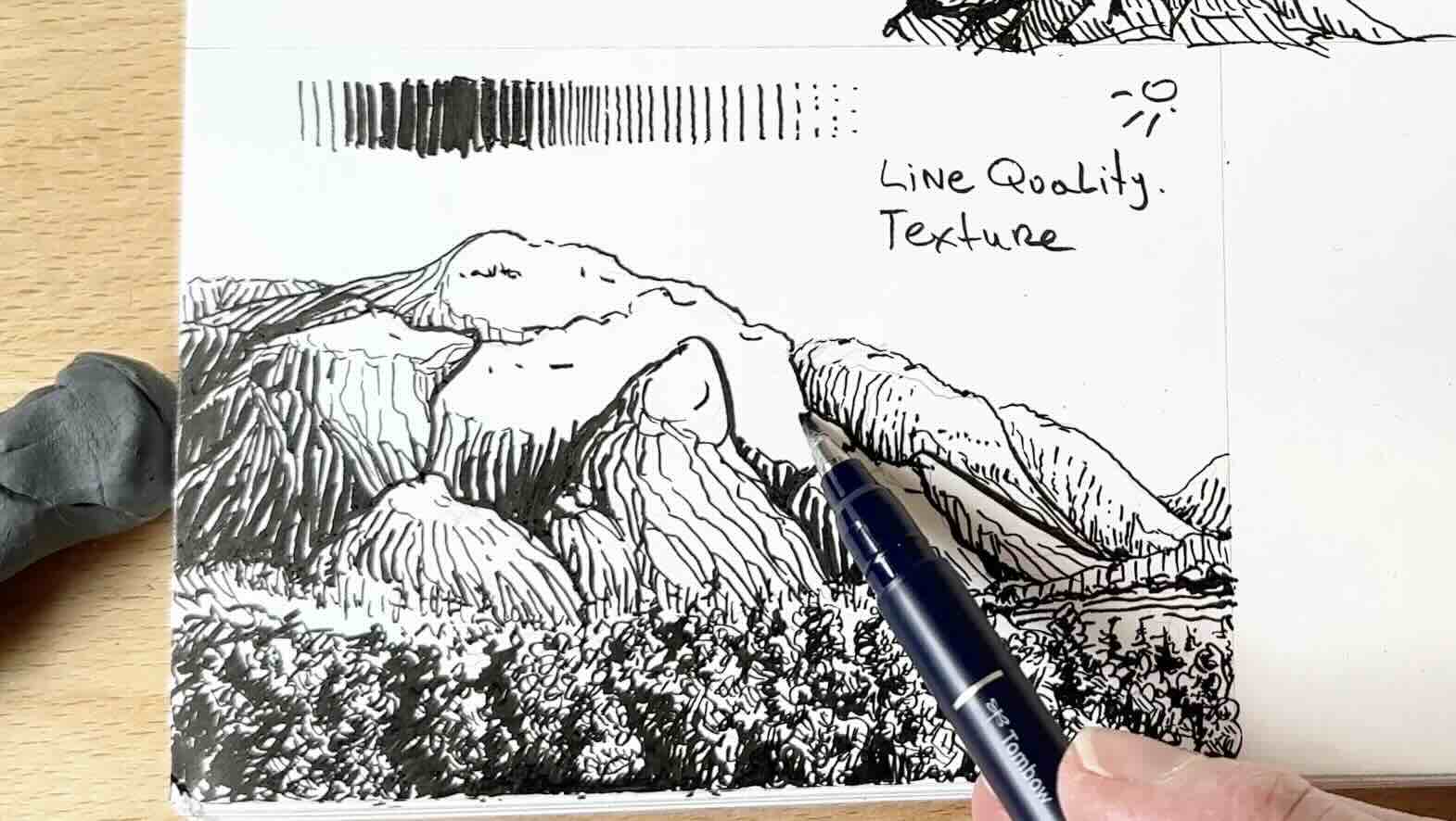
It’s a full scene with a foreground, middle ground, and background.
A good rule of thumb with line quality is that anything that is closest to the viewer will be thick or bold, and the elements or objects that are further in the distance have thinner lines and fewer details.
I’ve added a row of trees in the very foreground using a bold scribble pattern and five values.
I’m not actually drawing any leaves, just implying leaves by varying the tonal values. Adding in a few directional strokes, because as we saw in the prior sketch, irregular marks can enhance the texture.
I’m using a thin line for the outline until I get to the parts that are closer to the viewer. The front apron of the mountain, therefore, gets bold outlines.

To render the mountain, we’re still using the five values, with the back side of the mountain in shadow. That back side is solid black or nearly black.
You would build tonal value by gradually increasing the weight of the lines, and or bringing the lines closer together.
Closer together without increasing the weight of the strokes gives us a grey value.
Bold and close together strokes give us the darkest value.
Using line quality, thin to thick, ensures a smooth transition of tones.

In the next scene, we have even more overlaps and lots of depth. It has a foreground, middle ground and background.
The elements closest to the viewers, although small, are rendered with thick strokes.
You’ll note the hills closest to the horizon line are the smallest. These hills progressively grow into taller mountains as we go further into the picture plane.
These overlaps give the scene a sense of dimension, but it could look flat if we render them all in the same tonal value.
There are two ways to give the hills volume and depth.
Alternate tonal density
The first method is to alternate the tonal density between the layers, so one layer of dark hills, then the hills behind that would be a shade lighter, then the layer tucked behind a shade darker and so on.
Vary line direction
The second method is to vary the line direction. In the sketch shown below, I’m following the plane angles. The marks, therefore, travel parallel to the form of the hills. The steeper the hills, the more vertical the rendering gets.
And minding the source of light. Changing the pattern of the hatch marks can suggest texture and that the ground has varied terrain.
Sparse, broken lines indicate highlights, and bold lines, closer together, imply areas in shadow.
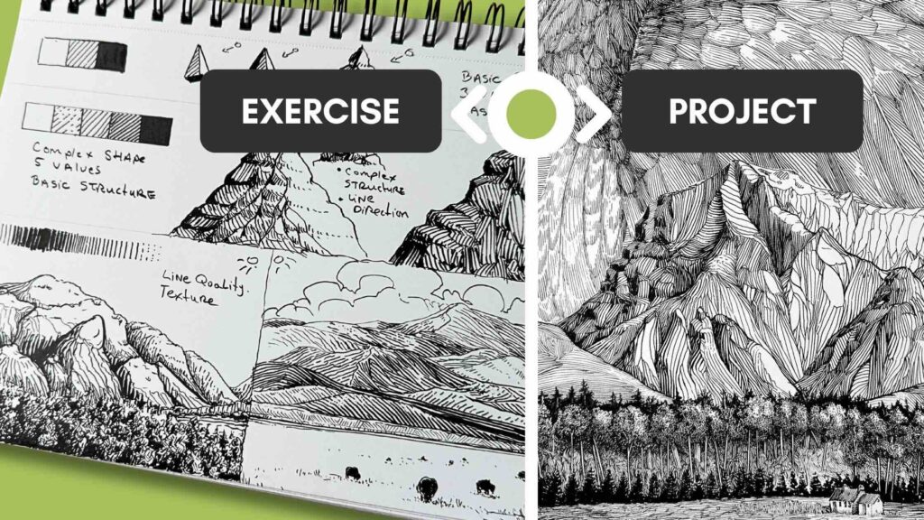
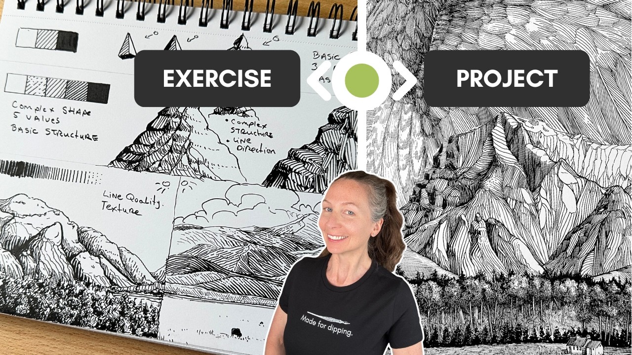
Apply the Shading Principles to Your Projects
The only difference between the 10-minute sketches shown in the previous exercises and this 10-hour project below is the execution.
Same principles
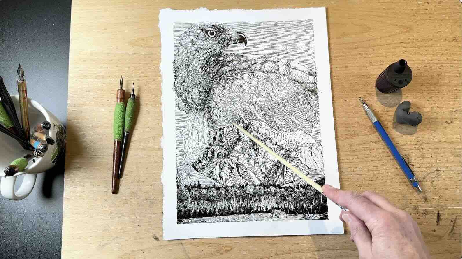
In my final landscape illustration project, you’ll notice:
- A value scale; this time jumping from 5 values to 8.
- The source of light is on the right-hand side.
- A foreground, middle-ground, and background.
- Varied line quality, textures, layers.
I used line quality to give more prominence to the mountains because it’s the main subject. Therefore, the thickest outline is around the big mountains, making them more imposing.
That’s also where you’ll notice the most contrast, black on the shadow side and white on the sunny side.
To give the illusion of depth and differentiate between each overlap, I varied the texture, the line angles and the values.
In the foreground, we have a grey layer of grass, then black trees, over top of lighter shrubs and trees, over top of more black trees, and so on.
True, the sky is a bird and could distract from the main subject. However, since it is rendered using mostly the same tone of grey and line width, it serves to frame the main subject.
So here you have it, you can use these pen and ink shading principles whether you’re doing 10-minute sketches or a complex illustration.
If you’re interested in exploring different hatching styles and mark-making techniques, check out the Stones and Rocks article.

Resources
Photo reference for the bird in my mountain illustration by: Ronald Visser