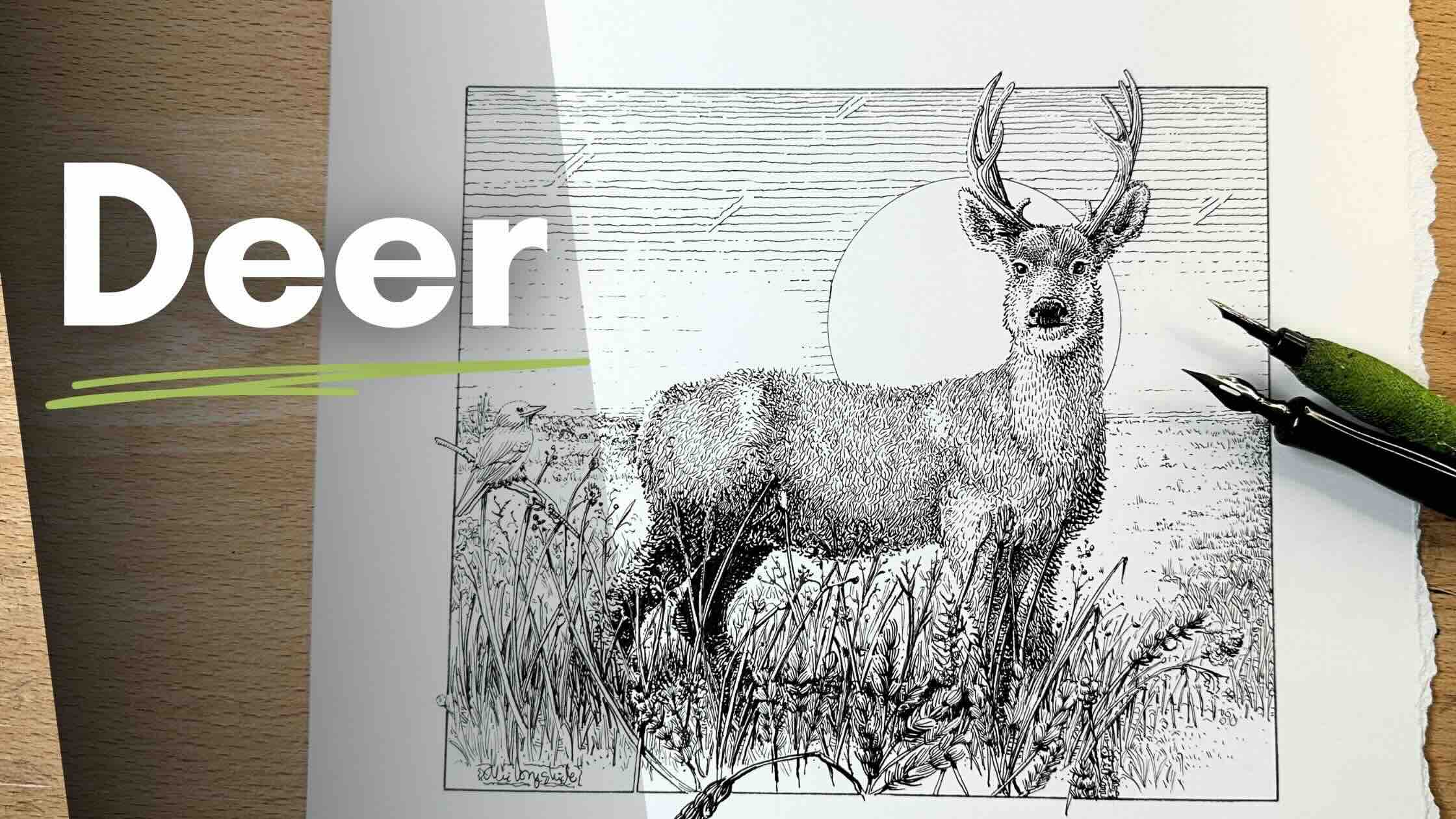
In this lesson, we’ll use dip pens and textures to draw a mule deer landscape. Join me for this step-by-step pen and ink drawing project.
//DISCLOSURE: I earn a small commission when you use my affiliate links to make a purchase. Learn more about my affiliate partnerships on the Terms page.
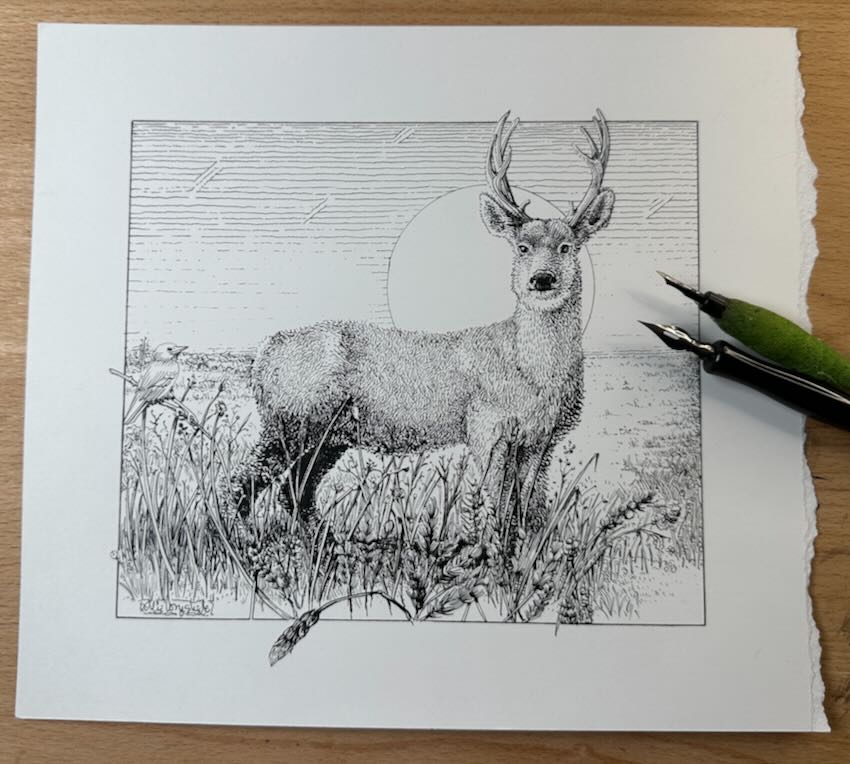
Deer Drawing Project
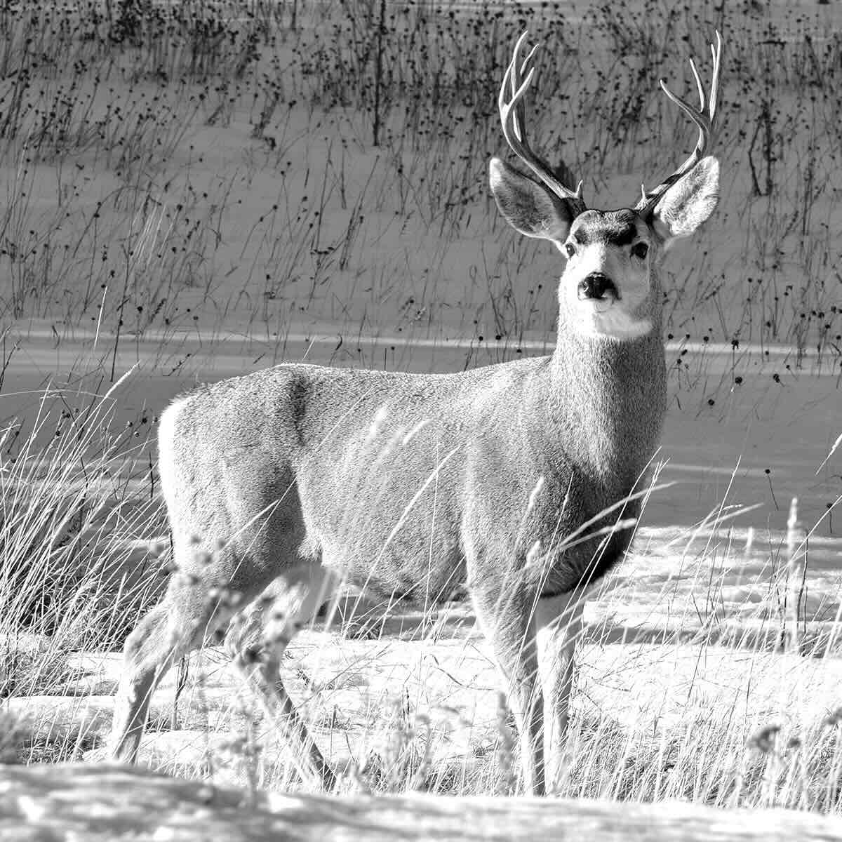
For our project, we’ll reference the photo below for the pose. For this materials, I am using:
- 12” Corked Stainless Steel Ruler
- Faber-Castell Kneaded Eraser
- Large Circle Template
- Hunt 102 Crowquill and 512 Bowl nib – get the Speedball set
- Speedball Super Black India Ink
- Staedtler Mars Technico Lead Holder with H Lead
- Strathmore Bristol Smooth Paper 9×12”
The format is square. I cut a piece of the Bristol smooth paper to 9 x 10 inches by ripping the edge with my ruler for a frayed look.
Download the photo reference (link to the Deer Association page) or take a screenshot. I keep it open on my iPad for easy access while drawing. Or you can print it out.
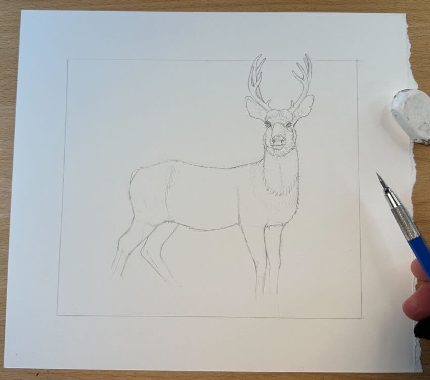
The Project Underdrawing
Take measurements of your reference, figure out the x/y axis, to position the subject on the page.
Then roughly estimate overall proportions.
I use my fingers to estimate the size of the head, then compare that to the remainder of the body parts, counting how many head-lengths fit into each section of the subject.
Mark where the edges are with a short dash, from the top of the antlers to the top of the head, moving down to the eyes, mouth, neck and chest. In this case, “edges” refers to the outer outline of the subject.
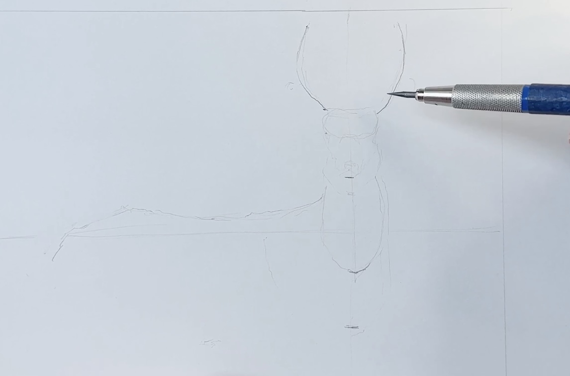
Connect the marks you drew by following the edges of the subject, a mule deer, let’s call him ‘Ezekiel’.
Continue to refer to Ezekiel and connect the marks for the whole body.
Note that the nose lines up with the front legs, and his chest sticks out from there. The next identifiable markers are the shoulder, belly, knees, haunches, rump and tail.
Then estimate the distance between the markers to establish the proportions. Also, compare the negative space between the legs to estimate their placement.
If your sketch has a lot of “finding lines”, go over the lines you want to keep in pencil, then lift off the construction marks with your kneaded eraser.
Continue to use your kneaded eraser as you develop the drawing to prevent excess graphite residue from building up on the inking surface. Aim for a clean drawing; we’re just capturing the main outlines and using very light pressure on the pencil.
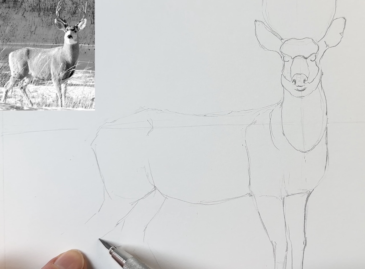
Now that the main contour lines are established, we can refine the drawing by adding some details.
For the antlers, I’m again looking at the negative space to estimate sizing and positioning.
We’re not doing any shading in pencil. Only include a few directional strokes as guidelines for the inking stage.
We can stylize the drawing later; at this stage, we mostly want to capture recognizable features and proportions of a mule deer.
For the landscape environment, we’ll place a horizon line so we can plan for depth and perspective from here.
Starting with the vegetation in the very foreground. That’s why Ezekiel had no feet if you were wondering. We’re now building the environment in layers, front to back.
At this point, the photo reference is just for inspiration.
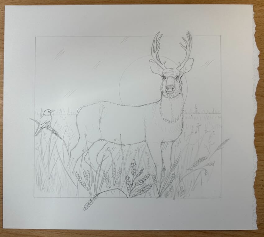
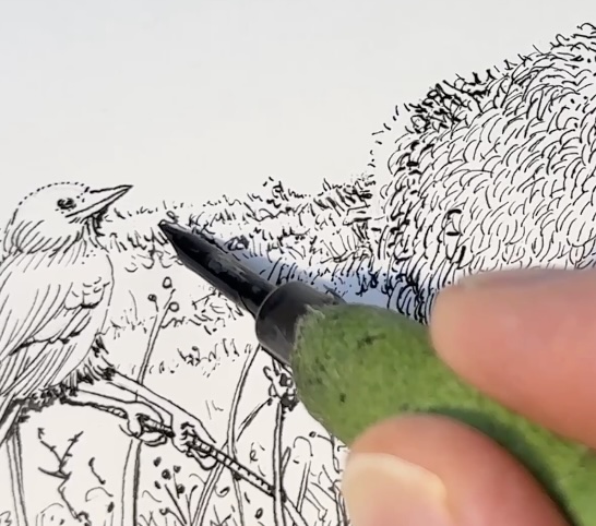
Let’s perch a generic bird in the tall grasses.
The plants in the very forefront emphasize that Ezekiel is standing in deep vegetation. The grasses and such get smaller and less detailed, travelling towards the horizon line.
We’re definitely not going to spell everything out.
A few of the forefront grasses will have more detail, but the remainder of the environmental features will be created with textures and values. Basically, organized scribbles.
I’ll use some of the value scales from last week’s blog post as a guideline for shading the textures.
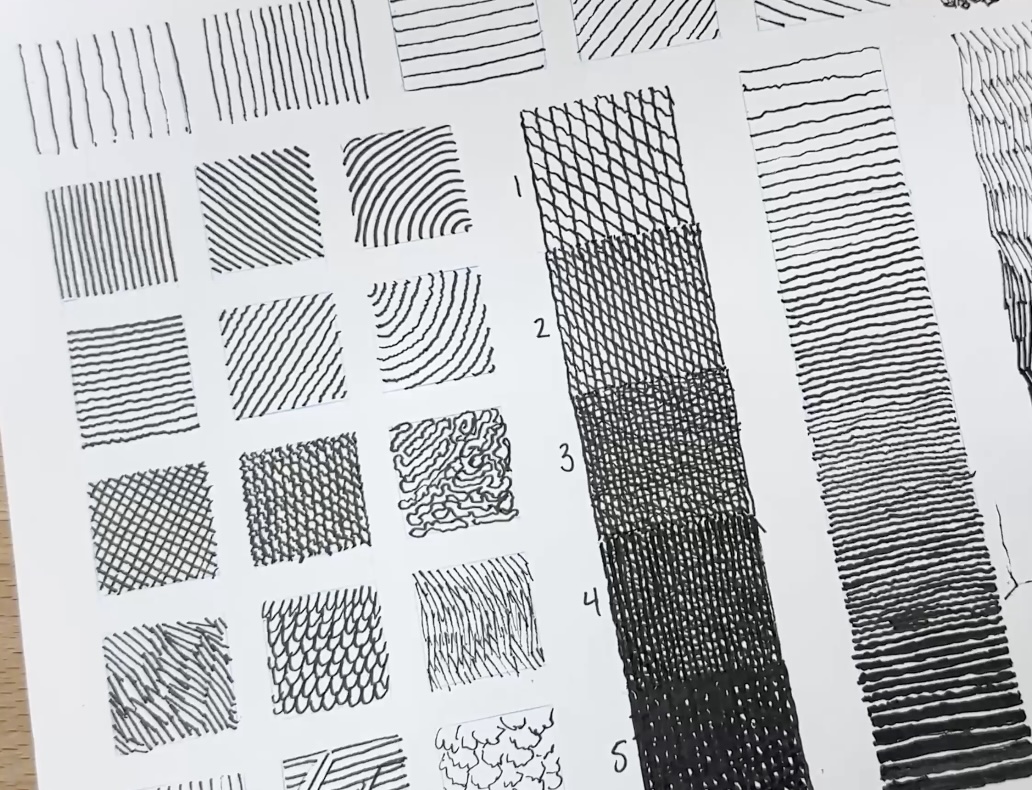
📝 If you want to learn more about creating texture charts, check out “Useful Inking Exercises“.
Ink Application
I’m using a Hunt 102 crowquill for most of the ink application. If using technical pens or fine liners, this would equal a tip size 01.
We’ll begin the ink application with the face and move outwards from there. The idea is to lay down a mid-tone first and gradually build the texture.
You’ll note that we’re not starting with a solid outline around the outer edges. We’re actually not going to use hard edges anywhere. Just build the values bit by bit with marks.
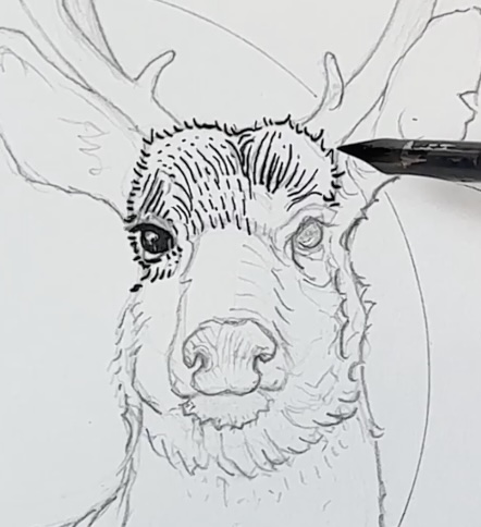
What’s guiding our rendering decisions here is the source of light.
In the photo reference, the light seems to be coming from the left-hand side, and we’ll take our cues from that. This tells us where to leave open gaps for the highlights and where to place more marks for the areas of shadow.
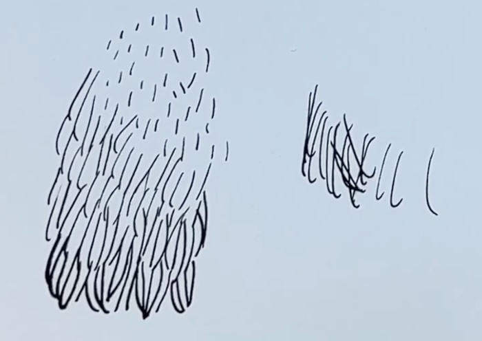
Essentially, we have a fur texture with a repeatable pattern.
Establish the mid tone first. To make the pattern lighter, use shorter marks, placed further apart.
To darken it, increase the length of the marks, placed closer together in a locking formation. Moving to the darkest tones, nearly black, makes those marks thicker.
Avoid irregular spacing, random lengths, or overlapping your marks. Any cross-hatches we do will have a purpose.
To summarize, use dots and short dashes for lighter tones, then gradually longer, thicker marks to make an area darker.
We’re building the form of Ezekiel’s face one stroke at a time.
His nose is darkest, so we can render that now, including the reflections on the edges.
We’ll come back to adjust the values when more of the drawing is done. This is still our first pass.

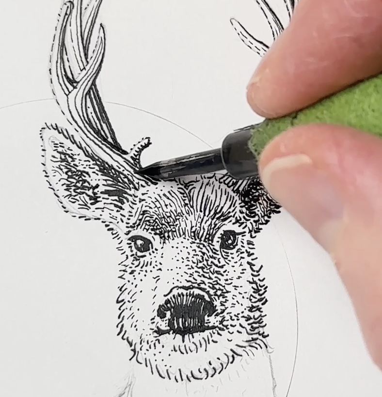
To give the antlers a wood-like texture, I’m using a linear gradation. A broken outline for the side closest to the light and a bold outline for the side furthest from the light and in shadow.
There’s a cast shadow between the ears and the rack, and that’s where our cross-hatching comes in. This is nearly black, not completely solid.
Continue to build a fur texture around the tubular form of Ezekiel’s neck. We’re hatching in the same direction that the fur grows out. Making the tone of the texture denser on the shadow side.
Draw in additional tall grasses in front of Ezekiel in pencil. Also, still in pencil, map out where the main highlights are on the shoulder and hunches. Mark a few shadows as well.
Then go ahead and repeat the fur pattern on the remainder of the body down to about midway towards the foreground.
Dots and dashes for the highlights, then gradations from there. Remember to change the direction of the hatches to follow how the fur grows over the form, essentially where the bones of the anatomy protrude.
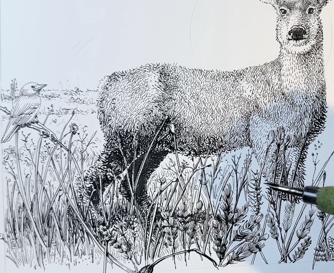
Stop inking at the halfway point on Ezekiel.
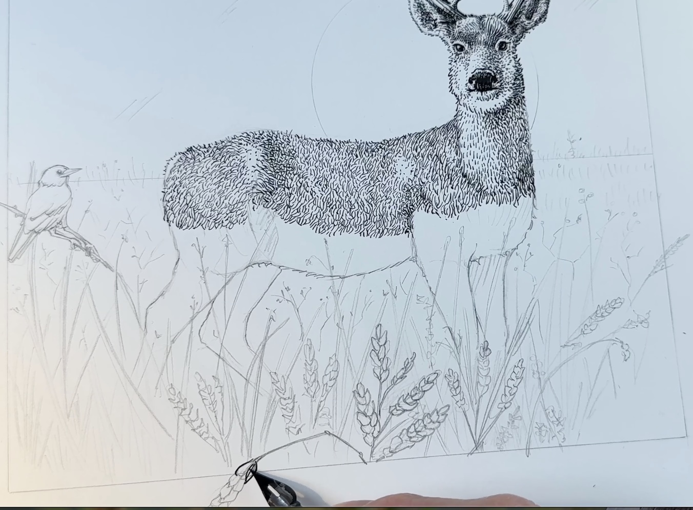
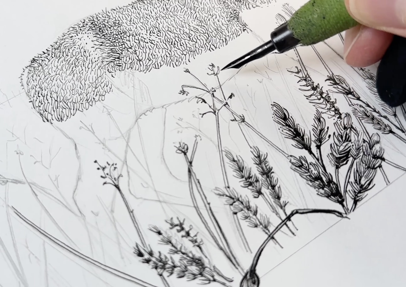
Now switch to a bigger nib to resume inking. I’m using a Hunt 512 bowl nib, equivalent to a tip size ranging from 03-05. Now render the very foreground elements.
For the forefront vegetation, closer to the viewer means thicker marks and more defined details. Though the rendering is rather loose and sketchy as not to detract from the main subject.
Then switch back to a smaller nib size for the grasses tucked behind and underneath what we just rendered. These are the grasses that are in front and directly below on the same plane as the subject.
Next, we return to finish rendering the bottom half of Ezekiel that we had left blank before we can complete the vegetation.
Note that I’m going super dark here. It’s a little daring. We could just use darker greys here, but the high contrast is more interesting. Especially with the reflected light on the outer edges of the legs and underbelly.
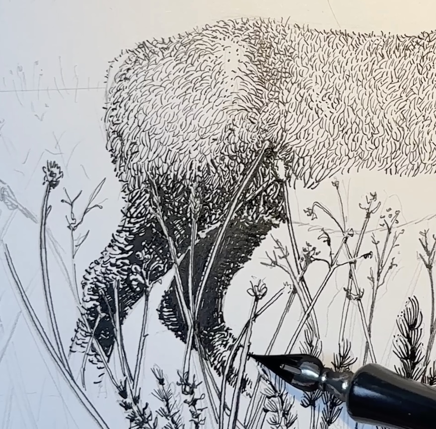
Go progressively lighter for the front legs, then round off the chest with darker values again.
We’ll revisit any transition areas on the deer and surrounding environment when more of the drawing is complete, so we can balance the values against each other.
For the remainder of the vegetation, use the same formula. Dots and dashes for the lighter tones, longer and bolder strokes for the areas in shadow.
Increase the tonal density directly underneath where Ezekiel stands, to make it look like the grasses are quite deep, and why we can’t see his feet.
I’m leaving white haloes around the taller grasses that are overlapping Ezekiel’s body, so we can still see them.
Add a cast shadow to whatever, wherever there’s an overlap. For example, grasses that are on top cast a shadow on the grasses below.
These overlap shade shadows are actually pretty important for creating the illusion of depth of field. And we’ll continue to add those as we develop the values.
Let’s layer in additional grasses on top of the front legs; the tone is lighter here.
Let’s move on to the background environment. Starting with the sun and the frame.
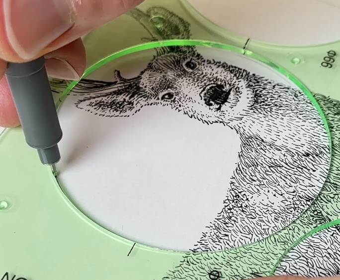
I’m using a 03 fine liner with the circular template for the sun. And an 08 tip size for the frame with a ruler.
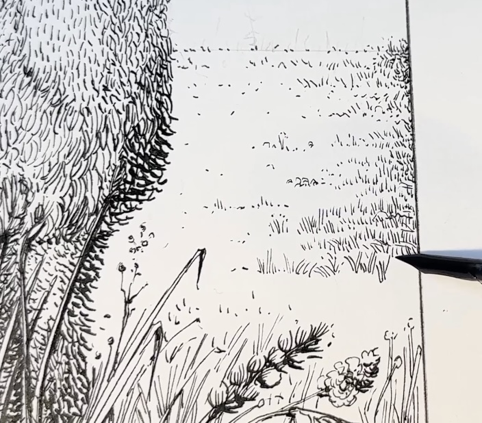
Then render the remainder of the background all the way to the horizon line.
Vary the texture to look less uniform, more natural, with little circles, squiggles and horizontal dashes.
Bump up the contrast in the background near the horizon so we can see more of Ezekiel’s white tail.
And now it’s time to address any transition areas to smooth out gradations, increase or decrease contrasts for balance in the overall composition.
Then finish off with the sky with squiggly horizontal strokes. It’s a good idea to add a few pencil guidelines with a ruler to stay on track.
I’m opting for a gradation for the sky. Spread the horizontal lines as you travel from the top of the picture plane towards the horizon line.
The random diagonal squiggles you see are for visual interest and as a nod to my favourite ink master, Franklin Booth.
The sky fades to white at about mid-point near the sun, then the gradation is reversed, narrowing as it reaches the horizon line.
Erase the remaining pencil marks, add your signature and voilà.
I hope that you enjoyed our project of a Deer Landscape with Pen and Ink.
If you did, I appreciate you sharing the post.
Let me know what other subjects you’d like to draw in a future lesson.
Resources
- Adjustable Tablet Stand
- Adjustable Tabletop Easel
- Faber-Castell Kneaded Eraser
- Speedball Dip Pen Set
- Speedball Super Black India Ink
- Staedtler Mars Technico Lead Holder
- Steadtler Fineliner Set
- Strathmore Bristol Smooth Paper
- 12” Corked Stainless Steel Ruler
✒️ My tools