The reason Arthur Rackham’s work is legendary, in my opinion, has less to do with how he perfectly captures the essence of fairy tales and fantasy.
It’s his line work.
There’s a beautiful logic to it. It makes sense. That’s why his illustrations read so well.
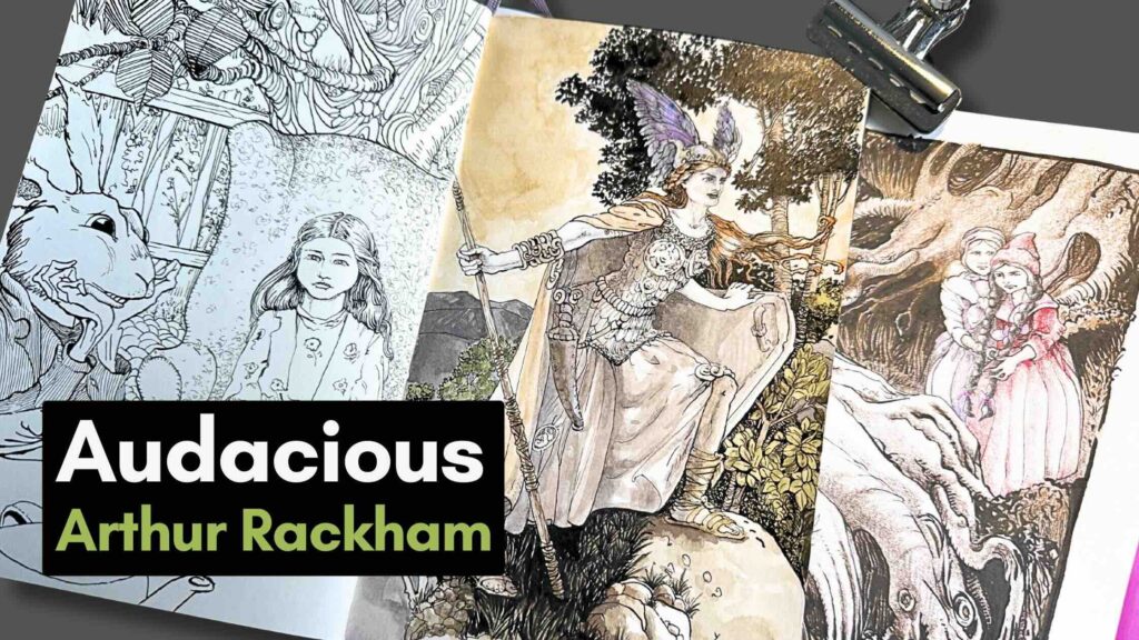
In this blog post, I’ll be rendering three studies in pen and ink, and adding colour to two of them.
I’ll also be sharing how I did the studies and what was interesting about Rackham’s work in hopes it will help inspire you as well.
//DISCLOSURE: I earn a small commission when you use my affiliate links to make a purchase. Read the terms to learn more about my partnerships.
Master artist feature
If you’re new to my Blog, I feature different illustration masters, usually suggested by YouTube viewers.
Doing master studies is one of the activities that’s helped grow my pen and ink skills, in just a few years, to what you see today.
Be sure to subscribe to my email list so you can catch when your favourite master artists come out.
Now let’s jump into Arthur Rackham.
Getting acquainted with Rackham’s work
When doing a master study, the first thing is research and getting acquainted with the master’s work. Then I flag several pieces based on my goals and curiosity.
It so happens that I’ve been experimenting with colour mediums to mix with pen and ink. And Rackham is renowned for combining watercolour techniques with his pen and ink drawings.
Of course, you never know what will surprise you during these studies.
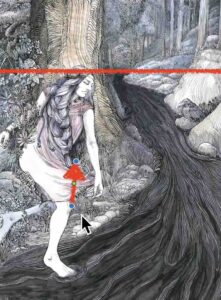
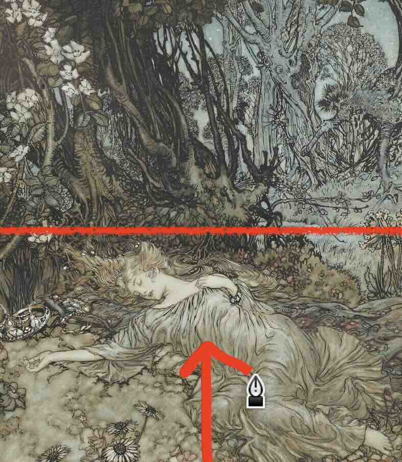
Like, when I came across Rackham’s illustration of “A Midsummer’s Dream” (below).
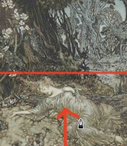
I did a piece for the Wow X Wow Gallery a few months ago, named “Forest Maiden,” (below), and my concept is strikingly similar to Rackham’s – except this is the first time I’ve ever seen it.
Since we’re here, let’s do a quick critique of my piece compared to the master’s.
Self-critique against the master
When doing a masterwork analysis, my starting point is to look for these two things.
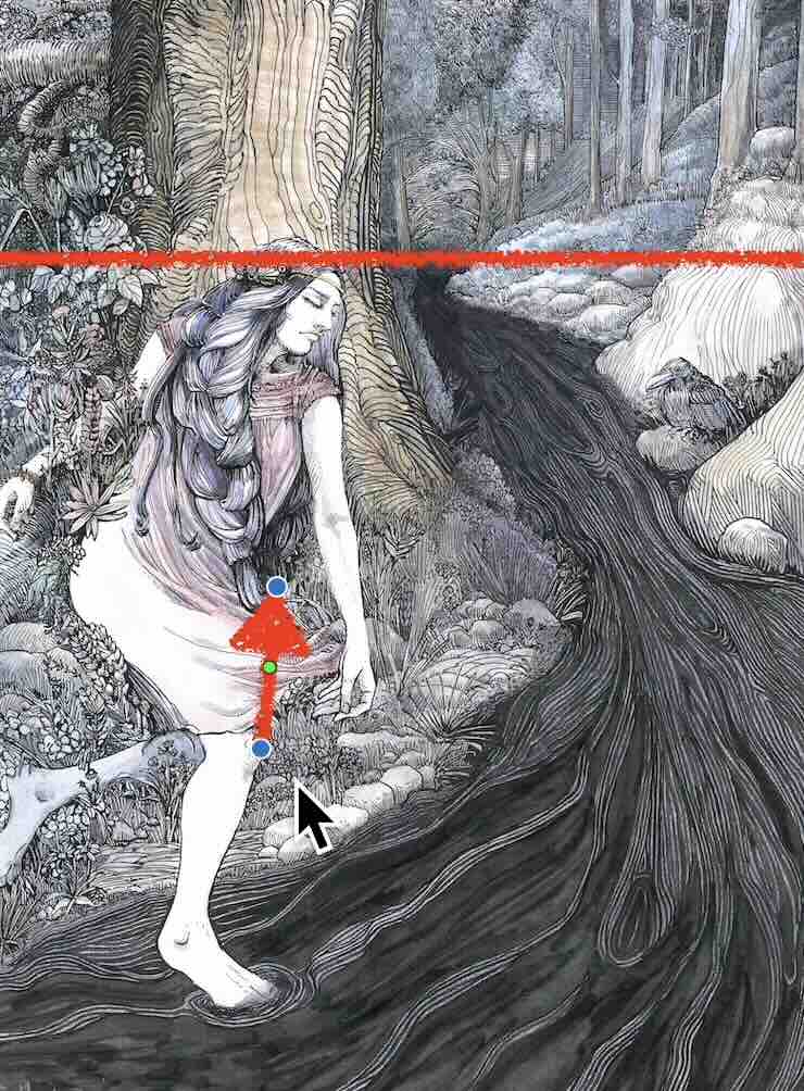
First, establish the source of light. From which direction is it shining in the composition?
This will give you all the information about the values.
So, if you were copying the Midsummer’s Dream illustration as a study, you’d note the highlights in her hair, coming from to top right-hand corner, which then tells you where to place the cast shadows.
This is how you would proceed to match the shading with your tonal values.
The second thing is the perspective that the viewer is looking at the scene.
Find the horizon line – which is usually where the ground meets the sky (shown in red, above).
Based on where the horizon line is, it’s like we’re standing right in front, looking down at her.

His composition is so much more alluring than how I structured the viewpoint in my composition.
So, find the horizon line to understand how the master structured his composition, and if you like that – apply the same viewing angle to your next drawing project, so it comes out as awesome as the master’s.

When looking over his works, what struck me with admiration is how fearless he is with details.
Rackham combines classic line weights in the foreground and wild brushwork in the back, which makes his compositions magically harmonious.
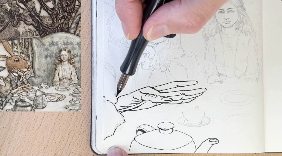
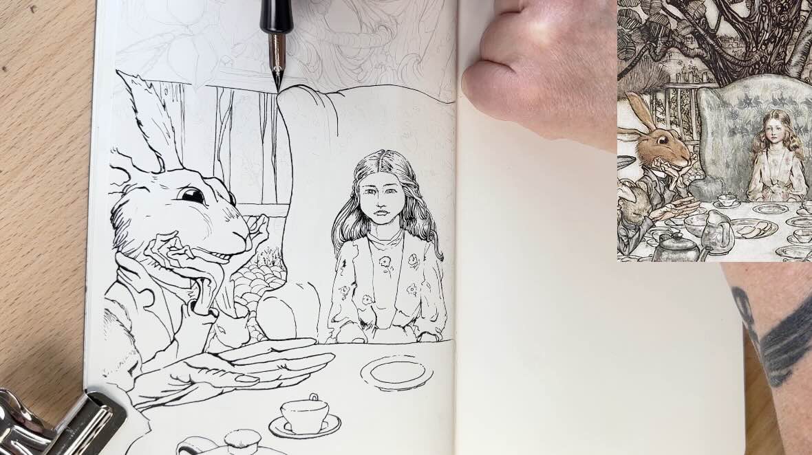
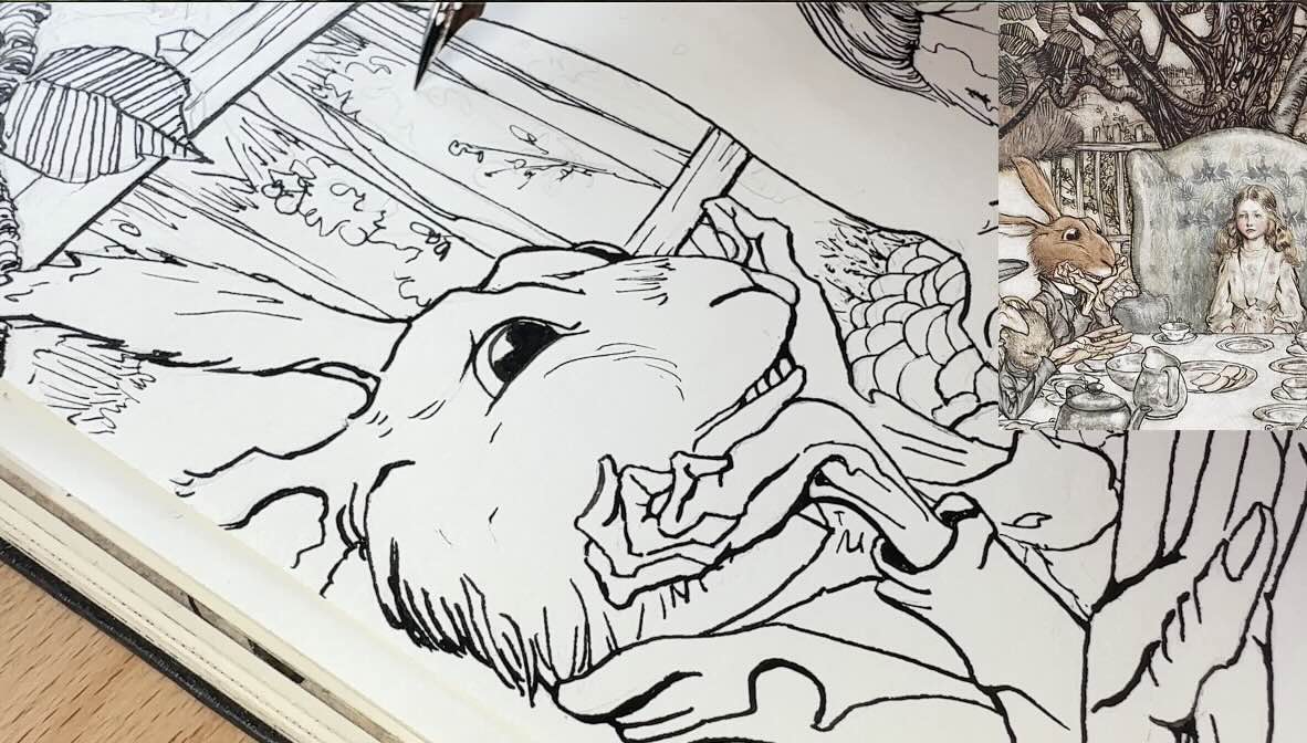
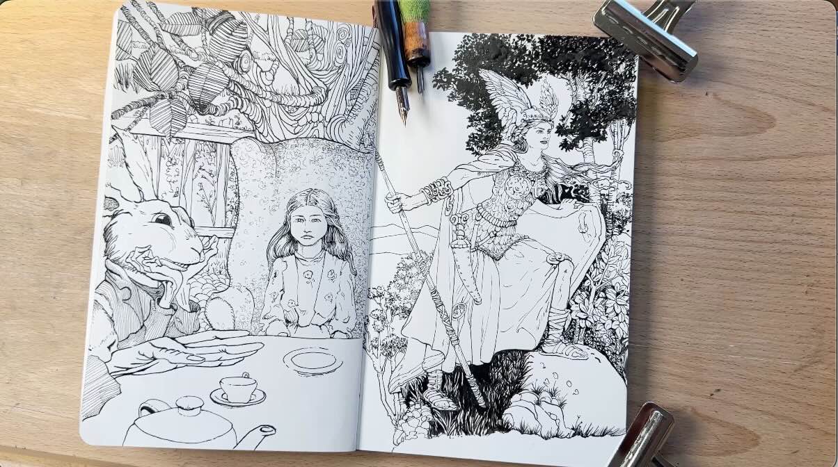
Study of Alice in Wonderland
Let’s start with Alice in Wonderland.
I cropped a section to do a “mini” study in my Moleskine Art sketchbook. That’s where I keep most of the studies. Having the studies in a single book makes it easier to track progress over time.
I did a full scene earlier, but we’ll review that one later in this article.
For the underdrawing, Rackham does these loose doodly patterns. This approach to rendering communicates the form and contributes to visual storytelling.
The way I cropped the image, we get a bony hand in the very foreground. Which turns out to be serendipitous because the way Rackham depicts bone structure is pretty iconic.
You’ll notice that he’s very consistent with how he draws his bony creatures, bordering on caricatures, exaggerated.
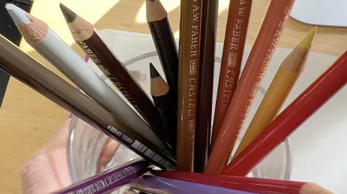
For this piece, I’m using a Hunt 101 Imperial Artist Nib from Speedball. It’s soft and has a good range from thin to thick lines.
Squeezed in between the rabbit and the bony hand is a mouse. We barely see to top of its head in my study because of how I cropped the image.
I gave Mister White Rabbit a furry textured outline, except for the sharp, angular, bony hands.
You can see that I’m varying the line weight; this is what I was saying about the logic of the master’s line work.
With Alice, the details of her dress are thinner, less detailed, compared to bolder lines for the hair and face, where our attention should be.
The lines in the very forefront or closest to the viewer are also bolder than the lines that are further away. And that is the classic protocol for line work.
Following this classic method contributes to the illusion of depth – it informs the viewer of what’s in front, and what’s behind in the picture plane.
Rackham follows this protocol until you get to the trees. Then the rendering gets interesting.
The classic method would be to render the background with the thinnest lines and the fewest details.
Rackham goes wild with his backgrounds. Plus, he used a brush, so even thicker and really audacious. Yet restrained, he held off with the crazy brushwork with the very back layer, which is thinner and appropriately abstract. He did it this way to describe distance. And just like that – the composition clicks into harmony.
For the finishing touches, I dropped down to a smaller nib, a Tachikawa T-99.
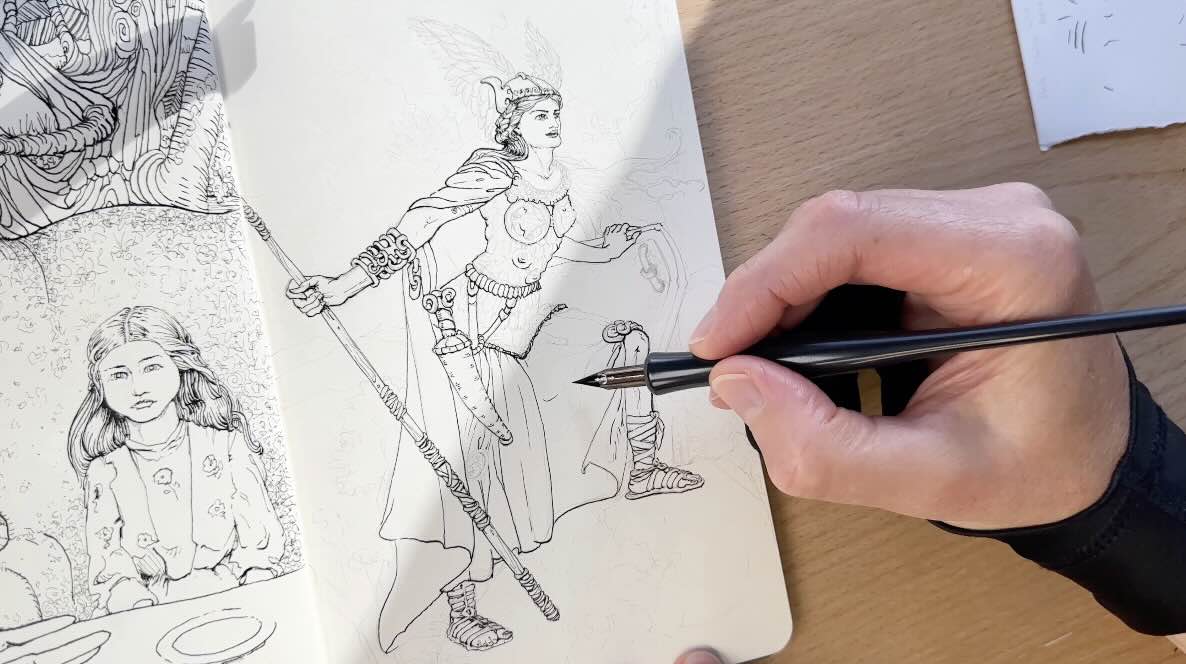
Study of Brynhildr from The Rhinegold
I started the pencils for a study of Brynhildr.
I sketched her figure, aiming to get the proportions and dimensions to fit the illustration in my sketchbook. Then, layered the clothing on the body parts. Her valkyrie kit is elegantly detailed.
This is the other thing he does that showcases his level of mastery. Tons of details that seem to only appear when you focus on them.
Because he’s such an accomplished draftsman, everything looks cohesive. Nothing is distracting the viewer from the storytelling of this piece.
The tonal values of the colouring tie it all together, making the illustration look clean and simple.
I’m taking mental note of the light source, which is top left, casting shadows on her face from those leafy trees.
Going ahead with the ink application, starting with the face with that small Tachikawa 99 nib.
I continue with this nib for the key details, like her hands, armour, and feet. I’m adding the shadows on the first pass.
There’s very little rendering, so the values are expressed mostly through line weight, and later the colour will enhance this effect.
Now I’m ready for the Hunt 101 nib, tackling the drapery of her robe, her hair and helmet wings.
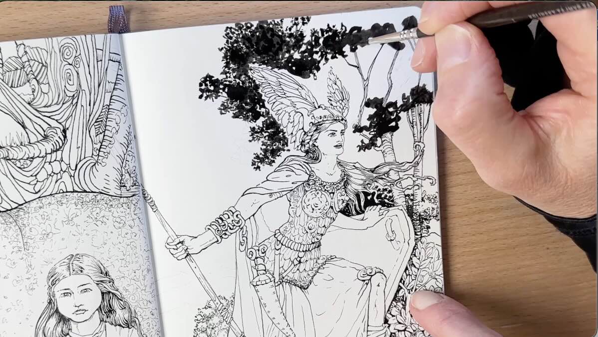
For the background – she’s standing on a mountain top or in the mid-sub alpine, seeing smaller trees there.
First, I did the texture with my pen, but quickly realized that since he used a brush, I should as well. Starting with the blades of grass, then the clusters of leaves. I know the secret is to keep the pattern consistent, for leaves to look believable, and it is patient work.
Once the ink was completely dry, I applied the watercolour, beginning with the ‘golden hour’ sky. Travelling back to front on the picture plane.

I did paint wet on wet, blending the hues right on the paper. But not overly wet because this is a hot press paper and will warp with too much water.
So, there we have it. Let me know in the comments which of these two studies you preferred: ink-only, in black and white, or ink with colour.
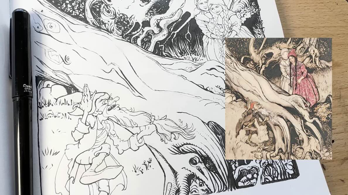
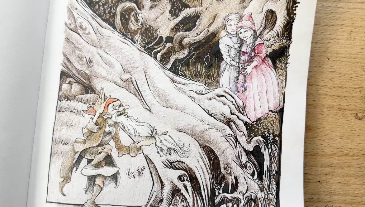
This next study, Snow White and Rose Red, is the one I had initially started with.
Study of Snow White and Rose Red
This particular sketchbook paper, Speedball Art’s Flexi-sketchpad, is for dry mediums only. So, I used a brush pen for the wilder background, a set of fine liner pens for the classic line work, and coloured the entire scene in pencil.
Repeating the same process as with the other two studies, using the smallest tip for the faces, hands and other detail designs in the composition.
Then, moved on to a bigger dip pen size for the character in the very forefront to match the line weights that the master used in his illustration.
Smallest tips in the background and bigger in the foreground. Except, again, when we get to the trees – but that’s his signature style.
The technique I noticed here is – wherever the lines join at a different plane angle, Rackham builds that section gradually. The effect on the overall illustration is subtle. It’s a small thing, yet it adds so much finesse to the linework.
🎓 If you want tips for how to practice techniques like this, then you’ll like my latest course, called “Explore rendering in pen and ink.” Check out my course page for more info.

I had already picked my colour palette aiming to match the master’s illustration. Because his colour choices are important.
See how the ladies are further, above the middle ground. They’re off to the side, yet are the first point of interest, because of the contrasting red. Then our eye goes to the bonhomme in the front of the scene, note his orange hat.
You’d think that the giant tree in the centre would be the main attraction, but it isn’t. It blends seamlessly into the other shades of brown to support the characters.
Key takeaways
The key takeaways from doing these studies of Arthur Rackham’s works, were:
- Going back to the very first scene: the learning point here was to pay attention to the source of light, so you know where to place the shadows and shade your values from there.
- To be mindful of where you place the horizon line in your composition to create a more pleasing viewpoint for the viewer.
- It is safe to follow the classic protocol for line weights (bold in the front, thin in the back), essentially, anything closer to the viewer would have thicker line weights.
- But we also saw there are exceptions to this line weight logic, as Rackham demonstrated in his background, for the trees in particular.

It could have been visually confusing, but the master managed to create a harmonious feel by unifying the composition through the use of subtle details, like how he joins the plane angles, and through his judicious choice of colour.
And that’s why his illustrations read so well.
Resources
📗 Books ↓↓
- Rackman – Treasury 86 Illustrations
- Rackham – The Ring of the Nibelung
- Rackham – Fairy Tale Illustrations
- Rackham – Fantastic Line Art

🧰Tools ↓↓↓
- Staedtler Lead Holder
- Staedtler Carbon Lead, 2mm, H
- Faber-Castell Kneaded Eraser
- Speedball Art Sketchpad 8×8
- Steadtler Pigment Liner Set
- Speedball Super Black India Ink
- Tachikawa T99 Nib
- Speedball Hunt 101 Imperial Nib
- W&N Watercolor Set
- Moleskine Arts Sketchbook
- Artist Drawing Glove