In this article, you’ll learn more about the illustration style of Master Alphonse Mucha.
I demonstrate how to do studies, what I observed about this master’s style, and how to integrate the learnings into a pen and ink composition of your own.
How to design your composition like Alphonse Mucha
//DISCLOSURE: I earn a small commission when you use my affiliate links to make a purchase. Visit the Terms Page to learn more about my affiliate partnerships.
Master: Alphonse Mucha, Czech Republic
Active Years: 1868 – 1938
Style: Art Nouveau

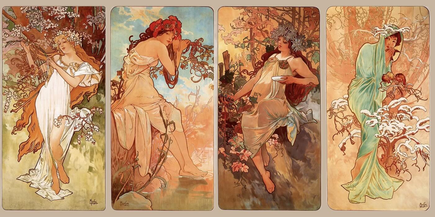
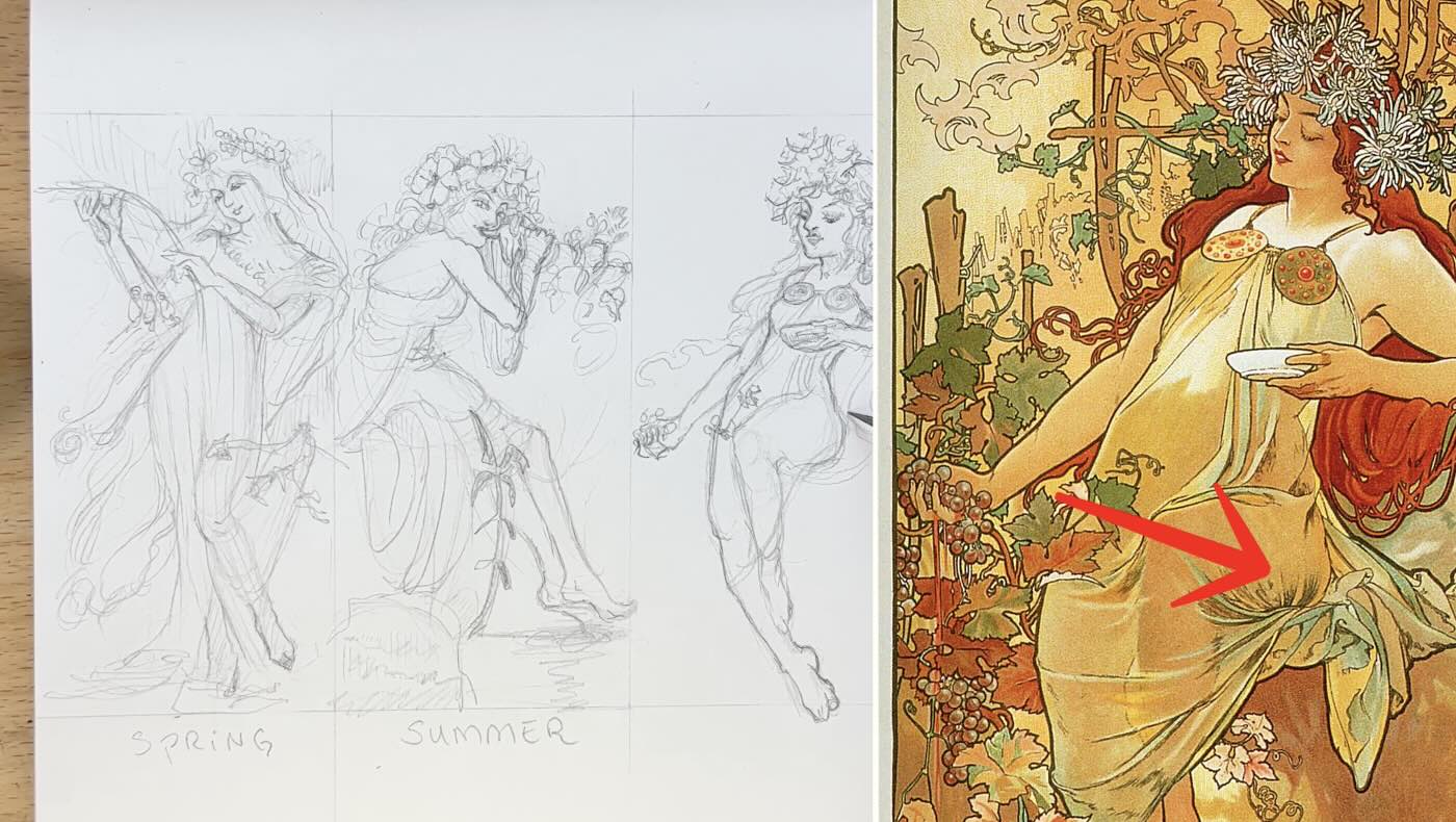
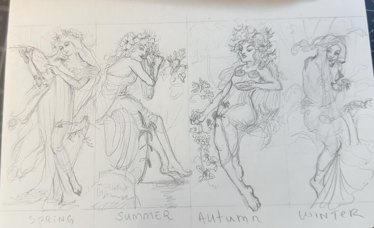
Thumbnail Studies – The Seasons 1896
I first sketched rough thumbnails of the 1896 lithograph version of the piece, called The Seasons (above), to get an initial impression of the Mucha style.
I used these materials for sketching:
- Staedtler Lead Holder
- Staedtler Carbon Lead, 2mm, H
- Faber-Castell Kneaded Eraser
- Speedball Art Sketchpad 8×8

What I noticed from doing these initial thumbnails…
From a pen and ink perspective, there are three things Alphonse Mucha achieves exceptionally well:
- Foremost are his flowing, fluid compositions
- Second is the ornamental yet economical linework
- Third is the harmonious decorative integration – of it all
Let’s get into it.
A thumbnail study is a quick and easy way to help capture what you first observe. We do notice more things by doodling out what we see rather than just analyzing the art.
I was immediately struck by the visual design.
The seductive poses of his “Seasons” series flow in curves, swirls, and patterns that guide the viewer’s eye in a controlled rhythm.
Note how the anatomy of the ‘Mucha ladies’ is simplified in graceful postures. I’m seeing similarities to comics and manga-style drawings, where the art is more about expression and storytelling than realism.

Spring
For Spring, see how her arm curves in one direction, extending into the branch that then arcs oppositely.
Her hair swoops in an arc, wrapping around the other side of her body. Then the eye follows this arc to her dress, which is caught in the branch.
These arcs and curves make a bunch of “S’s” in the composition. All these little things create lovely counterbalances for visual symmetry.

Summer
With Summer, Mucha is using opposing curves in the lady’s posture to both fill the space and to describe her serene mood.
See how the tunic fabric is halfway in the barge (or whatever) she’s leaning on. Again, using a counterbalance of different elements to harmonize the composition.
After doing only two doodles, I had already gained a sense of how the master achieved flowing, fluid compositions.
Autumn
In the Autumn sketch, my attention shifted to the tones in values.
Although the colour hues are muted, the darker tones frame the line of action. The line of action is the movement of the figure.
There are tons of little details and side stories happening in these four illustrations.
Like the interweaving of botanicals and bunched fabrics, snagged dresses that accidentally reveal more of the young maidens’ body parts. Which I assume would have been provocative in 1896.
However, the way master Mucha arranged the values and strategically used line weights is what I call ornamental yet economical linework.
A lot is going on. Yet our attention is pulled to the figure. That’s where the eye goes first.

Winter
Same with Winter. Even though there are organic shapes in front of the figure, we almost don’t register them.
Did you notice the cute birds on the branch? How about the one in her hand?
Because of the tones and line weight differences, the main attraction is still the lady in the bold outline.
This thumbnails exercise helps to understand how the master achieved a harmonious decorative integration in his compositions.
Mini Study – The Rose
The thumbnails exercise was good for an initial impression of what stood out about the master’s approach and style.
Next, I practiced the three things I noticed earlier by doing a more detailed drawing.
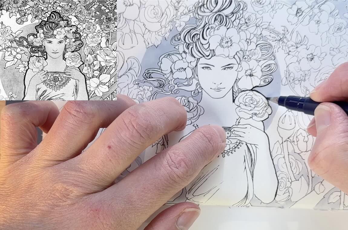
I cropped a section of this illustration called ‘’The Rose’ for my mini-study.
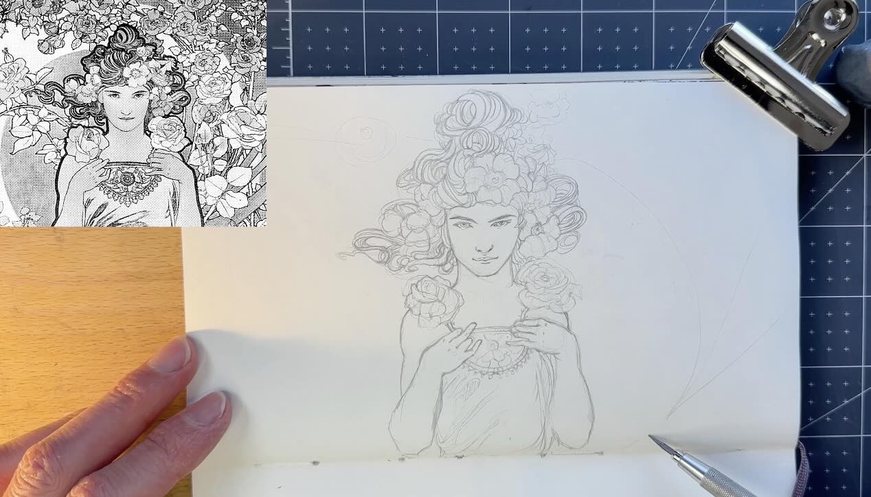
The Underdrawing
After converting ‘The Rose’ reference image to greyscale (above top corner), I went ahead and roughed out the edges of the main shapes for the underdrawing in my Moleskine Art sketchbook.
While doing the pencil drawing, I was focused on how the master depicted the hair as a visual design with the other motifs and textured patterns.
While sketching those elements around the lady, I became interested in how the master used negative space and what that flow suggests.
It was clear that, while doing the underdrawing, the master assigned volume to the shapes with line direction. Which is good because that means his line work does not actually need colour.
The line direction, along with line weights and how he structured the composition, such as the negative space, together created the illusion of depth and dimension without the use of shading.
Mucha didn’t rely on colour or value gradients to achieve this stunning dimensionality.
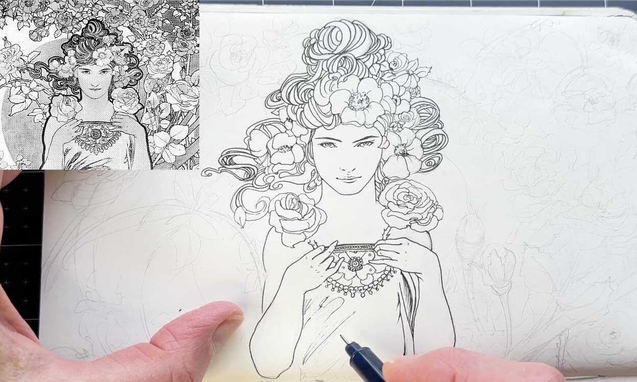
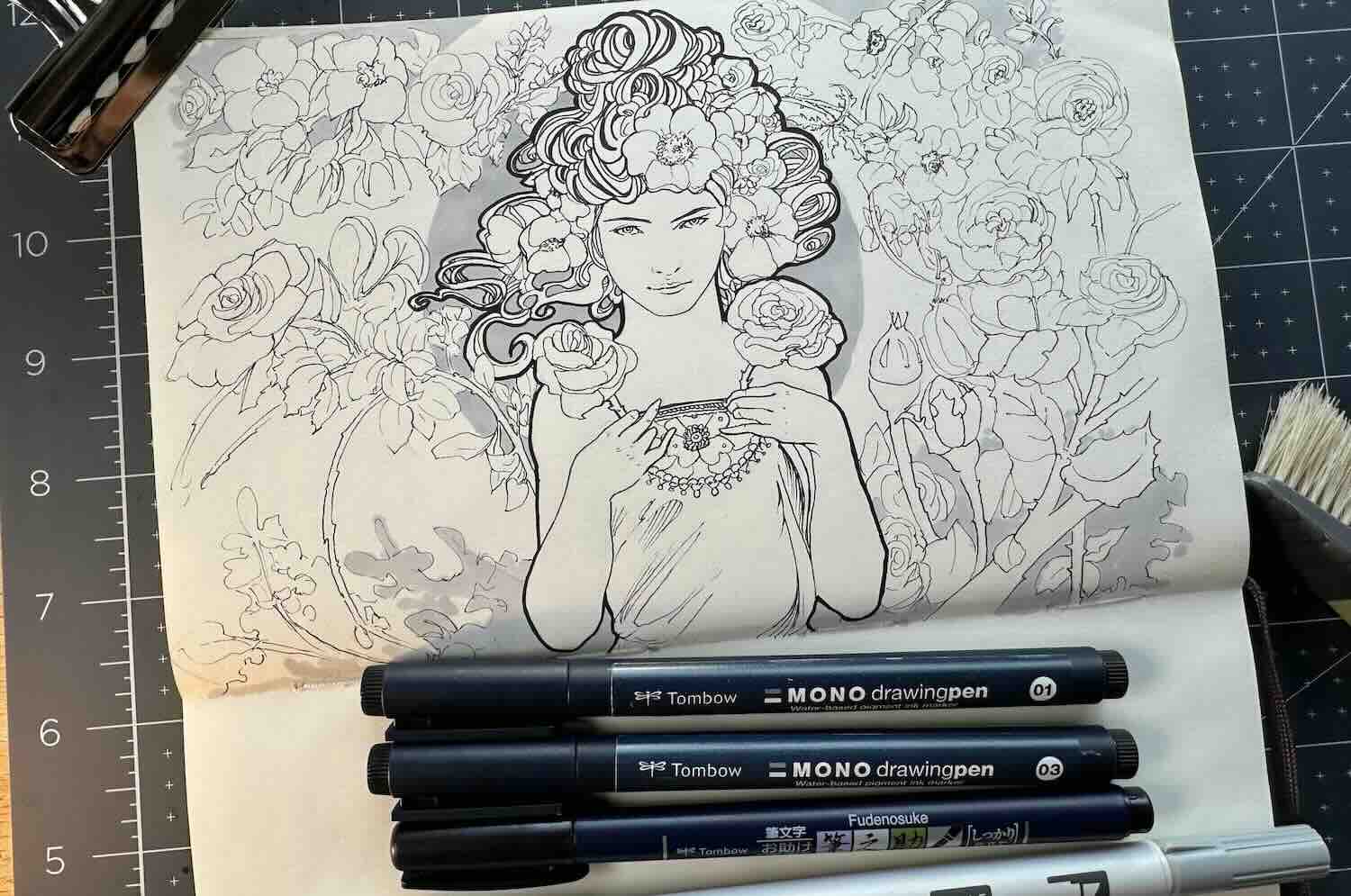
Ink Application
For the ink application of this study, I used a set of Tombow fine liners, a calligraphy brush pen, and grey markers.

Oh, and a 0.05 Steadtler pigment liner for the finer features of the face. Then I switched to a 01 and went ahead outlining pretty much everything I sketched.
I was mindful to keep the outline light on this first pass. I didn’t draw an exact copy. I improvised a lot, especially with the background, but I monitored for detail overload.
Master Mucha often used just enough line work to suggest form, then surrounded it with a pattern or open space.
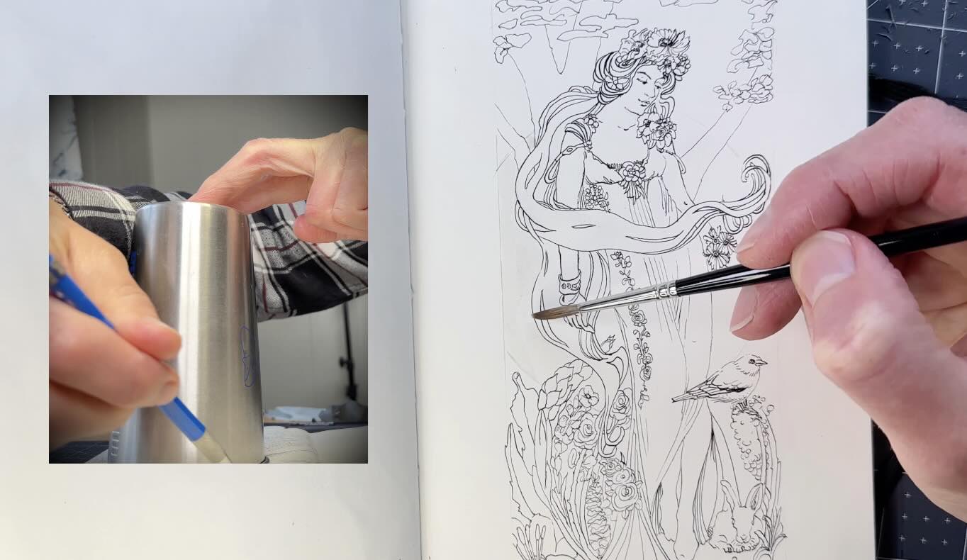
I used a cup to draw a circular shape as part of the background design. This is where the grey markers can mimic some of the motifs. It’s just a grey circle behind the lady.
Then I used my thickest pen, the Tombow Fudenosuke for the boldest outlines. Note that the bold follows the outer silhouette of the figure and her hair, not the face or hands.
For the clusters of hair, it reads like bold outlines, but I think that’s intended as a deeper tone for contrast and not part of the outline design.
So, I used a mid-weight 03 fine liner there.
This showcases how Mucha’s figures are not anatomy portraits — they’re stylized, idealized forms.
His style prioritizes design flow and fun!
Integration Study – Line and Decorative Elements
In that spirit, for the final study, I thought it would be fun to reference vintage photos and integrate decorative elements inspired by what we’ve reviewed so far about the master’s approach.
Mucha used photo references extensively.
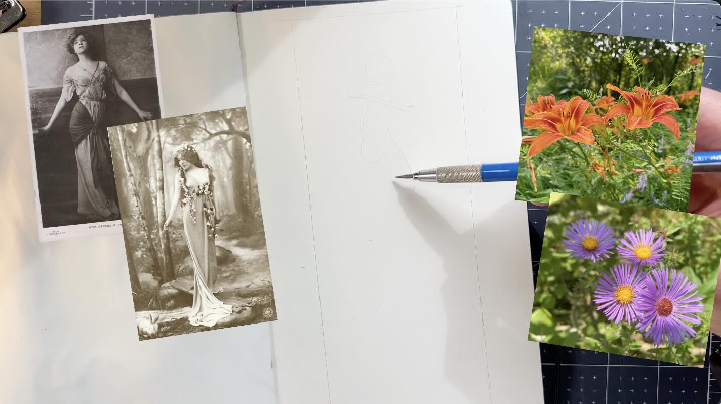
I established the figure first, aiming to reach that serene, elegant, simplified anatomy, in a graceful posture. Which took several tries.
I drew a few lines to indicate a dress. How fabric drapes the form seems to be an essential part of the design to create that idolized look, as I noted in the initial thumbnails.
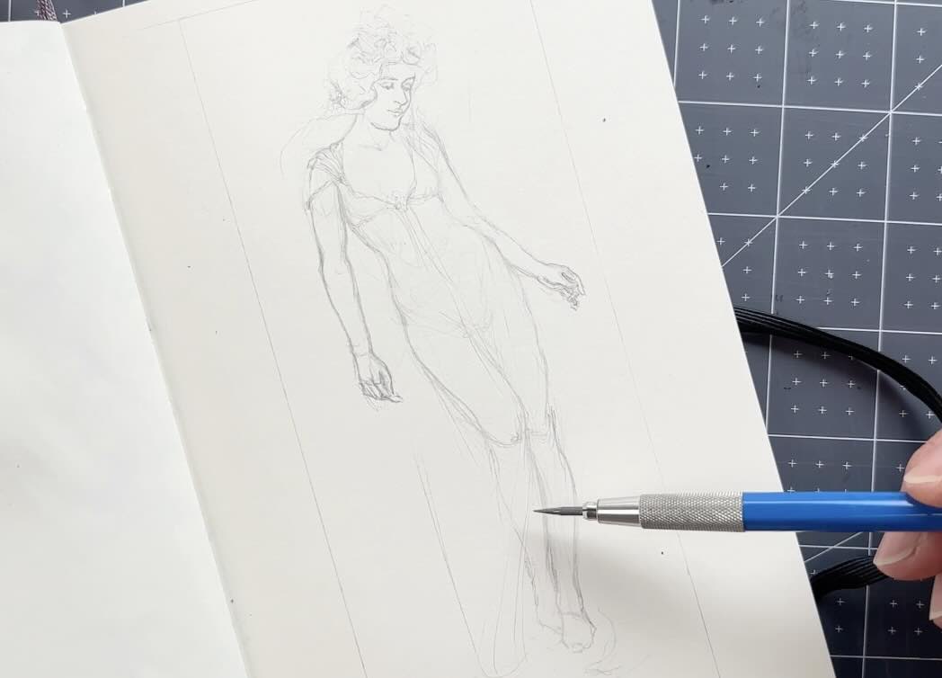
Then I layered the decorative elements, starting with her flowery hairpiece. Then continued to think of the composition as a fluid integration.
I like birds and placing large botanicals in the extreme foreground, so I composed with that.
The challenge here is knowing how much detail to put in, without losing sight of the overall harmony, trying to keep it fluid and clean at the same time.
Ink Application
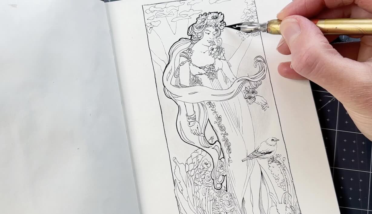
This time, I opted for a dip pen and India ink.

The supplies are linked altogether at the end of this article, along with other helpful resources like books and courses.
The inking part was pretty straightforward and uneventful.
Mucha inks all the contour lines without any fancy tricks.
Everything is the same, equal line weights, except for the main subject and the border in bold, which I saved for last.
I repeated the grey circle design in the background to simulate a motif. This time, as an ink wash with a watercolour brush instead of using the grey marker.
Otherwise, the ink application was easy because of the planning that went before that.
Doing the thumbnail sketches helped sort out possible compositions, aiming for flow and fluidity.
The mini-study was practice for how to draw the detailed ornaments and balance those with a harmonious linework.
Therefore, this final composition tied it all together, integrating our own design influenced by the masters’ decorative style and approach.
I hope you found fresh ideas from reading this article. I wish you the best with your art projects.
Resources
✍🏻 Mucha Art


🧰Tools ↓↓↓
- Staedtler Lead Holder
- Staedtler Carbon Lead, 2mm, H
- Faber-Castell Kneaded Eraser
- Speedball Art Sketchpad 8×8
- Tombow Fineliner Set
- Tombow Fudenosuke Brush Pen
- Tombow Greyscale Brush Pen Set
- Speedball Super Black India Ink
- Tachikawa Soft Maru 77
- Speedball Dip Pen Set
- W&N Brush Set of 4
- Moleskine Arts Sketchbook
- Adjustable Tabletop Easel