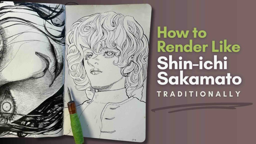
There’s something unattainable about master Shin-ichi Sakamoto’s art, but we can learn from studying his mark-making techniques.
In this article, we’ll render three characters from his Innocent Rouge Manga using traditional pen and ink tools.
Master Study in Pen and Ink
//DISCLOSURE: I earn a small commission when you use my affiliate links to make a purchase.
In this study, we will:
- render three characters
- analyze what stands out about this master’s work,
- and reflect on what we can learn from his style (original work).
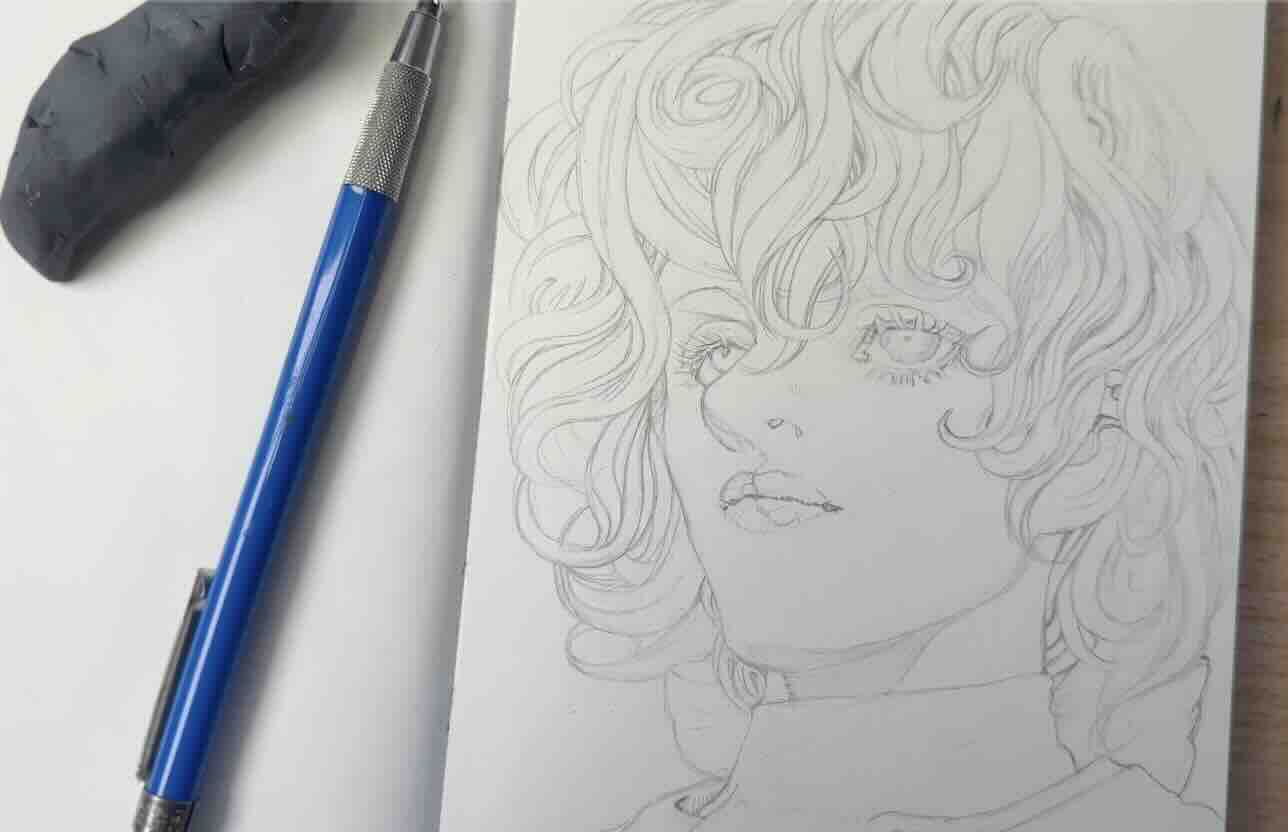
Study 1 – Marie-Joseph Sanson
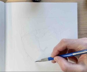
We can use the first character study as a warm-up sketch.
Pay attention to proportions and aim to match the character’s expression, as master Shin-ichi Sakamato intended.
Think of this warmup sketch as an initiation to how the master makes marks.
The characteristic of his style, he says, is an artistic pursuit of realism.
Start thinking ahead on how to ink your sketch.
Sakamato Sensei builds each line so delicately that it looks like he gently renders with a soft pencil.
The strokes have a transparency to them that are tricky to replicate with traditional inking tools.
He’s self-taught and worked incredibly hard for the past three decades to get to this level. He started his career in the early 1990s, right out of high school.
His first serialized manga, including The Climber, were rendered traditionally using a brush pen.
He switched to digital when he started Innocent Rouge manga.
The master still uses analogue mediums, like when he’s drafting his storyboards, but the final art we see today is produced digitally.
It’s important to keep in mind that he has his own team of specialists who work together with him on each spread. So, it’s best not to get too caught up in the technical proficiencies or complexity of the production of his manga.
A lot goes into it, from storyboard to final product.
The entire process can get overwhelming, but we can learn about his mark-making style by studying these characters.
Amongst his digital brushes is a g-nib that he uses for some of the outlines. It works similarly to a traditional g-nib dip pen.
However, we noted that his style is realistic, and since subjects in real life have no outlines, he blurs, softens, and erases parts of those outlines. Which is another aspect of his technique that makes his work stand apart.
I saw in an interview that Sakamoto Sensei starts the ink application of his characters with the eyes, nose, and then lips.
The sun-kissed lips are plump, drawn in the shape of clouds.
That’s actually what he’s known for. The lips, hair, and eyelashes.
His characters’ expressions can quickly go from innocent to monster, simply with how he renders lips, hair and eyelashes.
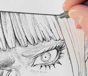
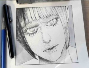
For this first attempt at replicating his digital marks (pictured above), I went with fine liner pens and a grey marker. That’s what I recommend for the first try because they’re easier tools to use. However, brushes and dip pens typically do a better job for manga.
As mentioned at the beginning, there’s something unattainable with the way he draws. A reason for that his threshold for working on a single piece is higher than most of us.
What I mean by that is … if a drawing takes me several hours to complete, my stamina and enthusiasm fade considerably. Anything over five hours starts to feel “long” to complete an illustration.
But the master will keep working, and reworking the same drawing for days if that’s what it takes to get it right.
With traditional, there’s no clean way to rework a piece that’s been inked. The best, and sometimes only thing we can do is assess the results. Then, decide what might look better or be more effective, and apply that information to the next project.

By doing this first sketch, you’ll know what to improve on in the next study.
For myself, my underdrawing was too loose, not clean enough. The lines weren’t clearly defined, which made for a lot of guesswork at the inking stage.
The best way to keep a drawing clean is to lift the graphite with a kneaded eraser once your rough sketch is done. With the finding lines barely there, go over the marks you like in pencil in one go. Without hesitation.
I’m learning that hesitation does not serve this style. Especially at the inking stage. One must apply the ink with confidence.
Master Sakamoto builds his values gradually. Each stroke is intentional and has a purpose.
With digital tools, he can redo the marks when dissatisfied with the effect.
With analogue, the pencilling stage is the last experimental step before the final inks.
Therefore, for this style of illustration, it makes sense to put the effort in at the pencilling stage.
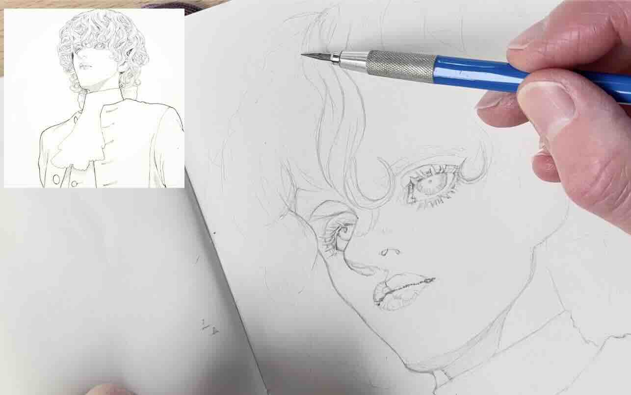
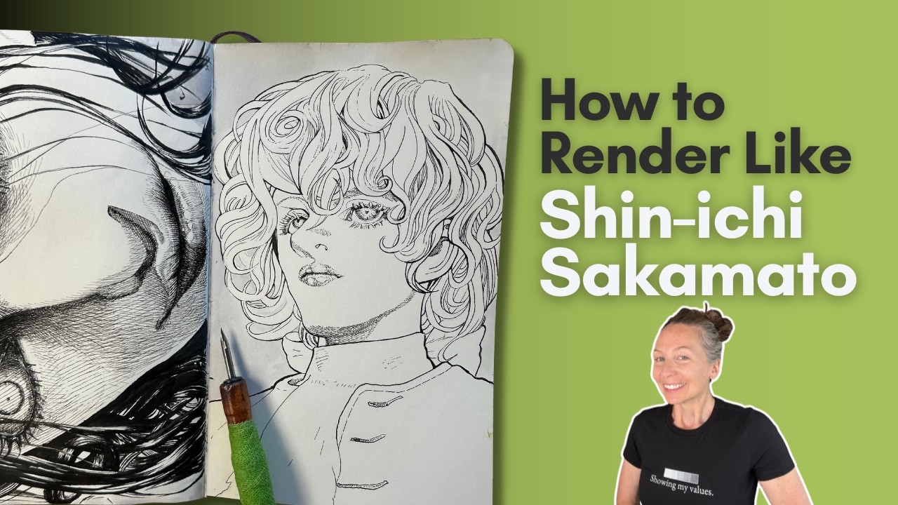
Study 2 – Louis XVI
I’ve been a longtime fan of Sakamato Sensei’s meticulous process.
It was this mesmerizing image of Louis XVI from Innocent Rouge that first caught my attention.
You can see how pristine and organized the marks are in this illustration.
So, for our second study, I aimed for a cleaner underdrawing than the previous study.
It’s worth taking the time, investing effort in the key traits:
- eyes
- lips
- magnificent hair
Knowing how precise Sensei is, the placement of each curl of this hairstyle plays a key role in framing the character’s face.
It’s likely best to build the hair cluster by cluster as the master likely did.
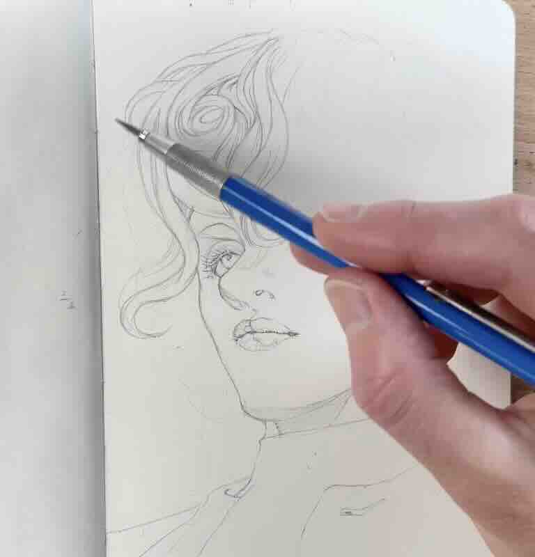
Start from the middle strands, top to bottom of the head, then travel left to right across the head.
Be sure to erase the finding lines as you make progress with the clusters of hair and clean them up as you go; otherwise, the jumble of marks could get confusing.
Actually, a fun fact.. Sakamoto Sensei has a hair library of his past drawings that he then customizes for different characters.
He’s saved over 2000 pre-designed hairstyles. This tells me he’s drawn hair, to this god-level at least 2000 times. No wonder he’s good!

If you’re thinking that the hair library is a shortcut, it may save time in his workflow, but not in the overall product.
He’s not taking shortcuts on the final art. The time he saves not drawing the hair from scratch means he can re-allocate his creativity elsewhere.
He might still take several days to refine a significant spread or cover art. He’s dedicated to the artistry.
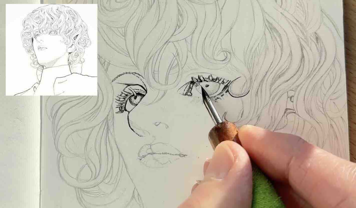
Seeing as I applied myself on the pencil stage of this study, the ink application went smoother than expected. You likely had the same experience if you’re following along the same steps.
I mentioned earlier that brushes and dip pens do a better job for inking manga (and also comics).
Therefore, for the ink application, I used Speedball Super Black India Ink and a Tachikawa soft Maru dip pen.

This dip pen has a finer, more flexible nib than a standard g-nib. I like the soft Maru better for details and contour lines.
I started the ink application in the same sequence as the master. Eyes, nose, and lips. Travelling left to right on the picture plane to avoid smudging the ink.
For the hair, I paid attention to the line quality.
Line quality is the weight of the marks. Observe in the reference that the main clusters of curls are thicker, and the supporting strands inside those clusters are lighter, thinner.
It’s at this point that I noticed how the outline is faded or missing where small strands overlap.
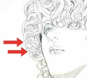
As I mentioned before, Sakamato-sensei doesn’t rely solely on outlines to describe the forms.
He avoids hard lines where a soft hatching texture is sufficient. Marks that are broken or left blank can then be completed by the viewer. This makes a more engaging illustration.
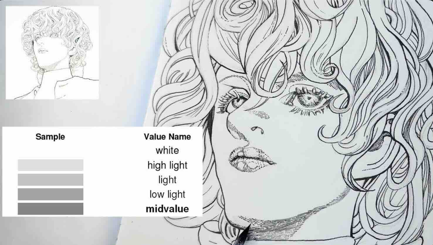
You’ll observe that 90% of this illustration is rendered in light to mid-tones.
The master accomplishes an overall softer look with this character by using tones that are below the mid-value range of the scale. Then he punches areas of contrast judiciously to emphasize volume and depth.
This arrangement of values successfully pulls the focus to the character’s face.
So, if you are using a dip pen, it’s essential to apply very little pressure on your nib.
Even for the sections where contours swell to a bolder line, build those with several thin strokes as the master does. He gently goes over the marks rather than going bold on the first stroke.
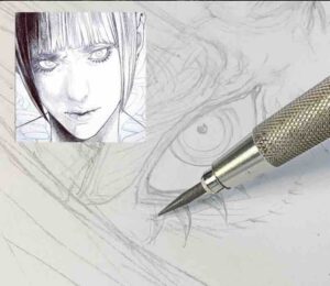
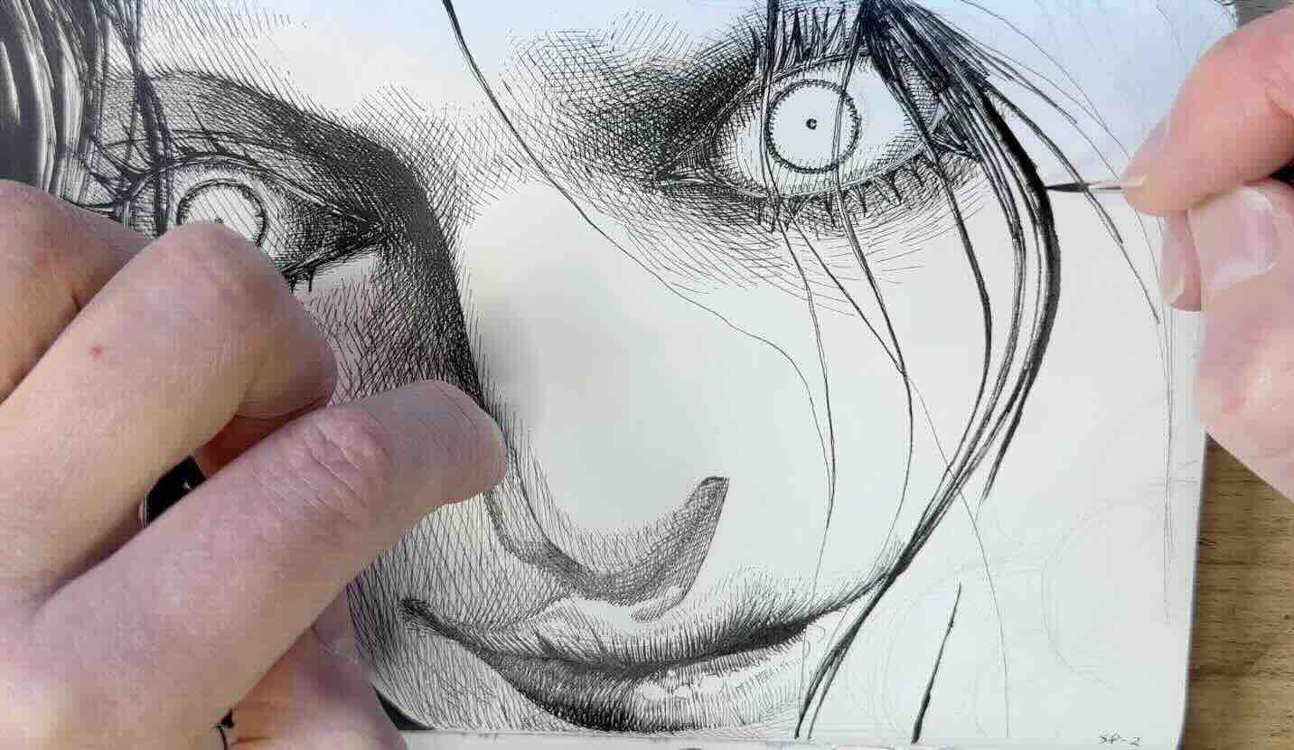
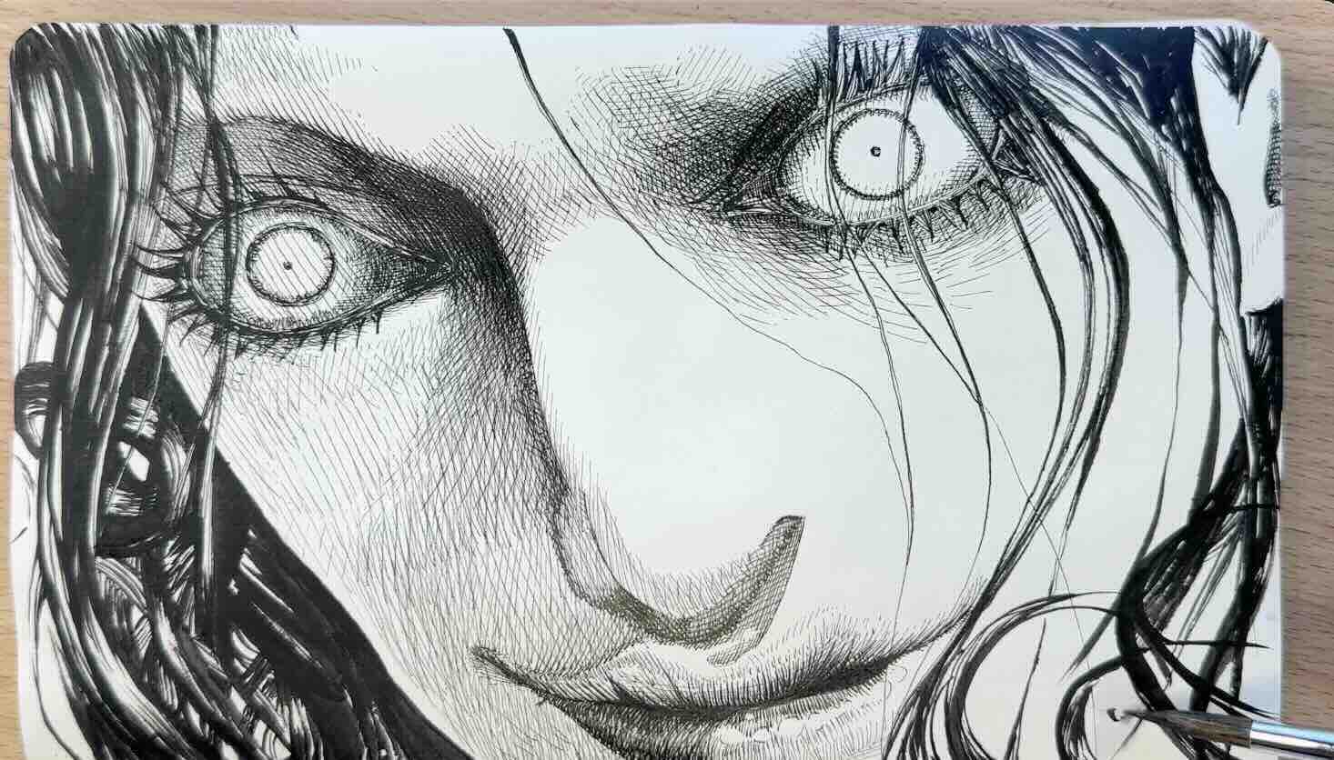
Sketch 3 – Charles-Henri Sanson
For the next character, I had my heart set on studying the high-contrast image below of one of the main characters from his most recent manga, Bram Stoker’s Dracula.
Except, look at the texture. Some of his illustrations are more challenging than others to interpret using traditional pen and ink tools.
It would be best to save this Lucy-Luke study for a different medium, like graphite, charcoal, or even acrylic would provide more resembling results.
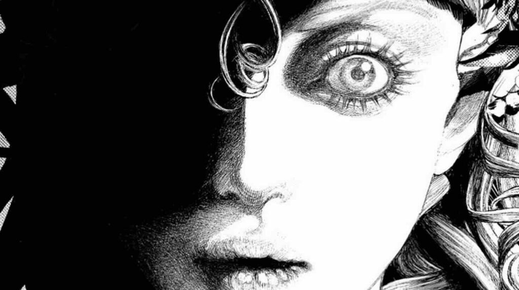
Instead, I opted for yet another character from the Innocent Rouge series, which you’ll agree has more pen-friendly hatch marks.
The goal with the previous character study was to improve on the first, warm-up sketch. I had some success by being more careful at the pencilling stage.
The two prior character illustrations I used as references to study were executed by the master with clean, precise strokes.
However, in this third image, the master’s marks are more dynamic and textured. There’s an introduction of cross-hatching rendered with energy.
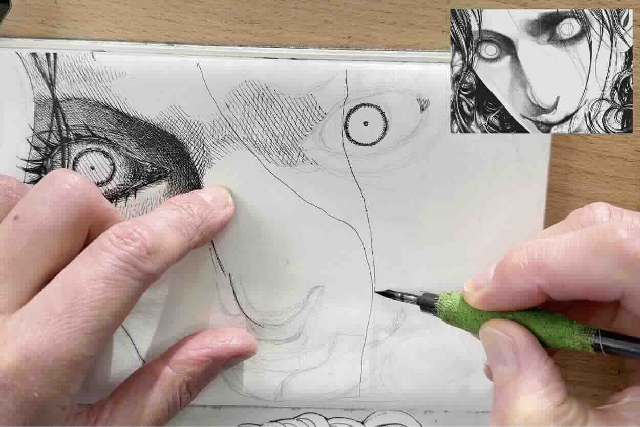
Therefore, rather than focus on polished, calculated mark-making, aim to capture the unhinged energy of the character’s expression.
In this case, a more scribbly sketch is likely okay. Simply indicate the contour lines and map out where the changes in values will go.
For the ink application, it’s important with the cross-hatching texture to match the range of values.
Pay close attention to:
- Line direction
- Curved versus straight cross-hatches
- Layering the marks gradually
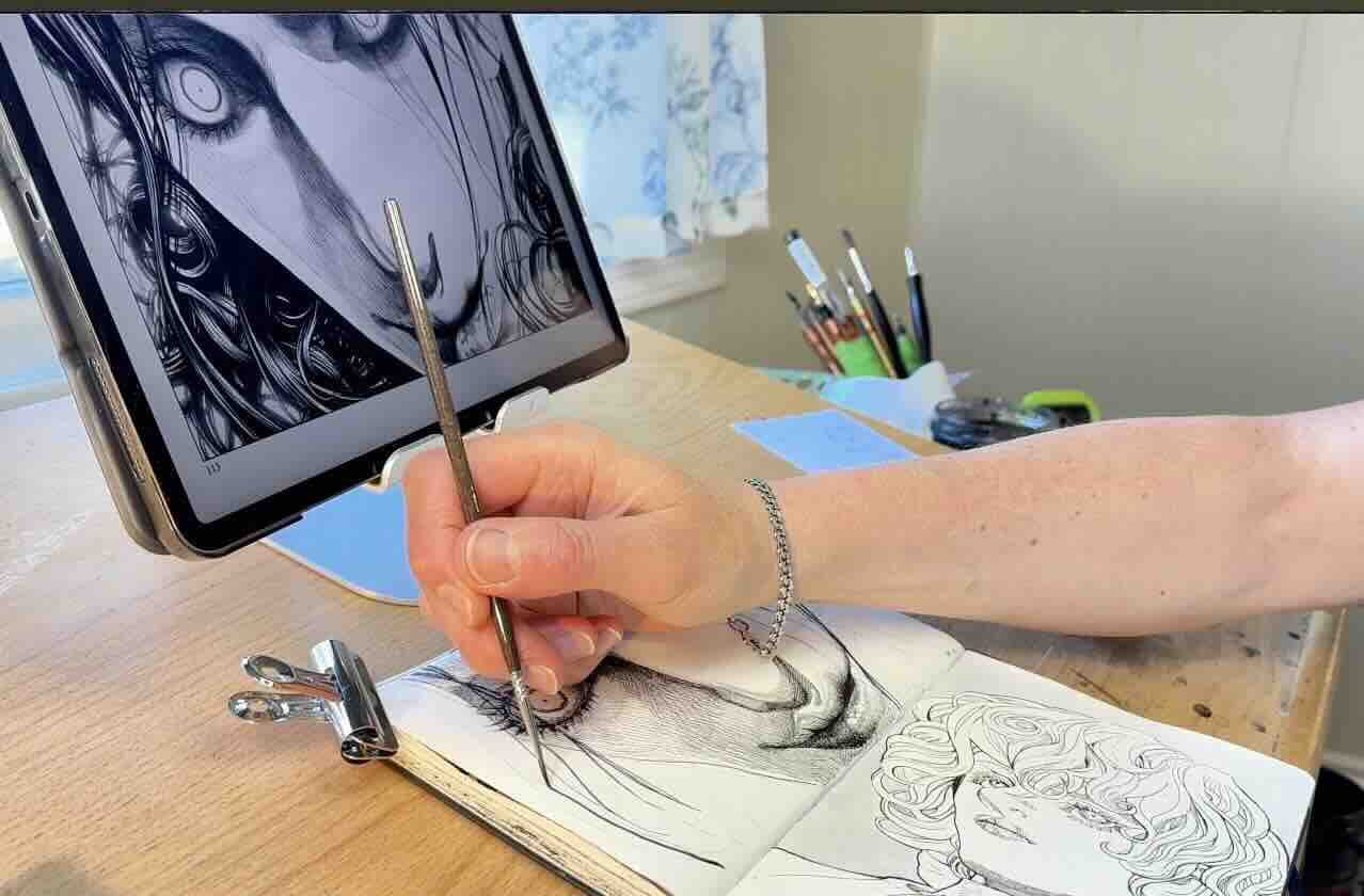
Initially, I was rendering with a G-nib, but it was too big for the size of my illustration. I do all my master studies in a dedicated Moleskine Arts sketchbook, which measures 5 x 8.25 inches.

This sketchbook is the ideal dimension for studying “mini” sections of larger scenes, but otherwise a bit small for a detailed portrait like this.
The solution is to use a finer nib size. I settled on a Speedball Art crow quill for the line work and switched to a No. 2 paintbrush to ink the thicker strands of hair framing his face.
If you’re wondering why I didn’t use the soft Maru nib again, it’s because the crowquill has a wider range of line quality (thin-thick in a single stroke), which works well for energetic line work.
📖 Find out which nib is best suited to your inking style.
I concluded this study with a grey wash for the background.
Lessons Learned
What did you learn from imitating the master’s strokes?
Take a moment to reflect on what you noticed during your studies. What might you change about your methods or incorporate into your next pen and ink project?
My takeaways from doing these studies were kind of small things, but they will help level up my skills for future projects.
Lesson no.1
Not every outline needs to be bold or even inked at all.
Many of us will overdo the line weight variety. That can create unnecessary contrast and distract the viewer from the storytelling.
Master Shinichi Sakamoto shows restraint in his rendering style. His art is over the top, but the line quality is disciplined.
Lesson no.2
The use of open sections in the overlaps to describe areas of highlight. I was familiar with missing edges on outlines, but Sakamoto-sensei uses this technique with true flair.
Lesson no.3
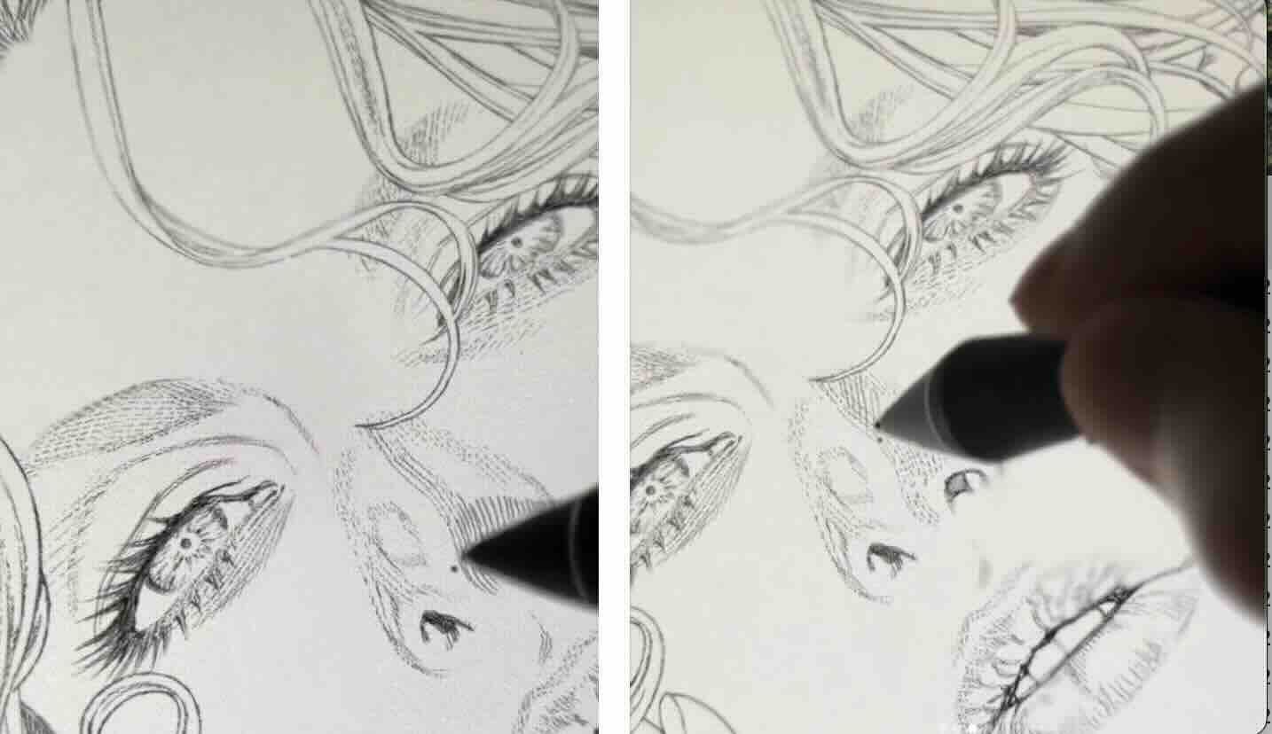
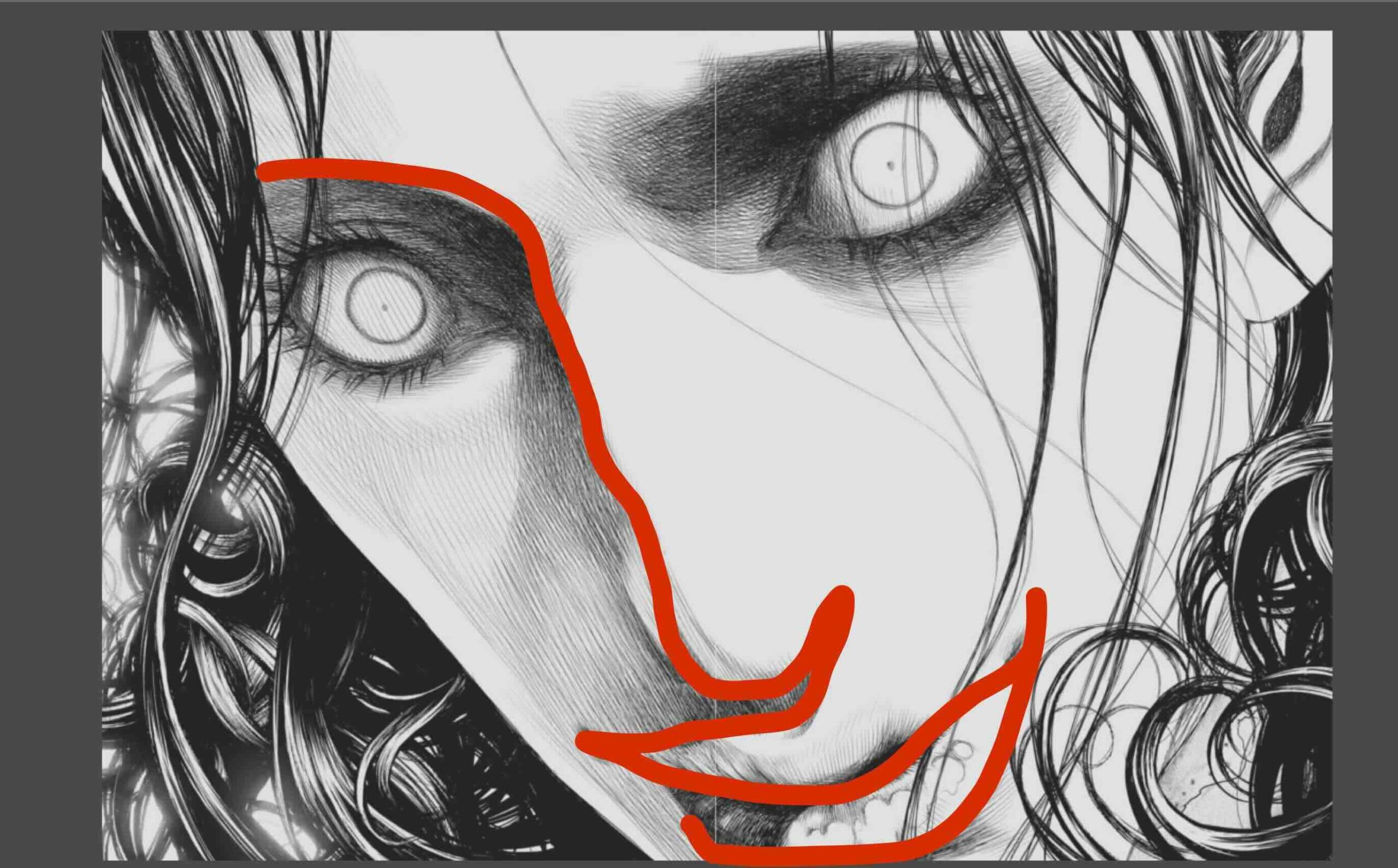
In the third study, I noticed his use of gesture-drawing techniques for capturing the main line of action.
The mark travels from the eyebrow, nose, upper lip and mouth all in a single stroke to establish the character’s face (shown above).
These three things seem small, but with practice, they will have a big impact on improving my art.
Although his level of mastery seems unattainable, in one of the interviews, Sakamoto-sensei said there was a 10-year span where he had zero success.
His journey shows that with determination, repetition, and a vision, you can achieve a lot.
So, let’s keep at it.
If you found inspiration in this article to study your favourite masters, be sure to browse the Master Studies category of this Blog.
All the best with your studies!
Resources
📗 Books ↓↓

✒️Tools I used ↓↓↓
Staedtler Rotary Lead Sharpener
Tombow Greyscale Dual Brush Pen Set