How to Analyze Comic Artwork
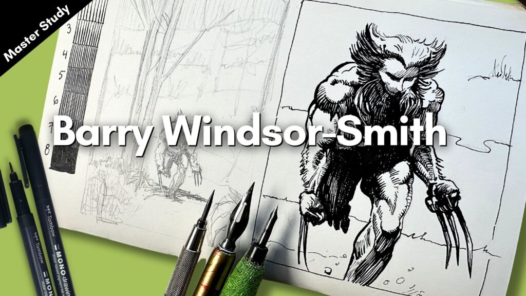
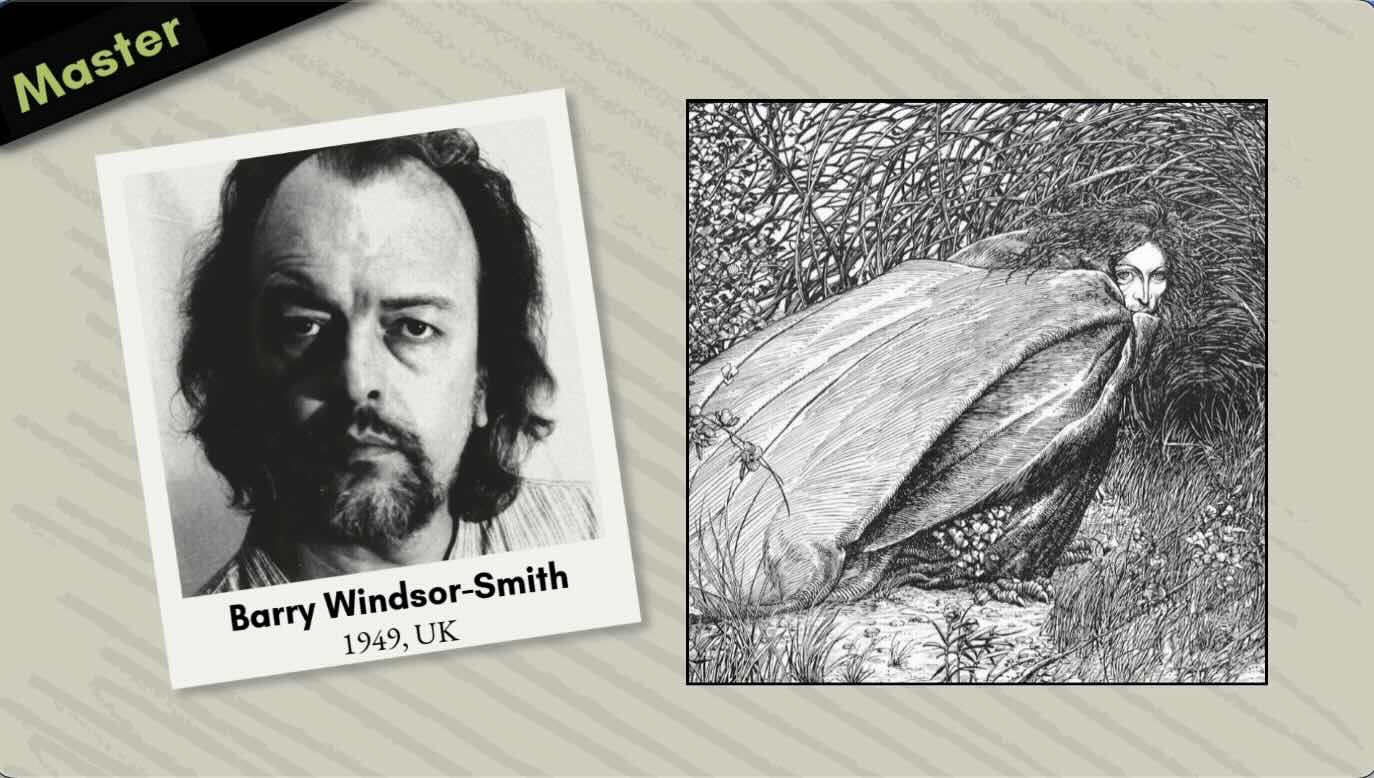
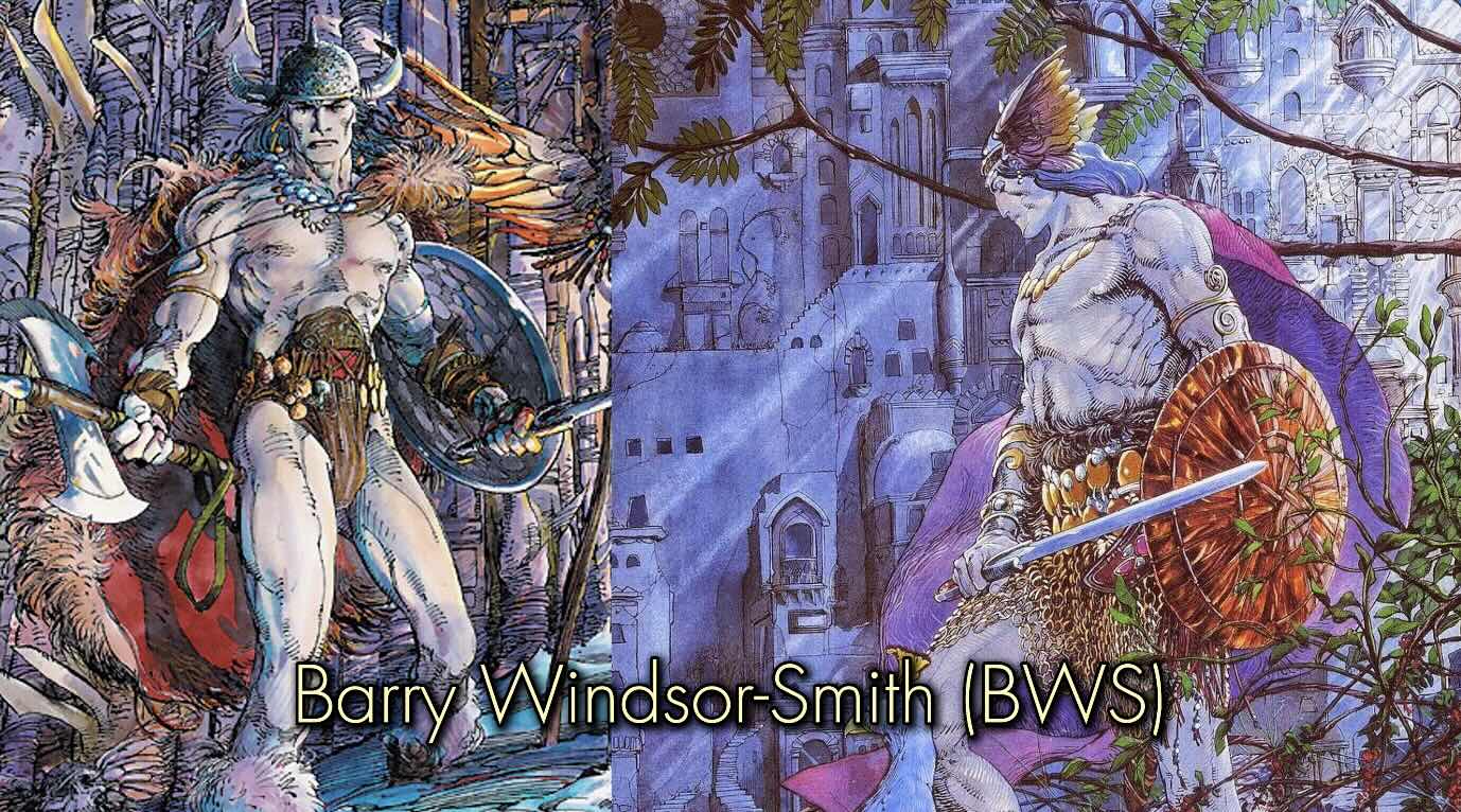
Barry Windsor-Smith (1949, UK) is a painter and comic book creator known for his fine style from diverse influences – anywhere from Wally Wood to Leonardo da Vinci.
The complete list of tools and reference books mentioned is linked in the resources section at the end of this article.
//DISCLOSURE: I earn a small commission when you use my affiliate links to make a purchase. Learn more on the Terms page.

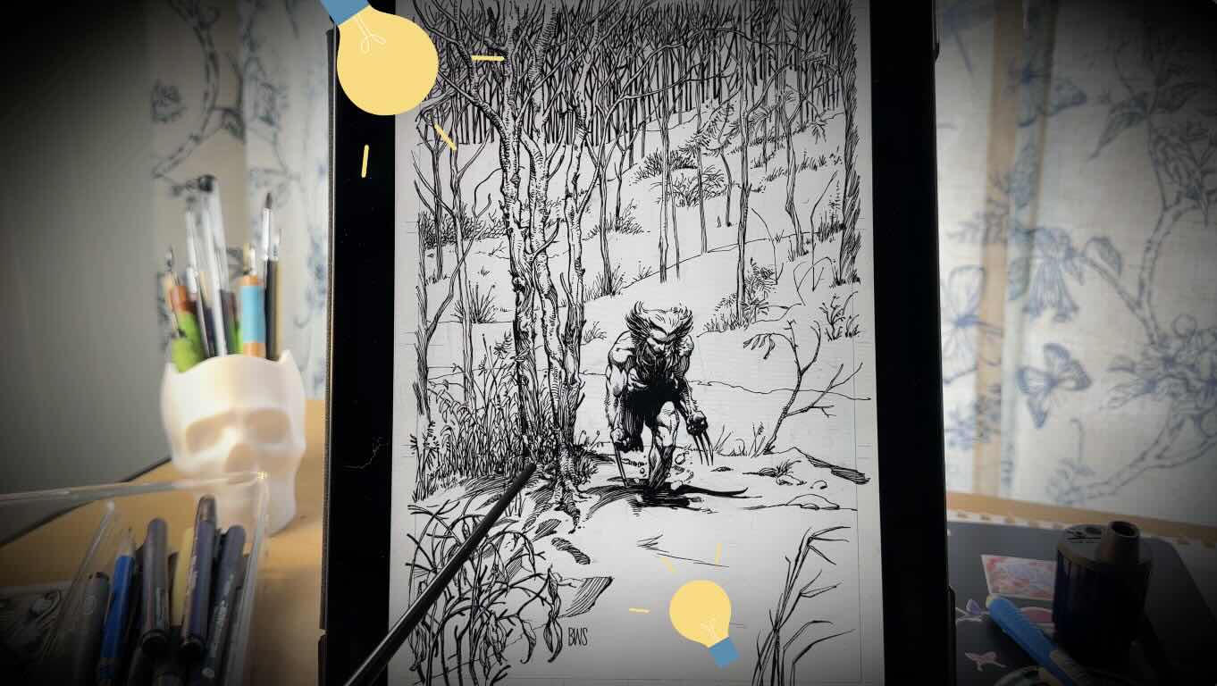
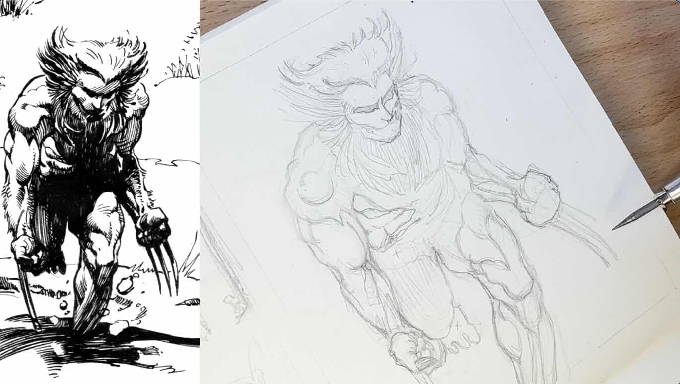
Let’s start by analyzing the Wolverine Weapon-X piece comic book illustration below using my Master Artist Study Observation Checklist. Then we’ll do some exercises.
Observation Guide
Lighting and Shading
Lighting refers to going lighter or the highlight areas. Shading refers to doing darker, or the shadows in a piece.
Values are affected by the light source in a composition.
When analyzing pen and ink artwork, the first and most important step is to locate the light source.
You find the source of light by identifying the highlights and darks on the picture plane.
Look for the high-contrast areas.
The difference between the lightest value and the darkest value is known as the contrast. Where there is the least amount of value. So, black or white.
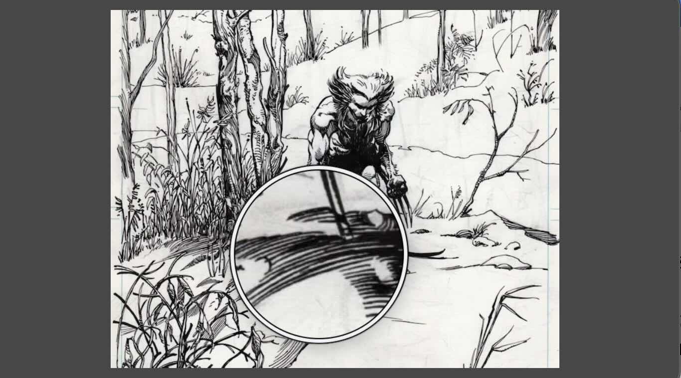
In the illustration below, this would be:
- Highlights: the top of Wolverine’s head, his upper back and thigh
- Shadows: his right foot and leg (viewer’s left)
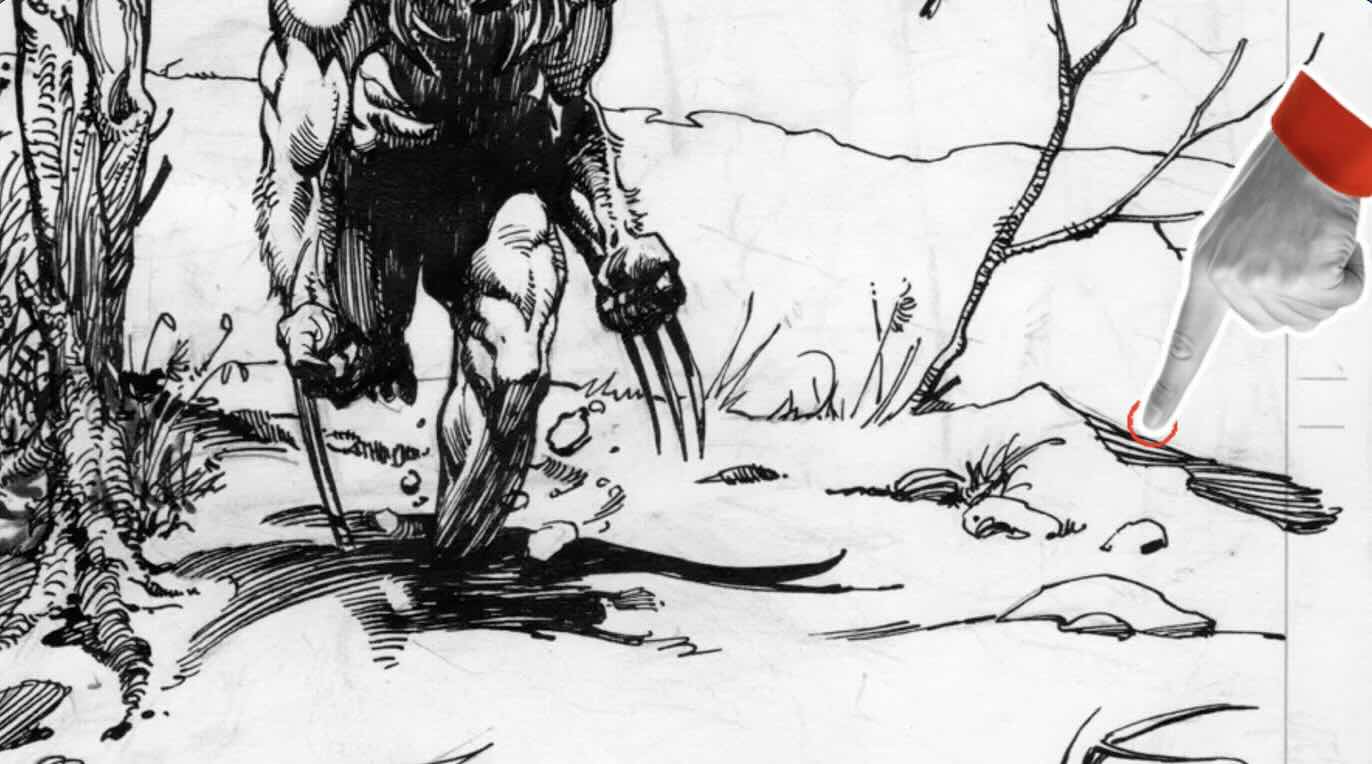
In the zoomed-in image, you can see shadows on the right side of other elements in the scenery.
When drawing an illustration, we first establish the light source. Doing so informs where to place cast shadows and how to plan the values in a composition.
Therefore, finding the source of light when analyzing a piece is also the first step, as this provides insights into how the master made decisions about everything else.
Is there more than one source of light?
There can be multiple sources of light in a composition, such as backlight or reflection, also called a bounce light.
Sometimes there is a significant bounce light in a composition. This reflective effect impacts the values.
To confirm whether there is a second source of light, look for the cast shadows. Cast shadows are typically on the opposite end of the highlights.
The shadows are mostly on the right side of the elements in this composition. This confirms that the main source of light comes from the top left-hand side.
However, we can see a small amount of shading on the left of the prominent trees next to Wolverine. This could indicate bounce light from the snow.
This reflected-light effect is minimal and doesn’t affect the overall arrangement of values in the composition. Meaning, the shadows seem visually consistent and do a good job of framing the main subject.
When you focus on lighting and shading, you can immediately see how master Barry Windsor-Smith created volume, giving form to shapes.
Let’s talk about this composition.
Composition
Composition is the structure of a drawing. In pen and ink, the structure of a composition can be established on the picture plane by organizing the elements or the values, or both.
An effective composition frames the main subject and/or guides the viewer to a focal point.
Once the ‘lighting and shading’ is established, the second fundamental to determine in a composition is the horizon line.
While analyzing a finished piece, locating the horizon line helps to understand how the master communicated a sense of perspective, depth, and scale.
In this illustration, the landscape makes it easy to find the horizon. Which is where the sky meets the ground.
At a glance, the elements on the page seem to line up with a vanishing point towards the center of that horizon line.
From what perspective is the viewer looking at the scene? from above, below, at eye level?
The viewer is looking at this scene from slightly below eye level.
Involving the viewer when structuring a composition is a technique that enhances the narrative, the visual storytelling aspect of a piece.
Knowing the location of the horizon line contributes to more clearly seeing the linear perspective.
Based on the horizon line and the viewpoint, we can then confirm the use of ‘one-point’ perspective.
Also note how the elements get smaller, rendered with fewer details, further in the picture plane.
The master used this effect to create a sense of atmospheric perspective.

How is the composition structured? How is the space divided? And how is the main subject framed in the picture plane – with values or elements?
This is a single question because most masters combine elements and values to divide the space.
You’re likely familiar with the “golden ratio” and “rule of thirds” guidelines to structure elements in a composition.
Such models are helpful when you’re sketching concepts for a layout to test how to best frame the main subject.
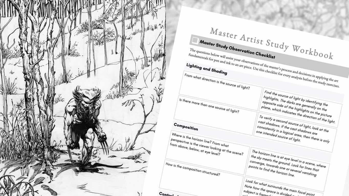
📋 Need a glossary of terms? For definitions and the observation checklist used in this article, check out my Master Artist Study Workbook.
But here we’re looking at a final piece for clues to the structure used.
That structure becomes almost obvious when you shift focus to the arrangement of values.
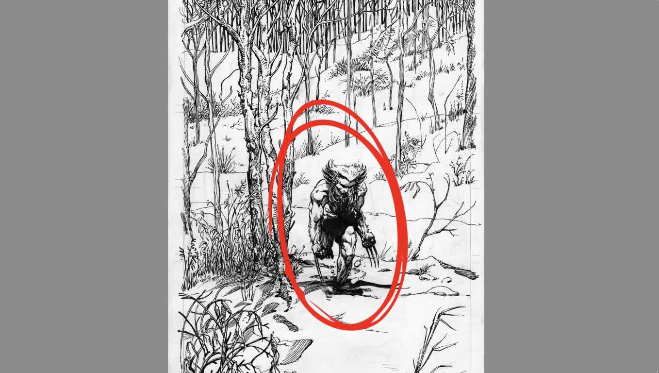
Where do you look first in this image?
The eye first lands on the main character.
Not only because of where the character is positioned in the composition, but because he is:
- rendered in high-contrast tones,
- with bold outlines,
- and framed by lighter values.
As well, the eye is drawn to the character because he’s framed by negative space.
That negative space is then framed by the trees, and then the trees are framed by the surrounding landscape.
There’s also a pleasing assembly of vertical and horizontal lines dividing the space.
This is an effective composition.
Master Barry Windsor Smith succeeded in framing the subject with values and elements.
He also delivers on visual storytelling by leading the viewer to the area of focus, the main character.
In the last section of my observation guideline, we examine the master’s rendering techniques.
Control of the Instruments
Control of the instruments is the ability to manipulate different inking tools to achieve desired effects convincingly, using mark-making and rendering techniques.
What techniques were used to build values?
The master used line quality. So, different line weights to build values. He varies the spacing between strokes to transition the tones.
There is a lovely use of edging. Edging is the transition of boundaries between elements or values
Hard edges are closed contours.
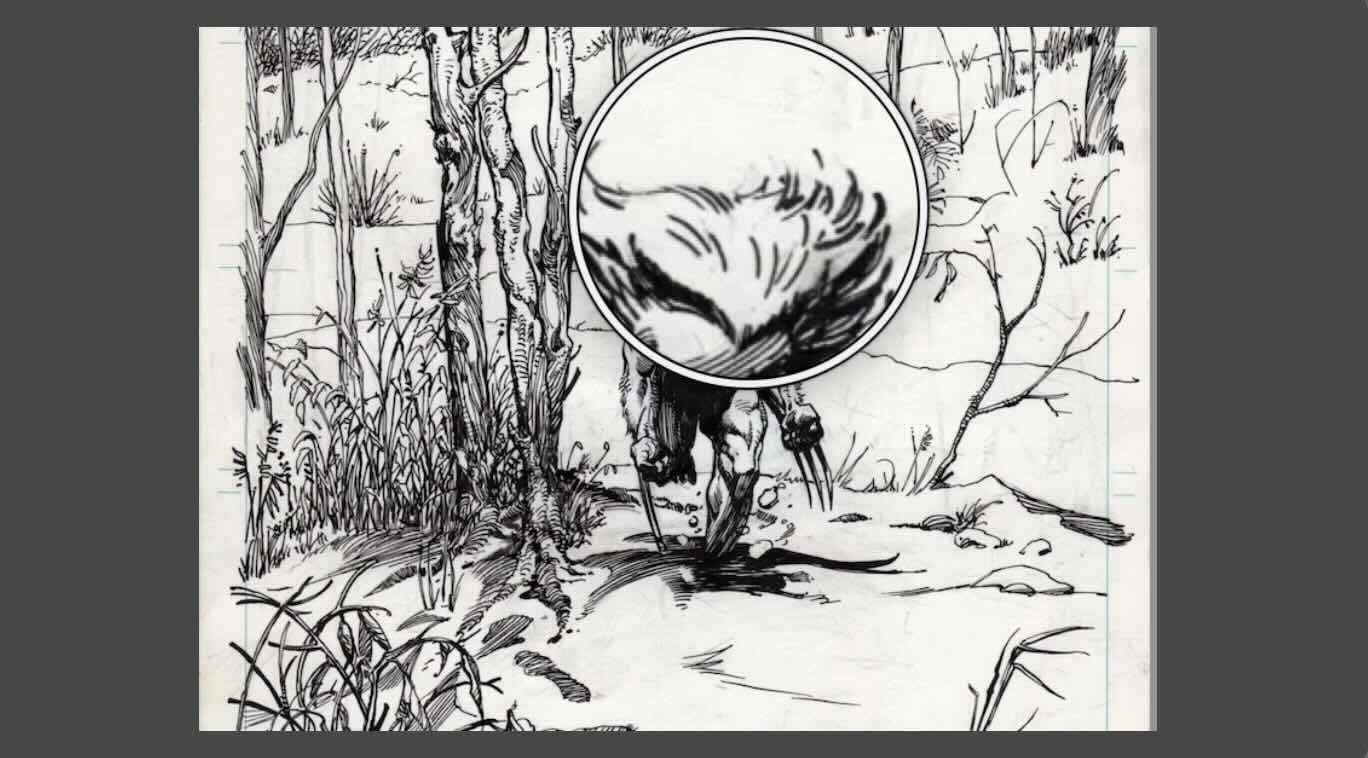
Note the shadow in the snow cast by the main character. It has a hard contour edge transitioning to a soft edge with a linear gradation.
There’s also the use of implied edges.
The implied edges are seen mostly on the open gaps in the character’s hair. Both on his head and arms. In the landscape, there are implied lines where the organic elements come out of the snow.
Compare the implied and soft edges to the hard lines across the horizontal planes of the landscape.
Does the master use mostly lines, cross-hatches, or any unique textures?
Barry Windsor-Smith is known for his texture variety.
When you zoom up close, the marks appear loose and gestural. When you zoom out, those marks suddenly transform into polished and intentional lines.
Otherwise, he uses more of a freestyle method of rendering.
Freestyle is a combination of varied methods of mark-making, for example, loose brushwork mixed with repeated hatch patterns.
He cross-hatches when appropriate but otherwise builds tone through the mixed methods.
Observation alone is not enough for a comprehensive sense of the rendering techniques used in a masterpiece. We need to experience it first-hand to get the full benefit.
Let’s check our analysis by doing study exercises.
Study Exercises
Exercise I – Lighting and Shading Values
For more insights on lighting and shading, let’s count the values in the illustration.
We have white, black, then nearly black, then dark grey, then slightly lighter grey, and maybe one or two more lighter tones, to white.
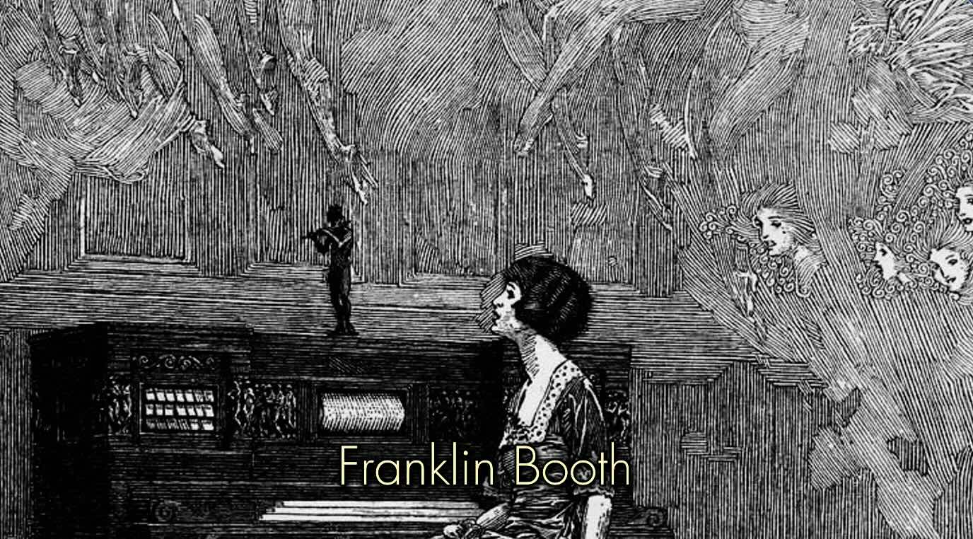
That makes around 6 values, potentially 7 values, which is a standard amount for a pen and ink piece. Unless you’re Franklin Booth, then we’d be looking at 9+ values.
💡Tip: For master studies, I use a dedicated sketchbook so my exercises are saved all together. This makes it easier to monitor progress and keep track of lessons learned over time.
My preference is a Moleskine Art Sketchbook because the high-quality paper allows for a wide range of mediums, and also its robust construction ensures preservation of the art. Plus, it travels well.
In my Moleskine sketchbook, I divided the page in half for the exercises.
On the edge of the left-hand side, in pencil, I’ve sketched a 7-value scale but saved space at the bottom of my scale, in case there’s more than seven.
We learned a few things using the observation checklist. The objective of these exercises is to:
- confirm our observations, and
- gather additional insights
I’m 99 percent sure that the master used a brush to render this piece. If you’re confident with a brush or brush pen, then go for it.
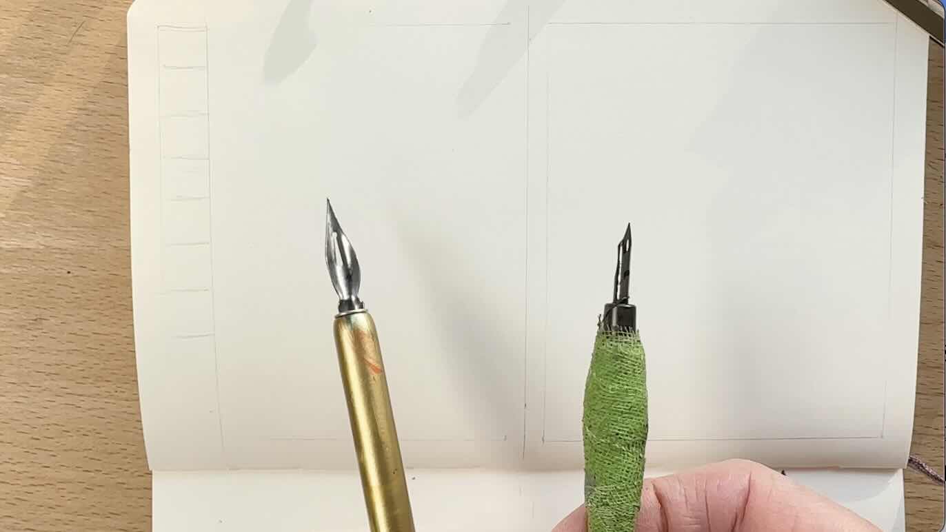
I’ll be using two sizes of dip pens for these exercises.
The first box of the values scale is left white. This is value number one.
Next to white, look for the next lightest value in the image, value number two.
Keep searching for values in the illustration, repeating the process to complete your scale by transitioning the tones from white to black.
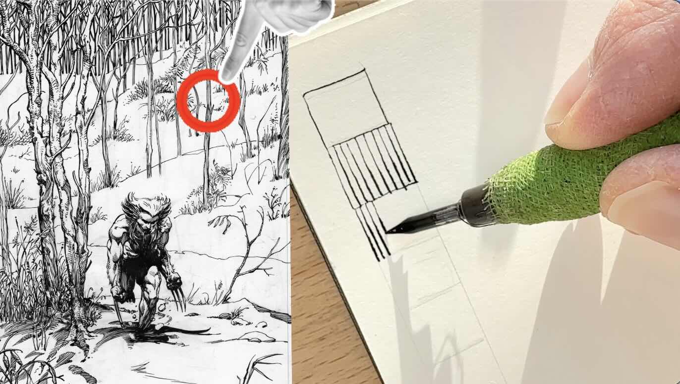
I’m opting for vertical parallel strokes to render my values because that’s what I’m noticing more of in this illustration overall.
With a Speedball Hunt 102 crow quill, I’m using pressure on the nib to produce thin-to-thick marks and more closely mimic the master’s brush strokes.
For value number three, look for the next darker tone. To darken the value, render strokes slightly closer together, to match the same tone as the elements in the illustration. Such as the skinnier trees in the background
Next value, the thicker trees next to Wolverine, and some of the shading on his face and upper shoulder.
I’m increasing the pressure on the nib to create a bolder line as I bring strokes even closer together.
Next darkest is the shading on his face, the shaded bicep on the viewer’s right, and the rendering on the legs.
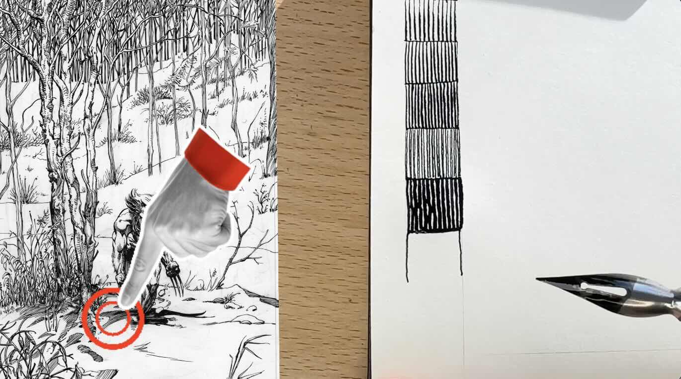
Then the tone transitions to thicker strokes, on his cast shadow and at the bend in the torso – also the shading of the nearby trees.
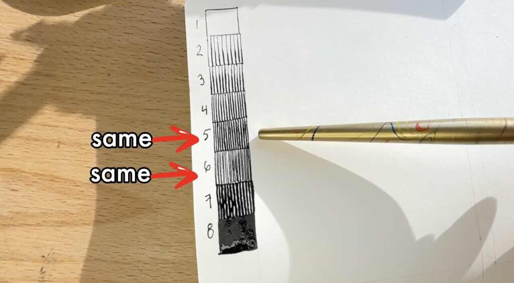
Zooming into the image, it looks like the master doubled the line to thicken the strokes rather than opting for a thicker brush.

The double line gives a rich effect. It’s very close in tone to the value I rendered above it, where I instead used a single thick stroke.
I see one more transition after that before solid black. This value would be for the bolder lines in the cast shadow and anywhere that is not completely black.
I count eight values on my scale, though arguably numbers five and six visually hold the same tonal value, so end with seven values as initially observed.
In the next exercise, we can arrange our values into the composition to better understand its structure.
Exercise II – Composition with Values and Elements
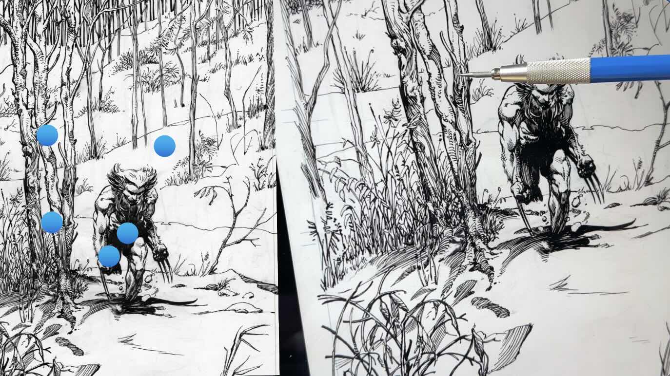
To learn more about the composition, I did a mini thumbnail sketch in pencil of the entire layout.
The objective was to capture the main elements on the picture plane. This is a quick five to ten-minute doodle to map the illustration as a simple outline. No details.
This is where we pay close attention to the arrangement of values.

Still in pencil only, I matched the values from what we observed in the analysis to my value scale exercise.
It’s best to block in the values from dark to light, using the same line direction as the master.
Optionally, you could use an inking tool for this exercise. But inking a doodle is unnecessarily time-consuming. Your aim with this exercise is to get a snapshot of how the master arranged the values, which is directly achieved in pencil.
With the values in, we also get a clearer visual of how the master framed the character with the spacing of elements, as we observed in the analysis. (See thumbnail example pictured further down the article).
Let’s take a look at the rendering techniques by doing a mini sample study.

Exercise III – Mini Sample Study
For the mini sample study, I’ve cropped a section of the illustration as the reference for this exercise.
In pencil, loosely sketch the underdrawing to establish the positioning and proportions. Refine the details, then remove any excess lines and graphite from the drawing surface. I use a Faber-Castell kneaded eraser for this.
Proceed to the ink application. Refer to your values chart and the master reference to render your sample. I’m inking with Speedball Super Black India Ink.
Benefits of a Mini Study
There are several benefits to keeping your study sample small.
You could copy the entire illustration, granted, it would be unnecessarily time-consuming.
A great piece like this, from start to finish, rendered using dip pens (or brushes), likely took the master anywhere from four to seven hours.
Executed at top effort, the entire piece would take me ten+ hours. That’s time and energy I would prefer to invest in my original work.
It’s more efficient and less daunting to do a mini study of key sections of a masterpiece.
The learning insights from doing a mini are just as valuable as slogging on a full masterpiece.
The reality is that we’re making a copy of someone else’s work for educational purposes, so why not invest our art time wisely?
My advice is to crop sections that will provide the best learning opportunity. Not the easiest parts of the artwork.
Aim for a balanced effort. Keep it challenging yet achievable, and finish on a high note.
The purpose of the study is to:
- get a better feel for the master’s technique
- confirm observations from the analysis
Is there something you’re aiming to improve? Approach these studies with either specific objectives or for general exploration.
A general exploration is to discover something that you didn’t know you needed to work on, until after doing a master study. You’ve uncovered a specific objective as a result of your studies.
For example, as a result of doing the values scale exercise, I became intrigued by the double-line technique used by master Barry Windsor-Smith.
I noticed this technique used by other masters such as Bernie Wrightson and Franklin Booth. I’m now keen to explore this further as an objective in future studies and projects.
📖 Read “Improve Pen and Ink in Two Ways” to learn about doing master studies based on specific or general objectives.

Learning Reflections and Application
To make the most of your study time, it’s critical to take reflective notes afterwards.
Some guiding questions could be:
- What were the top three things you learned in today’s study?
- How will you apply this information to future projects or subsequent studies?
The study is incomplete without reflecting on it.
Most of us need to apply what we’ve learned immediately in order to retain it. At least if it’s written down, we can look back to help track our progress and adjust objectives.
For example, maybe you’ll consider doing a values scale and sample study to plan the composition for your next project.
Master Artist Study Course
If you enjoyed this article, then you’ll love my Master Artist Study course!
It’s a step-by-step process to study the works of master artists. By the end of the lessons, you’ll have created a custom learning guide so you can confidently progress to more advanced projects.
🎓 Visit the Courses Page for all the details!
It’s available on two types of learning platforms, or if you’d rather just get the workbook, it’s available on my website. The workbook comes free with the course (so don’t purchase both).
I encourage you to continue exploring the works of master Barry Windsor-Smith.
Thanks again for your continuous support. For more practical tips and art, check out my:
Resources
📗 Books ↓↓↓
- BWS Wolverine Weapon X
- BWS Opus Vol.1
- BWS Conan Vol.1
- 🎥 Watch Barry Windsor-Smith’s Wolverine on YouTube
🎓 My Courses ↓↓↓

✒️Tools ↓↓↓
Staedtler Rotary Lead Sharpener