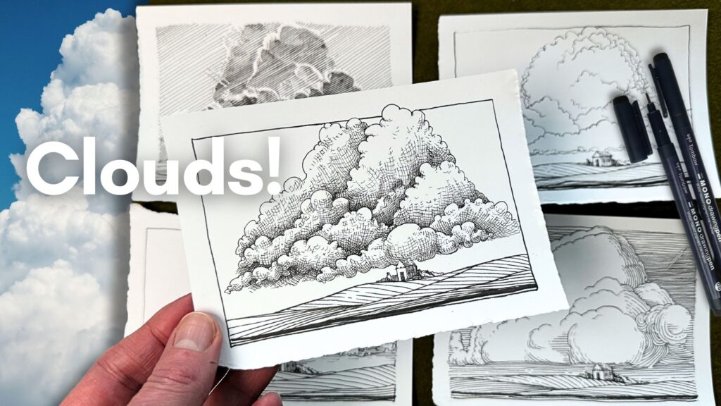
The trick to drawing attractive clouds with pen and ink is:
- Shape design, and;
- Understanding how light affects form.
In this article, you’ll learn why clouds need a different drawing approach, and how five iconic ink masters construct clouds with pen and ink in a composition.
How to Draw Clouds with Pen and Ink
// DISCLOSURE: This post contains affiliate links. View the Terms for more information.
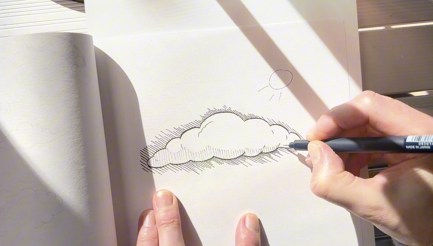
When you draw a cloud from memory, it probably looks something like the image below.
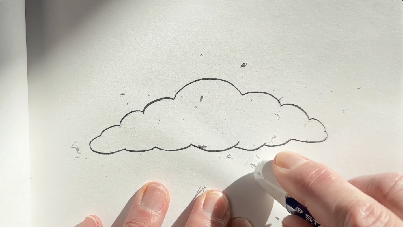
That’s because that’s the universal cloud shape we’ve seen since childhood, so we know it by heart.
A basic, but effective design.
It’s effective because we immediately know what it is.
Shape is the most important fundamental to get right when constructing a cloud with pen and ink.
Cloud Construction Fundamentals
There are three key fundamentals for constructing realistic clouds:
- Shape
- Shading
- Style
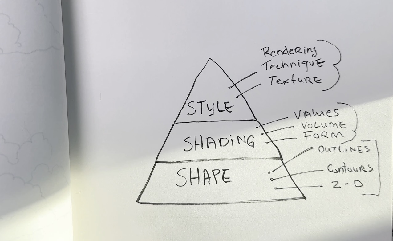
Shape
Shape is what helps define the subject.
You can define the shape using an outline. The outline is like the cloud’s container.
Investing time in studying and practicing the shape of clouds will reap the highest return for your efforts.
Shading
Rendering tonal values to a shape is what gives that shape its form.
By shading the shape, the cloud becomes 3 dimensional.
Shading has an important role because, in reality, there are no outlines around the cloud. It’s the contrast in values that our eyes perceive as an outline.
Style
Style is the technique used to render the shape and shading of a drawing.
Understanding Your Subject
Clouds are challenging to render with pen and ink because of what they’re made of.
Understanding that your subject is transparent and in constant motion will help you decide how to render it.
How light interacts with clouds affects the form of what we see.
If clouds were a solid object, it would make sense to shade the area that is furthest from the light, like the image below.
Except the light shines through clouds and bounces around in there.
The darker areas that we see on a cloud are cast shadows from the overlap of clouds layered over one another.
Therefore, a cloud will look more convincing when you apply slightly different principles than for shading a solid, static object.
That’s why the illustrations below are so mesmerizing.
The masters obviously studied clouds and understood the subject that they were creating.
The more we understand the subject, the better we can describe what we’re seeing visually in a drawing.

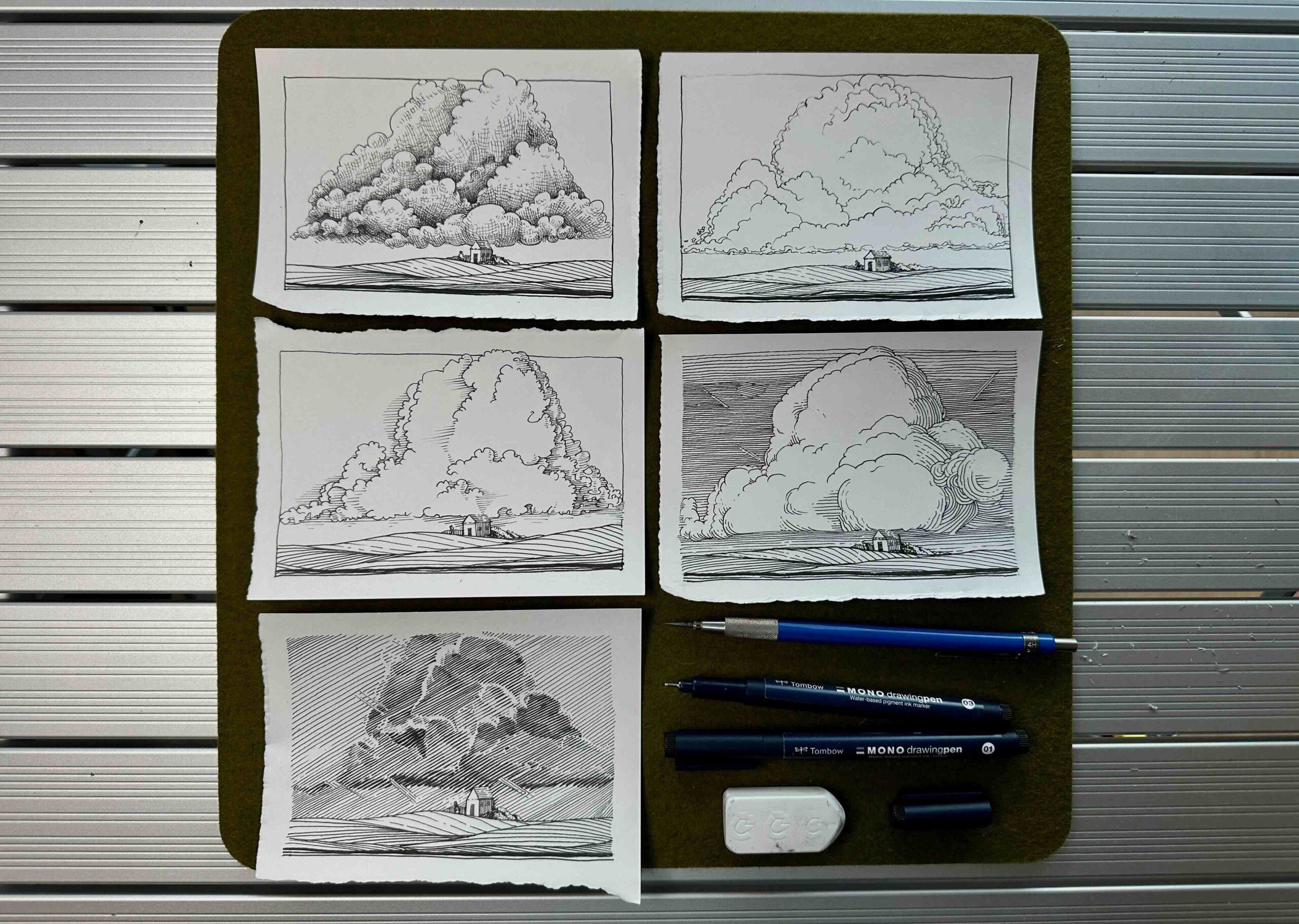
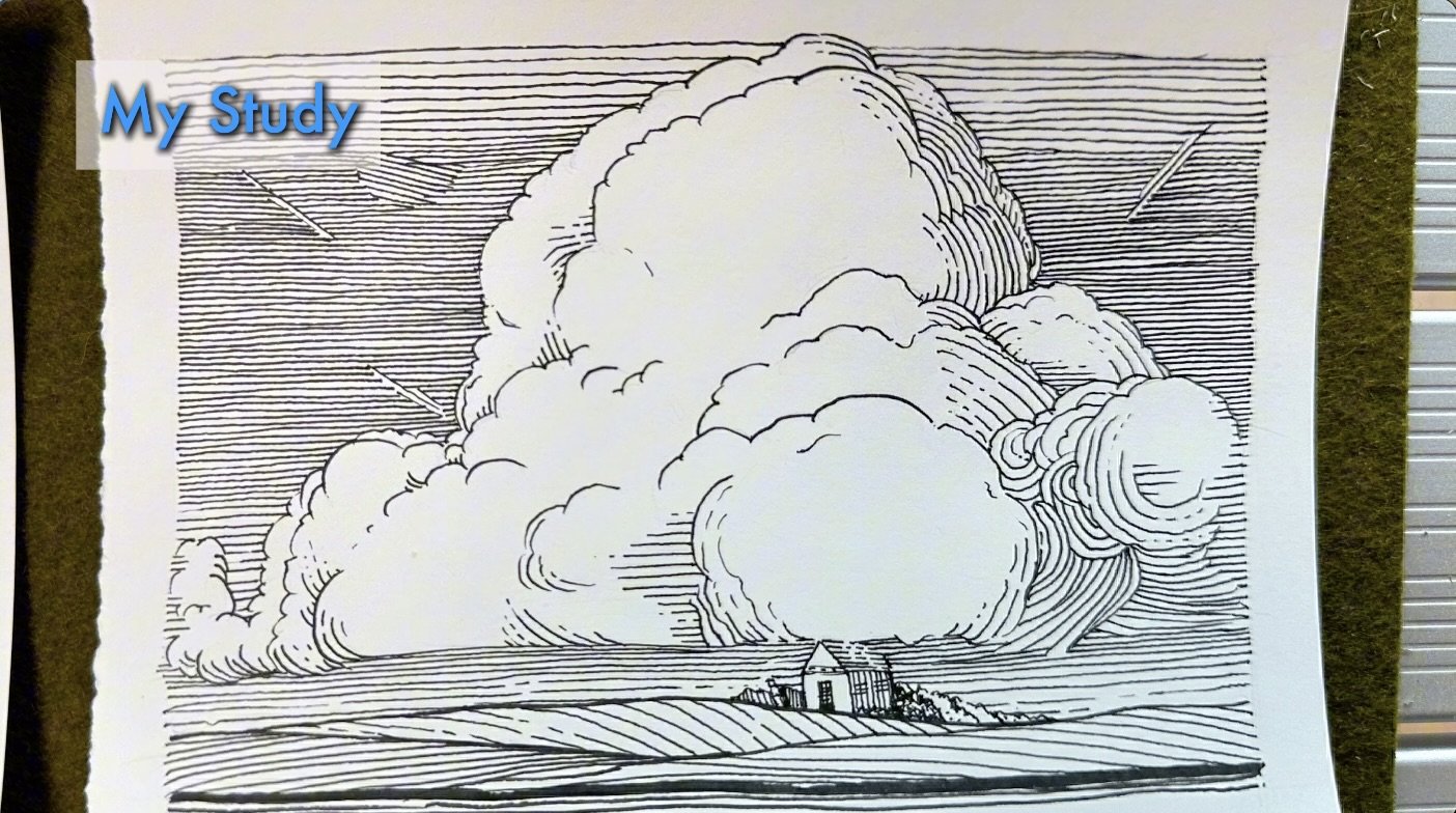
Cloud Construction Practice
Earlier you saw a cloud drawn from memory. Now let’s draw one from reference using this copyright-free photo.
I found two ways that work well for sketching cloud formations in a composition.
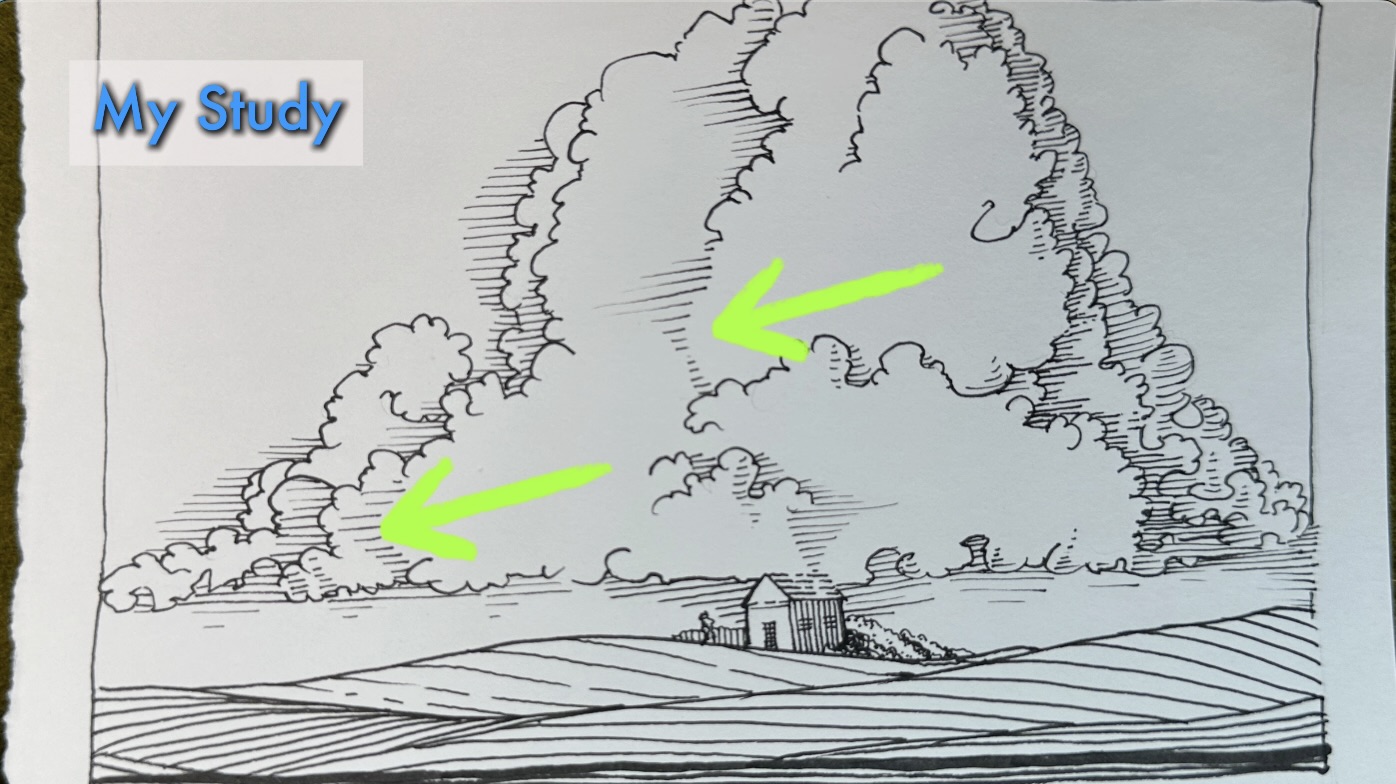
You can start with the larger general shape, sketching the entire cloud formation, then separating its overlapping clusters with contour lines. So, going from large to small in the composition.
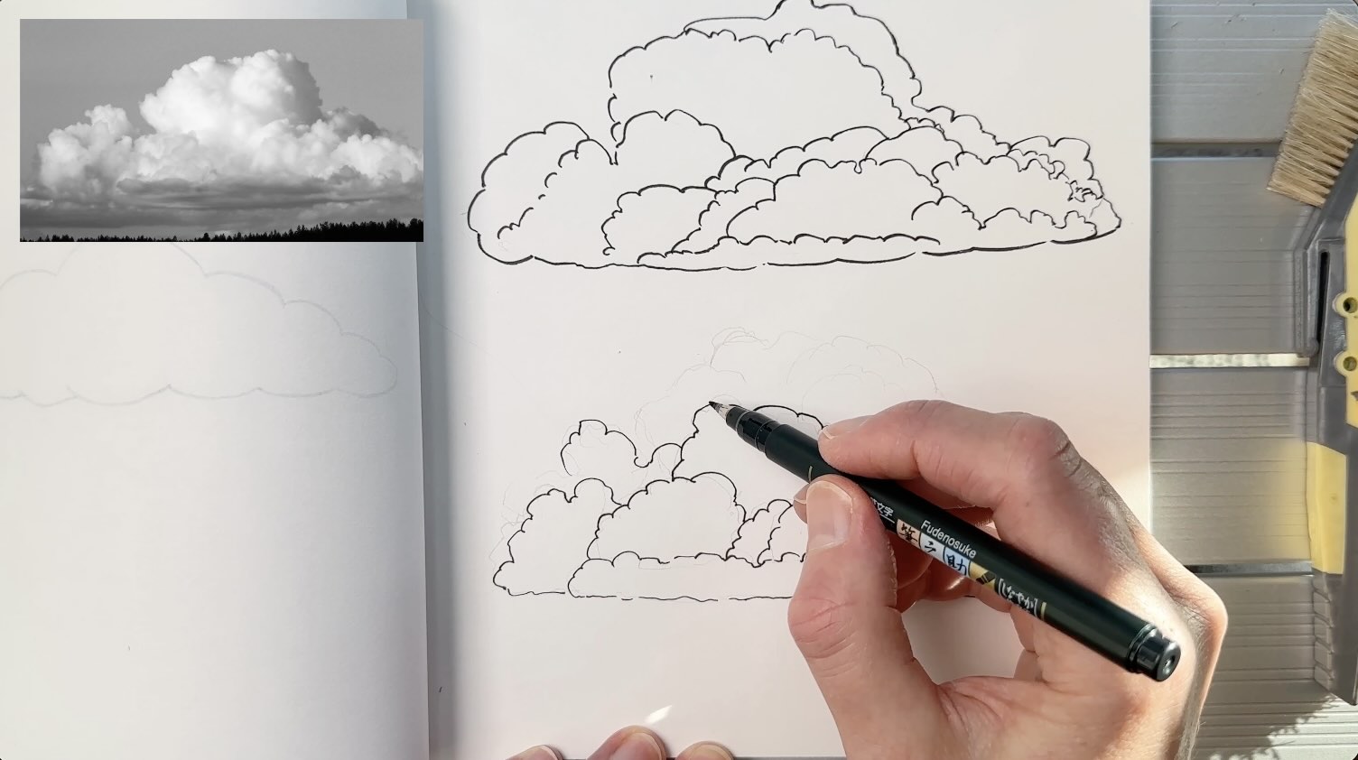
Or you can sketch the shapes in the foreground first, then add the layers behind to complete the cloud formation. So, going front to back on the picture plane.
Use whichever method seems more natural and gives you the most realistic result. Next, we’ll look at rendering styles for inking our clouds.
Rendering Techniques
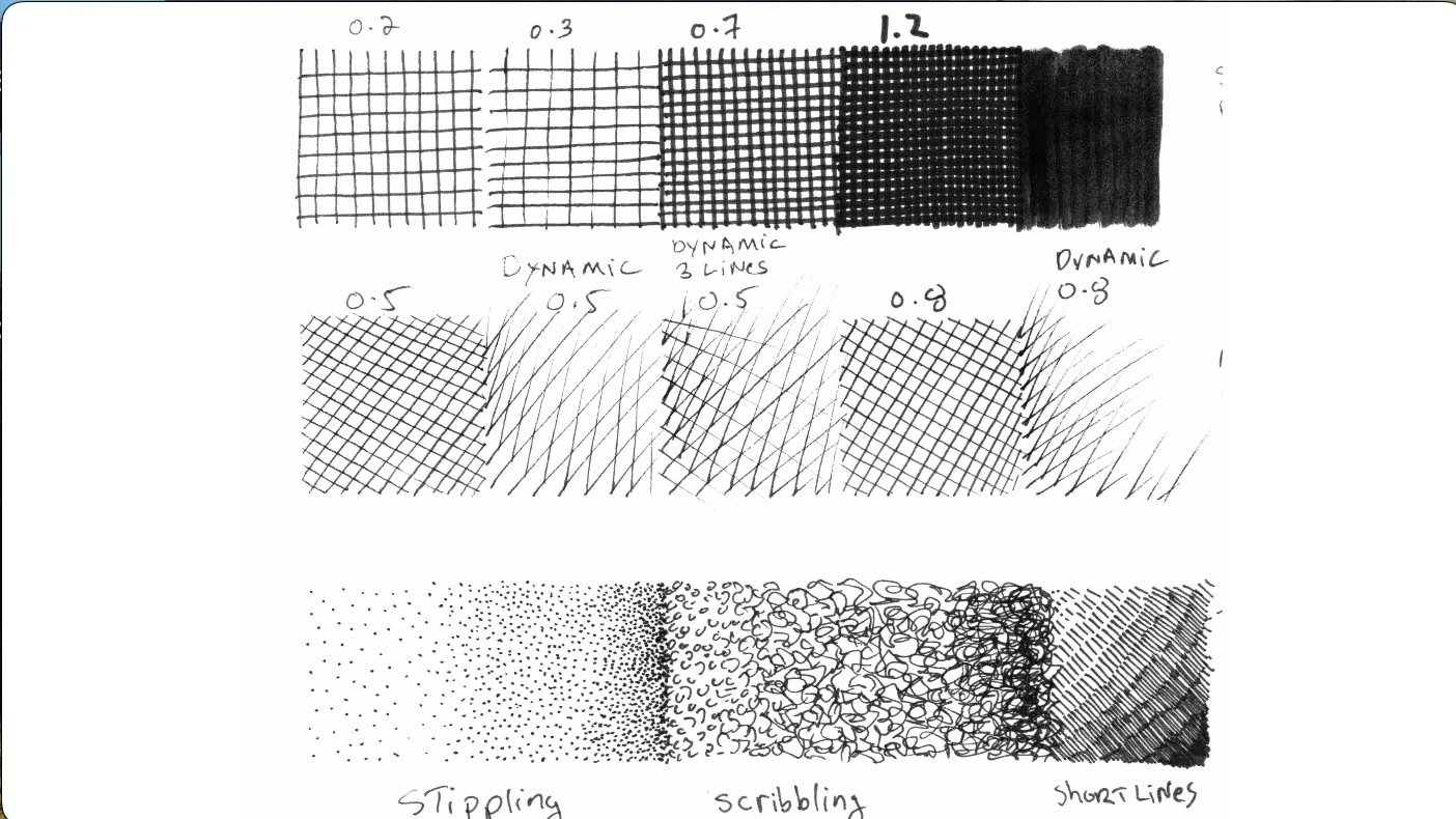
From cross-hatching to stippling, there are many possible techniques for rendering clouds.
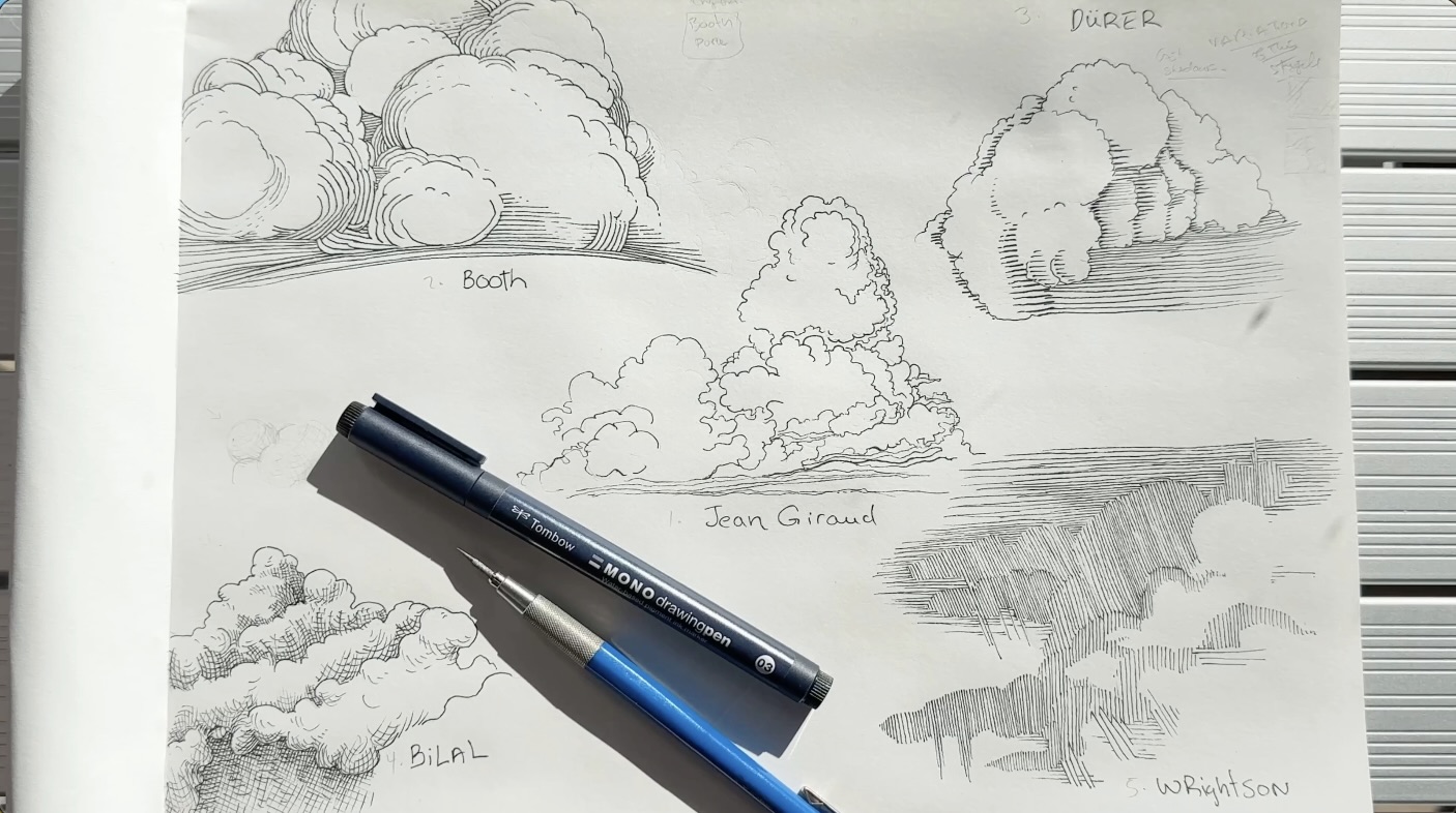
For guidance, I analyzed iconic cloud styles from these five masters:
- Jean Giraud (Moebius)
- Franklin Booth
- Albrecht Dürer
- Enki Bilal
- Bernie Wrightson
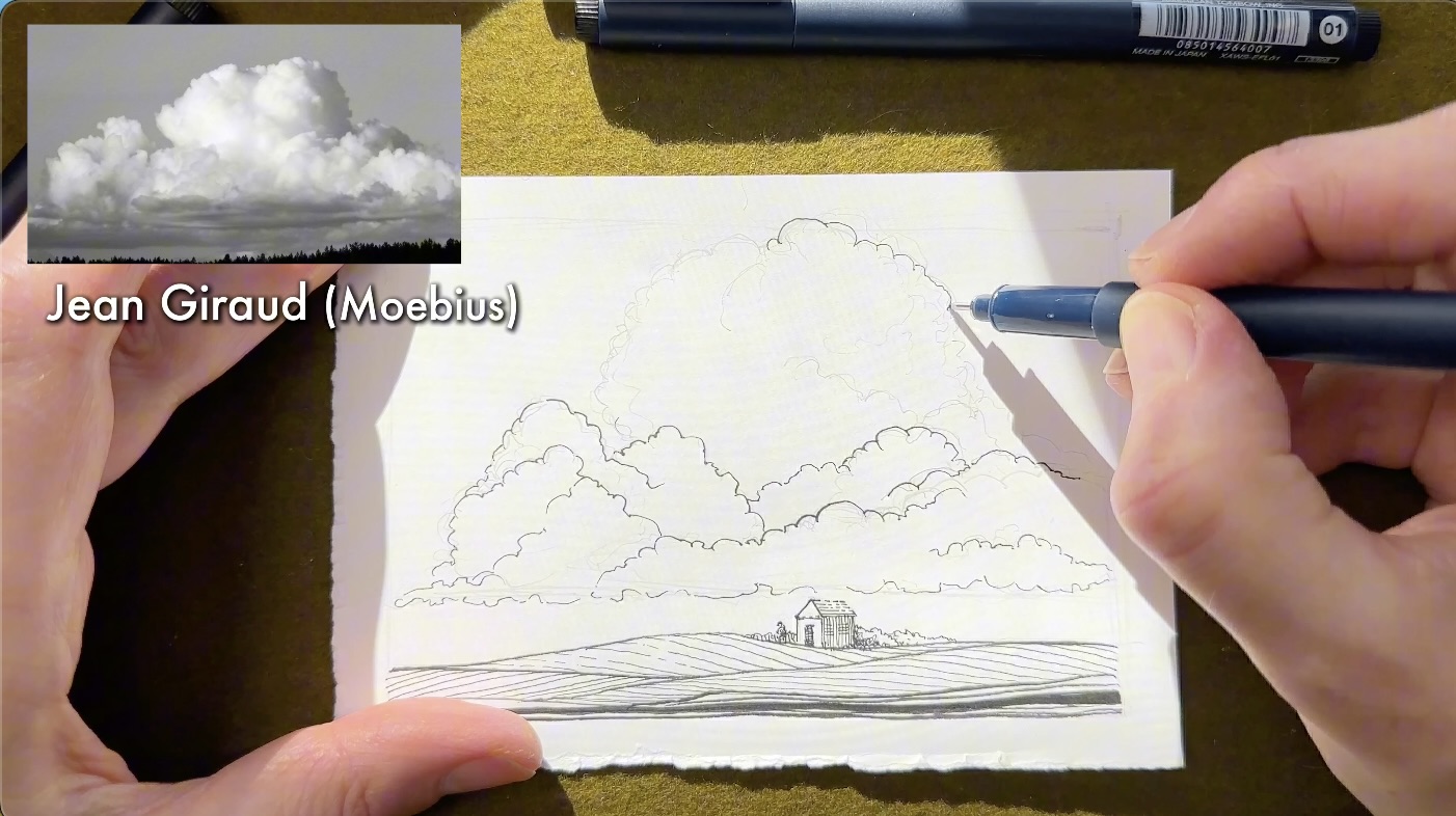
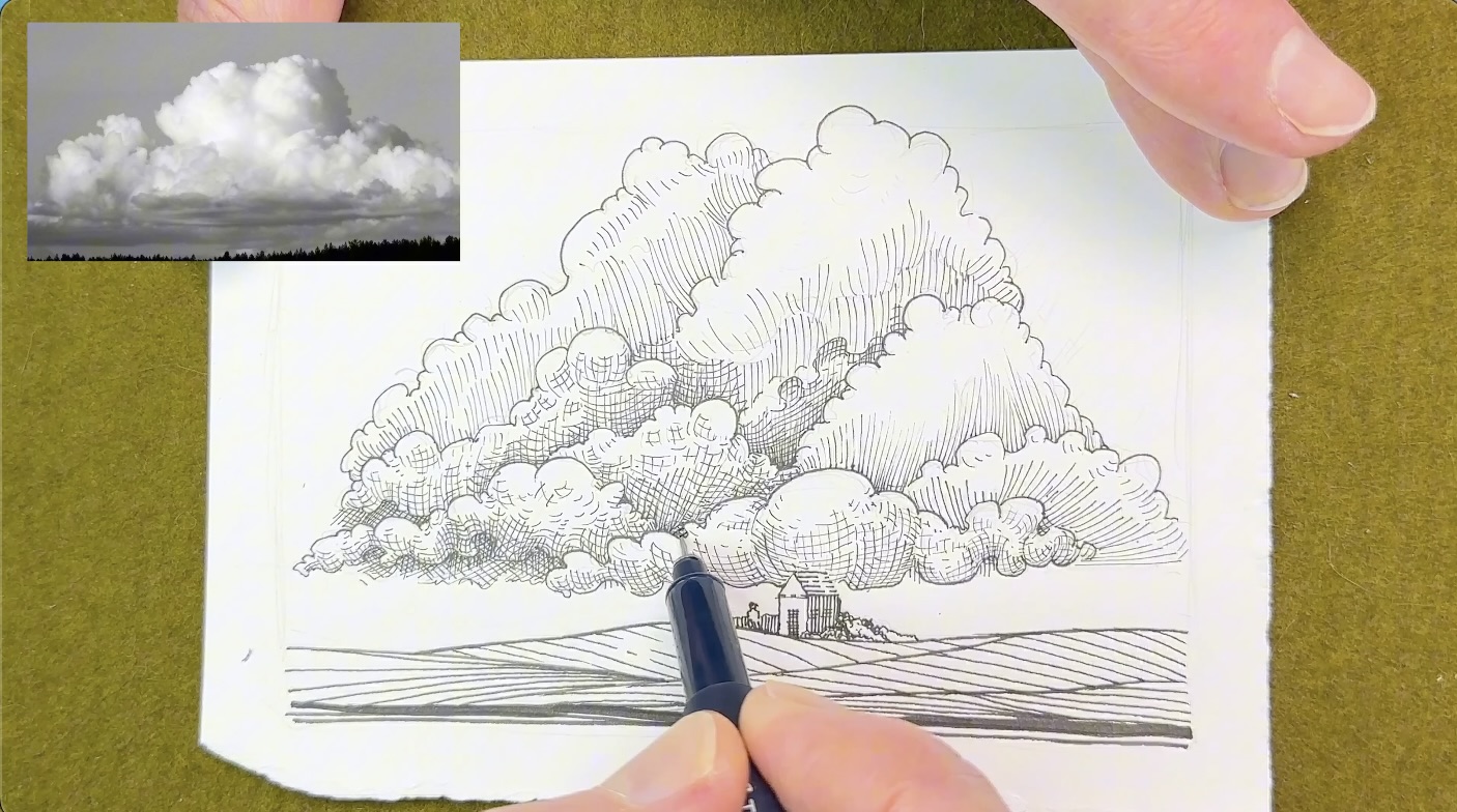
Jean Giraud (Moebius)
I sketched the composition using my preferred construction method, I like drawing front to back on the picture plane.
Master Giraud communicates a lot of information with just an outline, so the success of this drawing relies on effective shape design.
He doesn’t use values (shading) to create depth, instead, he builds volume by increasing the number of strokes. The increased strokes visually describe the overlapping of clouds.
This technique implies more clouds are visible because less light can shine through in that area.
The darker areas show details and the lighter areas have less rendering or none.
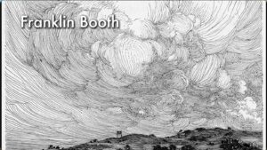
Franklin Booth
Master Booth also applies those principles of outlines and tight overlaps to create depth, similar to Master Giraud.
Plus, Booth introduces values. His shading technique combines parallel and contour lines that follow the form.
He controls the spacing between strokes to create tone, and sparse rendering in the highlight areas.
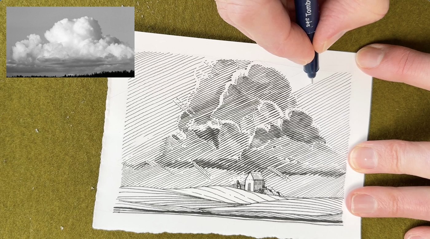
Albrecht Dürer
Master Dürer’s rendering technique makes it more obvious how the light is reflected, and the clouds cast shadows on the layers beneath.
Dürer uses even-spaced parallel strokes to build values.
Plus, he introduces the ‘missing edge technique’ where there is no outline at all. The values around the shape of the cloud act as contour lines.
Enki Bilal
Now’s where it gets interesting.
Master Bilal uses all of the techniques shown in the previous compositions, plus he introduces curved hatching.
The curved hatches both follow and cross the form. The curved, crossing strokes give us very dynamic cross-hatching.
Bilal emphasized cloud movement and how light and shadow affect their form.
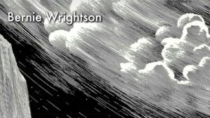
Bernie Wrightson
For our last study, Master Wrightson takes a different approach.
Because, in reality, there are no lines around the clouds, he removes outlines altogether.
Wrightson uses shading alone. It’s the contrast in values that defines the shapes in the sky.
He grades the values by careful line placement and varying the tone through line quality.
Line quality is the weight of each stroke. So, for darker values, Wrightson uses thicker lines. For lighter values, he draws thinner lines, spaced further apart.
In my opinion, Master Wrightson’s style is the most complex to study because of its abstract quality.
Even though his illustrations are highly detailed, the information he communicates with strokes is only inferred. It is up to us, the viewer, to complete the image in our minds.
That wraps up our cloud studies.
I hope you enjoyed these tips on drawing clouds with pen and ink, why they need a different approach, and how the ink masters render clouds in a composition of their style.

All your master study videos and the basics (how to hatch in 10 ways, etc) and so informative! Thank you for making them.
Can irequest you to share the links for the master photos references, would make it easier to download and follow along.
Good suggestion to share the references, I’ll aim to include those in future articles.
Oh sorry and forgot to add – moebius also did some really dynamic clouds with amazing depth! – https://in.pinterest.com/pin/538039486729737374/
Very interesting! Thank you ! 🙏 ☺️
My prompt today was clouds. I’m so glad I found your work to help me grow. Thank you for this.
That’s great to hear Lorna! All the best with your projects!
So helpful! Thanks a lot!