Practicing how to shade flowers in pen and ink is a handy skill because florals can really enhance your compositions.
//DISCLOSURE: I earn a small commission when you use my affiliate links to make a purchase. Read the Terms page to learn more about my affiliate partnerships.
How to Render Florals with Pen and Ink
Join me as we apply the principles of shading in pen and ink to three types of flowers.
You’ll find additional resources and a list of the tools I used in this tutorial in the resources section at the bottom of the article.

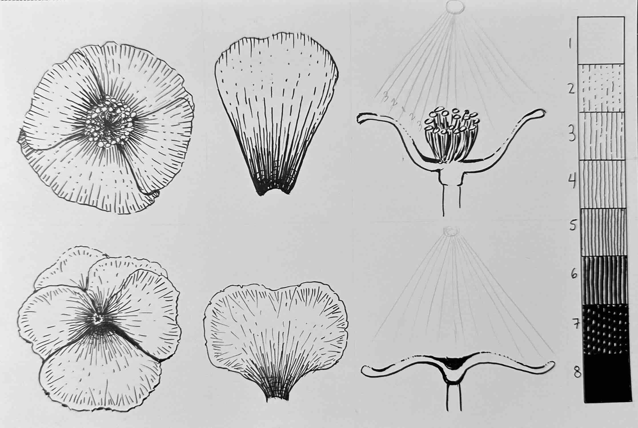
Poppy Flower
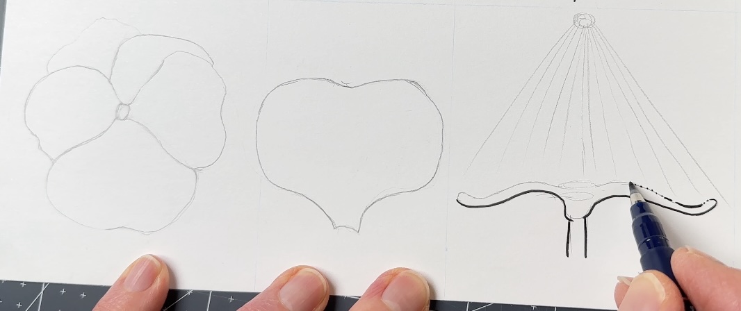
In pencil, draw a circular shape. Divide it into four from the centre circle. Round the corners of the top two opposing petals. Then draw the other two petals slightly larger and tucked underneath.
Now your poppy has a shape. You’ve successfully constructed your subject.
Do not jump into shading just yet.
First, we need to understand the flower. Why? Because of the line direction.
We use line direction to shade the flower. And we want that shading to describe the form in three dimensions.
So imagine the poppy from the side view with the sun shining above. To shade it based on that source of light, you’ll want some grey values.
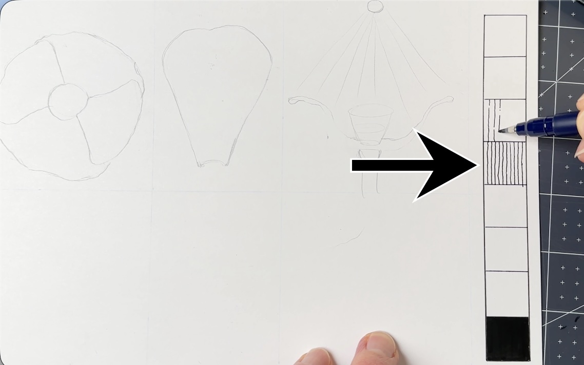
Create a values scale with eight levels from solid white to solid black.
In the middle of the value scale is 100% grey, level four tonal value.
Think of this middle-value as the local colour. So if our poppy is red, the middle grey value represents 100% red.
The closer to the light, the less intense the shade is – since we’re working in black and white, our 100% grey fades to white. The furthest from the light, the darker the values.
Apply those same levels of grey from the value scale to the shape of your flower using the value levels.
The side-view diagram becomes your guide. It shows where there’s more or less light hitting the subject based on the shape.
- Closer to the light = lower grey level
- Middle or flat = 100% grey, local colour
- Furthest from the light = higher grey levels to black
Now you know how to distribute the greys on this petal to give it form. And you shade it using line direction, strokes that follow the form to give it volume.
The volume, which is the illusion of depth and dimensions, becomes more obvious when you put the petals together.
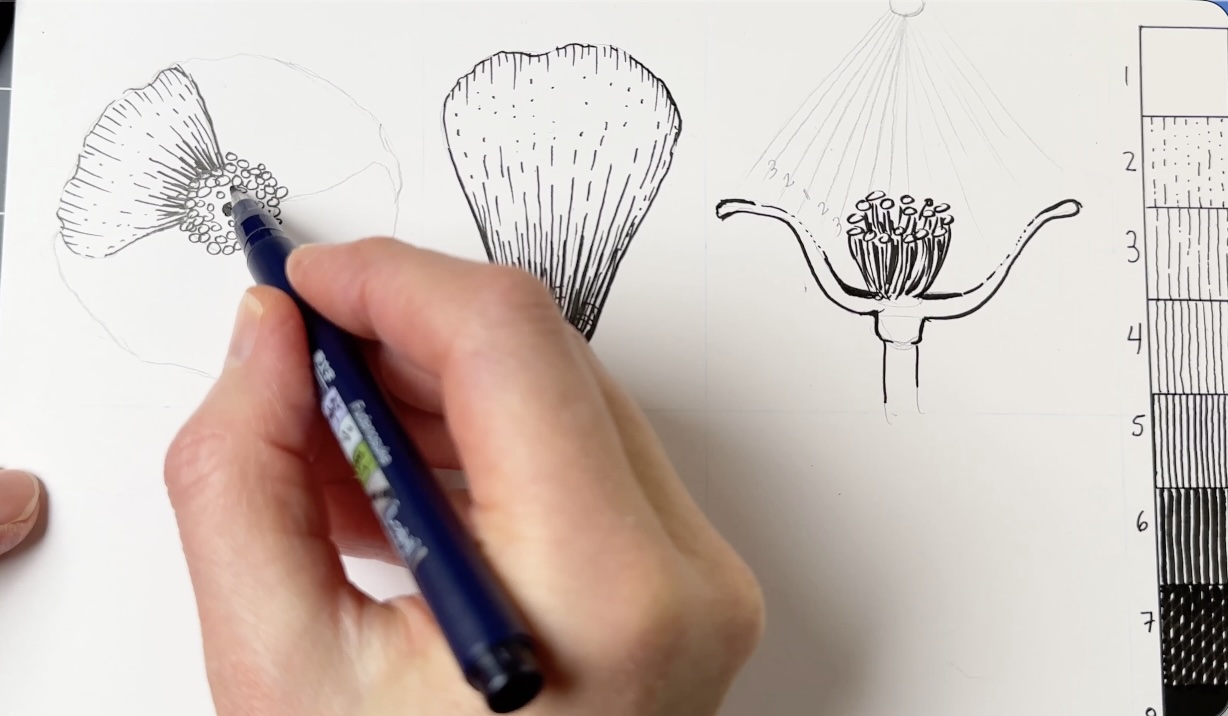
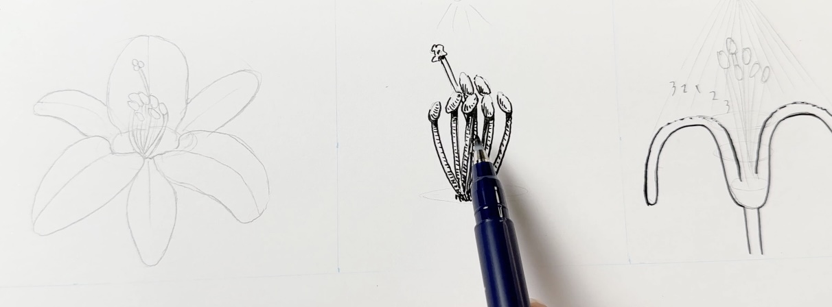
Let’s add the stamen. From a side view, might look like the side-view diagram above in relation to the source of light (the circle at the top with the sunshine rays illuminating the flower diagram).
From the top view, we can assume there’s less light coming through from between the stamen bunch. That means solid black and nearly black at the bottom of the stamen bunch and in between.
We can see in the side view that the tips of the petals curve away from the light, and that’s why the hatch marks go all the way to the edge.
The flower is concave like a cup. At the bottom of this cup, the stamens are tightly gathered, receiving the least amount of light.
Next, we’ll follow the same steps with a pansy flower.

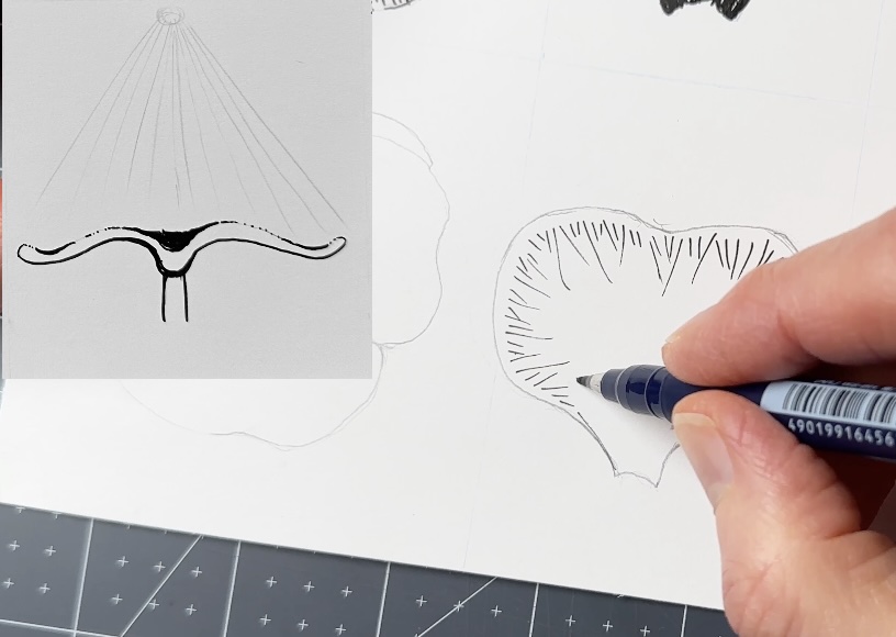
Pansy Flower
Let’s build on the concepts we just reviewed with this next pansy flower.
The pansy petals overlap; they’re staggered in sort of a windmill formation.
Individual petals are similar to a heart shape.
The side view petals are more open than the previous flower; they’re floppy. And we can assume that the concave parts are further with darker values.
Note how this side-view diagram is different from that of the poppy flower.
To render the individual petal in ink.
There’s three things to note here:
- First, observe in the side view how the outer edges of the petals are lighter. That means the hatching doesn’t go all the way to the outer outline.
- Second, I’m now using a pattern for the hatch marks to simulate a texture.
- And thirdly, I’m again following the general form of the petal with line direction.
The centre of the pansy has the darkest values.
There are more layers to this flower design, more petals that overlap. Which means we’ll use lighter hatch marks for the petals tucked behind.
So far, I’ve said, lighter hatch marks give you a lighter tone of grey.
A lighter tone of grey is used to describe parts of the subject or areas of the drawing that are closer to the light source.
A lower grey value could also mean a lighter local colour. For example, if the flower has a soft pink mixed with a deeper red.
With pen and ink, in black and white, lighter marks combined with fewer details definitely mean distance.
So, for the petals that are further from the viewer, we’ll use lighter marks and fewer details to create a sense of depth.
This is referred to as atmospheric perspective.
For the flower parts that overlap on top and that are closest to the viewer, use a thicker outline.
This is referred to as line quality when you use thin and thick lines.
For the pansy flower, we’re using line quality to describe atmospheric perspective.
Let’s build on these concepts so far with a lily flower next.
Lily Flower
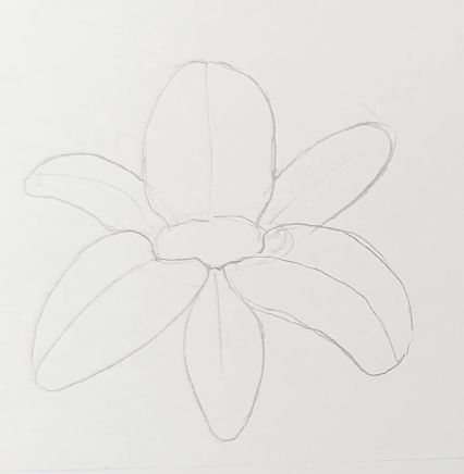
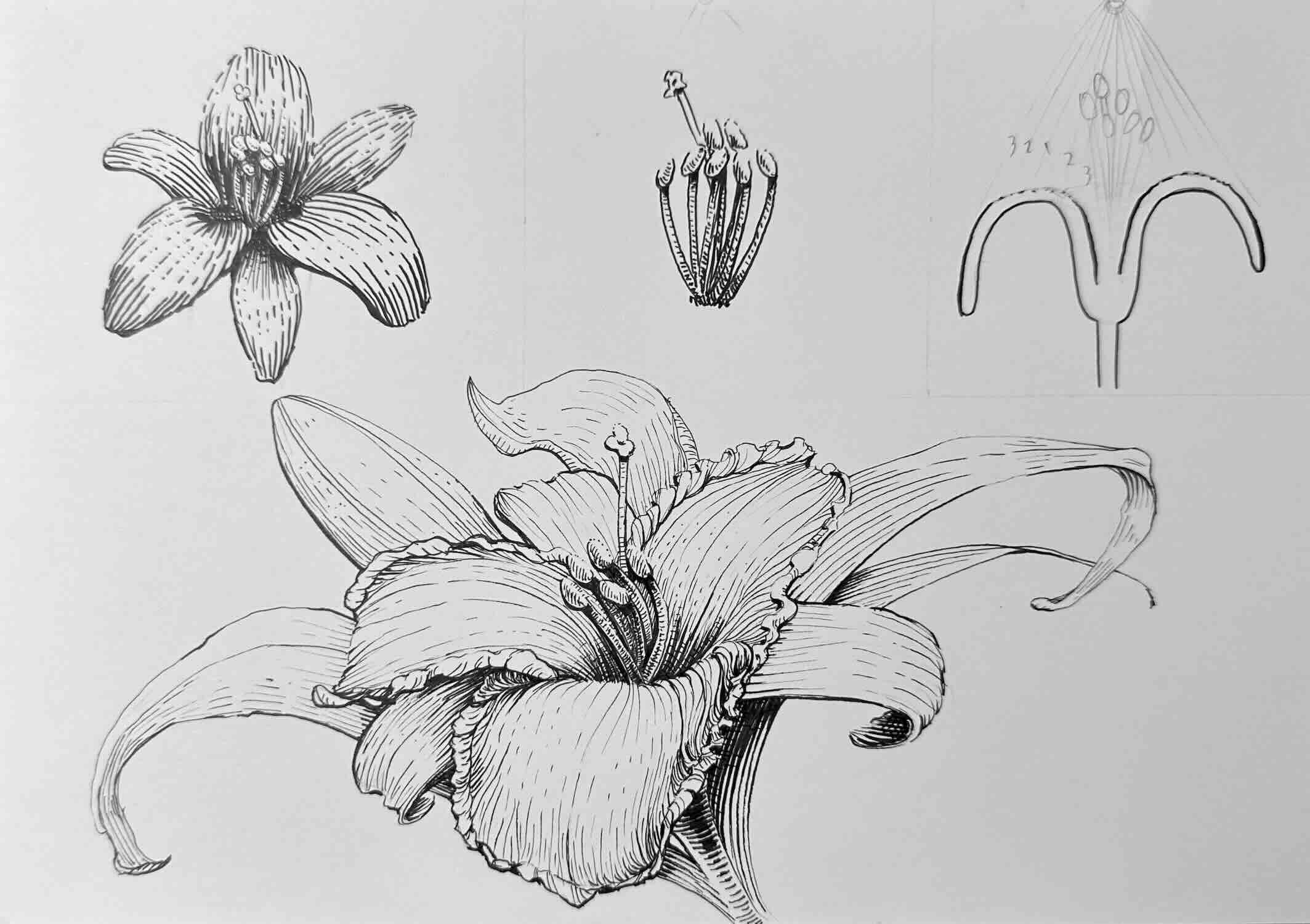
We’ll begin our next flower, a lily, with a circle, an oval for the centre, and attach the three main petals to the centre oval.
Draw another set of three petals, smaller in size, tucked behind the main petals.
Erase the structural guidelines and go over the lines you want to keep.
This time, instead of studying an individual petal, we’ll draw the stamens. The stamens bunch out from the stem centre and sway towards the sun. Add the pistil.
You’ll notice that I’m now incorporating cast shadows by adding a touch of solid black directly below the bulb of each stamen.
Then use a linear gradation on each of the little stamen posts. For your linear gradation, render using curved cross-contour hatches that go from dark to light to dark.
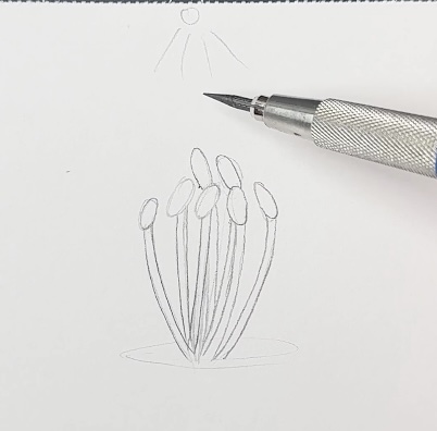
The side view diagram is more or less like this (below).
Go ahead and add a similar stamen-bunch centre piece to the lily you’ve drawn.
Then ink the remainder of the flower, front to back, so that it layers nicely.
I refer to the side view diagram to determine the values distribution, and continue to follow the form of the petals using stroke direction for the hatch marks.
I continue to use line quality to describe depth and to introduce cast shadows where the light is blocked. So solid black and nearly black in the centre area and behind the stamen bunch.
Comparatively, even though the principles of shading are the same, because the shape of each flower is so different, you can see how important it is to understand your subject.
But once you know, the shading part becomes pretty straightforward.
That’s why it’s so beneficial to include practice sessions where you also draw from life, not just photo references.
Lily with a Background
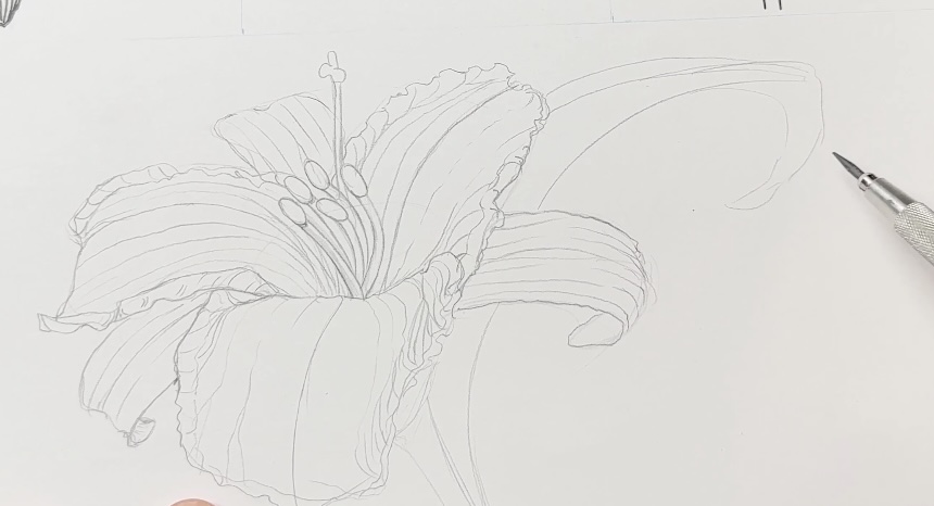
We’ll go one step further with our shading practice by drawing a slightly more detailed lily flower. This time from a ¾ view.
For the flower details, I’m now drawing the edges of the petals to show that they are curling at different angles. This creates more plane directions.
These plane direction changes in the petals will cast shadows and provide a broader range of values, from light to dark.
Also, I’m layering additional botanicals in the background. This will provide more rendering practice with atmospheric perspective.
For the workflow, the inking sequence, I’m again starting with the centrepiece with the stamen bunch, then travelling front to back on the picture plane.
Do an initial pass of the values. That means establishing the local colour first, that’s our level 4 value, the 100% grey.
Leave extra white space for the highlights so you can build the values gradually in relation to one another. It’s best to work light to dark.
Continue referring to the side-view diagram from the first lily as you start distributing the darkest values. The darkest values are:
- in the flower centre, below and between the stamens
- where the petals fold over, and
- where there are overlaps that block the light.
For the background botanicals, use lighter values, fewer details, and thinner outlines to create atmospheric perspective.
Finish your lily with bolder outlines for the petals that are on top and closest to the viewer.
Interested in a more advanced background? Check out my comprehensive step-by-step course to create a detailed lily garden composition, easy.

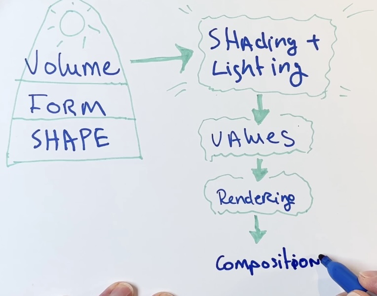
Shading Foundamentals for Pen and Ink
As you can see, practicing how to shade flowers in pen and ink is a handy skill. These shading principles can be applied to any subject in your compositions.
We started by establishing the shape of the flower with an initial structure.
We looked at an individual part of the flower to determine the line direction of our hatch marks. The direction of the hatch marks serves to give form to the shape, making it appear three-dimensional.
The side-view diagram gave us an indication of proximity to the light source. And based on how close or how far the flower parts were in relation to the light, we got shading and lighting using values.
Finally, we rendered each subject, and concluded with a mini composition by adding a background.
Resources
✒️ My tools
🎥 YouTube
🖼️ Instagram