
Join me in these eight studies of water subjects in pen and ink.
You’ll see after reading this article that drawing water is not so challenging when you apply this one simple concept.
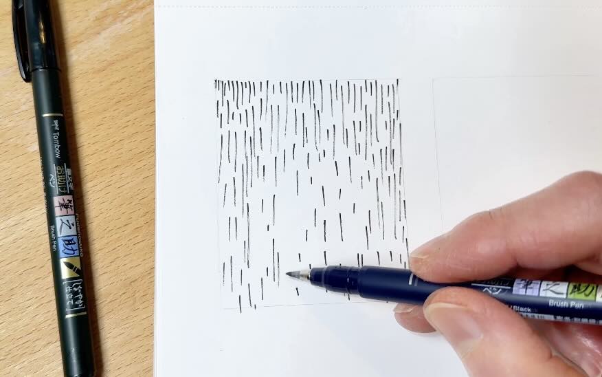
For materials, I’m using a set of soft and hard sponge tip brush pens in a smooth paper sketchbook.

Find the full list of materials and books mentioned in the article (and YouTube video) in the resources section below.
//Disclosure: I earn a small commission when you use the links in this article to make a purchase on Amazon. To learn more about affiliate partnerships, read the Terms page.
Water is an illusion
Drawing water with pen and ink may seem challenging, but there’s one thing that matters more than technique. Let’s see if you can guess what it is.
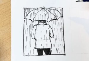
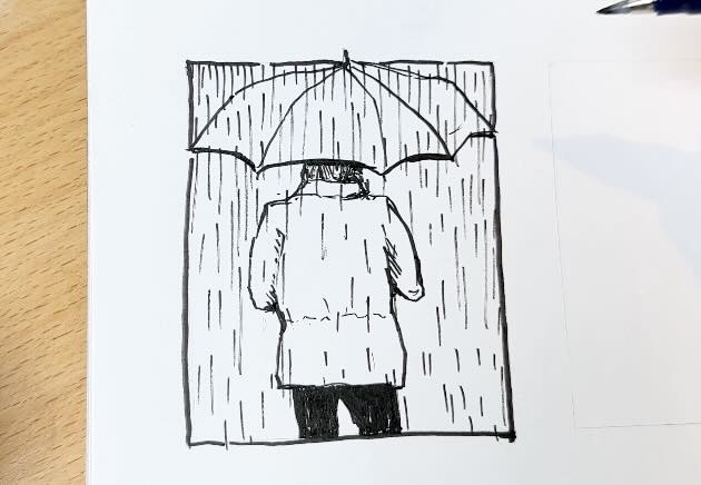
Below, on the left, we have random hatch marks. On the right, the hatch marks have become rain. How?

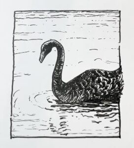
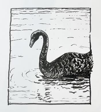
Below, on the left, we have squiggles. On the right, the squiggles have transformed into a black swan swimming in a pond.
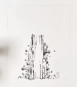
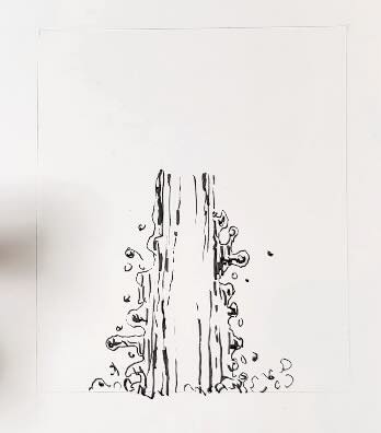
In this last example below, the oddly shaped tower becomes water running from a tap.
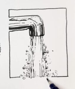
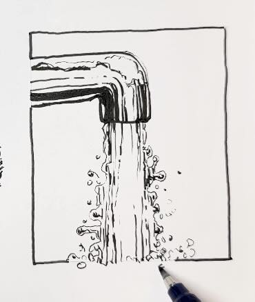
What matters most when drawing a water subject with pen and ink is not shape, not shading, not even expertise.
You’ve likely guessed it. The most important thing to focus on when drawing a water subject with pen and ink is to establish the context.
As you saw in those three sketches, we created the illusion of water, and we achieved this by giving the water a context: an umbrella, a swan, a tap.
Without the context, the hatch marks are just hatch marks.
Rain
What do you notice in the photo reference below?
There’s no umbrella, which means we need to create context in some other way.
How else can we describe the rain?
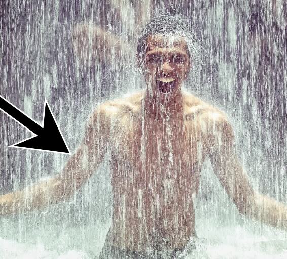
There are 3 things we want to pay attention to:
- Note the natural halo that forms around the man. Rain is bouncing off his body. There could also be a mist created by the vapour heat.
- The second thing you’ll notice are visible raindrops.
- The third important visual is the overlapping of raindrops in front of the man.
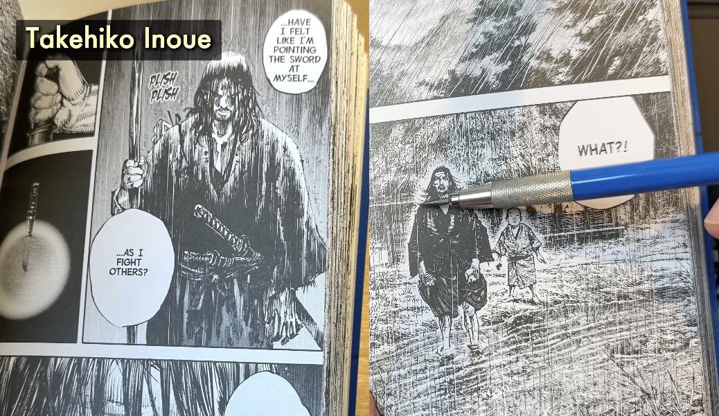
Observe in the image above how master Takehiko Inoue applied the:
- Halo
- Raindrops
- Overlap
Because I know about these 3 things:
I’m careful to leave some open edges in the outline of my character for the rain to overlap.
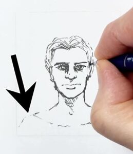


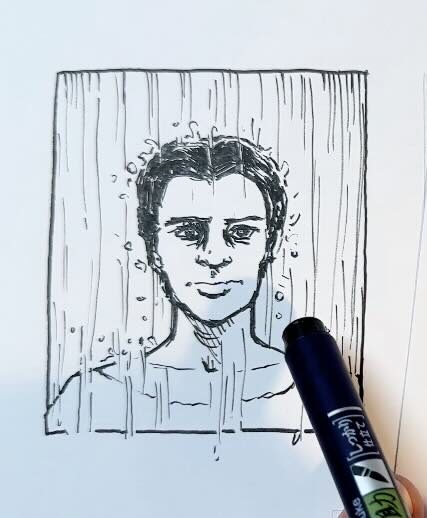
Then I add the splashy halo, with visible raindrops
To make the overlap more obvious, you can increase the contrast in spots. Like giving him black hair. Now the rain is in reverse, white on black.
In the intro sketch, the umbrella provided context for the hatch marks. If the scene you are illustrating doesn’t include an obvious context, then create one from what you know about the subject and its environment.
In the end, you’re still just making pen marks with dashes and ovals, yet the illusion of rain makes sense and is therefore believable.
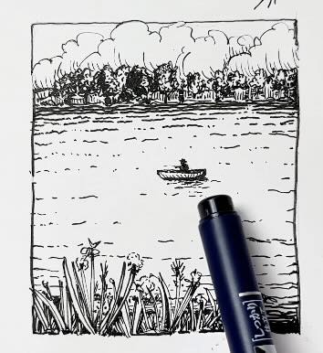
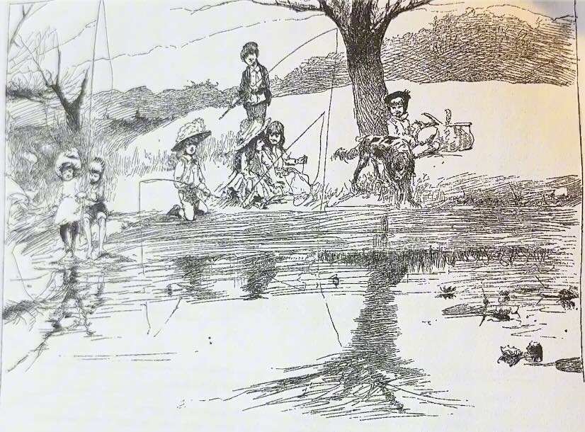
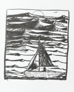
Lake
In the photo reference below, what 3 things tell us that this is a lake?
- First, there’s a boat. What else?
- We have vegetation on the horizon line and vegetation in the foreground. These two prominent coastlines create a visual container for the water.
- And lastly, on the water, there are visible ripples. Any kind of texture on a water surface is something we can use to help create a more convincing illusion.
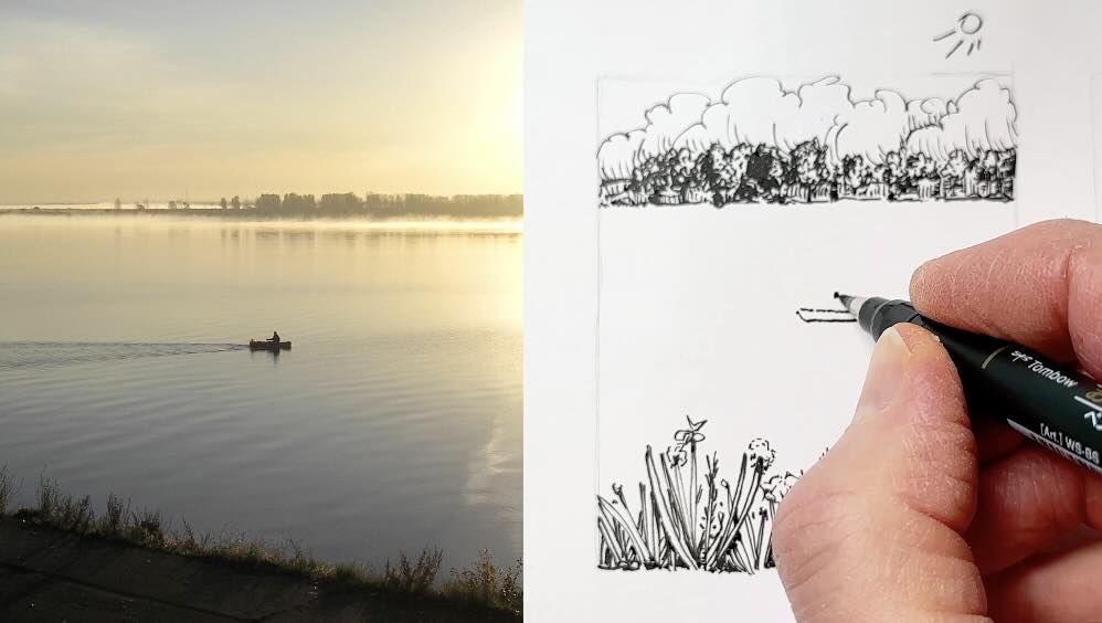
Having a container and a possible texture allows us to build a depth of field, creating a sense of dimension and perspective.
To draw in perspective with pen and ink, it helps to use a range of values.
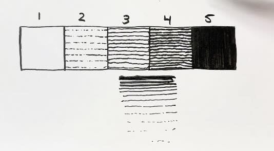
We’ll spread the values in a gradation scale using a linear pattern to create the illusion of distance and foreshortening.
It’s therefore darker in the distance because the ripples in the water are closer together, plus there’s a reflective shadow from the trees.
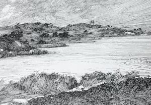
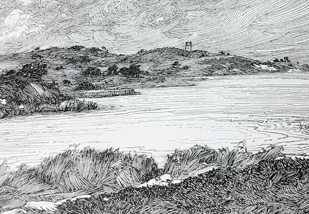
See here how master Franklin Booth (left) creates the illusion of perspective and movement, with a linear gradation.
We can repeat the linear gradation effect in the foreground same as we did for the horizon line.
The gradation in the foreground therefore describes a tide, movement, or cast shadow from the shoreline vegetation or whatnot.
To complete the illusion, add a shadow from our tiny fishing boat as a reflection on the surface of the lake.
Let’s talk about the reflection.
Pond
We know that water is reflective; we know that when the water is calm, it becomes like a mirror.
Therefore, it makes sense to mirror the objects from the surface onto the water. This swan is then flipped to create its cast shadow.
For this example, we can once more use the values linear gradation effect to describe the depth-of-field in the pond.
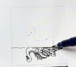
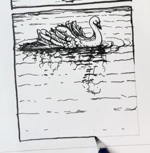
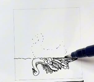
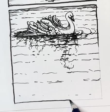
The water texture becomes squiggles. The squiggles indicate movement in the water. This tells the viewer that it’s windy or it’s a flowing river.
See below how master Alfred Laurens Brennan rendered reflections with irregular strokes to describe motion in the water.
And finally, drawing rings around the swan tells us that the subject is in movement as well.
Speaking of running water, let’s draw a waterfall next.
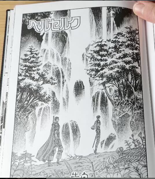
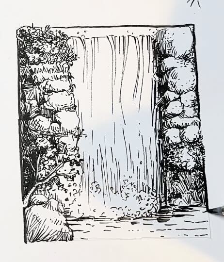
Waterfall
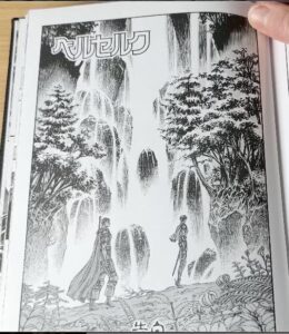
Context plays a huge role in the illustration below (left) from master Kentaro Miura.
He didn’t need to use any rendering marks to draw the waterfall itself because the environment that frames it tells us that it’s a waterfall. The context is obvious.
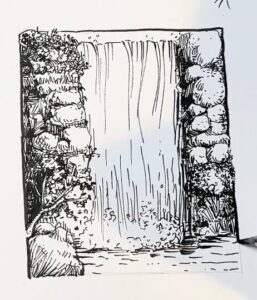
There are clues in the photo reference below about the environment that we can use to support the context.
The clues are:
- One, the high contrast in values. There’s a stark contrast between the water and the environment. The dark shrubs and rocks frame the lighter values of the water.
- Two, there’s a big bubbling spray at the bottom of the waterfall.
- And thirdly, there are some dark spots in the waterfall breaking up the lighter values. These darker spots tell us that the water is flowing over top of more rocks.
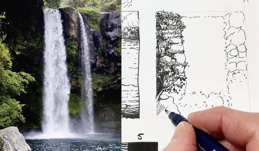
Including these three clues in our illustration will establish the context for the viewer.
Using what we know about the subject makes the waterfall look more realistic, even without using any special rendering techniques for drawing the water itself.
Next, let’s add some chop to our water.
Choppy Waters
Children are masters of observation. That’s why they draw choppy waves in the shape of an elongated 3-D pyramid or Polyhedron.
Waves do look like elongated polyhedra, especially when you shade them using high-contrast values.

In this example, it’s necessary to add context, such as a sailboat; otherwise, the drawing could be read as a mountain range or dunes.
In this scenario, the sailor is avoiding the big choppy waves seen in the distance.
How about we draw some big waves next!
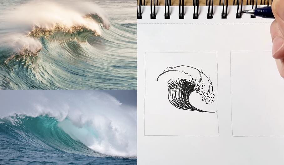
Ocean Waves
The three main clues from the photo references below that visually describe these big waves are:
- The shape of the waves
- The big spray
- The contrast in values
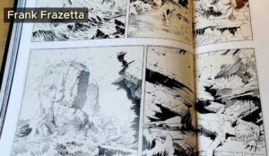
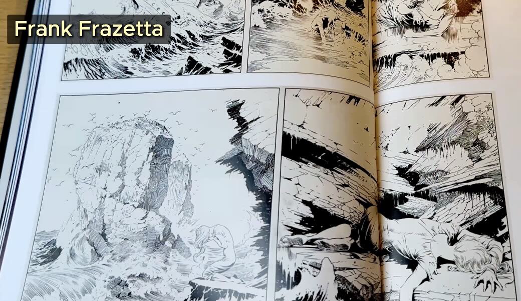
We can also take inspiration from masters, Philippe Druillet (below) and Frank Frazetta (lower, on the left) on how to render big waves.
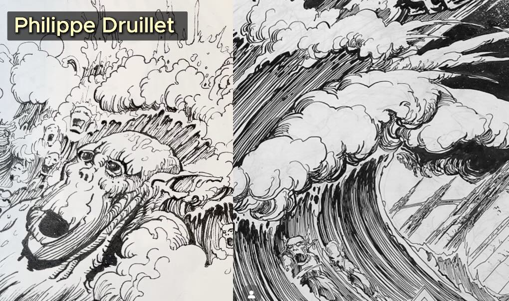
📖 Read more about master Druillet’s techniques in this article.
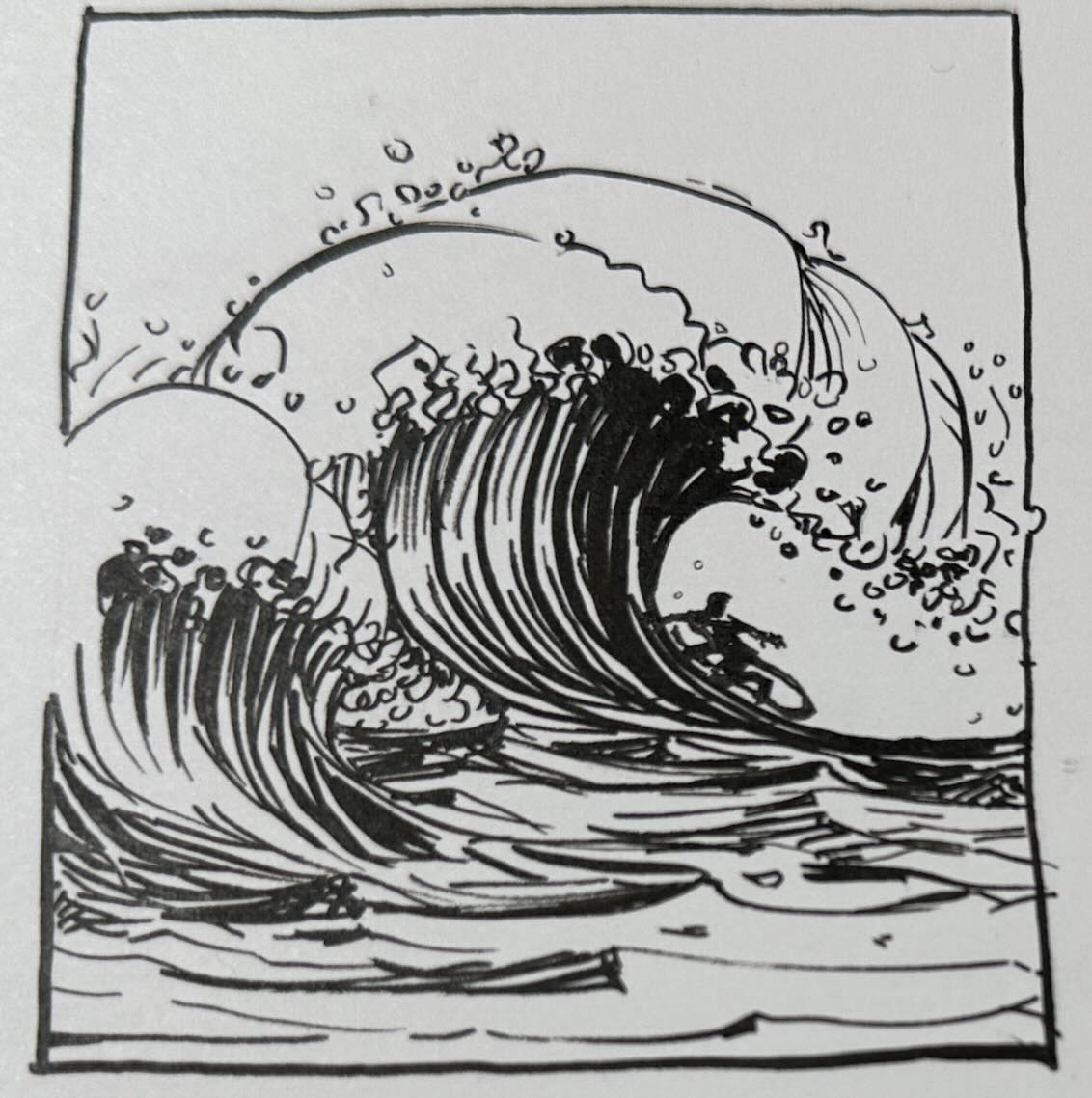
And if your execution is not convincing enough, it’s easy to give context by adding a tiny surfer.
We can enhance the illusion by incorporating more elements of the environment. Let me show you how in the next example.
The High Sea
First, establish the shape, since that’s what people associate with most when thinking of big ocean waves.
To render the water, I’m using short dashes and irregular lines with sharp angles, plus some oval-shaped spray or foam on the surface. This describes the force of the back-and-forth movement of the ocean.
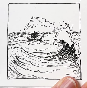
This time, I positioned the curling wave in the foreground to establish depth of field. Then, I kept the hatch marks closer together for the waves in the distance to reinforce the sense of scale.
For added context, a Viking ship is in the middle ground and an iceberg in the background to give the viewer more clues about the environment.
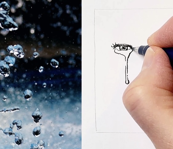
Another scenario where we’d typically need to draw water is the infamous waterdrop.
Sweat and Tears
I say infamous because it’s tempting to shade waterdrops to give them volume.
Maybe you’ve tried to render waterdrops with cross-hatching or stippling? How did that turn out?
The thing is, a waterdrop has no texture; it’s smooth.
With pen and ink, the best way to describe a smooth texture, in my opinion, is not to render it.
Use line weight instead.

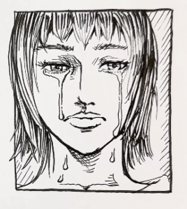
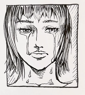
In this example, I used a broken outline on the section of the tears that curve over the face following the form, and a thicker outline on the shadow side.
Varying the line weight for the outer contour of the shape of the waterdrop subject is sufficient to convey volume.
My recommendation? For waterdrops, tears, or sweat, use shape and line weight to create a convincing illusion.
Conclusion
I hope you enjoyed these water studies in pen and ink. As you can see, it’s not so challenging to draw water subjects when you include a context.
When there’s no obvious context, you can create one by giving the viewer clues from the environment.
Let me know in the comments what other subjects you’d like to render in pen and ink.
Subscribe to my email list to get notices on future articles, and I wish you all the best with your projects.

Resources
✒️ My tools
🎥 YouTube
🖼️ Support the blog (link goes to my shop)

📚 Books used in this article (note that some may be temporarily out of print)
- Frank Frazetta
- Franklin Booth
- Philippe Druillet
- Takehiko Inoue
- Kentaro Miura
- American Treasury of Pen & Ink Illustration
🧰 Tools used in this article

bonjour
j aime beaucoup ce que vous faites et aimerais m abonner à vos cours.
ne parlant pas bien l anglais est ce que sur des 2 sites que vous proposez on peut avoir soit 1 traduction ou 1 sous titrage en français?
merci de votre réponse
Bonjour, mes cours sont traduits (dubbed) automatiquement sur les deux plateformes: Udemy et Skillshare ; vous n’avez qu’à naviguer sur leurs sites en version française:
https://longstrideillustration.com/learning/